Buyer Fit Snapshot
| Best fit | custom rigid boxes foil stamping for packaging buyers comparing material specs, print proof, MOQ, unit cost, freight, and repeat-order risk where brand print, material, artwork control, and repeat-order consistency matter. |
|---|---|
| Quote inputs | Share finished size, material target, print colors, finish, packing count, annual reorder estimate, and delivery region. |
| Proofing check | Approve dieline scale, logo placement, barcode or warning zones, color tolerance, and any recyclable or compostable wording before bulk production. |
| Main risk | Vague material claims, crowded artwork, or missing packing details can create delays even when the unit price looks attractive. |
Fast answer: Custom Rigid Boxes Foil Stamping: Design, Cost, Process should be specified like a repeatable production item. The safest quote includes material, print method, finish, artwork proof, carton packing, and reorder notes in one written spec.
What to confirm before approving the packaging proof
Check the product dimensions against the actual filled item, not only the sales mockup. Ask for tolerance on folds, seals, hang holes, label areas, and retail display edges. If the package carries a logo, QR code, warning copy, or legal claim, reserve that space before decorative graphics fill the panel.
How to compare quotes without losing quality
Compare board or film grade, print process, finish, sampling route, tooling charges, carton quantity, and freight assumptions side by side. A lower quote is only useful if the supplier can repeat the same color, closure quality, and packing count on the next order.
Custom Rigid Boxes foil stamping is one of the fastest ways to make packaging feel expensive without changing the structure underneath. Two boxes can use the same greyboard, the same wrap, and the same lid-and-base build, yet the foil-stamped version usually wins the first glance. Light does part of that work. Contrast does the rest.
The appeal is not decoration for decoration's sake. Foil stamping gives a controlled visual signal inside branded packaging, retail packaging, and premium product packaging where presentation has to do real work before anyone opens the box. The better question is not whether foil looks good. It does. The better question is where it pays off, where it wastes money, and how to spec it so the result feels deliberate instead of loud.
There is also a practical buyer side to this. A cosmetics brand launching 3,000 holiday sets may need a restrained gold mark that reads well under store lighting. A jewelry supplier shipping 200 VIP boxes may want a richer treatment, because the box itself is part of the sale. The finish decision changes with the use case, and that is where the money is either well spent or quietly lost.
A rigid box with weak foil is still a weak box. Foil stamping sharpens a strong design. It will not rescue fuzzy typography, cluttered artwork, or a structure that was rushed into production.
What Custom Rigid Boxes Foil Stamping Actually Is
Foil stamping is a heat-and-pressure decoration process that transfers a thin metallic or pigmented foil film onto the surface of a box using a custom die. The die presses the foil into the wrap paper or label, and the foil bonds only where the metal plate touches. The result is a crisp logo, a clean border, or a sharp title on a premium box without printing metallic ink across the full surface.
Rigid boxes are a strong match for this finish because they have structure. A typical rigid build uses a thick greyboard core, often around 1.5 mm to 3 mm depending on the style and weight target, wrapped in paper, specialty stock, or printed sheet. That stable surface holds detail better than a soft folding carton. It also protects the decoration during handling, which matters if the box will be opened repeatedly, shipped across distances, or used as gift packaging.
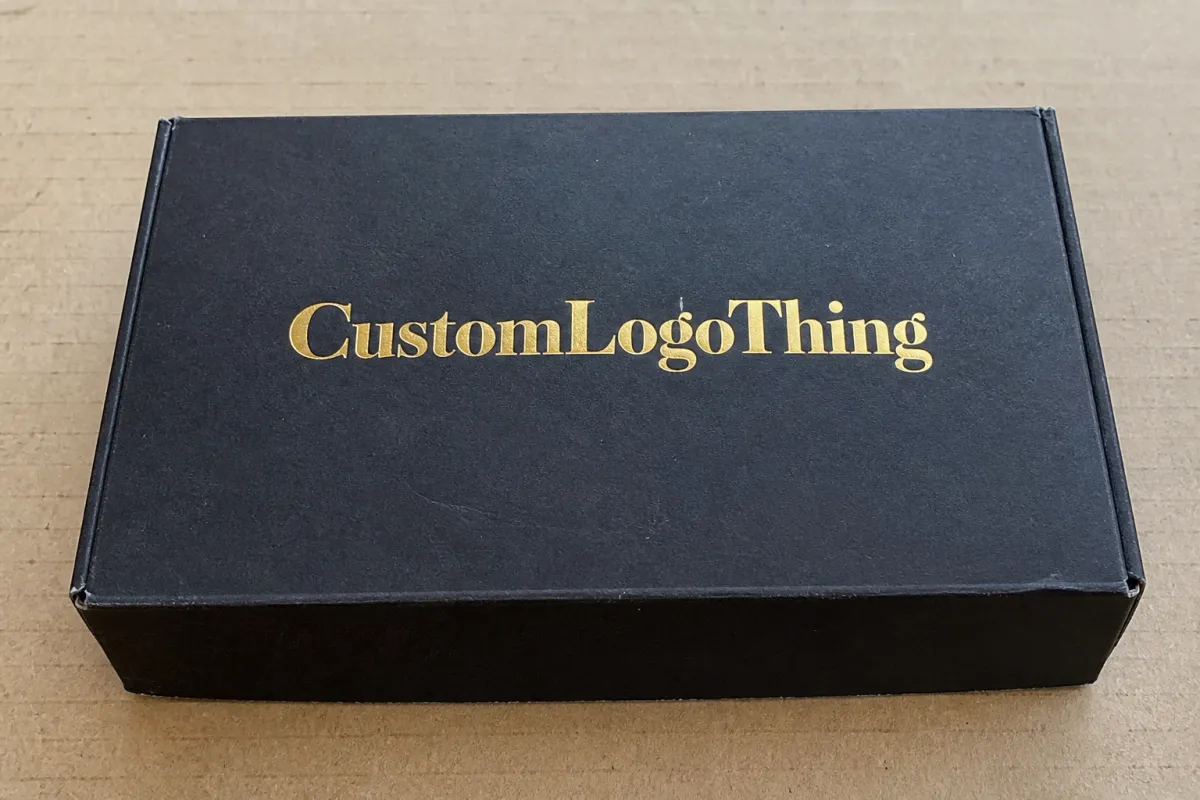
From a packaging buyer's point of view, the value is easy to see. Foil adds contrast, shine, and perceived value without forcing a full redesign. A plain black rigid box can feel premium. A black rigid box with a carefully placed gold logo usually feels more premium. That gap is why Custom Rigid Boxes foil stamping keeps appearing in luxury cosmetics, jewelry, candles, tech accessories, and corporate gifting.
There is no hidden trick behind the shine. If the artwork is crowded, the type is too small, or the board and wrap are low grade, the finish will look cheap no matter how much foil you use. Good packaging design still does the heavy lifting. Foil only gives it a better stage.
Visual value and production value are not the same thing. A small foil logo can feel expensive because it is restrained. A full-panel metallic box can feel expensive too, but only if the layout, color, and material support that move. Otherwise it starts to read like a nightclub flyer wearing a tuxedo.
How Foil Stamping Works on Rigid Boxes
The process is more mechanical than most people expect. Artwork review comes first. The supplier checks line weights, placement, and file quality. A die is then made from the approved design. That die is usually a metal plate engraved or etched with the stamping image. The foil film is loaded, the box wrap is positioned, and heat plus pressure transfer the design onto the surface.
Before a production run starts, a careful plant will pull test samples. That step matters because it shows registration, coverage, pressure, temperature, and how the foil behaves on the actual wrap material. If the foil looks too thin, the type closes up, or the edges break, the team can adjust there instead of after a thousand boxes are already stamped.
Die choice matters as well. Magnesium dies are often used for quicker turnaround and shorter runs because they are faster to produce. Brass dies cost more, but they hold fine detail better and usually stand up to longer production runs. If the logo is simple, either can work. If the art is dense or the run is large, the die material stops being a small detail and starts affecting consistency.
Several foil methods are worth separating:
- Hot foil stamping uses heat and pressure to transfer foil from the film to the surface. It is the most common choice for rigid boxes and gives strong detail on logos and typography.
- Cold foil applies adhesive and transfers foil without the same high-heat setup. It is more common in print production and labels than in typical rigid box wrapping, so it is usually chosen for different workflows.
- Specialty foils include holographic, matte metallic, satin, pearl, pigment, and texture-based finishes. These shift the visual tone quickly, which helps when a brand wants more than standard gold or silver.
Where the foil lands matters just as much as the foil itself. On rigid boxes, the foil can be stamped onto the wrap paper before lamination, onto a printed sheet before wrapping, or onto a label or insert that is then mounted to the box. Each path changes cost, registration risk, and the final look. A foil logo on a soft-touch wrapped lid looks different from the same logo on a coated art paper wrap. One reads smoother and more restrained. The other reflects more sharply and can feel bolder.
Design limits show up fast during stamping. Tiny text can fill in. Hairline rules can break. Dense gradients do not belong here. Corners, folds, and lid wraps need careful alignment because foil near a seam will not always behave like foil sitting on a flat surface. If your artwork crosses a wrap edge, the die and the box structure need to be planned together, not treated as separate jobs.
Finish behavior matters too. A matte wrap can make foil pop harder because the contrast is stronger. Soft-touch lamination gives a velvety feel, but it can soften the reflected edge of metallic foil in photos. Textured papers can look beautiful, though they may reduce sharpness on very fine details. That is why samples are not optional for serious work. Screen mockups lie politely. Paper does not.
For broader packaging standards and structure testing, the packaging industry has useful references through ISTA testing protocols, especially if the box needs to survive shipping and handling after decoration. For responsibly sourced paper components, FSC certification is a practical mark to ask about when sustainability claims matter to the brand story.
Cost, Pricing, MOQ, and Quote Drivers
This is the part buyers want answered directly. Price depends on how much area is stamped, how complex the die is, what material you are stamping onto, and how many boxes you order. More coverage means more setup and more time at press. More detail means more risk. Fewer units mean setup costs get spread across a smaller run, which pushes unit price up.
For custom rigid boxes, MOQ often starts higher than people hope because these boxes are built, wrapped, and finished in a more manual workflow than standard folding cartons. Small quantities are possible, but they carry a premium. A 200-unit order and a 5,000-unit order do not live in the same cost universe. That is not greed. It is labor, setup, press time, and the reality of running decorated packaging through a production line.
Here is a practical range for typical foil stamping adders on rigid boxes, assuming standard production in moderate quantities and a simple-to-mid complexity design:
| Spec Type | Typical Setup/Die Range | Approx. Unit Add-On | Best For | Tradeoff |
|---|---|---|---|---|
| Small logo on one panel | $75-$180 | $0.12-$0.28 | Clean premium branding | Least dramatic, strongest value |
| Large logo or title block | $120-$250 | $0.18-$0.45 | Visible retail packaging impact | Higher risk of alignment issues |
| Multi-location stamping | $180-$350 | $0.30-$0.65 | Luxury presentation boxes | More setup, more correction points |
| Foil plus embossing | $220-$500 | $0.35-$0.90 | Higher-end custom printed boxes | Best-looking option, not the cheapest |
Those figures are not a quote. They are a working range that helps you judge whether an offer is realistic or fantasy. If a supplier gives you a price that looks suspiciously low, check what is missing. Maybe the foil area is smaller than you expected. Maybe the board is thinner. Maybe the die cost is hidden elsewhere. Maybe the finish will arrive with just enough quality to pass from three feet away and not much farther.
Good quote requests include the basics. Anything less turns pricing into guesswork dressed up as data:
- Exact box dimensions.
- Rigid box style, such as lid and base, magnetic closure, or book-style.
- Foil color and finish, such as gold, silver, black, holographic, or matte pigment.
- Artwork file format, ideally vector.
- Quantity and target delivery date.
- Whether you need embossing, spot UV, soft-touch wrap, or another finish alongside foil.
Ask the supplier to separate structure cost from decoration cost. That is a smarter way to buy. You can see whether the premium is coming from the box build, the wrap material, the foil process, or all three. It also makes it easier to decide whether you want to spend more on tactile structure or on visible branding. A lot of buyers say they want "better packaging," then discover they really mean "a more visible logo, with the same budget." Those are not the same request.
If a quote feels too high, the first place to look is the design, not the press. A smaller foil area, fewer stamping locations, or a simpler die can reduce cost without making the box feel generic. If the order is meant for a holiday launch or a gift set, a restrained foil treatment on one or two focal panels is often the cleanest balance between appearance and budget. Full-surface foil can be striking, but it also raises the odds that something shifts during production.
For many brands, the sweet spot is a restrained foil treatment on one or two focal panels. That keeps cost under control while still improving the unboxing experience. Full-surface foil can be beautiful, but only if the brand wants that level of shine and can handle the extra production risk. The best packaging design choices usually feel obvious after the sample arrives. Before that, they often feel irritatingly uncertain.
Production Process, Timeline, and Lead Time
The full production path usually looks like this: artwork review, die creation, foil proofing, sample approval, bulk stamping, box assembly, quality check, and packing for shipment. Each stage can move quickly or drag, depending on how clean the files are and how much back-and-forth happens before approval. The actual stamping may be only one part of the schedule, but it is usually the part buyers remember when a deadline starts slipping.
Simple jobs can move fairly fast. A small rigid box order with a single foil location and clean vector artwork may finish within roughly 12-15 business days after proof approval, assuming the plant is not overloaded and the sample clears on the first round. More complex jobs take longer. Add a custom structure, multiple foil zones, embossing, specialty wrap, or a tightly matched color system, and the timeline often stretches into several weeks.
Three delay points show up again and again. First, late file delivery. Second, vague specs. Third, last-minute changes after the sample is already approved. That last one is a classic. Someone looks at the proof, decides the logo should be bigger, the foil should be brighter, the lid should be shorter, and the finish should suddenly feel "more luxurious." That is how a normal schedule turns into a rescue operation.
Rigid box production is not just printing. It includes board cutting, die cutting, wrapping, assembly, and finishing. Each stage depends on the one before it. If the die lands slightly off, the foil changes. If the wrap stock shifts, the box corners change. If approval happens late, everything downstream moves too. Packaging does not care how urgent your launch is.
A practical benchmark helps here: if a project needs holiday shelf dates, influencer mailers, and retail allocation at the same time, add more buffer than the sales team thinks necessary. A box that looks simple can still involve multiple approval loops, especially if the foil color has to match a brand standard or a companion insert. Production does not move on excitement. It moves on signed-off files.
Good timelines come from clean approvals, not optimism.
One more practical note: if the order needs transit protection after production, ask about shipment testing or handling requirements early. Standards from organizations like ISTA matter because a beautiful foil finish means little if the box arrives scuffed, crushed, or corner-dented. Decorative work and shipping durability should be planned together, not as separate afterthoughts.
Key Design Factors That Change the Result
Artwork scale is the first thing that changes how foil looks. Bold logos, solid icon shapes, and clean type usually stamp well. Hairline details, tiny subtext, and thin decorative rules are where trouble starts. If the lines are too narrow, the foil can blur or break. If the text is too small, the detail can fill in and lose legibility. That is not a defect in the machine. It is the design asking for more precision than the process wants to give.
Foil color choice changes the mood immediately. Gold still reads as luxury because buyers know what it means. Silver feels cleaner, cooler, and more modern. Black foil can be subtle on a matte surface and surprisingly elegant on lighter wraps. Holographic foil is loud by design, which makes sense for some retail packaging but not for every brand. Custom tones can work well if the brand has a tight color system and enough volume to justify the setup.
Substrate and wrap selection are equally important. Coated paper usually gives crisp results. Soft-touch wrap looks rich but can mute the reflected edge slightly. Textured stock can add depth, though it may not hold ultra-fine detail cleanly. If your box uses printed wraps, the underlying print also affects the result because busy artwork competes with the foil. A box that is already doing a lot visually does not need the foil to shout over it.
Structural choices matter more than some buyers expect. Lid depth affects how much front panel is visible. Seam placement changes where the foil can land cleanly. Box panel size affects whether a logo feels balanced or cramped. A large lid with a tiny logo can look timid. A narrow panel with oversized foil can look like someone lost a bet. Proportion matters in packaging design the same way it matters in architecture.
Brand style also changes the correct spec. A minimal luxury brand usually benefits from a single foil mark and careful whitespace. A bold retail brand might use larger coverage and stronger color contrast. Gift packaging often needs a bit more warmth and a more obvious reveal, especially if the box is part of the experience itself. That is why a blanket spec rarely works. The best build depends on what the box is supposed to do for the product.
Finish combinations that work well
Foil rarely has to work alone. It pairs nicely with embossing for added depth, with debossing for a pressed-in effect, with spot UV for contrast, and with specialty papers for tactile interest. The important thing is restraint. Too many finishes at once can make the box feel overworked. Good premium packaging usually feels edited, not decorated by committee.
If the design team is still deciding between options, ask a simple question: what should the box communicate from arm's length? If the answer is "premium, clean, and easy to recognize," the foil spec should probably stay tight. If the answer is "giftable, memorable, and obviously special," there is room for a stronger finish combination. The right answer changes by product category, price point, and audience. No surprise there.
Common Mistakes to Avoid with Foil Stamping
The first mistake is overdesigning the box. A lot of brands think more foil means more luxury. Sometimes it means less taste. Full-panel foil, oversized logos, multiple metallic colors, and busy copy blocks can look aggressive instead of premium. In practice, a single strong focal point usually looks more expensive than a box trying to impress everyone at once.
The second mistake is poor file prep. Low-resolution artwork, unexpanded type, messy layers, and incorrect registration setup can create delays or visual defects. Foil dies need clean vector artwork. If the file is fuzzy before production starts, it will not become sharp because someone in manufacturing had a good attitude. That is not how this works.
The third mistake is ignoring material compatibility. A foil that looks excellent on a coated paper sample may behave differently on a textured wrap or soft-touch lamination. Color temperature, reflectivity, and edge sharpness all change depending on the surface. If the sample is not viewed on the actual chosen material, the final result can surprise you in the worst way.
The fourth mistake is skipping samples. This is the one that hurts the most because it is entirely avoidable. A pre-production sample shows whether the logo sits correctly, whether the die registers cleanly, and whether the foil color matches the brand direction. If the sample looks wrong, you can still fix it. If the full order is already moving, you are paying to learn expensive lessons.
The fifth mistake is taking the lowest quote without checking the print method, board quality, or finish tolerance. Cheap foil can look flat, flaky, or misaligned. Cheap rigid board can dent faster and make the premium finish feel less premium the second the box is handled. Buyers sometimes chase a lower unit cost and end up paying for rework, wasted units, or a product launch that looks weaker than it should.
Here is a simple reality check: if your box is for an $18 impulse product, you probably do not need the same foil treatment as a $120 gift set. If the box itself is part of the perceived product value, spending more on finish makes sense. If the box only needs to hold the product safely and look decent on shelf, a simpler spec may perform better economically. Good packaging buyer judgment is mostly about matching spend to business goal, not chasing the prettiest sample in the room.
Expert Tips and Next Steps for Better Results
Start with one strong focal area. A logo on the lid, a title on the front panel, or a small repeated mark inside the box usually delivers more value than stamping every visible surface. Restraint tends to read as higher end because it gives the finish room to breathe. Luxury brands know this. They do not need to yell; they need to be recognized.
Order a physical sample or pre-production proof before approving the run. That sounds obvious, but people still skip it when they are rushing. A sample lets you inspect color, alignment, tactile behavior, and how the foil reacts under light. It also makes internal approvals easier because everyone is looking at the same object instead of arguing over a screen render that can be interpreted six different ways.
Put the finishing spec in writing. List the foil color, finish type, exact placement, and whether embossing or another effect is included. If you leave room for interpretation, someone will interpret it. Maybe correctly. Maybe creatively. Either way, you do not want the production team guessing at the expensive part.
If the box needs to support a larger branding system, make the foil treatment part of the same conversation as the rest of the package branding. That means the logo lockup, typography, insert style, and wrap material all need to point in the same direction. A premium box works best when the decoration, structure, and content feel like they belong to one brand, not three separate decisions.
For buyers working through multiple packaging options, a practical checklist helps more than a mood board:
- Confirm the final dimensions.
- Choose the rigid box structure.
- Decide where foil should appear.
- Lock the foil color and finish.
- Request a sample and review it under real lighting.
- Set the timeline with padding for changes.
If you need a broader packaging supplier view, browsing Custom Packaging Products can help you compare structures, finishes, and box types before you request quotes. That is often the smarter route than asking for a premium effect first and figuring out the box architecture later. Structure first. Finish second. Corrections last.
For brands building a launch kit, it also helps to compare rigid boxes with related Custom Printed Boxes and inserts before locking the spec. Sometimes the box is the hero. Sometimes the insert, sleeve, or outer mailer does more of the work. A good vendor should be able to talk through those tradeoffs without pretending every option is equally ideal.
Bottom line: custom rigid boxes foil stamping works best when the design is simple, the material is compatible, and the approval process is disciplined. Use it as a finishing decision, not a rescue plan. If you line up the artwork, structure, and budget before requesting quotes, the result is usually cleaner, more consistent, and less expensive to fix.
How much does custom rigid box foil stamping usually cost?
Cost depends on foil coverage, die complexity, box size, and order quantity. Small runs usually carry a higher unit cost because setup is spread across fewer boxes. A single logo hit is cheaper than full-panel or multi-location stamping, so a tight design is the easiest way to keep the budget in line.
Is foil stamping on rigid boxes better than embossing?
They do different jobs. Foil stamping adds shine and contrast, while embossing adds texture and depth. Many premium boxes use both because the effects complement each other. Choose foil if visual impact matters most. Choose embossing if tactile detail matters most.
What artwork works best for custom rigid boxes foil stamping?
Bold logos, clean type, and simple symbols usually stamp more cleanly than tiny details. Thin lines and small text can fill in or lose sharpness during production. Vector files are the safest starting point for most packaging jobs, especially if the box is supposed to look crisp under retail lighting.
How long does the foil stamping process take for rigid boxes?
Lead time depends on die setup, sampling, artwork approval, and total quantity. Simple specs move faster than custom structures with multiple foil areas. Late changes are the fastest way to turn a normal timeline into a headache, so get the approval chain locked early.
Can foil stamping be combined with other finishes on rigid boxes?
Yes, it pairs well with embossing, debossing, soft-touch wrap, spot UV, and specialty paper. The trick is balancing finishes so the box feels intentional, not overloaded. A good sample is the easiest way to judge whether the combination actually works, and it is also the fastest way to see whether your custom rigid boxes foil stamping spec deserves a bigger run or a calmer revision.
If you are planning a new run, start with one panel, one foil color, and one physical sample. That is usually enough to tell whether the idea is strong, whether the budget matches the ambition, and whether the final box will feel premium for the right reasons.

