This custom wine Paper Bags Logo Placement guide is really about one thing: making sure the brand still looks composed once the bag is printed, folded, filled, carried, and photographed. A logo can be technically correct on a flat dieline and still feel awkward on the finished bag if it sits too low, crowds the handles, or disappears into a crease. Packaging buyers run into that mismatch all the time, especially with wine carriers, because the bottle changes the structure the moment it goes inside.
A wine paper bag is a moving surface with limits. The front panel looks generous on screen, but a 750 ml bottle pulls the paper into a new shape, the handles rise, and the eye naturally shifts to the upper third of the bag. That is why good placement is less about filling space and more about choosing the part of the bag that stays readable in use. The right decision can make a modest one-color print feel refined; the wrong one can make premium stock look rushed.
For buyers comparing branded packaging across formats, the same principles show up in Custom Packaging Products: structure, material, and print method all shape how the artwork performs in the real world. The sections below cover panel selection, logo sizing, proofing, pricing, and the mistakes that turn a clean wine bag into something forgettable.
Custom Wine Paper Bags Logo Placement Guide: What Buyers Often Miss
The first thing many buyers miss is that a wine bag is not a flat rectangle with handles attached. It has a front panel, back panel, gussets, bottom fold, handle zone, glue areas, and safe margins that all affect the final look. A logo placed with only the flat layout in mind can end up clipped by a fold, pushed too close to the edge, or visually trapped under the handle once the bag is assembled.
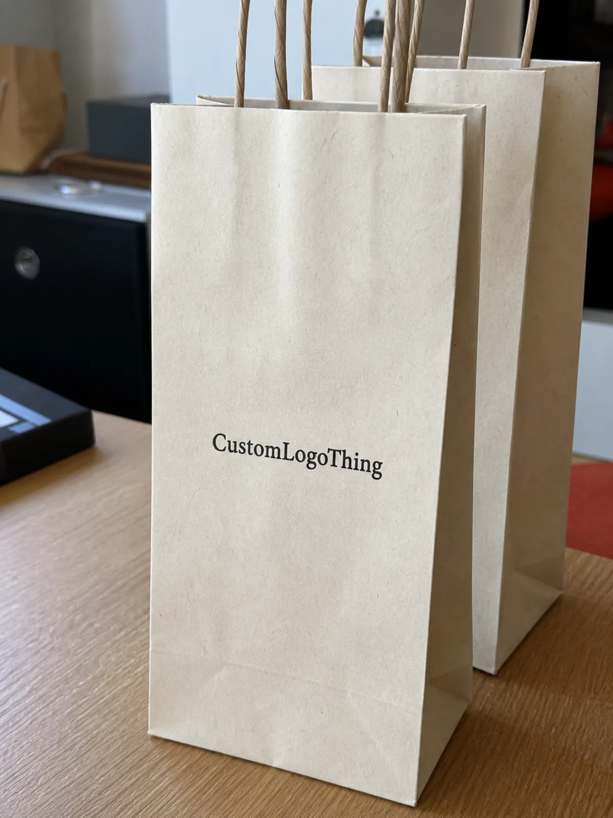
The front panel usually carries the primary logo because it is the cleanest visual field. It is the side people see at retail counters, in tasting rooms, and in gift exchanges before the bottle weight starts to alter the silhouette. Side gussets are better for lighter branding, a monogram, a small icon, or a repeat pattern. The bottom fold should stay clear of anything important; artwork there is almost always wasted space.
What surprises many first-time buyers is how much the loaded bottle changes the composition. A bag that looks perfectly centered on a sample sheet can appear too low or too tight once the bottle is inserted. The shoulder of the bottle, especially on sparkling or taller formats, creates a visual bump that can interfere with a logo sitting in the lower half of the front panel. The goal is not “centered on paper.” It is centered on the carried bag.
A logo can be fully legible and still feel wrong if it sits where the bottle changes the silhouette.
That matters commercially. Shelf recognition, gift appeal, and photo visibility all depend on the logo landing in a place the eye can read quickly. It also affects production efficiency, because a poorly judged placement often leads to sample revisions, extra proof cycles, or rejected inventory. Buyers who work on custom boxes usually recognize the same pattern: the structure decides what the branding can actually do.
How Logo Placement Works on Wine Paper Bag Panels
The simplest way to think about wine bag branding is to break the bag into print zones. The front panel is the hero area. The back panel often carries a website, tasting room address, or a short brand line. The side gussets can support a small mark or repeat pattern. The handle zone needs breathing room. Bleed and safety margins keep the art from getting clipped during cutting, folding, or gluing.
Front-panel placement usually wins because it reads clearly whether the bag is upright, being carried, or set on a counter. It is also the most useful surface for photography, which matters more than many buyers expect. Wine packaging gets shared visually in retail, events, and gifting, so a logo that reads well at a glance tends to perform better than one that requires a close look.
The gussets are useful, but they should not carry the main brand mark. Folds distort thin type and detailed emblems, and the viewer rarely sees both gussets at the same time. A small icon, a repeated motif, or a secondary line of text can work there, but the primary logo belongs on a stable panel that remains legible when the bag opens and closes.
Handle style changes the available space more than buyers often plan for. Twisted paper handles create a narrow interruption near the top. Cotton rope handles add a premium feel, but they also occupy more visual territory. Ribbon handles can look elegant and gift-ready, though they can sit directly in front of a logo if the artwork is placed too high. Die-cut handles require even tighter control because the opening itself becomes part of the composition.
Bottle format matters as well. A standard 750 ml bottle behaves differently from a magnum or a sparkling wine bottle with a wider shoulder. A tall, narrow bottle changes where the center of gravity sits, and that changes how the bag hangs. If a single bag size is used across multiple bottle styles, logo position needs enough tolerance to stay readable across the whole range.
That is why a proper proof should show the formed bag, not just the flat dieline. A logo that looks centered in a layout file can drift visually once the bag is folded and loaded. Buyers should also ask about paper source and material consistency. FSC-certified paper is worth requesting when environmental claims are part of the brand story; the standards context is available through FSC. For packaging that travels through a broader distribution chain, the same practical mindset used in transit testing helps evaluate whether the bag will hold up after stacking, shipping, and handling.
Key Factors That Decide the Best Logo Size and Position
Logo size is not a taste decision first. It is a visibility decision. A mark meant to be read across a tasting room should be larger than a restrained logo on a premium gift bag. The right scale depends on the viewing distance, the paper color, the bottle shape, and how much of the front panel remains visible after the bag is filled.
As a practical starting point, many buyers find that the logo occupies about one-quarter to one-third of the front panel width. That is often large enough to read without turning the bag into a billboard. Retail and event packaging usually needs a stronger signal because the bag is seen in motion. Luxury programs often work better with more negative space and a quieter mark, especially if the paper stock and finishing already signal quality.
Paper choice changes the design math. Kraft stock softens contrast and hides small details better than white paper. White paper gives sharper edges and more predictable color. Black paper usually needs foil or very opaque ink if the logo is going to remain visible. Textured paper can make fine lines look fuzzy, which is why intricate crests and tiny serif type deserve caution rather than optimism.
Print method matters just as much. Screen printing works well for bold one-color logos. Flexographic printing suits larger runs and simple artwork. Digital printing is useful for short runs with more color variation. Foil stamping rewards disciplined layouts with enough clean space around the mark. Embossing and debossing add tactility, but they also demand stronger spacing because the impression can flatten nearby detail. A design that looks beautiful on a screen may still be awkward on paper once the substrate and finish are taken seriously.
If the logo includes the winery name, an appellation cue, a sustainability icon, or a QR code, the layout needs enough room for each element to breathe. Buyers often try to place too much information on one panel, especially when they want the bag to work as both packaging and a marketing surface. The result is rarely premium. It usually looks crowded, and crowded packaging tends to read as lower value no matter how expensive the stock is.
For production planning, many suppliers are most comfortable with 200-250 gsm kraft or 230-300 gsm coated stock, depending on the handle style and print coverage. Heavier paper can support richer ink laydown and better stiffness, but it also raises material cost and can change folding behavior. It is sensible to ask how the stock behaves when loaded, not just how it looks in isolation. That small question catches more problems than buyers expect.
Process and Timeline: From Artwork File to Approved Wine Bag Proof
The cleanest projects follow a simple order: confirm the bag size, choose the material, review the artwork, place the logo on the dieline, approve the digital proof, request a physical sample if needed, move into production, then inspect the finished bags before shipment. The process looks straightforward on paper. The friction usually appears in artwork preparation and proof approval, not on the production floor.
Vector files save time. AI, EPS, and editable PDF files give prepress a clean path into print. Low-resolution JPEGs, screenshots, flattened files, and tiny text slow everything down. If the logo uses a custom color, include Pantone references or a precise CMYK build. “Close enough” is not a color spec. It is a warning sign that the final bags may arrive with avoidable variation.
A useful proof should show logo position, handle clearance, fold lines, safe margins, print colors, and any special finish such as foil or embossing. If that information is missing, the proof is too thin to approve with confidence. The question is not whether the art looks attractive in a vacuum. The real question is whether it still looks right after the bag is folded, filled, and carried.
A physical sample is most valuable for premium wine club packaging, holiday gift programs, retail launches, and any order where the bag is treated as part of the product experience rather than a disposable carrier. Samples add time, but they also reveal the things digital proofs hide: how the paper feels, how the handles sit, how the logo reads against the stock, and whether the bottle changes the visual balance more than expected.
Turnaround depends on quantity, print method, stock availability, and approval speed. A smaller digital run can move faster than a foil-stamped order with custom handles and specialty paper. Many buyers see production land around 12-15 business days after proof approval, though complex finishing and freight planning can stretch that. If a supplier gives a tighter estimate, ask what assumptions sit behind it: artwork readiness, material stock, line capacity, and shipping method all matter.
For packaging that will travel through a wider distribution chain, the testing mindset used in transit standards is useful even if the bag itself is not being certified. See ISTA for the kind of thinking packaging teams use when they evaluate risk in shipping, stacking, and handling. Wine bags do not need overengineering, but they do need enough discipline to survive real use without the branding drifting out of place.
Cost, Pricing, and MOQ Effects of Logo Placement Choices
Logo placement affects price more often than buyers expect. Not because the logo itself is expensive, but because placement changes setup complexity, ink coverage, registration, and finishing steps. A simple one-color front-panel print is usually easier to quote than a design that runs across the front, back, and gussets with foil and a custom handle.
MOQ matters too. Smaller orders often favor digital printing or simple layouts. Larger runs can unlock better unit pricing through screen, flexographic, or offset-style workflows. If you are comparing quotes, make sure the paper weight, handle type, print coverage, and finish are identical. Otherwise the lowest price may only reflect the leanest assumption, not the best value.
| Placement option | Typical look | Common use | Indicative cost effect |
|---|---|---|---|
| Front panel only, one color | Clean, direct, easy to read | Retail, tasting room, basic branded packaging | Lowest setup; often the best unit value at 5,000+ pieces |
| Front panel plus back panel | Balanced, more informative | Gift bags, product packaging with QR code or website | Usually adds 8-15% depending on coverage and registration |
| Front panel plus gusset branding | More visible in motion | Wine clubs, events, retail packaging with repeat use | Often adds 10-18% because folding and alignment matter more |
| Foil stamp or emboss on front panel | Premium, tactile, high contrast | Luxury gifting and seasonal runs | Can add 15-30% or more based on finish and tooling |
A bigger logo is not automatically more expensive, but richer ink coverage, metallic foil, embossed areas, specialty paper, and custom handles can raise the quote quickly. Buyers often forget about plates, screens, samples, rush charges, freight, taxes, and duties. A fair comparison should include the full landed cost, not just the unit number.
Two quotes can look similar and still assume very different levels of prepress review. One supplier may include tighter alignment control and a more careful proofing process. Another may price a looser layout with fewer checks. That difference matters if your brand expects seasonal consistency or if the same bag needs to be reordered later without changing the visual language.
Comparing the bag against other items in a broader custom packaging product range can also help, because the same production logic applies across boxes, sleeves, and inserts: artwork location is part of the build, not an afterthought. Buyers who treat placement as a design-only decision usually underestimate both the cost and the risk.
Common Logo Placement Mistakes That Make Wine Bags Look Cheap
The quickest way to lose premium impact is to place the logo too low. The paper curves around the bottle, the hand covers part of the front, or the bottom crease cuts into the mark. The bag then reads as cramped, even if the print itself is sharp. That is a layout problem, not a print quality problem.
Handle clearance is another frequent miss. Rope knots, die-cut openings, and reinforced folds can crowd the top edge of the artwork. If the logo sits directly under the handle zone, the composition feels compressed and unplanned. That often happens when the layout is reviewed on a flat screen instead of a loaded sample.
Over-centering can fail too. A mathematically centered logo on a dieline may look visually off once the bag is open. People do not read packaging with rulers. They read it with pattern recognition. If the weight of the artwork feels wrong, the whole bag feels wrong, even when every measurement is technically correct.
Artwork style can create its own trouble. Thin lines, tiny serif type, low-contrast ink on kraft paper, and photo-heavy logos are all riskier than strong vector marks. A logo that works on a label can lose clarity on a paper bag because the substrate is larger, more fibrous, and more exposed to folds. Fine detail is not always the premium route.
Side gussets need restraint. They can support a pattern or secondary message, but not your entire identity. When the main logo gets pushed into a fold, the brand message breaks apart. That is a common mistake in retail packaging and event bags, where the urge to use every surface overrides readability.
Operational mistakes matter just as much: approving a proof without checking the actual bag dimensions, bottle fit, delivery date, or color expectations. Rework is expensive. So is a run of bags that arrives looking slightly off because nobody compared the mockup to the bottle silhouette before approval.
Expert Tips for Premium Placement on Retail, Gift, and Event Bags
Placement should change with the job the bag has to do. Retail bags need quick recognition from a distance. Gift bags need balance and restraint. Event bags need to photograph well. Wine club bags need consistency over repeat shipments. One logo file can support all of those uses, but the placement logic should not be identical.
Mockup testing remains one of the most useful quality checks, and it is still cheap compared with a reprint. Print the logo at actual size, tape it to a sample bag, insert a bottle, and view it from three angles: counter height, hand-carried height, and photo distance. That small exercise catches a surprising number of problems before production starts.
A strong hierarchy helps. Put the primary logo on the front. Use the back panel for a short URL or QR code. Reserve the gussets for a pattern, monogram, or subtle wine motif. The bag then feels deliberate because it is not trying to say everything at once. Packaging that knows its priority usually looks more expensive than packaging that tries to fill every inch.
Premium cues are often quiet. A slightly higher logo position, generous negative space, restrained color, and alignment that respects the handle geometry can make a paper bag feel more polished than a busier design with more ink and more claims. Minimal does not mean empty. It means edited with care.
Think beyond the handoff. The bag may show up in tasting room photos, hotel welcome baskets, retail shelves, holiday gifting, or the recycling bin. That last one sounds blunt, but it is part of real packaging life. Good branding keeps doing its job after the point of sale, even if only for a few more seconds.
Once a placement system is chosen, keep it consistent across reorders and seasonal runs. Consistency is one of the few brand assets that gets stronger each time someone sees it. A practical custom wine paper Bags Logo Placement guide should do more than explain where the logo goes; it should give the next production run a repeatable standard.
Next Steps: Build a Print-Ready Logo Placement Brief
Start with the bottle. Confirm whether the bag is meant for a standard 750 ml bottle, a magnum, or a taller style. Then lock the bag dimensions, paper color, handle type, and primary viewing side. Those choices frame the artwork before anyone opens a design file.
Prepare the essentials in one place: a vector logo file, Pantone or CMYK values, preferred logo width, placement reference, quantity, delivery date, and any notes on foil, embossing, or specialty paper. If the bag is for retail use, say so. If it is for gifting or events, say that too. The use case changes the placement advice in ways that are easy to miss if the brief is too short.
Ask for a dieline proof that shows safe margins, handle clearance, fold lines, bottom fold, and final print area. A logo floating on a white rectangle is not enough. You want to see how the artwork behaves on the actual structure. That is where experienced buyers separate clean programs from the ones that rely on luck.
One useful test is almost embarrassingly simple: show the mockup to someone outside the project for three seconds, then ask what brand they remember, where their eye went first, and whether the bag feels giftable. If the answers are hesitant, the placement probably needs another pass.
When supplier replies come back, look for three things: specific placement recommendations, realistic turnaround details, and transparent unit cost assumptions. If the vendor notices a risk before production, that is a good sign. It means they are treating the bag as packaging, not just a print job.
Handled well, a custom wine paper Bags Logo Placement guide becomes more than layout advice. It turns into a production brief that helps the supplier quote accurately, proof cleanly, and manufacture with fewer surprises, which is exactly what good branded packaging should do.
Where should a logo go on custom wine paper bags?
For most wine bags, the best position is the upper-middle or visual center of the front panel. That keeps the logo visible when the bag is carried while staying clear of the handle zone and bottom fold. The back panel can hold a website, QR code, or short brand line if additional branding is needed.
What logo size works best for branded wine bottle paper bags?
A common starting point is a logo that uses about one-quarter to one-third of the front panel width. That usually gives enough readability without crowding the bag. Luxury designs often go smaller and rely on negative space, while event or tasting room bags may need a larger mark for visibility in photos.
Does logo placement affect the cost of custom wine bags?
Yes. Placement can change cost if it affects the number of printed panels, ink coverage, registration difficulty, or finishing method. A one-color front-panel logo is usually more cost-efficient than full-wrap artwork, multi-panel printing, foil stamping, or embossing. Ask whether setup, proofing, samples, freight, and duties are included so the quote is easier to compare.
Can I print a logo on the side gusset of a wine paper bag?
Yes, but gusset printing is usually better for patterns, icons, or secondary branding than for the main logo. Because gussets fold in and out, detailed text and fine marks can distort once the bag is opened or carried. If gusset branding matters, request a dieline proof that shows the fold lines clearly.
What files do I need for a proof?
Send a vector logo file such as AI, EPS, or editable PDF, plus brand color values, desired bag size, quantity, handle preference, and deadline. It also helps to note whether you want upper-third, centered, lower-third, front-only, or front-and-back printing. If foil, embossing, or specialty paper is involved, ask for a proof that confirms finish location and safe margins before production.
