Frosted Zipper Bags Logo Placement Guide: What Buyers Miss
A logo can look perfectly centered on a flat artboard and still feel wrong once it is printed on a filled bag. The zipper track, heat seals, side gussets, product bulk, and matte plastic all change how the mark reads in a hand, on a hook, or stacked in a carton. That is why a Frosted Zipper Bags logo placement guide belongs in the first specification conversation, before the artwork is locked and before a supplier starts quoting from assumptions.
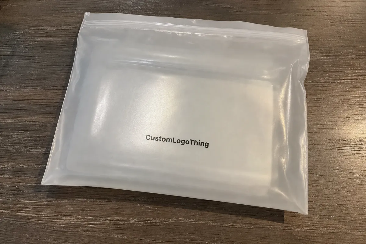
Frosted Zipper Bags are resealable plastic bags made with a translucent matte finish, usually in polyethylene or polypropylene depending on the application and supplier. The finish diffuses light, reduces glare, and gives the package a softer look than clear glossy poly. It also partially obscures the product inside, which can be useful for apparel, accessories, cosmetics, supplements, stationery, small kits, and other retail items where the package needs to feel clean without becoming fully opaque.
Logo placement is not only a visual preference. It affects dielines, print zones, proofing, production setup, and how the package behaves after filling. A mark placed too high can fight the zipper. A mark placed too close to a gusset can bend out of shape. A pale logo that looks subtle on screen may nearly disappear once product color sits behind the frosted film.
The goal is simple: choose a logo position that still looks deliberate after the bag is filled, sealed, shipped, displayed, and handled. A good placement also helps the converter price the work more accurately, because the print side, ink coverage, color count, plate or screen size, and approval path all affect cost.
Before approving artwork, treat the bag as a physical object rather than a rectangle. The cleanest placement decisions come from measuring the product, mapping the closure and seals, checking the proof at actual size, and reviewing the design with realistic fill volume in mind.
How Frosted Film, Zippers, and Print Zones Affect the Logo
Frosted film scatters light instead of reflecting it sharply. That reduced glare is one reason buyers like the material, but it also softens fine type, thin outlines, low-contrast colors, and delicate logo details. A fine serif, hairline icon, or pale gray wordmark that looks refined in a PDF can read flatter on matte plastic, particularly if the product behind the film is dark, textured, or colorful.
The zipper track is a structural feature, not a decorative line. It has thickness, a raised profile, and a small shadow once the bag is closed. Artwork placed too close to that band often feels crowded, and because hands naturally grip the top of the bag to open and close it, the area above and immediately below the zipper is a poor place for small text or essential brand detail.
A proper dieline should show the header, zipper channel, front panel, back panel, side seals, bottom seal or gusset, hang hole if used, tear notch if used, and any required bleed or safe area. Those marks define the real working space. The neat rectangle in a presentation mockup is useful for conversation, but it does not tell you where the film folds, where the seal thickens, or where the bag will distort under product weight.
Front-panel placement is usually best when the bag needs to face a shopper directly on a shelf, in a bin, or on a peg hook. Back-panel placement works better for barcodes, instructions, warnings, ingredients, product specifications, recycling marks, or care information. Many strong packaging layouts use a restrained front panel with a clean logo, then reserve the back for the details that need to be present but should not compete with the first impression.
Print method also changes the decision. Screen printing is common for simple spot-color logos and can produce solid opacity on shorter or mid-sized custom runs. Flexographic printing is often used for larger repeatable programs. Gravure can be appropriate for very large-volume work with consistent artwork. Digital printing may suit lower quantities, multiple designs, or shorter promotional runs, though material compatibility and finish expectations should be confirmed early. Each method has its own limits for line weight, registration tolerance, opacity, and setup cost.
If the bag is part of a larger shipping kit or retail-ready system, think beyond the pouch. Transit handling can scuff, compress, or bend the package, and test methods from ISTA may be relevant for more controlled distribution programs. If printed cartons, paper sleeves, or inserts are being developed alongside the pouch, resources from FSC may be useful when paper sourcing claims are part of the packaging brief.
If the logo only looks right while the bag is empty and flat, it has not really been approved. The real test is how it reads after product volume, zipper hardware, matte film, and handling marks start working against the perfect geometry of the art file.
Key Placement Factors: Size, Fill Volume, Color, and Readability
Start with bag size and orientation. A logo that feels balanced on a 10 x 12 inch apparel pouch can overpower a 4 x 6 inch accessory bag, even if the artwork scales cleanly. The usable front panel shrinks once you subtract the zipper band, side seals, bottom seal, hang hole, tear notch, and any gusset expansion.
Fill volume is one of the most common sources of placement surprises. Bulky products push the film outward, rounding the front panel and shifting the visual center. A logo centered on a flat proof may read low once a folded garment, cable set, cosmetic tool, or multi-piece kit sits inside. Thick products can also create shadows behind the film, which may make the lower half of the bag look visually heavier than the top.
Color contrast needs a practical review rather than a purely brand-driven one. White ink often looks clean on frosted film, but it must have enough opacity to hold its shape. Black ink is usually readable, though it can feel heavier than expected on a soft matte surface. Deep spot colors can work well. Pale beige, soft gray, thin metallic effects, and low-opacity tints are riskier because the translucent film and the product behind it both reduce clarity.
Readability includes more than the logo itself. Leave breathing room around the mark, avoid tiny supporting type, and keep important information away from areas where fingers pinch, seals thicken, or the bag bends. If the pouch will hang on a peg hook, the top area needs enough quiet space for the hole and hardware; otherwise, the display fixture competes with the branding before the shopper even reads the package.
Compliance and retail requirements should be mapped at the same time as the front logo. Depending on the product and market, the bag may need a barcode quiet zone, suffocation warning, recycling symbol, country-of-origin copy, batch or lot field, product directions, child-safety information, or regulated statements. Those elements should not be forced into leftover corners after the front has already been approved.
| Placement Choice | Best For | Readability Risk | Typical Cost Impact |
|---|---|---|---|
| Small centered front logo | Simple branding, retail kits, lighter products | Low if contrast is strong | Usually lowest |
| Large front-panel logo | Apparel, premium presentation, stronger shelf presence | Medium if it crowds the zipper or seams | Moderate increase from larger print area |
| Front logo plus back-panel copy | Regulated goods, instructions, barcode needs | Low if panels are planned separately | Higher due to added print side and setup |
| Full-panel or wrap-style graphics | Higher-end retail or larger campaign runs | Highest if registration is tight | Highest because ink coverage and setup rise |
A useful approval habit is to review the bag empty, filled, and viewed from the distance where it will actually be seen. Frosted film changes character once product color, texture, and shadow sit behind it, and the logo can shift from crisp to muted more quickly than a screen proof suggests.
Production Steps and Timeline for Approving Logo Placement
The cleanest approval path starts with the bag style and size, then moves through material thickness, zipper style, artwork files, dieline mapping, proofing, sample review if needed, and bulk production. Problems usually appear when these steps are compressed or handled out of order. A supplier can print a logo only as accurately as the specification allows.
A strong proof should label the zipper position, heat seal margins, gusset fold lines, hang hole or tear notch, front and back panels, safe area, bleed if applicable, and exact print location. If the proof only shows a polished mockup without technical geometry, ask for a production proof before signing off. The mockup may help a sales conversation, but the technical proof protects the actual order.
Artwork should be supplied as clean vector files when possible. AI, EPS, and print-ready PDF formats are common starting points. Fonts should be outlined, placed images should be high resolution if raster elements are used, and Pantone or CMYK references should be stated clearly. If the design needs a white underbase to improve opacity, that layer should be identified separately so the printer does not have to guess which areas require backing.
Timeline depends on print method, order quantity, material availability, number of colors, sample requirements, and revision speed. As a practical planning range, a straightforward order may move from final proof approval to production in roughly 12 to 15 business days. More complex programs can take longer, especially if physical sampling, custom film, special zipper features, multiple SKUs, or several approval teams are involved.
Sampling is especially useful when the logo sits near a zipper, seam, gusset, or large filled area. A physical sample can reveal problems a PDF cannot: the logo may feel too low once product is inserted, the matte surface may mute the ink more than expected, or a thin line may not hold cleanly with the selected print method. Even a pre-production sample with a close material match can prevent a costly surprise.
Build time for internal review as well. Brand, merchandising, operations, legal, compliance, and ecommerce teams often look for different things on the same bag. A proof that seems simple to one group may raise barcode, warning-label, retail-display, or product-visibility questions for another. Late comments are one of the easiest ways to stretch a production schedule.
Pricing, MOQ, and Unit Cost Changes Caused by Placement Choices
Logo placement can change pricing when it affects the number of printed sides, ink coverage, color count, plate or screen requirements, registration control, or proofing workload. A one-color front mark centered in a modest print zone is usually simpler than a two-sided design with instructions, barcode space, and large coverage near folds.
MOQ matters because setup costs have to be spread across the order. If the job needs plates, screens, color matching, or longer machine setup, a small run can carry a high unit cost even when the base bag is not expensive. Larger runs usually bring the unit price down because fixed costs are divided across more pieces, though freight, storage, and inventory risk still need to be considered.
The material specification also affects the quote. Film thickness, zipper quality, gusset type, custom size, hang holes, vent holes, tear notches, recycled-content options, and special finishes all move the number. Placement adds another variable, especially when the logo becomes large enough to require a wider print zone, extra ink, or tighter registration near a fold or seal.
The ranges below are illustrative rather than guaranteed, but they show how artwork coverage and placement can move cost. Actual pricing depends on supplier capability, freight, market conditions, material choice, print method, and the level of proofing or sampling required.
| Order Style | Typical Quantity | Indicative Unit Price | What Drives the Price |
|---|---|---|---|
| One-color front logo | 5,000 pieces | $0.12-$0.22 | Simple setup, lower ink coverage, fewer proofing variables |
| Front logo plus back copy | 5,000 pieces | $0.18-$0.30 | Two print areas, more registration checks, more artwork detail |
| Large multi-color logo | 10,000 pieces | $0.20-$0.38 | Larger print zone, more colors, higher ink usage, tighter control |
| Full-panel premium design | 10,000+ pieces | $0.28-$0.48 | Highest coverage, more setup, usually more proof and sample work |
A low unit price is not useful if the finished placement looks improvised. Poor contrast, awkward proximity to the zipper, or a logo distorted by fill can make a decent bag feel cheaper than it is. Packaging value comes from the full result: material, structure, print quality, and the way the brand mark sits on the finished form.
For a more accurate quote, send the complete specification: bag width and height, usable fill dimensions, thickness, quantity, film preference, zipper style, printed sides, color count, logo position, compliance copy, and sample requirements. A logo file by itself leaves too much room for interpretation.
Step-by-Step Logo Placement Guide Before You Request a Quote
Step 1: Measure the actual product, not just the old package. Width, height, depth, compression, product stiffness, and headroom above the item all affect where the zipper can sit and how much front panel remains for branding.
Step 2: Decide how the bag will be seen first. Upright shelf display, peg-hook hanging, flat mailer-style presentation, bin display, ecommerce unboxing, and kit packing all favor different logo positions. A logo meant to be seen from two feet away needs different scale than one viewed at a packing table.
Step 3: Mark the no-print and caution zones. Keep the main logo away from zipper tracks, heat seals, gusset folds, hang holes, tear notches, and areas that will be gripped repeatedly. Secondary patterns may tolerate some distortion, but the primary mark should live on the flattest, most visible panel.
Step 4: Review the logo at actual size. Print the dieline at 100%, place it over or beside the product, and check the mark in the hand. This quick test often catches logos that look elegant on a monitor but too small, too high, or too close to a seal in real life.
Step 5: Choose color with frosted film in mind. Strong contrast, adequate line weight, and a white underbase where needed usually perform better than delicate tints. On translucent matte film, subtle artwork can become weak artwork if the product behind it interferes.
Step 6: Decide what the front panel must accomplish. Some bags need only brand identity. Others also need a product name, size, flavor, variant, batch field, small benefit line, or warning. The more the front panel has to say, the more disciplined the hierarchy needs to be.
Step 7: Write a measurable placement note. “Centered on front panel, 0.75 inch below zipper, inside safe area” gives production something to check. “Make it look good” sounds flexible, but it slows quoting and increases the chance of a proof that misses the intent.
If the supplier asks for fill weight, product photos, transit expectations, or display method, that is a good sign. Those details help keep the logo from being approved in a vacuum. A bag that works beautifully on a flat proof still needs to survive filling, packing, handling, and display.
Common Logo Placement Mistakes on Frosted Zipper Bags
The most common mistake is placing the logo too close to the zipper. Plastic bunches slightly around the closure, fingers work that area constantly, and the zipper line competes with the mark. Even a strong identity can look rushed if it sits directly against that visual pressure point.
Another frequent problem is designing on a flat rectangle without accounting for fill shape. Once the product goes inside, the visual center changes. On wide apparel bags, bulky kits, or soft goods with uneven folds, the eye reads the filled mass first and the artwork second, so mathematical centering may not feel optically centered.
Low-contrast ink choices create avoidable trouble. Pale gray, muted beige, thin white, and delicate metallic effects may look polished in a presentation deck, but they often lose strength on frosted film. Matte plastic already softens edges, so the artwork needs more clarity than it would on coated paper or a glossy label.
Oversized logos can be just as damaging. If the mark leaves no breathing room, the bag feels cramped and less premium, even when the material is good. Space on packaging is not empty by default; used well, it creates hierarchy, directs attention, and lets the finish of the frosted film do some of the work.
Back-panel content is often underplanned. Barcodes, warnings, instructions, care details, product specifications, and recycling marks cannot be treated as leftovers after the front logo is final. Reserve space early, keep required information grouped by function, and protect barcode quiet zones from folds and seals.
Skipping actual-size proof review is another expensive shortcut. A PDF scaled to fit a laptop screen can hide small type, awkward seam proximity, weak contrast, and a logo that is slightly too high or low. Once plates, screens, or production art are approved, even small corrections can add cost and delay.
Next Steps: Build a Placement Brief Your Manufacturer Can Use
Begin with the product, the intended display method, and the finished bag size. Those three details remove much of the guesswork. If the package will hang, leave the top area clean enough for the hang hole and hardware. If it will sit in a bin or ship inside a kit, think about how much of the front panel remains visible after packing.
Then prepare a concise placement brief. Include product dimensions, target bag dimensions, fill depth, film preference, thickness, zipper style, quantity, front and back artwork needs, print colors, compliance copy, and any no-print zones. Add product photos if the item is bulky, dark, reflective, irregularly shaped, or likely to press against the front film.
Ask for a dieline proof that clearly labels the zipper, heat seals, gussets, safe area, print area, and front/back orientation before approving artwork. If possible, review a physical sample or at least a material swatch with the intended ink approach. The closer the review gets to the finished handling condition, the fewer surprises appear during production.
Choose one final decision-maker for placement approval. Too many late opinions can stretch the schedule and create conflicting instructions. A single clear sign-off keeps the artwork consistent and gives the manufacturer a stable target.
The best frosted zipper pouch designs rarely feel accidental. The logo has enough room, the ink holds against the matte film, the closure does not compete with the mark, and the filled bag still looks like the brand intended it to look. Use this frosted zipper Bags Logo Placement guide as a practical checklist before requesting quotes, and the proofing conversation will be much more productive.
Where should a logo be placed on frosted zipper bags?
For most retail uses, place the logo on the front panel below the zipper track with enough clearance so the closure does not crowd the artwork. Keep it inside the safe print area and away from heat seals, gusset folds, hang holes, and tear notches. Check the placement with the product inside the bag, because fill volume can shift the visual center.
How large should my logo be on a frosted zipper pouch?
The logo should be readable at shelf or tabletop distance without taking over the full front panel. Small bags usually need simpler marks and fewer words, while larger apparel or kit bags can handle a wider logo or supporting copy. Print the proof at actual size before approval, since screen previews often make small type look clearer than it will on plastic.
Does frosted plastic make printed logos look lighter?
Yes. Frosted film can soften contrast because the matte surface diffuses light and the product color may show through the translucent material. Dark inks, strong spot colors, or white ink with enough opacity usually read better than pale colors or very thin linework. If the product behind the bag is dark, patterned, or colorful, ask whether a white underbase is needed.
Does logo placement affect the cost of custom frosted zipper bags?
Placement can affect cost when it changes print size, number of printed sides, number of colors, ink coverage, or setup requirements. A small one-color front logo is typically simpler to price than a two-sided design with larger coverage and tight registration. The strongest quote includes bag size, quantity, material, thickness, print colors, artwork position, and whether sampling is required.
Can I print a logo across the zipper or gusset area?
It is usually not recommended to place important logo elements across the zipper because the raised track, shadows, and repeated hand contact can reduce readability. Printing near a gusset can work for secondary graphics, but fold lines may distort the artwork when the bag expands. Keep the main logo on the flattest, most visible panel unless the design has been tested on a physical sample.

