Boutique Paper Bags Logo Placement Guide for Buyers
The same logo can make a paper bag feel expensive, forgettable, or quietly wrong. That is the useful truth behind any serious boutique paper Bags Logo Placement guide: placement is not decoration after the fact. It shapes the way the bag reads in someone’s hand, on a counter, in a mirror, or in a quick product photo.
Boutique bags are not flat posters. They fold, bow, crease, fill out at the bottom, and pull inward near the handles. A logo that looked perfectly centered on a PDF can feel too high once rope handles drop over it, or too low once the base opens and the bottom fold starts competing for attention. It happens often, and it usually happens because the artwork was approved as a flat graphic instead of a finished object.
Boutique Paper Bags Logo Placement Guide: What Matters Most
Logo placement means deciding where the brand mark lands on the physical bag: centered on the front panel, repeated on the back, set into the lower third, tucked onto a side gusset, or carried across a wrap-style layout. Each option changes visibility, production complexity, and the mood of the packaging.
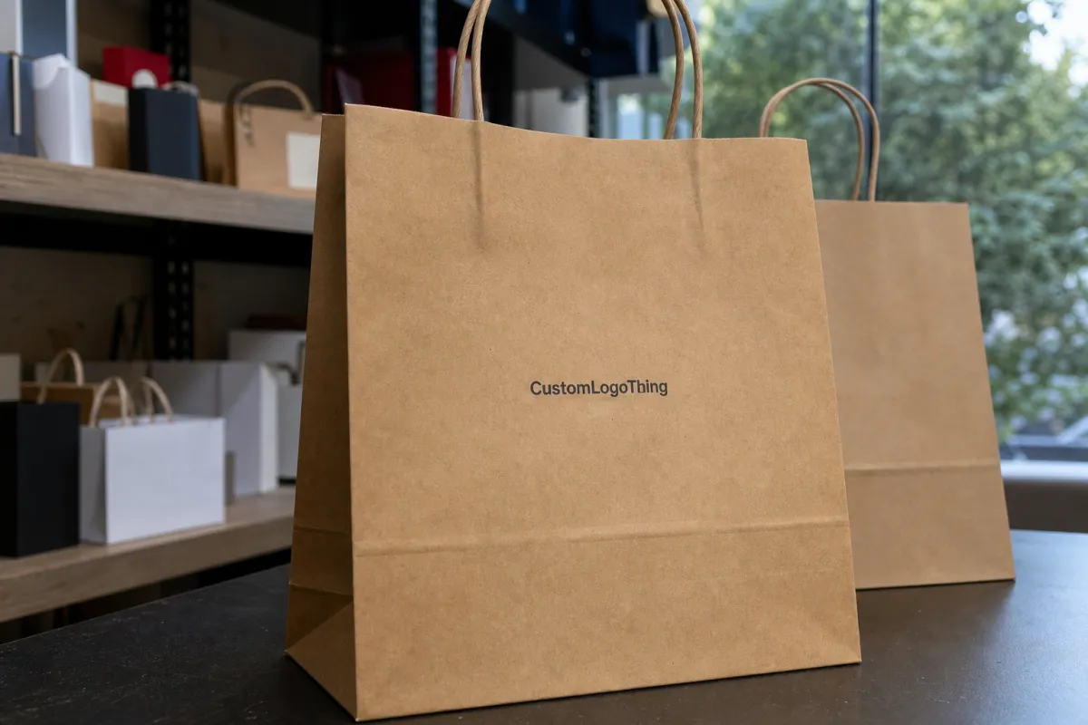
Most boutique brands want premium packaging without spending money on print nobody notices. The difficult part is that a bag’s usable space is smaller than the outer dimensions suggest. A common boutique shopping bag might have a 7-10 inch front panel, a 3-5 inch side gusset, a folded base, and handle reinforcement near the top. Once those structural areas are respected, the clean printable field can shrink quickly.
A practical starting rule: the logo should be visible from 3-6 feet away, but not so large that it reads like a sale sign. Quiet luxury tends to need generous blank space. Retail-driven packaging can handle larger marks, repeat patterns, or front-and-back printing. Neither choice is automatically right; the use case decides.
Packaging buyer reality check: if the logo touches a fold, fights with the handle, or sits too close to the bottom crease, the bag will look cheaper than the material you paid for.
Before approving artwork, judge four things: visibility, proportion, print method, and handling. Will the mark show while the bag is being carried? Does the front panel have enough breathing room? Can the printer hold the registration? Will the finish sharpen the logo, or bury it under glare?
That is the difference between buying a bag and building a brand touchpoint. One holds merchandise. The other carries the brand after the purchase.
How Logo Placement Works on Boutique Paper Bags
Printers do not place logos by instinct. They work from a dieline, the flat production template showing front panel, back panel, gussets, glue zones, fold lines, bottom flaps, handle holes, and reinforcement areas. The dieline tells you where artwork can safely sit. Ignore it and the layout becomes guesswork with expensive consequences.
The safe zone is the area where artwork can print without being distorted by folds, cuts, glue, handles, or assembly movement. For many Boutique Paper Bags, a safe margin of 0.375-0.5 inch from panel edges and fold lines is a sensible minimum. On larger bags, 0.75 inch often looks more refined. If the logo has thin lines, small type, or foil detail, more breathing room is usually better.
Front-only placement is usually the cleanest and most economical option. It keeps the face of the bag calm and reduces setup complexity. Front-and-back printing improves visibility in malls, markets, events, and other settings where the bag is seen from both directions. Gusset printing is best treated as an accent: a small icon, URL, short pattern, or color field. Unless the gusset is wide, it should not carry the main brand message.
Print method changes the rules quickly. One-color screen printing can handle direct centered artwork. Foil stamping needs clean edges, suitable spacing, and enough room for the die to hit consistently. Embossing and debossing need paper with enough body, often 180-250gsm for structured shopping bags and heavier stock for deeper impressions. Digital print can carry more color detail, but it still has trim and fold tolerance. Flexo is efficient for larger runs, especially kraft bags or repeat prints, though fine detail may soften.
| Placement Option | Best Use | Typical Cost Impact | Watch-Out |
|---|---|---|---|
| Centered front logo | Premium boutique look, clean retail packaging | Lowest to moderate | Needs enough margin from handles and bottom fold |
| Front and back logo | Busy retail, events, bags seen from both sides | Moderate | Second side can add setup and print pass cost |
| Side gusset mark | Small icon, pattern, web address, design accent | Moderate to high | Narrow space makes type hard to read |
| Foil centered logo | Luxury, gifting, jewelry, cosmetics | Higher | Foil dies and alignment tests add cost |
| Oversized wrap print | Bold fashion, pop-up campaigns, graphic brands | Highest | Folds can interrupt artwork if not planned well |
Flat proofs are necessary, but they do not tell the whole truth. They look clean because nothing has folded yet. Review both the flat dieline and a folded mockup. A logo can shift visually after the gussets tuck inward, after the bottom opens, or after a handle patch breaks the open space near the top.
Key Factors That Change Placement and Visibility
Bag size comes first. A 5 x 3 x 8 inch jewelry bag does not behave like a 13 x 5 x 10 inch apparel bag. On a small bag, a 2-inch logo can dominate the panel. On a larger bag, that same mark may look timid. Scale matters more than most buyers expect.
Paper weight changes the outcome as well. Lightweight kraft around 120-150gsm can work for small retail goods, but it may flex, wrinkle, and make tight logo placement look uneven. A sturdier 180-250gsm paper shopping bag holds shape better and gives centered artwork a more stable field. Heavy laminated bags or rigid-style constructions can go higher, but the added paper weight affects freight, storage, and unit cost.
Handle type is one of the easiest constraints to underestimate. Twisted paper handles usually sit near the top through punched holes. Rope handles may use eyelets or reinforced patches. Ribbon handles can look elegant, but they may fall over the artwork if the mark sits too high. On a medium bag, leaving 1.5-2.5 inches between the handle anchor area and the top of the logo is often safer; thick rope handles may need more.
Surface finish affects contrast. Matte lamination gives a softer upscale look and pairs well with black, navy, forest green, cream, or metallic foil. Gloss lamination reflects light, which can make metallic ink harder to read from an angle. Kraft stock is forgiving for earthy brands, but pale ink on brown paper can turn muddy. White ink may need an underbase or additional pass, depending on the production method.
Brand tone matters. A skincare, jewelry, or fragrance brand with a restrained identity may need one centered mark, roughly 40-60% of the printable width, with no slogan, no URL, and no extra icons on the front. A streetwear shop or lifestyle brand can push larger coverage, side-panel graphics, or two-sided print without losing credibility. Same bag format, different visual job.
Viewing distance is practical. If the bag mostly sits on a checkout counter, subtle placement can work. If customers carry it through a trade show aisle or outdoor shopping district, the logo needs more size and contrast. If the bag is meant for gifting, the front panel should look balanced in photos, because people will judge it at phone distance as much as at arm’s length.
Intricate marks need room. Thin serif type, hairline icons, small taglines, and decorative crests should not be crushed into a lower corner because the brand deck calls them “refined.” Refined is not the same as unreadable. A good layout protects legibility first, then polishes the negative space around it.
Logo Placement Process and Approval Timeline
A normal custom paper bag project starts with a dieline request. The supplier needs dimensions, handle type, paper stock, quantity, and print method before sending the right template. If you send only a logo and no bag size, someone has to guess the layout, and that guess may turn into a revised quote later.
After the dieline comes artwork setup. The designer places the vector logo, usually an AI, EPS, or editable PDF file, inside the safe zones. Pantone colors, foil colors, embossing layers, debossing layers, and varnish areas should be labeled clearly. For CMYK digital print, images should generally be 300 dpi at final size. For foil, the foil area should be a solid vector shape, not a fuzzy raster image pulled from a website header.
Proof review follows. A digital proof can often be returned in 1-3 business days after complete files are received. Revisions commonly add another 1-2 business days per round. Physical sampling may add 5-10 business days for simpler bags and longer for foil, embossing, specialty paper, imported components, or nonstandard handles. Full production often runs 12-25 business days after final approval, depending on quantity, finish, capacity, and packing requirements.
The delay I see most often is not a missing logo file. It is artwork that is technically usable but poorly positioned on the bag template. The vector file is fine. The color callout is fine. The mark is simply too close to a fold, too small for the panel, or sitting where the handle shadow will cross it. That triggers another proof round, another email chain, and another quiet hit to the schedule.
Buyers can reduce that friction by sending placement priorities with the first quote request. For example: first choice, centered front logo in black; second choice, front and back logo; third choice, front logo with small gusset icon. That gives the supplier a clear way to price options instead of quoting a generic version that may not match the brand or budget.
Approval tip: ask for a flat dieline proof and a folded visual mockup. One shows production safety. The other shows whether the bag actually looks good.
For performance and transit confidence, brands shipping filled bags or assembling event kits can review guidance from organizations like ISTA. For paper sourcing claims, FSC certification may be relevant; the Forest Stewardship Council explains what FSC labeling means and how chain-of-custody claims work.
Logo Placement Cost, MOQ, and Unit Cost
Placement affects cost because it affects setup complexity, print passes, alignment checks, waste, and sometimes handwork. A single centered one-color logo on the front panel is usually the budget-friendly route. Add a back logo, foil stamp, gusset print, edge-to-edge pattern, or oversized wrap design, and the job needs more setup time and tighter control.
For a basic Custom Boutique Paper bag order, broad pricing may land around $0.45-$1.25 per unit at 1,000-3,000 pieces for simple paper, one-color print, and standard handles. At 5,000-10,000 pieces, unit cost can fall into the $0.28-$0.75 range, depending on size, paper weight, finish, packing, and freight. Premium laminated bags with foil, rope handles, reinforced tops, and heavier stock can run $1.20-$3.50+ per unit in smaller quantities. These are working ranges, not guarantees. The quote follows the specification.
MOQ matters. Smaller runs often limit flexibility because the supplier may offer only digital print, standard stock sizes, or limited handle choices. A 250-piece order may be possible, but the unit cost will usually be much higher and finishing options may narrow. Around 1,000 pieces, more standard custom choices tend to open up. At 5,000 pieces and above, custom sizing, PMS color matching, foil dies, and multi-side layouts become easier to justify.
Setup fees are the line items buyers often miss. Plate charges, foil dies, embossing dies, sampling fees, rush fees, carton packing, and freight can change the total by hundreds of dollars. A foil die may cost $80-$250+ depending on size and complexity. Physical samples may run $75-$300+ before freight. Rush scheduling can add 15-30% if the supplier has to move other production around.
The practical mindset is simple: spend where people can see the value. A clean front logo may do more for the brand than tiny social icons printed on both gussets. Foil can look excellent on matte black, deep navy, warm white, or forest green stock, but it is not automatically better than crisp one-color ink on a well-chosen paper.
- Lowest-cost layout: one centered front logo, one ink color, standard paper stock, standard handles.
- Mid-range layout: front and back print, PMS color match, heavier paper, matte lamination.
- Premium layout: foil or embossing, rope or ribbon handles, reinforced top, custom stock color.
- Highest-risk layout: oversized wrap art across folds, multiple finishes, tight registration, short deadline.
Ask for good, better, and best quote tiers. It is the fastest way to see whether the budget belongs in paper weight, finish, logo placement, or quantity.
Common Logo Placement Mistakes on Boutique Paper Bags
The classic mistake is placing the logo too close to a fold, handle anchor, or bottom edge. The bag looks fine while flat, then gets assembled and the mark suddenly feels crooked, squeezed, or visually low. On a medium boutique bag, a slightly smaller logo with 0.75 inch of clean space often looks better than a larger logo fighting the creases.
Another mistake is going too small. Buyers worry about looking loud, so they shrink the logo until it disappears once tissue paper, handles, shadows, and movement enter the picture. If the mark cannot be read from a few steps away, the bag is not doing enough work. Minimal does not mean microscopic.
Clutter creates a different problem. A logo, tagline, URL, Instagram handle, QR code, store address, and three icons rarely belong on one boutique bag front. Use the main panel for a clear focal point. Put secondary information on the back panel, inside a hangtag, on a sticker, or leave it off entirely. Restraint is often cheaper than redesign.
Contrast also gets overlooked. Metallic ink on shiny stock can lose definition under store lighting. Pale beige ink on kraft may look natural on screen and nearly invisible in person. Thin type on textured uncoated paper can break up during printing. If the artwork uses hairline details under 0.25 pt, confirm the print method can hold them before approving the layout.
Color matching deserves a sober conversation. PMS matching helps, but paper stock changes perception. The same black reads differently on coated white, natural kraft, and dyed paper. Foil colors shift by viewing angle. Blind embossing looks elegant on thick matte stock, but on lightweight paper it may feel weak or uneven.
Also avoid placing the logo where a hand naturally covers it. If customers grip the upper third, a high logo may disappear in every carry photo. Center placement usually survives handling better because it sits below the handles and above the bottom fold.
Expert Tips for Sharper Artwork and Faster Approval
Start with vector artwork. AI, EPS, or editable PDF files give the printer clean edges, scalable lines, and separable colors. PNG files are fine for mockups, but they are not ideal for foil, embossing, debossing, or spot-color production. If the logo came from a website upload, assume it needs cleanup.
Simplify line weights before production. Very thin rules, tiny registered symbols, and delicate scripts may print poorly on kraft or textured papers. For small boutique bags, keep supporting type large enough to read at arm’s length. For many marks, a minimum type height of 0.12-0.16 inch is safer than ultra-small detail, though the correct number depends on font, ink, paper surface, and press process.
Size the logo to command the panel without consuming it. A common starting point is 45-65% of the printable width for a centered horizontal logo. For a stacked logo, 35-50% of panel height can work if the bag has enough vertical room. On very small bags, reducing the mark and increasing blank space often looks more expensive than forcing the logo larger.
Use hierarchy. Logo first. Supporting text second. Decorative details only if the bag still reads clean from arm’s length. If everything has equal visual weight, nothing feels premium.
Ask for both a digital proof and a physical sample when the order matters. A digital proof catches placement errors. A sample catches paper stiffness, handle behavior, finish, color, and scale. For a 5,000-piece or higher run, sampling is cheap insurance compared with receiving cartons of bags that feel off by half an inch.
If sustainability claims are part of the brief, be precise. Recycled content, FSC-certified paper, water-based inks, and reusable construction all mean different things. The U.S. Environmental Protection Agency offers general guidance on recycling and materials at epa.gov/recycle, but local recycling acceptance still varies. Do not print a claim you cannot support.
The best boutique Paper Bags Logo Placement guide is not about making the mark larger by default. It is about making the right mark obvious, balanced, printable, and appropriate for the brand’s price point.
What to Prepare Before You Request a Quote
Before asking any supplier for pricing, gather the basics: final logo files, bag dimensions, quantity, paper stock preference, handle type, print side, finish, need-by date, and shipping destination. Complete information gives the supplier less room to guess and makes the proof process faster.
Rank your placement options. Do not simply say, “Put the logo where it looks best.” That sounds flexible, but it forces the supplier to guess your taste and your budget. Better: “Quote a centered front logo first, front-and-back second, and foil front logo as a premium option.” Now the pricing has structure.
Give the real deadline. Not the dream deadline, and not the date someone chose because it sounded tidy in a meeting. If the event is in 18 business days, say that. If a longer lead time is acceptable for better paper, cleaner foil, or a physical sample, say that too. Time changes production choices.
- Final vector logo files: AI, EPS, or editable PDF preferred.
- Target bag size: width x gusset x height, such as 8 x 4 x 10 inches.
- Quantity range: 500, 1,000, 3,000, 5,000, or 10,000 pieces.
- Paper choice: kraft, white art paper, dyed stock, recycled paper, or laminated board.
- Finish: matte, gloss, foil, embossing, debossing, spot UV, or no coating.
- Placement preference: front only, front and back, gusset, lower third, centered, or wrap-style print.
- Delivery details: need-by date, ship-to ZIP code, and whether freight quotes should include liftgate or inside delivery.
Ask what production tolerance the printer expects. A 1-2 mm print shift may be normal for certain processes. For tight foil registration or artwork placed near folds, that tolerance matters. If a design only works when every element lands perfectly to the millimeter, it may be too fragile for production.
A useful Boutique Paper Bags logo placement guide comes back to three questions: does the layout look premium, does it fit the budget, and can it land on time? If the answer is yes to all three, approve the proof. If one answer is shaky, fix it before production starts. Paper bags are far cheaper to correct on a proof than in finished cartons.
FAQs
What is the best logo placement on boutique paper bags?
For most boutique bags, a centered front-panel logo with generous white space gives the cleanest premium look. If the bag needs visibility from both sides, add a back-panel mark instead of crowding the front. This keeps the main panel polished while improving brand exposure in retail settings.
How big should a logo be on a boutique paper bag?
A good starting point is 45-65% of the printable panel width for a horizontal logo, with safe margins around folds, handles, and edges. The mark should be readable from a few steps away while leaving enough empty space to feel intentional and upscale.
Is front-only or front-and-back printing better for boutique bags?
Front-only printing usually looks cleaner and costs less, which is why it works well for luxury-leaning packaging. Front-and-back printing makes sense when the bag will be carried in busy retail settings, events, or shopping areas where both sides are visible.
How does logo placement affect boutique paper bag pricing?
Simple centered placement with one color is usually the least expensive because it needs fewer setup steps and less press adjustment. Foil, multi-side printing, gusset artwork, and oversized coverage tend to raise unit cost because they add complexity, setup time, and production waste.
What should I check before approving logo placement on paper bags?
Check the dieline, safe margins, logo size, color contrast, handle position, and whether the artwork still looks balanced once the bag is folded. Also confirm MOQ, proofing steps, turnaround, setup fees, and production tolerance so the final layout matches both the brand look and the delivery schedule.

