Ribbed Winter Hats Logo Placement Guide for Buyers
Use this Ribbed Winter Hats logo placement guide to compare patch placement, embroidery limits, cuff sizing, costs, proofing, and production timelines before ordering branded beanies.
Ribbed Winter Hats Logo Placement Guide: What Buyers Usually Miss
The same logo can look sharp or cheap on a ribbed beanie. The difference is often not the logo file. It is where the mark lands after the hat stretches on an actual head.
A flat proof helps. It is not the product. Ribbed knit is a moving surface: the vertical channels open as the hat stretches horizontally, the cuff compresses around the forehead, and a logo that looked centered on a screen can sit too high, too low, or slightly bowed once worn.
That matters for embroidery, woven patches, leatherette patches, rubber patches, faux suede patches, and folded labels. Each method reacts differently to rib texture. Each one also changes the perceived value of the hat.
Buyers often treat logo placement as a decoration preference. It is really a visibility decision. A front cuff logo gets seen in staff photos, outdoor events, delivery handoffs, fundraiser tables, retail displays, and unboxing clips. Side or back placement feels quieter and more retail, but it gives up some instant recognition.
There is a packaging angle too. Branded beanies often ship in employee welcome kits, holiday merch boxes, school bundles, and retail mailers. If the logo faces the bottom of the box or disappears under tissue paper, the first impression weakens. The hat and the presentation need to work together.
Buyer takeaway: do not approve a ribbed beanie logo from a flat image alone if the order size, resale value, or brand standards matter. Ask how the logo behaves on the cuff, on the head, and inside the final package.
This ribbed winter Hats Logo Placement guide covers the practical mechanics: placement zones, decoration methods, logo sizing, cost drivers, proofing limits, production timelines, and the checks worth making before you request a quote.
How Ribbed Knit Changes Logo Visibility on Beanies
Ribbed knit stretches mostly side to side. The decoration does not always move with it. Embroidery locks thread into the knit. A patch stays comparatively rigid. A woven label sits flatter, but its edges still follow the cuff.
That mismatch is why a logo that looks balanced on a table can look crowded or curved on a wearer. Smooth jersey, fleece, and acrylic rib do not behave the same way. Ribbed Winter Hats have vertical channels that can swallow small letters, thin outlines, and detailed icons.
A lowercase “e” may close up. A thin border may disappear between ribs. A detailed mascot may lose its face. Not every logo needs redesigning, but many need simplification before production. Tiny type is usually the first thing to question, not the last.
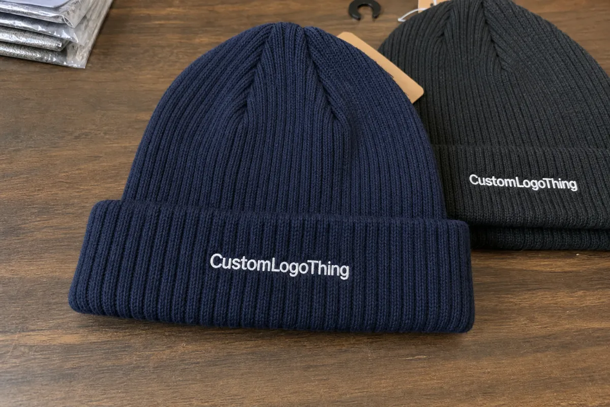
The most common placement zones are front cuff center, front body above the cuff, side cuff, side seam area, back cuff, and small repeat marks across the body. Front cuff center is the default for promotional beanies because it gives strong straight-on visibility and works with most decoration methods.
Above-cuff placement can look more fashion-driven. It also carries more risk. The crown stretches more than the folded cuff, so a logo on the body of the hat may warp around the head. On cuffed ribbed hats, the fold creates a more stable display band. On slouch styles or uncuffed beanies, buyers need cleaner artwork, smaller marks, and more conservative placement.
Think in proportions before fixed dimensions. A 2.25-inch patch can dominate a cuff that measures about 2 inches tall after folding. The same patch may look balanced on a 3-inch cuff, especially if the logo has open space. A 1.5-inch woven label can look intentional on the side cuff. A 3-inch rectangle in that same position can look like somebody missed the center.
Visibility does not require a huge mark. It requires enough contrast, a stable surface, and a placement zone that matches how the hat will actually be worn.
Best Logo Methods for Ribbed Winter Hats: Patch, Embroidery, or Label
Decoration method changes both the look and the risk. Embroidered logos are durable, familiar, and still read as premium for many corporate winter hats. They work best for simple marks, bold initials, and clean wordmarks.
The caution is stitch density. Heavy embroidery can pull ribbed knit inward. Small copy can fill in once thread tension meets the rib texture. If the logo depends on delicate spacing or thin strokes, direct embroidery may not be the safest choice.
Woven patches are often better for detailed logos because the artwork sits on a stable surface instead of fighting every rib. Small lettering, multiple colors, and precise shapes usually reproduce better on a woven patch than directly on the knit. For taglines under about 0.25 inches tall, that can decide the whole project.
Leatherette, faux suede, and rubber patches do a different job. They add texture. They also push the hat toward outdoor, workwear, brewery, coffee, resort, campus, construction, or lifestyle merch. A debossed leatherette patch can make a basic acrylic beanie feel more retail-ready, especially if the packaging is clean.
Rubber patches handle bold shapes and weather exposure well. They can also feel bulky on a narrow cuff. That is not a flaw if the brand is sporty or utility-driven. It is a problem if the buyer wanted quiet retail branding and approved a chunky patch by accident.
Woven labels and folded tags are lower-profile. They work well for side cuff placement, boutique merch, and retail-style branding where recognition matters but shouting does not. They can also keep costs under control when the same label is used across beanies, scarves, totes, and packaging.
| Logo Method | Best Use | Typical Buyer Watchout | Common Cost Behavior |
|---|---|---|---|
| Embroidery | Simple logos, initials, bold wordmarks | Tiny letters and dense stitching can distort ribbed knit | Often economical for simple designs at moderate quantities |
| Woven Patch | Detailed logos, small text, tighter color control | Patch size must match cuff height | Setup and application add cost, but detail improves |
| Leatherette or Faux Suede Patch | Outdoor, lifestyle, workwear, brewery, resort, and campus merch | Fine tonal marks may need more contrast | Usually priced above basic embroidery |
| Rubber Patch | Sport, utility, youth merch, weather-friendly branding | Can feel bulky on narrow cuffs | Higher setup cost, stronger tactile effect |
| Woven Label | Side cuff, subtle retail branding, shared label programs | Small size limits complex artwork | Cost-efficient when artwork is simple |
Heat transfers need caution. Some work on certain knits, but ribbed stretch, winter friction, laundering, and adhesive compatibility should be tested. If the hat will be worn by outdoor staff for long shifts or sold as retail merch, do not treat transfer durability as a guess.
Packaging may tip the decision. Raised patches photograph better in mailer kits and gift boxes because they create shadow and texture. A flat mark can still work, but tactile decoration usually reads as higher value in product photos and first-open moments.
Key Placement Factors: Cuff Height, Logo Size, Contrast, and Wear Angle
Start with cuff height. It sets the usable space. A short cuff may only support a compact label or small embroidered mark. A taller cuff can handle a larger woven patch without looking squeezed.
For many cuffed beanies, a front mark between 1.5 and 2.5 inches wide is a practical range, depending on logo shape. A circular patch may need less width than a horizontal wordmark. A tall vertical logo can fight the rib pattern unless the cuff is unusually deep.
Do not fill the cuff edge to edge. Leave breathing room above and below the mark. This helps the logo survive normal folding variation and keeps the decoration from looking like it was pasted onto the hat without proportion checks.
Contrast matters more than buyers expect. Black-on-charcoal branding may look refined in a mockup, then vanish in outdoor photos, trade show lighting, warehouse lighting, or short-form video. Winter light is rude like that. Snow glare, gray skies, and phone camera compression all punish subtle contrast.
If the logo needs to be seen from 6 to 10 feet away, test contrast hard. A tonal patch may be right for retail merch where the buyer is holding the hat. It may be wrong for event staff who need quick recognition across a parking lot.
Placement relative to the wearer’s face also changes the message. Centered front placement draws attention fastest. Side placement feels more fashion-led. Rear placement works best for crews seen from multiple angles, such as delivery teams, ski staff, event volunteers, and outdoor market workers.
Logo complexity is the filter. Stacked type, thin serif fonts, gradients, metallic effects, and fine borders often need simplification. ASTM textile testing standards are not written as logo design advice, but the broader point applies: materials behave under stress. Ribbed knit is a stressed surface once worn. Buyers building stricter product requirements can review general textile performance context through ASTM International.
Ask for a physical sample or at least a photographed sample on a head form when the order is large, the brand guide is strict, or the hats will be sold. A digital proof confirms size, location, orientation, and colors. It does not fully show rib expansion or how the cuff settles across different head sizes.
Cost and Pricing Factors for Custom Ribbed Beanie Logo Placement
Unit cost depends on the blank hat, decoration method, logo size, color count, quantity, packaging, and sampling. A basic acrylic ribbed beanie sits far below a heavier recycled yarn, wool blend, or lined winter hat. The same logo can price differently on each because handling, stitch behavior, and perceived retail value change.
Embroidery may be economical for a simple logo, especially if the stitch count stays modest. Woven or leatherette patches usually add setup and application costs, but they can improve detail and perceived value. On a 5,000-piece run, a $0.35 difference per hat becomes $1,750 before freight or packaging. Small decisions scale quickly.
Minimum order quantity changes the quote. Lower minimums help small teams test a merch idea, but higher quantities spread setup charges across more units. A $60 to $120 setup fee feels large on 48 hats and almost invisible on 2,000 hats. That is not supplier magic. It is production math.
Hidden variables cause many quote surprises: patch shape, stitch count, label fold style, thread color matching, individual poly bags, hang tags, branded boxes, carton labeling, and split shipments. Packaging should be priced early, not after decoration is approved.
If you need FSC-certified paperboard for retail boxes, belly bands, or inserts, confirm sourcing and claims before artwork goes to print. The Forest Stewardship Council is a useful reference for responsible paper sourcing claims.
Placement affects cost indirectly. A single front cuff patch is usually simpler to Quote and Produce than front embroidery plus a side label plus a custom belly band. Unusual side placements, multi-location logos, and exact alignment tolerances can increase handling time because operators need more checks per unit.
For budgeting, request two or three options side by side. One could be simple front embroidery. Another could be a woven patch. A third could include a side label and individual box. That comparison shows the real cost of visibility, not just the cheapest decoration line on a spreadsheet.
Production Steps and Timeline From Artwork to Finished Hats
A clean production process has stages: artwork review, placement recommendation, digital proof, sample or pre-production confirmation, bulk decoration, quality control, packaging, and shipment. Skipping a stage can save a day and cost a week if the logo lands wrong.
Artwork review should catch low-resolution files, thin lines, tiny lettering, gradients that do not translate, and logos too wide for the cuff. Vector files such as AI, EPS, or SVG are preferred because they scale cleanly. PNG files can work for reference, but they are not ideal for embroidery digitizing or patch production.
The proof confirms logo size, location, method, color callouts, and orientation. Treat it like a contract checkpoint. Still, proof approval is not wear testing. Ribbed knit stretches, and the proof usually shows the hat flat or lightly shaped.
Samples are not always necessary. For 72 giveaway hats with a simple front label, a proof may be enough. For 1,000 retail beanies, influencer kits, employee welcome boxes, or a launch tied to a fixed date, a sample gives a much better read on texture and placement behavior.
A pre-production sample can add several business days. It also reduces guesswork. That tradeoff is usually worth it when the hats will be sold, photographed heavily, or packed into higher-value kits.
Typical timing depends on decoration method, patch production, blank inventory, proof approval speed, packaging add-ons, and freight distance. A straightforward embroidered beanie often moves faster than a woven patch order because the patch must be produced before it can be applied. Custom boxes, hang tags, and belly bands create another proofing path.
Buyer delays are the quiet lead-time killer. Every day spent debating logo size, searching for vector art, or changing hat color can push the ship date. Finalize artwork and packaging decisions before asking for a firm in-hands date. Production schedules are only reliable when specifications are locked.
Build in buffer. If your event date is fixed, treat the internal delivery deadline as earlier than the public deadline. Winter merchandise moves through seasonal demand, weather delays, and carrier volume spikes. The hat may be simple. The calendar is not.
Common Logo Placement Mistakes That Make Ribbed Hats Look Off
The biggest mistake is approving logo placement on a flat beanie image without checking how the cuff sits when worn. A cuff can roll slightly. A wearer may fold it higher. The logo may shift toward the brow line. Small changes are obvious because the mark sits close to the face.
Oversized patches are another common failure. They can overwhelm the cuff, buckle at the edges, or turn the hat into a billboard. Bigger is not automatically more visible. Often, a smaller mark with higher contrast looks more expensive and reads faster in photos.
Tiny embroidery causes predictable trouble. Ribbed texture and thread tension can close small counters in letters such as e, a, and o. Thin punctuation, registered marks, and taglines often need removal or conversion into a patch. Honestly, too many buyers protect every detail of a logo that was never designed for knitwear.
Placement too close to the cuff edge also looks risky. Folding variation during wear can hide part of the mark or make it appear crooked. Leave margin above and below the logo, especially on front cuff placement.
Color mistakes are quieter but expensive. Low-contrast thread or tonal patches may satisfy brand guidelines on paper, then fail in outdoor photos, winter light, or event footage. If brand standards only allow low contrast, accept the tradeoff knowingly. Do not expect a charcoal logo on a black ribbed beanie to perform like a white patch on navy.
Packaging orientation gets ignored more than it should. If hats are folded into boxes or mailers, the logo should face up cleanly rather than hiding under tissue, ribbon, or a belly band. For merch kits, the first open-box view is part of the product.
Investigative takeaway: many “bad logo” complaints are actually placement, proportion, and approval-process problems. The factory may have produced exactly what was approved. The approval just did not test reality.
Build a Placement Brief Before You Request a Quote
Before contacting a supplier, gather the basics: logo files, intended use, wearer or audience, estimated quantity, deadline, and packaging needs. A winter hat for construction crew gear should not be briefed like a school fundraiser beanie or a retail merch wall item.
Define the role of the hat. Is it promotional, employee-facing, resale merchandise, part of a holiday gift box, or a giveaway for outdoor events? Each use pushes placement differently. Staff uniforms need fast recognition. Retail merch can be subtler. Gift kits need strong presentation inside the package.
Send a preferred placement zone and a backup placement zone. For example: front cuff center as the main option, side cuff woven label as the alternate. Include decoration preferences if you have them, but stay open to production feedback if your artwork contains tiny type, gradients, or fine linework.
Ask for a proof that shows the logo on the cuff at actual size, not a floating logo over a generic beanie outline. If the decision is not obvious, request two quote versions: one economical option such as embroidery or a woven label, and one premium option such as a woven, leatherette, faux suede, or rubber patch.
- Artwork: AI, EPS, or SVG files, plus brand color references.
- Hat specs: ribbed knit style, cuff height target, color, lining needs, and yarn preference if known.
- Placement: front cuff, side cuff, back cuff, above cuff, or multi-location branding.
- Decoration: embroidery, woven patch, leatherette patch, rubber patch, faux suede patch, or woven label.
- Packaging: individual bags, hang tags, belly bands, branded boxes, carton labels, or kit assembly.
- Timing: proof deadline, sample need, delivery date, event date, and split shipment details.
A good placement brief prevents the usual back-and-forth and gives the supplier enough context to flag problems early. The finished beanie should look intentional on the head, in the box, and in the buyer’s hands. That is the point. Not a pretty mockup that falls apart the first time someone puts the hat on.
FAQ
What is the best logo placement for ribbed winter hats?
Front cuff center is usually the safest and most visible placement because the folded cuff gives the logo a flatter, more stable surface. Side cuff placement works well for subtle retail-style branding. Above-cuff placement should be tested because the crown stretches more than the cuff. For employee uniforms or event giveaways, prioritize front visibility; for fashion merch, a side label or small patch may feel more premium.
How large should a logo be on a ribbed beanie?
Logo size should be based on cuff height, patch shape, and artwork detail rather than one universal dimension. Many front cuff marks fall around 1.5 to 2.5 inches wide, but that range changes with the design. A compact woven label may suit a narrow cuff, while a larger patch needs enough cuff height to avoid looking crowded. Ask for an actual-size proof and, for larger orders, consider a sample worn on a head form.
Is embroidery or a patch better for ribbed winter hat logo placement?
Embroidery is strong for simple logos, initials, and bold type, but tiny details can distort on ribbed knit. Woven, leatherette, rubber, or faux suede patches create a stable decoration surface and often handle detailed logos better. If the brand mark includes small text, fine linework, or multiple small color areas, a patch or woven label is usually the more controlled choice.
Does logo placement change the cost of custom ribbed winter hats?
Standard front cuff placement is typically the most efficient to produce and quote. Side placements, multiple logo locations, specialty patches, and exact alignment requests can increase handling or setup costs. The biggest pricing drivers are usually quantity, decoration method, logo complexity, blank hat quality, packaging add-ons, and sample requirements.
How do I prepare artwork for a ribbed winter hats logo placement guide proof?
Send vector artwork when possible, such as AI, EPS, or SVG files, plus brand color references. Simplify tiny lettering, thin outlines, gradients, and complex shadows before decoration review. Include the preferred placement, hat color, logo size target, order quantity, deadline, and whether the hats need individual packaging, hang tags, boxes, or kit assembly.


