Dom Perignon Custom Label Buying Guide for Luxury Gifts
A dom perignon custom label changes the read of a bottle in a few square inches. That sounds small until you see the first proof. The same bottle can land as a routine retail purchase, a polished corporate gift, or a keepsake tied to a single night, depending on how the label is built, finished, and applied.
That shift happens fast because people judge luxury packaging before they read it. Under warm event lighting, a foil accent can look elegant or excessive. A textured stock can look refined or simply busy. The bottle itself already carries a strong brand identity, so the label has to work with that image, not pull attention away from it.
For weddings, VIP client gifts, hospitality programs, and branded celebration pieces, the objective is not to overwrite the original bottle. It is to add a personal layer that feels deliberate. Done well, the label looks like part of the plan. Done poorly, it looks like an afterthought applied ten minutes before the event.
Dom Perignon Custom Label: What Changes on the Shelf
The shelf effect is immediate. A bottle with a well-made custom label reads as more personal and more considered, even before anyone opens the box. That matters because gifting is emotional first and practical second. People respond to the visual cue, then they start reading the details.
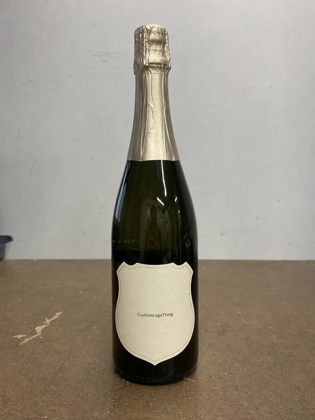
A good dom perignon custom label has to do three things at once. It needs to respect the bottle’s premium look, carry the message cleanly, and survive the environment it will live in. That environment is rarely gentle. Condensation, cold storage, repeated touch, gift wrapping, and transport all test the adhesive and the edge finish. A label that curls after 20 minutes in an ice bucket does not read as luxury, no matter how elegant the file looked on screen.
There is also the photography problem, which buyers often underestimate. Event planners and corporate teams increasingly use bottle shots in place cards, social posts, gift tables, and recap decks. Under those conditions, the label has to read clearly from a distance and still hold detail up close. That is why restrained typography, decent contrast, and a finish that does not glare under flash matter more than extra decoration.
“The strongest luxury labels usually say less, not more. The bottle already carries the prestige. The custom label should sharpen the message and stay out of the way.”
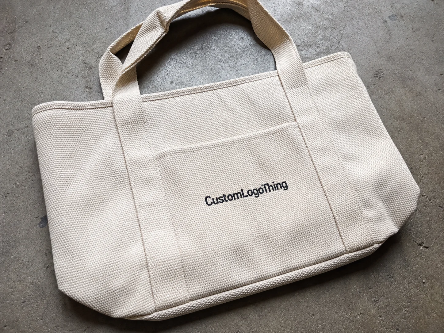
If the bottle is part of a larger branded packaging program, the label should feel consistent with other pieces such as Custom Labels & Tags or coordinated Custom Packaging Products. That consistency is what turns a single personalized item into package branding.
For sustainability-minded programs, ask whether the stock can be sourced with FSC-certified paper and how the adhesive affects recyclability. The FSC framework helps when paper traceability matters, while the EPA recycling guidance is a useful reference for mixed-material packaging. Neither one solves every disposal issue, but both give buyers a better baseline than guesswork.
How the Process Works From Artwork to Approval
The workflow is straightforward once the right inputs are on the table. It usually starts with artwork or wording, then moves to bottle confirmation, proof building, layout review, and final approval. The cleanest orders are the ones where the production team does not have to infer the bottle profile or guess where the label should land.
Vector artwork is the safest starting point for logos, wordmarks, and line work because it stays sharp at any size. If the design includes photos or fine illustration, the files need to be high resolution and checked for color consistency before proofing. Small labels magnify file problems quickly. A line that looks acceptable on a desktop screen can turn soft or muddy once it is reduced to bottle scale.
The proof should show more than placement. It should show trim lines, safe area, color direction, and any special finish zones. That is how buyers catch spacing issues, a logo pushed too close to the edge, or type that feels cramped once it is on the bottle. Proofing is not a formality. It is the best chance to stop a minor layout problem from becoming a costly reprint.
From a buyer’s point of view, the process gets easier when three details are settled early: bottle count, event date, and finish preference. Once those are known, the layout can be built with fewer revisions. It also becomes easier to make a dom perignon custom label feel polished when the team knows whether the order is for a single luxury gift set or a broader hospitality rollout.
- Share the logo, wording, or monogram in vector format when possible.
- Confirm the exact bottle surface or label area before layout begins.
- Review proof color, line spacing, and trim carefully.
- Approve only after the bottle still looks balanced from a distance and close up.
If the bottle is being used in public-facing promotion or resale, check the trademark and brand-use rules in your market before you order. That step is easy to skip and harder to fix later. A premium label can be beautiful and still run into legal trouble if the use case was never cleared.
Packaging vendors often rely on practical transit and handling standards such as ISTA testing methods. A label is not a shipping box, but the logic is similar. The final piece has to survive handling, temperature swings, and transport, then still arrive looking controlled.
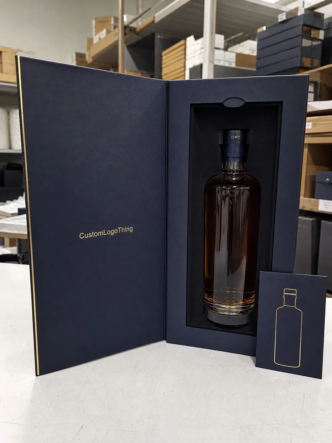
Materials and Finishes That Make It Feel Premium
Material choice changes the feel immediately. Coated paper is usually the most economical and prints cleanly. Textured papers add a more tactile, refined impression. Film stocks matter when moisture resistance is a priority, especially for chilled bottles or long display periods. Specialty materials can work too, but only if the design is restrained enough to let the stock do its job.
Most luxury labels rely on a limited set of finish options: foil, embossing, soft-touch coating, matte varnish, or spot gloss. Each one solves a different problem. Foil adds brightness and formality. Embossing creates depth you can feel. Soft-touch coating gives the surface a velvety look without making it visually loud. Spot gloss can pull attention to a crest, border, or monogram if the rest of the design stays quiet.
The mistake I see most often is overuse. Too much foil, too many fonts, too many decorative moves, and the bottle starts to look promotional instead of premium. A dom perignon custom label usually works best when the design is disciplined. Luxury often shows up as restraint, not density.
Adhesive choice matters just as much as appearance. If the bottle will be chilled, handled by servers, or placed in gift packaging for more than a few minutes, the adhesive has to be chosen for those conditions. Some labels look excellent on a flat sample and fail once condensation appears. That is why moisture resistance, edge durability, and lay-flat performance should be part of the quote conversation from the start.
Print method matters as well. Digital printing works well for short runs and variable details. Offset can be better for longer runs when color consistency is critical. Foil stamping and embossing add a separate production step, and that usually means more setup and more inspection. On textured stock, dark colors can gain visual weight, so the proof should be reviewed under good light rather than on a dim monitor.
| Option | Typical Look | Best Use | Notes |
|---|---|---|---|
| Coated paper | Crisp, clean print | Short events, lighter handling | Usually the most economical choice |
| Textured paper | More tactile, refined | Luxury gifting, premium presentation | Pairs well with foil or embossing |
| Film label | Sleek, moisture resistant | Chilled bottles, longer display | Often the practical choice for condensation |
| Specialty stock | Distinctive, high-end feel | Signature corporate gifts, limited runs | Higher cost and longer production planning |
For a luxury bottle, the finish should match the mood of the occasion. A black-tie event usually calls for cleaner contrast and a quieter finish. A celebratory brand launch can support a little more shine. The right choice depends on whether the bottle is meant to blend into the table setting or stand out as the focal point.
Cost, MOQ, and Unit Pricing Factors
Price is driven by a few concrete inputs, and most of them are predictable. Material selection, number of colors, size, finish complexity, die cutting, and quantity all shape the quote. The more specialty effects you add, the more setup and handling the job usually requires. That is true for a dom perignon custom label just as it is for any premium packaging project.
Small runs cost more per unit because setup time gets spread across fewer labels. Large runs bring the unit price down, but only if the design is stable and the quantity will actually be used. There is no value in over-ordering a label that exists for a single dinner or event unless there is a second use for the remaining stock.
Minimum order quantity matters most for weddings, hospitality programs, and limited promotions. A bride might need 24 to 60 labels. A corporate team may need 100 to 500. A larger branded rollout can justify a much higher count because the per-unit cost becomes easier to absorb across the total program.
Here is a realistic way to think about price bands for a Custom Bottle Label project:
| Run Size | Typical Unit Range | Common Drivers | Buyer Takeaway |
|---|---|---|---|
| 50-100 pieces | $0.90-$2.50 each | Setup, proofing, short-run handling | Best for highly specific gifts or events |
| 250-500 pieces | $0.45-$1.20 each | Material, print colors, finish selection | Good balance for hospitality and corporate use |
| 1,000+ pieces | $0.18-$0.65 each | Scale, streamlined finishing, fewer setup changes | Usually the best value for repeat programs |
Those ranges move with foil, embossing, custom shapes, and rush timing. A simple printed label can sit at the lower end, while a textured stock with metallic detail lands higher. If the label has to coordinate with custom printed boxes or a fuller product packaging program, the budget should reflect the complete presentation, not just one component.
Ask how setup is billed. Some vendors separate file prep, die creation, finishing tooling, and shipping. Others fold them into a single quote. That detail matters because a quote that looks inexpensive can become less attractive once the add-ons are counted. The cleanest comparison is not the headline unit price. It is the total landed cost for the finished, approved piece.
Cheap is not the same as good value. A low-cost label that lifts under refrigeration or prints poorly on a dark bottle can create a bigger loss than a slightly higher upfront price. In luxury gifting, the cost of a reprint or a last-minute replacement can erase any savings from choosing the wrong spec.
Production Steps and Lead Time You Should Plan For
Lead time should be planned from approval backward, not from the event date forward. Once the proof is signed off, production can move through print, finishing, inspection, and shipping. The exact timeline depends on the label structure, but a straightforward run often takes about 12 to 15 business days after final approval. Specialty finishing can push that longer.
Where delays usually happen is easy to identify. Artwork arrives incomplete. Proof comments come back slowly. Someone asks for a size change after approval. Quantity changes late in the process. Each of those adds friction, and friction costs time. The cleanest projects are the ones where the buyer has already chosen the use case, the bottle count, and the finish before the first proof is built.
Foil stamping, embossing, and Custom Die Cutting all add steps that need setup and inspection. That does not make them difficult, but it does mean the schedule should be realistic. If the labels are for a wedding weekend, client dinner, or launch event with fixed delivery timing, the safest move is to add shipping buffer on top of the production window.
For teams comparing packaging design elements across multiple items, a label project should not be planned in isolation. If the bottle will be presented with rigid cartons, inserts, or custom printed boxes, the timing has to support the whole presentation so the pieces arrive together and match visually.
A practical production sequence looks like this:
- Submit logo, copy, quantity, and bottle details.
- Review the digital proof with trim and finish notes.
- Approve color direction and final layout.
- Produce, finish, inspect, and pack the order.
- Allow shipping time before the event or distribution date.
That order matters because every later change is more expensive than the same change during proofing. A careful review up front protects both the budget and the final presentation.
What to Check Before Final Approval
Pre-press review is where most avoidable problems get caught. The first pass should verify spelling, names, dates, and punctuation. The second pass should check layout balance. Then comes the physical reality check: does the label still look right when it is reduced to bottle scale and viewed under normal light?
Color is the part that surprises people. On screen, a deep black can look rich and controlled. On textured stock, the same black may print heavier than expected. Metallics can also behave differently depending on the angle of the light. If color accuracy matters, ask for a hard proof or a sample before approving the full run.
Adhesion deserves its own check. A label should be tested on the actual bottle, not only on a flat swatch. Look at the edges after chilling, after gentle handling, and after a few minutes of condensation. If the edges lift or the label slides on first contact, the spec needs to change before production is locked.
Other checks are simple but easy to miss:
- Confirm that the type is large enough to read from a normal table distance.
- Make sure border elements are not too close to the trim.
- Check that any foil or embossing aligns with the main message, not just the decorative areas.
- Verify that the label shape fits the bottle curve and does not fight the shoulder or seam.
If you are ordering a dom perignon custom label for a public event, do not rely on the digital mockup alone. Screens flatten texture, hide scale issues, and make contrast look more forgiving than it will in real light. A sample, even a rough one, tells you more than a polished render.
The final signoff should be boring in the best sense. No uncertainty about the spelling. No doubt about the finish. No last-minute debate about whether the label overwhelms the bottle. If any of those questions are still open, the proof is not ready.
Common Mistakes That Make a Premium Label Look Off
The most common visual failure is clutter. Buyers often want to include a logo, message, date, names, and a decorative border, and the result is a label that feels crowded. Luxury packaging usually benefits from fewer elements arranged with more breathing room. Strong contrast and a clear hierarchy do more than extra decoration ever will.
Typography is another weak point. If the type is too small, too thin, or too compressed, it can disappear on a reflective bottle surface. If the type is too large, the label can start to feel promotional rather than elegant. A dom perignon custom label should read easily without becoming loud.
Technical mistakes matter too. Low-resolution artwork can print soft. Poor alignment can make the label look hand-applied in the wrong way. Overly glossy finishes can fight condensation. A design that looks clean in a flat mockup may feel awkward once it wraps the curve of the bottle, so bottle shape should always influence layout decisions.
Another common problem is finishing without purpose. Buyers sometimes choose foil or spot gloss because those options sound premium, then end up with a label that looks busy under event lighting. A better approach is to choose one focal detail and let the rest stay quiet. That is how the bottle still feels like the original luxury item, just adapted for a specific moment.
The final mistake is underestimating timing. A rushed label job tends to show it. Files arrive late, proofs get approved too quickly, and the schedule leaves no room for a reprint if one is needed. That is not a design problem. It is a planning problem, and it is usually visible in the finished piece.
FAQ
What makes a dom perignon custom label different from a standard bottle label?
It is usually designed with presentation as the main goal, so the typography, finish, and layout lean more toward luxury gifting than everyday retail labeling. The shape and surface fit also matter more because the label has to look balanced on a premium bottle, not just print clearly.
What artwork files work best for a dom perignon custom label order?
Vector files are best for logos and text because they stay sharp at any size and print cleanly. High-resolution images can work for detailed art, but they should be checked carefully to make sure they still hold up at small label scale.
How long does production usually take for a custom premium bottle label?
Lead time depends on proof approval speed, quantity, and finishing complexity. Simple printed labels can move faster, while foil, embossing, and custom cutting usually need more time for setup and inspection.
What affects the price of a dom perignon custom label the most?
Quantity, material choice, and finishing method usually have the biggest effect on price. Custom shapes, tight deadlines, and more complex artwork can increase cost as well.
Can custom labels hold up on chilled bottles or in gift packaging?
Yes, if the stock and adhesive are chosen for moisture and handling conditions. A sample or proof is a smart step when the bottle will be refrigerated, chilled, or displayed for an extended period.