Choosing embroidered headwear looks easy on a screen. Then the first sample arrives, and the logo that felt balanced in a flat proof reads larger, softer, and more forward on the knit. That gap between artwork and finished garment is exactly why an embroidered Beanies Logo Placement guide matters: it turns a visual preference into a production decision that still works after the beanie stretches, folds, and gets worn in real life.
The best placement is rarely the biggest one. It is the placement that respects the cuff height, seam position, crown taper, and the knit itself. A logo that is slightly smaller but cleaner usually ages better than a wide, dense design that fights the fabric. Buyers who understand that tradeoff tend to get fewer surprises, fewer revisions, and fewer samples that look good only when laid flat on a table.
Practical rule: judge beanie embroidery by how it reads on a head, not by how it fills an artboard.
Embroidered beanies logo placement guide basics
Beanies do not behave like caps. A cap has a structured panel and a predictable curve; a knit beanie has give, compression, and a shape that changes as soon as the wearer pulls it on. That means placement has to start with the garment construction, not the logo file. The same artwork can look crisp on a cuffed acrylic beanie and awkward on a loose cuffless knit.
The main placement zones are simple, but the results are not. Front-center gives the strongest visibility and is usually the safest choice for a promotional or retail brand mark. Left-front feels a little more fashion-forward and less overt. Side placement can keep the front cleaner, especially if a seam or fold would otherwise interfere. Back placement is useful for team or event orders where repeat exposure matters, though it is less immediate. Cuff placement tends to be the most reliable because the folded area offers a flatter embroidery window and better repeatability.
Placement is also a production decision. Seams can break up a stitch run. The crown narrows quickly, which limits space. A shallow cuff can crowd a logo that looked fine in the proof. On some styles, the difference between a good result and a puckered one is only a quarter inch of placement shift.
“The right placement is the one that survives fabric movement, not the one that wins the first proof.”
Buyers also forget how shipping and storage affect the final look. Beanies packed tightly into cartons or mailers can pick up fold memory around the cuff. That does not ruin the embroidery, but it does make placement choices matter more. If an order is going into retail or direct-to-consumer fulfillment, ask how the items will be folded and whether the pack-out method keeps the logo visible after compression. For packaging standards, some buyers reference ISTA test methods for transit protection and FSC for paper-based cartons.
How embroidery placement works on knit beanies
Embroidery on knit beanies starts with stabilization. The blank has to be supported enough for the needle to form consistent stitches, but the fabric still behaves more like a soft textile than a rigid panel. That is why the digitizer has to think about movement, not just image size. Dense fill areas, tiny text, and sharp corners can all create trouble if the knit is loose or highly elastic.
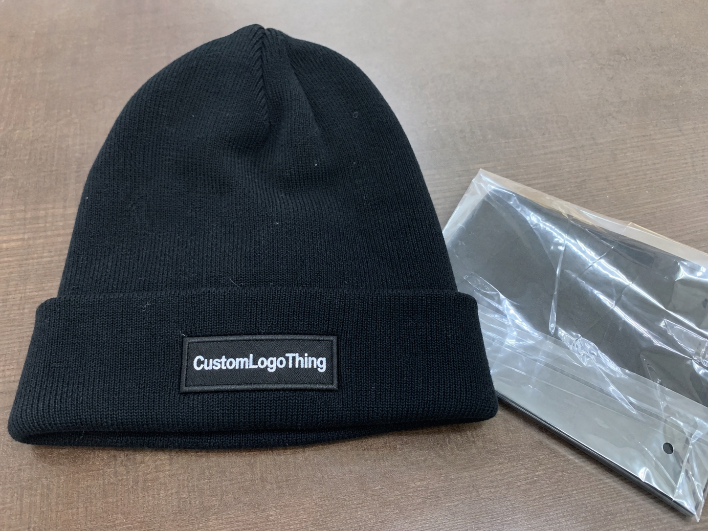
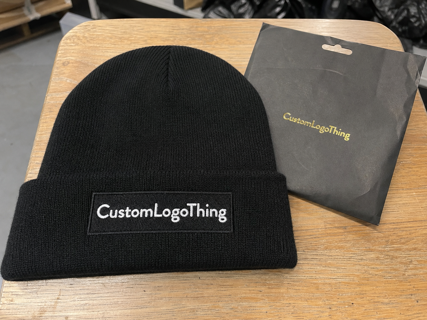
Cuffed beanies are the easiest to place because the folded band creates a predictable zone. Most buyers end up there for a reason. A cuff gives the decorator a flatter surface, a better visual anchor, and a little more room for adjustment. Cuffless beanies are harder. The crown tapers, the knit often stretches more, and logos near the top can distort once the hat is worn. On cuffed styles, a finished width around 2.25 to 3 inches is often workable for a standard logo, while cuffless pieces usually need to stay smaller unless the knit is especially dense.
Stitch direction matters more than many people expect. When stitches run against the knit structure, the logo usually sits cleaner. When the fill is too heavy, the surface can pucker or tunnel, especially around small lettering and narrow elements. A good digitized file trims unnecessary stitch count, reinforces only the parts that need support, and avoids forcing thread to behave like print. On knitwear, thread is not ink. It has thickness, bounce, and limits.
Proofs should show the garment in context, not a logo floating on a blank canvas. A useful proof includes the beanie silhouette, seam position, cuff fold, and final embroidery dimensions. If those details are missing, the buyer is making decisions in the dark. That is where most placement errors start.
For technical buyers, the logic is similar to print placement on a carton panel: the substrate, fold, and viewing distance all affect the final read. The art file matters, but the surface matters more.
Cost, pricing, MOQ, and unit cost tradeoffs
Placement changes cost in indirect but very real ways. A single front logo with moderate stitch density is usually the most efficient option. A second location, tiny lettering, or a design with several thread changes increases setup time and machine time. The machine only sees stitch count, color changes, and complexity; it does not care whether the logo looks “small” on the artboard.
Most quote sheets should separate digitizing, setup, sample fees, unit price, and any placement-specific charges. That separation matters. One supplier may include a simple front logo in the base price, while another bills every embroidered location separately. Extra thread colors can also add cost, especially if they slow production or require additional handling. Buyers who ask for a total landed cost, not just a unit price, usually get a more accurate comparison.
| Placement option | Typical use | Relative cost impact | Buyer takeaway |
|---|---|---|---|
| Front-center | Main brand visibility | Low to moderate | Usually the most efficient option for direct branding |
| Left-front or side | Subtle lifestyle branding | Low to moderate | Can look premium, but still depends on stitch count and cleanup |
| Cuff placement | Stable area on cuffed beanies | Low | Often the easiest location to reproduce consistently |
| Two locations | Retail, team, or promotional programs | Moderate to high | Expect more setup time and higher total stitch volume |
MOQ changes the math again. A 24- or 48-piece run spreads setup over a small batch, so unit cost stays higher. At 250, 500, or 1,000 pieces, the same setup becomes easier to absorb. That is why buyers should compare not only the per-piece figure, but also the fees attached to proofing, digitizing, revision rounds, and special packing.
For simple embroidered beanies, pricing often falls into tiers shaped by blank quality, decoration size, and order volume. A plain one-location logo on a standard cuffed beanie may sit in a very different range from a dense, multi-color mark on a premium blank. As a rough buyer-side expectation, low-volume orders can look expensive because setup is doing most of the work; larger orders usually soften the per-piece number, but only if the artwork stays simple enough to run efficiently. If a quote looks unusually low, check whether revisions are limited or whether placement options are being priced later.
Ask directly: is the quote based on one placement, one proof round, and standard thread colors? That single question removes a lot of noise from the buying process.
Process and turnaround from proof to production
The workflow is straightforward, but each step can introduce delays. Artwork comes in, ideally as vector art. The logo is reviewed for stitchability, then digitized into a machine-ready file. A proof follows with placement, finished dimensions, and thread colors. Once the buyer approves it, production starts, then inspection, folding, packing, and shipment.
Turnaround slows down when the art is incomplete or the placement notes are vague. A blurry PNG with no measurements forces the production team to guess at scale. That guesswork is where mistakes hide. Revisions add more time, especially if the buyer wants to compare front-center against side placement or asks for multiple versions of the same logo.
Stitch-heavy designs also take longer on the machine. Dense satin columns, tiny type, and multiple thread changes increase sew time and inspection time. A simple cuff logo can move quickly. A more detailed front mark may need extra checks to keep edges sharp and avoid thread pulls. If the design is pushing the limits of the knit, a slower run is often a sign of better control, not inefficiency.
Lead time should be locked before approval, not after. Buyers working toward a launch, uniform rollout, or event date should build in time for proof review and at least one round of correction if the art needs cleanup. A hard ship date is not the place to discover that the logo has too many fine lines for the chosen beanie.
Packaging discipline matters too. If finished goods are shipping in bulk cartons, the fold pattern, bagging method, and label durability all affect how the order arrives. Some teams use packaging references the same way they use garment specs: as a way to reduce preventable damage and keep the first impression clean.
Choosing the right placement, size, and stitch density
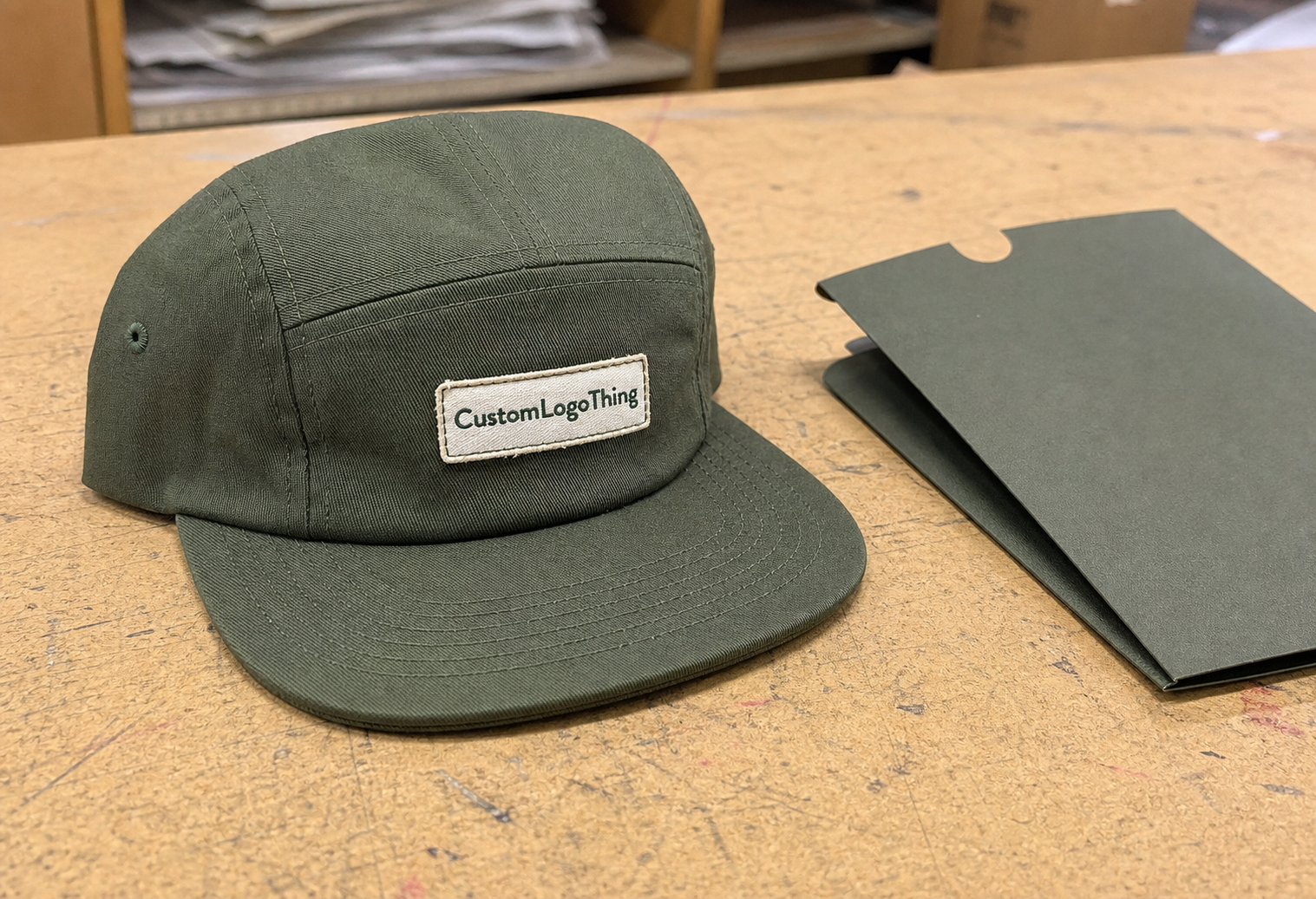
Front-center, side, left-front, back, and cuff placement each send a different signal. Front-center says the brand should be seen first. Side placement feels quieter and more fashion-led. Cuff placement usually reads as practical and clean, which is why it works well for corporate gifts, retail beanies, and outdoor programs. The right option depends on how visible the brand needs to be and how much restraint the buyer wants in the final piece.
Logo size should match the beanie structure. A thick rib knit can support a stronger mark. A softer, looser knit often needs a smaller footprint to stay flat. If the style has a tall cuff, there is room for more horizontal width. If the cuff is shallow, pushing the logo too wide can crowd the crown seam or make the design feel heavy.
Text-heavy logos need particular care. Small lettering under about 0.2 inches in cap height can blur on knit surfaces unless the font is simplified. Thin lines, gradients, and tiny interior details are usually the first things to adjust before digitizing. That does not mean the design has to lose character. It means thread has to work with the fabric instead of fighting it. A clean two-color icon often outperforms a complicated full-color mark that breaks down at small sizes.
Thread contrast changes the result faster than most buyers expect. A dark logo on a light beanie reads bold even with moderate stitch density. A low-contrast combination may need more definition to stay legible. More stitches do not automatically improve appearance. Sometimes a cleaner, lighter map gives the logo better shape and avoids the swollen look that dense fills can create on knitwear.
Practical range: for many cuffed beanies, a finished logo around 2 to 3 inches wide is a sensible starting point. The final size should still be checked against the actual blank, because cuff height, knit tension, and seam position can shift the usable space more than a template suggests.
Step-by-step checklist before you approve the layout
Start by measuring the blank. Not every beanie style gives the same embroidery window, and the usable area can shift by half an inch or more depending on cuff height and knit tension. Confirm where the logo begins and ends relative to the cuff edge, seam line, and crown slope. That gives the placement real boundaries instead of a generic mockup shape.
Next, review the proof like a production person would. Check the centerline, edge clearance, and whether any text sits too close to a fold. Ask whether the embroidery lands on a flatter section or over a more mobile part of the knit. If the proof looks slightly off, trust that instinct. On beanies, small offsets become more visible once the garment is worn.
Then verify the written details. Thread colors should be listed clearly. Placement should be named clearly. Finished dimensions should be stated in inches or millimeters, not implied by the logo file alone. If the order includes more than one embroidery location, each one should be documented separately. That prevents confusion later about which version was approved.
If the design is complex, ask for a sample or a photo of a similar placement on the same beanie style. A cuffed knit beanie does not behave like a lower-gauge acrylic beanie, and a proof on one blank does not guarantee the same result on another. Matching the blank matters as much as matching the artwork.
- Confirm the beanie style, knit type, and cuff height.
- Check the logo width and height in the proof.
- Review seam clearance and fold clearance.
- Approve thread colors and any stitch count notes.
- Save the final proof before production starts.
The cleanest approvals happen when the buyer treats the proof as a production record, not just a preview image. That habit reduces rework and makes the order easier to manage if anything needs to be referenced later.
Common mistakes and expert tips for cleaner beanie embroidery
The most common mistake is making the logo too large for the crown. Buyers often want more presence, so they push the artwork upward where the beanie narrows. On paper that looks dramatic. On the head, it can look cramped because the surface is bending in two directions at once. A slightly lower placement usually reads better and stitches more cleanly.
Another frequent issue is over-detail. Thin outlines, tiny serifs, and complex gradients are difficult to translate into thread on knit fabric. Once embroidered, they can turn muddy or patchy. A better approach is to simplify the design so the important shapes carry the message without extra noise. Strong type, clean spacing, and a clear icon almost always produce a better sewout than a crowded mark that tries to preserve every pixel.
There are a few habits that save time and money:
- Keep lettering bold enough to read at arm’s length.
- Avoid tiny gaps inside letters that may close during stitching.
- Choose thread colors with strong contrast against the beanie color.
- Ask how the logo looks after the beanie is stretched on a head form.
- Request stitch count if the design seems unusually dense.
End use matters more than buyers sometimes expect. A giveaway piece may benefit from front-center visibility. A retail beanie may look better with a quieter cuff mark. Team uniforms usually need repeatability across sizes and lots, so placement should be chosen for consistency as much as style. That is the real value of an embroidered Beanies Logo Placement guide: it helps the buyer make the same good decision more than once.
One more practical point. Material choice changes the outcome. A tighter acrylic knit usually supports cleaner edges than a looser wool blend, but it can also show puckering if the digitizing is too dense. Heavier yarns may hide minor imperfections, while very soft knits can magnify them. That is why production teams look at stitch density, backing, and blank construction together instead of treating embroidery as a simple logo transfer.
My advice is simple: send vector art, request a placement mockup, confirm the finished size, ask about stitch count, and compare the quote structure before approval. If the layout still looks balanced after those checks, the odds are good that it will look balanced on the finished beanie too.
Clean headwear orders tend to come from specific instructions, realistic placement, and a proof that reflects the actual garment. Keep the art clear, the measurements exact, and the expectations tied to the fabric rather than the mockup. That combination usually protects both budget and result.
The strongest embroidered beanies logo placement guide is the one that respects how knitwear behaves. If the placement fits the fabric, the logo stays readable, the production run stays predictable, and the finished piece looks intentional instead of forced.
How do I choose the best logo placement for embroidered beanies?
Choose placement based on who will wear the beanies, how visible the logo needs to be, and whether the blank has a cuff or a smooth crown. Front-center gives the strongest visibility, while side or cuff placement can feel more restrained. Ask for a proof so you can judge the logo in context instead of as flat artwork.
What is the ideal size for an embroidered beanie logo?
Most logos need to stay compact enough to read clearly on knit fabric without crowding seams or stretching awkwardly. The right size depends on the beanie style, stitch detail, and whether the logo includes text or an icon. Always confirm the finished dimensions in the proof rather than relying on the logo file alone.
Does logo placement change the price of embroidered beanies?
Yes. Placement can affect pricing when it changes stitch time, setup complexity, or the number of locations embroidered on each beanie. Larger or more detailed placements usually cost more than a simple single-location logo. Ask whether digitizing, setup, and sample fees are separate from the per-piece unit price.
How long does the embroidery process take after proof approval?
Production time usually starts after proof approval, so delays in review can push the schedule back. Simple orders move faster than stitch-heavy or multi-location designs. Confirm lead time before approval so the order fits your event, launch, or delivery window.
Should I use front, side, or cuff placement for my beanie logo?
Use front placement when you want the strongest brand visibility and the cleanest first impression. Choose side or cuff placement when you want a more understated look or need to work around a fold or seam. Match the placement to the beanie style and logo size so the result looks intentional, not squeezed.