The Retail Merch Beanies logo placement guide matters because beanies are unforgiving in a way flat mockups hide. A logo can look perfect on a screen, then twist, sink, or disappear once the knit relaxes around a head. The difference between “clean retail” and “something feels off” is often measured in fractions of an inch.
For buyers, the real question is not just where the art fits. It is what the product should communicate from three feet away on a shelf, from a hanging hook, and on a person actually wearing it. That decision affects decoration method, stitch density, pricing, lead time, and even how much room you need for seams and fold depth.
Why logo placement on retail merch beanies changes the whole read
On knit headwear, placement changes meaning. The same mark can feel sporty, premium, or awkward depending on whether it sits front-center, off to one side, high on the crown, or tucked into a patch zone. A shift of a quarter inch is enough to move a logo out of the visual sweet spot, especially on a cuffed beanie where the fold creates a second frame around the art.
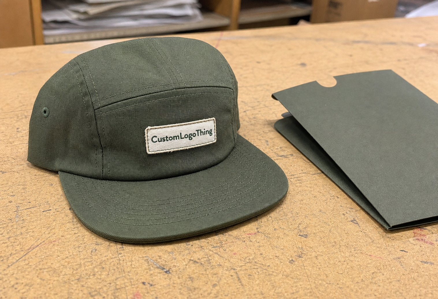
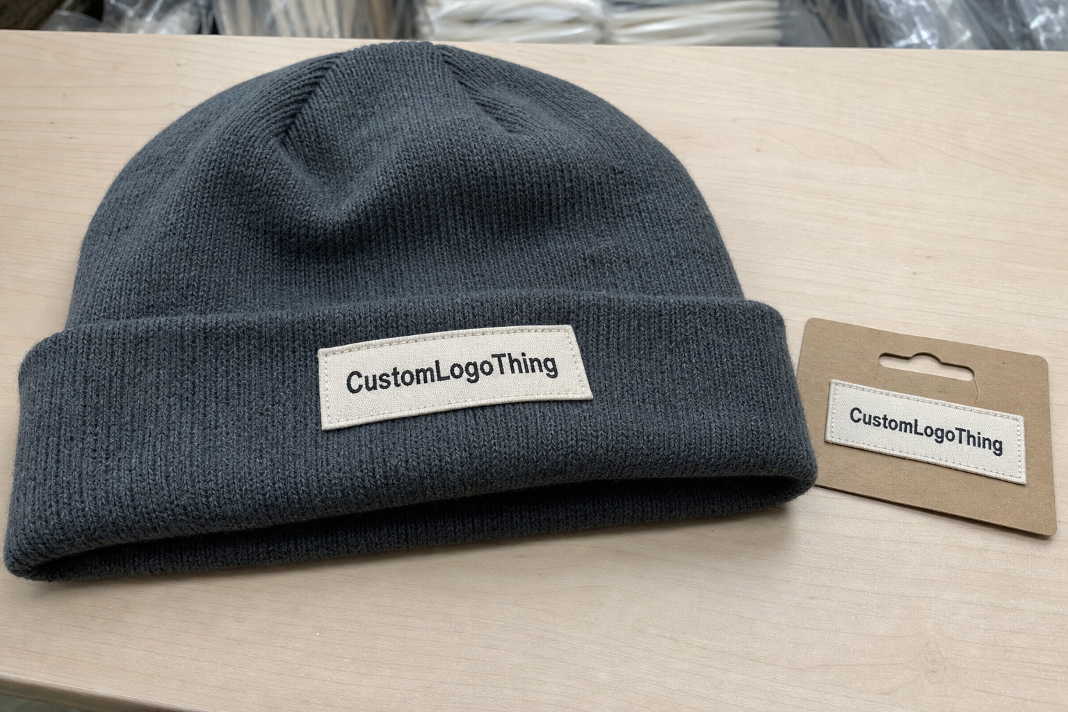
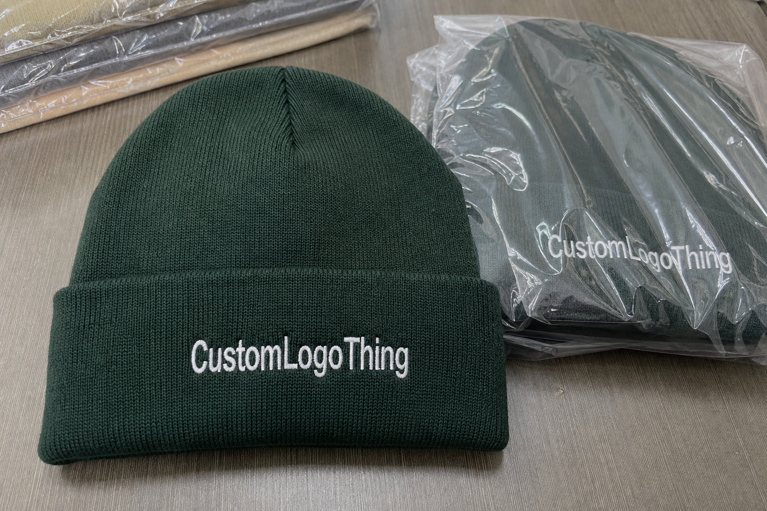
Front-center on the cuff gives the strongest retail read. It is easy to spot, easy to explain in a spec sheet, and usually the least ambiguous for production. Slightly left of center can feel more fashion-driven, while side placement tends to read quieter and more deliberate. That can work well for brands that want the beanie to feel like apparel, not a billboard.
The garment itself changes the viewing angle. A deep cuff gives more usable space and usually handles embroidery better. A shallow cuff compresses the decoration field and can force the logo too close to the fold. Slouch styles create a different problem: the crown softens and the front panel may sit lower or higher once worn, which can make a proof that looked balanced on a table look misaligned on a head.
“If the logo only looks centered when the beanie is perfectly flat, the placement still needs work.”
That is the point buyers sometimes miss. A beanie is not a rigid substrate. It stretches, stacks in cartons, shifts during packing, and changes shape with body heat and handling. Good placement plans for all of that before production begins.
How placement works on cuff, crown, and patch zones
The usable real estate on a beanie is smaller than it first appears. In practice, you are working with the cuff front, the side panel, the body above the cuff, the back near the seam, and any flat patch area that can hold decoration without fighting the knit. The Retail Merch Beanies logo placement guide is useful because it forces the conversation onto these actual zones instead of the overall silhouette.
Embroidery, woven patches, leather patches, and heat-applied labels each behave differently. Embroidery needs room for the needle path, the backing, and the density of the thread. A woven patch can carry tighter detail, but it still needs border space so the edge does not feel cramped. Leather patches read as a material statement, so they usually need a little breathing room to avoid looking squeezed. Heat transfers can work well for small marks, but they depend on a flatter area and tighter process control during application.
Fabric structure matters more than many buyers expect. Ribbed cuffs usually hold decoration well because the knit has some grip. Looser body yarns may let a dense stitch sink into the surface or spread a little more than planned. Seam placement also affects the final read; if a logo lands too close to a seam line, the eye can read it as tilted even when the factory placed it exactly where the spec said.
For proofing, ask to see the mark in three views: flat, folded, and worn. Flat proves the measurement. Folded shows how the cuff changes the visible area. Worn tells you whether the logo stays readable once the knit flexes. A proof package that skips the worn view is usually incomplete for retail approval.
As a practical range, many cuff logos land around 2.0 to 3.0 inches wide, though the right size depends on cuff height, knit gauge, and how much negative space you want around the mark. Smaller can feel refined if the brand is minimal. Larger can work if the artwork is bold and the cuff is tall enough to support it. What matters most is keeping the mark away from seam lines and fold edges so it feels intentional instead of squeezed in.
Cost and pricing: what logo placement changes in your quote
The Retail Merch Beanies logo placement guide also helps buyers make sense of pricing. Placement changes cost because it changes stitch count, patch size, setup time, and sometimes the number of decoration locations. A single front cuff embroidery is usually the simplest and most economical route. Add a second hit, a side placement, or a larger patch and the quote rises faster than the artwork alone would suggest.
As a rough buying reference, a one-location embroidered cuff logo on 5,000 pieces might land around $0.45-$0.90 per unit depending on thread count, stitch density, and the base beanie. Woven patch applications often sit around $0.70-$1.30 per unit. Leather or specialty patches commonly move into the $0.85-$1.60 range. Multi-location branding can push higher, often $1.20-$2.25, because there is more handling and more placement control at every step.
Digitizing is another line that deserves attention. Small type, narrow curves, and intricate symbols often need cleanup before production, which can add $25-$75 for a standard logo and more for complex marks. If the design needs a custom patch shape, merrowed edge, debossed finish, or specialty backing, those choices often affect the quote more than placement alone.
| Decoration option | Typical unit price at 5,000 pcs | Setup impact | Best use | Placement note |
|---|---|---|---|---|
| Front embroidery | $0.45-$0.90 | Low to moderate | Clear brand read | Best on cuff-center or slightly off-center front |
| Woven patch | $0.70-$1.30 | Moderate | Small details and sharper art | Needs a flat zone with enough edge clearance |
| Leather patch | $0.85-$1.60 | Moderate to higher | Premium retail presentation | Works well on the front cuff or side panel |
| Multi-location branding | $1.20-$2.25 | Higher | Layered or fashion-led branding | Use only when every placement has a purpose |
Comparing quotes gets easier when you know what is included. Ask whether digitizing, sample revisions, packing, retail tags, and color changes are built into the price or billed separately. A lower unit cost can turn into a higher landed cost if every extra step has its own fee.
Production process and turnaround from proof to finished beanie
Once placement is chosen, the process follows a fairly standard path: logo review, art prep or digitizing, placement proof, sample approval, bulk decoration, and final inspection. The retail merch Beanies Logo Placement guide matters at every step because a vague first decision creates confusion all the way down the line.
Most delays show up in three places. The artwork is too detailed for the knit structure. The placement was never tested on the actual beanie style. Or the chosen finish, especially for patches, needs a physical sample because paper proofs do not show sheen, edge behavior, or thickness well enough.
Simple embroidery placements usually move faster than patch programs. A straightforward front cuff logo can sometimes be approved and produced in about 10-15 business days after final art sign-off, depending on factory load and material availability. Custom patch programs often need 15-25 business days because the patch has to be made, reviewed, and then attached. If the order includes retail packaging, hang tags, or folding instructions, add time for those details as well.
If the beanies are shipping into stores or distribution centers, ask how the cartons will hold up under transit handling. Packaging and carton standards matter because a beanie rarely ships alone; it ships with tags, inserts, folding instructions, and whatever presentation standard the retailer expects. For buyers who need a benchmark, carton testing guidance from ISTA can help frame expectations, while paper-based inserts may point toward FSC sourcing if the retailer cares about responsible fiber content.
During proof review, ask for exact measurements: distance from cuff edge, logo width in inches, thread or patch color callouts, and the view angle used for approval. If you only get a flat mockup, push for a worn-view reference before final sign-off.
Size, fabric, and decoration limits that affect the final logo
Beanie decoration is as much a material problem as a design problem. Knit stretch can widen small text, soften sharp corners, and make circles look a little oval once the hat is worn. That means the logo size has to respect the garment’s movement, not just the dimensions of a screen mockup.
A tighter knit or 2x2 rib cuff usually gives cleaner embroidery than a loose, lofty yarn. Heavier yarns can show thread sinks more easily, especially if the logo uses solid fills. Recycled polyester, acrylic, wool blends, and acrylic-wool mixes all react a little differently under the needle, so a file that works on one base may need adjustment on another.
Detail level has to be judged honestly. Thin outlines, tiny text, and intricate icons can look crisp in vector form and still fail on knitwear. A good rule is to simplify any logo that depends on hairline strokes or small internal cutouts. If the art needs a magnifying glass to read at proof stage, it will not improve in production.
Contrast matters too. Dark-on-dark can look subtle and premium, but retail merchandising often needs enough separation to read from a fixture arm or a folded stack. Light-on-light may vanish under store lighting. A strong placement balances style with legibility so the beanie still reads from three to six feet away.
Clear space helps more than many buyers realize. Leave enough room between the mark, the seam, and the cuff edge so the decoration feels deliberate rather than crowded. On many programs, a centered logo with decent breathing room looks better than a larger mark squeezed into a weak zone.
Step-by-step logo placement checklist for merch buyers
This Retail Merch Beanies logo placement guide works best as a production checklist, not a design theory exercise. The faster you define the target, the faster a supplier can lock the art, the proof, and the decoration method without backtracking.
- Choose the read you want. Decide whether the beanie should feel premium retail, utility-driven, or streetwear-led before touching placement. A strong logo can still feel wrong if the visual tone does not match the brand.
- Measure the usable zone. Check cuff height, fold depth, and logo width together. A 2.25-inch mark can work well on one style and feel too wide on another if the cuff is shallow.
- Match the decoration method. Put embroidery on a zone that can handle needle density, or choose a patch if the artwork needs finer detail. The knit and the method have to agree.
- Request a placement proof with real measurements. Ask for front, side, and worn views. Make sure the proof shows the exact distance from the cuff and a width callout in inches or millimeters.
- Approve with the full retail line in mind. Compare the beanie against hang tags, apparel, and packaging so the scale feels consistent across the collection.
One more habit saves a lot of time: write the placement note in plain language. A line like “front-center on cuff, 0.5 inch above lower edge, logo width 2.25 inches, centered between side seams” removes most confusion before the order reaches production.
It also helps to define your tolerance before sample review begins. If the logo can move a little left or right to avoid a seam, say so. If exact centering matters more than edge clearance, say that too. Factories work faster when the approval standard is clear, and buyers avoid endless revisions when the non-negotiables are stated up front.
Common placement mistakes that make beanies look off
Most placement problems are not dramatic. They are small errors that add up, and the retail merch beanies logo placement guide is useful precisely because it surfaces those errors before they become expensive.
One common mistake is placing the logo too low so the cuff hides part of it when the beanie is worn. The opposite happens too: the mark sits too high on the crown and looks like it is floating above the fold. Both problems can happen even when the flat proof looked clean.
Oversized artwork is another frequent miss. A large logo might look bold on screen, but on a cuffed beanie it can crowd the fold and leave no breathing room near the seams. The result feels less premium, not more.
Thin script and detailed line work cause trouble as well. Narrow strokes, tiny serif details, and delicate internal shapes often break down on textured knit surfaces, especially if the yarn is soft or the stitch density is high. If the factory suggests simplifying the art, that is usually a sign they are trying to protect the final result.
- Bad reference point: buyer measures from the wrong edge while the factory measures from the fold.
- Flat-only approval: no worn-view proof, so the placement looks fine on paper and wrong in use.
- Too much detail: small letters or thin lines do not hold cleanly on the knit surface.
- Ignored seam line: the logo lands close enough to a seam that the eye reads it as off-center.
- Inconsistent instructions: one email says front-center, another says left-front, and the approval never gets cleaned up.
The fix is usually not a new logo. It is a clearer spec, a better proof, and a more realistic understanding of how the beanie sits on a head instead of a table.
Next steps for approving retail merch beanie placements
If you are preparing to approve a run, the safest path is simple: gather the logo file, choose the decoration method, and state the placement in writing before asking for a quote. The retail merch beanies logo placement guide is most useful at this stage because it keeps everyone aligned on the same measurements and the same visual target.
Send a note that covers four things: which part of the logo matters most, where it should sit, how wide it should be, and any no-go zones around seams, folds, or crown space. If you are deciding between cuff embroidery and a patch, ask for both mockups side by side. That comparison usually makes the right choice obvious quickly.
From there, confirm the final spec sheet in writing. Include the beanie style, decoration method, logo size, distance from cuff, thread or patch colors, and any retail packaging details. If the order ships folded and tagged, ask how the cartons will be packed so the presentation arrives consistent. If the supplier offers a sample before bulk production, use it. One sample is far cheaper than correcting a full run.
The most reliable placements are the ones that still read well on a real head, under store lighting, after packing. That is the line between a beanie that feels retail-ready and one that feels improvised. Use this retail merch beanies logo placement guide as the final check before approval, and the finished product is far more likely to land where you intended.
Where should a logo sit on retail merch beanies for the clearest read?
Front-center on the cuff is usually the most visible placement. If the cuff is tall, shifting the mark slightly higher can keep it from getting hidden when the beanie is worn. Side placements work well if you want a quieter, more fashion-led look.
Is embroidery or a patch better for retail merch beanies logo placement?
Embroidery is usually the cleaner choice when you want a direct brand read and fewer material layers. Patches are stronger for detailed logos, textured branding, or a more premium finish. The better option depends on knit texture, logo complexity, and the shelf presentation you want.
How does beanie logo placement affect pricing?
Placement affects setup time, stitch count, patch size, and whether one or more decoration zones are needed. Patch placements add material and application steps compared with simple embroidery. Complex or tightly controlled placements may also require more digitizing and proofing time.
What slows down turnaround on custom beanie placement orders?
Late artwork changes and unclear placement instructions are the biggest delays. Detailed logos, specialty patches, and multi-location decoration add extra production steps. Approvals move faster when the buyer confirms size, location, and method early.
What should I send before requesting a beanie placement proof?
Send vector artwork, the preferred placement, the target beanie style, and any brand rules that affect decoration. Include a note on whether you want cuff, crown, or patch placement. Ask for a worn-view proof so you can judge real-world visibility before approving.