The Premium Cuffed Beanies logo placement guide starts with one simple reality: knit headwear moves. A logo that looks centered on a flat mockup can shift once the cuff folds, the beanie stretches, and the wearer adjusts it on the head. That is why placement is a production decision, not just a design choice.
On cuffed beanies, the visible area is small and the margin for error is tighter than most buyers expect. Placement affects readability, embroidery quality, and cost. The cuff height, knit density, and fold behavior all change what will actually work in bulk.
Start with the garment, not the artwork. Measure the cuff, identify the knit type, and confirm whether the beanie will be worn folded once, twice, or slightly slouched. Those details matter more than a digital comp when you are trying to approve something that has to hold up in real wear.
A beanie logo is judged in motion. A placement that looks balanced flat can feel crowded, clipped, or oddly high once the cuff folds and the fabric settles.
Premium Cuffed Beanies Logo Placement Guide: Why Inches Matter
Cuffed beanies give you a limited branding zone, so small changes matter. A cuff that measures 2.5 inches behaves very differently from one that is 4 inches tall. The visible panel can shrink once the knit settles, which is why placement has to be based on real measurements rather than a general idea of "center."
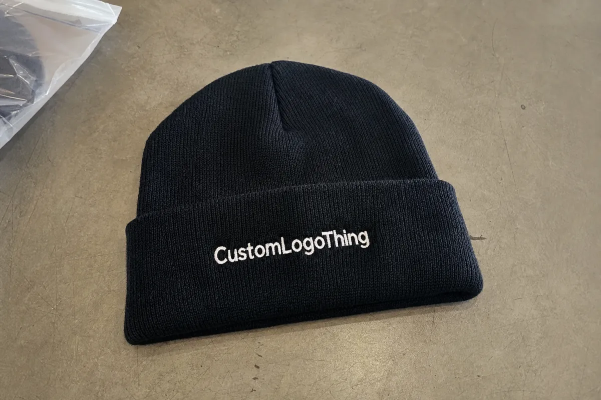
Front-center is usually the safest choice because it gives the clearest read and the most predictable production path. Higher placement can work on tall cuffs or slouch styles. Side placement feels quieter and more fashion-led. Back placement is less common and usually reserved for utility headwear or secondary branding.
Visual center and physical center are not always the same on soft goods. A logo can be technically centered on the cuff and still look low if the fold sits deeper than expected. It can also appear too high if the wearer folds the cuff differently than the sample was staged.
Placement should follow the use case. Event giveaways need quick recognition. Retail beanies need a cleaner, more intentional look. Team and promo headwear usually sit between those two goals. The right answer depends on how far away the logo must read and how often the beanie will be seen from the front.
Logo shape also affects placement. Wide wordmarks may need to be shortened or stacked. Thin scripts and tiny details often do not survive embroidery well on rib knit. The more compact and legible the art, the more placement options you usually have.
How Cuffed Logo Placement Works on Real Garments
The cuff is not a flat canvas. It has a seam, a fold line, an edge, and a knit structure that changes under tension. Tighter rib knits generally hold embroidery better than loose, lofty knits. Fleece-lined or brushed styles can behave differently again because the cuff and body do not always settle the same way.
Front-center remains the most efficient placement because it is easiest to hoop, proof, and repeat across a bulk run. Slightly elevated front placement helps when the cuff is tall or likely to be worn lower in practice. Side cuff placement works best for minimal icons or smaller marks. Back placement is more niche and often adds complexity without adding much visibility.
Safe margins matter. Too close to the top seam and the embroidery can pucker when the cuff flexes. Too close to the lower edge and the logo can fall into the fold. Many decorators keep the art a few millimeters below the top seam and leave enough room below the design so the stitches do not sit in the crease. That buffer should increase for thicker yarn and softer cuffs.
| Placement | Visibility | Best For | Production Risk | Typical Cost Effect |
|---|---|---|---|---|
| Front-center | High | Retail basics, events, team wear | Low | Usually lowest |
| High front | High to medium | Tall cuffs, slouch styling | Medium | May rise if reproofing is needed |
| Side cuff | Medium | Minimal branding, fashion-led pieces | Medium | Often similar, sometimes slightly higher |
| Back cuff | Low to medium | Utility or secondary branding | Medium | Can rise if a second decoration pass is added |
Decoration size matters as much as location. A wide wordmark may need to be stacked. A dense logo can become stiff if the stitch count climbs too high for the knit surface. On ribbed beanies, simple artwork usually produces the cleanest result. That is especially true when the goal is a premium finish rather than maximum detail.
For serious orders, sew-outs are essential. A flat mockup cannot show how the thread sinks into the knit, whether letters close up, or whether the logo still feels centered after the cuff is folded the way people will actually wear it. A physical sample answers the questions that usually create rework later.
Cost, MOQ, and Quote Drivers for Logo Decoration
Blank beanie price matters, but decoration often drives the quote more than buyers expect. On Premium Cuffed Beanies, stitch count, number of thread colors, digitizing complexity, and sample revisions can move unit cost almost as much as the blank itself.
The biggest pricing levers are easy to identify once you know what to ask for. A compact front logo with about 3,000 to 5,000 stitches is usually more predictable than an 8,000-stitch design with small type or fine linework. Gradients, micro text, and hairline strokes usually need simplification before embroidery is approved.
Single-location front embroidery is the most efficient setup. It uses one hooping position and fewer quality checks. Add a side mark or second placement and labor rises. That does not always make the order expensive, but it does mean quotes need to be compared on the same spec.
Minimum order quantities for Premium Cuffed Beanies often sit around 24, 48, or 100 units, depending on the supplier and decoration method. Small runs carry more setup cost per piece. Larger runs usually lower unit price, often by 10% to 25%, when the artwork stays compact and uses limited colors.
Common line items to watch for:
- Digitizing: usually $25 to $75 per logo, depending on complexity and size.
- Sample revisions: a placement change or stitch adjustment can trigger another sew-out.
- Rush production: short timelines often add a premium, especially in peak season.
- Thread upgrades: metallic, matte, recycled-content, or exact color-match thread can increase cost.
- Packaging: polybags, hangtags, inserts, and retail folding are often separate.
To compare vendors fairly, ask each one to quote the same artwork width, placement, stitch range, and decoration method. Otherwise the lowest quote may simply be the least complete spec. For retail-packaged orders, distribution and compliance can also affect landed cost. References such as ISTA can help frame handling expectations, and FSC may matter if the packaging needs certified fiber.
Production Steps and Turnaround: From Artwork to Bulk
The clean workflow is straightforward: review the artwork, digitize it, proof placement, sew a sample, and move to bulk only after approval. Skipping any of those steps increases the chance of rework, especially on knit goods where the cuff does not behave like a flat print surface.
Placement proofs are valuable because the spec sheet rarely captures how the cuff will settle under wear. A 3.0-inch folded cuff on paper may behave closer to 2.75 inches once it is stretched and worn. That small change can move the logo enough to affect the whole look.
Turnaround depends on complexity, but a simple embroidered beanie often moves in 7 to 15 business days after proof approval. Add artwork cleanup, a second sample round, or a placement change and the schedule can slip by several days. In peak seasons, especially when blanks are knitted or dyed to order, lead time may stretch to 2 to 4 weeks.
Material choice affects timing too. Dense acrylic is usually easier to embroider than a loose knit. Recycled polyester blends can perform well, though surface texture may vary by run. Wool blends feel premium but are less forgiving if stitch density is too heavy. The fabric weight matters more than the marketing description.
Thread contrast should be checked on the exact colorway. Black on navy, charcoal on dark olive, or tonal embroidery on heathered bases can all read differently in indoor and outdoor light. A logo that looks strong on screen can disappear if the thread and knit are too close in value.
A production-ready proof should answer four questions: does the logo fit, does it read at arm's length, does it stay clear of the fold, and does it still look intentional when the cuff sits slightly off-center?
Buffer time matters if the order is tied to a launch date. The expensive mistake is usually not the embroidery itself. It is discovering too late that the cuff is shorter than expected, the colorway reads darker in person, or the logo needed one more simplification round.
Choosing the Right Placement for Brand Visibility and Wearability
Use case should drive placement. A trade-show giveaway needs quick recognition from a distance. A retail beanie needs to feel worth keeping, which often means a smaller or more restrained logo. Team headwear sits between those two goals: readable, but not overbranded.
Audience behavior also matters. If wearers will be face-to-face with others, front-center usually makes sense. If the beanie is part of a streetwear-inspired drop, side placement can feel cleaner and more current. Both can work if they match the product story.
Logo geometry is a hard constraint, not a preference. Compact icons travel well on cuffed styles. Stacked wordmarks can work if the letters are thick enough. Thin script, tiny text, and gradient-heavy artwork are much less reliable. For buyers asking for beanie embroidery, simplifying the art before digitizing often produces a better result than trying to force every detail into thread.
Contrast changes the read more than most people expect. High contrast between thread and knit base gives the eye a faster read, which can make a smaller placement feel stronger. Low contrast can look more premium, but it needs cleaner placement and better stitch mass to stay legible.
Wear state should decide the final approval. Folded high, folded low, or slightly slouched each changes the visible panel. If the cuff height changes the usable area by more than half an inch, test the logo in that exact wear position before signing off.
There is a difference between visible and right-looking. A logo can be legible and still feel off if it crowds the edge or sits too close to the seam. On premium headwear, the breathing room around the mark is part of the quality signal.
Common Placement Mistakes Buyers Should Avoid
The first mistake is approving from a flat mockup alone. The cuff fold changes the apparent center, and knit stretch changes how the logo sits. A mockup can hide both issues. A sample usually exposes them immediately.
The second mistake is overdesigning a small surface. A logo with multiple gradients, thin lines, and tiny internal details may look refined on screen, then collapse into a heavy patch of thread on a 3-inch cuff. Embroidery has a ceiling on detail, and staying under it is usually what makes the result look premium.
The third mistake is placing the mark too close to seams, edges, or the fold line. Once the beanie flexes, the logo can drift off-axis or disappear into the crease. Even a centered logo can look crooked if the seam pulls the knit slightly left or right.
The fourth mistake is skipping the sew-out because the artwork "looks fine." Rework on knitwear is slow. Thread removal, fabric repair, and a second run all add time and risk. The cost of being wrong is usually higher than the cost of the sample.
The fifth mistake is changing logo width after approval without checking the stitch impact. A 15% size increase does not always mean a 15% cost increase, but it can push the design into a different production band or require a new digitized file.
These issues show up when buyers treat a beanie like a flat promo item. It is not flat. It is a shaped garment with fold behavior, stretch recovery, and surface texture. Addressing those variables early usually leads to a cleaner bulk run.
Next Steps: Build a Spec Sheet Before You Request Samples
If the goal is a clean result, start with a spec sheet that removes guesswork. Measure the folded cuff height. Confirm the decoration method. Decide whether the logo should read front, side, or back. Then specify the width in inches, not just "small" or "medium." Vague instructions create avoidable problems.
A useful spec sheet for Premium Cuffed Beanies should include the artwork file format, thread colors, target quantity, deadline, blank color, and whether every piece needs the exact same placement. If there are multiple logo versions, identify the preferred one. That reduces digitizing time and prevents the wrong file from being used for the sew-out.
If you are deciding between two placements, compare them physically. One front-center sample and one alternate sample, such as a slightly higher front or a side cuff mark, usually settles the question faster than email back-and-forth. Measured comparisons beat opinions based on a screen.
Always approve the sample on the exact beanie color and fabric weight that will be produced in bulk. Not a similar knit. Not a placeholder. The exact item. That is the difference between a logo that feels planned and one that feels improvised.
The key lesson in the premium cuffed Beanies Logo Placement guide is that placement is a production choice with measurable consequences. The best answer protects readability, fits the price point, and matches how the beanie will actually be worn.
Where is the best logo placement on premium cuffed beanies?
Front-center on the cuff is usually the most readable and the easiest to produce consistently. It works best when the logo stays clear of the fold line and seam. Side placement makes sense when the brand wants a quieter, more fashion-led look.
How big should a logo be on a cuffed beanie?
Most logos need to stay compact enough to fit the visible cuff area without crowding the edges. Final size depends on cuff height, stitch count, and how much detail sits in the artwork. Simple logos can usually be a little larger than detailed ones.
Does cuff height change logo placement?
Yes. Taller cuffs give more vertical room and more flexibility. Short cuffs force tighter margins and smaller artwork. Measure the actual folded cuff, not just the flat beanie height.
How much does logo placement affect beanie pricing?
Single-location front embroidery is usually the most efficient setup. Extra placements, larger logos, and complex stitch paths can raise unit cost. Ask for quotes using the same placement and size so pricing stays comparable.
What should I approve before production starts?
Approve the artwork size, placement, stitch density, thread colors, and beanie color. Request a sew-out or placement proof on the actual product whenever possible. Confirm the sample matches the way the beanie will be worn in real use.

