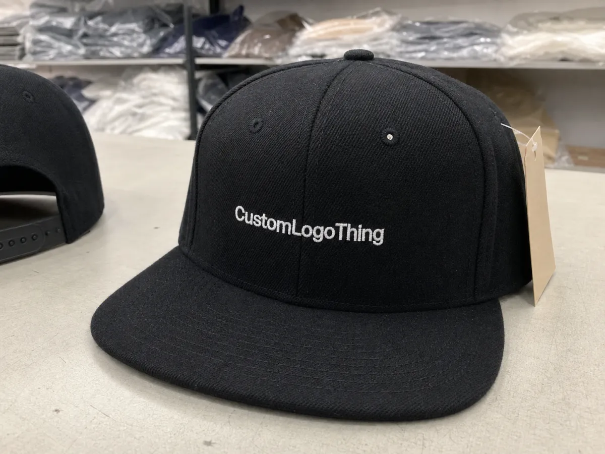
Event merch Flat Bill Snapbacks sample checklist is a long phrase for a fairly simple idea: do not approve a cap based on hope. A flat bill snapback can look clean in a mockup and still miss the mark once structure, stitch density, and brim angle turn a flat drawing into an actual product. One millimeter in the wrong place can change the silhouette enough to matter, especially on a hat that will be photographed, worn on stage, or packed into thousands of boxes.
Event merchandise is unforgiving because everything happens at speed. The cap has to look right, fit a wide range of heads, survive distribution, and still read clearly in a photo six weeks later. A good sample review catches problems before the order becomes inventory. A poor one turns a small technical miss into a full production correction, and that usually costs time first, then money.
The sample is not a formality. It is the cheapest place to discover what the finished cap will actually do.
What the event merch flat bill snapbacks sample checklist catches
Start with the thing buyers often underestimate: a mockup is only an approximation. Once decoration moves onto a structured cap, the front panels, buckram, seam placement, and visor board all influence how the logo sits. A logo that appeared centered on a screen can end up slightly high, slightly low, or crossing a seam in a way that looks accidental rather than designed.
The event merch Flat Bill Snapbacks sample checklist exists to catch production risks that are easy to miss in a proof. The main ones are fit, symmetry, decoration quality, color accuracy, and how the cap is packed. Those are not aesthetic preferences. They decide whether the order feels polished or rushed.
Flat bill snapbacks deserve a separate review because their shape carries so much of the visual identity. A small shift in crown height can make the cap feel sporty, streetwear-heavy, or oddly formal. A brim that is not as flat as expected can change the profile enough that the product no longer matches the art direction. On event floors and in photos, those differences get amplified.
Light also changes the story. Under stage lighting, embroidery thread can pick up a sheen that makes a logo look brighter than expected. In daylight, the same mark may soften. Matte fabrics can mute a bold color, while a slightly glossy fabric can push a dark tone toward black. The sample should be judged in the conditions the cap will actually face, not only under a studio lamp.
That is why a useful checklist asks one blunt question: does this cap still look like the brand once it leaves the proof? If the answer is no, the sample has earned its job. Revision is cheaper than producing thousands of wrong units and discovering the issue after the event order is already locked.
Packaging deserves the same discipline. If the cap will ship in individual poly bags, with hangtags, or in labeled cartons, review those details before approval. Damage during transit is often a pack-out issue rather than a cap issue. Secondary packaging guidance from industry groups such as the Packaging Machinery Manufacturers Institute is useful background at packaging.org.
How the sample review process works
Most programs follow the same sequence: concept art, sample request, physical sample, revision notes, second sample if needed, then production approval. The weak link is usually not the sequence itself. It is confusion about what type of sample is in hand.
A photo mockup shows intent. A sales sample shows the supplier’s general capability. A pre-production sample matters most, because it reflects the actual blank, decoration method, and finishing choices for the order. Those sample types should not be treated as interchangeable. Approving a sales sample as if it were final is one of the fastest ways to create a surprise later.
At minimum, review crown shape, panel alignment, visor stiffness, closure function, logo placement, and packaging presentation. If the design uses embroidery, inspect stitch density and edge crispness. If it uses a woven or TPU patch, check for lifting at the corners and whether small type remains legible. If there is an underbill print, verify that the contrast supports the design without overpowering it.
The review should also include internal stakeholders with different priorities. Marketing tends to focus on visual impact. Operations cares about carton counts, lead time, and shipping method. Procurement watches unit cost and what happens if a revision is needed. That mix matters, because a cap can satisfy one group and still fail the order if the others discover a problem too late.
A practical workflow is better than a vague one:
- Inspect the cap under daylight and indoor lighting.
- Try it on at least two head sizes if possible.
- Measure logo placement against the approved artwork.
- Record every issue in one revision file.
- Approve only after the supplier confirms fixes in writing.
That final written confirmation matters more than many teams realize. A verbal promise to “adjust it” can turn into a production misunderstanding when the factory reads the notes differently from the buyer. Clear approvals reduce that risk.
Material, fit, and decoration details that matter
Construction choices shape the final feel more than most buyers expect. A structured front panel gives a snapback presence. A softer, less structured crown looks relaxed and can photograph differently. Crown depth affects how the cap sits on the head. Too shallow, and the hat looks perched. Too deep, and the front panel can press into the face or collapse visually when worn.
Panel count changes the decoration window. Six-panel and five-panel caps create different seam lines, and those seams affect logo placement. A front graphic that fits comfortably on one template may sit awkwardly on another. Buckram stiffness also matters because it keeps the crown shape stable; if it is too soft, the cap can lose definition after packing or wear.
The visor board should not be treated as a minor component. A flat bill is not always perfectly rigid, and small differences in stiffness alter how the brim sits during wear and shipping. If the order is for staff uniforms, a slightly more forgiving brim can be easier to distribute. If it is for a fashion-forward event line, a firmer profile may be part of the appeal.
Closure quality is another detail with real consequences. A snapback needs an adjustability range that matches the audience, not a narrow fit model. For mixed event staff, volunteers, and attendees, one size may need to cover a broader range than a retail-style cap. Poor closure tolerance shows up fast when the hat is shared across a team.
Decoration method changes the product’s personality. Flat embroidery usually feels cleaner and lighter than heavy raised stitching. A woven patch handles small type well and gives a crisp edge. Leather or faux-leather patches can read premium, but they limit color flexibility. Heat-applied labels are efficient and often cost-friendly, though they may not match stitched decoration for durability. A useful event merch flat bill snapbacks sample checklist compares those choices in context, not in theory.
Color matching also needs a reality check. A Pantone reference is a starting point, not a guarantee. Thread sheen, fabric weave, and the base color of the blank all influence the final look. A dark navy cap can read almost black under artificial light. A matte finish can protect contrast but dull a bright brand color. For any event that will be heavily photographed, the sample should be examined under more than one light source.
Comfort is easy to overlook because it is hard to judge from a screenshot. Yet a cap that feels stiff, scratchy, or too hot usually gets worn less. Check the sweatband, inside seam finish, breathability, and whether the stitching rubs the forehead. If the cap will be worn for six or eight hours, those details stop being small.
Material choices matter too. Common event snapbacks use cotton twill, polyester twill, acrylic blends, or mesh-back combinations. Each behaves differently. Cotton can feel more natural but may show wear sooner. Polyester tends to hold color better and resists moisture, while mesh improves airflow but changes the product’s visual weight. None is universally better. The right one depends on the event, climate, and how the hat will be used after distribution.
For hangtags or insert cards, if certification matters, ask about FSC-certified paper options at fsc.org. That does not affect the cap construction itself, but it can improve the consistency of the full package.
Pricing, MOQ, and unit cost tradeoffs
Unit price is usually the first number buyers ask for and rarely the best one to anchor on. Fixed production costs need to be spread across a run, so lower quantities almost always cost more per piece. A 100-unit order may look modest on paper, but setup, decoration prep, and admin time do not shrink just because the quantity does. That is not a markup trick. It is basic production math.
Minimum order quantity also affects what decoration methods are realistic. A simple embroidered logo may work at a lower MOQ, while a multi-color patch, side decoration, or custom interior labeling can raise the minimum or the sample charge. If the order has more than one decorated location, the pricing usually changes faster than buyers expect.
Sample fees should be treated separately from production pricing. Some suppliers credit the sample cost against the bulk order; others do not. Custom embroidery, patch tooling, or a revised blank can add cost even when the production order is still undecided. The event merch flat bill snapbacks sample checklist should track that policy so the budget is not built on assumptions.
| Option | Typical sample cost | What it shows | Best use |
|---|---|---|---|
| Photo mockup | $0-$25 | Artwork placement and color intent | Early internal review |
| Sales sample | $20-$60 | General construction and finish | Shortlisting suppliers |
| Pre-production sample | $40-$120+ | Actual decoration, fit, and materials | Final approval before bulk production |
There are also costs that hide in plain sight. Poly bags, carton labels, split shipments, insert cards, and domestic freight can all move the landed price. Air shipping can easily cost more than the decoration on a tight deadline. That is not unusual for event work. It is just easy to miss if the quote is written only as a factory price.
As a working range, a simple cap at scale may sit in the low single digits per unit, while a more decorated version with premium fabric, special patches, or rush delivery can rise notably. The exact number depends on quantity, blank quality, stitch count, and packaging. Price comparisons make more sense once the sample confirms what is actually being built.
Process and turnaround timeline from sample to production
Timeline is where strong orders stay on track or fall apart. A clean process usually follows this order: artwork submission, sample making, review window, revision cycle, final approval, bulk production, then shipping. The trouble starts when any of those steps get compressed by late changes.
Lead time depends on blank availability, decoration complexity, revision count, packaging requirements, and whether the factory already stocks the right cap style. If the blank has to be sourced first, the calendar stretches before decoration even begins. A detailed spec sheet prevents a lot of that drag. A vague request slows everyone down.
Missing logo files, unclear placement instructions, and last-minute thread changes cause a surprising amount of delay. So do approvals spread across too many people. One reviewer wants a brighter thread color. Another wants a larger logo. A third wants the same production price held steady for another week. The result is drift, not progress.
If the delivery date is fixed, work backward from that date and build in one buffer day for each correction round. The calendar is usually tighter than it first appears.
For shipping confidence, it helps to ask how the cartons will be packed and whether the outer pack has been checked against transit risks. The International Safe Transit Association publishes widely used guidance on distribution testing at ista.org. Not every cap order needs formal lab testing, but crushed crowns and bent brims are far easier to prevent than to fix after arrival.
For most event programs, the first revision cycle takes longer than expected. A clean sample can move quickly. A sample that needs logo repositioning, thread adjustment, or closure changes can add several days, sometimes more. One useful rule is to assume every round of corrections adds a little more time than the team wants to believe.
Common mistakes that ruin approvals
The most common mistake is approving from a screen alone. A digital proof cannot reveal crown depth, brim stiffness, stitch texture, or how the cap will hold up under event lighting. It can show intent, but not performance. That difference is the whole reason the physical sample exists.
Measurement blind spots create a second wave of issues. Buyers often check logo width and forget front-panel height or brim angle. Then the cap arrives looking too tall, too shallow, or oddly bulky once worn. On a flat bill snapback, silhouette matters almost as much as decoration. If the shape is off, perfect artwork will not save it.
Branding details also slip through when the review is rushed. Thread colors drift. Patch edges are not centered. Labels land on the wrong panel. Underbill contrast ends up too faint to read or too loud to feel intentional. Each miss may look minor in isolation. Together, they can make a premium order feel careless.
Packaging errors are the last easy way to spoil a good cap. A finished product can still feel incomplete if it ships in the wrong bag, with the wrong insert, or in cartons marked inconsistently. If the pack-out instructions are not reviewed before production, the supplier may default to a standard method that does not fit the launch. The event merch flat bill snapbacks sample checklist should cover presentation, not only the hat itself.
Comparing samples in different lighting, with different notes, is another subtle source of bad decisions. One hat looks better simply because it was placed near a brighter window. Another gets criticized because someone handled it first and smudged the finish. Compare like with like. It takes a little more discipline and saves a lot of regret.
Expert tips and next steps for a cleaner launch
A one-page scorecard works better than a long email thread. Keep the criteria consistent: fit, color, logo placement, closure quality, packaging, and shipping readiness. Use pass or fail fields, then add a short notes line for exceptions. It sounds plain, but simple systems are often what keep a fast-moving merch order from becoming noisy.
Ask for side-by-side images of the sample and the approved mockup, ideally with a ruler or measurement reference in frame. That makes proportion issues easier to spot. If the logo needs to sit 20 mm above a seam, say so. If a patch must be centered within 2 mm, say that too. Precision removes ambiguity, and ambiguity is where most rework starts.
Lock the final logo file, Pantone references, delivery address, and packaging instructions before production starts. Those details feel administrative until a cap run misses one of them. A hat order is really a chain of dependencies: artwork, blank, decoration, pack-out, freight, and receiving. Weakness in any one of those links can delay the whole job.
For high-visibility launches, a second physical sample can be worth the time. It is not always necessary, and for straightforward orders it can be overkill. But for sponsor-heavy events, field uniforms, or merchandise with strong public exposure, the extra cycle may be cheaper than a public correction. The highest-cost mistakes in this category are usually the ones visible in photos.
The practical takeaway is fairly simple. Use the event merch flat bill snapbacks sample checklist to check the shape, the decoration, the comfort, and the packing method in one pass. Keep the notes specific. Confirm revisions in writing. If the sample still feels off after review, trust that signal rather than talking yourself into approval.
What should be on an event merch flat bill snapbacks sample checklist?
Start with crown shape, brim structure, and fit because those define how the cap wears. Then verify logo placement, stitch density, patch alignment, thread color, and closure function under natural and indoor light. Finish with comfort and packaging so the sample matches the actual receiving experience.
How many samples do I need before approving flat bill snapbacks for an event?
One physical sample is often enough when the artwork and construction are straightforward. A second revision sample makes sense when color matching, patch work, or pack-out details are more complicated. Larger launches justify extra sampling because the cost of a mistake is much higher than the sample fee.
What drives the price of event merch snapbacks the most?
Decoration complexity usually has the biggest effect on unit cost. MOQ, blank quality, and the number of branded locations also move pricing quickly. Packaging, freight, and rush timing can add more than buyers expect if those items are not included in the quote.
How long does a snapback sample and production run usually take?
Sample timing depends on artwork readiness, blank availability, and how many revisions are needed. Production lead time grows when the order uses custom decoration, special packaging, or multiple approval rounds. Shipping method can change the calendar more than the factory schedule, especially when deadlines are tight.
What is the biggest mistake buyers make with flat bill snapback samples?
Approving the sample from mockups or photos alone is the most common miss. Skipping fit checks can lead to hats that look right on paper but wear wrong on real heads. Not checking packaging and final presentation can make a good product feel less finished at the event.


