Why soft-touch proofs matter before you commit to print
The first useful thing a fitness brands Soft Touch Poly Mailers artwork proof checklist does is slow the approval down just enough to catch what a screen cannot show. Soft-touch poly film has a smooth, velvety matte character, and that finish changes how artwork behaves. Bright colors can lose some snap, dense blacks may feel richer and heavier, and fine lettering that looked perfectly crisp in a PDF can read softer once ink, film, and coating are working together.
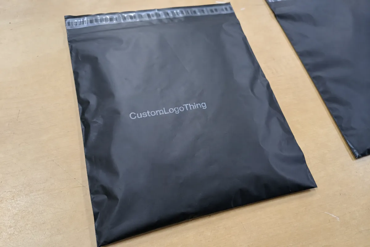
For a fitness brand, the mailer often carries more responsibility than a plain shipping sleeve. It may hold apparel, resistance bands, recovery tools, supplements, welcome kits, or event merchandise, and the outside of the package becomes the first physical brand touchpoint after checkout. If that outer surface looks muted, crowded, or slightly off-color, the customer may not know why it feels wrong, but they will feel the difference.
A proof is not only a typo check. It is a shared production checkpoint between design, purchasing, operations, and the printer. It confirms whether the artwork sits correctly on the dieline, whether the brand color has been translated into a printable target, and whether any copy or code risks landing too close to a fold, seal, or trim area.
Soft-touch finishes are attractive because they remove glare and give plastic mailers a more restrained, premium feel. The tradeoff is that the finish can flatten contrast. Small reversed-out copy, delicate icon sets, thin dividers, and dark-on-dark brand systems all deserve a closer look before approval. A glossy mockup can make those details seem safer than they are.
One missed fold line or one unconfirmed color assumption can create a reprint, a delay, or a stack of mailers that technically ship but never feel quite right. The proof protects the customer experience, but it also protects the budget, because production mistakes become expensive once thousands of bags have been printed, converted, packed, and scheduled for delivery.
How the process and timeline move from artwork upload to approval
Most proof cycles begin with file handoff. The supplier receives the artwork, checks it against the dieline, confirms the usable print area, reviews image resolution, and looks for anything likely to be affected by the bag structure. Seams, seals, flap edges, and fold lines matter as much as the center artwork, especially on mailers where the logo or pattern runs close to the edges.
A clean proof path usually follows a predictable order: artwork receipt, dieline fit check, print-area placement, color review, prepress adjustment, proof issue, buyer comments, and final approval. The process sounds straightforward, but the delays usually sit between those steps. Missing vector logos, unembedded fonts, low-resolution photography, unclear Pantone references, or last-minute copy changes can add a revision round before production has even been scheduled.
Proof turnaround is often shorter than full production lead time, but the buyer’s response speed still has a large effect on the schedule. A simple logo mailer may receive a digital proof quickly if the file is complete. More complex work, such as full-bleed graphics, multi-color printing, custom sizing, or artwork with barcodes and compliance text, needs more careful prepress attention.
It helps to separate review responsibilities. One person should own brand accuracy: logo placement, color feel, product names, copy tone, and whether the artwork still looks like the brand when it is applied to a physical bag. Another person should own operational details: quantity, finished size, film gauge, packing count, carton labeling, and delivery window. That split keeps the proof from drifting into a long group review where everyone comments on everything and no one actually approves the job.
For planning purposes, many Custom Poly Mailer orders follow a rhythm of one to three business days for a basic proof after clean artwork is received, with additional time for sample requests, revisions, or difficult color matching. Full production timing depends on the supplier, the order size, the finish, and shipping terms, but buyers should treat approval as the point where the production clock truly begins.
For broader packaging context, the internal references at Custom Packaging Products and Custom Poly Mailers can help compare format, finish, and use case before the order is locked.
Fitness Brands Soft Touch Poly Mailers Artwork Proof Checklist
This checklist focuses on the details most likely to cause a delay, a reproof, or a disappointing first run. Read the proof as a physical package, not as a flat design file.
- Check the dieline first. Confirm finished width, finished length, flap depth, closure style, and any gusset or special construction notes. If the quote was based on one size and the proof shows another, pause before approving.
- Confirm logo size and placement. The main mark should sit inside the safe area, not merely inside the artboard. Folds, side seals, and flap edges can visually crowd a logo even when nothing is technically trimmed.
- Review color targets. Ask whether the printer is matching Pantone references, converting to CMYK, or using a press-friendly equivalent. Fitness brands often rely on strong blacks, reds, greens, blues, and metallic-inspired neutrals, and those colors should not be guessed at from a monitor.
- Inspect small type and line weights. Fine rules, tiny icons, nutrition-related notes, care instructions, return copy, and reversed-out text can soften on matte film. If a detail is already close to the edge of legibility in the proof, it may be weaker in production.
- Read every line of copy at full size. Check URLs, social handles, return instructions, recycled content statements, warnings, SKU references, and any country-of-origin language. Old boilerplate is one of the easiest errors to miss.
- Verify barcodes and quiet zones. A barcode needs enough clear space around it to scan reliably. Keep it away from folds, seals, heavy texture, and high-distortion areas of the bag.
- Check bleed and trim clearance. Artwork that reaches the edge of a digital layout may look tight once the mailer is formed. Important text, logos, and codes need extra breathing room.
- Confirm material and finish notes. The proof should match the quoted film gauge, soft-touch finish, print side, print coverage, closure type, and quantity. A beautiful proof tied to the wrong specification is still a problem.
- Look at the whole hierarchy. Stand back from the proof or print it at actual size. The brand name, primary mark, and any required handling information should remain clear without needing close inspection.
A strong proof also shows whether the design still feels balanced after the soft-touch finish removes glare. Gloss can make contrast feel sharper; matte surfaces ask the artwork to do more of the work on its own. If a dark block overwhelms the logo, if the spacing around the mark feels cramped, or if the smallest copy gets lost, the proof is doing its job by showing that before the bags are printed.
Photography needs a separate check. Images should be high enough resolution for the final printed size, and they should not depend on bright sheen to look vivid. Soft-touch film can make midtones more subdued. That can be excellent for a premium apparel or wellness brand, but it may dull an image that was designed to feel energetic and high contrast.
The proof should answer one practical question: if this mailer were packed and shipped tomorrow, would the brand still feel deliberate, legible, and worth the production cost?
Cost, pricing, and MOQ factors that change the quote
Custom poly mailer pricing usually moves with size, film thickness, order quantity, print coverage, number of colors, finish, closure style, and shipping terms. A one-color logo on a standard-size bag is a very different job from a full-bleed soft-touch mailer with dense solids on both sides. The proof should make those production choices visible enough that the buyer can see what is being purchased.
Lower quantities almost always cost more per unit because setup work is spread across fewer pieces. Plates, prepress time, calibration, proofing, and press setup do not disappear because the order is small. Buyers are often surprised by how much the economics can change when a custom size, extra ink coverage, or added revision round enters the job.
MOQ should be discussed before design work goes too far. A polished proof is not useful if the desired run falls below the supplier’s practical minimum. Some projects can shift to a standard size or simpler print treatment to reach a workable price, while others need a larger order to justify the custom setup. That conversation is much easier early than it is after the brand team has fallen in love with a layout.
The figures below are broad planning ranges, not fixed pricing. They reflect common cost movement at a 5,000-piece quantity, where setup is spread across a moderate run but the order is not yet at very large-volume efficiency.
| Option | Typical setup | Approx. unit cost | Notes |
|---|---|---|---|
| Single-color logo, standard size | One print area, basic proof round | $0.18-$0.28 at 5,000 pieces | Usually the simplest route when the file is clean and copy is final. |
| Two to four colors, soft-touch finish | More color control and tighter proof review | $0.24-$0.38 at 5,000 pieces | Color matching, registration, and small detail become more important. |
| Full-bleed artwork or heavy coverage | Broader ink laydown and added prepress attention | $0.30-$0.52 at 5,000 pieces | Strong for bold brand systems, but it benefits from a careful proof review. |
| Custom size or special finish request | Revised dieline and added setup | Quoted case by case | MOQ and lead time often move together on custom structures. |
Final pricing depends on dimensions, film gauge, resin or recycled-content requirements, ink coverage, print side, freight, and whether the order needs a physical sample or multiple proof rounds. A buyer comparing quotes should make sure each supplier is quoting the same finished size, same thickness, same finish, same print coverage, and same delivery assumptions. Otherwise, the lowest number may simply be describing a different bag.
Performance language can also affect the specification. Packaging supply chains often refer to ASTM and ISTA testing when discussing strength, transit expectations, or distribution handling. FSC applies to paper-based materials and sourcing claims rather than poly film itself, but it may still matter if the mailer ships with paper inserts, sleeves, or branded carton materials. Resources from packaging.org, the ISTA, and the FSC can help buyers understand the language behind these conversations. If recyclability, recycled content, or disposal claims appear on the package, check the EPA’s guidance at epa.gov before approving print.
Common proof mistakes that lead to rework or color drift
The most common mistake is trusting the screen more than the substrate. A monitor is backlit, smooth, and forgiving. A soft-touch poly mailer is matte, flexible, and affected by film color, ink laydown, coating, and bag conversion. The same navy, charcoal, or red can feel different once it is printed on the actual material.
Placeholders are another quiet source of trouble. Placeholder copy, low-resolution images, missing bleed, unoutlined fonts, and linked assets that never made it into the final package all create avoidable risk. A proof may look finished at a glance while still carrying a line of outdated return copy or a low-resolution photo pulled from a presentation deck.
Barcode areas deserve more discipline than they usually receive. So do seal zones and folds. A layout can look elegant in the center of the bag and still fail in fulfillment if the barcode lands near a crease, the return address sits too close to a seal, or the customer-facing message wraps into the flap area. These are not dramatic design failures; they are production misses.
Color drift often begins with vague language. “Match the mockup” is not enough, especially when the mockup was built in RGB or displayed on several different screens. Use Pantone numbers where possible, identify whether the printer will convert to CMYK or use spot color, and ask how the soft-touch finish may affect the final appearance. Some drift is a normal part of printing on film, but unspoken expectations are what turn a normal tolerance into a dispute.
The final mistake is approving too quickly because the order feels routine. Mailers look simple, so buyers sometimes treat the proof as administrative paperwork. The small checks are the ones that matter: the recycle mark, the closure direction, the orientation of the flap, the exact URL, the logo clearance, the finished size, the count per carton. Once those details are printed at volume, they are no longer small.
Expert tips for sharper artwork on soft-touch film
Strengthen thin type before it becomes a production concern. Delicate sans serif copy, fine icon strokes, light dividers, and reversed-out details may need a little more weight on soft-touch film. The goal is not to make the design clumsy; it is to keep the intended crispness after the finish softens the contrast.
Dark brand colors should be checked against a material reference whenever possible. Black, navy, forest green, burgundy, deep plum, and dark gray can all look elegant on soft-touch film, but they can also close up if the artwork relies on subtle tonal separation. A printed sample, drawdown, or previous production reference gives a more realistic read than a polished digital rendering.
Give the edges more respect than the artboard suggests. Packaging files are flat, but the finished mailer has folds, side seals, and a closure flap. Keep important copy and brand marks away from those transitions. Extra clear space rarely hurts a design; cramped edges often do.
Print the proof at actual size or view it at scale before signing off. Packaging does not live inside a design program. It gets handled, stacked, scanned, opened, photographed, and thrown into shipping bins. If the hierarchy still reads at arm’s length, the artwork is usually in better shape.
- Use slightly heavier fonts for small copy and reversed-out text.
- Favor clean shapes over fragile linework.
- Keep barcodes away from folds, seals, and heavy ink coverage.
- Check full-size readability instead of relying on zoomed-in screen clarity.
- Match important dark colors against the real film when the budget and timeline allow it.
Also be cautious with large solid fields. They can look powerful on a proof, but they may show scuffing, handling marks, or slight variation more readily than lighter artwork. For brands shipping activewear or gym accessories, that may still be the right choice. It simply needs to be a conscious choice rather than a surprise after cartons arrive.
Next steps before you approve and release the order
Before approval, bring the buyer, designer, and operations lead back to the same proof. The designer may see color and spacing. The buyer may see cost and quantity. Operations may see carton count, delivery timing, and whether the selected bag size actually fits the product stack. A short shared review prevents one person from approving artwork while another later discovers a fulfillment issue.
Keep the final dieline, print file, target quantity, material specification, and delivery schedule together. If any of those items differ from the quote, mockup, or purchase order, reconcile the mismatch before release. Production files should not depend on memory or scattered email comments.
Ask one last set of plain questions. Is the color target clear? Is the finish correct? Are all copy lines final? Are barcode zones clean? Does the proof show the right closure and finished size? Does the quantity match the order? If sustainability or recycled-content language appears anywhere on the mailer, has that claim been checked against the actual material and current guidance?
The strongest approvals are calm because the uncertainty has already been removed. Once the proof, specification, pricing, and timeline all describe the same job, the order can move into production with a much better chance of printing the way the brand intended.
FAQ
What should fitness brands check first on a soft touch poly mailer proof?
Start with the dieline, finished dimensions, logo placement, and safe margins. Then confirm the finish, film gauge, closure style, and quantity so the proof matches the actual order. If the layout includes a barcode, return address, legal copy, or recycled-content claim, review those zones before focusing on smaller design preferences.
How long does the artwork proof process usually take for custom poly mailers?
A clean, simple file may move through proofing in a few business days, while missing assets, unclear color targets, custom sizing, or late copy changes can add revision time. The proof step is usually shorter than production, but buyer response time often controls the real schedule. One complete file and one final decision maker help keep the approval cycle tight.
Why does soft-touch finish change the way colors look in a proof?
Soft-touch coating reduces glare, so colors can feel deeper, flatter, or less reflective than they appear on a glossy mockup. Thin lines, small type, and dark solids need extra attention because the matte surface can soften contrast. A printed sample or material reference is the best way to judge the final look.
What details affect the quote for fitness brand soft-touch mailers?
Size, quantity, film thickness, number of print colors, ink coverage, finish, closure style, and shipping terms all affect unit cost. Custom sizing, heavy coverage, and multiple proof rounds can raise the total. MOQ matters because setup, prepress, and calibration costs are spread across the full run.
How can a brand avoid reproofs before ordering soft-touch poly mailers?
Use final artwork, outline or embed fonts, include high-resolution images, and confirm all copy before the first proof is issued. Match the artwork to the correct dieline and review folds, seals, barcodes, and safe areas at actual size. Give one person final approval authority so comments do not keep returning in scattered rounds.


