Most embroidered cap problems start before production, in the proof. That is why the fitness embroidered baseball caps Digital Proof Checklist matters: it catches sizing errors, placement drift, thread mismatches, and details that look fine on a screen but fail once stitched onto a curved crown.
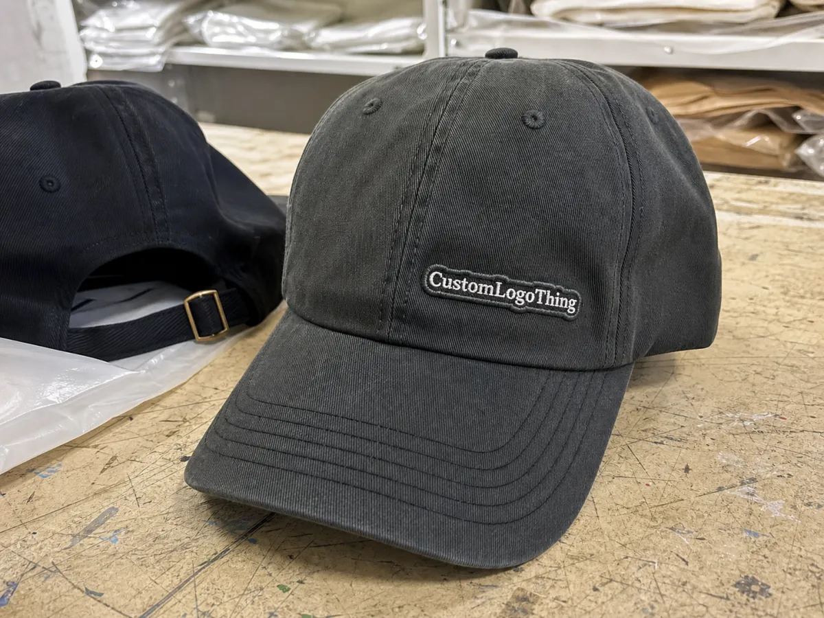
Fitness buyers feel those mistakes quickly. Gym merch, running clubs, and activewear brands often use compact logos, condensed text, and angular symbols that are close to the limit of what embroidery can hold. A design that looks sharp in vector form can lose clarity once thread, seam, and crown shape change the layout.
Fitness embroidered baseball caps digital proof checklist
A useful proof checklist starts with the basics: cap style, closure type, logo dimensions, thread colors, placement, and stitch count. If any of those are vague, the finished cap usually shows it. A proof is not a guarantee of perfection; it is the last low-cost chance to correct the order before production locks in.
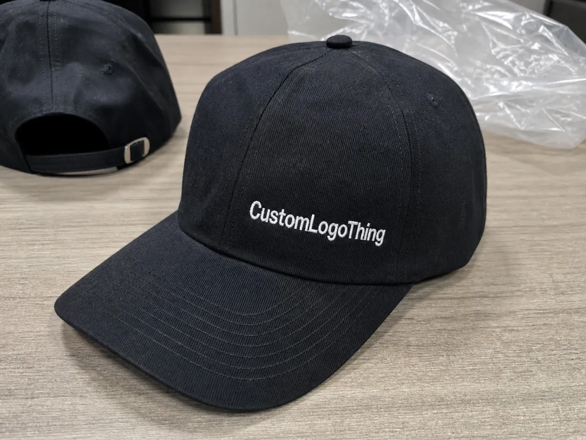
For front embroidery on structured baseball caps, logo widths often land around 45-65 mm. Side marks are usually smaller, sometimes 25-40 mm. The real limit is the artwork itself. Fine lines, tiny type, and narrow strokes collapse faster than bold shapes, especially on low-profile caps or soft fronts with less support.
Text is usually the first casualty. Lettering below about 4 mm in height can become hard to read once stitched, especially with condensed fonts. That does not mean small logos are impossible. It means they often need simplification before approval. Embroidery rewards clarity more than ambition.
A digital proof should answer one question clearly: can this artwork be stitched cleanly on this cap without changing the brand beyond recognition?
Thread is thicker than ink, curved panels distort shapes, and dense fill stitches add weight. A logo that looks sharp in a PDF can still sit too low, run too wide, or lose the negative space that made it legible. That is why the proof should be read like a production document, not a marketing image.
Before approving, make sure the proof shows the exact cap model, crown profile, stitch style, and thread callouts. If it does not, ask for a revision. Approval is the moment to slow down, not speed up.
How a Digital Proof Turns Your Logo Into a Cap Mockup
A proper proof starts with input, not styling. The factory needs vector artwork, the intended cap blank, the decoration position, and color references if brand accuracy matters. A structured six-panel cap does not behave like a soft five-panel, and mesh does not react like brushed cotton or performance polyester. The base changes the result.
The proof is a stitched simulation, not a finished product photo. Use it to check placement, proportion, spacing, and color direction. Do not expect exact thread sheen or fabric grain. What matters is whether the logo sits correctly on the cap and still reads from a normal viewing distance.
Good proofs usually show four things clearly:
- Placement: the logo sits centered or intentionally offset.
- Scale: the mark has room to breathe and does not crowd seams or eyelets.
- Balance: the design looks visually level on the curved panel.
- Stitch direction: the thread flow supports the artwork instead of flattening details.
If any of those are hidden, vague, or shown on the wrong blank, pause approval. A mockup on the wrong crown profile can still look polished while being useless for production. One common failure is a correct logo shown on the wrong hat; the mistake only appears after the order has already moved forward.
For embroidered fitness caps, the biggest risk is often the relationship between the logo and the surface. A taller crown changes where the eye expects the mark to sit. A shallow cap can make a front logo feel higher and more compressed. The proof needs to reflect that reality.
Cost, Pricing, and MOQ: What Actually Changes the Quote
Pricing changes because the work changes. Stitch count, color count, cap construction, placement complexity, and blank quality all affect the quote. A one-color icon on a standard structured cap is a different job from a dense athletic emblem with fine lines and multiple fill areas.
MOQ matters too. Lower quantities spread setup costs over fewer pieces, so unit price rises. Bigger runs usually lower the per-piece cost because digitizing, machine setup, and inspection get distributed more efficiently. A 50-piece order can make sense for a launch, but it will rarely price like a 300-piece run.
| Quote factor | Lower-complexity setup | Higher-complexity setup | Typical effect on price |
|---|---|---|---|
| Stitch count | Simple icon or short wordmark | Dense emblem with fine detail | Higher stitch count increases unit cost and production time |
| Color count | 1-2 thread colors | 4-6 thread colors or split-color fills | More color changes raise setup effort and revision risk |
| Cap blank | Standard structured cotton or poly blend | Performance fabric, premium trim, specialty wash | Premium blanks raise the base price before decoration |
| MOQ | 100-300 pieces | Below 100 pieces | Lower MOQ usually means a higher per-unit cost |
| Extras | Standard proof and digitizing | Rush, sample caps, extra revisions, split shipments | Each extra adds friction and usually a fee |
Typical add-ons are worth budgeting for. Digitizing often falls around $25-$75, depending on complexity and the number of files. Sample charges can add another $20-$60. Rush work usually pushes the order up by 10%-25%, sometimes more if the schedule is full. If the artwork is dense or the brand colors are strict, a stitch-out sample is often the cheapest insurance available.
Cap material also matters. Standard cotton-twill or cotton-poly caps are usually easier to decorate than technical fabrics with moisture-wicking finishes, laser-cut vents, or unusual seams. Special materials can work well, but they usually need more planning, and that shows up in the quote.
Production Steps and Timeline After Proof Approval
After approval, the order moves into a more mechanical phase: proof approval, digitizing lock, test stitch if needed, bulk embroidery, trimming, inspection, and packing. Simple orders move through that chain with minimal friction. Complex designs, specialty blanks, or large runs can slow down any stage, especially if a test stitch reveals that the logo needs a cleaner path.
A proof may return in one or two business days, but the full order often needs 12-15 business days after approval. Rush jobs can move faster if the design is clean and the blank is in stock. They can also slow down if the artwork keeps changing or the cap model is not readily available. Fast is possible, but it is not automatic.
Before approving, ask for four dates and keep them in writing:
- Approval deadline so the artwork lock is clear.
- Production start so you know when the order enters the line.
- Estimated ship date so internal launch plans stay realistic.
- Transit window so arrival is measured in a range, not a guess.
Packaging matters too. If the caps are heading to retail, an event, or a warehouse with strict receiving rules, carton strength and labeling matter. If paper inserts, hang tags, or retail cartons are part of the job, say so early. Those details do not change stitch quality, but they do affect whether the finished order arrives in good shape.
Common Proof Mistakes That Ruin Fitness Cap Orders
The most common mistake is simple: the logo is too small for the cap. Thin lines, delicate symbols, and compact type can look precise in a vector file and still lose definition once thread fills the artwork. A running club crest may look balanced in the proof and then turn crowded after stitching.
The second mistake is choosing the wrong blank for the logo. A shallow crown, an unstructured front, or a highly curved panel changes how the mark reads. Put the same design on a low-profile cap and a mid-profile structured cap and the personality shifts immediately. One version may feel athletic and sharp; the other may feel squeezed.
Color is another area where expectations go wrong. Screen color, Pantone references, and embroidery thread do not behave the same way. A dark blue thread can read nearly black in one light and clearly blue in another. If brand color is sensitive, ask for a thread chart or physical sample instead of assuming the mockup is final.
Placement errors are subtle and expensive. A logo can be technically centered and still look wrong once stitched on a curved panel. The human eye judges balance differently from a ruler, so a mark that is low by a few millimeters can change the whole cap.
The final mistake is rushing the decision. Once approval is given, rework gets costly fast. You may be paying for new digitizing, extra samples, freight changes, or delayed launch time. A careful review is much cheaper than a corrective run.
Expert Tips for Cleaner Revisions and Better Stitch Quality
If the design is detailed, ask for stitch count and coverage notes. A logo at 6,500 stitches behaves differently from one at 11,000 stitches, even if the proof looks similar. More stitches can improve edge definition, but they also add weight, time, and cost.
Simplify the art where the cap demands it. Bold lettering, thicker strokes, and fewer internal cutouts usually hold up better on embroidered fitness caps. Tiny taglines, hairline outlines, and decorative flourishes are the first elements to remove if the design starts to strain the medium.
Clean revisions start with a disciplined comparison. Put the proof beside the spec sheet and check width, height, placement, cap color, thread colors, closure type, and any note about seam or panel alignment. If several people are reviewing it, designate one approver. Multiple comments are fine, but one person should decide.
A few habits make the process smoother:
- Send vector art instead of a screenshot or low-resolution image.
- Provide Pantone references if color accuracy matters.
- Specify the exact cap model and closure type.
- Use a single point of approval whenever possible.
- Keep revision notes specific: "move logo up 4 mm" is better than "make it stronger."
Also ask whether the first proof reflects the actual stitch method. Flat embroidery, 3D puff, patch application, and mixed techniques behave differently, and the wrong assumption can create a proof that looks right in concept but wrong in production. If texture or raised lettering matters, state that before approval.
Next Steps Before You Approve the Final Cap Proof
Before final approval, run one last check on size, placement, thread colors, cap color, closure, quantity, and shipping timing. Those are the fields that cause the most expensive errors when they are left vague.
- Size: confirm the logo dimensions in millimeters or inches.
- Placement: verify center point, height, and left-right balance.
- Thread colors: match the thread chart or color reference exactly.
- Cap details: confirm style, crown shape, and closure type.
- Quantity: make sure the MOQ and final run count match the quote.
- Timing: confirm approval deadline, production window, and shipping plan.
Save the approved proof and the quote together. Also confirm what counts as a change order after approval. Even a small adjustment to stitch count, thread color, or placement can trigger additional fees or restart part of the process.
If the order supports a launch, sponsor activation, or retail delivery, get the schedule in writing and build in a little cushion. Shipping delays, blank shortages, and revision loops do not care about the marketing calendar. A careful proof review cannot remove every risk, but it can remove the avoidable ones.
The fitness Embroidered Baseball Caps Digital Proof checklist works because it forces the hard questions early. That is what saves the order: clear specs, realistic costs, and a proof that matches the cap that will actually be stitched.
FAQ
What should I check first on a fitness cap digital proof?
Check logo size, center placement, and thread colors first. Those are the hardest details to fix after approval. Then verify cap style, closure type, and crown shape so the proof matches the real blank.
How many revisions are normal for embroidered baseball cap proofs?
One revision round is common if the artwork is clean and the instructions are complete. Two rounds can still be normal for complex logos. More than that usually means the design needs simplification or the spec sheet needs more detail.
Can I trust a digital proof to match the finished cap exactly?
Trust it for layout, proportion, and general color direction, but not for exact texture or hand-feel. Thread, fabric, and crown shape all change the final look. If the order is critical, ask for a stitch sample or production sample before bulk approval.
Why does the price change so much between cap proof quotes?
Price usually shifts with stitch count, logo complexity, cap blank quality, quantity, and turnaround time. Rush requests, low MOQ, and extra revisions also raise the total. A simpler logo and a standard blank usually produce the cleanest quote.
How do I speed up the proof and production process?
Send vector art, Pantone references if needed, the exact cap model, and one clear approver in the first message. That removes most back-and-forth. A complete brief gets you to a usable proof faster than repeated corrections later.
What makes a fitness logo hard to embroider?
Thin lines, tiny lettering, low contrast, and intricate symbols are the usual problems. Athletic logos often look sharp in digital form but lose clarity when the stitches are packed into a small front panel. Simplifying the artwork usually improves both legibility and stitch quality.