Buyer Fit Snapshot
| Best fit | Foil Stamping vs Embossing Boxes projects where brand print, material claims, artwork control, MOQ, and repeat-order consistency need to be specified before quoting. |
|---|---|
| Quote inputs | Share finished size, material target, print colors, finish, packing count, annual reorder estimate, ship-to region, and any compliance wording. |
| Proofing check | Approve dieline scale, logo placement, barcode or warning zones, color tolerance, closure strength, and carton packing before bulk production. |
| Main risk | Vague material claims, crowded artwork, missing packing details, or unclear freight terms can make a low unit price expensive after revisions. |
Fast answer: Foil Stamping vs Embossing Boxes: Board, Finish, Dieline, and Unit Cost should be specified like a repeatable production item. The safest quote records material, print method, finish, artwork proof, packing count, and reorder notes in one written spec.
Production checks before approval
Compare the actual filled-product size with the drawing, then confirm tolerance on folds, seals, hang holes, label areas, and retail display edges. Reserve space for logos, QR codes, warning copy, and material claims before decorative graphics fill the panel.
Quote comparison points
Review material grade, print process, finish, sampling route, tooling charges, carton quantity, and freight assumptions side by side. A quote is only useful when the supplier can repeat the same color, closure quality, and packing count on the next order.
If you are comparing foil stamping vs embossing boxes, start with the board and the box structure, not the finish. People love to reverse that order and then wonder why the result looks flat, cracks at the folds, or costs more than it should. The material decides how much relief the surface can hold, how crisp the edges stay, and whether the box reads as premium or just busy.
The real buyer question is simple: does the box need to catch attention or feel expensive in hand? Foil stamping usually handles the first job. Embossing usually handles the second. When a brand needs both shelf presence and tactile weight, a small combined treatment often beats one oversized effect that tries to do everything at once. Custom Logo Things sees that pattern constantly in cosmetics, gifts, subscription kits, and luxury retail packaging.
You do not need to guess. Once you look at stock thickness, lamination, finish area, and how the box gets handled, the answer gets clearer fast. A render can look gorgeous and still tell you nothing useful. Real boxes face hard store lighting, rough shipping, warehouse stacking, and customers who open them like they are hunting for a hidden prize.
Quick Answer: What Actually Wins on Real Boxes?
If the box sits on a shelf and has to sell itself from a few feet away, foil stamping usually does the better job. It throws light, creates contrast, and makes a logo readable almost instantly. If the box is meant to feel elevated when someone picks it up, embossing often looks more restrained and more expensive, especially on rigid cartons and thick paperboard.
The catch is that neither finish works in a vacuum. A deep blind emboss on 2 mm rigid board can look more premium than shiny foil on weak stock. A foil logo on a flimsy folding carton can make the budget look misplaced. Packaging people hate hearing that because it means the structure matters more than the shiny layer. Still true.
For most premium packaging, the answer is not “foil” or “emboss” as a universal rule. It is the finish that matches the brand story, the board thickness, and the shipping reality. Cosmetics, gift boxes, and subscription kits often need a finish that works from a distance and in the hand. Luxury retail often wants both. Price-sensitive mailers usually do better with one controlled accent instead of a full decoration overload.
“If the box only looks good in a render, it is not finished. It is pretend.”
That is why the first decision should be about the box itself: rigid setup box, sleeve, magnetic closure box, folding carton, or mailer. Each one handles foil stamping, embossing, and combined effects differently. A rigid box has the strength to carry deeper relief and more ambitious detailing. A thin folding carton usually needs a lighter touch. The board tells you what is realistic before anyone starts arguing over fonts.
If you want to move faster, begin with a structural sample or at least a board spec. Once the surface finish, closure style, and print coverage are known, a supplier can tell you pretty quickly whether the look you want will hold up. If you need a starting point, browse Custom Packaging Products and think about which box type is doing the most work for your product.
Foil Stamping vs Embossing Boxes: Top Options Compared
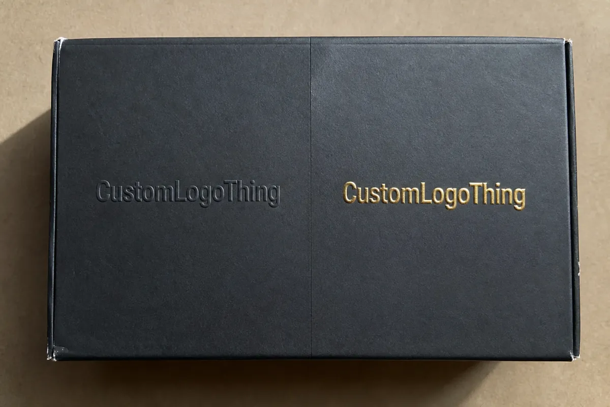
Here is the practical version, with the fluff removed. Foil stamping gives you color, shine, and immediate visibility. Embossing gives you depth, texture, and restraint. Registered emboss plus foil gives you both, but you pay for the extra control. Debossing pushes the image inward instead of lifting it out, which can look architectural and clean, though it does not always read as strongly on shelf packaging.
These finishes are not interchangeable. A monogram, seal, or short brand name usually looks excellent in foil. A crest, symbol, or quiet logo mark often feels better embossed. Busy artwork, tiny type, and hairline rules are where both finishes start pushing back. The more detail you cram in, the more the finish stops being polite.
| Finish | Best Use | Visual Effect | Typical Cost Level | Production Risk |
|---|---|---|---|---|
| Foil stamping | Logos, seals, names, shelf-facing boxes | Bright, reflective, high contrast | Low to medium on simple coverage; higher with wide coverage or special foil | Scuffing, flat spots, alignment issues |
| Blind embossing | Luxury cartons, rigid boxes, tactile branding | Quiet depth, no color added | Medium; can rise with deep or large dies | Weak impression on thin stock, loss of detail |
| Foil plus emboss | Premium logos, luxury sets, hero packaging | Raised and reflective | High | Misregistration, longer setup, tighter approval |
| Debossing | Minimal marks, architectural branding | Pressed inward, understated | Medium | Low visibility if depth is too shallow |
Box style changes the result more than most first-time buyers expect. A magnetic closure rigid box can carry deep embossing on the lid and still close cleanly. A sleeve box works well with a metallic foil wordmark because the flat surface gives the die a fair shot. Folding cartons need more caution; if the board is too thin or the fold area is too crowded, the finish can crack or look uneven. Good packaging specs solve a lot before the sample phase even starts.
Board and coating matter too. Coated stocks usually sharpen foil edges and make metallics look more vivid. Uncoated and textured papers tend to make embossing feel more natural and premium. If the box uses lamination, especially soft-touch lamination, the finish can feel luxurious but may also change how sharply foil pops. A matte aqueous coating or UV coating changes the surface again. None of this is one-size-fits-all. Packaging never is.
If you are deciding between foil and embossing on a new line, ask the supplier what material they recommend for the actual box format. For a cosmetic carton, 350gsm C1S or SBS artboard might be enough for light foil and modest depth. For a rigid gift box, chipboard wrapped with printed paper usually handles embossing better and supports a cleaner premium finish. If the artwork is simple enough, a combined treatment can look expensive without turning the box into a glitter trap.
Detailed Reviews: Where Each Finish Looks Best
Foil stamping looks strongest when the artwork is simple and the contrast is deliberate. Gold, silver, black, copper, rose gold, and holographic foils each send a different message, and the wrong one can drag the whole box down. Gold on a clean white carton can feel elegant. Gold on an overdesigned box with five fonts and too much copy? That looks like a brand trying to borrow confidence from reflection.
Foil behaves best on smooth surfaces and clear shapes. It likes strong spacing, medium-weight type, and logos with room to breathe. If the design includes tiny legal text or an overly detailed illustration, the foil can blur at the edges or lose readability. Better die work helps. It does not create magic. The print room is full of tools, heat, pressure, and physics, not miracles.
Blind embossing is the quieter flex. It does not shout. It asks the customer to look closer. That is why it works so well for luxury skincare, artisan chocolate, jewelry, and brand-led gift boxes. The raised shape catches light at an angle, which gives the logo movement without adding color. On thick board, the result can feel calm and expensive. On flimsy stock, it collapses into a weak ripple and everyone pretends that was intentional.
The sweet spot for embossing is usually a clean symbol, short wordmark, crest, or border detail. It is not the best place for tiny copy or intricate scenes. The die needs enough material to form the shape cleanly, which means the board must have enough body. If the relief is too shallow, customers barely notice it. If it is too deep on the wrong stock, the board can distort. Good embossing is physical, not decorative. That difference matters.
Registered emboss plus foil is the premium move when the brand needs a strong reveal and the budget is there. The raised form creates depth, and the foil catches light on top of it. It looks strong because the eye gets two signals at once. The downside is plain: more setup, tighter tolerance, more chances for misregistration, and a higher unit price. A combo finish is not for packaging that needs to be cheap and cheerful. It is for packaging that needs to justify its price before the customer even touches the product.
Here is a practical way to think about it:
- Foil stamping is better for shelf visibility, branding, and quick recognition.
- Embossing is better for tactility, restraint, and quiet luxury.
- Combination finishing is better for flagship packaging, gift sets, and launches that need a stronger perceived value.
- Spot UV can sometimes replace part of the shine effect if the budget cannot support foil, though it does not feel as premium in hand.
- Die cutting matters when the box shape is part of the presentation, especially with sleeves, windows, and nested inserts.
Scuff resistance matters too. Foil on a high-touch area may show wear faster, especially if the box gets stacked, rubbed, or packed tightly in shipping cartons. Embossing tends to age better because it is part of the board instead of sitting on top of it. That is not true in every case, but it happens often enough that I would treat it as a working rule unless the project says otherwise.
For brands with sustainability claims, the material story matters too. If the packaging uses FSC-certified board, ask for proof and chain-of-custody documentation if the claim appears on the product page or retailer spec sheet. The FSC site is where you verify the standard, not a vague phrase on a quote sheet. If the box needs transit testing, the ISTA framework is worth a look before you assume the finish will survive shipping abuse.
Process, Timeline, and Lead Time
Most delays do not happen during the press run. They happen before it. Artwork cleanup, dieline confirmation, die making, sample approval, and last-minute changes eat time. The production team can only move as fast as the slowest decision-maker, which is usually someone waiting on a CEO, a buyer, or a brand manager who vanished into a meeting and took the logo file with them.
The normal sequence is straightforward, even if the calendar refuses to cooperate:
- Confirm the box style, board thickness, and finish type.
- Clean up artwork and set the dieline.
- Build the embossing die, foil die, or both.
- Approve a sample or proof.
- Run production, inspect, pack, and ship.
A simple foil or emboss job can move fairly quickly once the artwork is locked. A realistic timeline is often 10-15 business days after approval for straightforward runs, depending on quantity and finishing complexity. Add a few more days if the box needs a custom die, a special foil color, or a second sample round. Combo finishes usually stretch that further because registration has to be tighter and setup is less forgiving.
There are a few common delay points worth calling out. Low-resolution logos slow everything down. Changes after sample approval slow everything down more. Unclear foil color choices create dumb delays that should never happen. Shipping decisions made too late can also wreck an otherwise solid schedule. If you want speed, send the final logo, final quantity, final box size, and final shipping destination before asking for a quote. The process gets faster the moment everyone stops pretending the details are negotiable.
There is also a difference between a rush job and a rushed job. A rush job is planned. A rushed job is what happens when someone says “we need it sooner” after two weeks of silence. Those are not the same thing, even if the meeting vibe says otherwise.
For jobs with foil stamping vs embossing boxes on thick board, ask about sample strategy early. A physical sample is worth more than a polished PDF, especially if the design includes subtle relief or a metallic finish. If the packaging will be handled in stores or shipped through distribution centers, request a transit test plan based on real product conditions rather than guessing. It costs less to confirm durability before production than to explain broken corners later.
Cost, Pricing, MOQ, and Quote Breakdown
Price depends on setup, coverage, and quantity. That is the boring truth, and it runs the whole show. The main cost drivers are die setup, foil film choice, emboss depth, box style, board thickness, quantity, and whether the artwork needs exact registration. A small logo with one foil color on a standard rigid box is a very different animal from a full-panel foil pattern with a deep embossed border on a custom sleeve box.
Minimum order quantity matters because setup cost has to be spread somewhere. If you order a small run, each box carries more of the die and setup expense. If you order larger quantities, the unit cost drops because the setup gets diluted. This is why suppliers sound happier when you mention volume. They are not being mysterious. They just like math that works.
For practical budgeting, these are the kinds of ranges buyers often see:
- Simple foil stamping on a modest run can add roughly $0.10-$0.30 per unit once tooling is spread out.
- Blind embossing can land in a similar range on simple shapes, but deep or large-area embossing may rise to $0.20-$0.45 per unit.
- Registered foil plus emboss usually pushes higher, often $0.30-$0.80 per unit or more depending on quantity and complexity.
- Rush schedules, special foils, or upgraded board can push the total higher fast.
Those ranges are not a promise. They are a sane starting point. Small quantities, heavy board, unusual artwork, or premium finishes can move everything upward. Large-volume retail programs may lower the per-unit cost, but only if the design stays efficient. Wide foil coverage, multiple foil colors, and full-panel embossing are the things that make quote sheets start looking serious.
Watch the hidden costs too. Sample charges matter. Freight on rigid boxes matters because they are heavier than people expect. Artwork cleanup matters if the files are messy. Thick board upgrades matter. Lamination choices matter. And yes, a fancy coating like soft-touch or specialty UV coating can change the finish cost and the feel of the box at the same time. The cheapest line item on paper is not always the cheapest delivered to your warehouse.
A proper quote should break out:
- Tooling or die fees
- Printing and finishing costs
- Material spec and board grade
- Sample or proof charges
- Freight and packaging for shipment
If a vendor sends only one total number and expects you to understand everything from that, ask for more detail. Buyers compare better when the quote is itemized. You can see whether the difference comes from the finish, the stock, or the shipping method instead of guessing like it is some kind of personality test.
How to Choose the Right Finish for Your Box
Start with the brand promise. If the brand is loud, polished, and retail-driven, foil usually does the job better. It is visible from a distance and it creates a fast read. If the brand is restrained, artisanal, or built around understatement, embossing often feels more credible. It says the box had thought put into it without shouting for applause.
Then look at handling. Boxes that will be shipped, stacked, brushed against other cartons, or stored for weeks need a finish that can survive contact. A deep emboss on sturdy board often holds up well because the effect is built into the structure. Foil can still be excellent, but it is more exposed to scuffing, especially if the surface gets handled a lot. A foil finish that looks beautiful on launch day can age badly if the box lives a rough life.
Artwork is the next filter. Simple logos, icons, seals, and short wordmarks are the safest bets. Fine lines, tiny text, and complex illustrations tend to break apart once the die starts doing physical work. If you need both detail and impact, simplify the finish area and let the rest of the box use print, texture, or a secondary feature like spot UV. That keeps the premium cue where it belongs instead of turning the whole box into a crowded argument.
Budget and role matter too. If the packaging is the hero moment, spend money on the finish. If the product itself is the hero, keep the box cleaner and let structure, insert design, or print quality carry more of the experience. Not every box needs to act like a luxury perfume launch. Sometimes the right move is a polished but restrained carton that protects margin and still feels considered.
A buyer-friendly checklist looks like this:
- Board thickness: Is the stock thick enough to hold the relief?
- Finish area: Is the foil or embossing small and controlled, or trying to cover too much?
- Artwork size: Will the logo stay readable after die work?
- Lead time: Can the schedule absorb sampling and approval?
- Shipping route: Will the box survive transit and warehouse handling?
- Price target: Does the landed cost still fit the margin model?
If the answer is still unclear, order two physical prototypes. Compare them under daylight, store lighting, and in hand. A render cannot tell you how a raised logo feels through a thumb press. It cannot tell you how foil shifts under fluorescent light. It cannot tell you whether the box opens like a premium object or a disappointment with a magnet. Real boxes are judged by touch and angle, not wishful thinking.
Our Recommendation: Best Choice and Next Steps
Here is the blunt version. For most brands, embossing wins on tactility and staying power, while foil stamping wins on immediate shelf impact. If the budget allows and the artwork is simple, a small registered combo finish is the strongest premium move. Not because it is fancy for the sake of it, but because it gives the customer two signals at once: visual value and physical value.
For cosmetics and luxury gifts, foil accents often make sense because those categories live and die by first glance. For premium artisan brands, embossing usually feels more honest and less loud. For high-volume retail, keep the effect controlled. A box that is too decorated starts costing money in setup, material, and handling without necessarily selling more product. Pretty is not the same as profitable.
If I were setting up a new project, I would ask for three things before approving anything: one foil sample, one emboss sample, and a material sample on the exact board. Then I would look at them under natural light and store lighting. I would also check how the box folds, whether the corners crack, and whether the finish survives a few rounds of handling. That sounds boring. It also saves money.
Then I would compare:
- Perceived value versus unit cost
- Scuff resistance versus shelf impact
- Turnaround time versus design complexity
- MOQ versus the actual sales plan
- Landed cost versus the margin you still want to keep
For most buyers, the right answer is the one that makes the box feel premium, survives production, and still looks worth opening after shipping. That is the real test. So if you are deciding between foil stamping vs embossing boxes, do not ask which finish sounds better in a meeting. Ask which one fits the board, the brand, the budget, and the route the box has to travel before a customer ever sees it.
The simplest rule is this: choose foil when you need sharp visibility, choose embossing when you need tactile depth, and combine them only when the structure, artwork, and margin can support the extra complexity. That gives you a box that looks intentional on shelf and still holds up once it leaves the photo shoot.
Frequently Asked Questions
Is foil stamping or embossing better for luxury boxes?
Embossing usually feels more refined and understated, especially on thick board or rigid boxes. Foil stamping is better when the goal is instant visual impact and fast shelf recognition. If the budget can handle it, a small registered foil-and-emboss combo often looks the most premium because it gives both depth and shine without overloading the design.
What is cheaper: foil stamping vs embossing boxes?
Blind embossing can be cheaper on simple designs because it may use less setup and no foil film. Foil gets more expensive when the coverage area is larger, the foil is specialized, or the artwork needs tighter registration. The cheapest quote is not always the best value, so compare tooling, samples, board, and freight before deciding.
How long do foil stamping vs embossing boxes take to produce?
Simple projects can move quickly after artwork approval, but custom dies and sample rounds add time. A straightforward job may finish in about 10-15 business days after approval, while combo finishes usually take longer because alignment has to be tighter. If speed matters, lock the board, quantity, and logo size before requesting the quote.
Can you combine foil stamping and embossing on the same box?
Yes, and that is often the strongest premium look if the artwork is simple and the board is thick enough. Registered combo work needs better tooling and tighter production control, so the cost and lead time go up. It works best for logos, seals, and limited accent areas rather than full-panel decoration.
What box materials work best for embossing and foil stamping?
Thick paperboard, rigid chipboard, and smooth coated stocks usually give the cleanest results. Thin or flimsy materials are more likely to lose emboss depth or show foil cracking at folds. Ask for a sample on the exact board you plan to use, because material choice changes the final look more than most people expect.
Which finish is safer for shipping?
Embossing is often more forgiving because the effect is built into the surface instead of sitting on top of it. Foil can still travel well, but it is more exposed to scuffing if boxes rub against each other or get handled a lot. If the box will move through a rough supply chain, ask for a transit test on the final structure before you approve production.
Do soft-touch or UV coatings change the result?
Yes. Soft-touch lamination can make a box feel richer, but it may soften foil contrast a little and change the way light hits the surface. UV coating can sharpen certain printed areas and alter how embossing reads. These finishes are useful, but they are not neutral. They change the entire surface behavior, which is why a sample matters.
Related packaging resources
Use these related guides to compare specs, costs, quality checks, and buyer decisions before making the final call.