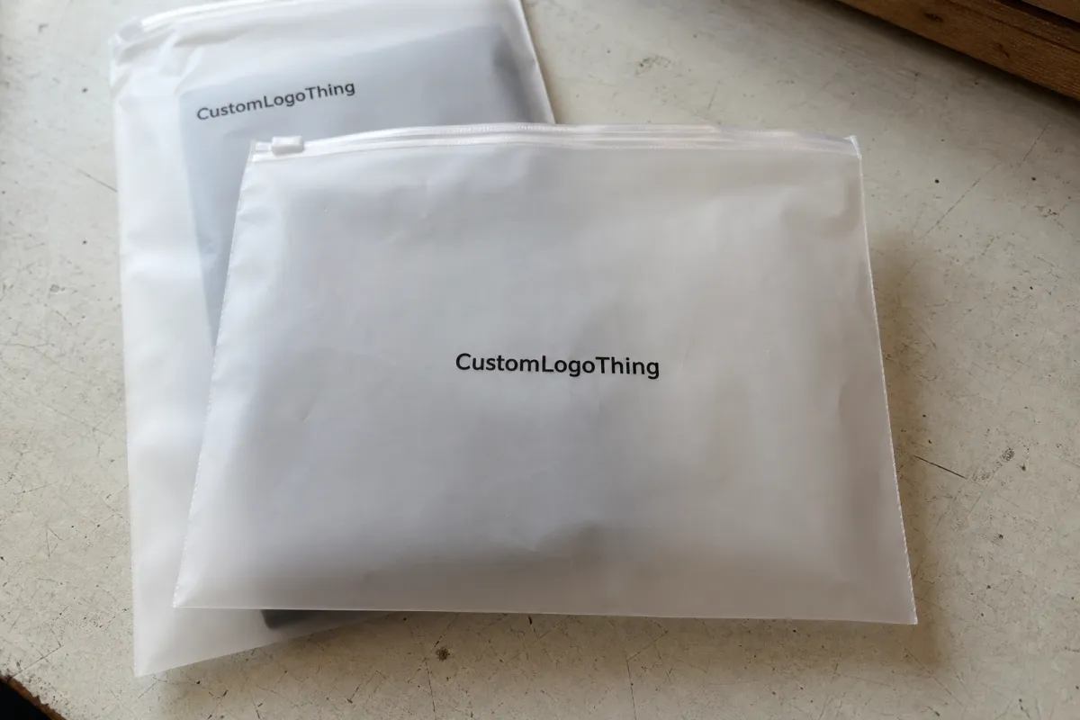
On Frosted Zipper Bags, logo placement is a production decision as much as a design one. The film is translucent, the zipper and seals take up real space, and the filled product changes the way the front panel reads. A logo that looks centered on a flat mockup can end up cramped, weak, or too high once the pouch is manufactured and packed.
For buyers, the main question is not just where the logo looks best. It is where the logo will stay readable, keep enough room for required copy, and still work once the bag is filled and shipped. That means placement affects artwork, cost, approval timing, and inspection risk.
This guide focuses on the decisions that matter most: visibility, print zones, layout constraints, pricing, MOQ, lead time, and the checks that prevent a reprint.
Frosted Zipper Bags Logo Placement Guide: Start With Visibility
Frosted film softens contrast, so artwork needs more breathing room than it would on paper or a rigid carton. Thin strokes, pale colors, and overly detailed scripts tend to lose definition faster. Darker inks and simpler shapes usually hold up better because they stay readable against the satin-like background.
Start by deciding what the bag should communicate first. If the brand is the priority, the logo needs the cleanest, most open part of the panel. If the product itself should lead, the branding may need to sit slightly higher or lower so the contents remain visible. On a filled pouch, that visual order matters more than screen-perfect centering.
For most buyers, the right placement is the one that survives real use: shelf display, shipping, photo use, and customer handling. If the logo only works when the bag is empty, the layout is too aggressive.
How Frosted Film, Seal Lines, and Print Zones Work Together
Frosted Zipper Bags often appear roomy on a dieline, but the usable print area is smaller than it first looks. Side seals, the bottom gusset, zipper height, and any hang hole or tear notch all reduce the safe zone. A logo placed too close to those areas may still print, but it can look squeezed or poorly balanced.
Film gauge also changes the result. Many Frosted Zipper Bags fall in the 4.0 to 6.0 mil range, though heavier retail or food pouches can run thicker. Thicker film can feel more premium and hold its shape better, but it also affects material cost and how the pouch sits when filled.
Color choice should be decided with the material, not just the art file. Strong contrast usually performs best. Fine gradients, light grays, and low-saturation colors can look acceptable on screen and weak on the finished bag. If the mark uses thin lines, simplify it or increase stroke weight before approval.
Always review the artwork against the actual print window and expected fill level. A flat file does not show seal bulge, zipper height, or how the product settles in the pouch. If a supplier approves a logo without checking the bag geometry, the finished pack can still look off even when the print itself is clean.
Key Placement Factors That Change the Final Layout
Five variables shape most layout decisions: bag size, gusset depth, zipper type, finish, and print side count. A flat 5 x 8 pouch does not behave like a 9 x 12 stand-up bag with a wide base. The larger pouch gives more branding room, but it also changes how the design reads when the bottom expands and the contents shift.
Logo structure matters just as much as bag size. Bold wordmarks are forgiving; fine scripts, dense emblems, and long taglines are not. If the logo is too detailed for the print zone, simplify the lockup instead of shrinking it until it becomes fragile. Clear spacing and contrast usually outperform decorative complexity.
Functional copy can force layout changes late in the process. Ingredients, warnings, barcodes, lot codes, and recycling marks should be planned early. If they are added after the logo is placed, the whole composition may need to move, which is where good layouts turn into compromises.
Typical placement choices:
- Front center: strongest brand visibility and easiest to read quickly.
- Upper third: useful when fill levels are high or the contents should stay visible.
- Lower band: works for secondary branding but crowds fast on upright pouches.
- Back panel: better for instructions, compliance copy, or a secondary logo treatment.
Buyer context should drive the choice. If the bag hangs on a peg, the top half matters most. If it sits in a tray, the full front panel carries more weight. If it ships flat and is opened later, the back panel can hold more functional information. Same pouch, different use case.
Cost, Pricing, MOQ, and Unit Cost Tradeoffs
Pricing for Frosted Zipper Bags usually moves with three inputs: print method, number of colors, and coverage area. One-color printing is generally easier than a design with multiple spot colors or tight registration on both sides. Larger print areas add setup time and more quality-control pressure, which pushes cost up as well.
MOQ changes the unit math directly. Smaller runs carry a higher per-bag cost because setup is spread across fewer pieces. Larger runs usually lower unit price, often by 15% to 30% depending on size, film gauge, and artwork complexity. Many custom projects land in the 3,000 to 5,000 piece range, though some vendors will quote lower test runs at a premium.
As a rough reference, simple frosted zipper bags with a single-color logo may fall around $0.18 to $0.45 per bag at moderate quantities, while two-sided or more complex print work can move closer to $0.30 to $0.65 or higher. Those are only ballparks. Bag size, zipper style, underprint, and finish can shift pricing quickly, and specialty structures often matter more than logo placement itself.
| Placement Option | Best Use | Typical Cost Impact | Buyer Note |
|---|---|---|---|
| Small front-center logo | Minimal branding, lower ink coverage | Lowest setup burden | Good for samples, inserts, and premium packaging with visible contents |
| Upper-third logo with text | Retail display and higher fill levels | Moderate increase | Often the best balance of branding and readability |
| Front and back printing | Full brand storytelling | Higher due to extra setup and registration | Worth it if the pouch is photographed from both sides |
| Large coverage design | Strong visual impact | Highest ink and proofing sensitivity | Needs the cleanest file and tighter approval control |
Budget for the approval process, not just the unit price. Revisions, sample rounds, and delayed launches can cost more than a slightly larger print area. If moving the logo a few millimeters avoids a reprint, that is usually money well spent.
Process and Lead Time: From Proof to Production Steps
The cleanest orders follow the same path: send exact bag specs, receive a dieline or template, place the artwork, review the proof, approve color, then move to production. Every delay usually starts with missing information. A vague request like “print our logo on a frosted bag” is not enough for an accurate quote or useful proof.
Lead time depends on the build and how quickly the proof is approved. A straightforward order with complete specs and fast feedback can often stay in the 12-15 business day range after approval. That is a practical target for standard custom work, not a promise for every factory or every structure. Specialty inks, white underprint, dual-side decoration, or nonstandard dimensions usually take longer.
Material availability matters too. If the bag size is common and the zipper style is in stock, production moves faster. If the pouch needs a special film gauge, custom gusset depth, or a less common finish, the timeline stretches. Buyers should ask about those variables early because they affect launch dates more than the logo itself.
For packaging context, packaging.org is useful for fundamentals, and ista.org helps when the pouch has to survive transit testing. Those references matter most when the bag is part of a shipping system or will see rough handling.
A proof is only useful if it reflects the real bag, not just a flat artwork file.
That is why approval needs the true dimensions, print side, zipper location, and final fill height. A logo that looks centered on an empty bag can shift visually once product weight pulls the pouch down and the gusset opens.
Step-by-Step Placement Method for a Clean, Centered Logo
Start with the safe area, not the logo. Measure the pouch, mark the seals and zipper line, then subtract anything that should stay clear after the bag is filled. That gives you the real print window. On frosted film, balanced spacing usually looks stronger than forcing artwork edge to edge.
Next, decide how the bag will be viewed: hanging on a peg, standing on a shelf, packed in a carton, or photographed on a white background. These are not minor differences. A logo that reads well from eye level may sit too low if the package is mostly seen from above in a tray or shipping box.
Then size for legibility at arm’s length. Thin icons and small caps often need more size than designers expect. Compare the mark on the mockup, not only on the screen, and check whether it still feels centered once the product is inside. If the layout includes a tagline, keep it short and give it space. Crowding text into a frosted panel often makes the pouch look cheaper.
- Measure the true print window, including seams and zipper clearance.
- Choose the primary viewing side based on shelf, photo, or shipping use.
- Set logo size for fast reading, not screen perfection.
- Check contrast against the frosted background and expected product fill.
- Approve only after alignment, spacing, and secondary text feel balanced.
A useful QC habit is to test the bag in three states: empty, partially filled, and fully filled. The logo can look fine in one state and awkward in another. That is especially true for stand-up pouches with a gusset, because the front panel changes shape as the bag opens. If the brand still reads clearly in all three states, the placement is probably right.
Common Mistakes That Make Frosted Bags Look Off-Balance
The most common issue is crowding the zipper or seal lines. Even if the printer can technically fit the design, the package still looks rushed if the logo sits too close to the edge. Frosted surfaces need visual margin.
Oversizing is the next mistake. A large logo may look powerful on a monitor, then take over the whole panel once it is printed and filled. This happens often with bold emblems and wordmarks designed for boxes or flyers rather than pouches. The fix is not to abandon the mark, but to resize it for the actual package.
Thin type and low-contrast colors create another round of problems. They can print, but they do not always hold up under retail lighting or in photos. Teams also forget barcode space, legal copy, or lot coding until the last review. Once that happens, the logo gets moved at the worst possible time and the layout suffers.
One good test: if the logo only looks right when the bag is empty, the placement is probably too aggressive.
Another mistake is assuming that a centered logo is always the safest option. It is not. Centered can mean balanced, but it can also create dead space on both sides and make the package feel static. If the bag has a strong product silhouette, a slightly higher or lower placement can make the composition feel more natural.
Expert Tips Before You Approve Artwork
Use vector artwork whenever possible. It keeps edges clean and scales properly across bag sizes. If the brand system includes multiple logo versions, choose the one built for packaging, not the one made for a website header. Those are rarely the same file.
Simplified lockups print better on frosted film. That does not mean the brand has to lose personality. It means the artwork should respect the medium. Fine lines, tiny words, and decorative flourishes often need to be reduced so the pouch still reads clearly after printing and filling.
Before final approval, have these items ready:
- Exact bag dimensions and gusset depth
- Print side count and preferred logo placement
- Color count and any white ink or underprint needs
- Target quantity and acceptable MOQ range
- Timeline for proof approval and launch
Those details cut revision time, sharpen quotes, and lower the risk of a reprint. For a frosted zipper bag project, the best result usually comes from simple artwork, clear measurements, and a layout that is checked against the real bag instead of a flat screen. Measure first, place second, approve with a cold eye. That is what keeps the finished pouch looking intentional.
FAQ
Where is the best logo placement on frosted zipper bags?
The best spot is usually the largest flat panel with the clearest view line, often the front center or upper third. The right choice depends on the zipper location, expected fill level, and whether the brand or the contents should lead visually.
How big should a logo be on frosted zipper bags?
Big enough to read quickly, but not so large that it crowds the seams or overwhelms the pouch. The safest way to judge size is on the actual bag dimensions, because detailed marks and small text often need more room than expected.
Does frosted film change how logo colors look?
Yes. Frosted film softens contrast and can mute fine detail, especially with pale inks or thin strokes. Darker, simpler colors usually hold up better on translucent packaging.
What affects pricing for logo placement on frosted zipper bags?
Pricing changes with print method, number of colors, print area, and whether the design is on one side or both. MOQ, bag structure, and revision rounds can also affect unit cost, so it helps to finalize measurements before requesting quotes.
How long does it take to approve and produce custom frosted zipper bags?
Lead time depends on how fast the proof is approved and whether the artwork needs revisions or special color matching. A complete spec sheet and a clean artwork file usually shorten the process and reduce back-and-forth before production.

