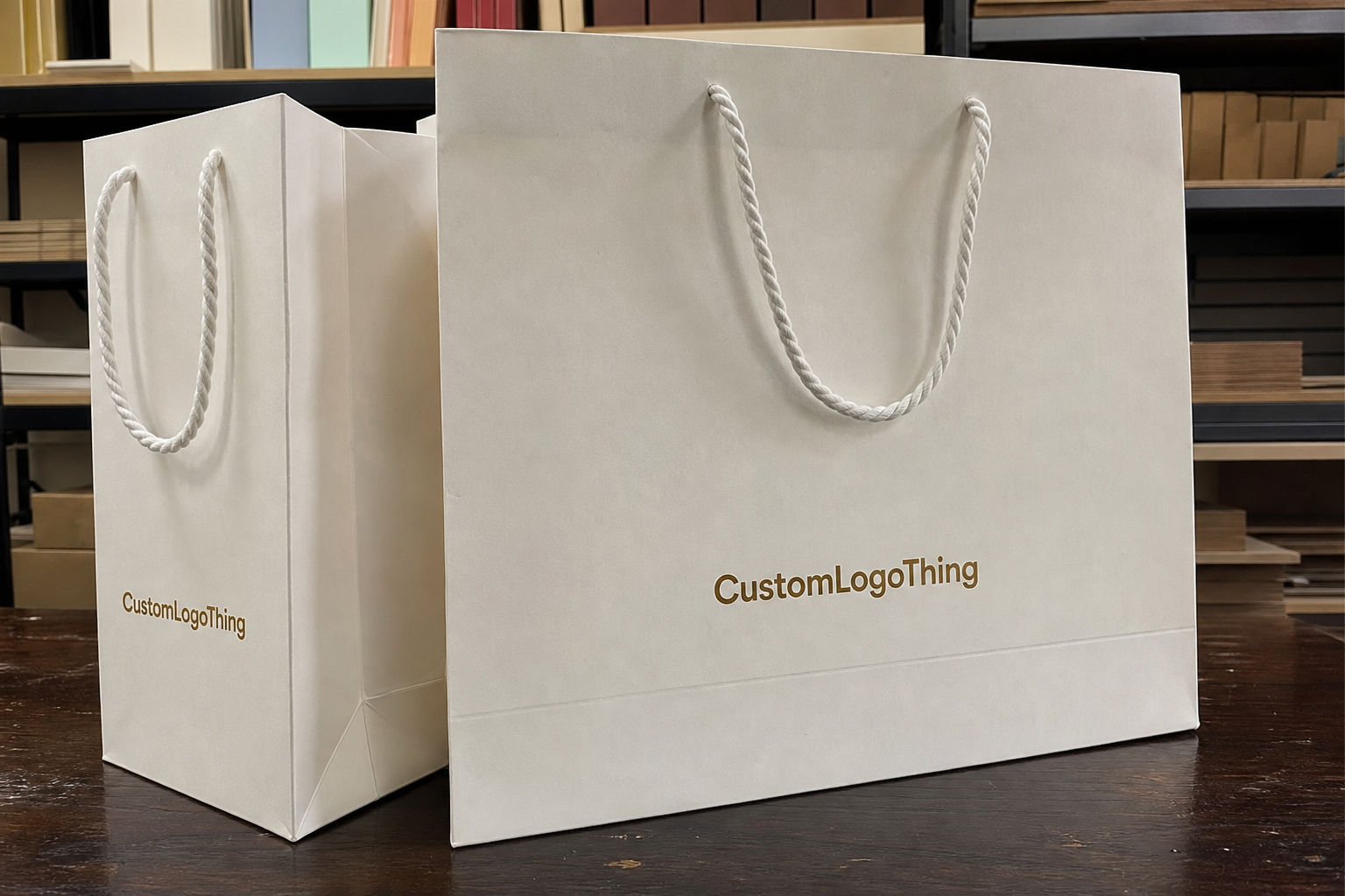
On Frosted Zipper Bags, logo placement is a production decision, not just a design choice. The translucent film softens glare and gives the pouch a premium feel, but it also lowers contrast and makes spacing more important. A logo that looks balanced in a mockup can feel cramped, too faint, or oddly floated once the bag is filled and sealed.
That is why a buyer should judge placement by how the pouch will actually be used: empty, filled, stacked, photographed, and handled in transit. The goal is simple. The logo should read clearly without fighting the zipper, seals, gussets, or product fill.
Frosted Zipper Bags Logo Placement Guide: What Stands Out
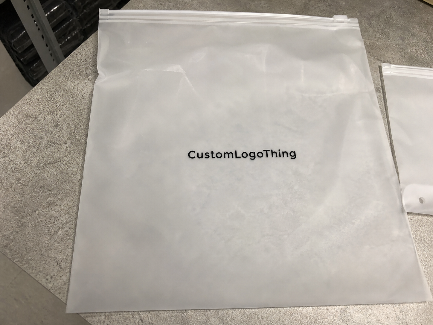
Frosted film has a softer visual character than clear film. It hides fingerprints better, reduces glare, and makes simple graphics feel cleaner. It also reduces sharp contrast, so thin lettering and pale colors need more care than they would on a white carton or opaque bag.
Center-front is the most straightforward placement and usually the easiest to read on shelf. Lower-center can feel more restrained and premium when the product should stay visually dominant. Back-panel placement works well when the front needs to stay minimal for photography, ingredients, or compliance information. None of these is automatically best; the right choice depends on the package role.
Spacing matters more on frosted bags than many teams expect. The logo needs room from the zipper track, top seal, side seams, and any gusset expansion. If the art is pushed too close to hardware, it can look crowded even when the file is technically centered.
"A good logo placement on frosted packaging should look planned, not pasted on."
The practical test is whether the layout still feels deliberate after the bag is filled, photographed at an angle, and packed with other units. If it only looks good in a flat file, the placement is not finished.
How Logo Placement Works on Frosted Film
Frosted film scatters light, which is part of the appeal and part of the challenge. Dark inks usually hold their shape well. White ink can look strong too, but it needs clean registration and proper underbase control. Very fine lines, small type, and pale colors can lose authority once the artwork is printed on translucent material.
Material structure matters as well. Many retail pouches use PET/PE or matte BOPP constructions, and print response can vary by thickness and finish. A common total structure may fall around 100 to 140 microns, but the right number is less important than the actual build and print method. Buyers should ask for a proof on the intended substrate, not just a generic mockup.
The bag itself limits the usable print area. Zipper tracks take space at the top, heat seals reduce height, and gussets change how the pouch sits on shelf. A layout that looks centered on paper can still fail once those constraints are measured into the real bag dimensions.
Viewing angle changes readability too. Straight-on, a logo may look clear. Tilt the pouch and thin type can fade into the frosted texture. Good proofs show the bag both empty and filled, because product color and density can change how the mark reads.
For that reason, buyers should ask for a true-to-size proof whenever possible. It reduces the chance of approving a logo that only works in ideal lighting and on an empty pouch.
Cost and Pricing Factors That Change the Quote
Placement affects price because it affects the production setup. One clean logo on one side is simpler than a wraparound layout or a front-and-back print. Print colors, ink coverage, artwork complexity, and number of locations all change the quote.
As a broad reference, a simple one-color logo on a 5,000-piece order may fall around $0.18-$0.28 per bag, depending on size, material, and coverage. Add another color, larger ink areas, or a second print location, and the price often moves into the $0.25-$0.45 range. Small runs usually cost more per unit, often $0.45-$1.10+, because setup is spread across fewer bags. These are directional figures, not fixed offers, but they help spot quotes that are far outside normal range.
Setup costs also matter. Plates, screens, proofing, and sample runs can add to the total if they are not included in the first estimate. A design that needs a white underbase or tight registration usually takes more control than a basic spot-color logo.
Print method changes economics too. Flexographic printing is often efficient for larger runs with simple spot colors. Gravure suits high-volume work where consistency matters, but cylinder cost makes it less attractive for smaller orders. Digital printing can reduce setup friction on short runs or changing artwork, though it may not be the lowest-cost option at scale.
Lead time affects price because rush work limits scheduling flexibility. Multiple revision rounds can also increase cost if the placement has to shift to clear the zipper, seals, or gussets. The easiest quote to approve is usually the one that comes with complete dimensions, clear print locations, and a clean logo file.
| Placement option | Visual effect | Production complexity | Typical quote impact |
|---|---|---|---|
| Center-front | Strong shelf read, clean for photos | Low to moderate | Usually the most economical single-location option |
| Lower-right or lower-center | Product stays visually dominant | Low | Often similar to center-front if artwork is simple |
| Back-panel | Supports compliance text, QR codes, secondary branding | Moderate | Can increase setup if paired with front printing |
| Side gusset | Visible in stacked or angled displays | Higher | Frequently needs extra proofing and tighter tolerances |
When comparing quotes, ask for a line-item breakdown: bag specification, print method, number of colors, placement count, setup fee, and shipping assumption. That usually shows whether the difference is coming from material, process, or simply a different interpretation of the artwork.
Production Steps and Lead Time
Most custom orders move through the same flow: artwork intake, placement review, proof, revision if needed, production, inspection, and shipment. The process is quick when the buyer sends complete information and slows down when the supplier has to guess about dimensions or safe zones.
Vector artwork in AI, EPS, or editable PDF form is easiest to scale without rebuilding the file. Raster art can work, but cleanup adds time and risk, especially when the design includes small text or fine line work.
For a standard order, proofing may take one to two days if the files are ready. Production often lands around 12-15 business days after proof approval, though quantity, print method, and factory workload can change that. If a sample approval is required, add time. If the deadline is tight, pricing and placement flexibility usually narrow.
Material availability can also affect timing. A common size frosted bag may move faster than a custom width, unusual zipper color, or special finish. The zipper style matters too because track depth, tear-notch placement, and hang-hole options all affect the available print field.
The most useful first message is short and complete: bag dimensions, quantity, print location, logo file, deadline, and any product-filling details. If the pouch will carry dark or dense product, say so. That can change the visual background behind the print area and the best placement choice.
Good proofing conversations are usually simple: exact measurements, clear placement, written approval. That is what keeps an order on schedule.
Best Placement Zones for Different Packaging Goals
Different packaging goals call for different logo positions. If the bag needs a fast retail read, center-front is the clearest option. That is especially useful for small-format items that may only be seen briefly on shelf or in ecommerce thumbnails.
If the product itself should stay in focus, lower-center or lower-right keeps the branding present without taking over the composition. That approach often suits specialty foods, skincare refills, and sample packs where a calmer layout feels more premium.
Back-panel printing is useful when the front must stay clean for photography, ingredients, QR codes, or compliance text. It also works well when the pouch will appear in product listings but the reverse side becomes visible after opening.
Side gussets need special caution. They may look fine in a flat proof and behave differently once the pouch is filled and folded. Artwork can stretch visually or disappear when the gusset compresses. Zipper-adjacent zones can work, but only when the printer confirms the clearance.
A simple decision path helps:
- Retail display: choose center-front or upper-center for the quickest read.
- Premium presentation: choose lower-center or a restrained offset for a calmer look.
- Functional packaging: choose back-panel or a compact front mark to keep product visible.
- Sample kits and mailers: choose the side that photographs best during unboxing.
The right placement depends on the bag's job. A snack pouch, a cosmetic refill bag, and a tea sample pack do not need the same visual hierarchy.
Step-by-Step Logo Placement Workflow
Start with the bag specification, not the mockup. The printable field is always smaller than the total pouch size once the zipper, heat seals, seams, and gussets are removed from the equation. If the supplier has a safe-zone drawing, use it. If not, ask for one before approval.
- Confirm dimensions. Check width, height, gusset depth, zipper style, and seal location.
- Mark the safe zone. Keep art away from hardware, seals, and fold lines.
- Scale the logo. Test at least two sizes to see how the mark behaves on film.
- Check contrast. Compare the logo against the frosted surface and the likely product fill.
- Review in context. View the pouch front-on and at a slight angle.
- Approve in writing. Lock the final placement before production starts.
If the design is complex, a physical sample is the safest route. If that is not realistic, ask for a true-to-size proof with exact measurements and clear placement boundaries. A vague approval invites trouble. A four-millimeter shift can be enough to make a logo feel cramped against the zipper.
A practical rule: if the artwork already feels tight in the proof, it will feel tighter on the final pouch. Leave more breathing room than your first instinct suggests.
For retail programs, QC should check more than appearance. Ask whether the bag still reads after compression in a master carton, whether the print rubs when stacked, and whether the surface scuffs under bright light. A pouch that passes a desktop proof but fails transit is not production-ready.
Common Mistakes That Reduce Logo Clarity
The most common mistake is placing the logo too close to a seam or zipper track. Those areas move and compress differently from the flat center panel, so a mark that looks tidy in a layout file can feel unstable once the pouch is made.
Another problem is shrinking the logo until it depends on the frosted film to carry visibility. The film gives the bag its character, but it does not make tiny text easier to read. If the design includes a tagline or registration mark, test it at the actual print size.
Low contrast is a recurring issue. Pale ink on frosted material can look elegant in a presentation and muddy on the shelf. The same thing happens with overly detailed artwork: thin outlines, busy icons, and stacked text can disappear once the surface diffuses light.
Screen-only approval creates false confidence. Monitors sharpen art and hide texture. Printed bags do the opposite. They reveal spacing problems, weak contrast, and placement errors that a digital mockup hides.
Fill level is also easy to overlook. A logo that looks strong on an empty pouch can lose clarity once the contents sit behind it. Dark or textured product can change the background enough to affect readability.
Most of these issues come from approving artwork before thinking through handling and fill. One earlier check usually saves a reprint later.
Expert Tips Before You Request a Quote
If speed matters, send the supplier five things at once: vector artwork, exact bag dimensions, quantity, preferred print zone, and delivery deadline. That removes most of the back-and-forth that slows custom pouch work.
Ask for three items before approving the job: a placement proof, a pricing breakdown, and a timeline estimate. If the design is subtle, light-colored, or meant for premium retail, ask whether a sample run is worth it. Short-run testing is not always necessary, but it can be useful when the logo depends on fine detail or exact color behavior on frosted film.
Material pairing matters too. If the bag is part of a larger kit with cartons, inserts, or outer mailers, those elements should support the same visual logic. If sustainability claims are part of the brief, align the packaging stack early and check whether any paper components should be FSC-certified.
It also helps to confirm practical tolerances. Ask whether the printer wants a minimum line thickness, minimum text size, or a preferred amount of clear space around the logo. Those thresholds are not cosmetic details; they determine whether the artwork prints cleanly.
My working checklist is short:
- Send the logo in vector form.
- State whether the bag is retail-facing or fulfillment-only.
- Ask where the safe zone begins and ends.
- Confirm whether one side or both sides will print.
- Approve only after seeing a true-to-size proof.
That approach treats placement as packaging design, not decoration, and it usually produces a more reliable result.
Where should a logo go on frosted zipper bags for the best visibility?
Center-front usually gives the strongest shelf read and the clearest photo result. Lower-center or lower-right can work when the product itself should stay visually dominant. Keep the artwork away from seams, zipper tracks, and gussets unless the printer has confirmed those areas are safe.
Does frosted film change how logo colors look on the bag?
Yes. Frosted film softens contrast, so colors often look less crisp than they do on screen. Darker inks and fuller coverage usually hold better than pale or highly detailed artwork. A proof on the actual bag material is the best way to judge the final appearance.
What affects the cost of frosted zipper bags with a logo?
The main drivers are quantity, number of print colors, print coverage, and placement count. Setup fees, proofing, and sample runs can raise the price quickly. Rush timelines and low-volume orders usually increase the per-bag cost as well.
How long does logo proofing and production usually take?
Proofing can move quickly if you submit clean vector artwork and exact bag dimensions. Revisions add time, especially if the placement needs to shift for a safe zone. Production timing depends on quantity, print method, material availability, and whether a sample approval is required.
What should I send before asking for a frosted bag quote?
Send your logo file, bag dimensions, quantity, preferred print location, and target deadline. Include any color requirements and a reference image if you have one. The more specific your placement details are, the faster the quote and proofing process usually goes.
The clearest takeaway from this Frosted Zipper Bags logo placement guide is practical: placement should be judged by how the bag behaves, not just how the artwork looks in a file. Frosted film can make a package feel refined, but only if the logo has enough contrast, the safe zone is respected, and the design still reads after filling and shipping.