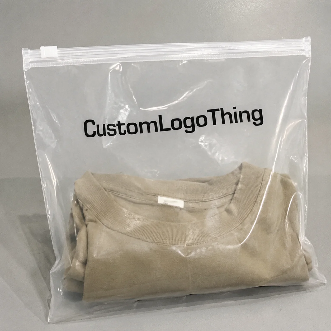
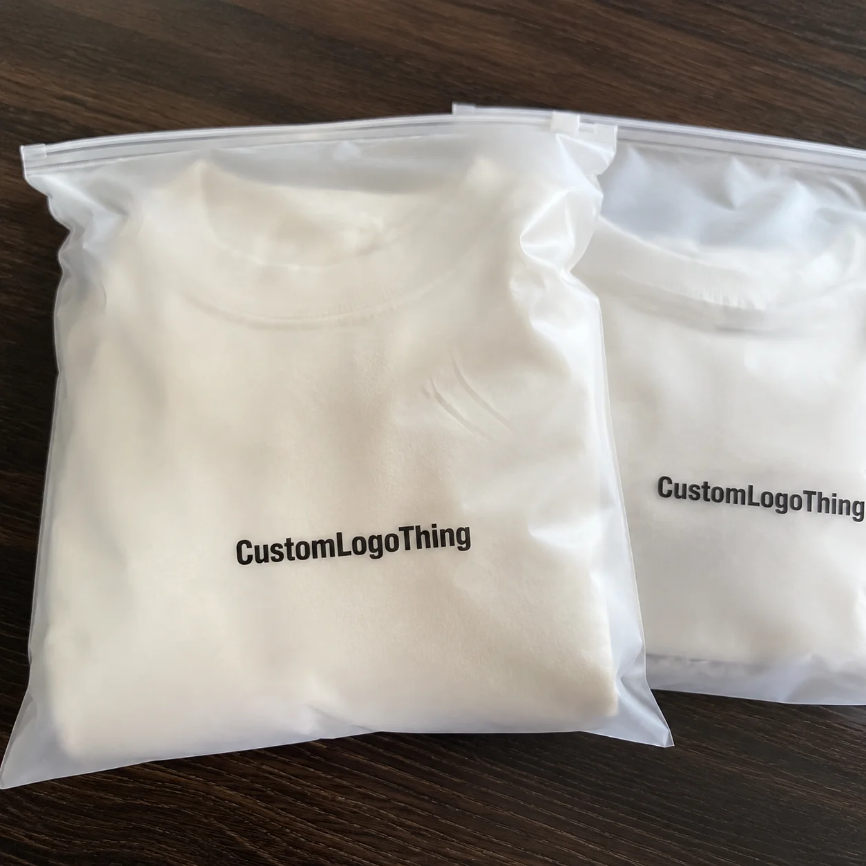
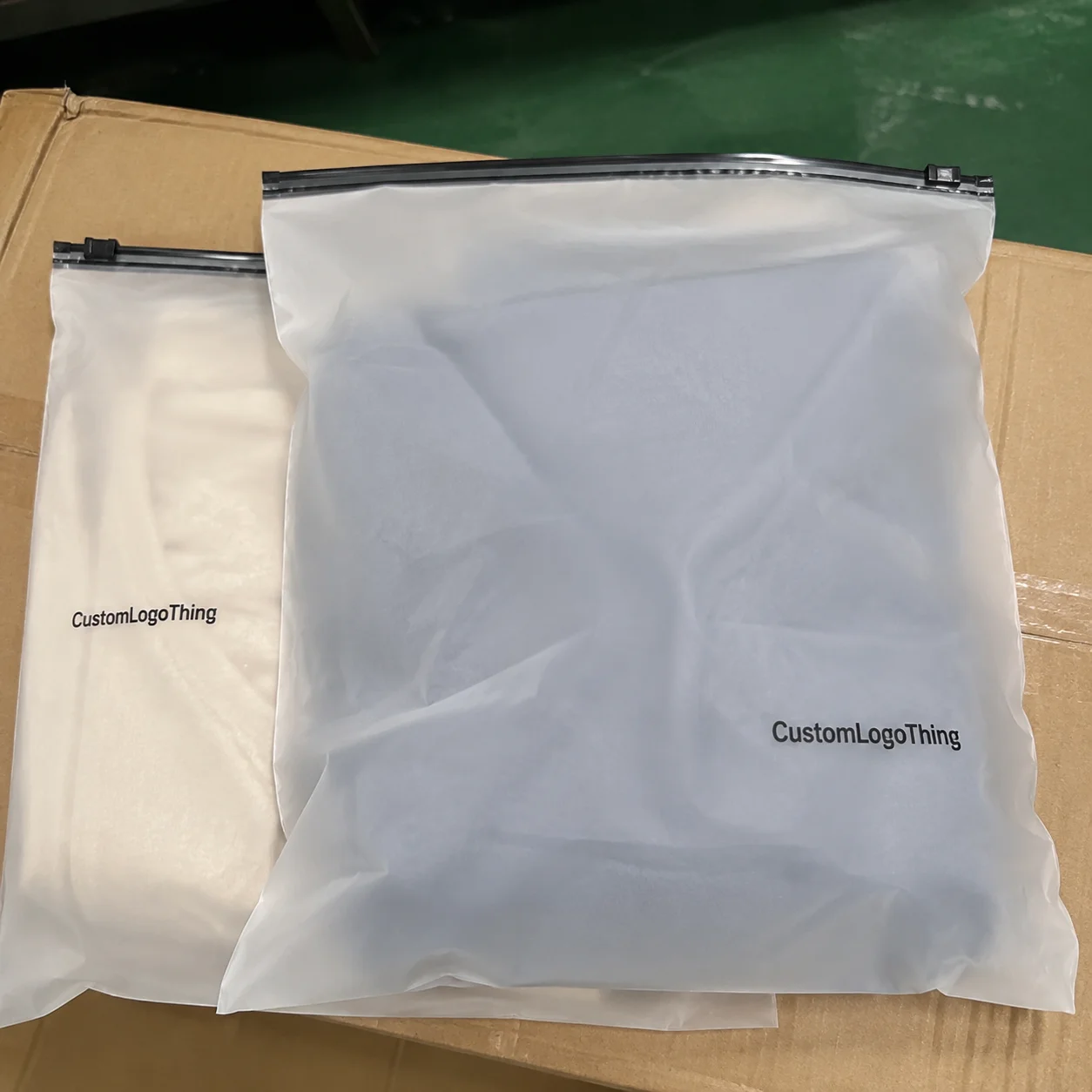
Reviewing Garment Poly Bags for Gift shops artwork proof checklist items is rarely hard because the artwork is complicated. It is hard because the bag looks simple. That simplicity fools people into approving too quickly, and that is usually where the expensive mistake slips through.
Gift shop bags do a lot of quiet work. They protect folded apparel, keep small items organized, and make the shelf look cleaner than it really is. A clear sleeve, a printed retail bag, or a lightweight poly mailer-style presentation bag can all look fine on screen and still fail in production if the dimensions, print method, or copy were not checked against the actual substrate.
The proof stage is where most avoidable problems show up. A logo that sits too close to a seal zone. A barcode that scans poorly because it is too small. A warning line that disappears because nobody noticed it was dropped from the latest file. None of that is dramatic. It is just expensive.
Why proof failures happen more often than press errors
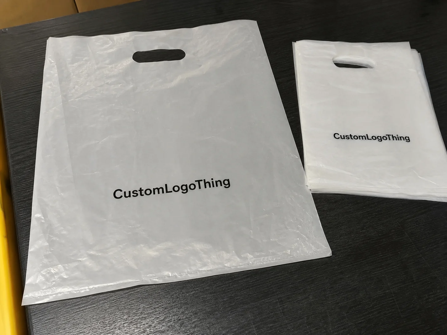
Buyers usually expect the press run to be the risky part. In practice, the proof is where the bad assumptions get locked in. Once a layout is approved, the same mistake gets repeated across every bag in the run.
That matters more with gift shop packaging than with a lot of other retail items. These bags are often thin, transparent, and visually unforgiving. If the artwork is a few millimeters off, the human eye notices immediately because the bag is meant to look clean and lightweight. There is nowhere for sloppy placement to hide.
Another issue is that gift shop programs often move fast. Seasonal assortments, tourist traffic, event launches, and store resets all create pressure to sign off early. The pressure is real. The mistake is letting schedule pressure replace file review.
From a buyer’s side, proofing should confirm:
- finished dimensions and true printable area
- copy accuracy, warnings, and barcode placement
- color references and print method
- seal zones, hang holes, and safe margins
- how the bag will actually look on shelf and in hand
That last point gets skipped more often than it should. A layout can be technically correct and still look awkward on a peg hook or in a basket near checkout. Gift shop shoppers notice presentation first, technical precision second. Sometimes not even second.
“A good proof does not just show the artwork. It shows where the job can fail.”
How the artwork proof process actually moves from file to approval
The process usually starts with source files: logo art, product copy, size specs, and any compliance language. A prepress or production team checks the file for basic issues first. Missing fonts. Low-resolution images. Wrong dimensions. Color builds that may not print cleanly on film. Those are the usual suspects.
Then comes the digital proof. Usually a PDF. Sometimes a rendered layout. It shows placement, proportion, and copy. It is useful, but it is not a finished product. A proof can show where the art goes. It cannot fully show how an ink will behave on clear polyethylene, or how a white underprint will change the look once the bag is filled.
Flexographic printing and gravure printing both need clean files, but not in exactly the same way. With flexo, vector logos are safer than flattened low-res images, and fonts should be outlined or embedded so nothing shifts when production opens the file. With gravure, separations and color control matter even more because sloppy source art tends to get amplified in cylinder prep. There is no magic rescue phase later.
Color approval is where many jobs start to drift. Buyers often ask for a “match” without clarifying whether they mean exact Pantone reproduction, a close visual match, or a tolerable retail approximation. Those are not the same thing. They affect ink mixing, proof method, and whether a press check is needed.
Slow approvals also affect lead time in a very boring, very real way. If a buyer takes three days to answer one proof question, that can push the job behind other work already lined up for film, cylinders, or press time. Production teams do not like guessing. Guessing is how a job gets remade.
For brands coordinating multiple packaging formats, it can help to keep the bag program visually aligned with other retail items such as Custom Packaging Products and, in some cases, matching carry or shipping materials like Custom Poly Mailers when the goal is a consistent look across product lines.
| Proof stage | What it confirms | What it does not fully confirm |
|---|---|---|
| Digital layout proof | Placement, copy, dimensions, safe zones | Exact ink behavior, sheen, and feel on the actual film |
| Color proof | Brand direction and approximate color intent | Final press match under every lighting condition |
| Press-ready approval | Release for production | Design issues that were already signed off |
Specs that change cost, color, and shelf performance
Film thickness is one of the first things that changes price. Buyers may hear it called gauge or mil. Thicker film usually feels stronger, resists punctures better, and looks a little more premium, but it also costs more. For gift shop garment bags, common thickness ranges are roughly 1.25 mil to 2.5 mil depending on size, product weight, and how polished the shelf display needs to look.
Size matters just as much. A bag meant for a folded T-shirt will not behave like one for a scarf, plush accessory, or bundled souvenir set. Fold style, header area, adhesive strip, hang hole, and vent holes can all shrink the usable print area. If the design crosses a fold or lands too close to a seal, the finished bag can look off-center even when the proof looked fine.
Print coverage is another cost driver. A small one-color logo on clear film is not the same job as a full-coverage retail graphic with white ink, metallic accents, or print on both sides. Each added color usually increases setup time, ink control, and the chance of registration drift. White ink matters a lot on transparent film because it keeps the logo visible instead of letting it disappear into the product behind it.
Quantity changes the quote just as much. MOQ, setup charges, plate costs, and cylinder costs can make a 5,000-piece run look much more expensive per unit than a 20,000-piece run, even if the bag itself barely changes. The first run usually carries the heaviest setup burden. That is normal. It is not a vendor trick. It is just how the math works.
Here is a basic way to compare common cost factors:
| Spec | Lower-cost choice | Higher-cost choice | Typical effect |
|---|---|---|---|
| Film thickness | 1.25-1.5 mil | 2.0-2.5 mil | More durability, higher material spend |
| Print coverage | Small one-color logo | Full-coverage multi-color art | More setup and ink control |
| Print sides | Single-side print | Front and back print | Extra press time and registration checks |
| Quantity | Small MOQ | Higher volume run | Unit price usually drops with volume |
If the supplier is handling recycled content claims, paper inserts, or broader packaging standards, ask what documentation is actually available. Sometimes people toss around sustainability language like it is interchangeable with compliance. It is not. If the package needs to align with broader packaging guidance, sources such as the Institute of Packaging Professionals can be useful for reference. For transit testing or carton validation, many teams also rely on ISTA methods when finished goods need to survive shipping, not just sit nicely on a shelf.
Garment poly bags for gift shops artwork proof checklist
Use this checklist in order. It is faster than hopping around the proof randomly and then discovering the one thing that matters most was missed.
- Confirm finished dimensions. Check width, length, gusset if present, and the actual printable area, not just the nominal bag size.
- Mark safe zones. Make sure no text, barcode, or icon sits inside seal areas, punch holes, or trim-sensitive edges.
- Read every word. Spelling, SKU text, care instructions, product claims, and country-of-origin notes need a line-by-line check.
- Check color callouts. Confirm Pantone references, acceptable tolerances, and whether the supplier is matching to a standard or approximating a brand tone.
- Review logo scale. A logo can look fine in a mockup and still be too small to read once printed on clear film.
- Inspect white ink needs. On transparent film, ask whether white underprint is needed behind the logo or text.
- Verify barcode placement. Barcodes need quiet zones, enough contrast, and a location that stays scannable after folding or hanging.
- Ask for front and back views. If the bag has copy on both sides, get both sides shown on the proof.
- Check finish notes. Gloss, matte, soft-touch, and adhesive strip details should all match the intended build.
- Document the approved version. Save the final proof number and version date with the PO so there is no confusion later.
A good proof should also show warning text, recycled-content notes, or retailer-specific language clearly enough to read without zooming in until your screen looks like a microscope. If that text is tucked into a corner, it may be technically present and practically useless. The law does not care that it was hard to see.
Print the proof if possible. Review it at roughly actual size. Screens forgive too much. On paper, the balance of the layout, the readability of small type, and the placement of visual elements become much easier to judge.
For clear bags, ask a simple question: is the artwork being built for a transparent background or for a white flood behind the design? Those are different jobs. A black logo on a clean white proof can vanish once the bag is filled with a dark garment or a busy souvenir set.
Timelines and lead time after proof approval
A typical timeline starts with artwork prep, then proof creation, revision rounds if needed, final approval, material procurement, printing, converting, and packing. Straightforward jobs can move in about 12-15 business days after proof approval, but that depends on queue length, material availability, and whether tooling or film is already on hand. If someone promises a fixed lead time without seeing the art, treat that number carefully.
Revisions are what stretch schedules. A typo fix is quick. A legal text change is not. Barcode redesigns, color corrections, or a bag size change can trigger a new proof cycle. If the job also needs a custom size, special closure, or specific venting, sourcing can take longer because those parts are not always sitting ready to use.
Gift shops feel this timing pressure more than most people realize. Seasonal launches do not wait. Tourist traffic does not wait. Store reset dates do not wait. If the bags show up late, the packaging program misses the moment it was built for.
Work backward from the shelf date, not forward from the purchase order. Build in at least one proof cycle plus extra time for internal sign-off, file cleanup, and the usual back-and-forth that comes with any retail packaging job. That buffer is not wasted time. It is the part that keeps the order from slipping.
Proofing mistakes that lead to reprints
The first common mistake is approving low-resolution artwork and expecting crisp print on thin film. Fine lines, small type, and detailed logos do not always survive that treatment. Clear film makes the problem more obvious because contrast is already working against you.
The second mistake is forgetting how transparency changes color. Dark artwork can sink into the background without white underprint. Light colors can disappear completely if the product behind the bag is busy or dark. If brand color matters, ask how the design will behave on the actual substrate, not on a white paper proof that has almost nothing in common with the final bag.
Third, trim-line shifts can move artwork closer to the edge or seal zone than expected. A design that looked centered in the file may end up a few millimeters off after converting and sealing. That is enough to make the bag look poorly made, even if the press run itself is technically clean.
Fourth, people treat monitor color like final color. It is not. Screen calibration, file compression, and CMYK conversion all affect how the artwork appears. The final ink on poly film will still have its own character. If exact match is critical, ask for production color notes and set tolerance before the order is released.
Fifth, gift shop assortments often include multiple SKUs, and one master layout does not always fit all of them. A bag for folded apparel may need different text placement than a smaller sleeve for accessories, even if the branding stays the same. Reusing art without adjusting proportions is a fast way to make the line look inconsistent on shelf.
Practical tips for clean approvals and better retail display
The cleanest approvals happen when design, purchasing, and operations are looking at the same version. If each team is checking a different PDF, somebody will assume somebody else already caught the problem. That assumption is usually the mistake.
Keep master files in editable vector format whenever possible. Label them by size, version, and quantity. Name the proof file clearly enough that nobody has to guess which revision is current. A folder full of nearly identical file names is not a system. It is a trap.
Ask for a physical sample or press-ready simulation when the design depends on transparency, sheen, or white ink behavior. Some bags look acceptable digitally and still need a hands-on review before release. If the final look matters for a premium gift shop display, the extra check is usually worth it.
Match the bag style to the item being packed. A garment sleeve for folded apparel needs a different width-to-length relationship than a giftable accessory bag. If the bag is too tall or too narrow, the product can look awkward or undersized on the shelf. Good retail presentation is part graphics and part fit.
Think about what the shopper sees first. Brand, product, or warning text? That answer should decide hierarchy on the proof. If the warning text dominates, the bag can feel compliance-heavy instead of retail-friendly. If the logo is too small, the bag feels generic. The layout needs to support both readability and presentation.
Keep a clean record of approved specs for reorders. Thickness, print method, color targets, sealing style, and special notes about transparency or scannability should live with the PO, not in somebody’s inbox. Reorders go faster when the old proof is the baseline instead of a vague memory.
Final check before you release the order
Before you approve the final run, gather the finished size, final artwork files, compliance copy, and quantity target in one place. Then run the proof against that list line by line. If anything does not match, stop and request a revision. Hoping the press team will fix it later is a great way to buy scrap.
Create one sign-off path so design, marketing, and purchasing all approve the same version. Separate approvals on separate drafts create confusion. Confusion creates rework. The approved proof should be the single source of truth, saved with the PO and easy to find when it is time to reorder.
It also helps to compare the proof to the actual retail setting. Will the bag hang on a peg, sit in a basket, or be stacked near the register? Will the shopper see the front first or the back? Those details decide whether the artwork feels polished or merely acceptable. There is a difference.
If anything is unclear, ask for clarification immediately and document the change. That paper trail matters when the same bag gets used across seasons or product lines. This is where the Garment Poly Bags for gift shops artwork proof checklist earns its keep: fewer assumptions, fewer revisions, fewer costly surprises.
What should I check first in garment poly bags for gift shops artwork proof checklist?
Start with the bag size, the printable area, and whether the logo fits inside the safe zone. Then confirm spelling, colors, and warning or compliance text before spending time on smaller design details.
How long does the proof and approval process usually take?
Simple artwork can move quickly, but revisions, color questions, and compliance edits can add time. The timeline depends on proof rounds, production queue, material availability, and order complexity.
Why does the price change so much between similar plastic bag quotes?
Cost is affected by bag size, film thickness, print colors, number of sides printed, and order quantity. Setup charges and MOQ rules can make a small run far more expensive per unit than a larger run.
Do clear garment poly bags need white ink under the artwork?
Usually, yes, if the design needs to stay visible on transparent film or preserve brand color contrast. Without white ink, dark or detailed artwork can look muted or disappear against the product inside.
What is the safest way to approve a final proof for a gift shop order?
Check dimensions, copy, placement, color notes, and production notes on the same version. Save the approved proof with the PO and have every stakeholder confirm the exact revision before release.