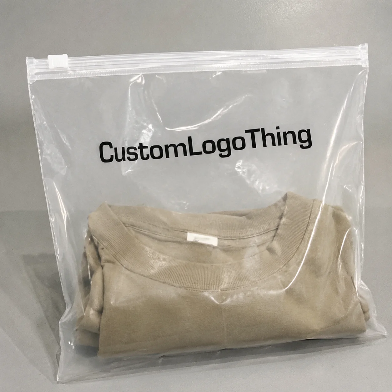
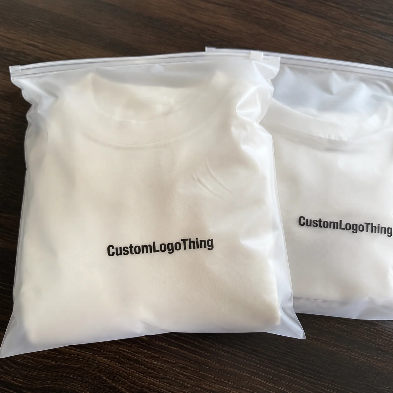
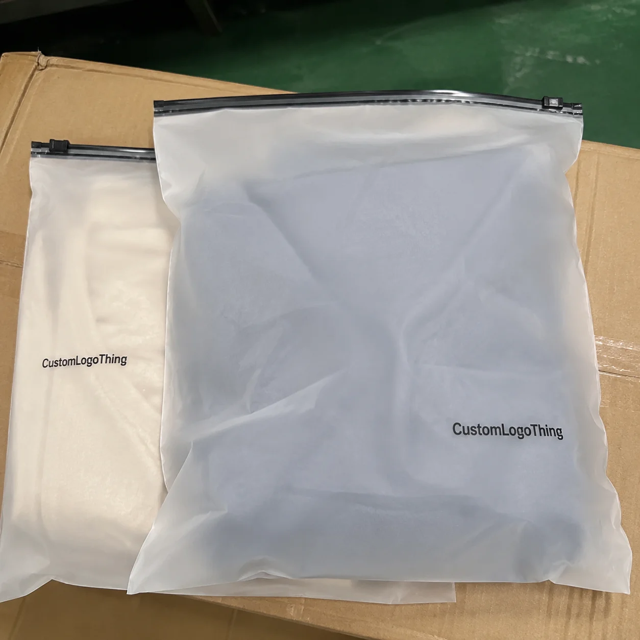
Why print placement changes the unboxing and brand impact
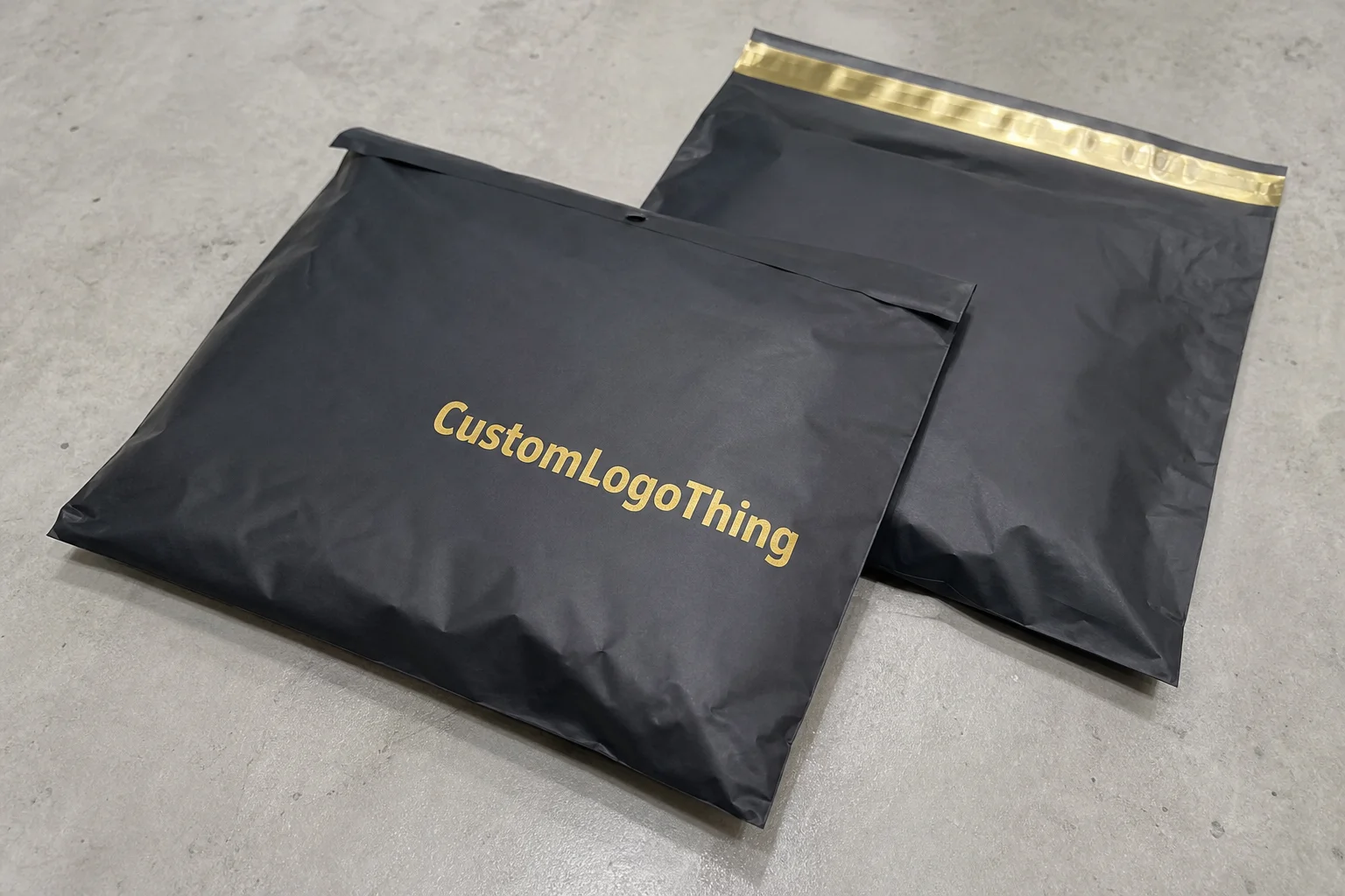
Garment Poly Bags for ecommerce brands print placement guide sounds technical because it is technical. The bag looks simple. The setup is not. A logo, a seal line, a folded garment, warning copy, and maybe a hang hole all have to share the same piece of film without turning the package into clutter.
Garment Poly Bags are the clear, frosted, or tinted plastic bags used to protect folded apparel during storage, shipment, and handling. In ecommerce, they do more than keep dust off the product. They also shape the first impression a customer gets before the apparel is even touched. If the print sits in the wrong spot, that impression drops fast.
A logo can be perfectly on-brand and still look weak if it lands too close to a seam, too low on the front panel, or partly hidden by the fold of the garment. That is the annoying part. The artwork is “right,” but the bag still reads wrong. Buyers usually notice this only after approving a proof that looked fine on screen and looked cramped in production.
Good placement also affects how quickly fulfillment teams work. A clear, predictable front panel makes packing faster because staff do not have to rotate each bag or double-check where branding sits. That sounds minor. It adds up quickly on high-volume apparel orders.
If you are comparing packaging formats, a well-planned poly bag can also support coordinated items like Custom Packaging Products or inserts. The point is not decoration for decoration’s sake. The point is consistent presentation, clearer brand recognition, and fewer surprises once production starts.
For ecommerce brands, that makes placement a design decision and an operations decision at the same time. Ignore either side and the bag ends up looking half-finished.
How printed poly bag graphics are applied in production
Most printed poly bags follow a familiar production path. Artwork gets prepared first. Then the supplier confirms the film type, bag dimensions, and live print zone. After that comes plate or screen setup for flexographic printing, or a digital setup for shorter runs. Printing, curing or drying, sealing, and inspection follow. The order matters because a bag that looks clean in a mockup can still misbehave on real film under real heat.
Film quality changes the result more than many buyers expect. A 1.5 mil bag with high clarity can make a logo look sharp. Slight haze softens edges and reduces contrast. That is fine if the brand wants a softer look, but it is not fine if the logo depends on crisp definition. The same artwork can feel premium on one substrate and dull on another.
Ink choice matters too. Spot colors tend to hold brand consistency well for repeat orders, especially when the logo must match across multiple SKUs. CMYK or digital printing is better when the artwork includes gradients, more complex graphics, or small type that would be awkward to break into separate spot colors. Flexographic printing is still common for higher-volume runs because it becomes efficient once setup is locked.
Buyers often use “printing” as a catch-all term, but the method affects registration tolerance, waste, and how much proofing the job needs. Offset printing is usually associated with paper packaging, not poly film. For bags, the realistic choices are flexo or digital. That distinction matters because the supplier needs to know whether the design is meant for short-run flexibility or long-run repeatability.
Some layouts are easier to control than others. A single centered logo on the front panel is straightforward. A design that wraps near a gusset, crosses a warning panel, or sits close to a top-seal area needs tighter alignment and a cleaner handoff between art and production. More print zones usually mean more setup time and more chances for a small shift to show up in the final bag.
Key factors that affect placement, visibility, and brand impact
Bag dimensions are only the starting point. The folded garment inside changes the final look more than many people expect. A T-shirt, hoodie, or sweater does not sit the same way in a bag. Thickness changes the visible area. So does fold style. A logo that looks centered on a flat dieline may drift once the product is packed.
Live space is not the same as flat space. Header area, bottom seals, hang holes, perforations, and suffocation warnings all reduce the printable zone. On a top-seal bag, the usable area can shrink more than expected once seal allowances are added. If a hang hole lands too close to the mark, the eye goes to the hole first. Not great for branding.
Viewing distance changes how the layout reads. A design that looks balanced at arm’s length on a computer screen may feel tiny in a warehouse photo or crowded when held by a customer. Clear film can also make the product underneath part of the visual design, which is useful until the garment color clashes with the ink. Frosted film hides some of that noise and usually feels more polished. Glossy clear film shows every ripple, fingerprint, and fold. Charming in theory. Less charming in a fulfillment line.
Color contrast deserves more attention than it gets. Black ink on frosted clear film usually reads cleanly. Light gray on clear film can disappear if the garment underneath is busy or dark. If you are using spot color for a logo, check the contrast against the actual apparel color, not against a white screen. Screens lie. Film does not.
Compliance copy has its own rules. Warning text, retailer requirements, barcode labels, and recycled-content statements need room to breathe. They should not fight the brand mark for attention. Better layouts give compliance a separate lane so the logo still feels like the hero and the bag still passes review without looking crowded.
That is why the bag should be treated as a communication surface, not just a container. If the visible area is planned properly, the logo stays readable, the packaging looks intentional, and the pack-out process becomes easier to repeat.
For terminology and general packaging best practices, references from the Institute of Packaging Professionals can be useful, especially if your team is defining print zones, compliance language, or quality checks for the first time.
Step-by-step print placement workflow from artwork to approved proof
Good placement starts before anybody opens a design file. First define the bag size, garment type, fold style, and the exact viewing moment you care about most. Some brands want the logo visible as soon as the parcel is opened. Others care more about how the bag looks on a retail shelf or in a warehouse stack. Those are different goals, and the print layout should reflect that.
Next comes the live-area map. The supplier should mark seal lines, folds, hang holes, perforations, warning zones, and no-print regions. That map is more useful than a flat bag sketch because it shows what can actually be printed and what only looks printable. A lot of artwork problems start when someone designs right up to the edge because the blank drawing makes the space look bigger than it is.
Then the artwork should be placed at true scale. Margins need to be measured, not eyeballed. A logo that sits 6 mm from a seal line on paper but only 2 mm after production allowances is a problem waiting to happen. If the bag includes barcode labels, recycled-content statements, or suffocation warnings, those elements need to be spaced carefully so they stay readable after sealing and handling.
After that comes the digital proof. It helps, but it is still only a preview. If placement is important, ask for a physical sample or press proof on the same film finish that will be used in production. Clear film, frosted film, and matte-treated surfaces can all change how ink density reads. Fine type is especially sensitive. So are light CMYK builds and thin line work.
A clean approval process usually looks like this:
- Define the product — bag size, garment type, fold method, and packing style.
- Map the safe zone — show seal lines, holes, warnings, and no-print areas.
- Place artwork at true scale — check the visible area, not the full flat bag.
- Verify readability — confirm logo, warning text, and barcode clarity.
- Approve the sample — confirm orientation in the packed state, not just on a screen.
- Lock the spec — document the approved layout for reorders.
One practical detail gets missed all the time: the fulfillment team may fold apparel differently from the sample used during design. That shift is enough to change where the logo appears in the finished pack. So the pack-out method should be part of the proof approval, not a separate conversation later.
Cost, pricing, and MOQ factors that influence your print layout
Print placement affects price more than buyers usually expect. It is not just “where should the logo go?” It is also how many colors are used, how much of the bag is covered, whether the design prints on one panel or multiple surfaces, and whether the layout fits standard production settings. A one-color centered logo is usually cheaper than a layout that wraps, uses several spot colors, or combines branding with dense compliance blocks.
Minimum order quantities matter because setup costs get spread across fewer bags. Those costs can include art prep, plate or screen creation, registration checks, and the waste that comes from dialing in the first run. A 5,000-piece order and a 25,000-piece order can land in very different unit-price bands for the same reason. Volume changes the math.
For basic buyer context, a simple branded bag might fall around $0.18-$0.28 per unit at 5,000 pieces, depending on size, film type, print coverage, and supplier setup. More complex layouts, higher coverage, or extra colors can push the unit price above that. Those numbers are not fixed. They move with material thickness, ink count, and timing.
| Print layout option | Typical setup complexity | Relative unit cost | Best use case |
|---|---|---|---|
| Single centered logo | Low | Lower | High-volume ecommerce basics |
| Logo plus compliance panel | Medium | Moderate | Most apparel shipping bags |
| Multi-color front print | Medium to high | Higher | Premium brand presentation |
| Front, back, and gusset print | High | Highest | Retail-forward or promotional packaging |
MOQ strategy matters too. A complex layout that looks great on a presentation board can become expensive and slow if the brand needs seasonal versions, multiple SKUs, or regional variations. Sometimes simplifying the print placement or reducing the color count protects the look while improving efficiency. That is usually the smarter move than forcing a complicated design that creates waste and delays approval.
If you are comparing supplier options, review Case Studies for examples where layout decisions improved pack-out speed or reduced waste. Good packaging buying is not only about the lowest quote. It is about the total cost of getting the bag to look right every time.
Lead time and delivery steps for branded garment poly bags
A typical timeline starts with artwork intake, then proofing, revisions, production scheduling, printing, drying or curing, inspection, and shipping. Straightforward repeat orders can sometimes move in about 12-15 business days after proof approval, though queue position and material availability can change that. New layouts usually take longer because the placement needs more review.
Custom placements add time for a few practical reasons. The supplier may need new plates, registration adjustments, a test on a specific film, or a check to make sure warning text stays readable after sealing. If the chosen film gauge or finish is backordered, the job waits. Good art cannot outrun missing material.
Ink matching can also slow the process. One-color jobs are often quicker to stabilize than multi-color builds, especially when the artwork includes small text or tight line work. Digital printing can shorten setup for smaller runs, but the film finish and pack-out orientation still need to be verified. Fast is useful. Fast and wrong is expensive.
For a launch or seasonal drop, build in a buffer. That gives room for a revision to logo position or compliance copy without putting the schedule at risk. If your packaging program includes other branded film items such as Custom Poly Mailers, coordinate lead times across the full set instead of treating each item as independent.
To make reorders faster, keep a spec sheet for the approved version. Include bag size, film type, print method, ink colors, live-area measurements, and the exact placement coordinates. Reorders move more cleanly when nobody has to reconstruct the layout from memory or from an old email thread that nobody wants to read again.
For broader material and sustainability references, the EPA and FSC can be helpful when your packaging decisions involve recycled content goals, disposal guidance, or material sourcing policies. That does not make a plastic bag magically sustainable. It does help teams make cleaner decisions about inputs and claims.
Common print placement mistakes that make bags look unpolished
The easiest mistake is placing the logo too close to the top seal. Once the bag is closed, folded, or stacked, the mark gets partially hidden and the package loses visual strength. This happens a lot when teams design from the flat bag only and never check the packed state. The result is technically acceptable and visually disappointing. A lovely combo.
Another common problem is artwork that is too large for the visible area. Big graphics can look bold on a mockup, but on the real bag they crop awkwardly, crowd compliance text, or run into the edges once the garment is inside. A smaller, cleaner layout often feels more premium because it leaves breathing room.
Transparent film creates its own traps. The color of the folded garment underneath changes how the ink reads. A medium-gray logo over a dark tee can disappear faster than expected. That is why proofing against the actual product color matters. If the sample is tested only on white paper or a blank render, the finished bag may still be wrong.
Compliance text gets mangled when it is squeezed into decorative space or shoved too close to edge seals. Mandatory copy needs room, plain and simple. It should not compete with branding. It should not be forced into the weakest corner of the layout just to keep the front panel looking empty.
The last mistake is relying only on a screen mockup. Digital renders hide small alignment shifts, finish differences, and registration issues that show up immediately on a physical sample. One real sample can save a lot of waste. It also saves awkward conversations later, which is a nice bonus.
Expert tips for better placement and faster reorders
Start with one primary print zone that stays visible both in the packed and unpacked state. That is the simplest way to make a garment bag feel polished without stuffing the surface with extra graphics. Secondary branding should only be added if it serves a real function, such as compliance, SKU identification, or retailer handling.
Ask for a live-area template before finalizing the artwork. The template should show seal margins, folds, warning boundaries, and no-print areas. It keeps the designer and the supplier working from the same map, which is usually all it takes to avoid a round of placement corrections. It also makes reorders faster because the approved dimensions are already documented.
If the team is split between two layouts, test them side by side. One version may be centered for shelf presence, while the other sits slightly higher for pack-out visibility. The right choice often becomes obvious once the bag is shown with the actual folded garment inside. Mockups help. Real product tells the truth.
Keep a spec sheet for every approved version. Record bag size, film type, print method, ink colors, live-area measurements, and whether the run used flexographic printing or digital printing. The more exact the documentation, the less likely the next reorder drifts from the original approval.
It also helps to review real packaging examples before locking a format. Browsing Case Studies or comparing other product formats on Custom Packaging Products makes it easier to see how different layouts behave once they are packed and shipped.
My practical rule: if the artwork still looks good when the bag is full, folded, and sitting under warehouse lighting, the placement is probably right.
That test is simple, but it catches more problems than most approval checklists.
FAQs
Where should the logo go on garment poly bags for ecommerce brands?
Place the logo in the area most visible after folding and sealing, usually centered or upper-front if seal lines allow it. Keep a clear distance from edges, seams, perforations, and warning text. A live-area template is the best way to confirm the final visible position.
Does print placement change the cost of garment poly bags?
Yes. Wider coverage, multiple sides, and extra colors usually increase unit cost. Complex placements can also add setup, proofing, and waste, which affects the quote. Simple, well-planned artwork is often the more economical choice.
How long does it take to produce printed garment poly bags?
Timeline depends on artwork approval, setup, printing method, and the current production queue. Simple repeat orders are usually faster than new placements that need fresh proofing or tooling. Build in extra time for samples and any revisions to the placement.
What is the safest printable area on a garment poly bag?
The safest area is the live print zone away from seals, folds, hang holes, and perforations. Your supplier should provide a dieline or spec sheet showing safe margins. Always verify the area with a real sample, not just a digital proof.
Can I print both branding and compliance text on the same bag?
Yes, but the layout has to keep mandatory text readable and separate from the logo. Compliance copy should not be squeezed into decorative zones or near edge seals. Plan both elements together early so the final bag looks intentional and stays compliant.