Buyer Fit Snapshot
| Best fit | To Layered Logo Packaging Prints projects where brand print, material claims, artwork control, MOQ, and repeat-order consistency need to be specified before quoting. |
|---|---|
| Quote inputs | Share finished size, material target, print colors, finish, packing count, annual reorder estimate, ship-to region, and any compliance wording. |
| Proofing check | Approve dieline scale, logo placement, barcode or warning zones, color tolerance, closure strength, and carton packing before bulk production. |
| Main risk | Vague material claims, crowded artwork, missing packing details, or unclear freight terms can make a low unit price expensive after revisions. |
Fast answer: To Layered Logo Packaging Prints: Artwork Proof, Packing Count, and Landed Cost should be specified like a repeatable production item. The safest quote records material, print method, finish, artwork proof, packing count, and reorder notes in one written spec.
Production checks before approval
Compare the actual filled-product size with the drawing, then confirm tolerance on folds, seals, hang holes, label areas, and retail display edges. Reserve space for logos, QR codes, warning copy, and material claims before decorative graphics fill the panel.
Quote comparison points
Review material grade, print process, finish, sampling route, tooling charges, carton quantity, and freight assumptions side by side. A quote is only useful when the supplier can repeat the same color, closure quality, and packing count on the next order.
A plain box can move product. A layered logo packaging print can change how the product is read before the seal is broken. I have watched buyers pick up one package, set it down, and then come back to the version with the better finish stack because it felt more resolved in hand. That is not decoration trivia. It affects shelf presence, shipping perception, and the unboxing moment, which now does a surprising amount of brand work. A solid guide to layered logo packaging prints should make that split obvious: one version blends in, the other signals value before anyone lifts the lid.
For Custom Logo Things, the real question is rarely whether layered effects look better. They usually do. The practical question is which layered logo packaging prints fit the substrate, the run size, and the budget without turning a packaging order into a small factory experiment. A useful guide to layered logo packaging prints has to answer that part honestly, because packaging lives in the physical world, not inside a mockup.
Custom Packaging Products are easier to sort through once you understand what each finish layer is doing, what it adds to cost, and how it behaves after stacking, transit, and handling. A finish that looks elegant under studio lights can get scratched by a mail carrier's sort tray or scuffed when a carton slides across a warehouse belt. That detail matters more than most mood boards admit, and it is one reason a guide to layered logo packaging prints has to balance aesthetics with durability.
What a Guide to Layered Logo Packaging Prints Covers
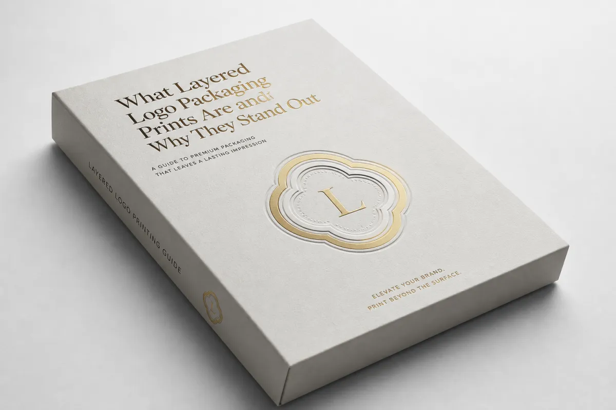
Picture two mailer boxes on the same table. Same footprint. Same product category. Same general color family. One uses a flat logo in a single pass. The other uses layered logo packaging prints with a matte field, a gloss highlight, and a raised accent around the mark. The second one feels more deliberate before anyone opens it. That reaction is exactly why layered logo packaging prints show up so often in premium product packaging and retail packaging.
At the basic level, layered logo packaging prints combine ink, coating, texture, and finishing steps to create depth, contrast, or tactile interest. The effect can be subtle, like soft-touch stock with spot UV on the logo, or more dramatic, like foil stamping paired with embossing. The point is not to cram in effects for the sake of it. Strong layered logo packaging prints make the logo easier to spot, easier to photograph, and easier to remember after the box is gone.
This approach works especially well on rigid boxes, Custom Printed Boxes, folding cartons, sleeves, labels, and limited-edition packaging. Flat print still has a place. A crowded category changes the equation. When dozens of packages sit within the same visual field, hierarchy matters. Buyers notice the logo faster. Retail staff can identify the brand from across an aisle. Customers are more likely to keep the box if the object itself feels worth keeping. A guide to layered logo packaging prints has to account for that, because the package is both an object and a signal.
Not every brand needs the same depth of treatment. A skincare line chasing quiet luxury may only need layered logo packaging prints with tone-on-tone varnish and a restrained emboss. A launch kit or gift set may need foil plus a second finish layer to pull attention on shelf. Taste plays a role, sure. Strategy plays a bigger one. So does budget, and so does the way the package has to perform in the real world.
A layered logo should support the brand story, not wrestle with it. If the mark needs six effects to become visible, the packaging design is probably doing too much.
Good layered logo packaging prints usually solve one clear visual job. The logo might need to feel refined, technical, handmade, loud, or quietly expensive. The finish stack should reinforce that job instead of scattering attention. People skip that step all the time. The result feels expensive in individual parts and awkward as a whole, like a suit with shoes from a different decade.
For teams building branded packaging from scratch, the smartest move is to map the logo against the product and the channel. A box built for ecommerce shipping needs scuff resistance and durable layers. A shelf carton needs legibility from three to six feet away. A luxury rigid box may need enough finish depth to photograph well, because the unboxing clip now does part of the selling. The same layered logo packaging prints can work across all three, but the balance changes every time. That is the useful part of a guide to layered logo packaging prints: it turns an abstract style choice into a channel decision.
If premium is the goal, restraint usually wins. Two layers done well beat five layers done badly. That sounds plain because it is. The packaging world ignores that lesson often enough to make it worth repeating, especially when a guide to layered logo packaging prints gets mistaken for a checklist of effects instead of a decision tool.
How Does a Guide to Layered Logo Packaging Prints Work?
The mechanics behind layered logo packaging prints are not mysterious. They are just easy to underestimate. A typical build starts with a base print layer, then adds a second ink pass, a varnish, a foil layer, or a raised finish. The printer has to control opacity, registration, and surface behavior at the same time. If those pieces line up, the logo feels intentional. If they drift, the effect looks sloppy instead of premium. A crooked foil edge on a luxury box can feel like a loose thread on a tailored coat.
Registration matters more than most buyers expect. A small offset in the top layer can blur edges, push highlights out of place, and steal control from fine detail. On a dense design, that misalignment can disappear on screen and jump out in hand. Layered logo packaging prints reward simple shapes, steady spacing, and artwork built for the substrate, not just the render. That is one reason a guide to layered logo packaging prints should emphasize production constraints early, not after the concept deck is already approved.
There are a few common methods. Overprinting puts one ink on top of another to build a darker or richer mark. Spot finishing isolates the logo and applies gloss, matte, or varnish only where it matters. Mixed-material effects combine substrate texture with print and finishing, which is why kraft board, coated SBS, and rigid board all behave differently. A logo that reads cleanly on coated paperboard may flatten on textured stock. That is not a flaw. It is material science showing up on schedule.
The surface changes the result quickly. Coated stocks hold crisp detail and strong contrast. Uncoated stocks absorb more ink and soften edges. Textured stocks can make a minimal layered effect feel handcrafted, and they can also swallow fine details whole. Dark substrates often need an opaque underbase or a stronger finish stack. Without that planning, the logo can disappear into the background and the package loses presence before it reaches the buyer's hands.
Imagine a black rigid box with a matte base print. Add a gloss black logo on top. On paper, the idea sounds understated. In hand, the contrast comes from reflection, not color. The mark appears when the box catches room light, which is exactly what a premium presentation box should do. That kind of behavior is the core of a strong guide to layered logo packaging prints: appearance is only half the story, and light does the other half.
Testing deserves a seat at the table too. Packaging that looks beautiful and fails in transit is not premium. It is expensive confetti. ISTA's testing protocols help because they focus on handling, vibration, and drop conditions instead of wishful thinking. A basic reference point from the ISTA standards forces teams to think beyond artwork and into performance, where the box actually earns its keep.
Sustainability can complicate the stack in a useful way. If the packaging needs recycled content or certified fiber, the finish plan has to work with that requirement instead of fighting it. That is where material planning and sourcing discipline matter. If certified board is part of the brief, FSC-aligned options are worth reviewing early through FSC. A better board choice early on usually saves a painful redesign later, and a guide to layered logo packaging prints should treat that as part of design, not a separate procurement problem.
Key Factors That Change Quality, Cost, and Price
The cost of layered logo packaging prints comes down to a few predictable variables, and none of them are glamorous. Number of layers. Finish type. Print coverage. Substrate choice. Setup complexity. Order volume. Those six items explain most of the pricing spread across quotes. A buyer who compares only the final number is comparing shadows, not inputs. Two quotes can look far apart while describing entirely different jobs. A good guide to layered logo packaging prints keeps those inputs visible so the budget conversation stays honest.
Small runs cost more per unit because the setup work gets spread across fewer pieces. That setup includes file prep, press calibration, die setup, sample approval, and finishing alignment. A run of 500 boxes can still be a custom production puzzle, even when the order seems modest. A run of 5,000 absorbs setup more efficiently, which is why the per-unit price usually drops as quantities rise. This is one of packaging's least romantic truths, and it catches people every week.
There is a plain tradeoff here. A two-layer ink build on standard paperboard can be a smart entry point when the goal is clean branding and controlled spend. Foil stamping, embossing, spot UV, and soft-touch lamination raise the price because each added step adds labor, tooling, and quality control. Layered logo packaging prints can absolutely be worth the spend, but every product does not need every effect. The right stack often looks simpler than the first concept deck.
For larger runs, a simple layered treatment might land around $0.18 to $0.45 per unit, depending on coverage, board, and finish passes. A more premium stack with foil, emboss, and soft-touch lamination can move into the $0.65 to $1.50 range or higher, especially on lower quantities or specialty board. Those numbers are planning ranges, not promises. They are still more useful than a glossy quote with no context, and they are a practical checkpoint in any guide to layered logo packaging prints.
Hidden cost traps usually show up late. Custom inks can require minimum orders. Multiple dielines add design time and make the press run harder to manage. Coatings that fight each other can create rework. Color matching across two production steps can trigger extra proofs. Anyone buying premium retail packaging should talk through those issues before the quote goes out, not after the sample is already sitting in someone else's inbox with a note that says "one more tweak."
The cheapest option is not always the smartest budget move. A matte box with a single gloss logo often outperforms a crowded stack of effects that nobody can read from arm's length. From a packaging buyer's point of view, layered logo packaging prints should improve brand recall first. Fancy is allowed. Invisible is wasted money.
| Option | Typical Build | Approx. Unit Cost | Best Use | Main Tradeoff |
|---|---|---|---|---|
| Basic layered print | Two ink layers, limited coverage, standard board | $0.18-$0.45 | Short launches, clean branded packaging | Less tactile impact |
| Mid-tier finish stack | Spot UV or varnish with one accent layer | $0.35-$0.85 | Retail packaging, ecommerce boxes | More setup and proofing |
| Premium stack | Foil, emboss, soft-touch lamination, precision registration | $0.65-$1.50+ | Luxury product packaging, limited editions | Highest tooling and timing burden |
If you are still narrowing the spec, start with the structure of the box first and the finish stack second. Teams reverse that order all the time and end up paying for a treatment that does not suit the packaging format. A cleaner approach is to pick a structural style from Custom Packaging Products, then build layered logo packaging prints around the carton, sleeve, mailer, or rigid box that actually fits the product.
One more practical point: dark colors are not automatically more expensive, but they often demand tighter control. White underprints, heavier ink coverage, or specialty coatings can raise production complexity. That does not make dark branded packaging a bad idea. It just means the quote should reflect the real work, not a fantasy version of the job that lives only in the mockup file.
Step-by-Step Timeline for Layered Logo Packaging Prints
A typical layered logo packaging prints project moves through seven stages: brief, artwork prep, proofing, sampling, approval, production, and shipping. Clean projects stay organized because each stage answers one question before the next stage starts asking for money. Messy projects try to fix the concept halfway through production. That usually ends with overtime, reprints, or a tense email thread nobody wants to archive.
The process starts with a brief that says something useful. "Make it premium" is not enough. Better details include quantity, product type, box style, substrate preference, finish goals, shipping needs, and the intended use case. A brief that includes brand tone and viewing distance helps too. A logo built for close-up influencer content needs a different balance than a logo meant to read across a retail aisle. A guide to layered logo packaging prints gets much more useful once those details are on the table.
Artwork prep comes next. This is where layered logo packaging prints get separated into distinct print or finish layers. The printer checks line weight, contrast, bleed, and registration tolerances. Fine lines that look elegant on a designer's monitor can fail on press if they are too thin for the finishing method. Clean vector files matter for that reason. Raster logos are not impossible, but they make the process slower and riskier.
Proofing follows. Digital proofs help with color and layout, yet they rarely tell the whole story on a layered job. A physical sample gives a better read because it shows how the paperboard behaves, how the logo sits under light, and whether the depth reads from normal viewing distance. For premium product packaging, one sample round is often the minimum sensible step. Skipping it saves a little time and can cost much more later.
Production timing depends on the finish stack. Simple layered logo packaging prints may move from proof approval to production in roughly 7 to 12 business days. Mixed finishes, specialty boards, or complicated tooling can stretch that to 12 to 20 business days or more. Shipping time sits on top of that. If the package has a launch date, the safest move is to build a buffer into the plan instead of hoping the press line gets sentimental.
Delays show up in familiar places. Artwork files arrive incomplete. The die line changes after proofing. A foil decision gets added late. Someone decides the logo should shift two millimeters because the mockup "felt off." All of that can be fixed, but every change pushes the timeline. Layered logo packaging prints are less forgiving than flat print because every finish creates another chance for mismatch.
Packaging teams often ask for a shortcut. There usually is not one. The most reliable way to keep layered work on schedule is to finalize the format early, define the finish stack clearly, and approve the sample with the right people in the room. A layered effect that looks elegant on screen can feel heavy in hand or too faint on textured stock. The sample is the place where those problems reveal themselves, and a practical guide to layered logo packaging prints should say that plainly.
Common Mistakes That Ruin Layered Logo Packaging Prints
The most common mistake is over-layering. More effects do not automatically create better branding. They often create noise. A logo with foil, emboss, spot UV, three ink colors, and a busy background leaves the eye nowhere to rest. Premium packaging starts looking confused fast. Layered logo packaging prints should guide attention, not fight for it like a room full of people talking over each other.
Weak contrast is another classic problem. If the base and top layers are too similar, the depth disappears. The customer sees effort but not hierarchy. Matte on matte can work if the surface shape carries the message. In most cases, though, the design needs a stronger contrast between layers, either through sheen, color, height, or edge definition. Subtle is good. Unreadable is not.
Bad file prep acts like a production tax that never quite stops collecting. Low-resolution art, missing separations, unclear finish callouts, and unflattened effects can trigger delays. A printer can sometimes clean up the mess. That does not mean the file was ready. The best layered logo packaging prints start with clean vector artwork and a layout file that shows exactly what is printed, what is foil, what is raised, and what is left alone.
Ignoring substrate behavior causes another set of problems. A design that looks crisp on coated board may lose clarity on kraft stock or textured paper. A logo that feels elegant on a rigid box may become too faint on a folding carton if the board absorbs too much ink. The packaging format matters. The surface matters. The finish stack matters. Pretending they do not matter is how teams end up paying for a second round of samples they had already hoped to avoid.
The finish fight is real too. Shiny foil on a crowded background with no breathing room usually reads as cheap, even if the materials themselves are expensive. Embossing on an overcrowded front panel can do the same thing. The effect needs negative space. It needs a clear focal point. Without those, the result reads like a list of production tricks rather than a coherent brand statement.
One quick field rule holds up well: if you have to explain the effect before someone appreciates it, the effect is probably too complicated. Strong layered logo packaging prints make the logo understandable in one glance. Weak ones need a tutorial. Nobody buys a box because the box asked for a tutorial.
For teams buying Custom Printed Boxes, simplification is often the best fix. Reduce the number of treatments. Increase the whitespace around the logo. Test a higher-contrast version before approving the fancier option. Many brands discover that a tighter, quieter design performs better because the logo finally has room to breathe and the package stops arguing with itself.
Expert Tips for Better Layered Logo Packaging Prints
Start with one strong focal point. That is the first rule worth giving any brand working through layered logo packaging prints. Decide which surface, panel, or side deserves the most attention, then build the rest of the package around that decision. If every panel is trying to be the hero, nothing is. The box becomes a committee, and committees rarely photograph well.
Use finish contrast before color overload. Matte versus gloss, flat versus raised, smooth versus textured, opaque versus transparent - those contrasts can do more work than a rainbow of ink choices. Texture often acts like a luxury signal because it feels more considered than simply adding more color and hoping for the best. Layered logo packaging prints built on finish contrast also tend to age better, which matters once the package enters a real shelf environment instead of a render file.
Test the logo at the distance where it will actually be seen. A brand manager staring at a 4x zoomed mockup is not the customer. A logo that reads from arm's length on a shelf or in a shipping video is doing its job. If the effect only appears under perfect lighting and a microscope, it is too fragile for practical use.
Keep the rest of the pack quieter if the logo carries the effect. The temptation to decorate everything is strong, especially when a sample looks expensive in isolation. A hero surface with a layered mark and a calmer side panel often feels more premium than a fully dressed box with no hierarchy. Good package branding knows where to stop. Bad package branding keeps adding treatment until the box looks like it wants applause from strangers.
Ask the printer how the effect behaves at scale. Experience beats guesswork here. A finish that looks elegant in a prototype can slow production or increase waste if it needs tight registration or multiple cure stages. The right question is not only "Can you do it?" but "What happens when we run 3,000 or 10,000 units?" That question usually reveals the real cost structure faster than any price sheet.
Material choice should support the final job instead of fighting it. If the brand needs recycled fiber content, ask for board options early. If the box needs to ship well, confirm compression and scuff expectations before the finish stack is locked. Packaging education resources can help frame those decisions, and PMMI and packaging education resources are useful places to compare structural and material choices against your own goals.
Do not let the sample become a moving target. Approve the effect, the substrate, the color, and the size together. If the logo size changes after the finish stack is approved, the balance can shift enough to damage the result. Layered logo packaging prints are sensitive. Treat them like it. A small change in scale can change the entire reading of the front panel, which is why a guide to layered logo packaging prints should always include a sample-first mindset.
Next Steps for Layered Logo Packaging Prints
The next move is straightforward: define the goal, choose one packaging format, and decide whether the priority is shelf impact, unboxing, or premium feel. That sounds basic because it is. Half the packaging problems I see begin with a brief that tries to chase all three without saying which one matters most. Layered logo packaging prints work best when the job is clear from the start.
Build a finish stack brief before you ask for quotes. Include the logo file, substrate choice, quantity, box style, desired effects, and any non-negotiables like FSC-certified board, scuff resistance, or shipping durability. If you are comparing custom printed boxes, ask for the same assumptions in each quote so the numbers are actually comparable. Otherwise, you are comparing guesswork dressed up as pricing.
Get two or three production options side by side. One should be the clean, practical version. One can be the mid-tier upgrade. One can be the premium option if the budget allows it. That gives you a real tradeoff instead of one glossy sample that makes every other path look dull by design. For most brands, the right answer is not the fanciest package. It is the one that balances look, lead time, and unit cost without wasting effort.
Order a physical proof or small pre-production run before committing to a full order. Layered logo packaging prints are judged in hand, not on a PDF, and the differences can be surprisingly large. Lighting, texture, registration, and finish depth all change once the box is built. If the box will live in retail packaging, ecommerce, or a premium gift set, that real-world check is worth the time.
If the product direction is already clear, use that momentum. Pull together the artwork, select the substrate, and choose the finish stack with intent. The best layered logo packaging prints make the package clearer, stronger, and easier to buy from. That is the point. Not noise. Not gimmicks. A box should earn attention, then keep it.
For brands ready to turn the concept into a real order, Custom Packaging Products can help narrow the format and finish choices before the project gets too expensive to redirect. A practical guide to layered logo packaging prints ends with one simple rule: choose one structural format, one focal face, and one finish story, then approve a physical sample before production starts.
What are layered logo packaging prints in simple terms?
They are logo treatments built from multiple print or finish layers that create depth, shine, texture, or contrast. The effect can be subtle, like matte plus gloss, or more dramatic with foil, embossing, or raised ink. The goal is to make the logo feel more premium and more noticeable on the package, which is exactly why a guide to layered logo packaging prints focuses on both style and structure.
How much do layered logo packaging prints usually cost?
Cost depends on layer count, finish type, substrate, quantity, and setup complexity. Small orders usually have a higher per-unit price because setup costs get spread across fewer pieces. A simple layered effect is often the best starting point if you need impact without blowing the budget.
How long does the layered logo packaging prints process take?
A straightforward job can move from proof to production faster than a design with mixed finishes or custom materials. Sampling, approval delays, and artwork revisions are the most common reasons timelines stretch. Build in time for at least one proof round so the final result matches the intent.
What file setup do I need for layered logo packaging prints?
Use clean vector artwork whenever possible so layer separations stay sharp. Label each layer or finish clearly, especially if you are combining color, foil, varnish, or embossing. Ask for printer-specific templates or dielines before you finalize the design.
Can layered logo packaging prints work on short runs?
Yes, but short runs usually cost more per unit because setup is harder to spread out. Simple layered effects are better for low quantities than highly customized multi-finish builds. If the run is small, focus on one strong effect instead of stacking everything at once.


