Buyer Fit Snapshot
| Best fit | Brand Gift Box Inserts projects where brand print, material claims, artwork control, MOQ, and repeat-order consistency need to be specified before quoting. |
|---|---|
| Quote inputs | Share finished size, material target, print colors, finish, packing count, annual reorder estimate, ship-to region, and any compliance wording. |
| Proofing check | Approve dieline scale, logo placement, barcode or warning zones, color tolerance, closure strength, and carton packing before bulk production. |
| Main risk | Vague material claims, crowded artwork, missing packing details, or unclear freight terms can make a low unit price expensive after revisions. |
Fast answer: Brand Gift Box Inserts: Board, Finish, Dieline, and Unit Cost should be specified like a repeatable production item. The safest quote records material, print method, finish, artwork proof, packing count, and reorder notes in one written spec.
Production checks before approval
Compare the actual filled-product size with the drawing, then confirm tolerance on folds, seals, hang holes, label areas, and retail display edges. Reserve space for logos, QR codes, warning copy, and material claims before decorative graphics fill the panel.
Quote comparison points
Review material grade, print process, finish, sampling route, tooling charges, carton quantity, and freight assumptions side by side. A quote is only useful when the supplier can repeat the same color, closure quality, and packing count on the next order.
How to Brand Gift Box Inserts: Design, Cost, Timing
Learning how to brand gift box inserts can change customer perception faster than a full packaging redesign. A mid-priced product inside a well-fitted insert can feel considered and premium. A luxury item in a generic cavity can look unfinished the second the lid comes off.
That gap matters because the insert does three jobs at once. It holds the product securely, shapes the unboxing experience, and tells the customer whether the brand cares about details or just hopes nobody looks too closely. From a packaging buyer’s point of view, the insert is not filler. It is part of the brand signal. The decisions behind it are practical, but the effect is emotional: confidence, anticipation, and stronger brand recognition after the box is opened.
There is also a very ordinary business reason to take it seriously. Inserts affect damage rates, pack-out speed, and whether a product can survive shipping without rattling itself into a return. A pretty insert that fails in transit is just expensive cardboard with opinions.
How to brand gift box inserts: why the insert matters
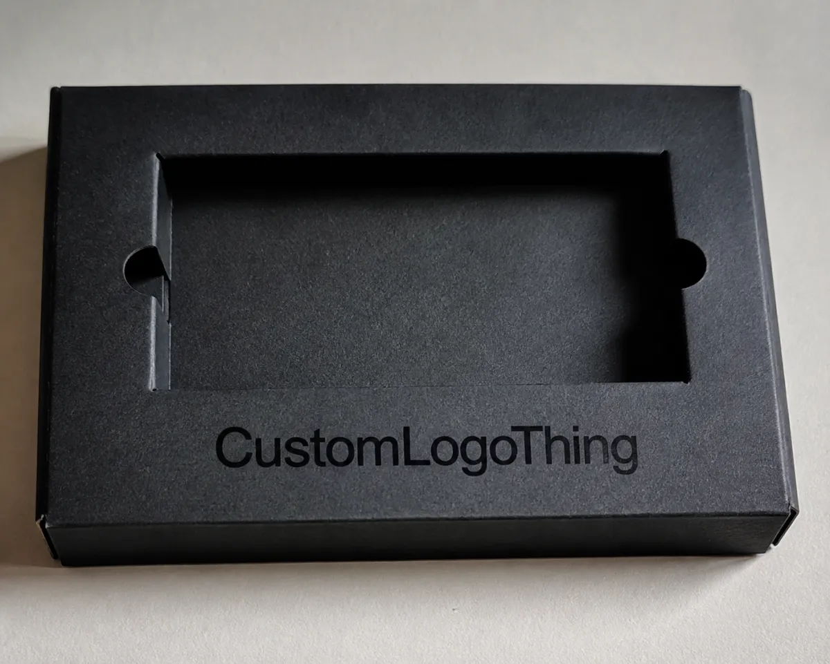
A gift box insert is the structural and visual layer inside the carton that holds the product, protects it, and frames the reveal. It can be a rigid board tray, a molded pulp nest, a paperboard fold, a foam cavity, or a wrapped insert with printed surfaces. Whatever the format, it is often the first material the customer touches after opening the box, which gives it more influence than most brands expect.
The outer box gets the first glance. The insert gets the first interaction. That distinction matters. The lid may carry the logo, but the insert controls whether the product sits still, whether it is easy to remove, and whether the package feels intentional or improvised. A carefully branded insert can make a modest skincare set look polished. A loose, plain insert can make a watch, candle, or tech accessory feel underdeveloped even if the product itself is excellent.
For brands dealing with returns, breakage, or repeat purchases, the insert affects more than presentation. It affects product safety and the odds that the customer remembers the package as “premium” instead of just “pretty.” That is why insert design should be treated as part of the packaging system, not as leftover budget after the main carton is approved.
Before choosing materials or finishes, define the job. Is the insert mainly protecting fragile components? Is it supporting visual branding? Is it meant to educate, upsell, or slow the reveal down? The answer usually includes more than one of those goals. The real work is deciding which one leads.
“The insert is often where the customer decides whether the brand feels deliberate. If it fits badly, the whole package feels cheaper. If it fits well, everything else looks more expensive.”
That is why many teams bring insert planning into the packaging conversation early, alongside structural carton specs and graphics. Brands that wait until the end usually end up with compromises: awkward cutouts, extra assembly labor, or a design that looks fine in a mockup and fails the second a real product is dropped into it.
Buyers run into this in very different scenarios. A DTC cosmetics brand may need a tray that protects glass jars, keeps mascara upright, and gives room for a small instruction card. A corporate gifting program may care more about the first reveal and the premium feel in a boardroom than about transit abuse. A subscription box may need fast, repeatable pack-out more than ornate finishing. The insert has to fit the business model, not just the mood board.
How the branding process works inside the box
Branding an insert is not just about printing a logo on a surface. It is a system. The die-cut shape, cavity sizing, surface finish, color use, typography, and brand details all work together. If one piece is off, the whole experience feels less controlled.
Think of the insert as stage design. The product should be revealed in a specific order, with the most important element seen first and the less important details arranged behind it. A good insert directs the eye. It can place the product at a slight angle, create a clean border around the item, or leave a message panel visible before the product is lifted out. That ordering changes how customers read the package.
There are several ways to brand the interior without turning it into a shouting match:
- Debossed or embossed logos for a subtle tactile mark
- Printed liners for brand color, pattern, or campaign messaging
- Foil stamping on a small logo panel or message strip
- Custom cutouts that mirror the product silhouette
- QR codes that route to setup instructions, registration, or care content
- Color-matched foam or pulp when the product needs higher protection and a consistent look
The difference between functional branding and decorative branding is easy to miss. Functional branding helps the customer use the product, understand the brand, or remove the item safely. Decorative branding raises the emotional value. The best inserts do both. A QR code linking to a product tutorial may not feel glamorous, but if it cuts setup frustration, it improves the brand experience far more than another line of copy would.
Consistency matters here too. The insert should not look like it came from a separate brand. Color cues, typography, icon style, and tone should echo the outer carton, labels, website, and any retail display materials. That is how brand consistency becomes visible rather than theoretical. If your product pages use restrained typography and clean spacing, an insert packed with slogans and clip-art-style icons will create visual friction the customer notices immediately.
Brands that already have a packaging system often use the interior to extend that system rather than rebuild it. A fragrance brand may keep the exterior quiet and elegant, then use a pattern or short message inside the tray. A supplement or wellness brand may choose a technical, organized structure with clear product slots and a clean instruction panel. The interior should fit the message, not fight it.
There is a line here, and it matters. Not every insert needs to be printed edge to edge. In some categories, an unprinted natural board or a plain molded pulp tray feels more credible than a busy interior. Eco-focused buyers often notice that difference immediately. A recycled-looking surface can support the brand story, but only if the claim is honest and the finish matches the rest of the pack. If you are using recycled board, say so only when the spec actually supports it.
Key factors that shape a branded insert
The first decision is material. It changes almost everything: price, tactile feel, protection level, print quality, and sustainability story. Paperboard is usually the lightest and most economical option for small items. Corrugated board works well when the product needs more cushioning or a stronger backbone. Molded pulp offers a natural look and better shock resistance than many buyers expect. Foam creates precise cavities and is often used when the product shape is irregular or the breakage risk is high. Wrapped rigid board sits higher on the premium scale and gives the most polished interior surface.
Product weight and fragility should drive the structure, not the other way around. A 200-gram cosmetic jar and a 1.2-kilogram gift set do not belong in the same insert design. Nor do a glass bottle and a metal accessory. The heavier or more fragile the item, the more the insert should prioritize restraint and support over decorative freedom. If the product shifts during transit, the customer may never care how nice the printing is because the item arrives damaged.
Color strategy matters more than many teams expect. Using brand palette colors can strengthen recognition, but full-color interiors are not always the smartest choice. Sometimes a neutral insert lets the product stand out better. Sometimes a deep contrast color gives the reveal more drama. White on white can feel clean, but it can also flatten the presentation. A muted black, kraft, gray, or brand-tinted surface can create visual separation between product and box, which is especially useful in photography and retail displays.
Print and finish choices add another layer. CMYK printing is flexible, but Pantone matching may be worth the cost if the insert must precisely echo a signature brand color. Soft-touch lamination creates a smooth, subdued finish and tends to read as premium in hand. Spot UV can highlight a logo or short line without flooding the whole piece with gloss. Foil, embossing, and debossing each add tactile distinction, but they should be used sparingly. Overdoing finish effects can make the insert feel busy, and busy usually reads as cheaper than expected.
Brand voice belongs inside the box too. Copy length, tone, and icon style all affect perception. A short welcome line can feel warmer than a paragraph. A care note can be more useful than a slogan. A QR code may save space and reduce clutter. The question is not what else can be printed. The question is what deserves to be printed here.
For sustainability-minded brands, material selection can also support the environmental story. FSC-certified board, recyclable paperboard, molded pulp, and minimal plastic can all reinforce a cleaner packaging position. If that matters for your product line, it helps to understand standards and sourcing claims directly from an authority such as FSC. For transit and performance questions, packaging teams often look to test protocols and methods from organizations such as the International Safe Transit Association. Those references do not replace design judgment, but they do give useful guardrails.
Insert types at a glance
| Insert type | Typical unit cost range | Best for | Branding potential | Typical lead time |
|---|---|---|---|---|
| Paperboard insert | $0.20-$0.60 | Lightweight cosmetics, stationery, small gifts | Print, color blocking, die-cut shape | 10-15 business days after proof approval |
| Corrugated insert | $0.35-$0.90 | Sets with moderate protection needs | Print, liners, simple coatings | 12-18 business days |
| Molded pulp insert | $0.40-$1.20 | Eco-focused programs, fragile items | Color-matching, embossing, minimal print | 15-25 business days |
| Foam insert | $0.60-$2.00 | High-protection, custom-shaped products | Wrapped surfaces, cut precision, limited print | 15-30 business days |
| Wrapped rigid insert | $0.80-$2.50+ | Premium gifts, luxury presentation | High-end finishing, full-color wrap, foil | 18-35 business days |
These ranges are not universal quotes. They are planning numbers. Quantity, cavity depth, finish complexity, and freight distance can move the final price significantly. Still, the table helps separate the options by intent. If a brand needs a premium interior for a launch box, it will usually sit in a different tier than a simple mailer insert for a small accessory.
One more practical detail: some finishes change recyclability. Lamination, heavy adhesive coverage, metal foil, or foam inserts may affect how a package is handled in local recycling streams. That does not make those options bad. It just means the sustainability story should be accurate instead of decorative. Buyers get burned when a supplier promises “eco-friendly” without defining what that means in real terms.
Step-by-step guide to brand gift box inserts
Step 1: Define the goal. Decide whether the insert exists to protect, present, educate, or upsell. A launch kit for a skincare routine may need clear product separation and instruction space. A gift box for a limited-edition candle may need visual drama and fragrance storytelling. A subscription box may need repeatable structure more than ornate presentation. The goal shapes everything downstream.
Step 2: Measure the product precisely. Measure the product itself, then map the interior dimensions of the box. Allow for tolerances, packaging sleeves, caps, seals, and any small protrusions. A difference of even 2-3 mm can create rattling or make removal annoying. If the product varies slightly across batches, build in enough forgiveness so the insert does not become obsolete after one production run.
Step 3: Build the visual concept. Align the insert with brand colors, typography, logo placement, and message hierarchy. Decide what the customer should notice first. Maybe it is the product silhouette. Maybe it is a printed welcome panel. Maybe it is a hidden message under the tray. A clean concept usually beats a crowded one. If the outer carton already carries bold graphics, the insert may work better as a quieter extension of the same visual language.
Step 4: Choose the production method. Ask for dielines, digital proofs, and samples before approving the final build. This is the point where many packaging programs save money later. A proper dieline catches cavity mistakes before tooling starts. A digital proof verifies layout and copy. A sample shows whether the finish, color density, and structural support actually work in hand.
Step 5: Test the unboxing experience. Put real products into the insert and watch the sequence from the customer’s side. Is the product easy to remove without damage? Does it sit level? Does the insert photograph well in natural light and studio light? Does the interior create a strong first impression or just hide the product? A useful test is to record a simple unboxing video and check where the eye goes first.
Step 6: Finalize the artwork and notes. Once the structure is approved, document the details clearly: material grade, finish, Pantone references, print side, glue locations, tolerances, and pack-out instructions. This prevents variation across reorders. It also makes the next launch easier because the vendor can repeat the design instead of reinterpreting it.
Brands that manage multiple SKUs should consider building a shared insert system, then adjusting only the cavity or graphic panel per product. That saves time and can reduce setup complexity. It also supports brand consistency across product lines. If you want to see how this type of packaging thinking plays out in real projects, our case studies show how structure and branding can work together without adding unnecessary complexity.
For teams with a product line that changes often, modularity is worth a look. A standard tray size with swappable sleeves, top cards, or cavity components can keep tooling costs under control while still giving each SKU a distinct presentation. That approach is common in cosmetics, candles, electronics accessories, and gift sets where the hero product changes but the box size does not.
Process, timeline, and production steps
The production path from brief to delivery usually follows a predictable sequence: discovery, dieline development, artwork setup, proofing, sampling, revisions, production, finishing, and shipping. The exact order can vary, but the pressure points stay the same. The more customized the insert, the more time each step can take.
Simple branded inserts may move fairly quickly if an existing dieline can be adapted. Fully custom inserts often need more time because the cavity shape, board thickness, print layout, and assembly method all have to be coordinated. Color-matched materials can add another layer, especially if the supplier needs to source a specific stock rather than use something standard.
Typical timing depends on three variables: how close the design is to standard tooling, how many approval rounds are needed, and whether the supplier is making the insert in-house or sourcing components. Lead times also stretch when a launch lands near peak season or when a brand is ordering multiple SKUs at once.
The most common delay points are not dramatic. They are small and procedural:
- Artwork revisions arriving after dielines are already approved
- Measurements changing after the product pack-out has been finalized
- Sample feedback coming in late because too many stakeholders are involved
- Special finishes requiring extra setup or a separate production run
- Freight timing slipping because the packaging was approved too close to launch
That is why experienced packaging teams build a buffer. If the insert is required for a holiday launch, a retailer planogram update, or a seasonal gift set, it should not be treated as the last item on the schedule. The insert often becomes the bottleneck precisely because it depends on the final product dimensions, the approved carton size, and the chosen branding method.
There is also a difference between internal approval time and actual manufacturing time. A supplier may quote 12 business days, but if three rounds of internal comments add a week, the schedule is already moving. Good planning means separating the two. The factory clock starts after approval, not when the idea is first discussed.
Brands that want stricter performance testing should ask for transit validation that references accepted methods such as ASTM or ISTA protocols. That is especially useful for ecommerce programs, where drops, vibration, and compression matter more than shelf appeal alone. A well-branded insert that fails in shipment creates a cost problem, not just a presentation problem.
If the program needs retail display as well as shipping protection, the testing brief should cover both. A tray can pass a drop test and still look awkward on shelf if the product tilts too far or the printed face gets buried. That is a common miss. Packaging teams sometimes optimize for one environment and accidentally make the other worse.
Cost, pricing, MOQ, and quote planning
Price is usually driven by five factors: material choice, insert complexity, print coverage, finishing, and volume. Tooling or die costs can also matter, especially when the design is highly customized. If the insert needs multiple cavities, angled supports, or hand assembly, the quote will climb quickly.
MOQ, or minimum order quantity, is the number of units a supplier requires to make the job economical. In plain language, small runs cost more per unit because the setup work gets spread across fewer pieces. A 500-unit run of a premium insert can feel expensive next to a 5,000-unit order, but that does not mean the supplier is overcharging. It usually means the setup burden is being carried by a much smaller batch.
From a budgeting standpoint, it helps to think in tiers rather than exact line items:
- Entry tier: simple paperboard or corrugated inserts, one-color print, minimal finish
- Mid tier: branded inserts with better board, color-matched surfaces, selective finishing
- Premium tier: wrapped rigid structures, foil, embossing, custom cavities, more assembly
When comparing quotes, ask vendors to separate setup, tooling, sample fees, freight, and unit price. Otherwise, one quote may look cheaper simply because it hides costs in the back end. Clear quote structure makes it easier to compare suppliers honestly. It also protects you when reorder time comes around, because you will already know what was included.
There are smart ways to cut cost without weakening the brand story. You can simplify print coverage and keep the branding to one panel. You can standardize insert sizes across multiple products. You can reserve premium finishes for hero SKUs rather than every item. You can also choose a more economical material and rely on smart structure and color to carry the presentation.
For example, a clean one-color insert with a precise die-cut and a single foil logo often feels more premium than a crowded multicolor insert with mismatched surfaces. Buyers frequently overestimate how much visual detail they need and underestimate the value of fit and restraint. In packaging, good proportion can do more than extra ink.
Another cost trap is pack-out labor. A structure that takes thirty seconds longer to assemble may not sound serious until you multiply it across thousands of boxes. If the insert needs a person to fold, glue, align, or separate layers by hand, that labor becomes part of the real unit cost. The quote should reflect that, or the budget will suffer later.
Quote planning checklist
- Final product dimensions with tolerances
- Box interior size and pack-out orientation
- Material preference and finish preference
- Print coverage and logo placement
- Target quantity and reorder forecast
- Launch date and freight deadline
That checklist may look basic, but it can prevent most pricing surprises. It also helps suppliers quote the right structure the first time instead of guessing and revising later.
Common mistakes to avoid when branding inserts
The biggest mistake is designing for appearance alone. A beautiful insert that does not hold the product securely creates damage, returns, and customer frustration. If the item slides around, tilts, or arrives crushed, the brand has spent money to create a bad memory.
Overbranding is another frequent problem. Too many logos, too many slogans, too many finishes, and the inside of the box starts to feel noisy. Luxury does not usually read as crowded. It reads as controlled. One sharp logo treatment and one strong message often create more impact than a long paragraph and a pattern on every surface.
Measurement errors are more expensive than they look. A few millimeters can be the difference between a snug fit and a cavity that scrapes labels, catches on closures, or makes the product difficult to remove. That is especially true for glass, ceramic, and assembled gift sets. If the product changes shape during development, the insert should be updated before tooling starts.
Assembly labor is easy to overlook when a design looks simple on screen. Some inserts require hand placement, extra folding, gluing, or nested components. Those steps may be manageable at 500 units and painful at 10,000. Packaging buyers should ask how long the pack-out takes and whether the structure adds labor at fulfillment. Labor is part of the real cost of the insert, even when it does not appear on the printed quote.
Brands also run into trouble when they approve a one-off sample and then change materials later without checking consistency. If the reorder uses a different board grade or a slightly altered color, the interior can stop matching the rest of the system. That weakens customer perception and makes the packaging feel less dependable. Consistency across orders matters almost as much as the first reveal.
If you are comparing inserts for a multi-product program, test the entire line, not just the hero item. What works for a heavy serum bottle may fail for a lighter companion SKU. What photographs well in a studio may be awkward in a warehouse pack-out. A system that scales is better than a single beautiful sample that cannot repeat cleanly.
Another quiet mistake: forgetting the hand that opens the box. If the insert has no finger notch, no lift point, or no easy release, the customer has to wrestle with it. That is not premium. That is friction. Friction is fine in a gym. Not in packaging.
Expert tips and next steps
Start with the moment the customer will notice first. Is it the lift? The reveal? The note under the product? The first touch matters more than brands often realize. Once that moment is clear, the insert can be designed backward from it. That approach usually produces better results than starting with decoration and hoping the structure follows.
Create a one-page insert brief before contacting suppliers. Include product dimensions, brand colors, finish preferences, target budget, and launch date. Add the box size, quantity, and any shipping constraints. A concise brief does not just save time; it reduces the chance that the supplier quotes the wrong build.
If budget is tight, prototype before scaling. A sample kit or short-run prototype can reveal whether the insert feels premium enough, whether the cavity needs adjusting, and whether the print quality supports the brand. Small mistakes are much cheaper in prototype form than after a full production run. That is one reason many teams use early samples to compare options before placing a larger order.
For brands with several product lines, a phased rollout often works best. Launch the insert on the bestsellers first. Watch customer feedback. Check whether support tickets, damage rates, and social posts change. Then expand the same logic across the rest of the range. That creates a cleaner learning curve and protects the budget.
It also helps to audit current packaging with an honest eye. Ask three questions: Does the insert protect the product? Does it improve the unboxing experience? Does it clearly support brand identity? If the answer to any of those is no, there is likely room for a better solution. Sometimes the upgrade is a new material. Sometimes it is just smarter print placement and a cleaner cavity layout.
Packaging is full of small decisions that compound. A slightly better fit reduces movement. A cleaner print panel improves visual branding. A clearer message improves customer onboarding. Together, those changes strengthen brand recognition without adding unnecessary complexity.
For teams trying to learn how to brand gift box inserts with confidence, the most practical approach is simple: define the job, Choose the Right material, request samples early, and treat the interior as part of the brand system rather than an afterthought. Do that well, and the insert will support the product instead of competing with it.
The next time you map out how to brand gift box inserts, start with the product in hand, not the artwork file. Measure it. Test it. Check how it lifts out of the cavity. Then decide where the brand mark belongs. That sequence keeps the design grounded, and grounded packaging tends to age better than clever packaging with nowhere to go.
Frequently Asked Questions
How do I brand gift box inserts on a small budget?
Use one-color printing, a simple die-cut shape, and a standard paperboard or corrugated stock to keep setup costs lower. Reserve premium finishes for a small logo panel or message strip instead of covering the entire insert. That usually gives you the strongest visual return without pushing the quote into a higher tier.
What materials work best for branded gift box inserts?
Paperboard and corrugated board are strong choices for lightweight products and cost-conscious programs. Molded pulp, foam, or wrapped rigid inserts are better when protection, premium feel, or product stability matters more than material simplicity. The best option depends on weight, fragility, and the look you want customers to feel in hand.
How long does it take to brand gift box inserts?
Simple designs can move quickly if the dieline already exists and the artwork is finalized early. Fully custom inserts usually need extra time for sampling, revisions, and production planning. If the insert is tied to a launch, it is smart to build in buffer time so approvals do not become the bottleneck.
What should I print on a branded insert?
Keep the message focused. A logo, a short brand line, care instructions, or a QR code is usually more useful than a crowded paragraph. Print only what supports the unboxing experience, product use, or customer education. If the insert is already doing a strong structural job, the message should stay light.
What affects the MOQ and quote for gift box inserts?
MOQ and unit price are driven by material, tooling, size, print coverage, finishing, and how customized the structure is. Larger runs usually lower unit cost, while highly custom inserts often need a higher starting quantity to be economical. Asking for separate setup, tooling, sample, freight, and unit pricing makes comparison much easier.
Do branded inserts always need printing?
No. Some of the strongest inserts are unprinted or barely printed. If the structure, fit, and material already support the brand, adding more ink can actually dilute the effect. In premium packaging, restraint usually ages better than decoration for decoration’s sake.


