Buyer Fit Snapshot
| Best fit | Design Product Sleeves Better projects where brand print, material claims, artwork control, MOQ, and repeat-order consistency need to be specified before quoting. |
|---|---|
| Quote inputs | Share finished size, material target, print colors, finish, packing count, annual reorder estimate, ship-to region, and any compliance wording. |
| Proofing check | Approve dieline scale, logo placement, barcode or warning zones, color tolerance, closure strength, and carton packing before bulk production. |
| Main risk | Vague material claims, crowded artwork, missing packing details, or unclear freight terms can make a low unit price expensive after revisions. |
Fast answer: Design Product Sleeves Better: Material, Print, Proofing, and Reorder Risk should be specified like a repeatable production item. The safest quote records material, print method, finish, artwork proof, packing count, and reorder notes in one written spec.
Production checks before approval
Compare the actual filled-product size with the drawing, then confirm tolerance on folds, seals, hang holes, label areas, and retail display edges. Reserve space for logos, QR codes, warning copy, and material claims before decorative graphics fill the panel.
Quote comparison points
Review material grade, print process, finish, sampling route, tooling charges, carton quantity, and freight assumptions side by side. A quote is only useful when the supplier can repeat the same color, closure quality, and packing count on the next order.
I still remember a premium candle launch in Shenzhen where the sleeve missed center by 1.5 mm at the seam and the front logo shifted just enough to make the pack feel hurried, even though the approved proof had looked elegant at 100 percent scale. The difference sounded trivial in the studio, then the first case hit the shelf under 4000K warehouse lights and the whole presentation lost its confidence. If you are learning how to design product sleeves, that tiny gap between precise and off-kilter is usually where the budget is won or lost. Fit, score placement, and restraint do more for perceived value than a pile of decoration ever will, especially on a 350gsm C1S artboard sleeve that has to wrap cleanly around a 90 mm jar. The pressroom is not gonna rescue a shaky dieline later, so it pays to get the structure right from the start.
Plenty of people treat a sleeve like a printed wrap and stop there, which misses the real function of the format. A well-built sleeve gives a brand a surface for identity, a place for messaging, and a cleaner retail presence without forcing a full rebuild of the primary pack, and that matters when a candle line or skincare kit is shipping 5,000 units at a time from Dongguan or Suzhou. I have seen brands spend $0.18 more per unit on a better sleeve and watch sell-through improve because the pack finally looked intentional under fluorescent retail lights in Chicago and Seoul. Honestly, that is one of the easiest packaging upgrades to underestimate. That is why how to design product sleeves matters so much: it is one of the fastest ways to add presence without redesigning the container itself, and the choice often pays for itself in better shelf read and fewer production headaches.
How to design product sleeves: what they are and why they work
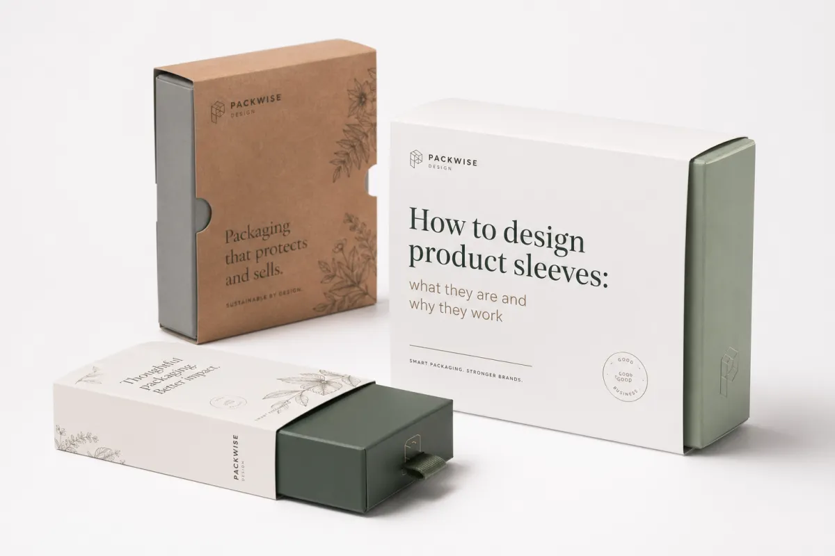
At the simplest level, a product sleeve is a printed wrap that sits around a container, carton, or bundled set. It can be a band, a full wrap, an open-ended tube, or a partial cover held by one glued seam, and most converters in Shenzhen or Ningbo will quote it from a flat dieline rather than from the rendered mockup. The mechanics look easy on paper and unforgiving on press. A measurement that is off by 0.8 mm can shift the print, reveal the seam, or make the board buckle at the fold, especially if the stock is a 300gsm SBS sheet with a tight score. That is why how to design product sleeves begins with structure, not with graphics. I know that sounds unromantic, but the sleeve does not care about our feelings.
I learned that lesson the hard way on a cosmetics project in Shenzhen years ago. The client wanted a matte white sleeve with a rose-gold logo, and the render looked polished enough to sell the entire room on the idea, but the first sample told a different story. The score was too tight, the paperboard came in at 350gsm instead of the approved 310gsm, and the front panel bowed just enough to lift the logo out of alignment by nearly 2 mm. The brand team spotted it at once, and they were right to push back. On shelf, that slight drift read like a production miss, not a premium finish. I was annoyed at the time, quietly and professionally, but the printer in Dongguan was right to say the board choice was fighting the structure.
The real value of how to design product sleeves well is flexibility. A sleeve gives a brand a way to create instant recognition without paying for a rigid box, a custom mold, or a complicated structural build, and that matters when a launch has three scents, two sizes, and a holiday edition all moving through one line. The format leaves room for the logo, the product name, scent or flavor variants, benefit claims, barcodes, QR codes, and seasonal messaging, often on a single wrap that is only 45 to 70 mm tall. One base package can support six SKUs if the sleeve system is planned cleanly, which is exactly why many brands keep the same 420 mm blank width and only swap the center panel artwork. That kind of adaptability matters in cosmetics, candles, supplements, apparel, and gift packaging, especially when a brand wants to test a new scent or regional language version without starting over on tooling. In practice, how to design product sleeves is really about creating a repeatable packaging system instead of a one-off graphic treatment.
Brands also choose sleeves because the economics are usually kinder than a full custom box. A sleeve often uses less board, fewer structural decisions, and less setup than a carton with multiple panels, inserts, or magnetic closures, and on a 5,000-piece run that can keep the unit price closer to $0.15 to $0.22 instead of pushing beyond $0.35. In my experience, short runs are where sleeves shine brightest. A client can change the art for a new scent, a Canadian French version, or a limited promotion without reworking the whole primary package, which keeps the calendar moving and the pressroom in Guangzhou from needing a full reset. That makes how to design product sleeves a business decision as much as a design one, which is not exactly the sexy part, but it is the part that keeps the finance team from calling with that tight-lipped silence I have come to fear. If you are comparing packaging formats, the sleeve often wins because it balances speed, shelf impact, and cost with less structural risk than a box redesign.
Here is the mistake I see most often: teams try to make the sleeve carry every piece of brand information at once. The result is a cluttered front panel, too many typefaces, and a product name that disappears from arm’s length, especially when the pack sits 36 inches away on a grocery shelf. A sleeve should do four jobs well. It should create recognition, add message space, support promotions, and make the container feel finished. If it does those four things clearly, it is doing its job. Anything more than that and the sleeve starts acting like a salesperson who will not stop talking, which is tiring in a meeting and even worse in aisle seven.
Product sleeves show up everywhere because they solve practical packaging problems. Cosmetics use them to separate shades and variants. Candles use them to make a plain jar feel giftable. Food brands use them for seasonal runs and bundles. Supplements use them for regulated text and dosage notes, often with a 12-point minimum legibility standard that the legal team will defend to the millimeter. Apparel brands use them for tissue-wrapped sets and retail presentation. Gift packaging uses them because a sleeve can make a plain carton feel deliberate without demanding a large budget. That is the core reason how to design product sleeves keeps coming up in brand meetings: the format is flexible, affordable, and easy to refresh across markets in the U.S., U.K., and Australia. It is also one of the cleaner ways to bring retail packaging discipline to a line that needs to evolve quickly.
How product sleeves work on shelf and in shipping
A sleeve has two jobs at once. It has to sell on shelf and survive in transit, whether the product is moving from Dongguan to Los Angeles by sea or from a local plant in Ohio to a distribution center in Texas. That sounds obvious until you see a retail display where the sleeve has shifted half a centimeter during shipping and the front logo is suddenly kissing the seam. A sleeve should support the primary package, not fight it. Curved jars need enough wrap tolerance to stay flat. Tall, narrow cartons need a panel layout that cuts through shelf crowding with strong contrast and a clean logo block. I have spent more time than I care to admit re-centering artwork that should have been planned better from the start, usually after the sample showed a 2 mm creep at the spine. Once you understand how to design product sleeves for both shelf and transit, the structure gets much easier to trust.
Shelf visibility usually comes from contrast, framing, and hierarchy. Dark text on a pale sleeve can work, but only if the product name is larger than the support copy by a clear margin, usually around 2:1 or better, and the name is set at 18 to 24 points depending on viewing distance. Dense visual clutter slows reading. Weak contrast does the same. I have watched beautifully made artisan packaging lose to a simpler competitor because the competitor used a crisp 18-point product name, a single 12 mm color band, and a matte 350gsm board that read cleanly under 3000K store lighting. Nothing glamorous there, just smart how to design product sleeves for actual retail conditions in Minneapolis, Berlin, or Osaka.
The structural format matters just as much. Open-ended sleeves work well for cartons and nested boxes because they slide on cleanly and leave more of the base package visible. Band sleeves add branding without hiding the whole container. Tuck-style wraps can hold a product set together or give a giftable feel. Full wrap bands carry the most information and give the most canvas, though they demand tighter registration and more careful seam planning, often within a 1 to 1.5 mm tolerance if the printer is using offset on a coated sheet. Anyone learning how to design product sleeves should start by choosing the structure that matches the way the product is handled, not the way it looks in a presentation deck from a design studio in Manhattan or Milan. The best product wrap is the one that works with the pack, the line, and the shelf, not just the render.
Shipping is where the geometry stops being theoretical. A sleeve that looks perfect in a flat PDF can misbehave inside a corrugated shipper if the stock is too soft, the seam is weak, or the product inside is slippery. I once watched a supplement brand lose a week because the sleeves rotated during cross-country transit from California to Pennsylvania. Better artwork would not have fixed it. The fix was a tighter wrap, a slightly rougher uncoated back panel, and a better friction balance between the sleeve and the inner bottle carton. If the product is moving through distribution, ask the printer about transit testing and compare the result with standards like ISTA so you are not guessing. Guessing is expensive, and packaging already has enough ways to be expensive on its own.
Material choice changes the behavior more than most teams expect. Paperboard gives structure and crisp print detail. SBS board has a smooth surface that helps with sharp graphics. Kraft brings warmth and a natural tone, though it can mute fine details and shift some colors darker, especially with heavy coverage over 70 percent ink density. Specialty stocks can elevate the look, but they also change how the sleeve folds, how the edges catch light, and how the seam reads. I tell brands that how to design product sleeves is part visual design and part material science. Ignore the second half and the first half tends to disappoint. The difference often shows up first in the way the sleeve slides, snaps, and holds its shape after a few weeks in the supply chain.
For teams that want a broader view of how packaging systems fit together, I often send them to resources like PMMI’s packaging.org. It helps show how machinery, carton conversion, and retail presentation connect in the real world, especially when a project spans print in Foshan, conversion in Dongguan, and fulfillment in Chicago. A sleeve does not live alone. It has to work with filling, gluing, stacking, and the way a customer opens the package. I wish more teams would remember that before they ask for a finish that makes the whole thing behave like a slippery postcard.
What should you check before you design product sleeves?
Size comes first. No amount of strong typography can rescue a sleeve that is 2 mm too tight or 3 mm too loose, and on a 60 mm-diameter candle jar that can mean the difference between a clean seam and a warped front panel. Exact product dimensions come before the dieline, and the dieline comes before the layout. Wrap allowance, score placement, and glue area all need to be confirmed before the design file starts to take shape. I have watched brands spend $600 on revisions because they skipped that sequence and designed around the concept instead of the structure. Concepts are cheap. Reprints are not. And yes, I have seen someone say “we can probably fudge the measurements,” which is a phrase that should make every packaging person nervous. If you want how to design product sleeves That Actually Convert on shelf, the measurement stage is where the real work begins.
Material choice is the second major factor. A standard 300gsm paperboard sleeve is often the best place to begin because it prints cleanly, folds predictably, and behaves well on most lines in Shenzhen, Suzhou, or Columbus. Recycled stock gives a more natural tone and can support FSC-certified sourcing, which matters when a brand wants to make a real sustainability claim instead of printing a leaf icon and hoping nobody asks for proof. Coated papers give brighter color and tighter detail. Kraft gives warmth. Soft-touch coating can make a $0.22 sleeve feel much more expensive, though only if the rest of the design stays disciplined. That is a big condition, and one I repeat a lot because the quote marks on “premium” do not disappear just because the coating feels nice.
Print method comes next. Digital printing works well for short runs, test launches, and fast revisions because setup is lighter and color changes are easier to manage. Offset printing is usually the stronger choice for consistent color and larger quantities, especially when tight logo reproduction matters across multiple SKUs. Flexographic printing can make sense for some high-volume sleeve work, though it depends on the artwork and the converter’s equipment in places like Dongguan, Xiamen, or Ningbo. How to design product sleeves well means designing for the process you will actually run, not the process that sounds smartest in the room. I have seen too many “ideal” specs collapse the minute the pressroom starts asking practical questions.
Brand hierarchy decides whether the sleeve reads quickly or gets ignored. The logo should be visible, but it should not overpower the product name. The product name ought to be the most readable item on the front panel, followed by flavor, scent, variant, or functional claim, with supporting copy held to one or two short lines. Compliance copy, ingredients, instructions, and warnings belong lower unless the category requires more space. A supplement sleeve may need more regulated text than a candle sleeve, while an apparel sleeve can stay almost entirely visual. That is why how to design product sleeves always changes with category. Different categories bring different headaches, which is packaging’s little way of keeping everyone humble. The right retail packaging hierarchy makes the shelf read faster and the brand feel more deliberate.
Finishes deserve a real conversation, not a mood board full of samples and guesses. Matte film feels quiet and premium. Gloss pushes color and helps graphics pop under bright retail lights. Soft-touch coating feels expensive in hand, though it can scuff if the product gets handled often in a store or fulfillment center. Foil stamping works best when it lands on a logo or seal, not when it is scattered across half the panel like confetti. Embossing adds depth and tooling cost, and it can complicate stacking. Spot UV can spotlight a detail, though too much of it makes the sleeve look restless. My rule stays simple: one main finish, one accent at most. More than that usually means the brand is trying too hard, and the sleeve starts sounding like it wants applause.
Practical content matters just as much as decoration. If the sleeve needs a UPC, ingredients, directions, warnings, multilingual copy, or recycling marks, reserve that space early, ideally before the first design round on a 420 mm by 65 mm sleeve template. Do not leave compliance for the last round, squeezed into a dead corner near the fold. On a food packaging project, a client asked for a last-minute nutrition panel after the art was already approved. That single change added four revision rounds and a $275 prepress charge. One planning call and a 20-minute checklist would have saved all of it. I still remember the sigh from the print rep on that one. It was the sound of a person who had seen this exact mistake a hundred times before.
What to decide before design work starts
I always want five answers before anyone opens Illustrator: exact product size, target quantity, print method, finish budget, and whether the sleeve has to fit one SKU or several. Those answers shape every choice that follows, whether the job is 1,000 pieces for a local brand in Portland or 20,000 pieces headed to retail in Toronto and Dallas. Get them early and how to design product sleeves feels orderly and efficient. Get them late and the process fills up with corrections, delays, and very tired email threads. The tired email threads are somehow always the most expensive part, and the missing details usually show up in the worst possible hour.
- Product dimensions: measure width, height, depth, and any taper within 0.5 mm if the product is rigid.
- Quantity: 1,000, 5,000, and 20,000 pieces usually produce very different unit prices, with 5,000 often landing around $0.15 to $0.22 per unit for a standard sleeve.
- Print method: digital, offset, or flexo changes color control, turnaround, and cost structure.
- Finish budget: decide whether the sleeve needs foil, embossing, or just one clean coating.
- Regulatory load: confirm barcode space, warnings, ingredients, or multilingual copy before layout starts.
How to design product sleeves step by step
Start with the dieline. Always. That sounds almost too basic, though I have sat through enough client meetings to know how often this step gets skipped. Someone builds a beautiful mockup, the team falls in love with it, then the seam lands on the logo and the room goes quiet. The sleeve does not care about the mood board. It cares about fold lines, glue zones, and panel widths. If you want to know how to design product sleeves Without Wasting Money, begin with geometry and a clean CAD file from the converter in Dongguan or Guangzhou. I know geometry is not the glamorous part, but it is the part that saves your Friday, and it is usually the foundation of a cleaner carton sleeve as well.
Step two is panel mapping. Mark the front, back, spine, seam, and any fold or tuck areas before placing a single icon or headline. Important art should never sit on a fold or under glue. If the sleeve wraps around a cylinder, build in allowance for curvature and side-panel distortion, typically 1.5 to 2 mm depending on diameter. If it wraps a carton, account for the edges, the tuck, and the amount of board that will remain visible after assembly. It is a boring step, which is usually a sign it will save you from expensive embarrassment later. Boring is underrated in packaging. Boring keeps invoices smaller.
Step three is the visual system. Decide where the logo lives, how large the product name should be, which color owns the shelf, and whether the texture should feel matte, patterned, or bold. Keep the hierarchy obvious. If the first thing a buyer notices is a decorative pattern instead of the product name, the sleeve is already losing the sale. One client I worked with wanted eight selling points on the front panel. I cut it to three, with the largest claim set at 20 points and the rest reduced to short support lines. Sales went up, and nobody missed the other five. People read packaging faster than marketers usually expect, which is one of the reasons I trust shelf testing more than enthusiasm.
“The sleeve is the salesperson that never gets tired. If it cannot explain the product in three seconds, it is decoration, not packaging.”
Step four is technical setup. Bleeds, safe zones, trim lines, barcode clearance, legal copy, and vendor notes all belong in the working file. A standard bleed of 3 mm is common, though some printers ask for 5 mm depending on stock and finishing. Safe zones matter even more. If text sits too close to the edge, one small shift can ruin the entire run. That risk rises with metallic foil, where small misregistration becomes painfully visible under store lighting. I have watched a near-perfect sleeve get rejected because a barcode sat just a hair too close to the trim. That hair was apparently very expensive.
Step five is proofing. I prefer a three-stage review whenever the budget allows: a flat art proof, a printed color proof, and a physical structure sample. The flat proof catches spelling, hierarchy, and barcode placement. The printed proof catches color shifts and finish behavior. The physical sample catches fit, stiffness, and seam performance. If the sleeve has a tight tolerance or a premium finish, skipping any of those stages is usually a false economy. The printer may save time. You will not save stress. And you definitely will not enjoy the phone call explaining why the foil is sitting a millimeter off the mark.
The timeline deserves honesty too. A simple sleeve project might spend 2 to 4 business days on design and dieline review, another 3 to 5 days on proofing, and 7 to 12 business days in production after approval. Add time for foil stamping, embossing, or specialty coating. Add more time if the client wants three revision rounds or if the factory is in peak season around Lunar New Year in Guangdong. I have seen a “two-week project” stretch into five weeks because approvals sat in someone’s inbox for four days at a time. Packaging moves at the speed of decisions, not optimism. If a project manager says “we should be fine,” I reach for my calendar and my coffee.
Here is the order I recommend for how to design product sleeves without chaos:
- Measure the product: confirm real dimensions, not a vendor sketch.
- Request the dieline: make sure the sleeve template matches the conversion method.
- Set the hierarchy: logo, product name, variant, then support copy.
- Check the stock: choose the paper or board before finalizing artwork.
- Proof the sample: review fit, color, and finish on the actual product.
Product sleeve cost, pricing, and budget drivers
Pricing is where the fantasy leaves the room. A sleeve can be inexpensive, but it is never free. Unit cost depends on size, board type, print method, quantity, finish level, and whether the sleeve needs die-cutting or complex folding, and the numbers shift depending on whether the work is done in Dongguan, Foshan, or a domestic plant in Ohio. A simple 5,000-piece sleeve on standard paperboard might land around $0.14 to $0.22 per unit. Add soft-touch coating, and that can move to $0.18 to $0.32. Bring in foil, embossing, or specialty paper, and $0.35 to $0.75 is not unusual. Those are normal ranges, not promises. Supplier, region, and spec will move them. I would love a world where every quote behaved perfectly, but packaging procurement was never built for my happiness. Knowing how to design product sleeves with cost in mind makes these quotes easier to compare and easier to defend internally.
Setup costs can matter just as much as unit price on shorter runs. A 500-piece order can look affordable until the setup fee, color matching, plate charge, and shipping are spread across such a small quantity. I once negotiated with a Dongguan converter and watched the quote move by $180 because the client wanted a tighter white border on a dark sleeve. That border meant more careful register control, more waste, and more time on press, often an extra 30 to 45 minutes of make-ready. The supplier was not making drama. They were pricing reality. Honestly, I appreciated the bluntness more than the polished excuses.
| Option | Typical use | Approx. unit price at 5,000 pcs | What you get | Trade-off |
|---|---|---|---|---|
| Standard paperboard sleeve | Candles, cosmetics, simple retail cartons | $0.14-$0.22 | Clean print, reliable folding, lower setup risk | Less tactile impact |
| Coated sleeve with spot color work | Skincare, gifts, premium supplements | $0.18-$0.32 | Sharper graphics and better shelf contrast | Higher cost if revisions run long |
| Foil or embossed sleeve | Holiday sets, premium gifting, limited editions | $0.35-$0.75 | Strong visual emphasis and tactile depth | More setup, more chance of scuffing |
| Kraft or recycled sleeve | Natural brands, eco-positioned lines | $0.16-$0.28 | Earthy texture and lower-impact sourcing options | Color reproduction can be less vivid |
Hidden costs are where budgets usually wander. Sample shipping can add $25 to $80, whether the proof is moving by courier from Shenzhen to Los Angeles or from London to Berlin. Color matching can add a press check fee. Rush orders can add 10% to 30%. Multiple revision rounds can trigger prepress charges. If the sleeve needs a new die, that is another line item. Brands often forget that how to design product sleeves includes knowing where the labor lives. A cleaner art file can save real money because it cuts down the back-and-forth with the printer. I have seen one tidy vector file save more money than a month of “maybe we can tweak it later” ever did.
One budgeting habit saves more projects than people expect: decide what has to be readable from six feet away, then spend there first. If the logo, product name, and one core benefit matter most, make those the strongest elements. Save money by simplifying secondary copy or trimming a decorative treatment that does not actually help sell the product. I would rather see a clean $0.20 sleeve that reads well than a noisy $0.48 sleeve that tries too hard and still misses the message. I know which one I would bet my own name on, and it is usually the one that survives a shelf test in under five seconds.
Pricing changes by supplier and region, so asking for 2 or 3 quotes is smarter than treating one quote like a final truth. Give every vendor the same spec: stock, size, quantity, coating, print method, and delivery terms. When the quotes come back different, compare apples to apples. A $0.03 difference on paperboard can hide a bigger difference in setup fees, waste allowance, or finish quality. That is one of the most practical parts of how to design product sleeves from a business perspective. It is also the part that keeps spreadsheet people honest, which I mean as a compliment.
Common mistakes when designing product sleeves
The biggest mistake is designing before the dieline is confirmed. It may feel efficient to move fast, though this is where the expensive errors start. If the seam lands under a logo or a key graphic crosses a fold, the sleeve will look slightly wrong forever. That “slightly wrong” feeling is exactly what makes a product seem cheap. One physical sample usually proves the point, and by then the rework may already be paid for. I have had clients ask if we could “move the seam a bit in production,” which is a charming idea in the same way asking a carpenter to move the wall is charming, especially when the run is already booked in Dongguan for Friday press time. If you are still shaping the layout, pause and re-check how to design product sleeves before any art goes to plate.
Overcrowding is the second mistake. Too much text, tiny type, low contrast, and one more paragraph nobody will read can turn a smart sleeve into a cluttered one. I have seen brands add five benefit bullets, a long story, a testimonial, and a QR code to the front panel. Under retail lighting, the result became a gray blur with no clear priority, especially on a brown kraft stock with 60 percent ink coverage. If you are learning how to design product sleeves, learn to edit. White space is not wasted space. It is structure. It is also what makes the good parts breathe instead of shouting over each other.
Ignoring the seam, scores, and panel transitions is another costly error. The seam can cut through artwork if it is not planned carefully. Score lines can crack heavy ink coverage, especially on darker colors. Panel transitions can shift the way a pattern repeats. I remember a skincare shelf sample where a gold line ran straight into the seam. From a foot away it looked broken. The client called it “almost perfect,” which in packaging usually means “please fix this now.” That one still makes me wince a little when I think about it, because a 1 mm move would have saved the whole batch.
Finish choices cause plenty of trouble too. A mockup can make high-gloss foil look incredible, then the real sleeve ends up feeling loud and messy in a 3000K boutique fixture. Soft-touch coating can scuff in shipment. Heavy embossing can complicate stacking. A finish should support the idea, not shout past it. On one candle project, the brand wanted both foil and spot UV on the front panel. I asked them to pick one. They kept the foil, dropped the UV, and the sleeve got stronger because it stopped trying to impress everyone at once. That was one of those rare moments when removing something made the design feel richer.
Handling matters more than many teams admit. Retail staff stack, pull, restock, and rotate the product. Customers grab it with one hand, often while distracted, and open it quickly. If the sleeve peels, shifts, or tears too easily, the premium feeling disappears fast. During shipping, the pack may face vibration, compression, and temperature swings from 5 degrees Celsius in a truck to 28 degrees in a warehouse. That is why some teams test the sample with real handling before final approval. If you care about how to design product sleeves properly, you cannot ignore the physical life of the package. A gorgeous sleeve that falls apart in a warehouse is just an expensive disappointment.
Print testing is another place where brands get surprised. Dark solids can band. Gradients can shift. Metallic inks can dull. Fine lines can disappear. A monitor mockup will not warn you about any of that. I still ask for a test print when the design uses a lot of detail or a very dark palette, especially if the run is moving through offset in Guangzhou or digital in a small California shop. It costs a little more up front and saves a lot of regret later. Regret, in my experience, is always pricier than the proof.
Expert tips and next steps for how to design product sleeves
If you want the process to move more smoothly, build one master layout that can flex across multiple SKUs. Keep the base structure the same, then swap the scent, flavor, size, or language block as needed, which works especially well for candles, supplements, and cosmetic sets produced in batches of 3,000 to 10,000 units. It cuts design time, keeps the brand family consistent, and lets you launch variations without building a fresh packaging system every time. That is practical how to design product sleeves thinking, not packaging theater. I am all for beautiful work, but I prefer beautiful work that does not triple the workload for everyone involved. It also makes the next product sleeve much faster to approve because the brand rules are already established.
Ask the printer for a blank sample before you approve the graphics. A flat blank sleeve teaches you more about fit than a polished render ever will. Check whether it slides easily, whether the seam sits in a sensible place, and whether the sleeve stays square after a few minutes on the product. If the fit is wrong, fix the structure before polishing the artwork. I have watched brands spend hours debating a typeface while the real issue was a sleeve that could not hold its shape, usually because the board was 0.2 mm heavier than planned. That is the packaging equivalent of repainting the living room while the roof is leaking.
When color or finish really matters, ask for both a digital mockup and a hard proof. The mockup helps the team agree on composition. The physical proof tells the truth about color, paper texture, and how the light lands on the surface. If the sleeve will sit in a retail display under warm LEDs, test it there. Blue sleeves can go muddy under store lighting, and cream can shift yellow under a camera. The shelf is the final judge, not the screen. I learned that after a very expensive lesson and one very smug retail buyer who was not even trying to be smug.
Here is the process I recommend before you send anything to production:
- Measure the product: do not trust a rough spec sheet.
- Request the dieline: confirm the wrap style and seam placement.
- Set the hierarchy: decide what the customer should read first.
- Price three options: compare plain, coated, and premium finishes.
- Check the sample: inspect fit, color, and opening behavior on the actual product.
If sustainability is part of the brand story, keep the language concrete. FSC-certified board is a real signal. Recyclable coatings and reduced-ink layouts are real choices. Vague “eco-friendly” language is not a plan. If a sleeve uses less board because it covers only the needed area, say so. If the stock comes from responsible sourcing in Canada, Taiwan, or Sweden, document it. Customers notice specificity, and retailers do too. If you want help thinking through how to design product sleeves for a lower-impact line, ask the supplier what claims they can support before the art hits press. That question saves everyone from later embarrassment and a lot of awkward backtracking.
My last piece of advice is plain: make the sleeve serve the product, not your ego. The strongest sleeve is rarely the one with the most effects. It is the one that fits properly, reads fast, and survives the trip from press to shelf. If you measure carefully, keep the hierarchy clean, and ask for the right proof, you are already ahead of most brands. That is how to design product sleeves That Actually Sell better. And if a finish sample looks amazing but makes the whole thing harder to use, trust me, the shelf will punish that decision later.
If you are starting a new project, begin with the product dimensions, request the dieline, sketch the hierarchy, get 2 or 3 quotes, and schedule proof review before anyone approves print. That is the simplest way to avoid expensive surprises, whether the job is printed in Shenzhen, converted in Dongguan, or shipped through a warehouse in New Jersey. And if you want the short version of how to design product sleeves, here it is: fit first, readability second, finish third, and restraint everywhere else. That formula has saved me from more than one awkward call, and probably a few headaches too. It is also the fastest path to a sleeve system that feels intentional across every SKU in the line.
How do I start designing product sleeves for my packaging?
Start with exact product dimensions and request a dieline from your printer before you design anything. Then build the layout around front-panel hierarchy, seam placement, and safe zones, and review a printed proof before full production so fit and color can be checked in real life. On a typical run in Shenzhen or Dongguan, that extra proof step often takes 1 to 2 business days and saves a lot of rework later. I know that sounds procedural, but it is the fastest way to avoid the kind of surprises that make everyone suddenly very busy. If you are still figuring out how to design product sleeves, this first step is the one that protects the whole project.
What is the best material when learning how to design product sleeves?
Paperboard is usually the easiest starting point because it prints cleanly and holds structure well, and 350gsm C1S artboard is a common benchmark for premium retail sleeves. Kraft works for earthy or natural brands, while coated stock is better for vivid color and crisp detail. Choose the material based on shelf look, product weight, and finishing needs, then compare samples under the same lighting where the product will actually live, such as 3000K boutique LEDs or a bright supermarket aisle. Material choice is a major part of how to design product sleeves because it affects both presentation and durability.
How much do custom product sleeves usually cost?
Cost depends on size, quantity, stock, print method, and finish level. A standard 5,000-piece sleeve might price around $0.15 per unit for a simple 300gsm board, while a foil-accented version can move closer to $0.40 or more. Short runs cost more per unit because setup fees are spread across fewer pieces. Premium effects like foil or embossing raise the price quickly, so use them where they matter most. When teams learn how to design product sleeves with pricing in mind, they usually make better decisions on finish and stock.
How long does the sleeve design and production process take?
Simple sleeve projects can move from dieline to proof to production in about 12 to 15 business days from proof approval if the factory is not in peak season and the art is clean. Custom finishes, structural changes, and revision rounds add time. The biggest timeline risk is waiting on art changes or sample sign-off, especially when approvals sit for several days in an email chain between New York, Guangzhou, and the client’s finance team. If you want how to design product sleeves without schedule drift, build in proof time from the beginning.
What are the most common mistakes in how to design product sleeves?
The biggest mistakes are bad fit, cluttered layouts, and ignoring seam or fold areas. Many brands also overdo special finishes or forget legal and barcode space, which becomes a problem fast when the UPC needs a 100 percent quiet zone. Testing the sleeve on the real product prevents most of the expensive problems. If you catch the issue before the press run, you save money, stress, and a very annoying round of apologetic emails. That is the practical side of how to design product sleeves, and it is the side that usually keeps a launch on track.
Takeaway: if you want a sleeve that earns its keep, lock the dimensions, confirm the dieline, keep the front-panel hierarchy simple, and proof the actual structure before you approve print. That four-step habit is the difference between a sleeve that looks nice on screen and one that holds up on shelf, in shipping, and in the customer’s hand.


