A knit beanie can carry a logo that measures only 2 inches wide and still read more clearly than a larger mark on a flat mockup. That is why the Knit Hats with Logo logo placement guide matters. Placement changes how the eye reads scale, how the hat behaves in wear, and whether the brand mark survives stretch, cuff folds, and winter use.
Buyers usually start by asking how big the logo should be. That is understandable, but it is not the first question to answer. On knitwear, a smaller mark can look stronger than a larger one because yarn texture, cuff height, knit gauge, and garment stretch all change the visual result. A logo that seems modest on paper may dominate once it sits on a cuffed hat. The reverse happens too: a design that looks crisp on a screen can disappear into loose ribbing once it is stitched or patched onto a soft beanie.
Placement also changes the business side of the order. Front decoration gives better visibility and usually works well for promotions, team wear, and retail basics. Side placement feels quieter and more fashion-led. Back placement can suit premium merch or labels that want the branding to stay secondary. None of those is automatically right or wrong. The better choice depends on what the hat is supposed to do in the real world, not just what looks neat in a proof.
Practical rule: if the logo only looks right when the beanie is perfectly flat, the placement is still in draft form, not production form.
Knit hats with logo logo placement guide: what buyers should notice first
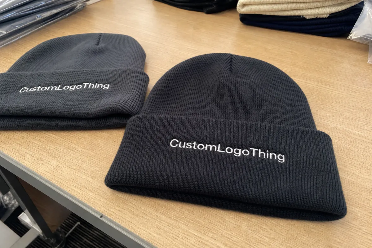
On knit hats, placement and construction are tied together. A front-cuff logo is the most predictable option because the fold creates a stable decoration zone. That area usually gives the clearest read, especially if the cuff height is consistent across the order. A side panel can work beautifully, but it needs enough open space and a knit structure that will not swallow the edges. A back placement can feel restrained and premium, though it will not deliver the same instant recognition as a front mark.
Buyers often focus on the artwork file before they think about the hat itself. That creates preventable problems. A clean logo may still fail if the cuff is too shallow, the seam lands too close to the design, or the yarn is too chunky for the level of detail in the art. The hat style determines how much decoration space is really available. A 12-gauge acrylic beanie can support cleaner edges than a loose 6-gauge rib knit. A wool blend tends to hold shape better than a very soft, overwashed acrylic, but wool can also make some embroidery feel denser and less forgiving if the stitch density is too high.
It helps to think about the logo in motion. The hat is stretched onto a head, not pinned to a board. Cuffs shift. Slouch styles drape. Ribbing pulls toward the seam. That means the working position matters more than the flat position. A logo centered in a digital mockup may sit visually high once the hat is worn, or it may drift lower as the cuff rolls. Buyers who approve artwork only from a flat render tend to miss those shifts.
Decoration method matters just as much as placement. Direct embroidery is the most common choice for front cuff branding because it gives fast recognition and a clean hand feel. Woven patches handle small type, thin outlines, and more intricate logos better. Sewn labels work well for understated branding. Applique can create a heavier, retail-ready look, but it needs enough structure underneath or the edges start to feel bulky on a soft knit.
There is no magic formula, but the decision usually comes down to one question: should the logo lead the design, or support it? If the hat is for an event, a crew, or a promotional drop, front placement usually wins. If the beanie is supposed to sit beside outerwear and hold up as fashion merchandise, a quieter side or back placement may be the better fit.
How logo placement works on different beanie constructions
Not all knit hats offer the same canvas. A cuffed beanie gives a more dependable front zone because the fold creates a defined band for decoration. That is the simplest place to put a logo, and often the safest. The cuff gives the eye a clear edge, which helps embroidery or a sewn patch read more cleanly against textured knit fabric.
Uncuffed beanies are less forgiving. They can look sleek and minimal, but the available flat space is smaller and the knit stretches more across the forehead. Placement has to account for tension, especially if the logo contains text or fine line work. Even a well-centered design can move slightly once the hat is worn. On a soft acrylic knit, a small amount of distortion is normal. On a looser yarn or a more open rib, it becomes obvious.
Slouchy beanies add another layer of difficulty. They have more drape, which gives them a relaxed look, but the logo may sit lower than expected or disappear into a fold behind the crown. A side patch often works better here than a centered front mark because the side position is less likely to be lost in the garment’s natural collapse. That does not mean every slouch style needs a side logo. It means the proof needs to be judged in a worn position, not only from a flat layout.
Construction details deserve more attention than they usually get. Knit gauge, rib structure, seam placement, yarn thickness, and cuff depth all affect usable space. A center seam can split artwork. A fold line can cut through a wordmark. A rib that looks even on the machine can pull slightly off-center once stretched. A logo placed too close to a seam may look fine on the sample board and crooked on the head.
There is also a difference between decoration methods on knitwear. Direct embroidery is strong for bold marks and short text, but tiny lettering can fill in or lose sharpness. Woven patches are better for small details and cleaner edges, though they introduce a more apparel-label look. Sewn labels are subtle and economical, but they do not carry complex brand marks especially well. Applique can create a premium layered effect, yet it needs enough surface area and a stable knit underneath to avoid curling or excess bulk.
Material choice affects the final read too. A 100% acrylic beanie usually offers good production consistency and a stable cost structure. Wool blends feel warmer and often look more premium, but they can be less predictable in hand feel and price. Cotton knits exist in some lighter-weight programs, though they are less common for true cold-weather use. The fabric profile affects how aggressively a logo can be placed and how much detail it can hold before the artwork starts to blur into the textile.
That is why a proof should never be treated as a decoration formality. The proof is the first place where the knit structure, logo size, and placement position need to be tested together. A useful sample answers a simple question: does the brand mark still read clearly once the hat is being worn, folded, and pulled into shape?
Cost, pricing, MOQ, and quote drivers for beanie logos
Pricing for knit hat decoration usually comes down to five variables: stitch count, thread colors, placement complexity, setup time, and finishing work. A simple one-location embroidery job with a single-color logo is usually the lowest-friction option. A patch plus label combination adds labor and more inspection points. If the art needs digitizing cleanup, that adds another step before production can start.
For rough planning, direct embroidery on knit hats often falls around $0.45-$1.10 per unit at mid-size quantities, with setup fees around $35-$85 depending on art complexity. Woven patches commonly land near $0.75-$1.75 per unit. Sewn labels can be cheaper on the decoration side, but the labor to apply them may raise the final number if the hat is not built for easy attachment. Applique usually sits higher, often around $0.90-$2.25 per unit, because it adds layering and more handling.
Those are useful planning ranges, not fixed prices. A 50-piece order behaves differently from a 500-piece run. A logo with three clean blocks of color is easier to produce than one that mixes thin outlines, tiny text, and a halo of negative space. If the design needs extra proof revisions or a sample adjustment, the quote can move quickly.
MOQ tends to follow the decoration method. Simple front embroidery may accept smaller runs because the setup is straightforward. A custom woven patch or a multi-location decoration plan usually needs more units before the price makes sense. Buyers sometimes chase the lowest unit price and end up with a decoration choice that weakens the artwork. That is backward. If a logo is small and detailed, a patch can protect readability better than embroidery and save the order from a second round of corrections.
| Decoration option | Typical use | Approx. unit cost | Common MOQ | Readability |
|---|---|---|---|---|
| Direct embroidery | Front cuff branding, simple logos | $0.45-$1.10 | 50-100+ | Strong for bold art, weaker for tiny type |
| Woven patch | Detailed logos, small text, cleaner edges | $0.75-$1.75 | 100-250+ | Very good for fine detail |
| Sewn label | Minimal branding, fashion-forward placement | $0.20-$0.60 | 100+ | Subtle, not ideal for complex marks |
| Applique | Large block logos, premium retail feel | $0.90-$2.25 | 100-300+ | Strong, if the shape is simple enough |
The fastest way to get a real quote is to send the logo file, hat style, target placement, target size, and any packaging needs in one pass. A buyer who sends only a logo file usually receives a rough estimate. A buyer who sends a beanie spec, a placement reference, and the expected quantity gets a cleaner number much faster. If retail presentation matters, include hang tags, size stickers, folding style, or polybag requests up front. Waiting until after proof approval often means revisiting the quote.
There are also hidden cost drivers that experienced buyers watch closely. Thread changes add time. Multiple proof rounds add labor. Special handling for woven patches, backing materials, or custom labels can increase both finishing time and inspection time. Sometimes the cheapest-looking decoration on paper is not the most efficient option once the hat is actually in production.
Process and turnaround: the path from artwork to shipment
The production path is usually predictable if the artwork is clear and the buyer approves quickly. It starts with artwork intake, then placement review, then digital proofing, then sample approval if needed, then production, quality inspection, and shipment. Orders move faster when the placement, size, and decoration method are settled before digitizing begins. They slow down when the proof becomes a negotiation about basic direction after the file has already been prepared.
Typical production for knit hat decoration often runs 10-15 business days after proof approval for standard orders. Sampling can add several days. Patch orders usually need more time than plain embroidery because there are more pieces to inspect and attach. Seasonal demand matters too. Cold-weather buying periods compress schedules fast, and even a simple order can sit behind a queue if the calendar has already turned.
Shipping adds another layer. Domestic transit can reduce freight time, though it does not always shorten production. International shipping may add a week or more depending on the route, customs timing, and carrier space. The closer the deadline, the more important it is to approve the proof cleanly the first time.
A few things consistently slow orders down:
- Late changes to size, placement, or decoration method after digitizing has started
- Low-resolution files or missing vector paths in the artwork
- Thread-color changes after sampling
- Seasonal backlog during peak cold-weather demand
- Custom packaging, labels, or folding instructions added too late
One of the simplest ways to protect the schedule is to approve three items quickly: logo size, placement location, and decoration method. Those choices drive the rest of the production chain. If the placement keeps moving, the stitch map gets revised, and every revision burns time even when the logo itself is small.
There is another practical issue that buyers sometimes ignore. A good vendor should tell you when the artwork is working against the material. If a 9-point font is too small for the chosen knit, that needs to be flagged before anything is stitched or sewn. The same applies to seam placement and cuff depth. If the logo is too close to the fold line, it may still look centered on paper while reading awkwardly on the hat.
If the logo needs three explanations in a proof review, it probably needs one more placement adjustment before production starts.
Step-by-step placement checklist before you approve a sample
The sample stage is where avoidable mistakes usually show themselves. That is the point of the sample. Treat it like a buying decision, not a routine checkpoint. The goal is to judge the hat in wear, not just admire the artwork on a table. A sample tells you whether the brand mark sits too high, whether the cuff hides part of the design, and whether the logo still reads from a few feet away.
Start with measurement. Check the logo against the visible area of the hat when worn, not against the full flat width. If the beanie will be folded into a 2.5-inch cuff, measure inside that band. If the art sits close to a seam, keep enough buffer so the stitch field does not buckle. Many buyers aim for a logo width between 1.5 and 3 inches on cuffed hats, but the right dimension depends on the hat construction and how much detail the artwork carries.
Then look for distortion. Does the design clear the fold line? Does it avoid the crown seam? Does it stay centered once the knit stretches? A logo can be technically centered and still feel off because the ribbing pulls it slightly to one side. That is why the sample should be checked from a worn angle, not only straight on. Take a photo. Hold it under natural light. Step back. Those checks reveal different problems.
Thread color deserves the same kind of attention. Some shades look balanced in a studio, then shift warmer or cooler under daylight. Dark yarn can swallow dark thread. Very bright thread can create a hard edge that looks louder than intended. If the hat is meant to feel premium, color contrast has to be handled carefully. If the goal is visibility, the thread choice has to survive low light and winter conditions, not just indoor review.
Finally, ask what the logo is supposed to do. Does it need to lead, support, or stay almost quiet? Front cuff placement says, “Look here first.” Side placement says, “Notice the brand if you look closely.” Back placement says, “This is polished, but the branding stays restrained.” Each option is valid. The problem starts when one order tries to do all three.
- Confirm the logo size in worn position.
- Check seam clearance and fold-line clearance.
- Review thread color under daylight and indoor light.
- Test legibility from 3-5 feet away.
- Approve only after the placement matches the brand intent.
If the sample looks strong on a head form but awkward in a mirror, keep investigating. That usually means the logo is sitting too high or the cuff is too shallow for the chosen decoration size. A shift of even 1/4 inch can change the read of the whole piece.
Common logo placement mistakes that hurt readability
The biggest mistake is trusting the flat mockup too much. A design can look centered on a screen and still read strangely once the beanie is stretched on a head. That happens often with slouchy styles and softer knits. The second mistake is using artwork that was never meant for textile decoration. Hairline strokes, tiny gradients, and dense copy rarely survive the texture of knit fabric. On a beanie, clear shapes usually beat clever detail.
Another problem is ignoring the relationship between placement and structure. A logo placed across a seam can buckle. A mark placed too close to the fold can vanish when the cuff gets adjusted. A side logo that looks balanced in the file can end up behind the ear once the hat is worn. Placement only works if the fabric behavior is part of the decision.
Readability also suffers when buyers ask too much of one decoration method. Embroidery is clean and durable, but it is not kind to very small text. Woven patches do better with detail, but they can look less integrated if the brand wants a minimal finish. Applique can look premium, yet if the shape gets too complicated, the edge finish starts fighting the knit underneath.
Budget mistakes show up here too. Extra colors increase thread changes. Extra proof rounds add labor. A placement plan that requires a specialty patch, a sewn label, and a second logo location on the back panel can add cost without improving the impression very much. Simplifying the design often saves more than trimming quality does.
Another trap is overestimating how much detail a cold-weather accessory can carry. Knit hats are not posters. If the message needs to be legible from across a room, use a bolder logo, a larger cuff zone, or a patch with cleaner edges. If the message can stay subtle, a smaller side placement may be perfect. The goal is to match the garment, not force the garment to behave like a flat print surface.
There is also a quality-control issue that shows up in repeat orders. A placement that works on one beanie style may not translate cleanly to another style from the same program. A looser rib, a different cuff depth, or a slightly thicker yarn can change how the logo sits. Reorders should still be checked, even if the first run went well. Small changes in the base hat can create visible shifts in the branding.
Expert tips and next steps for choosing the right placement
Start with use case. Front cuff placement gives the highest visibility and works well for promotions, sports teams, employee gifts, and simple retail basics. Side placement suits fashion-driven brands that want a quieter look. Back placement feels understated and can support a premium line if the front stays clean. That first decision usually shapes the rest of the order more than the logo color does.
If the branding matters a lot, ask for two or three placement options and compare them on a head form in natural light. The same artwork can feel more assertive, more balanced, or more refined depending on where it sits. A buyer who sees the front cuff, side panel, and back version side by side usually makes a better choice than one who only reviews a single proof.
A short decision list keeps the order grounded in production reality:
- Artwork file and accepted file format
- Target logo width in worn position
- Preferred placement location
- Budget ceiling per unit
- Target turnaround window
- Reorder plan if the first run sells through
That list matters because it removes guesswork. It also makes the quote cleaner. A buyer who is specific without being fussy usually gets a better production result. The order moves faster, the proof stage gets shorter, and the logo has a better chance of landing where it should.
Good workflow: send the beanie style, logo file, preferred placement, and size target together. Ask the proof to show how the logo will read in worn position, not only in a flat layout. That is the real difference between a hat that looks acceptable on paper and one that reads well on head.
The broader lesson is simple. Placement is a branding decision, a production decision, and a readability decision at the same time. The best logo is not the biggest one. It is the one that still makes sense after the hat is stretched, folded, worn, packed, and seen in ordinary light. That is the standard buyers should use for Knit Hats With Logo placement.
Where is the best logo placement on knit hats with logo for most brands?
Front cuff placement usually gives the strongest visibility because people see it first in real wear. Side placement works better for fashion-led brands that want a quieter look. The best choice depends on whether the goal is recognition, subtle branding, or a cleaner retail presentation.
How big should a logo be on a knit beanie?
Size should be based on the visible worn area, not just the flat width in a mockup. A logo needs enough room for clear edges, readable text, and safe distance from seams or fold lines. If the artwork is detailed, shrinking it too far usually hurts readability quickly.
Does knit hats with logo placement affect pricing?
Yes. Placement can change cost when it adds setup work, extra stitch complexity, or more proof revisions. Patch-based or multi-location branding often costs more than a simple single-front decoration. The quote gets sharper when the buyer shares placement, size, artwork, and quantity together.
How long does production take after placement is approved?
Turnaround depends on the decoration method, order size, and whether a sample or proof needs approval first. Peak season, thread changes, and custom labels can extend lead time more than buyers expect. Fast approval from the buyer is one of the easiest ways to keep the order moving.
Can the same placement work on cuffed and slouchy beanies?
Not always, because cuffed and slouchy hats expose different amounts of usable space. A placement that looks clean on a cuff may shift or drape differently on a slouchy knit hat. Each style should be proofed separately so the logo lands in the right visual zone.


