Buyer Fit Snapshot
| Best fit | Kraft Belly Bands with Logo projects where brand print, material claims, artwork control, MOQ, and repeat-order consistency need to be specified before quoting. |
|---|---|
| Quote inputs | Share finished size, material target, print colors, finish, packing count, annual reorder estimate, ship-to region, and any compliance wording. |
| Proofing check | Approve dieline scale, logo placement, barcode or warning zones, color tolerance, closure strength, and carton packing before bulk production. |
| Main risk | Vague material claims, crowded artwork, missing packing details, or unclear freight terms can make a low unit price expensive after revisions. |
Fast answer: Kraft Belly Bands with Logo: Material, Print, Proofing, and Reorder Risk should be specified like a repeatable production item. The safest quote records material, print method, finish, artwork proof, packing count, and reorder notes in one written spec.
Production checks before approval
Compare the actual filled-product size with the drawing, then confirm tolerance on folds, seals, hang holes, label areas, and retail display edges. Reserve space for logos, QR codes, warning copy, and material claims before decorative graphics fill the panel.
Quote comparison points
Review material grade, print process, finish, sampling route, tooling charges, carton quantity, and freight assumptions side by side. A quote is only useful when the supplier can repeat the same color, closure quality, and packing count on the next order.
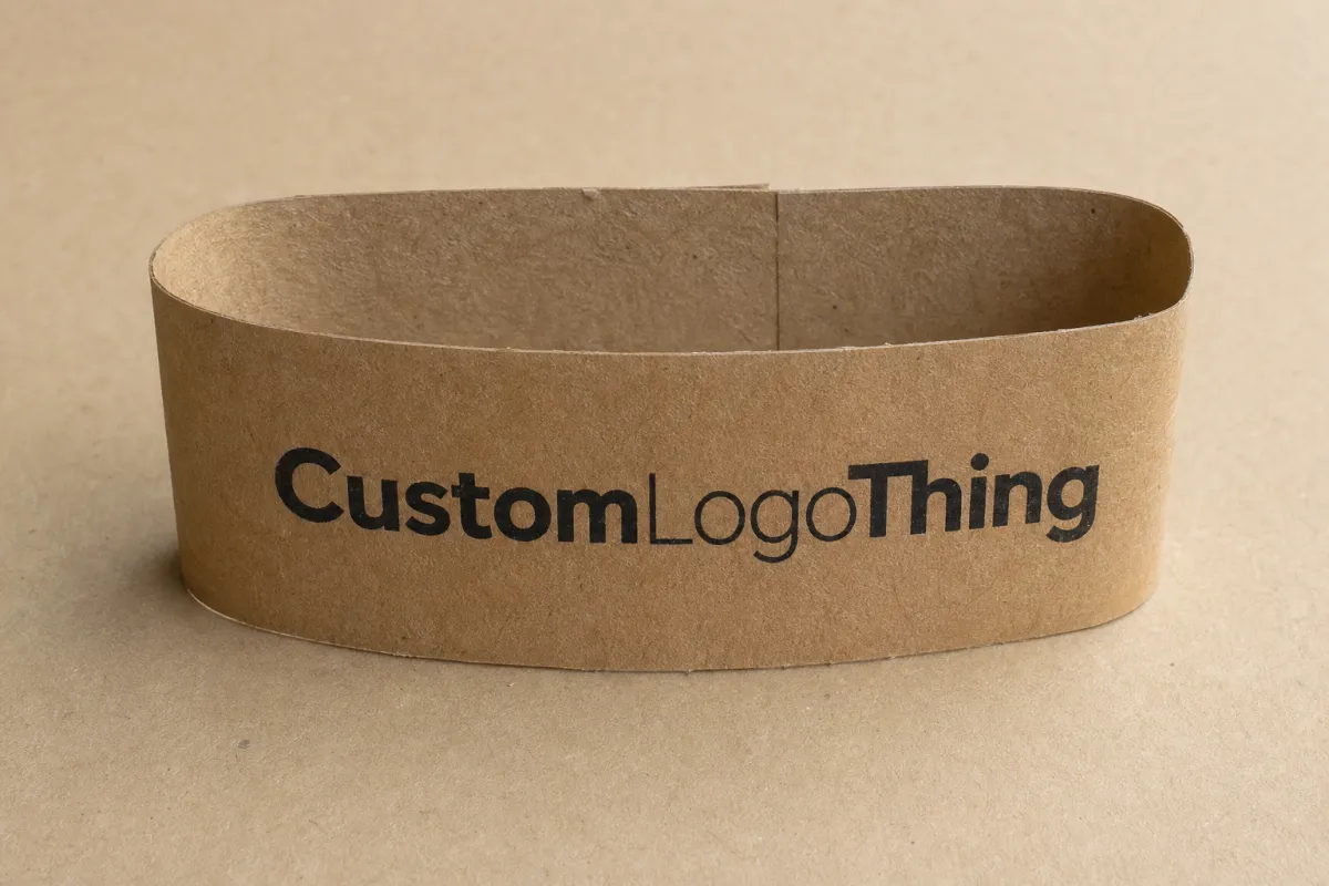
Kraft Belly Bands With Logo: A Practical Branding Guide. Kraft belly bands with logo can change how a plain box reads fast. Faster than a full packaging redesign, anyway. The eye catches contrast, texture, and logo placement before it sorts out the rest. A narrow strip of kraft paper can make an ordinary carton feel deliberate, finished, and tied to a brand without forcing a custom box order.
That makes the format useful for launches, seasonal kits, bakery sleeves, subscription inserts, gift sets, and other projects that need more shelf presence without a huge production commitment. A belly band is a printed wrap that sits around a carton, sleeve, or bundle. It does not replace the main package. It adds another branded layer on top.
For buyers, that difference matters. A belly band can cost less than a fully printed carton, be easier to revise, and adapt across several SKUs with less drama. Kraft stock adds a second layer of strategy because it signals natural, tactile, and lower-waste positioning. The logo often looks more intentional on kraft than on bright white paper. The material brings texture into the story instead of fighting it.
There is a practical reason brands keep coming back to this format. It solves a common packaging problem without dragging a project into structural redesign, new tooling, and long approval chains. That is useful if the box already works and the brand just needs a cleaner read on shelf or in a photo. No heroics required.
The real question is simple: when does this format earn its keep, and what should a packaging buyer check before placing an order? The sections below cover structure, pricing, turnaround, design choices, and the mistakes that quietly drive up cost. I will also flag where standards such as FSC sourcing or ISTA transit testing can matter, because those details often shape the buying decision more than the artwork itself.
Practical rule: if the band can deliver the branding lift on its own, it is worth testing before spending on a full carton redesign. If it cannot, the format becomes decoration instead of packaging strategy.
Kraft belly bands with logo: small strip, big shelf impact
A narrow band changes perception because it gives the package a focal point. A plain kraft mailer or unprinted folding carton can read as generic until a band breaks that visual silence. Then the package has a front, a message, and a brand cue. That shift happens quickly, which is why belly bands appeal to marketers and packaging buyers who want improvement without overhauling the entire pack.
From a packaging buyer’s point of view, the appeal is not just visual. It is commercial. A custom carton can require new tooling, minimum print volumes, and longer lead times. A belly band can often come in as a lighter-touch component, especially when the base box already exists. That keeps the project focused on the parts that create value: logo visibility, product differentiation, and faster time to market.
Kraft helps because it does not compete with the branding. Bright white substrates can make a logo look clinical or overly corporate if the design is not handled carefully. Kraft, by contrast, tends to support a grounded look. Dark inks read well. Simple layouts feel confident. Even a small amount of print coverage can look considered if the paper choice and artwork line up.
That said, kraft is not a magic trick. The stock is absorbent, the surface is fibrous, and print results will vary depending on the exact sheet or roll. A logo that looks crisp on screen can soften once it lands on an uncoated kraft sheet. Good vendors account for that. They may recommend heavier type, fewer fine details, or a white underprint if the design needs more pop. On digital jobs, a white ink layer can lift contrast. On offset jobs, the ink recipe and sheet choice matter just as much.
This is why belly bands show up so often in categories where the purchase is partly emotional and partly practical. Seasonal gift sets need a quick visual refresh. Subscription boxes often need recurring branding without a new carton every month. Bakeries and food brands use sleeves and wraps to identify bundles, while cosmetics and candle brands use them to add a premium note without turning the whole pack into a high-spec print job.
There is also a waste argument, though it deserves honest treatment. A band uses less material than a full wrap or custom box. That can reduce paper usage and sometimes simplify recycling, depending on the rest of the pack and the local stream. It is not a universal sustainability win, but it often supports a lighter packaging footprint. If the paper is FSC-certified, the sourcing claim becomes easier to defend with documentation instead of vague language.
That claim still needs discipline. FSC certification covers the source of the paper, not every part of the packaging system. If the band uses a plastic window, aggressive adhesive, or a coating that complicates recycling, the environmental story gets murkier. Brands do themselves no favors by pretending otherwise. Buyers notice the gap between the claim and the build.
For shelf work, the biggest advantage is speed. A full redesign can take most of a quarter once dielines, approvals, print specs, and testing are counted. A belly band project can move faster if the box size is already locked. That makes it appealing for holiday programs, private-label refreshes, and pilot products where the brand wants an upgraded look before committing to a bigger structural change.
The headline benefit is not that the band is smaller. It is that the format creates a high-visibility branding moment with relatively low structural risk. If the logo and paper choice are strong, the package reads as designed rather than improvised. Tiny difference. Big effect. Retail runs on tiny differences.
How kraft belly bands with logo work on real packaging
Mechanically, a belly band is straightforward. It wraps around the package, overlaps at a seam, and closes by tuck, adhesive, or a structural lock depending on the design. Some bands are loose wraps that hold shape through tension. Others use a small glue point or a pressure-sensitive closure. The best choice depends on the box style, how often the package will be handled, and whether the band needs to stay aligned during transit.
The structural advantage is flexibility. A brand may use the same core artwork across several carton sizes with only small dimension changes. That helps multi-SKU programs. One band can support a gift box, a mailer, and a tray sleeve, provided the wrap path and closure logic are adjusted correctly. The design stays consistent while the package architecture changes underneath it.
Common compatible formats include folding cartons, mailer boxes, Rigid Gift Boxes, sleeves for trays, product bundles, and promotional sets. The band can also work as a merchandising layer over a stock box, which is one reason it appeals to brands that need packaging to evolve in stages rather than all at once. Start with the band. Upgrade the box later.
Design zones matter more than many buyers expect. The front panel usually carries the logo, a short product line, or a campaign message. Side panels can handle secondary details such as ingredients, claims, or social proof. The back may hold a barcode, QR code, or compliance copy. When the band is too small, these zones collapse into one another and the package starts to feel crowded. When the zones are planned well, the whole wrap feels cleaner than a fully printed box because the layout has a clear hierarchy.
That hierarchy matters on shelf and in unboxing. A strong logo on kraft can do more than a dense wall of text on coated board. The contrast is doing the work. If the artwork is trying too hard, it often weakens the effect. If the band is restrained, the paper texture gets to support the message rather than distract from it.
There is a production detail that often gets overlooked: seam placement. If the seam lands directly behind the logo or a critical headline, the design can look off even if the measurements are technically correct. A good dieline accounts for that before the first sample is made. The same goes for score direction and the grain of the paper. Run the wrong way and the band may spring open or crease awkwardly.
There is also a transit angle. A belly band is not a substitute for pack integrity, but it can fit into distribution testing. If a package must survive channel stress, the full assembly should be evaluated under an appropriate shipping profile. Many teams look to ISTA methods when deciding whether a wrap, closure, or assembled bundle will hold together under vibration, compression, and handling. That matters for subscription boxes and e-commerce kits where presentation matters just as much as arrival condition.
Judging the band in context matters too. A kraft belly band with logo works best when it does one thing well: brand the package, identify the offer, and improve the visual read. If it is expected to replace structural protection, regulatory labeling, and heavy retail communication all at once, it will usually fail. The format is good. It is not magic. Packaging rarely is.
Kraft belly bands with logo: cost, pricing, MOQ, and quote drivers
Pricing starts with the basics: size, stock, print method, number of ink colors, finishes, die-cut complexity, and order quantity. Those are the obvious drivers. The less obvious ones are often the expensive ones. A small change in overlap allowance can affect usable layout space. A special score line can add setup work. A unique closure can force tooling. A late artwork change can turn a straightforward run into a revised job with extra proofing and rework.
For short runs, digital printing often makes the most sense because it avoids heavy setup costs and keeps small quantities accessible. For longer runs, offset or flexographic production can improve unit economics once press setup is spread across more pieces. That is why the most useful quote is usually a tiered one. Ask for pricing at multiple quantities, not a single number that hides the break point.
Here is a practical comparison of common approaches:
| Production option | Typical quantity range | Approx. unit price | Typical lead time | Best fit |
|---|---|---|---|---|
| Digital print on kraft stock | 100-2,000 | $0.18-$0.45 | 5-12 business days after proof approval | Pilot runs, launch tests, seasonal trials |
| Offset print on kraft stock | 2,000-20,000 | $0.06-$0.18 | 10-18 business days after proof approval | Established SKUs, retail programs, repeat orders |
| Special finish or die-cut version | 1,000-10,000 | $0.14-$0.60 | 12-25 business days after proof approval | Premium kits, rigid boxes, higher shelf pressure |
Those numbers are ranges, not promises. The exact quote depends on print coverage, panel size, and whether the project needs scoring, slitting, or special assembly. A simple one-color belly band can be surprisingly economical. A complex wrap with foil, extra varnish, or a custom lock can move into a different cost band very quickly.
MOQ is another place where suppliers differ. Some vendors can support low-volume pilot runs because they use digital equipment or have flexible finishing lines. Others set minimums based on press setup, die tooling, or run efficiency. That is not a problem if the buyer understands the tradeoff. The issue is when MOQ is assumed instead of confirmed. A packaging team can waste days building a launch calendar around a minimum that was never realistic.
Hidden costs deserve attention too. Sampling can add expense, but it often saves more than it costs. Proofing is another one. If the band must match a branded carton, a label, or a merchandising kit, the proof stage needs to be treated as part of the project rather than an optional extra. Shipping flat versus assembled can also affect total landed cost. Flat shipping is usually cheaper. Pre-assembled bands may save labor downstream, but that benefit has to be measured against the supplier’s assembly charge.
There is a second-order cost buyers sometimes miss: reprint risk. If final artwork arrives late, or if the dimensions are wrong by even a few millimeters, the result can be a batch that does not fit or a band that hides key artwork. That kind of mistake can cost more than paying for a sample. The lowest quote is not always the cheapest choice if the consequence is rework.
Ask for the quote in a way that forces the supplier to show the real variables. Final dimensions. Overlap. Closure type. Ink count. Finish. Assembly method. Quantity tiers. Target ship date. If the supplier knows the band has to match a mailer, a sleeve, and a label system, the quote will be much closer to reality. If not, the buyer may receive a price that looks attractive but leaves out a critical finishing step.
Price is not just about paper. It is about process discipline. And in packaging, process discipline usually decides whether a project stays inside budget or quietly slips past it.
Production steps, process, and turnaround for kraft belly bands with logo
The production path is usually simple on paper and messy in execution. It starts with the brief, then moves to sizing, artwork setup, proof review, production, finishing, packing, and delivery. Each step sounds obvious. Each step has a place where projects stall. A reliable timeline starts with complete specifications, not with optimism.
Artwork readiness is one of the biggest variables. A clean dieline, final copy, and vector logo files can save days. A file that needs reconstruction can burn those days quickly. If the supplier has to rebuild layout, correct bleed, or reverse-engineer the seam position, the job begins with avoidable friction. The faster teams usually get to proof review because they did the boring work first.
Typical turnaround depends on complexity. A simple digital run can move quickly once the proof is approved. A custom die-cut, special finish, or multi-SKU project usually adds lead time. That extra time is not waste. It is the cost of making sure the wrap fits, the seam lands where it should, and the printed result matches the intended hierarchy.
Most delays happen in the same places: proof revisions, color matching, sample approval, and missing specification details that trigger a re-quote. Those are not glamorous problems, but they push launch dates. A team that sends partial information usually gets a partial schedule in return. A team that sends exact dimensions, file types, and quantity tiers usually gets a faster and more dependable estimate.
Color matching deserves special attention on kraft. Unlike coated white paper, kraft can shift the appearance of ink because the substrate absorbs and mutes color. A dark logo may hold fine. A warm brand red may lean duller. A subtle gray may disappear. If color matters, request a material-specific proof, not a generic digital preview. Screens lie. Paper tells the truth.
One practical way to reduce risk is to treat the first sample like a production decision tool rather than a design exercise. Put it on the real package. Check the overlap. Look at how the logo lands across the seam. Judge the band under the lighting conditions where it will actually be sold or photographed. A mockup on screen will not reveal a 3 mm shift that hides a headline or leaves an awkward gap near the fold.
Planning for launch dates matters too. Seasonal campaigns, retail drops, and distributor deadlines leave less room for correction than internal product tests do. Build extra time into the schedule if the band needs to arrive pre-scored, pre-assembled, or grouped by SKU. If the program includes multiple box sizes, the timeline should assume at least one round of verification on each size group.
For buyers working with sustainability claims or FSC sourcing, the documentation step should sit inside the schedule as well. Certificates, chain-of-custody records, and material declarations can take time to confirm. That does not mean the project is difficult. It means the procurement process should reflect the claim being made. A brand that says it is using FSC-certified paper should be able to show the paper trail.
There is a useful comparison with transit performance. If the packaging will move through distribution and customer touchpoints, not just a single warehouse, the assembly should be tested under realistic handling conditions. That is where material choice, closure design, and shipping configuration intersect. A belly band that looks great on a table can still fail if it slips during pallet movement or arrives misaligned after vibration. Packaging lives in motion. The schedule should assume that.
What to decide before ordering kraft belly bands with logo
The first decision is measurement. Not the nominal size of the box. The full wrap path. That means the finished width, the depth of the package, the overlap allowance, and any flap or tuck space needed for closure. Buyers often measure the front face and assume that is enough. It usually is not. A band needs room to close cleanly without stretching, buckling, or creating a seam that lands awkwardly across the logo.
Paper and finish come next. Uncoated kraft gives the rawest, most tactile feel. Smoother kraft helps type stay crisper and makes fine lines easier to read. A protective coating can improve scuff resistance if the band will be handled often, but too much surface treatment can dull the natural look that makes kraft attractive in the first place. The right choice depends on the brand promise and how the package will be used.
Print style should match the visual weight of the stock. Bold black ink often performs well because it respects the paper. Two-color layouts can work if one color does the heavy lifting and the other is used sparingly. Full-color print can work too, but it is not always the strongest answer on kraft. Some brands need contrast more than they need complexity. A restrained layout can feel more expensive than a crowded one.
There is also the information question: how much belongs on the band? A strong logo plus one short message is often enough. A narrow format rarely improves when it tries to carry every claim, certification, barcode, and marketing line at once. A buyer should ask whether the band is meant to introduce, identify, or explain. If it is trying to do all three, the layout is probably overloaded.
Sustainability alignment deserves a separate check. If the packaging is positioned as eco-friendly, then the paper source, inks, coatings, and adhesives should support that claim consistently. A kraft look alone does not create an environmental claim. Documentation does. That is where FSC sourcing, responsible ink choice, and material transparency become more than procurement details. They become part of the brand story.
Another decision is how the band interacts with the rest of the pack. Does it cover a plain stock box? Does it wrap over a printed carton? Does it sit on a sleeve or a bundle? Each scenario changes the visual balance. A band that looks right on a white box may feel too quiet on a richly printed carton. A band that looks sparse on screen may read as elegant once it is on shelf and seen from a distance.
The safest way to lock the choice is to ask a supplier for a prototype or proof on the actual substrate. Not a visual approximation. The actual material. That is the only way to see whether the type weight, contrast, and seam position all work together.
For a brand buyer, this is the main judgment: the best belly band is not the one with the most effects. It is the one that clarifies the package fastest.
Common mistakes brands make with kraft belly bands with logo
The most common mistake is simple: the size is wrong. A band that is too narrow can hide part of the artwork or fail to close with enough overlap. A band that is too loose can slip, rotate, or look sloppy in the unboxing moment. Both problems are avoidable with correct measurement and an actual sample fit test.
Too much copy is the second error. Narrow wrap formats punish clutter. The more text a brand tries to force onto the band, the faster the design loses its premium feel. A dense block of claims can make the package feel like a flyer. That is the opposite of what most brands want from kraft.
Low contrast is another frequent miss. Pale inks, thin type, and delicate line art can disappear against kraft stock. The paper texture is already doing visual work. The artwork should not fight it. If the logo is not strong enough in a simple one-color proof, it will not improve when scaled into production.
Skipping a physical test is risky. Fold lines, corners, closures, and inserts can all interfere with the finished look. A band that appears centered in a digital mockup may land too low once it meets the actual box geometry. This matters even more when the package is photographed. A small alignment error becomes much larger in a product image because the camera exaggerates the asymmetry.
The last big mistake is assuming suppliers define MOQ, turnaround, and proofing the same way. They do not. One vendor’s “short run” may be another vendor’s minimum efficient print length. One vendor may include a soft proof but charge for a hard sample. Another may quote flat shipping separately. Those differences are not signs of bad quoting. They are signs that the buyer needs to ask better questions before the order is placed.
There is a pattern behind all of these mistakes. Brands often treat belly bands as a small accessory, then discover that small packaging components can have large operational effects. A narrow strip can affect assembly labor, shelf appearance, print cost, shipping, and approval timing. That is why the best teams treat the band as part of the packaging system, not as a last-minute add-on.
One more point: do not assume the band alone can solve a weak package story. If the base box is flimsy, the closure is awkward, or the product family is visually inconsistent, a kraft band may only decorate the problem. It will not erase it. Good packaging hierarchy starts with a package that works, then adds a brand layer that makes the structure easier to understand.
Expert tips and next steps for kraft belly bands with logo
Lead with hierarchy. Keep the logo dominant, add one short message, and leave room for the kraft texture to do some of the selling. The cleanest bands often look simple from a distance and more refined up close. That is not an accident. It comes from disciplined layout choices and a clear read on what the strip is supposed to accomplish.
Test at real scale on a production sample, not just on a mockup. A few millimeters can change the way seams, folds, and overlap read on shelf. That small shift can decide whether the logo feels centered or slightly off. Packaging buyers live in that margin. The difference between acceptable and polished is often only a few millimeters wide.
Use the band as a modular branding tool. One core design can often support multiple box sizes, holiday editions, or bundle configurations with only small revisions. That makes the format useful for brands that refresh often or test new offers regularly. It also keeps artwork management simpler. One base system, several uses.
Create a one-page spec sheet before requesting quotes. Include dimensions, paper preference, print colors, finish, quantity, closure method, and target date. That document does two things. First, it helps vendors price the job accurately. Second, it gives the buyer a clean comparison point when multiple quotes come back in different formats. Without that sheet, price comparisons are often apples to oranges.
Think beyond the first run. If the band performs well, will the design need a holiday version? A seasonal color change? A retail-only variant? A second SKU group? Planning for that now can save time later. A band system built to scale is more valuable than one that only works for a single launch.
If the packaging carries environmental messaging, gather documentation early. FSC sourcing, recycled content statements, and adhesive specifications should all be available before final approval. If the package will move through logistics channels, ask whether the closure or wrap design should be checked against distribution expectations. The best packaging decisions often sit between marketing, procurement, and operations. That is exactly where they should be.
Here is the simplest action sequence:
- Measure the package and confirm the wrap path.
- Choose the band style and paper finish.
- Request a sample or proof on the actual substrate.
- Review fit, contrast, seam placement, and handling.
- Approve the run once the look and timing are confirmed.
If you want the shortest version of the advice, it is this: start with the box, size the band to the real wrap path, and approve only after you have seen the actual material on the actual pack. That sequence prevents most of the expensive surprises.
Handled that way, kraft belly bands with logo become more than a branding accessory. They become a practical packaging decision that can support launches, reduce waste compared with heavier structures, and create a cleaner shelf story without forcing a full redesign. That is why they keep showing up in good packaging programs. The format is modest. The effect is not.
Frequently asked questions
What size should kraft belly bands with logo be for a product box?
Measure the full wrap path around the finished box, not just the front face, because the seam and overlap need room to close cleanly. Add a small allowance for tuck or adhesive so the band can be assembled without stretching or buckling. If the package has unusual corners, sleeves, or inserts, ask for a physical sample before production.
Are kraft belly bands with logo cheaper than full custom packaging?
In many cases, yes, because a band uses less material and usually involves less production complexity than a fully printed custom box. The savings depend on quantity, print method, and finishing choices, so short-run pricing may not mirror long-run economics. They are often a smart option when you want a branding upgrade without paying for a complete box redesign.
Can kraft belly bands with logo be used for food, beauty, or gift packaging?
Yes, as long as the band stays on the outside of the package and does not replace any required regulatory or product-safety labeling. They are especially useful for bakery sleeves, cosmetics kits, candle boxes, and gift sets where visual presentation matters. Check ink, coating, and adhesive choices if the package may face humidity, oils, or frequent handling.
What MOQ should I expect for kraft belly bands with logo?
MOQ varies by supplier and print method, with digital runs often supporting lower quantities than offset or specialty finishing. Ask for tiered pricing so you can compare pilot quantities against production quantities instead of guessing the break point. If you are launching a new product, a small test run can be cheaper than overcommitting to the wrong size or design.
How long do kraft belly bands with logo take to produce?
Simple jobs can move quickly once artwork is finalized, while custom die-cuts, proofs, or special finishes add time. The fastest projects usually come together when the dieline is approved, files are print-ready, and the quantity is already locked. Build extra time into seasonal or retail launches so approval delays do not compress shipping and merchandising.
For a packaging buyer, the smartest thing about kraft belly bands with logo is that they are practical before they are pretty. The strip can lift shelf presence, simplify production, and support a more sustainable material story if the paper source and specs are chosen carefully. Used well, it is a small component that makes the whole package feel more resolved.
The best next move is not complicated: verify the wrap path, confirm the paper behavior, and sample the band on the real box before you approve a run. That is the difference between a tidy branding layer and a costly reorder. Packaging rarely forgives assumptions, and this format is no exception.


