Buyer Fit Snapshot
| Best fit | kraft folding cartons with logo branding for packaging buyers comparing material specs, print proof, MOQ, unit cost, freight, and repeat-order risk where brand print, material, artwork control, and repeat-order consistency matter. |
|---|---|
| Quote inputs | Share finished size, material target, print colors, finish, packing count, annual reorder estimate, and delivery region. |
| Proofing check | Approve dieline scale, logo placement, barcode or warning zones, color tolerance, and any recyclable or compostable wording before bulk production. |
| Main risk | Vague material claims, crowded artwork, or missing packing details can create delays even when the unit price looks attractive. |
Fast answer: Kraft Folding Cartons with Logo Branding: Dieline, Finish, Proof, and Buyer Review should be specified like a repeatable production item. The safest quote includes material, print method, finish, artwork proof, carton packing, and reorder notes in one written spec.
What to confirm before approving the packaging proof
Check the product dimensions against the actual filled item, not only the sales mockup. Ask for tolerance on folds, seals, hang holes, label areas, and retail display edges. If the package carries a logo, QR code, warning copy, or legal claim, reserve that space before decorative graphics fill the panel.
How to compare quotes without losing quality
Compare board or film grade, print process, finish, sampling route, tooling charges, carton quantity, and freight assumptions side by side. A lower quote is only useful if the supplier can repeat the same color, closure quality, and packing count on the next order.
Kraft folding cartons with logo tend to read as honest before they read as fancy, and that is exactly why so many brands keep circling back to them. On kraft, the logo carries more of the visual burden, so the box has to earn its keep through proportion, print discipline, and a substrate that is doing real work rather than hiding under a flashy finish. Get those pieces right, and the package can feel restrained, shelf-ready, and more expensive than its material cost might suggest.
I have seen the same thing happen over and over: a brand starts with a crowded concept, then strips it back once the first sample comes in. The box usually gets better when the team stops trying to cover every surface with decoration. Kraft already brings texture, warmth, and a bit of natural character, so the design does not need to shout. It just needs to be clear.
What kraft folding cartons with logo actually are
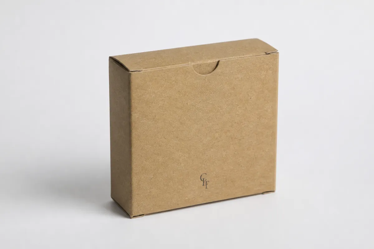
Kraft folding cartons with logo are paperboard retail cartons made from kraft-style stock, printed with a brand mark or other graphics, then shipped flat and folded into shape at the packing stage. They are not rigid set-up boxes, and they are not mailers. They are the familiar folding carton format used for soap, candles, supplements, small electronics, tea, grooming products, and other items that benefit from retail presentation without the weight or cost of a rigid box.
The carton starts as a flat sheet. It gets die-cut, creased, printed, and usually glued into a collapsed form that saves storage space and shipping cost. Once it reaches the packing line, it folds into a finished package that protects the product and gives the shelf a defined visual frame. That basic structure is ordinary. The effect is not.
Kraft changes the tone of the whole package. Brown kraft brings a fiber-forward look that can suggest restraint, sustainability, and a more tactile brand story. White board tends to look cleaner and brighter; kraft looks more grounded and a little less manufactured. On kraft folding cartons with logo, the stock itself is part of the identity. The material says something before the ink has even had a chance to speak.
For a packaging buyer, the logo is not a side note here. It is the anchor. A simple mark, a strong typographic layout, and enough negative space to let the material breathe can make a carton feel deliberate. If you are gonna hide the logo inside a wall of decoration, kraft will not save the design for you. It will usually do the opposite and expose the clutter.
Kraft folding cartons with logo are a strong fit when the product needs:
- A clean retail presence on shelves or in display trays.
- Flat shipping and efficient storage before filling.
- A material story that feels natural or lower-impact.
- Enough structure to protect the item without paying for a rigid box.
- A logo-led look instead of a highly decorative package.
That is why brands selling candles, soaps, nutritional powders, tea, grooming products, and smaller tech accessories keep coming back to kraft folding cartons with logo. They are practical. They stack neatly. They take up less space than rigid packaging. They still feel branded when the typography, panel layout, and print method are chosen with discipline.
There is a limit, though. If the product is very heavy, extremely fragile, or priced high enough that the packaging is expected to behave like a presentation object, kraft folding cartons may not be the best answer. They can absolutely look premium, but they are still folding cartons. That means the design has to respect the physical reality of paperboard instead of pretending it is something else.
How kraft folding cartons with logo work in production
The production path for kraft folding cartons with logo looks straightforward on paper and gets a little fussy in practice, which is normal for packaging. The carton size gets set around the product first. The dieline is built or adjusted next. Artwork then gets placed against the real fold lines, not a mockup that ignores flaps, glue tabs, and panel movement. After proof approval, the sheet is printed, die-cut, creased, glued, packed flat, and shipped to you or to a co-packer who folds and fills it.
The main technical difference is how kraft handles ink. Kraft is often uncoated or lightly coated, so it absorbs color rather than letting it sit on the surface the way coated board does. Dark colors can dry down warmer or flatter. Fine detail can soften a bit. A bright logo may need a white underprint if you want real contrast. That is why kraft folding cartons with logo usually look stronger with one or two controlled colors than with a rainbow of small graphic elements fighting for attention.
Common print and finish options include:
- One-color printing for a restrained, high-contrast look.
- White ink underlay when the logo needs more pop on brown stock.
- Reversed-out logos where the background prints around the mark.
- Spot color matching for a controlled brand color, though exact matches vary on kraft.
- Embossing or debossing for tactile emphasis without adding much ink.
- Selective varnish if you want a subtle highlight on part of the design.
Structure matters just as much as graphics. A tuck-end carton is common and economical. Reverse-tuck versions are easy to run and pack. Auto-lock bottoms and crash-lock bottoms are better when the product has more weight or the carton needs stronger bottom support. If you are packing glass jars, dense candles, or supplements with real heft, that bottom panel is not a small decision. It is the difference between a box that feels steady and one that gives way under ordinary handling.
Kraft folding cartons with logo also need to fit the pack line. If you are hand-filling, a simple tuck style may be enough. If a contract packer is doing high-volume assembly, they will care about how fast the carton opens, how reliably the glue holds, and whether the bottom locks cleanly without extra manual steps. Structure has to support the product first. Branding comes second. That sounds obvious, yet people still reverse the order more often than they should.
One practical point deserves attention: if your logo depends on exact contrast, do not trust a screen preview alone. Kraft changes the visual temperature of an ink draw. A dark green mark that looks rich on a monitor can dry down dull on brown paperboard. A white logo that looks crisp in a PDF can disappear if the underlay is weak. A printed sample is usually worth more than three rounds of debate and a pile of confident guesses.
Key factors that change the look and performance
The look and performance of kraft folding cartons with logo come down to a short list of variables, none of them glamorous. Board thickness, fiber shade, ink coverage, finish choice, and box size do most of the work. A 16pt kraft board behaves differently than 18pt or 24pt stock. A warmer brown sheet changes the apparent contrast more than many brands expect. A crowded design stops feeling premium quickly and starts feeling busy, especially on kraft where the surface already carries visual texture.
Logo placement is one of the biggest choices. Front-panel placement is the default, though not always the smartest move. Top-panel branding works well for products displayed in trays or stacked flat. Side-panel placement matters when the box sits in a narrow shelf bay and only a sliver is visible from the front. With kraft folding cartons with logo, the right placement depends on how the carton will actually be seen, not just how it looks inside a design file.
Visual strength and physical strength are different things. A carton can look solid and still crush too easily if the board is too light or the shipping environment is rough. If the product is moisture-sensitive, the wrong coating can make the surface scuff or warp. If the carton is going into a humid retail back room, a light aqueous coat is often safer than assuming raw kraft can survive everything. It cannot. Paper is still paper.
For brands thinking about sustainability, the details matter. Kraft can support recycled-content stories, FSC-certified sourcing, and lower-ink designs, but the final package is only as sustainable as its full spec. Coatings, lamination, adhesives, and windows affect recyclability. If sustainability is part of the brand promise, ask for the exact material stack instead of a feel-good line. The FSC standard matters because it gives you a sourcing framework that can be verified.
The best kraft folding cartons with logo usually look calm. Not empty. Calm. They leave enough negative space for the kraft background to do some work, and they use the logo as the main signal instead of treating the carton like an ad panel. That difference matters. One version feels branded, the other feels noisy. It is a small shift in layout, but it changes the entire read of the box.
Premium on kraft usually comes from contrast, spacing, and structure, not from piling on extra effects because someone in a meeting got nervous.
Durability should be tested in the context of shipping and handling. If the cartons are being drop tested, vibration tested, or packed into master cases, use a standard such as ISTA as a reference point. You do not need to overbuild every job, but you do need to know whether the carton survives transit without corner crush, ink rub, or panel bowing. A box that looks great and arrives crushed is not premium. It is a complaint with branding on it.
For heavier or awkward products, I usually look at three things together: board grade, bottom structure, and print coverage. If one of those is weak, the package tends to feel cheap even when the artwork is strong. Kraft folding cartons with logo leave very little room to hide structural shortcuts, which is exactly why they reward good decisions and expose poor ones. That honesty can be uncomfortable, but it is useful.
There is also a practical food-and-product caution that gets skipped too often. If the carton is touching direct food, grease-sensitive contents, or products that may bleed oils, confirm whether a barrier coating, liner, or insert is required. Kraft by itself is not a magic shield. It can be perfectly appropriate, but only when the build matches the product it is holding.
Cost and pricing for kraft folding cartons with logo
Pricing for kraft folding cartons with logo is driven by more than size. Carton dimensions matter, of course. Board grade, print colors, finishing, setup, dieline changes, and quantity all change the number as well. The catch with box pricing is that a clean-looking carton can still get expensive if it uses a special die, a white underprint, foil, embossing, or a multi-step finish. Simple helps, but only if the spec is truly simple.
At a practical level, low quantities usually carry the highest unit cost because setup charges get spread across fewer cartons. If you are ordering 1,000 units, the per-box price may feel high. At 5,000 units, the number usually starts making more sense. At 10,000 units or more, the rate often improves if the size and print method stay stable. For many brands, the sweet spot sits somewhere between 3,000 and 10,000 cartons, depending on the product cycle and cash flow.
These are rough pricing bands for kraft folding cartons with logo at about 5,000 units, assuming standard retail packaging sizes and typical print coverage. They are not fixed market prices, and they are definitely not a promise. They are the kind of ranges that help you stop arguing with quotes that are not really comparing the same thing.
| Option | Best for | Typical unit cost at 5,000 | What changes the price |
|---|---|---|---|
| One-color reverse-tuck kraft carton | Simple retail items, soaps, light candles | $0.18-$0.30 | Board thickness, dieline complexity, ink coverage |
| Two-color carton with aqueous coating | Products that need a little more shelf presence | $0.24-$0.38 | Print setup, coating, panel coverage, die cost |
| White ink underlay with cleaner contrast | Brand marks that need brighter readability | $0.30-$0.48 | White ink pass, color accuracy, extra press time |
| Embossed, foiled, or windowed carton | Premium retail lines or giftable products | $0.42-$0.85 | Tooling, finishing steps, window patching, labor |
That table is the one clients usually wish they saw before asking for "just a nice kraft box." Nice is not a spec. If you compare quotes, make sure every supplier is pricing the same carton size, the same board thickness, the same print method, the same finish, and the same packing format. A lot of the price gaps I see are not real price gaps at all. They are apples-to-oranges comparisons dressed up as shopping.
The expensive extras are easy to spot once you know where to look. White ink adds steps. Foil stamping adds tooling and labor. Embossing needs dies. Windows require extra assembly. Heavy ink coverage can increase risk and waste if the print needs more proofing. On kraft folding cartons with logo, the more the design pushes against the substrate, the more the cost tends to climb.
For price-sensitive products, I usually tell people to spend first on structural fit, logo placement, and board quality. Those three choices make the box feel deliberate. After that, add decorative finishing only if it is doing real work. A small foil line or a debossed mark can be useful. Five finishes on a brown box usually reads like a brand trying to buy elegance by committee.
One more buying tip: ask for setup and sampling costs separately. Some suppliers bury them. Some do not. You want the real landed cost before you sign off. If the sample is expensive, that can still be worth it if the logo matters and the product launch depends on the packaging looking right the first time. Cheap packaging that needs to be remade is not cheap for long.
Process and timeline for kraft folding cartons with logo
The process for kraft folding cartons with logo usually starts with the product itself, not the artwork. Measure the item. Check the pack-out. Decide whether the box needs to hold one unit, multiple units, or a product plus insert. Then choose the carton style that fits the handling requirement. After that, the dieline can be adjusted so the panels, flaps, and glue areas match the real object instead of an imaginary one.
A normal workflow looks like this:
- Confirm product dimensions and target carton size.
- Choose the carton style, like tuck-end, reverse-tuck, or auto-lock bottom.
- Review and approve the dieline.
- Place artwork onto the actual panels.
- Check proof files for text, folds, and panel alignment.
- Approve a sample or printed comp if color contrast matters.
- Move into production and packing.
Timing depends on how much the project changes. Straightforward artwork on an existing dieline can move quickly. A new structure, custom insert, or special finish takes longer. In practical terms, sampling often takes a few business days, while production plus shipping can land anywhere from two to four weeks, sometimes longer if the job is complex or the destination is far. That is the honest answer, not the optimistic answer people like to hear when they are trying to lock a launch date.
The schedule usually slips for the same reasons every time. Missing dimensions. Late artwork. Color corrections. Structural revisions. Unclear finishing instructions. A box spec that says "natural kraft look" is not enough for production. The supplier needs exact stock, print method, finish, and pack-out details. If those are fuzzy, the job moves slower and costs more.
A sample run is worth the time if your logo depends on precise contrast or if the product is a tight fit. A printed prototype can catch three annoying problems fast: the logo looks too small, the kraft tone is warmer than expected, or the box folds awkwardly around the product. Those are the kinds of issues that are cheap to fix during sampling and annoying to fix after 8,000 cartons are already in motion.
Kraft folding cartons with logo also need launch planning. If the product needs to hit shelves on a certain date, the packaging clock starts when the spec is locked, not when someone says they are "pretty close" to ready. I have seen more launch headaches caused by packaging indecision than by actual print problems. The box is not the delay because the file is perfect. It is the delay because the file was not ready.
One useful habit is to treat carton approval as a gate, not a casual design step. Once the dieline and print spec are approved, everything downstream gets easier. Once dimensions start changing after proofing, the whole timeline begins to drag. Experienced buyers push for a solid technical review before the art department gets emotionally attached to a layout. That sounds harsh, but it saves money and a fair bit of stress.
Common mistakes brands make with kraft folding cartons
The biggest mistake is designing the carton before the product dimensions are final. It sounds basic because it is basic, yet it happens constantly. If the box size changes late, the logo position moves, the panel balance shifts, and the whole layout can feel off. Kraft folding cartons with logo work best when the structure is settled before the creative team starts treating a mockup like a production file.
Another common error is overprinting the kraft. Too much ink can flatten the texture and make the carton feel muddy. Dark backgrounds, tiny type, and soft gradients are especially risky if the board absorbs color unevenly. Kraft is not the right substrate for every graphic idea. If the brand aesthetic depends on crisp detail and exact color reproduction, a coated board or a different box style may be the better path.
Brands also underestimate natural variation. Kraft can shift slightly in tone from sheet to sheet. That does not mean the supplier is failing. It means the material is natural, not lab-rigid plastic. If perfect uniformity matters, test first and approve the acceptable range. Otherwise you end up arguing with the character of the paper itself, which is a poor use of energy.
Then there is the finish mismatch problem. Rustic kraft plus heavy gloss can look confused. Kraft plus loud foil can look like the brand could not decide what it wanted. I am not against embellishment, but the finish has to support the material story. If the goal is natural, earthy, and honest, a restrained finish usually works better than a shiny rescue mission.
Another issue is weak logistics thinking. A carton that photographs beautifully but crushes in transit is a waste. A box with a strong logo but no case pack plan is a headache. A design that looks clever on a rendering but fails on a packing line costs money twice: once in rework and again in lost time. Kraft folding cartons with logo should be judged by shelf appearance and by handling durability. Both matter.
- Bad fit: Product dimensions were never locked, so the carton is too loose or too tight.
- Weak contrast: The logo gets lost because the ink choice was not tested on real kraft.
- Finish overload: Too many effects make the box feel busy instead of premium.
- Poor pack-out planning: The carton looks fine, but the line cannot assemble it efficiently.
- Transit failure: The package survives the design review and fails the shipping lane.
One more thing most people get wrong: they assume sustainable-looking equals sustainable. Not quite. Recyclability depends on the full build, including coatings, adhesives, windows, and special treatments. If you are promising a lower-impact package, confirm the spec in writing. Kraft folding cartons with logo can support that story, but only if the material stack actually deserves the claim.
What to do next before you order kraft folding cartons with logo
Before ordering kraft folding cartons with logo, build a spec sheet that answers the boring questions first. Product dimensions. Target carton size. Closure style. Print areas. Order quantity. Shelf constraints. Shipping requirements. Those are the details that save time later. If the carton needs to sit in a retail tray, say so. If the product is fragile or heavy, say that too. Packaging does not reward vague people, and it definitely does not reward last-minute guesswork.
Ask for the dieline early. Not after the artwork is finished. Early. The dieline determines where the logo can safely sit, where text should avoid folds, and how much visual room each panel actually has. A beautiful layout that ignores flaps and glue tabs is just a pretty mistake.
If your logo depends on contrast, get a sample or printed comp. Screen previews are useful, but they do not tell the full story on kraft. The tone of the stock changes the mark. The ink draw changes the edge. The finish changes the feel. A sample shows you whether the box reads clearly from a shelf or whether it only looked good in a browser window. That kind of check saves embarrassment later, which is honestly one of the cheapest forms of insurance a brand can buy.
When comparing vendors, do not chase the lowest unit cost without checking the rest of the quote. Compare unit price, sample Cost, Lead Time, board grade, finish scope, and packing spec. If one supplier is cheaper because they are omitting white ink, using thinner board, or skipping a finish you assumed was included, the quote is not really cheaper. It is just shorter.
Here is the sequence I would use for a sane buying process:
- Lock the product dimensions and pack-out.
- Choose the carton structure based on weight and handling.
- Request a dieline and place the artwork on real panels.
- Review a sample if logo contrast matters.
- Compare two or three quotes with the same spec.
- Approve production only after the details match your launch plan.
If you want kraft folding cartons with logo to do real brand work, keep the job simple in the right places and exact in the important ones. A strong logo, a clean structure, and a realistic print spec will take you farther than decorative noise. Kraft folding cartons with logo can look premium without acting precious about it. Start with the product dimensions, Choose the Right board, respect the material, and the package usually comes out intentional rather than improvised.
The clearest takeaway is simple: lock the structure first, test the logo on real kraft, and make every finish earn its place. That order keeps the package readable, affordable, and far less likely to surprise you after production starts.
Are kraft folding cartons with logo a good choice for premium products?
Yes, if the brand leans on restraint, texture, and clear logo placement instead of heavy decoration. Kraft folding cartons with logo work especially well for natural, artisanal, wellness, and specialty products. Premium usually comes from structure, print quality, and spacing, not from piling on more ink.
What is the MOQ for kraft folding cartons with logo?
MOQ depends on the supplier, carton size, and print setup, but smaller runs usually cost more per unit because setup is spread across fewer cartons. Some vendors can handle prototype runs or short production runs, while full runs are priced more efficiently. Ask whether finishing changes the MOQ, because foil, embossing, and custom dies can push it higher.
How long does it take to produce kraft folding cartons with logo?
Simple jobs can move quickly once artwork and dielines are approved. Sampling, revisions, and shipping are usually what stretch the schedule, not the printing itself. If you need a launch date, build in buffer time for proofing and any last-minute structural changes.
What printing method works best on kraft folding cartons with logo?
One-color printing often looks strongest because it keeps the logo clear against the natural stock. White ink or an underprint can help if the logo needs brighter contrast. Heavy gradients and tiny details are riskier on kraft because the substrate absorbs ink differently.
Are kraft folding cartons with logo recyclable?
Often yes, but the final recyclability depends on coatings, laminations, adhesives, and any added decorative elements. Recycled-content and FSC options are common, but they should be confirmed before you order. If sustainability is part of the brand promise, ask for the exact material spec instead of assuming every kraft box is the same.


