Buyer Fit Snapshot
| Best fit | Logo Labels for Candle Jars projects where brand print, material claims, artwork control, MOQ, and repeat-order consistency need to be specified before quoting. |
|---|---|
| Quote inputs | Share finished size, material target, print colors, finish, packing count, annual reorder estimate, ship-to region, and any compliance wording. |
| Proofing check | Approve dieline scale, logo placement, barcode or warning zones, color tolerance, closure strength, and carton packing before bulk production. |
| Main risk | Vague material claims, crowded artwork, missing packing details, or unclear freight terms can make a low unit price expensive after revisions. |
Fast answer: Logo Labels for Candle Jars: Design, Cost, and Process should be specified like a repeatable production item. The safest quote records material, print method, finish, artwork proof, packing count, and reorder notes in one written spec.
Production checks before approval
Compare the actual filled-product size with the drawing, then confirm tolerance on folds, seals, hang holes, label areas, and retail display edges. Reserve space for logos, QR codes, warning copy, and material claims before decorative graphics fill the panel.
Quote comparison points
Review material grade, print process, finish, sampling route, tooling charges, carton quantity, and freight assumptions side by side. A quote is only useful when the supplier can repeat the same color, closure quality, and packing count on the next order.
A candle can burn down to a thin ring of wax and still keep doing brand work. The jar stays on a vanity, a bedside table, a shelf in the bathroom, or next to the coffee machine long after the flame is gone. That is why logo Labels for Candle jars carry more weight than many founders expect. The label is often the first thing a shopper sees and, a few weeks later, the last thing they remember. Practically speaking, a strong label identifies the brand, supports compliance, and makes the candle feel worth its price.
Small fragrance brands have to do a lot with a surprisingly small patch of glass. A few square inches can make a handmade candle look gift-ready, make a line look organized, and make a buyer trust the jar before they ever smell it. The downside shows up fast too. Crooked placement, weak adhesive, cluttered copy, or a finish that looks flat under store lights can drag the whole product down. Logo labels for candle jars are not ornament. They are packaging with direct sales consequences.
I have seen more than one good candle lose shelf appeal because the label system was an afterthought. One brand had a gorgeous scent profile and a jar that photographed well, but the front label was just a touch too tall for the curve. Every batch lifted at the corners by week two. It was a tiny problem on paper and a loud one in the market. Custom Logo Things works with brands that need labels to perform, not just decorate a mockup. If you are launching a new scent family or cleaning up an existing line, the details below should help you compare design, material, Cost, and Production timing with fewer guesses and fewer expensive detours.
What Are Logo Labels for Candle Jars?
Logo labels for candle jars are brand identifiers applied to glass, metal, or coated vessels so the candle can communicate who made it, what it smells like, and how it should be used. The definition is simple enough. The execution is not. The strongest versions blend visual identity, required product information, and a bit of story into a space that is often smaller than a business card.
Packaging has a stubborn truth behind it: for many candle brands, the jar label is both the first impression and the longest-lasting one. After the wax is gone, the customer may reuse the vessel for cotton pads, matches, plant cuttings, pens, or tealights. The label may be peeled away, but the brand memory often stays attached to the jar itself. That is why logo labels for candle jars deserve the same seriousness as a carton, mailer, or gift box.
These labels usually have two jobs:
- Decorative identity - the logo, collection name, color palette, and finish create the look and feel of the candle line.
- Functional information - scent name, burn instructions, warnings, net weight, batch code, and distributor details keep the product clear and usable.
The tension between those jobs matters. A label that leans too hard into decoration can leave out essential copy. A label that tries to cram in every detail can start looking like a warning sticker from the back of a household product. Good logo labels for candle jars usually land in the middle: crisp, branded, and compact enough to feel premium.
Candles are unusual in one important way. Fragrance is sensory, but buyers rarely get to smell every SKU in a store or online. The label ends up carrying more of the emotional load than it would in a category with easy sampling. If the jar looks calm, elegant, and consistent across the range, the candle feels better before anyone checks the price. That is not hype; it is the way people read quality when the core product is hard to assess from a distance.
That effect reaches pricing too. A $22 candle with thoughtful logo labels for candle jars can read like a polished gift. The same candle with a wrinkled label, off-center placement, or flimsy stock can feel like a rushed private-label order. The difference is not always the wax formula. More often, it is the packaging system wrapped around it.
If you are still weighing label formats, the material and finish options in Custom Labels & Tags can help you compare paper, film, and specialty stocks before you commit to a full run.
One point gets missed often: candle labels are not only marketing pieces. In many markets, they also have to support compliant use. Depending on where the product is sold, that can mean burn directions, warning language, ingredient or allergen references, or supplier identification. In the U.S., many brands follow standardized candle warning conventions and retailer-specific requirements, while other regions use their own rules. The exact list changes by jurisdiction, but the label should never be treated like an afterthought. Logo labels for candle jars work best when design and regulatory copy are planned together from the start.
A candle label can be small enough to overlook and powerful enough to change how a shopper reads the entire brand. That tension is exactly why logo labels for candle jars deserve structured planning instead of guesswork.
How Logo Labels for Candle Jars Work on the Shelf
Shelf behavior is the moment logo labels for candle jars either earn their keep or slip out of the frame. Buyers usually see candles from a few feet away, often while moving. They do not inspect the vessel like a designer would. They scan. The visual hierarchy has to do the heavy lifting fast: logo first, fragrance name second, collection name third, and required copy where it can be read without fighting the branding.
That hierarchy is not just a style choice. It changes how the product is priced in the shopper's mind. If the logo stays legible at arm's length, the candle feels established. If the fragrance name stands out without overpowering the brand, comparison shopping gets easier. If legal copy sits neatly out of the way, the front panel keeps its premium tone. Those details are a large part of why logo labels for candle jars often outperform highly decorated but cluttered labels.
The label also has to work with the jar itself. A straight-sided vessel gives the designer more room and more forgiveness. A curved or tapered jar creates edge distortion, especially near the corners. Dark wax can make a white label feel sharper and more deliberate. Soft amber glass can warm the whole palette. A brushed lid can make a minimal label feel careful, while a glossy lid may require quieter artwork so the package does not start to feel noisy.
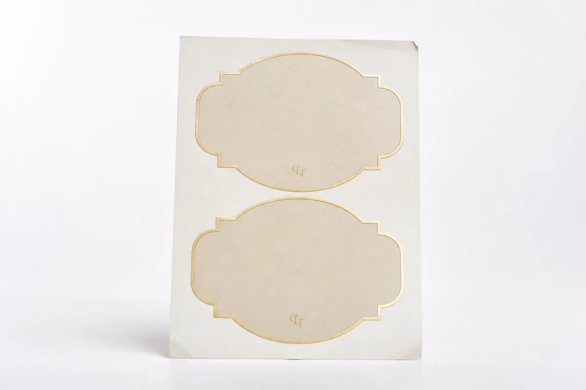
Placement choices matter too. The common formats are worth comparing because each one solves a different problem:
- Front-center labels - best for simple retail presentation and fast logo recognition.
- Wrap labels - useful when a brand needs more room for warnings, fragrance copy, or storytelling.
- Neck labels - helpful for collection marks, seasonal variants, or tamper-evident cues.
- Bottom labels - often used for barcodes, batch codes, or supplementary compliance details.
For most shelf-facing candles, front-center labels are the workhorse. They are easy to align, easy to photograph, and easy to repeat across line extensions. Wrap labels can look polished too, but only if the artwork is given enough breathing room. Otherwise the seam becomes a distraction. In both cases, logo labels for candle jars should be designed for real viewing distance, not just for a screen mockup.
The emotional job of the label should not be underestimated. Candle buyers use packaging as a shortcut for quality. They may not know the burn time yet. They may not know whether the scent throw is strong enough. What they can judge immediately is presentation. Quiet contrast, well-spaced type, and a label that sits flat can signal that the brand pays attention. That signal matters in a category where scent is difficult to evaluate before purchase.
Light changes the result too. Retail shelves are bright, and ecommerce photos are often even harsher. Gloss finishes can create glare. Clear labels can disappear against light wax. Heavy textures can photograph beautifully but be harder to read in a storefront. There is no one-size answer, but there is a useful rule: if the label depends on special effects to be understood, it may be working too hard. Logo labels for candle jars should stay readable in direct light, in dim rooms, and in small thumbnail images.
From a packaging buyer's point of view, the strongest labels answer three questions quickly: what brand is this, what scent is it, and why should I trust it? If the answer lands in two seconds, the label is doing its job. If the shopper has to tilt the jar and squint, the design is probably costing sales. That is the difference between a label that decorates and a label that converts.
Logo Labels for Candle Jars: Key Design and Material Factors
Design choices for logo labels for candle jars cannot be separated from material choices. A logo can look refined on one stock and muddy on another. A metallic accent can feel elegant in one line and excessive in another. Even the same artwork can shift from boutique to bargain depending on opacity, finish, adhesive strength, and print quality. For candle labels, materials are not background details. They are part of the brand language.
The main substrate options are usually paper, polypropylene, clear film, and textured specialty stocks. Paper remains a common starting point because it prints easily and usually costs less, especially on smaller runs. It also supports a handcrafted or natural feel, which suits many candle brands. Polypropylene and other film-based stocks hold up better against moisture, oils, and repeated handling, which is useful if the candle lives in a warm bathroom, travels through shipping, or sits in a less controlled retail environment. Clear film can create a floating effect on glass, though it requires careful artwork planning so the logo does not disappear against the jar color.
Textured stocks add depth, but they can alter how fine lines reproduce. A delicate script may look elegant on screen and faint on a rough stock. A bold sans serif often survives that texture better. For logo labels for candle jars, the smarter move is to match the stock to the brand story rather than chasing the most expensive option in the catalog.
Adhesive selection deserves more attention than it usually gets. Candle jars are curved, frequently handled, and sometimes exposed to warm ambient temperatures during storage or shipping. A standard adhesive may hold on a cold sample and still fail later when the room heats up or the vessel surface carries a trace of oil. Heat-resistant adhesives and well-matched liners can prevent bubbling, edge curl, and the slow slide that makes labels look crooked after a week on the shelf. If your candles are tested for transit, it is worth pairing the label with shipping tests aligned to ISTA test standards so the package survives vibration, pressure, and seasonal temperature swings.
Finish is the next decision point. Matte gives a calmer, more modern feel and reduces glare in product photography. Gloss adds punch and can make color fields look richer. Soft-touch feels upscale, though it can be more vulnerable to scuffing depending on the topcoat. Foil accents and spot UV add visual emphasis, but restraint matters. If every part of the label is trying to shine, the design starts to feel crowded rather than premium. Logo labels for candle jars usually benefit most from one strong accent instead of three competing effects.
Color control matters more than many brands expect. Small runs often expose tiny shifts in ink density or substrate tone, and those shifts become obvious when multiple scents sit side by side. A cream label printed on two different stocks may read as two different brand families, even if the file is identical. That is why proofing on the actual material is worth the time. It also explains why some brands keep the same label architecture across the full line. Consistency is easier to maintain than improvisation.
If sustainability is part of the brand story, paper sourcing can be checked against third-party certification rather than guessed. FSC-certified options can support that message, especially for brands that want to reduce the gap between a clean-burning candle and a package that looks disposable. You can review the certification framework at FSC. Not every candle line needs a certified stock, but for brands selling into gift, wellness, or premium home fragrance, it can become part of the value proposition.
Several practical sizing rules prevent a lot of trouble:
- Measure the visible flat area, not only the jar face width.
- Leave margin from the shoulder curve so the label does not buckle at the edge.
- Test the artwork at real size on the actual vessel, not only as a digital file.
- Check how the label looks with a full candle, not just on an empty jar.
Those checks sound basic because they are. They still prevent most of the label problems brands later pay to fix. A label that is 2 mm too tall on a curved vessel can look fine in a proof and poor on press. A label that is slightly too wide may lift at the corners after a few temperature changes. Logo labels for candle jars are only as good as the vessel they are built for.
If you need a quick decision rule, start here: paper if the line is artisanal and dry; film if handling and moisture matter; texture if the brand story needs tactility; foil or spot UV only where the accent actually improves recognition. That is the packaging buyer's version of discipline.
Logo Labels for Candle Jars: Process and Timeline
The production path for logo labels for candle jars is simple once you see it in stages, but the calendar can stretch when one stage slips. Printing itself rarely causes the delay. Artwork revisions, proof approvals, substrate sourcing, and shipping windows are the usual culprits. That is why candle labels should be treated like a project with dependencies, not a single purchase order.
The usual sequence looks like this:
- Brief - define the jar, scent line, quantity, finish, and required copy.
- Dieline selection - choose a label shape and size that fits the actual vessel.
- Artwork setup - align logo, copy, barcode, and warnings inside the printable area.
- Proofing - review a digital proof and, ideally, a material sample.
- Corrections - adjust color, placement, cut lines, or copy if needed.
- Printing and finishing - run the labels, add special effects if specified, and inspect the output.
- Packing and dispatch - prepare shipping, then check the first cartons on receipt.
Each stage may involve a different decision maker. The brand owner usually signs off on look and feel. A designer checks file setup. Someone handling compliance reviews warning text, weight declarations, or batch coding. A production lead watches timing and replenishment needs. If those roles are mixed up, small errors become expensive. A label can be visually approved and still miss a burn instruction line that a retailer expects.
For a first order, a realistic timeline is often 12 to 15 business days from proof approval for standard runs, though specialty materials, custom cutting, or unusual quantities can push that longer. If the order needs a new die, extra color matching, or a heat-resistant adhesive that has to be sourced separately, build in more time. Logo labels for candle jars are rarely delayed by the act of printing alone; they are delayed by the decisions around it.
Brands that plan backward from launch dates tend to avoid panic. If your candles must be on shelves for a holiday assortment, count back from the retail ship date, not the marketing launch date. Shipping can add several days. Rework can add more. A small proof correction can be harmless on paper and costly if it hits the wrong stage in the schedule. The safer approach is to approve earlier and keep at least one buffer window in the plan.
There is also a difference between a sample and a production run. A sample proves the artwork. It does not always prove the adhesive, packaging pressure, or line efficiency. That is why a physical sample on the actual jar matters. It shows the wrap, the edge behavior, the glare, and the way the brand reads at room distance. If your supplier offers a short run for validation, use it. A few dozen test labels can save an entire batch.
If you are ordering for the first time, the cleanest sequence is simple:
- Finalize the jar dimensions and label placement.
- Lock the logo version and scent naming system.
- Write the legal copy before layout starts.
- Request a spec sheet with material, finish, and adhesive notes.
- Approve the proof only after checking the label on the actual vessel.
- Order with enough lead time for shipping and reprint contingencies.
That process sounds methodical because it is. Good logo labels for candle jars rarely happen by accident. They happen because someone made the decisions in the right order.
One operational detail deserves a mention: if your candles move through distribution centers or retail receiving hubs, it helps to check label durability against carton handling and stacking pressure, not just the jar itself. A label that looks perfect on a studio table can scuff in transit. That is where packaging discipline shows up in the real world.
Logo Labels for Candle Jars: Cost, Pricing, and MOQ
Pricing for logo labels for candle jars usually comes down to a short list of variables: size, substrate, finish, quantity, print complexity, and whether the shape requires custom cutting. A small minimalist label on standard paper can be economical. A clear film label with foil accents, heavy coverage, and a custom contour cut will cost more. The real task is knowing which upgrades influence buying behavior and which ones mostly inflate the unit price.
MOQ changes the economics quickly. Smaller orders tend to have higher per-unit cost because setup is spread across fewer pieces. That is not a flaw in the printer; it is just how production works. For a new scent launch, a lower MOQ may be worth the premium because it reduces inventory risk. If a fragrance underperforms, you are not sitting on thousands of unused labels. For repeat sellers, larger runs usually lower the unit cost enough to justify the commitment.
Here is a directional comparison for a typical candle label size, assuming a mid-volume order and standard artwork. Actual quotes vary by region, printer, and finish complexity.
| Label Option | Typical Look | Best Use | Indicative Unit Cost | Main Tradeoff |
|---|---|---|---|---|
| Paper stock, matte | Warm, natural, understated | Handmade or farmhouse-style candles | $0.03-$0.08 | Less resistant to moisture and oils |
| Paper stock, gloss | Brighter color and stronger contrast | Retail shelves with strong lighting | $0.04-$0.10 | More glare in photos and display |
| Polypropylene film | Clean, durable, polished | Shipping-heavy or high-handling lines | $0.05-$0.12 | Feels less tactile than textured paper |
| Clear film | Floating label effect on glass | Minimal, modern, premium jars | $0.06-$0.14 | Artwork must be designed for transparency |
| Textured stock or specialty finish | High-touch, boutique presentation | Gift sets and premium collections | $0.08-$0.18 | Can raise waste if color matching is tricky |
| Foil or spot UV accents | High contrast, premium detail | Hero SKUs and top sellers | $0.10-$0.25+ | Better used selectively than everywhere |
Those numbers are directional, not a quote. They do, though, reflect how logo labels for candle jars usually scale. Quantity lowers the per-unit price. Special effects raise it. Custom dielines add setup time. A clean standard label with a strong logo often gives the best return because it looks considered without asking the budget to carry too much decoration.
There are a few easy ways to control cost without making the product look cheap:
- Standardize label sizes across multiple scents.
- Use one label structure with color changes rather than a full redesign per SKU.
- Keep special finishes for the hero candle rather than every item in the range.
- Choose a stock that supports the brand without requiring extra press passes.
- Share clean artwork files so proofing and corrections stay short.
If you are requesting a quote, send the jar diameter, label placement, finished size, quantity per scent, artwork format, and launch date. That information helps the supplier avoid guessing. It also reduces the back-and-forth that can slow down a label order. A vague request tends to produce a vague quote. A specific brief gets you much closer to the number you can actually budget.
Brands often ask whether premium finishes are worth it. The answer is sometimes, but not by default. A foil accent on a single hero fragrance may help the line feel elevated. Foil on every SKU can make the collection look overworked and can raise cost enough to hurt margin. Logo labels for candle jars should support the business model, not just the mood board.
If the goal is a profitable line, price the label alongside the jar, wax, wick, carton, and freight. A label that adds a few cents can still matter if it helps the candle move into a better retail tier. A label that adds a lot of cost without improving recognition is harder to defend. Packaging should earn its place.
Common Mistakes with Logo Labels for Candle Jars
The same problems show up again and again with logo labels for candle jars, and most of them are preventable. Sizing comes first. A label can be too tall for a curved vessel, too wide for the front face, or too close to the shoulder. Any of those choices creates wrinkles, edge lift, or a label that looks forced onto the jar. The proof may look fine. The actual vessel may not.
Readability follows close behind. Thin fonts, low contrast, and highly reflective finishes can make the label hard to read at retail distance. If the logo looks beautiful only under perfect studio lighting, it is not doing enough. The same criticism applies to crowded copy. A candle label that tries to include the brand story, scent notes, legal text, barcodes, and social handles on one tiny panel usually ends up helping none of them.
Another common error is ignoring heat and handling. Candle jars may not feel blazing hot on the outside, but they move through warm storage rooms, shipping trucks, and consumer homes with changing temperatures. Oil residue from fragrance can also interfere with adhesion near the lower edge if the label sits too close to the wax fill line. Labels that are not built for that environment may bubble, slide, or collect scuffs.
Compliance is where some brands take the biggest risk. Depending on market and channel, logo labels for candle jars may need burn instructions, warnings, scent identification, weight declarations, or batch details. Not every requirement is identical everywhere, but leaving out the essentials can lead to retailer pushback or reprint costs. A label that looks polished but misses required copy is not a finished package.
Here are the warning signs I watch for:
- The label sits too close to a curved shoulder.
- The logo disappears against the jar color.
- The font size drops below easy reading distance.
- The finish reflects too much light for shelf display.
- The artwork changes slightly between fragrance variants.
- The reorders have no documented spec sheet.
That last point matters more than people think. When a brand changes paper, adhesive, or artwork without documenting the original spec, the next reorder can drift. One batch may arrive slightly warmer in tone. Another may use a different liner. A third may place the warning line lower than before. Those differences are easy to overlook in the moment and irritating to correct later. Good logo labels for candle jars should be reproducible, not just attractive once.
There is also a hidden cost to inconsistency. If every scent looks like it belongs to a different sub-brand, the line loses coherence. That can make the collection harder to sell as a family and harder to replenish. A clear master system solves a lot of this. Same placement. Same type hierarchy. Same logo lockup. Then only the scent name and accent color change. It is simpler for production and easier for shoppers to understand.
Designing from a screen alone creates another trap. Color calibration, reflection, and curvature can change the outcome in ways that are hard to predict. A flat mockup does not show how the label looks when the jar is held under store lighting or photographed in a marketplace listing. For logo labels for candle jars, the real test is physical. A printed sample is worth more than a dozen pretty renderings.
Expert Tips and Next Steps for Logo Labels for Candle Jars
If you want logo labels for candle jars to do their job well, start with the vessel, not the artwork. The jar drives the label size, the curvature sets edge behavior, and the finish of the glass changes how colors read. A sample on the actual vessel is the fastest way to avoid a costly mismatch. Screens flatten texture and soften reflection; the jar will reveal both.
My strongest recommendation is to build one master label system that can flex across the fragrance range. That means a consistent logo position, one type scale, and a fixed location for required copy. Once that framework is set, the brand can rotate scent names and color accents without rebuilding every SKU. It is cleaner for production, and it protects consistency during replenishment.
Testing should happen in the same conditions the candle will face in the market. Put the jar under bright retail lighting. Hold it at arm's length. Pack a few units into a shipper and see if the labels scuff. Leave a sample in a warm room and check for edge lift or adhesive creep. Those tests are boring. They are also where logo labels for candle jars stop being a design exercise and become a packaging system. If a label survives those checks, it is probably in good shape.
Here is a launch sequence that usually keeps the process under control:
- Lock the logo lockup and typography.
- Confirm the jar dimensions and label placement.
- Write the warning copy, scent name, and any batch or weight details.
- Choose a material and finish that fit the brand position.
- Request a proof and, if possible, a physical sample.
- Approve only after checking the label on the real jar.
- Schedule production backward from the launch date, with shipping time included.
If you are comparing options now, the most useful question is not "What is the fanciest label?" It is "What will still look good after handling, shipping, and shelf time?" That answer is usually more practical than flashy. It often points to a stock that balances durability and cost, with one memorable accent rather than three. Custom Labels & Tags can be a useful place to compare those choices in one pass.
For brands selling into retail, subscription, or gift channels, it also helps to think about repeatability. Can the label be reprinted without color drift? Can the design scale to three, six, or twelve scents without looking assembled in different eras? Can the line hold together if a fragrance is discontinued and replaced? Those are the questions that separate a one-off design from a packaging system.
Logo labels for candle jars are not a minor detail. They shape shelf appeal, support compliance, and influence how the brand is remembered after the candle is gone. If the structure is right, the label becomes one of the most efficient pieces of the whole package. If the structure is wrong, it can undercut an otherwise good product. The path is manageable: Choose the Right vessel, match the material to the use case, proof the art on the actual jar, and build a repeatable label system before you scale. Start there, and you will avoid a lot of avoidable reprints.
What material is best for logo labels for candle jars?
Paper labels can work for dry, lower-cost applications, but film-based materials usually hold up better against handling, oils, and occasional moisture. If the jar will sit in warm rooms or travel in tight shipping cartons, choose a durable adhesive and a finish that resists scuffing. For many brands, that means polypropylene or another label film is the safer long-term choice for logo labels for candle jars.
Do logo labels for candle jars need heat-resistant adhesive?
Often, yes. Heat, shipping variation, and repeated handling can all push a label past what a standard adhesive was built to tolerate. A label that looks fine in a cold sample can still lift or bubble when the candle reaches a warm shelf or rides in a truck. Testing matters more than assumptions, especially for logo labels for candle jars used in retail or e-commerce.
How big should logo labels for candle jars be?
The label should match the visible flat area on the jar, not the total front face, because curvature can distort the edges. A good starting point is to mock up the label on the exact vessel and check readability from arm's length. If the brand name and scent can be read quickly, the size is probably in the right zone. If the eye has to hunt for it, the label is too small or too crowded.
What affects the price of logo labels for candle jars the most?
Quantity, material, finish, and size usually have the biggest impact on unit cost. Complex artwork, foil, specialty coatings, and low-MOQ runs can raise pricing quickly. If you want a sharper quote, share the jar dimensions, finished label size, quantity, and artwork format so the printer is not forced to guess.
How long does the turnaround usually take for logo labels for candle jars?
Turnaround depends on proof approval, material availability, and the printer's schedule, not just the print run itself. Many standard orders move in roughly 12 to 15 business days after approval, but specialty materials or custom cutting can extend that. Brands shorten lead time by sending final artwork early and keeping the spec stable across scents.


