Most Logo Patches for Ecommerce caps sell the idea of a hat faster than dense embroidery does. That is less about trend and more about viewing behavior. A shopper on a phone gives a product a blink or two, then moves on if the front panel looks busy, fuzzy, or underlit. A patch gives the logo a sharper silhouette, which usually reads better in thumbnails and in the first glance after the box is opened.
The difference matters because a cap has to do several jobs at once. It needs to look clean in a listing grid, ship without getting crushed, and still feel worth the price when the customer takes it out of the package. Those requirements shape the decoration choice as much as branding does. A design that looks fine in a mockup can still fail in production if it turns into a mushy stitch cluster or sits awkwardly on a soft crown.
That is why experienced buyers look past the decoration style and compare the whole build: cap blank, patch material, attachment method, unit cost, and how the item will photograph. A good hat program is usually the one that stays legible under bad lighting, survives packing, and keeps margin intact after freight and reorders are added in.
Why Logo Patches Beat Flat Embroidery on Ecommerce Caps
Flat embroidery still has a place. Simple scripts, bold initials, and sportswear-style marks often look clean in thread. The problem starts when the logo carries small text, layered shapes, thin outlines, or more than a couple of colors. Thread density can crowd the art, and a small front panel has limited room to absorb that complexity. The result is often a hat that feels heavier than the brand intended.
Patches solve that by separating the artwork from the fabric surface. That separation gives the logo a defined edge and a clearer read from a distance. It also lets the front of the cap stay visually calm, which is useful in ecommerce where the image has to carry the sale without much context. A buyer does not inspect stitch count. They notice whether the cap looks premium, intentional, and easy to understand.
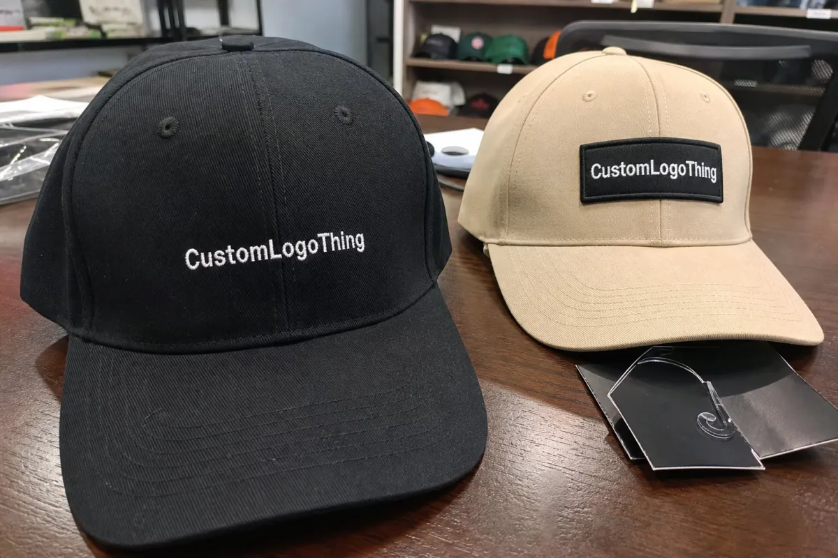
There is a practical side too. Patch construction gives more control over the final appearance of detailed logos. Woven badges preserve small type better than embroidery. Leather brings a restrained, elevated look. PVC creates a bolder, more molded profile. Even a simple woven patch can rescue artwork that would otherwise collapse into a blur once it hits a needle path.
Practical rule: if the logo is hard to read on a 1-inch mockup, embroidery is usually the wrong tool. A patch normally gives a cleaner result and fewer unpleasant surprises once the sample arrives.
For ecommerce, the patch also changes the perceived value of the cap. A plain blank with a well-placed badge often feels more deliberate than a heavily stitched logo on a soft crown. That can support a higher retail price, provided the rest of the product matches the presentation. Buyers are quick to spot the difference between a carefully built item and a cap that was decorated late in the process to meet a budget.
Patch Types, Materials, and Placement That Actually Sell
Choosing logo patches for ecommerce caps starts with artwork, not style preference. The patch has to fit the logo, the blank, and the price point. Woven patches are usually the safest choice for fine detail. They can hold small text and thin lines better than an embroidered patch, and that matters when the product photo is doing all the work. If the design has tiny registration marks or a busy badge outline, woven often gives the cleanest result.
Embroidered patches have more texture and dimension. They feel classic, and they work well for bold icons, simple crests, or logos that benefit from a little depth. The raised thread can look strong on structured caps and premium casual styles. The tradeoff is that embroidery is less forgiving with detail. If the art depends on precise edges or compact lettering, the thread can close in faster than the design should allow.
PVC patches sit in a different lane. They look modern, graphic, and durable. Brands in outdoor, utility, streetwear, or technical apparel often use them because the molded surface keeps strong edges and high contrast. The downside is feel: PVC can read as more tactical than fashion-forward, and on some cap bodies it can look out of place if the rest of the product leans soft or heritage-driven.
Leather patches carry a premium signal, especially on neutral caps or earthy color palettes. They are popular because they photograph well and do not fight the fabric. That said, leather is not ideal for every logo. Very small text can disappear, and exact color matching is limited. If the brand depends on precise hues, leather may be the wrong medium even if it looks elegant at first glance.
Printed patches fill a specific need: color-heavy art, gradients, or designs that would become too noisy in thread. They can be efficient for lower-cost programs, but the finish has to be handled carefully. Print quality, laminate quality, and edge cutting matter a lot because a cheap printed patch can look flat in a way that undercuts the product.
| Patch type | Best use | Typical patch cost at scale | What it signals online |
|---|---|---|---|
| Woven | Small text, fine lines, detailed badges | $0.22-$0.45 each | Clean, precise, retail-ready |
| Embroidered | Simple logos, textured branding | $0.20-$0.40 each | Classic, tactile, familiar |
| PVC | Bold icons, lifestyle and utility brands | $0.38-$0.85 each | Modern, durable-looking, graphic |
| Leather | Premium fashion positioning | $0.45-$1.10 each | Quiet luxury, warm, elevated |
| Printed | Color-heavy artwork, gradients | $0.18-$0.35 each | Direct, colorful, practical |
Cap construction changes the equation. Structured dad hats hold a patch nicely because the front panel stays flatter. Unstructured six-panels are softer and more casual, which can make a leather or woven patch feel refined, but only if the patch size is modest. Foam truckers bring a different problem: the front face is often less forgiving, and the attachment method has to avoid puckering or edge lift. Five-panels can look sharp with patches, but placement needs to respect the crown shape or the design starts to skew.
Placement is not just a design choice; it changes conversion. Front-center is the most familiar and usually performs best in listing images because the eye finds it immediately. A side patch reads as quieter and more editorial. Back-strap or brim placements feel niche and can support a limited-drop strategy, but they are not the safest option if the goal is broad ecommerce appeal. Size matters just as much. Too large and the cap looks crowded. Too small and the branding disappears once the photo is compressed into a thumbnail.
Attachment should match the selling model. Sew-on is the safest for permanence and repeatability. Heat-activated backings can work well, but only if the factory controls temperature, dwell time, and pressure consistently. That process can fail on some fabrics, especially if the crown finish or coating is not compatible. Velcro has a use case for removable branding or tactical programs, though it adds bulk and rarely feels elegant on a fashion-led cap.
The little details carry more weight than most buyers expect. Clean edge cutting, consistent border width, and the right backing thickness affect how the hat sits and how repeatable it looks across a production run. A patch that is technically correct but visually heavy can make the cap feel cheap. The same logo, trimmed well and placed with restraint, can look noticeably more expensive without changing the blank.
Cost, MOQ, and Unit Pricing for Small and Large Drops
Pricing for logo patches for ecommerce caps is usually a stack of smaller costs, not one neat number. The quote should account for the cap blank, patch production, application labor, setup or digitizing, packaging, and freight. If a supplier only gives you a unit price and nothing else, the missing pieces will usually appear later in the form of sample fees, rush charges, or added shipping. The first quote is often the friendliest one.
Low-volume runs carry a higher per-unit cost because setup gets spread across fewer pieces. That is the unavoidable math of custom product. A 200- or 300-piece test drop may be expensive on paper, but it reduces inventory risk. A 2,000- or 3,000-piece order drops the unit price, yet it only makes sense if the style has already shown demand. Overbuying a cap that only looks good in product renderings is an expensive way to learn a market lesson.
Typical numbers help with planning. A basic cap blank can run roughly $2.20-$5.50 depending on fabric, structure, and sourcing quality. Patch application may add $0.25-$0.80 per cap. Setup or digitizing might fall in the $40-$120 range depending on logo complexity and how many versions need to be prepared. Samples, freight, and packaging can add more than expected, especially if the order needs to move quickly. The landed cost is usually higher than the first unit quote by a meaningful margin.
For ecommerce brands, landed margin matters more than sticker price. A cap that costs less per unit may still earn less if it requires expensive packaging, slower turnaround, or a high return rate because the decoration did not hold up in transit. That is why the cheapest option is not always the cheapest once all the variables are counted. If the target retail price needs the landed cost to stay under a specific threshold, say so early. Otherwise the project can drift toward a product that looks viable until the numbers are fully assembled.
Packaging deserves its own line item. Poly mailers are cheaper, but they do not protect a structured crown well. Rigid boxes or better carton packing raise the cost, yet they reduce crush risk and improve the unboxing experience. For Brands That Sell accessories with higher perceived value, that trade is often worth making. If shipping performance matters, many teams use the logic and terminology of ISTA as a reference point for transit testing and package abuse.
Materials used in packaging can matter as part of the product story too. FSC-certified paper insert cards, hang tags, or cartons give the order a more credible sustainability angle than vague claims ever will. The reference standard is FSC. That does not solve the whole sourcing conversation, but it does give buyers and customers something concrete to verify.
Process and Timeline: From Art File to Finished Caps
The production flow is straightforward on paper and slightly messy in practice. It starts with art review, then mockup prep, then sampling, then bulk patch production, then application to the caps, followed by quality control, packing, and freight. Each step has its own risk. A clean workflow reduces those risks by forcing decisions in the right order instead of treating them as optional.
Lead times depend on the patch type, order size, and whether the cap blanks are already in hand. A realistic timeline often looks like 1-2 business days for mockup review, 5-8 business days for sample patch production, 7-15 business days for bulk decoration, and a few additional days for packing and shipping. If approvals are fast and the artwork is clean, a 12-20 business day window after proof approval is possible. If the logo needs revisions or the factory is waiting on a final call, the calendar stretches quickly.
Weak art files are one of the most common reasons for delay. Raster images, missing vector paths, vague size instructions, and no defined color references all slow production. A supplier cannot guess whether the wordmark should be 2.1 inches or 2.7 inches wide, and they should not have to. The clearer the file, the fewer rounds of back-and-forth are needed. Exact dimensions, one decision-maker, and a single approved version keep the project moving.
Sample approval is the point where the whole job either gets easier or becomes a chain of corrections. A pre-production sample on the actual blank is worth the time because the patch may behave differently once it is mounted. The crown can shift. The edge can sit higher than expected. A backing that looks fine on paper can fail under heat or pressure. Those issues are much cheaper to fix on one sample than on a bulk run.
Factories that handle this well can usually explain their check process in plain language. They should be able to tell you how they verify center placement, edge lift, patch symmetry, and whether the decoration distorts the front panel. If the answer is vague, that is worth treating as a warning sign. A finished cap does not need a lab report, but it does need repeatable assembly.
Step-by-Step Ordering Checklist for Ecommerce Brands
Before requesting quotes, assemble the details that actually change price and outcome. The cap style, patch type, patch size, patch shape, backing, quantity split, artwork file, and color references should all be locked before vendors start guessing. If the order includes multiple colorways or sizes, spell that out too. A quote built on incomplete specs is usually only useful as a rough first pass.
Then ask each supplier to quote the same package in the same format. That sounds basic because it is. Compare whether the patch, application, and freight are included. Some vendors quote only the patch. Others include decoration on the cap. A few will quote freight as though it is a separate surprise. The cleaner the comparison, the easier it is to spot where the real value sits.
- Cap style: structured dad hat, unstructured six-panel, foam trucker, or five-panel.
- Patch specs: woven, embroidered, PVC, leather, or printed; plus size and shape.
- Backing: sew-on, heat-activated, Velcro, or another attachment method.
- Artwork: vector file, Pantone or CMYK references, and any minimum text size.
- Quantity split: total run, color split, and whether samples count toward the order.
Once the sample arrives, inspect more than the logo face. Look at alignment, border finish, touch feel, and how the cap sits when worn. A patch can look technically good and still feel wrong if the attachment makes the front panel stiff or creates a visible ridge. If the hat is supposed to be a relaxed accessory, the sample should actually look relaxed.
A simple internal approval sequence works best: approve the art, approve the size, approve the sample, confirm the production schedule, confirm packaging, and then release payment or purchase authorization under the agreed terms. That order keeps the project controlled without making every small choice an emergency. The fewer assumptions you leave in the file, the fewer surprises appear in the box.
Common Mistakes That Cause Returns, Delays, or Blurry Logos
Size is the most frequent problem. Oversized decoration can overpower the crown and make the cap feel crowded. Undersized decoration disappears on a product page, where the image is already compressed and the mobile screen is not generous. Ecommerce is harsh about proportion because customers decide from a thumbnail first, not from a hand-held inspection.
Material mismatch is next. A stiff patch on a soft unstructured cap can curl or sit oddly. A light patch on a structured crown can look underbuilt. A leather patch on a foam trucker may feel out of place if the rest of the product leans casual or athletic. The decoration should feel like it belongs to the blank, not just attached to it.
Color management creates its own set of headaches. Screen color is not thread color. Leather has natural variation. PVC can shift a little under different lighting. If the project skips a physical sample and relies on a monitor, the chances of mismatch rise fast. It is a common mistake because the digital file looks finished, but the material does not behave like the display does.
Assembly issues are the hidden problem. A patch that looks excellent on its own can fail once mounted on the real cap. The crown may distort after heat application. The edge may lift after folding. Packaging can bruise the front panel if the crown is not supported. For that reason, a finished sample on the actual blank is not optional if the goal is predictable bulk production.
Transit testing does not need to be complicated to be useful. Borrow the logic of package abuse checks from organizations like ISTA: compression, vibration, and drop handling all matter. Caps are not fragile in the way glass is fragile, but they are easy to deform. Once a front panel creases, the decoration can look tired before the customer even opens the parcel.
- Oversized artwork: makes the hat look crowded and can distort the crown.
- Poor placement: throws off symmetry, which shows up immediately in photos.
- Unapproved backing: leads to lift, curl, or uncomfortable wear.
- No finished sample: leaves you blind to fit and packaging problems.
Expert Tips for Sampling, Photography, and QA
If you can only approve one sample, make it the exact cap blank intended for sale. A patch can look right on paper or on a loose sample and still behave differently on a real crown. Fabric stiffness, seam height, front panel shape, and even panel thickness change how the decoration sits. The right blank is part of the design, not just the carrier for it.
Photography should be treated as part of quality control. Good logo patches for ecommerce caps must read from a distance and survive thumbnail compression. If the logo only looks strong in a close studio shot, the product may underperform online. Buyers rarely zoom in before deciding whether to click.
Ask for two photo sets: one in daylight and one in controlled studio light. Daylight reveals texture, border irregularities, and color behavior. Studio light shows how the cap will actually read in the listing environment. Between the two, most issues with sheen, patch edge finish, and contrast become obvious before inventory is locked.
QA should be simple and repeatable. Check symmetry, patch adhesion, border finish, stitch consistency on embroidered patches, and whether the decoration survives folding and repacking. If the caps ship in mailers, test one in the same packaging. That often exposes crush points, crease marks, or crown deformation that would otherwise appear only after the first customer complaint.
A useful manual test is almost too basic, which is why it gets ignored: hold the cap at arm's length for three seconds. If the logo reads immediately, the design is probably working. If your eye starts searching for the mark or explaining it to itself, the customer experience will likely be weaker than the mockup suggested.
Good sample discipline saves money. One approved sample on the right blank is cheaper than 500 units of "close enough."
Document the approved sample carefully. Note the patch material, dimensions, placement, backing, packaging method, and any acceptable color variance. That record makes reorders faster and reduces the chance of a different factory interpretation later. It also gives your team a clear standard if a future batch arrives slightly off.
Next Steps Before You Place the Order
Before committing, choose the cap style, select the patch material, define the quantity, and request at least two quotes using identical specs. That alone removes a surprising amount of confusion. Once the specs are fixed, price comparison becomes meaningful instead of being a stack of unrelated numbers.
Verify the sample policy, lead time, and replacement terms before paying. A low unit price with weak approval rules is not much of a bargain if the order cannot be corrected without extra fees or long delays. The paperwork matters because it determines how much control you keep after the deposit is made.
Then check the product the way a customer will see it. Does the cap photograph well? Does the patch match the brand tone? Will the packaging protect the front face during shipping? If the answer is yes, the build is probably ready. If one part still feels unresolved, fix that now. The difference between a solid drop and a messy one is often a single practical choice made before production starts.
For most ecommerce brands, the strongest path is straightforward: keep the art readable, choose the patch type that fits the blank, approve a finished sample, and calculate landed cost instead of chasing the lowest quote. That approach turns logo patches for ecommerce caps from a styling detail into a product decision that can actually hold up at scale.
Are logo patches for ecommerce caps better than embroidery?
Patches usually work better when the logo includes small text, layered detail, or multiple colors. Embroidery still makes sense for very simple artwork and low-cost promo caps, especially if the goal is the lowest decoration cost and the design can stay bold at small scale.
What patch material works best for ecommerce caps?
Woven is often the cleanest option for fine detail, embroidered adds texture, PVC gives a modern molded look, leather feels premium, and printed patches handle color-heavy artwork. The right choice depends on cap style, target price, and how the hat needs to read online.
How much do logo patches for ecommerce caps usually cost?
Patch cost depends on material, size, backing, order quantity, and whether application is included. Small runs carry higher per-unit cost because setup is spread across fewer pieces, while larger orders usually reduce the unit price once the production process is locked.
What is the usual production timeline for patch caps?
A typical order moves through proofing, sampling, bulk decoration, quality control, and shipping. Clean art files and fast approvals shorten the schedule. Rush production is possible in some cases, but it usually adds cost and reduces flexibility for revisions.
What should I check before launching a cap drop?
Check patch size, color accuracy, attachment strength, placement, and how clearly the logo reads in real product photos. Approving one finished sample on the actual cap blank is the safest way to confirm that the final product matches the plan.


