If you’re building candle packaging that feels premium, the Logo Patches Material guide for candle brands is not a nice extra. Material choice changes how the pack looks, how it holds up in shipping, how it reads on a shelf, and whether it still looks polished after a few hands have touched it. A patch can be small, yet it often carries the first impression for the whole line.
That matters more for candles than for many other products. Candle packaging lives in a mixed environment: retail lighting, gift tables, mailers, seasonal displays, and homes where humidity, friction, and fragrance residue all have a say. The pretty part of packaging is easy. The hard part is picking a patch that can handle the real use case without warping the brand story.
There’s also a cost to getting it wrong. A bad patch choice can make a carefully priced candle feel like private-label filler. A good one can make a modest box feel considered and expensive. Same logo. Different material. Very different result.
Why candle brands care about patch material more than they think
Candle packaging sits in a strange middle ground. It is expected to look decorative, but it also gets handled, stacked, shipped, gifted, and sometimes stored near heat. That means the branding element on the pack has to do more than sit there and look elegant in a mockup. It has to stay flat, legible, and attached.
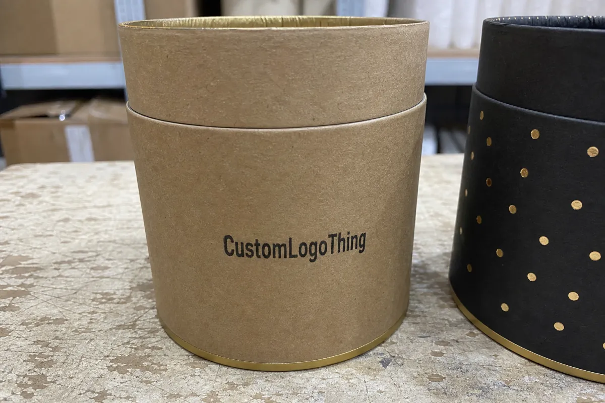
“Logo patch” can mean several things in candle packaging: a sewn label, an iron-on badge, an adhesive emblem, or an appliqué used on bags, rigid boxes, kraft sleeves, wrap bands, or gift kits. The effect is not cosmetic only. Texture tells shoppers whether the brand feels artisanal, minimal, luxury, earthy, or mass-market before they’ve read a single scent note. People read the surface first. Then they read the copy.
That is why patch material can shift perceived value more than founders expect. A dense woven patch on a cotton pouch suggests intention. A thin glossy piece trying to imitate a patch usually feels like a shortcut. The logo may be identical, but the material tells a different story.
Sharp observation: if the patch looks like an afterthought, customers often assume the rest of the packaging was treated the same way. That assumption is unfair sometimes. It is also common.
For candle brands, the most useful way to approach patch selection is through five filters: appearance, durability, application method, cost, and turnaround. In that order. Brands tend to start with style and then discover too late that the material cannot survive the actual packaging process.
How logo patch materials work on candle packaging
The main material families are simple enough: woven fabric, embroidered twill, felt, leatherette, PVC or silicone, and printed synthetic patches. The differences sound minor on a spec sheet. In hand, they are not minor at all.
Woven patches are a strong choice for sharp logos and smaller text. They handle detail better than heavy embroidery and tend to sit neatly on fabric bags, tissue wraps, and soft sleeves. Embroidered patches bring more texture and a handmade feel, but small lettering disappears quickly. Felt gives warmth and softness, which can suit winter sets or gift bundles, though it can pick up lint and show wear sooner. Leatherette reads structured and premium, which is why it shows up often in luxury gifting and limited editions. PVC and silicone are the most wipeable and durable, but they can feel less natural, which matters if the brand leans botanical or eco-led.
Attachment method changes the outcome just as much as the substrate. Sew-on is the most durable and usually the safest choice for tote sleeves, fabric pouches, and reusable gift bags. Heat-seal or iron-on saves labor, but not every candle pack can tolerate heat, especially coated paper, laminated board, or thinner wraps. Adhesive backing is fast and low-cost for short runs, but it only behaves well on smooth, clean surfaces. Hook-and-loop works for seasonal badges or removable promotions, though it is usually a special campaign choice rather than a core SKU solution.
There is one constraint candle brands underestimate: heat and handling. Warm shelves, compression during shipping, wax residue, fragrance oils, and repeated touching can all change how a patch wears. If the patch goes on a fold-over box, jar sleeve, or gift band, test it under realistic conditions, not just on a spotless desk under office lighting. A patch that looks fine in a proof can still fail after transport or display.
Some materials photograph better than they wear. Others do the opposite. Glossy synthetics often pop in online product images, while woven pieces may feel quieter on screen but age better in retail. The right answer depends on where the packaging spends its life: direct-to-consumer shipping, boutique retail, holiday gifting, or subscription boxes.
Key factors that decide the best patch material
Start with brand position. Luxury candle lines usually lean toward leatherette, dense embroidery, or high-quality woven patches because those finishes feel deliberate. Eco-led brands usually prefer woven cotton, recycled blends, or lower-plastic options that fit the story they are already telling. If the packaging says natural and the patch looks like shiny plastic, the mismatch is obvious.
Channel matters just as much. Direct-to-consumer shipping is rough on soft packaging. Mailers compress. Subscription boxes get stacked, repacked, and opened again. Boutique retail exposes packaging to constant touching. Seasonal gifting is unpredictable because people handle, re-tie, and re-open everything. A patch material that works beautifully in one channel can be a headache in another.
Visual style is the next filter. Matte finishes usually read more refined. Glossy surfaces can feel modern, but they also show scuffs and fingerprints faster. Soft texture suggests handmade. Structured texture suggests control and premium execution. Flat patches tend to feel understated; raised surfaces feel more tactile and, to many buyers, more expensive.
Artwork complexity should be checked early. Thin lines, tiny type, gradients, and multi-color graphics do not behave equally across patch types. Woven patches usually handle fine detail better than thick embroidery. Felt can swallow edges. Leatherette can look elegant with debossing or minimal print, but complicated graphics can become muddy. Printed synthetics offer the most flexibility for complex art, though they do not always carry the same premium signal.
Environmental claims also need discipline. If the packaging is positioned around recycled content, FSC-certified paper, or biodegradable components, the patch should not quietly undermine that claim. A small synthetic piece may be perfectly acceptable, but the material story should stay coherent. Buyers notice when one element looks borrowed from a different product category.
| Patch material | Best for | Typical look | Practical downside | Relative cost |
|---|---|---|---|---|
| Woven fabric | Fine logos, retail bags, sleeves | Crisp, refined, flat | Less texture than embroidery | Mid |
| Embroidered twill | Handcrafted or heritage positioning | Textured, dimensional | Small text gets lost | Mid to high |
| Felt | Seasonal or cozy gift sets | Soft, warm, tactile | Can pill or pick up lint | Mid |
| Leatherette | Premium gifting and luxury sets | Clean, upscale, structured | Can feel less eco-friendly | High |
| PVC / silicone | Durability and wipeability | Modern, durable, bold | Less natural-looking | Mid to high |
| Printed synthetic | Detailed graphics and fast runs | Flexible, colorful | Can look less premium | Low |
If you are comparing options for a new pack, do not trust a digital proof alone. Ask for a physical sample or a short run. Texture, stiffness, edge finish, and backing behavior read very differently in hand. A material that looks expensive on a screen can feel surprisingly light once it arrives.
Cost, pricing, MOQ, and unit cost basics
Patch pricing is driven by the usual variables: size, stitch count, material type, backing style, edge finish, color count, and assembly complexity. Larger patches cost more. More colors cost more. More embroidery detail costs more. Custom silhouettes can also increase tooling or setup time.
For budgeting, adhesive or printed patches are usually the lowest-cost options. Woven and felt sit in the middle. Leatherette and dense embroidered patches usually land higher, especially when paired with custom shapes or specialty backings. That does not make them wrong. It just means the finish should match the role. Paying for a premium patch on a temporary promo sleeve is a strange place to spend margin.
A realistic way to think about the pricing ladder:
- Printed or simple adhesive patches: usually the cheapest choice for short runs and quick testing.
- Woven and felt patches: often a balanced middle ground for brands that want texture without pushing unit cost too high.
- Leatherette and dense embroidery: typically the most expensive, especially with custom shapes or specialty backing.
MOQ matters because lower minimums usually mean higher unit cost. Higher volumes spread setup and sampling over more pieces, which improves pricing and usually improves consistency too. Still, ordering more than you can realistically use is not smart inventory management. It is just a larger pile of unused packaging.
Hidden costs show up quickly if they are not tracked early. Setup fees, sample charges, rush production, artwork cleanup, and special backing requests all affect landed cost. Brands also forget to count the rest of the packaging system. A patch might be cheap on its own, but once it is integrated into corrugated mailers, kraft wraps, tissue bands, and gift kits, labor and handling can shift the economics.
Compare total landed cost, not just unit price. Include freight, packing method, inspection time, and whether the patch arrives ready to apply or needs extra preparation. A slightly higher unit price can still be cheaper overall if it reduces labor at the packing table.
Process and lead time: from artwork to approved sample
The production flow should be predictable. First comes artwork prep. Then material recommendation. Then a digital proof. Then sample approval. Then bulk production. Then quality control and packing. If a supplier skips one of those steps, that is not speed. It is risk.
Most delays come from a handful of familiar problems. Artwork revisions eat time. Color matching stretches out when a brand wants a very specific tone. Missing dielines or unclear placement instructions stall proofing. Material choices that need extra testing, such as adhesive on coated cartons or heat-applied backing on delicate surfaces, add another round of validation.
Timeline expectations are fairly consistent. Simple patch runs can move quickly after proof approval. Custom shapes, specialty backings, and high-detail embroidery take longer. If the packaging is tied to a seasonal launch, build in buffer time for sampling and shipping. Candle brands often plan fragrance first and remember packaging too late. That is how rush fees happen.
To reduce lead time, finalize logo files early and keep them in vector format. Avoid changing materials after quoting starts. Approve one direction quickly instead of requesting six almost-identical versions. And do not combine too many SKUs in a single order unless the production schedule can truly handle it.
Practical timeline guide:
- Artwork prep and quote: 1–3 business days.
- Digital proof and revisions: 2–5 business days.
- Sample production: usually 5–10 business days, depending on material.
- Bulk production: commonly 10–20 business days after approval.
- Shipping: varies by destination and freight mode.
If packaging has to survive shipping, ask about the test method. For broader transit validation, standards such as ISTA testing standards are useful references. For paper and sustainability-related sourcing, the FSC certification framework helps you verify claims instead of assuming them. Those references are not decorative; they help brands make choices that hold up once the box leaves the warehouse.
Common material mistakes candle brands make
The biggest mistake is choosing a material that looks premium on screen but fails in hand. Overly glossy or flimsy patches can look acceptable in a render and still feel cheap once they are touched. That disconnect damages trust quickly, especially for premium candle lines.
Another common problem is using too much detail for the patch type. Tiny fonts, skinny lines, and intricate icons can disappear once woven, stitched, or embossed. What looked elegant in design software becomes a blur in production. That is a spec issue, not a supplier mystery.
Adhesive performance is also ignored more often than it should be. Textured, coated, curved, or oily surfaces are hard on adhesives. Jar wraps, rigid cartons with coatings, and sleeve edges all create weak points. If the patch is going onto a surface that is not perfectly flat and clean, test it first.
Candle packaging gets handled by people with scented hands, which means stain resistance matters. Oils, residue, and wax dust can cling to soft materials. If the patch shows dirt after a few touches, the retail presentation drops fast.
Sample testing gets skipped all the time. Teams approve the proof, place the order, and only discover the issue after full production. That is expensive and avoidable. If you are building a new packaging line, test the patch on the actual box, bag, or sleeve before committing.
Price-only buying causes another layer of trouble. A low quote can look clever until the color feels off, the texture reads wrong, or the patch loses detail at production size. Cheap can be smart. Cheap and wrong is just a second purchase later.
Expert tips for choosing the right logo patch material
Start with the packaging surface, not the logo. A smooth rigid box, a fabric pouch, a wrap sleeve, and a tissue band all favor different materials. Fabric-based surfaces generally work best with stitched options. Paperboard and coated card need more scrutiny, especially if you are considering adhesive or heat-seal backing.
Use stitched or woven patches when the brand promise is handcrafted, long-lasting, or tactile. Use printed or adhesive options when speed and volume matter more than texture. That is the tradeoff, and there is no material that wins on every variable.
Ask for a physical sample or a short run before scaling. Screen color and texture are not reliable enough for a final decision. Real light exposes flaws, and real handling exposes weak points. It is far better to discover a rough edge on a sample than in a full production run.
Keep the patch shape simple if you run multiple scents or seasonal collections. Simple shapes are easier to reorder, easier to place consistently, and usually less expensive to modify. If the line changes often, a highly detailed custom silhouette can become a maintenance problem.
Use one material family for core SKUs and reserve premium finishes for gift sets or limited drops. That keeps the packaging system cleaner and the buying process easier. A core line should be stable. Special editions can carry the extra texture or finish.
Practical rule: if the patch needs a paragraph of explanation, it probably is not doing enough visual work. Good packaging branding should feel obvious before it feels clever.
Next steps to spec your patch order
First, audit your current candle packaging surfaces. Note whether each one is smooth, textured, coated, or fabric-based. That single pass prevents a surprising amount of buyer regret later.
Next, shortlist two or three materials that fit both brand and budget. Request samples in the exact size and shape you plan to use. A 50mm patch and a 70mm patch do not read the same, even if the logo stays identical.
Prepare logo files in vector format and decide on backing type before asking for a quote. That makes pricing cleaner and cuts down on back-and-forth. Ask for a side-by-side estimate that includes unit cost, MOQ, setup, sample charges, and turnaround time so you can compare properly.
Before placing the full order, approve one test placement on actual packaging. Then lock the spec and keep it consistent for reorders. Consistency saves time, protects recognition, and makes inventory planning less frustrating.
If you are buying packaging as a system rather than a pile of separate parts, this Logo Patches Material guide for candle brands should make the decision more practical. The right patch material does not just decorate the pack. It helps the candle line feel credible, cohesive, and worth the price.
FAQs
What is the best logo patch material for candle brands that want a premium look?
Leatherette, dense embroidery, and high-quality woven patches usually deliver the strongest premium signal. The best choice depends on where the patch will be used: box, tote, wrap, or gift set. For luxury presentation, texture and edge finish matter as much as the logo itself.
Are adhesive logo patches a good option for candle packaging?
Yes, if you need fast application and lower cost. They work best on smooth, clean surfaces and short- to medium-term packaging use. They are less reliable on textured, curved, coated, or oily surfaces, so testing matters.
How do I choose between woven, embroidered, and printed patches for candles?
Woven patches are best for fine detail and crisp logos. Embroidered patches are better for texture and a handcrafted feel. Printed patches are usually the budget-friendly choice when speed and low unit cost matter more than tactile richness.
What affects MOQ and unit cost for custom logo patches?
Patch size, number of colors, stitching complexity, backing type, and shape all affect cost. Lower MOQs usually increase unit cost. Special finishes and custom shapes tend to require higher minimums, so quote several options before deciding.
How long does it take to produce custom logo patches for candle brands?
Simple runs can move relatively quickly after artwork approval. Custom materials, specialty backing, and detailed embroidery add time. Fast approvals and clean vector artwork help reduce delays, which is why prep work matters more than most people expect.


