Custom Logo Things
Apparel Heavyweight Winter Hats Logo Placement for Buyers
Compare apparel Heavyweight Winter Hats logo placement options, pricing, and turnaround so your beanies stay readable, durable, and worth reordering.
A flat proof can lie to you. With apparel Heavyweight Winter Hats logo placement, a mark that looks centered on screen can drift once a cuff folds, yarn relaxes, and a head starts moving outdoors. The knit itself changes the reading distance, the apparent balance, and even the way the logo sits against light.
That is why placement is not just decoration. It is a visibility problem with manufacturing consequences. Dense yarns, tall cuffs, and slouchy profiles all push the eye toward different parts of the hat, and the “best” location on a mockup can turn into a weak read on a real head. For buyers, the goal is simple: the logo should stay readable, feel comfortable, and hold up after repeated wear and washing.
From a packaging buyer’s point of view, this behaves a lot like label placement on a corrugated carton or a retail shipper: a design can look perfect in a file and still fail in motion. On Heavyweight Winter Hats, the moving target is even trickier because the product is worn, stretched, compressed, and photographed from several angles. A mark that works on a shelf display has to survive all of that.
Why Thick Knit Beanies Change the Placement Equation
Heavyweight winter hats are not a flat decorating surface. The knit ribs create lift and shadow, the yarn has memory, and the hat changes shape as soon as it touches a head. That means apparel heavyweight winter hats logo placement is really about managing distortion. A centered logo on a cuff can drift upward when the cuff is stretched, or sink lower when the fabric relaxes after a few wears. Neither problem shows up in a glossy render, which is why so many first proofs need a second look.
The size and structure of the hat matter just as much as the logo itself. A dense beanie with a 3-inch cuff behaves differently from a tall slouch style or a low-profile acrylic knit. Tall cuffs give you more stable space, but slouchy hats often shift the visual center farther back on the head. That changes where the eye lands first in retail photos, on a moving wearer, and even in a pile of folded inventory.
Think of the logo as a signal. On thick knit, it has to cut through texture, movement, and distance. Buyers usually want three things at once: a clean front read, enough softness that the hat still feels good, and decoration that does not crack, peel, or warp after repeated use. Those goals are compatible, but only if placement is chosen with the fabric in mind.
- Readability: Can someone identify the mark from 3 to 5 feet away?
- Comfort: Does the decoration sit on a flat enough area to avoid bulk?
- Durability: Will the logo survive laundering, folding, and re-wear without losing shape?
That last point is where many programs go sideways. The hat may leave the supplier looking crisp, then return from distribution folded tightly, compressed in cartons, and slightly misshapen at the cuff. A good placement decision anticipates those realities instead of pretending the hat will stay perfectly square forever.
Apparel Heavyweight Winter Hats Logo Placement Basics
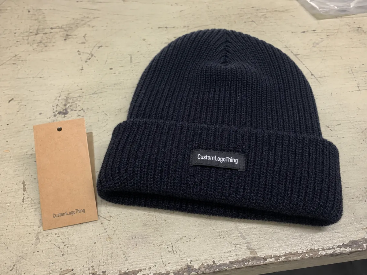
The common placement zones are straightforward, but they do very different jobs. Centered front cuff is the most familiar option because it gives the strongest retail read. Off-center front can look a little more casual or fashion-forward. Side panel placement works well for subtle branding. Back placement is usually a secondary signature, not the first choice for visibility. In practice, the hat style decides which of those zones is actually usable.
Folded-cuff beanies offer the most predictable space because the cuff gives you a flatter panel and a little more structure. Unrolled beanies, by contrast, stretch the artwork vertically and can make the same logo appear lower or narrower than expected. On some heavyweight knits, the visible logo position can shift nearly an inch once the hat is worn. That does not sound dramatic until you compare two samples side by side and realize one reads cleanly while the other feels slightly off-balance.
Here is a simple rule of thumb: keep the artwork inside the flattest, least distorted part of the hat. If the logo crosses a seam, climbs too close to the cuff edge, or lands on a curved high-stretch area, it will fight the fabric. That is especially true with small text, thin outlines, and tiny internal details. A logo that looks elegant at 1.25 inches wide can become muddy on a dense knit, while a bold 2.5- to 3-inch mark often reads better with less effort.
Placement also depends on the decoration method. Embroidery prefers a stable, low-distortion surface. Patches can tolerate a bit more complexity because they carry their own edges. Woven or printed labels need contrast and a cleaner visual field, otherwise the branding gets lost in the texture. The best answer is rarely “largest possible logo.” It is usually “the largest logo that still sits in a calm area of the hat.”
If the proof only looks right at 100 percent, ask for a scale check. On a heavyweight knit, the real test is how the mark reads from across a room, not how it behaves in a design file.
How Decoration Methods Affect Readability and Wear
Embroidery is the workhorse for simple marks. It is durable, familiar, and usually the easiest way to decorate a heavyweight beanie when the logo has clean shapes and limited detail. The catch is stitch density. Too much thread in a small space can stiffen the fabric and blur the edges. That is why a logo with tiny lettering or very thin strokes often needs to be simplified before production. A dense knit does not reward fragile artwork.
Patches solve a different problem. Woven patches, embroidered patches, and faux leather patches all create a controlled surface that preserves edges better than direct stitching on textured yarn. If the logo includes fine lines, small type, or layered shapes, a patch can hold the detail more faithfully. The tradeoff is that the patch itself becomes part of the visual language. Buyers should decide whether they want the patch to disappear into the hat or stand out as a deliberate brand element.
Labels work best for subtle branding. A small woven label on a cuff edge or side seam can signal quality without shouting. But labels need contrast, and they need a placement zone that does not disappear into folds. On very dark winter hats, a low-contrast label can vanish fast, especially in outdoor photography. On the other hand, a strong two-tone label can look polished without adding much weight.
There is also a comfort angle. Flat-backed methods typically add less bulk, which matters if the hat is worn under a hood or helmet. Heavy embroidery adds structure and can feel more premium, but that added structure is not free. It changes drape, and on softer knits it can make one section of the cuff sit differently from the rest.
For shipping and retail handling, I also like to think about transit abuse. If hats are packed tightly and pushed through distribution, it helps to know how the finished piece behaves under compression. The International Safe Transit Association has useful packaging test methods for rough handling and movement: ISTA. It is not a decoration rulebook, but it is a good reminder that the product’s final presentation depends on more than the sew file.
One more practical detail: if your program includes FSC-certified hang tags, belly bands, or fold-in inserts, the packaging side matters too. Clean branded packaging can support the hat, while a sloppy tag layout can distract from an otherwise solid logo placement. For that piece of the program, FSC is a useful reference for responsibly sourced paper materials.
Production Steps and Timeline for Custom Beanies
A clean beanie program usually moves through the same sequence: artwork review, placement proof, sample or sew-out approval, bulk decoration, finishing, and final packing. The sequence sounds ordinary, but the failure points are specific. Vector files with clipped points or tiny text can slow down digitizing. Patch designs may need a separate mockup or mold approval. And placement changes, even small ones, ripple through the rest of the schedule.
For simple stock-color runs, a typical production window after proof approval is often 10 to 15 business days. Add custom patches, multiple logo positions, or private-label details, and that window can move to 15 to 25 business days. If the hat body itself is custom dyed or knit to order, lead times stretch further. Buyers sometimes try to compress the schedule by skipping proof rounds, but that is usually the expensive way to save time. A one-quarter-inch placement error on a thick knit is hard to ignore later.
Where do delays usually happen? Three places. First, unresolved artwork files. Second, thread or patch color matching, especially when a brand has Pantone expectations. Third, last-minute placement changes after a buyer sees a mockup on a screen instead of a real hat. The screen is useful, but it is not the same as a cuff with tension and stretch.
Here is the checkpoint list I would use before release:
- Confirm the exact hat style, cuff depth, and yarn weight.
- Ask for a placement proof that shows seam clearance and fold orientation.
- Review the logo at actual size, not only as a full-page mockup.
- Request a sew-out or sample if the design has fine detail or a thick backing.
- Approve the final pack-out only after the logo reads clearly from 3 to 5 feet away.
That last step sounds almost too simple, but it catches a lot of problems. If the mark is hard to read from a few feet away in a normal office or warehouse setting, it will not suddenly improve on a shelf or in a social post. The point of apparel heavyweight winter hats logo placement is not to impress on paper. It is to survive the real world.
Pricing, MOQ, and Unit Cost Tradeoffs
Pricing is where placement decisions become very tangible. A simple center-front embroidery run is usually the least expensive path because setup is easier and the decoration is consistent. Add a patch, a second placement, or more stitch detail, and the unit cost climbs. For buyers ordering 500 pieces, the differences are often big enough to affect the whole program.
At a practical level, the main cost drivers are stitch count, patch material, number of colors, placement complexity, and whether the logo appears on one side or both. MOQ matters too. Small runs carry more setup overhead per unit, even when the logo itself is straightforward. A 100-piece order and a 1,000-piece order rarely scale linearly. The larger order usually absorbs setup better, which is why buyers should always ask for pricing at two or three quantities.
| Option | Typical use | Setup range | Per-unit impact at 500 pcs | Readability profile |
|---|---|---|---|---|
| Single-color front embroidery | Simple brand mark, sports, promo, retail basics | $35-$85 digitizing | $1.20-$2.40 add-on | Strong if the logo is bold and low-detail |
| Woven patch on cuff | Sharper line art, small text, premium look | $45-$120 artwork and tooling | $1.80-$3.20 add-on | Very good for fine detail and crisp edges |
| Faux leather patch | Outdoor lifestyle, heritage, utility styling | $50-$125 tooling | $1.90-$3.50 add-on | Good for bold marks; weak for tiny type |
| Two-location branding | Main logo plus side or back mark | Varies by method | +$0.60-$1.50 extra per placement | High visibility, but higher risk of crowding |
Those numbers are not universal. Blank quality, yarn weight, and labor region all move the final quote. But they are close enough to help a buyer compare options intelligently. A front-center embroidered logo often prices lower than a dual-location layout, and that difference can be large enough to upgrade the blank hat or add private labeling instead. That is usually a smarter trade than chasing one more decoration point.
To make quotes comparable, spell out the same details every time: hat style, fabric weight, cuff depth, logo size, placement, decoration method, and whether the logo should appear folded or unrolled. Without those inputs, suppliers may quote different assumptions and the numbers will not mean much. A clean spec sheet is boring. It also saves money.
Common Placement Mistakes That Make Logos Hard to Read
The first mistake is placing the mark too close to the cuff seam. That edge is rarely as stable as it looks on a flat table. Stitch tension, fold pressure, and movement can all warp the logo after the hat is worn. A design that sits just a half-inch farther into the flat zone often reads better and survives handling more gracefully.
Oversized artwork is the second trap. Buyers often approve a large digital mockup because it looks confident on screen, then discover that thick knit surface cannot hold the same amount of detail cleanly. The logo starts to crowd the crown curve, the spacing between letters collapses, or the edges climb into a stretch zone. Bigger is not always bolder. On heavy knit, bigger can simply be busier.
Contrast is another hidden problem. Dark thread on dark yarn, or light thread on pale yarn, can look classy in theory and disappear in practice. Winter hats are often photographed outdoors, where low winter light and movement reduce legibility even more. If the logo needs to be seen quickly, a clearer contrast pair almost always wins.
Then there is the stretch-and-wear issue. A logo may look perfect on the shelf, then tilt once the wearer pulls the hat down over the forehead. That is normal, but it should be anticipated. A placement that appears slightly higher than instinct suggests can end up reading more naturally on an actual person. That is one reason I prefer seeing a proof on the exact beanie style, not on a similar cap with different knit tension.
- Too close to seam: causes visible distortion after folding.
- Too much detail: makes dense knit look crowded.
- Weak contrast: reduces outdoor visibility fast.
- Wrong visual balance: makes the logo slide after the hat is worn.
If you keep those four risks in mind, the odds of a clean first run improve a lot. That matters because rework on winter hats is awkward and expensive. You do not want to discover a placement problem after the hats have already been packed and distributed.
Next Steps to Lock in Your Beanie Specs
Start with the exact hat style you plan to order, not a close substitute. Measure the visible decoration zone on that beanie, including cuff depth, seam spacing, and the flat area available for stitching or patch application. A similar-looking knit from a past run can mislead you by just enough to create a bad proof.
Next, choose one primary placement and one backup placement before you request pricing. That gives you a clean comparison between visibility, cost, and production risk. If front-center feels too crowded, test a slightly offset placement. If the logo has fine detail, compare direct embroidery with a woven patch. The point is to see the tradeoff clearly instead of guessing from one mockup.
Then gather the practical inputs: vector artwork, thread or patch color references, note on cuff orientation, and any retail requirements for private labeling or hang tags. If you expect the hats to be worn folded, slouched, or fully extended, say so early. That one sentence can save a lot of revision time.
Ask for a proof that shows scale, seam clearance, and fold orientation. If the hat is very thick, or if the mark contains fine type, request a sew-out or physical sample before full production. That step is slower than approving a flat digital image, but it is also the best way to prevent expensive surprises.
Finally, confirm the final apparel heavyweight winter hats logo placement in writing. That includes size, orientation, decoration method, and the exact hat style tied to the quote. When the placement is locked, production, pricing, and timing all stay aligned, and the reorder path gets much easier the next time around.
Where should logo placement go on heavyweight winter hats for the best visibility?
Front-center on the cuff usually gives the strongest read for retail and everyday wear. If the beanie is slouchy or worn off-axis, a slightly offset placement can look more natural without hurting visibility.
What logo size works best for thick beanies with a folded cuff?
Keep the artwork inside the flat, low-distortion area of the cuff so the edges do not climb into seams or curves. Smaller logos can work if contrast is strong; larger logos need extra room to avoid looking stretched or crowded.
Is embroidery or a patch better for heavyweight winter hats logo placement?
Embroidery is best for simple, bold marks that do not need tiny detail. Patches are stronger when the logo has fine lines, small text, or a more premium retail look.
How does logo placement change the price of custom winter hats?
Simple single-position placement is usually the lowest-cost option because setup is easier and faster. Multiple placements, denser stitching, or custom patches typically raise unit cost and may increase MOQ pressure.
What should I approve before production starts on heavyweight beanies?
Confirm the proof for placement, size, fold orientation, and color before the run starts. If the hat is very thick or stretchy, request a sample or sew-out so you can check real-world fit and readability. That final check keeps apparel heavyweight winter hats logo placement aligned with production, pricing, and timing.