Hotel unstructured dad Hats Logo Placement looks simple until the cap is on a head. A soft crown does not hold a logo the way a structured six-panel hat does. The front relaxes, the seam line shifts, and a mark that seemed centered on screen can sit low, wide, or slightly tired once the hat is worn. For hospitality teams, that difference is not cosmetic trivia. It affects how fast the brand reads, how polished the staff looks, and whether the cap feels like part of the uniform or a promotional giveaway.
The best results usually come from judging placement on the actual hat style rather than a generic mockup. Dad hats have a casual profile, thinner front support, and less usable height than many buyers expect. That means logo size, height, stitch density, and decoration method all need to be chosen together. A placement that looks a little smaller and a little higher than the first instinct often ends up looking more balanced in the real world, especially across front desk, housekeeping, valet, and event staff.
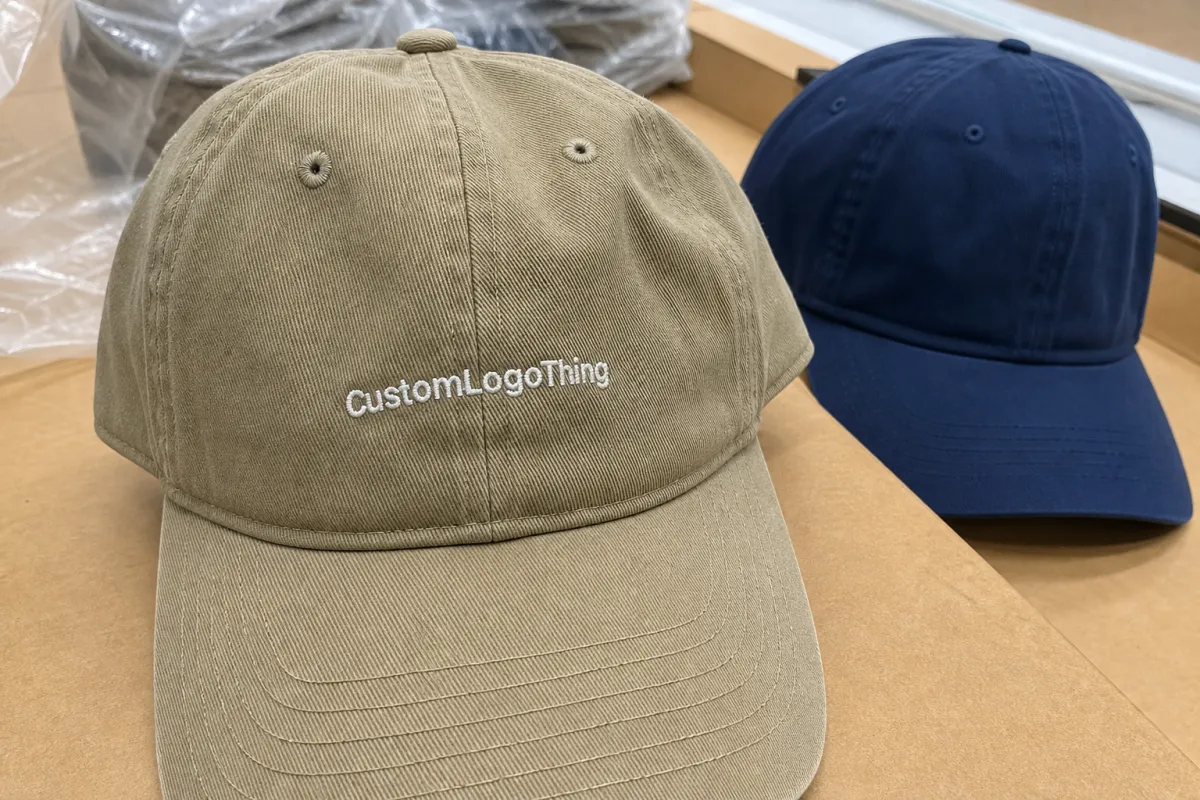
Hotel Unstructured Dad Hats Logo Placement: What Changes on Soft Crowns
An unstructured dad hat is built to drape, not stand at attention. That is the appeal, and also the problem. The front panel usually gives you only about 2.75 to 3.5 inches of useful rise, depending on the pattern and fabric. On paper that seems workable. In production, it is not much room once the logo has to clear the brim seam, avoid the panel fold, and remain readable after the crown settles.
This is why hotel Unstructured Dad Hats logo placement should be treated as a cap-specific decision, not a logo-only decision. A mark that works on a structured cap can feel oversized on a soft crown. A wordmark that is perfect on a flat template can become crowded once the hat is stitched, packed, and worn for a few hours. The fabric remembers gravity. So do the seams.
In hospitality, the visual goal is usually restraint. A front desk team needs a cap that looks neat and recognizable, not loud. Housekeeping and back-of-house staff need durability and consistency first, with branding that stays clear from a few feet away. That is one reason center-front placement is still the default for many programs. It is familiar, easy to recognize, and less likely to look accidental than a logo that drifts into a corner without a reason.
A logo can be centered in the file and still feel off on the hat. The real test is how it reads after the crown relaxes, the wearer moves, and the fabric begins to crease.
The cleanest approval process starts with a placement mockup on the actual style, not a universal artboard. The crown depth, slope, and brim angle matter more than most buyers expect. Ignore those, and even a technically correct measurement can land badly in the final product.
How Crown Shape and Seam Lines Affect Logo Readability
Soft crowns move. That sounds obvious, but many placement problems start with forgetting it. Direct embroidery, woven patches, leather patches, and printed patches all behave differently once they are attached to a hat that does not hold a rigid front panel. The logo has to survive motion, folding, shipping, and wear. If it only looks good while flat on a table, it is not ready.
Seam lines deserve more attention than they usually get. A centered wordmark can be visually split if the main seam cuts through the middle of the design. A monogram can feel pinched if it sits too low and collides with the seam intersection near the crown base. Small corrections often solve the problem: raise the placement a little, trim the width, or shift the mark slightly so the seam does not interrupt the most important part of the artwork. That kind of adjustment is often invisible in a proof, but obvious on the cap.
Decoration method changes the outcome as much as placement does. Direct embroidery gives a clean, durable finish, but very fine lettering can become heavy if the stitch count is high. Woven patches preserve sharper detail and smaller text better than thread alone. Leather patches add a quieter, more premium feel, though they work best with simpler graphics. Printed patches can handle color gradients or detail that embroidery would flatten. For soft-crown hotel hats, 3D puff is usually a poor fit unless the logo is extremely simple. The crown wants to collapse slightly; puff wants to stand up.
Material choice matters too. Cotton twill feels familiar and breaks in quickly, but it can wrinkle sooner. Brushed cotton or garment-washed fabric gives the relaxed look many hospitality teams want, though the surface can make ultra-fine stitching less crisp. Polyester blends hold shape a little better and can resist staining, which is useful for uniforms that see long shifts and frequent laundering. The same placement can look more open or more compressed depending on the fabric finish, so artwork should be checked on the actual cap fabric, not just the cap shape.
Packaging and shipping are part of the placement conversation, even if they rarely appear on the spec sheet. A soft crown can flatten in transit, and that changes how the logo reads when the box is opened. Caps packed too tightly may spring back unevenly, making a centered front mark look slightly tilted. Good folding, simple inserts, and sensible carton fill help protect the shape that was approved in sample form. The logo itself does not move, but the surface it sits on does.
Before approving production, check three things together: front rise, panel slope, and brim angle. Those dimensions decide how high the logo should sit and how wide it can be before the hat starts to look crowded.
Cost, Pricing, MOQ, and Unit Cost Factors
Price usually starts with decoration method, then moves through artwork complexity, quantity, and proofing needs. For Hotel Unstructured Dad Hats logo placement, the unit cost can change noticeably just by moving from simple embroidery to a patch build or adding a more demanding placement request. A buyer comparing quotes without separating blank cap cost from decoration cost is often comparing two different things and not realizing it.
For smaller programs, the decoration itself may cost more than the blank hat. That is normal. On larger runs, the blank cost matters more because savings from volume start to show up there first. Either way, stitch count is one of the clearest cost drivers. A compact 4,000-stitch logo and an 8,500-stitch logo are not the same production job. More stitches mean more machine time, more thread handling, and more chances for a dense area to sit stiff on a soft crown.
| Decoration method | Typical setup | Common decoration add-on at mid-size runs | Best use case |
|---|---|---|---|
| Direct embroidery | Lower digitizing cost; proofing is usually straightforward | $0.55-$1.40 per cap | Simple marks, clean lettering, durable daily wear |
| Woven patch | Patch artwork prep plus attachment labor | $0.85-$1.80 per cap | Fine detail, small text, sharper edges |
| Leather patch | Material and die costs can be higher | $1.10-$2.25 per cap | Premium, quiet branding with a tactile feel |
| Printed patch | Artwork prep is moderate; color art is easier | $0.90-$1.70 per cap | Artwork with color detail that thread cannot hold well |
Those ranges are not the full cap price. They are the decoration add-on, and they can move up or down based on quantity, thread colors, patch material, and how many rounds of revision the artwork needs. A small order with three department names, two logo versions, and a rush ship date can cost more per hat than a larger order with one simple logo and a clean approval cycle. That is why buyers should ask for pricing tied to a specific placement spec: width, height, distance from the brim seam, decoration method, and quantity.
Setup fees are easy to miss. Digitizing, patch dies, sample work, extra proofs, and unusual thread matching can add more than the decoration itself on a small run. The same is true for placement changes. Shift the logo by half an inch, and the quote may need to move because the production path changed. A quote without exact dimensions is only a loose estimate.
Minimum order quantities vary by supplier and by method. Embroidery often supports lower quantities than custom patch work, especially if the design is simple and the placement is standard. Patches can make sense for premium hotel programs, but they usually require more planning. The practical question is not just the MOQ. It is whether the MOQ still makes sense once the timeline, sample cost, and reorder expectations are added in.
Production Steps and Turnaround Expectations
The cleanest orders follow a plain sequence: artwork review, digitizing or patch prep, placement proof, sample approval if needed, bulk production, finishing, packing, and shipping. None of those steps is glamorous. All of them can slow down if the instructions are vague. A clean vector file and one confirmed decoration method will save more time than another round of broad comments about making the hat feel more premium.
Most straightforward runs move quickly once the proof is approved. A common schedule looks like this: proofing in 1-3 business days, sample work in several more days if a physical sample is requested, and bulk production in roughly 10-15 business days after approval. Larger hospitality programs, mixed department orders, and multi-location rollouts take longer. If the caps need to arrive before a seasonal refresh, conference, or property launch, build slack into the calendar. A best-case estimate is not a plan.
Delays usually come from predictable places. Someone changes the logo after the proof is already in motion. The placement was approved on a generic mockup instead of the actual hat style. The artwork is too detailed for the chosen method. Or a brand team asks for one more revision after digitizing is complete. None of that is rare. It is just expensive in time.
Ask for the timeline in parts rather than as one big number. Separate proof timing, sample timing, production timing, and transit timing. Vendors can usually answer those four questions more precisely than they can answer a broad question about turnaround. It also makes comparisons between suppliers fairer, because one quote may include sample development and another may not.
Quality control should be built into the process, not added at the end. The most useful checks are simple: thread color against approved Pantone or brand references, logo centering against the actual crown shape, stitch density on fine lettering, and repeatability across multiple hats from the same run. On a hospitality order, consistency often matters more than a perfect one-off sample. If one cap looks better than the rest, the order is not truly approved.
Common Placement Mistakes That Make the Logo Feel Off
The most common mistake is placing the logo too low. Once the brim starts competing with the artwork, the cap feels heavy and the front panel looks crowded. On a structured hat, that can sometimes pass. On a soft crown, it usually reads awkward immediately. The logo needs breathing room above the brim seam, especially if the cap is meant to look relaxed rather than promotional.
Oversizing is the second problem. Wide wordmarks that nearly touch the side panels can make the crown look stretched. That does not always show up in a flat digital proof, but it becomes obvious once the hat is worn. A narrower layout often looks better because the negative space gives the cap room to keep its shape. Counterintuitive, maybe. Better-looking, usually.
Too much detail is another trap. Thin outlines, tiny copy, and delicate gradients may look fine on screen and fail in thread. The risk gets worse when the crown creases during wear. If the design really needs fine detail, a woven patch or printed patch is often the smarter route. The question is not whether the decoration method can technically reproduce the art. The question is whether the art will still read after a week of use.
- Do not crowd the brim line.
- Do not let the logo collide with the seam bite.
- Do not force tiny lettering into embroidery if a patch will hold it better.
- Do not approve the mockup without checking it under real lighting.
Color contrast deserves its own check. A thread shade that seems crisp on white paper can disappear on navy, charcoal, or heather fabric. That risk is easy to miss because the proof may still look tidy. Once the cap is worn inside a lobby, at night, or in softer indoor light, weak contrast shows up fast. Hospitality uniforms should be readable in ordinary conditions, not just under perfect studio lighting.
There is also a quiet failure mode that buyers notice only after delivery: the logo looks too promotional for the property. That usually happens when the placement, scale, and decoration method all tilt too hard toward retail cap styling. For hotel uniforms, the better outcome is often restrained. Recognizable first, decorative second.
Expert Tips for Cleaner Branding on Hospitality Caps
Simple layouts age best on soft-crown caps. A center-front icon, a short wordmark, or a balanced icon-and-text combination usually looks more natural than a dense promotional design. Many hotel buyers use a slightly smaller logo on an unstructured dad hat than they would on a structured cap because the relaxed silhouette already carries a casual tone. If the artwork gets too large, the hat starts fighting the logo instead of supporting it.
Think in systems, not one-offs. If front desk, housekeeping, events, and maintenance all wear the same cap style, keep the logo location and thread colors aligned across departments. The uniform reads as one family, even if the shirts or outerwear change. That also makes reorders easier. A saved spec sheet can carry the program forward without starting the approval cycle from zero every time.
Premium does not have to mean busy. Tonal embroidery, matte thread, a subtle patch texture, or a small side hit can make the cap feel more considered without cluttering the front. For guest-facing staff, quieter branding often works better because it feels welcoming. For back-of-house teams, durability and quick recognition may matter more than a polished fashion look. The same hat can serve both, but the placement should respect the job.
One practical rule helps more than most style guidelines: the logo should be readable at arm’s length and comfortable at close range. If it passes both tests, the placement is probably doing its job. That is the real measure of hotel Unstructured Dad Hats logo placement, not whether the mockup looks neat on a white background. White backgrounds rarely wear hats.
Another useful check is the “desk test.” Place the mockup on a counter, step back, and look at it the way a guest, manager, or staff member would while moving. Then flip the cap, fold the crown lightly, and see whether the placement still feels centered once the fabric loses its perfect shape. That small exercise catches problems that polished renders often hide.
Next Steps for Sampling, Approval, and Reordering
Start with one clean vector file, one cap color, and one decoration method. That keeps the first proof focused and avoids the scattershot revisions that slow down hospitality orders. If the logo exists in several versions, choose the one that will actually live on the cap. A simpler mark often performs better once it is stitched into soft fabric.
Ask for a scale drawing or placement mockup on the exact hat style, then judge it as staff and guests will see it. Hold it at normal viewing distance. Check it in bright light and softer indoor light. If possible, request a physical sample before bulk production, especially for guest-facing teams or multi-property orders. A sample reveals stitch density, crown behavior, edge finish, and overall balance in ways a screen proof cannot.
Save the approved placement spec with the art file, thread colors, decoration notes, and reorder information in one place. Reorders are where inconsistency shows up. A different operator, a new buyer, or a separate property can easily change the look if the original instructions are not locked. Keeping the spec sheet complete is not administrative clutter; it is what protects consistency later.
For larger hotel groups, confirm the same approved setup across all sites before production starts. That means the same placement height, the same width, the same thread reference, and the same construction notes. If one property wants a slightly different cap for a special event, document that separately instead of letting it drift into the main program. Small deviations have a way of becoming permanent once they land in a reorder file.
If you want the cleanest outcome, confirm three things before release: exact placement, expected turnaround, and final unit cost. Once those are locked, the order becomes far easier to approve and far less likely to surprise anyone when the caps arrive.
Frequently Asked Questions
Where should hotel unstructured dad hats logo placement sit for the cleanest look?
Usually slightly above the center of the front panel, with enough space from the brim to avoid a crowded look. The exact position should be checked on the actual hat style because soft crowns settle differently than structured caps. A center-front mark often works best for hotel teams that want quick recognition without a loud appearance.
Does embroidery or a patch work better on unstructured dad hats?
Embroidery is usually best for clean, durable branding with simple shapes and solid lettering. Patches can protect fine detail or create a more polished edge when the logo is too complex for direct stitching. The right choice depends on the artwork, the cap fabric, and how quiet or premium the final look needs to feel.
How large should a front logo be on a soft-crown hotel hat?
Keep it modest enough to leave breathing room near the side seams and crown edges. A smaller, balanced mark usually reads better once the hat is worn and the fabric relaxes. If the logo is a wordmark, test the width first so the letters do not push too close to the side panels.
What affects pricing for hotel unstructured dad hats logo placement?
Decoration method, stitch count, and the number of thread colors are the biggest pricing drivers. Quantity, sample needs, and rush timing can change the unit cost significantly. Custom placement requests or multi-location branding can also add setup and approval time.
What should I approve before production starts?
Approve the exact placement, size, and decoration method on the actual hat style. Confirm thread colors, artwork spelling, and any patch details before the run begins. Check the sample or proof under real lighting so the final hats match how they will be worn.


