Buyer Fit Snapshot
| Best fit | Minimalist Custom Packaging Design projects where brand print, material claims, artwork control, MOQ, and repeat-order consistency need to be specified before quoting. |
|---|---|
| Quote inputs | Share finished size, material target, print colors, finish, packing count, annual reorder estimate, ship-to region, and any compliance wording. |
| Proofing check | Approve dieline scale, logo placement, barcode or warning zones, color tolerance, closure strength, and carton packing before bulk production. |
| Main risk | Vague material claims, crowded artwork, missing packing details, or unclear freight terms can make a low unit price expensive after revisions. |
Fast answer: Minimalist Custom Packaging Design: Material, Print, Proofing, and Reorder Risk should be specified like a repeatable production item. The safest quote records material, print method, finish, artwork proof, packing count, and reorder notes in one written spec.
Production checks before approval
Compare the actual filled-product size with the drawing, then confirm tolerance on folds, seals, hang holes, label areas, and retail display edges. Reserve space for logos, QR codes, warning copy, and material claims before decorative graphics fill the panel.
Quote comparison points
Review material grade, print process, finish, sampling route, tooling charges, carton quantity, and freight assumptions side by side. A quote is only useful when the supplier can repeat the same color, closure quality, and packing count on the next order.
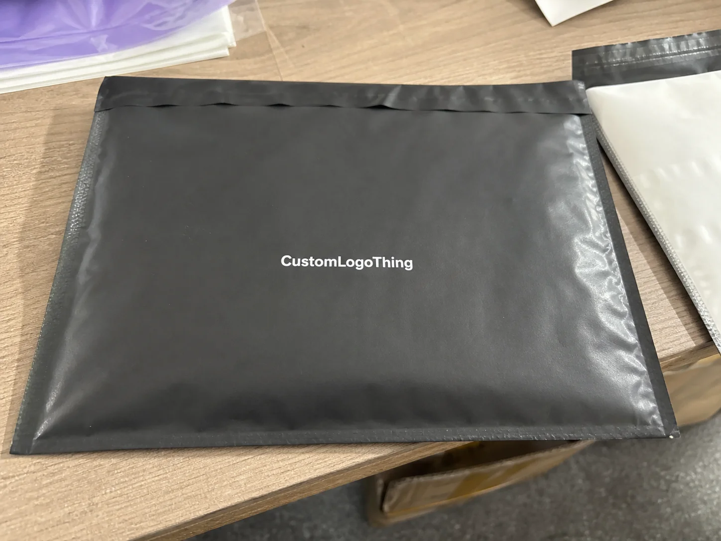
On one of my factory visits in Shenzhen, the ugliest sample on the table was also the one the client kept touching. Why? The box was clean, quiet, and weirdly expensive-looking. I remember staring at it and thinking, “Well, that’s annoying — the boring one won.” That’s the whole point of minimalist custom Packaging Design Tips 2024: less visual noise, stronger hierarchy, better materials, and a smarter use of white space can make a box feel worth more than a loud one with six colors and a foil explosion nobody asked for. The sample in question used 350gsm C1S artboard with matte lamination, a one-color black print, and a 12 mm logo margin, yet it outperformed a glossy six-color competitor on the same shelf at a Guangzhou trade showroom.
I’ve spent 12 years in custom printing, and I can tell you this without sounding like a brochure: minimalism is not about being lazy. It’s about deciding what deserves ink, what deserves texture, and what should stay off the box entirely. If you’re working on branded packaging, product packaging, or Custom Printed Boxes for cosmetics, supplements, apparel, candles, tech accessories, or DTC shipping, minimalist Custom Packaging Design tips 2024 can save money and make the brand look sharper at the same time. On projects I’ve handled in Dongguan and Ningbo, that usually means keeping the structure simple, choosing one special finish, and ordering enough units for the per-piece cost to stop fighting you.
Here’s the catch. Minimal does not mean blank. It means intentional. Every printed element has a job. Every millimeter matters. And yes, if the dieline is off by 2 mm, the whole thing starts looking like someone designed it after three bad coffees. I’ve seen that happen in a factory near Shenzhen Bao’an International Airport, and I still get twitchy about it. A 2 mm shift on a tuck flap can make a logo sit awkwardly close to a fold, which is exactly the kind of mistake that turns a $0.28 mailer into a $2,000 reprint.
Why Minimalist Packaging Looks Simple but Sells Hard
One client brought me a jewelry box sample that cost $0.42/unit at 10,000 pieces. Another sample, using the same board thickness and almost the same footprint, came in at $0.68/unit. Guess which one felt more premium? The cheaper-looking one. It had a cleaner logo lockup, a single black ink pass, and 18 mm of margin on each side. That’s a classic lesson in minimalist Custom Packaging Design tips 2024: visual restraint can make a box feel more refined than a busy layout loaded with gradients and slogans. The box was made in Shenzhen on a 1200 gsm rigid board wrap, then finished with a 0.3 mm deboss that caught the light only when you tilted it under showroom LEDs.
In plain English, minimalist packaging means fewer elements, stronger hierarchy, better materials, and intentional white space. You’re not cramming every brand message onto the outside panel. You’re deciding what the buyer needs to see first, second, and maybe third. That’s the difference between package branding that feels curated and packaging that looks like a crowded flyer glued to cardboard. Honestly, I think the second one belongs in a recycling bin, not on a shelf. A well-ordered front panel with a 24 pt product name, a 9 pt supporting line, and a single one-color icon can usually outperform a box with four taglines and a burst graphic, especially in retail packaging in Los Angeles, Austin, or Chicago.
Why does it work? Three reasons. The eye recognizes simple layouts faster, which helps on retail packaging and in unboxing videos. Minimalism tends to signal confidence, because the brand is not begging for attention. A clean layout usually reads as more expensive, especially when paired with matte paperboard, kraft stock, or rigid boxes with a soft-touch laminate. On Amazon-style listings, I’ve seen a product image with a minimalist box lift click-through more than a saturated competitor, even when both products were priced within $3 of each other.
Honestly, I think a lot of brands get this backwards. They assume more graphics equal more value. Then they spend $1,200 on design revisions and still end up with a box that screams “discount promo bundle.” I’ve seen that exact mistake in a Hong Kong sample room where the client had added five taglines, a QR code, two icons, and a giant burst shape. The sample looked busy enough to cause a headache. The production quote was $0.56/unit at 8,000 pieces, but the client’s “extra creative” versions pushed it closer to $0.79/unit because every added color meant another plate or another proof round.
Minimalist Custom Packaging Design tips 2024 are especially strong for products that sell on perceived quality: skincare, supplements, apparel, premium candles, wireless accessories, and subscription boxes. In those categories, the packaging is part of the product promise. A clean box says: this brand knows what it’s doing, and it doesn’t need to yell. That matters in cities like New York, Toronto, and Berlin, where shelf competition is dense and buyers often decide in 3 to 5 seconds whether a product belongs in their cart.
“The best box on the shelf is often the one that doesn’t try too hard.” — a buyer told me that during a meeting in Los Angeles, after rejecting three overdesigned mockups in a row.
Here’s the set-up for the rest of this piece: I’ll walk through how minimalist design works, what drives cost, how long production takes, the mistakes that waste money, and the exact minimalist Custom Packaging Design tips 2024 I’d use if I were launching a clean, premium brand tomorrow. If you need a starting point for structure, materials, or inserts, reviewing Custom Packaging Products after your first round of sketches usually saves one full revision cycle, which can be worth 3 to 5 business days.
How Minimalist Custom Packaging Design Works
The structure is simple. The execution is not. A strong minimalist box usually follows a strict visual order: brand mark, product name, supporting copy, legal text, and finishing details. If everything gets equal weight, the design collapses. If the logo, headline, and supporting line are arranged with discipline, the whole package feels calm and deliberate. That’s one of the most practical minimalist custom Packaging Design Tips 2024 I can give you, and I’ve seen it hold up on everything from 200 ml cosmetic cartons to 3 lb rigid gift boxes.
Think of the eye as a person walking into a room. It notices the biggest thing first. Then the next thing. Then it decides whether to stay. On packaging, that means the logo should not compete with a paragraph, and the product name should not hide under decorative clutter. I’ve seen brands bury the actual product under “brand story” copy, and then wonder why customers couldn’t tell what was inside. I wanted to shake the box and say, “The answer is right there — let the customer read it.” A front panel with 15 to 20 words total is often enough for premium packaging printed in Hangzhou or Foshan.
White space is not wasted space. It is active design space. It creates breathing room, improves legibility, and makes the printing look more expensive. When I visited a rigid box facility near Dongguan, the plant manager showed me two nearly identical boxes. One had text pushed close to the edges. The other had 14 mm of space around the logo. Same material. Same foil stamp. The second one looked like it cost double. It also passed a faster visual inspection on the line because the alignment marks were easier to read under the factory’s 5000K inspection lights.
Material choice does half the work in minimalist design. Kraft gives an earthy, honest feel. SBS paperboard gives a smoother, brighter canvas. Uncoated stock feels natural and a little editorial. Matte soft-touch adds a velvety finish that makes even a one-color print feel premium. Rigid boxes, especially those wrapped in paper with restrained graphics, are practically made for this style. In practical terms, a 350gsm C1S artboard carton with matte lamination and one PMS color often looks cleaner than a heavier board with muddy CMYK and no clear focal point.
Finishes should be used like salt, not soup. One foil detail, one emboss, or one spot UV area can elevate the box. All three at once? That usually means the design team got excited on Pinterest and forgot restraint. The best minimalist custom packaging design tips 2024 often come down to subtraction, not addition. A single 2 mm foil logo on a 90 mm-wide panel in silver or warm gold is usually enough to signal quality without making the carton look like a holiday gift set.
Dieline layout matters too. Minimalist packaging is unforgiving because every alignment issue is visible. If the logo drifts 3 mm left, you’ll see it. If a fold line cuts through a line of type, you’ll definitely see that. I’ve had clients approve a digital mockup, then panic when the physical sample exposed a tiny shift in panel placement that never showed on screen. Packaging always finds the lie eventually. That’s why I insist on a PDF proof, then a hard copy sample, then one more check against the press sheet before the run starts in Shenzhen or Dongguan.
Here’s the short version: minimalist design works because it turns every element into a signal. No filler. No decorative nonsense. Just a clear hierarchy and a box that knows exactly what it wants to say. That principle matters whether you’re producing 2,000 units for a Los Angeles pop-up or 25,000 units for a nationwide retail launch in Canada.
Key Factors in Minimalist Custom Packaging Design
Typography is usually where brands mess this up first. Choose one font family, maybe two if you know what you’re doing. Make sure the type is readable at actual box size, not just at 400% zoom in Figma. A 6 pt serif on a natural kraft box might look elegant on a monitor and then vanish in real life. That is not design. That is wishful thinking. On a 120 mm x 80 mm tuck box, I usually recommend keeping key copy above 7.5 pt and verifying it on a printed laser proof, not just on a laptop in an office in San Francisco or Shanghai.
Color palette is the next lever. Keep it to one, two, or maybe three core colors. A neutral background with one accent color often works best. Black on white. White on charcoal. Deep green on kraft. These combos feel clean and controlled. If you want the box to say “premium,” don’t hand it twelve shades and ask it to behave. A single PMS 419 C black on 350gsm C1S artboard, paired with matte lamination, is a surprisingly strong formula for skincare and stationery packaging.
Material and texture can carry the whole identity when graphics are reduced. That’s why a 350gsm C1S artboard with matte lamination can outperform a heavier board with cheap-looking print. Texture matters. So does the hand feel. In my experience, buyers remember how a box feels in the hand almost as much as how it looks on a shelf. I do too, and I’m still mildly offended by flimsy stock that folds if you look at it sideways. A rigid box wrapped in 157gsm art paper, for example, can feel more luxurious than a thicker corrugated mailer if the surface finish is controlled and the corners are crisp.
Print method changes the final mood and the budget. Offset gives crisp color and good control on larger runs. Digital is great for shorter quantities and faster proofing. Flexo works well for some mailers and corrugated structures. Foil stamping, embossing, and debossing add tactile interest, but each one increases setup complexity and can push unit cost up fast. This is where minimalist custom packaging design tips 2024 help you stay disciplined: choose one premium feature, not four. A one-color offset print with a single matte foil mark in Shenzhen or Suzhou is often enough to create a high-end effect without bloating the quote.
Compliance copy is not optional just because you want the box to look clean. Ingredients, warnings, barcodes, country-of-origin details, recycling symbols, and other required text still need space. I’ve had supplement clients try to hide the barcode on a flap so the front panel could look “more artistic.” Cute idea. Not practical. Retail buyers and compliance teams will notice. Fast. If you’re shipping into the EU, for example, you may need multilingual warnings and a lot number area, which can take 12 to 18 mm of panel height even on a minimalist carton.
Brand consistency matters more than people think. If your website uses a black-and-ivory look, your insert card should not suddenly turn neon blue. If the shipping box is minimalist but the thank-you card looks like a birthday invitation, the brand feels split in two. The strongest minimalist custom packaging design tips 2024 support a full system: outer box, insert, tape, label, and unboxing materials all speaking the same visual language. A kraft mailer from Dongguan, a black tissue sheet, and a one-color sticker can look unified without costing much more than a mixed set of mismatched pieces.
Here’s a quick comparison of common materials and finishes I’ve seen used in minimalist packaging:
| Option | Typical Look | Best For | Approx. Cost Impact |
|---|---|---|---|
| Kraft stock | Natural, earthy, understated | Apparel, candles, eco brands | Low to moderate |
| SBS paperboard | Clean, bright, sharp print | Cosmetics, supplements | Moderate |
| Soft-touch lamination | Velvety, premium, muted glare | Luxury retail packaging | Moderate to higher |
| Foil stamp | Reflective accent, strong contrast | Logo marks, small details | Higher |
| Emboss/deboss | Tactile, subtle, elegant | Rigid boxes, gift packaging | Higher |
One more thing. Don’t chase trends too hard. A minimalist box with a trendy font and trendy beige can look dated in 18 months. Pick durable decisions: strong type, clean spacing, and materials that feel honest. That’s the part most brands miss when they ask for minimalist custom packaging design tips 2024 but really want a shortcut to looking expensive. The best examples I’ve seen from factories in Shenzhen and Ningbo still look current after three product cycles because they rely on proportion, not novelty.
If you want manufacturing standards behind the scenes, I always recommend checking guidance from the International Safe Transit Association for transit testing and EPA recycling resources for material planning. Packaging is not just pretty graphics. It has to survive shipping, handling, and real humans dropping it on concrete. A box that survives a 36-inch drop test in a Chicago warehouse is a lot more useful than one that looks lovely and arrives crushed.
Minimalist Custom Packaging Design Tips 2024: Step-by-Step
Step one: define the one message the box must communicate in under three seconds. Not five messages. One. If the product is a premium candle, maybe the message is “clean scent, gift-worthy presentation.” If it’s a supplement, maybe it’s “simple formula, trusted quality.” Every other detail should support that sentence. That’s one of the most useful minimalist custom packaging design tips 2024 because it forces discipline before any artwork starts. I usually ask brands to write that sentence in 12 words or fewer before a designer opens Illustrator.
Step two: audit your current assets. Pull your logo files, font files, product copy, barcode, legal text, and any icons. Then delete what doesn’t support the main message. I’ve watched brand teams protect old taglines like they’re family heirlooms. Half the time, those lines were written three product launches ago and don’t belong on the box anymore. On a recent skincare project in Guangzhou, removing two obsolete claims saved 26 mm of vertical space on the back panel, which was just enough to keep the design from feeling cramped.
Step three: build the layout with a strong focal point. Use generous margins. Place the logo where the eye naturally lands. Give the product name enough size to read across a table. If you want a sub-line, keep it short, 6 to 10 words max. A minimalist box is not a newspaper column. It should feel composed, not crowded. A front panel with a 10 mm top margin and a 14 mm bottom margin often feels more balanced than a layout that tries to use every available millimeter.
Step four: choose a material and finish pairing that carries the design visually. If the artwork is simple, the stock should do some of the heavy lifting. That could mean kraft with black ink, white SBS with one foil logo, or a rigid box with soft-touch lamination and no extra graphics. When I sat with a candle brand in Guangzhou, we cut their print colors from four to one and moved budget into the paper wrap. Their sample looked $2 better per unit, and the art budget dropped by nearly 18%. I still remember the client’s face when that math actually worked. Their production quote moved from $1.86/unit to $1.52/unit after removing a second spot color and an oversized inner print.
Step five: make a physical prototype and inspect it in real light. Window light, warehouse light, retail light. Not just your laptop screen. Screens lie. Paper doesn’t. Check the fold lines, print clarity, glue points, and whether the matte finish picks up fingerprints. Minimalist custom packaging design tips 2024 work best when the sample is judged like a product, not like a concept board. I like to test samples in both Shanghai office light and daylight near a window because a warm monitor can hide a gray shift that shows up instantly on uncoated stock.
Step six: test the unboxing moment for both usability and shelf presence. Does the lid open cleanly? Does the insert protect the item? Does the box look good stacked with six others? Does the logo stay visible after tape and labels are applied? These questions sound basic, but they’re where packaging succeeds or gets annoying fast. A 1 mm lip on a rigid lid can change the whole feel of the reveal, especially for gift boxes sold in London, Melbourne, or Vancouver.
I tell clients to treat the sample like a dress rehearsal. If the tape tears the ink. If the insert rattles. If the product floats around inside like a loose screw. Fix it now. The cost of changing one board cut is nothing compared with the cost of reordering 8,000 boxes because the structure feels flimsy. And yes, I have watched someone try to “ignore” a loose insert as if the box would somehow apologize later. It didn’t. One brand in Dongguan had to scrap 6,400 cartons because the insert was 4 mm too shallow and the bottle cap kept rubbing the lid.
Here’s a practical sequence I use with teams who want a clean result without wasting time:
- Write the single brand message.
- Set the logo size and placement.
- Choose one font family and one accent color.
- Lock the material and finish.
- Approve a sample under real lighting.
- Only then move into production.
That sequence sounds boring. Good. Boring systems make premium packaging less risky. A clean workflow also shortens the back-and-forth, which is how teams in Shanghai, Shenzhen, and Los Angeles keep a packaging project inside a 10-business-day approval window instead of dragging it into a three-week email loop.
Minimalist Custom Packaging Design Cost and Pricing
People assume minimal artwork automatically means cheap packaging. Sometimes yes. Often no. The art may be simpler, but the stock, finish, structure, and quantity still drive the bill. I’ve quoted minimalist mailers at $0.18/unit for 5,000 pieces and rigid boxes at $2.30/unit for the same branded look. Same visual strategy. Different build. Different price. That’s the reality behind minimalist custom packaging design tips 2024. A 5,000-piece run in Shenzhen might come in at $0.15 to $0.22 per unit for a basic one-color mailer, while a 1,000-piece luxury rigid box with foil can easily climb above $3.00/unit.
The biggest cost drivers are pretty consistent: box style, size, material thickness, number of print colors, coating, special finishes, inserts, and order quantity. A small tuck box with one-color print is nowhere near the same pricing tier as a rigid shoulder box with foil and embossing. I wish more people understood that before asking for “a luxe look” on a budget that barely covers decent board. It’s like asking for a sports car with bicycle money. A 105 mm x 65 mm cosmetic carton on 350gsm C1S artboard is one thing; a magnet-closure rigid box with a ribbon pull in Foshan is another.
Minimum order quantities matter too. Smaller runs almost always cost more per unit because setup costs get spread across fewer pieces. On one project for an independent skincare brand, the client wanted 1,000 boxes only. The unit price was $1.14. When they moved to 5,000, it dropped to $0.41. Same dieline. Same print. Same supplier. That’s not magic. That’s math. In practical terms, the savings covered a second proof round and still left enough margin for a custom insert tray.
Then there are the hidden costs nobody wants to talk about during the first call. Dieline setup. Sampling. Plate charges. Freight. Revision rounds. Color proofing. If you’re using foil or embossing, the setup can add more than you expect. I’ve seen brands budget $4,500 for packaging and then discover $900 in proofing, $650 in freight, and a surprise surcharge because they changed the logo after proof approval. Fun times. My favorite kind of budget surprise is the one nobody asked for. A typical proof-to-production change fee can be $45 to $120 per revision depending on the supplier in Shenzhen, Dongguan, or Ningbo.
Here’s a simple pricing comparison based on the kinds of projects I’ve managed:
| Packaging Type | Visual Style | Typical Unit Cost Range | Budget Note |
|---|---|---|---|
| One-color mailer box | Clean and functional | $0.18–$0.45 | Great for DTC shipping and simple branded packaging |
| Printed tuck box | Minimal retail presentation | $0.22–$0.60 | Good for cosmetics and supplements |
| Rigid gift box | Premium, tactile, giftable | $1.20–$3.50 | Costs rise with wrap paper, inserts, and finishes |
| Kraft corrugated mailer | Natural, understated, durable | $0.35–$0.95 | Strong for ecommerce and subscription product packaging |
| Soft-touch rigid box with foil | Luxury minimal | $2.00–$5.00+ | Best for premium retail packaging and gifting |
If you need to save money, simplify the layout before you change the box style. That’s my rule. A cleaner design with fewer inks and one strong material choice usually beats a complicated concept that needs special handling every step of the way. If budget is tight, spend on one tactile element, not three. I’d rather see a beautiful emboss on a matte box than foil, emboss, and spot UV fighting each other like they’re all trying to be the main character. In many factories around Shenzhen and Guangzhou, removing one finish can reduce the quote by 8% to 15% depending on the setup.
Minimalist custom packaging design tips 2024 can help lower design overhead too, because fewer elements mean fewer revisions. But that only works if you keep the hierarchy clear and the copy short. If the legal team sends you nine paragraphs of text, the savings disappear fast. I’ve seen a clean carton move from 2 proof rounds to 5 proof rounds because the copy deck kept changing in the final 72 hours before print release.
Timeline, Sampling, and Production Process
A packaging project usually moves through briefing, concept design, dieline confirmation, sampling, revisions, production, and shipping. That sequence sounds neat on paper. In practice, one delayed logo file or one material shortage can shift the whole schedule by a week. I’ve had projects sit for four days because the client’s vector file had a font issue. Simple design doesn’t remove production reality. It just reduces one layer of chaos. A basic carton project from proof approval to shipment typically takes 12 to 15 business days in Shenzhen if the paper stock is in warehouse and there’s no special finish waiting on a second process.
For samples, I usually expect 7 to 14 business days depending on the structure and finish. A rush sample may be possible, but the price climbs fast. Rush jobs are almost always more expensive than a calm, organized plan. A minimalist layout can speed approval because there’s less to argue about, but only if the team gives clear feedback. Vague comments like “make it pop” are not feedback. They are a cry for help. On a standard rigid box sample from Dongguan, one foil correction can add 2 to 3 business days, especially if the supplier needs to remake the blocking plate.
During sampling, inspect the prototype like a buyer would. Check color accuracy. Check print clarity. Check fold quality. Check adhesive strength. Check finish consistency. If the box includes a simple logo and one accent line, any misalignment will jump out. Minimalism is unforgiving in the best way. It rewards precision and punishes sloppy setup. I usually ask teams to check samples under 5000K lighting and natural daylight because a warm office lamp can hide a tone shift that appears immediately in a retail aisle.
Press scheduling and material availability also shape the timeline. One time at a Shenzhen facility, a supposedly easy one-color run got delayed because the exact board grade was backordered. The art was ready. The sample was approved. The material wasn’t. That’s why I tell clients to ask about supply before falling in love with a concept. The supplier can print your dream. They cannot invent paper on demand. If the paper needs to come from a mill in Zhejiang or a wrap stock from Guangdong, add at least 3 to 5 extra business days for transit and booking.
A realistic planning window is 4 to 8 weeks for simple packaging and longer if you need custom inserts, special coatings, or retail compliance approvals. If your packaging launch is tied to a seasonal drop, start earlier than you think. If you think you need “just two weeks,” you probably need to trim expectations, not the schedule. A Q4 holiday launch in New York or Toronto can easily require a 6-week buffer once freight and customs are included.
Minimalist custom packaging design tips 2024 work best when production is treated like a chain, not a guess. Brief well. Approve faster. Sample carefully. Move only when the physical proof matches the brand promise.
For standards and shipping testing references, the ISTA testing framework is worth looking at if your packaging has to survive transit abuse. Minimal design is great. Broken boxes are not. A drop test in Shenzhen or a vibration test on a freight route to Chicago will tell you more than a polished PDF ever will.
Common Mistakes with Minimalist Custom Packaging Design
The first mistake is making the box too empty. There’s a difference between elegant white space and a package that looks unfinished. If the layout has no focal point, no clear hierarchy, and no reason for the eye to stop anywhere, the box reads as cheap. That happens more often than brands admit. A front panel with only a tiny logo on a 110 mm-wide carton can look accidental, especially when the product is selling at $24 to $38 in a retail store.
The second mistake is typography that’s too small. I’ve seen beautiful concepts die because the product name was set in a delicate 7 pt font and the stock absorbed the ink. On screen it looked refined. On the shelf it looked like a legal footnote. Minimalist custom packaging design tips 2024 should always include actual physical readability, not just digital aesthetics. If your customer needs to lean in from 60 cm away to read the name, the layout is already failing.
The third mistake is overusing finishes. One foil logo, one emboss, one gloss panel, one die-cut window, and maybe a soft-touch laminate sounds like luxury. It usually looks confused. Minimalism depends on restraint. If every surface wants attention, none of them wins. I once saw a cosmetic box from a factory in Foshan with four finishes on a 92 mm panel; it looked expensive in the most exhausting possible way.
The fourth mistake is choosing trendy colors and fonts that age fast. Warm beige, thin serif, and a tiny lowercase logo can feel elegant now, then suddenly look like every other direct-to-consumer brand that launched from a mood board. A better move is to use strong spacing, balanced proportions, and a palette that fits the product category instead of chasing aesthetics that fade in six months. Black, ivory, forest green, and muted charcoal usually survive longer than a trend color borrowed from a seasonal campaign.
The fifth mistake is ignoring practical requirements. Barcode placement. Ingredient text. Warning copy. Country-of-origin labeling. Shipping durability. All of it matters. I’ve had clients push the barcode to the bottom flap only to realize their retail partner required it on the back panel. Tiny oversight. Expensive correction. A retail account in the UK or EU may also require a specific EAN size and a minimum quiet zone, which can eat 30 mm of panel width before you even begin to decorate the box.
The last mistake is skipping physical samples. Digital mockups are useful. They are not truth. The sample shows you the actual color shift, the tactile feel, the fold behavior, and whether the box carries the brand story in real life. If you want one of the strongest minimalist custom packaging design tips 2024, it’s this: never approve packaging from a screen alone. Even a good mockup can hide a glue seam that becomes obvious on the production line in Shenzhen.
Expert Tips for Minimalist Custom Packaging That Feels Premium
Use contrast on purpose. A matte background with a gloss logo can look expensive without adding clutter. Natural kraft with a crisp black mark can feel grounded and modern. White SBS with a single foil stamp can read as premium retail packaging without turning into a glitter contest. Contrast is one of the cleanest tools in minimalist custom packaging design tips 2024 because it gives the box depth without noise. On a 2024 skincare launch I reviewed in Los Angeles, a single silver foil logo on a 350gsm C1S carton increased perceived value more than the brand’s original plan for a full-bleed gradient.
Keep one emotional detail. Not ten. One. That could be a short line inside the lid, a textured insert, a reveal moment, or a subtle message on the inner flap. I once worked on a skincare box where the outside was almost bare, but the inside lid carried a 5-word message in a soft gray ink. The client said customers actually paused before removing the bottle. That pause mattered more than a giant printed slogan ever would. The message was printed in 20% black on an inner flap, which made it feel almost private.
Design for the repeat buyer, not only the first unboxing photo. First-time customers like a clean reveal. Repeat customers care about speed, function, and whether the box is annoying to open. Strong minimalist packaging handles both. It looks premium once, and it keeps working the tenth time too. In practical terms, that means using a lid that opens in under 3 seconds, an insert that holds the product with 1 to 2 mm of tolerance, and graphics that still make sense after the tape is removed.
Ask the factory for print-safe spacing rules before you finalize artwork. Art directors love pushing to the edge. Factories love telling you after the fact that the edge was a terrible place to put text. I always ask for a 3 mm to 5 mm safe zone beyond the structural fold lines, and I confirm it before approval. That’s not me being fussy. That’s me avoiding reprints. A supplier in Dongguan once saved a client from a 14,000-piece reprint by catching a logo too close to the glue flap at pre-production stage.
If your budget is tight, invest in the outer box and simplify inserts. The outer structure carries the brand impression. Inserts can stay plain if they are clean and functional. I’d rather have a sharp exterior with a simple inner tray than a mediocre outer box with a fancy insert nobody sees. On many ecommerce shipments, the insert is visible for less than 4 seconds anyway, so it should protect the product first and perform second.
Work backward from the physical sample. Not the other way around. The sample tells you what the material likes, what the ink does, and where the box feels strongest. That approach has saved me from multiple expensive mistakes, including one project where the chosen black ink looked brown on uncoated stock. On paper it was “warm.” In reality it looked muddy. We changed the stock, and the entire design improved. The final run used a brighter white board sourced through a supplier in Zhejiang, and the result was cleaner by a mile.
For brands buying through a supplier or a custom shop, I’d also recommend reviewing Custom Packaging Products alongside your sample review so the structure and decoration choices stay aligned with the real production options. That kind of cross-checking helps keep your quantity, finishing method, and shipping method in sync before you approve 10,000 units.
In short, minimalist custom packaging design tips 2024 are not about making your box blank. They’re about making every visible detail count. That’s how you get a package That Feels Expensive, prints cleanly, ships well, and doesn’t need a redesign six months later because it was built on trend-chasing instead of discipline. A box designed this way can hold its own whether it’s made in Shenzhen, Dongguan, or Suzhou and shipped to a warehouse in Dallas or Rotterdam.
FAQ
What are the best minimalist custom packaging design tips for small brands?
Start with one clear brand message and remove any copy that doesn’t support it. Use one strong logo placement, a limited color palette, and, if the budget allows, one premium finish such as foil or embossing. Choose materials that already feel elevated so the design doesn’t have to carry the entire experience on its back. For small brands ordering 1,000 to 3,000 pieces, a simple 350gsm C1S carton with matte lamination can be a smart starting point.
How do minimalist custom packaging design tips help reduce costs?
Fewer colors and simpler artwork usually mean less print complexity, fewer revisions, and less setup time. Costs can still rise if you choose premium stock, special finishes, or very small order quantities. The smartest savings usually come from simplifying the layout before changing the box structure. A one-color design in Shenzhen can sometimes stay around $0.15 to $0.22 per unit at 5,000 pieces, while adding foil, emboss, and a custom insert can move it well above $0.60.
Which materials work best for minimalist custom packaging design?
Matte paperboard, kraft stock, uncoated paper, and rigid boxes with subtle finishing are all strong choices. The best option depends on product weight, shipping method, and how premium you want the brand to feel. A physical sample is the only reliable way to judge whether the surface supports the look. For a clean retail box, 350gsm C1S artboard or 157gsm art paper wrapped over rigid board often gives the best balance of print clarity and hand feel.
How long does a minimalist custom packaging project usually take?
Most projects need time for briefing, design, dieline checks, sampling, revisions, production, and shipping. Simple graphics can speed up approval, but factory scheduling and material availability still affect timing. If the packaging is tied to a launch date or seasonal campaign, start early and leave room for one revision cycle. A typical timeline is 12 to 15 business days from proof approval to production completion for straightforward cartons in Shenzhen, with sampling adding another 7 to 14 business days.
What is the biggest mistake in minimalist custom packaging design?
The biggest mistake is confusing minimal with empty, which makes the box feel unfinished rather than premium. Another common problem is typography that’s too small or too light to read quickly. A good minimalist package feels intentional, structured, and confident the first time someone picks it up. If the logo, product name, and legal text can’t be read at arm’s length in a warehouse in under 5 seconds, the design needs another round.