Buyer Fit Snapshot
| Best fit | Minimalist Logo Placement on Boxes projects where brand print, material claims, artwork control, MOQ, and repeat-order consistency need to be specified before quoting. |
|---|---|
| Quote inputs | Share finished size, material target, print colors, finish, packing count, annual reorder estimate, ship-to region, and any compliance wording. |
| Proofing check | Approve dieline scale, logo placement, barcode or warning zones, color tolerance, closure strength, and carton packing before bulk production. |
| Main risk | Vague material claims, crowded artwork, missing packing details, or unclear freight terms can make a low unit price expensive after revisions. |
Fast answer: Minimalist Logo Placement on Boxes: Quote Scope, Sample Proof, MOQ, and Lead Time should be specified like a repeatable production item. The safest quote records material, print method, finish, artwork proof, packing count, and reorder notes in one written spec.
Production checks before approval
Compare the actual filled-product size with the drawing, then confirm tolerance on folds, seals, hang holes, label areas, and retail display edges. Reserve space for logos, QR codes, warning copy, and material claims before decorative graphics fill the panel.
Quote comparison points
Review material grade, print process, finish, sampling route, tooling charges, carton quantity, and freight assumptions side by side. A quote is only useful when the supplier can repeat the same color, closure quality, and packing count on the next order.
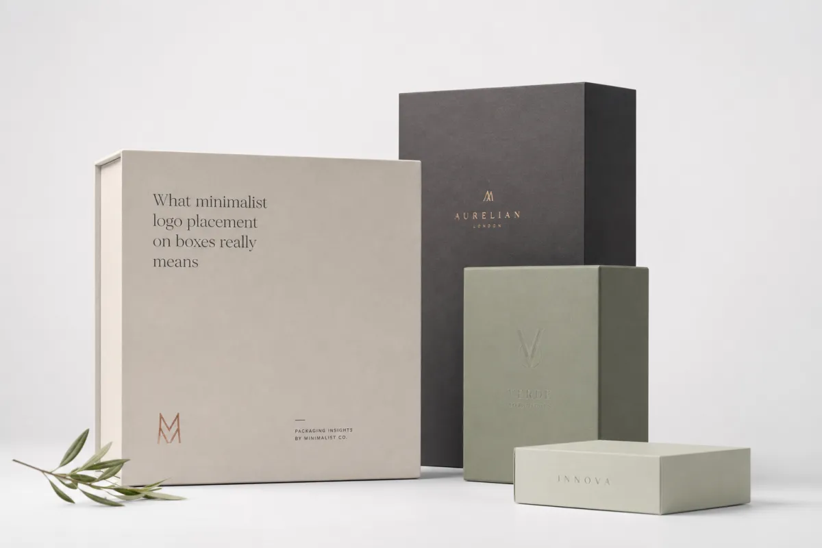
A box with one small, carefully placed mark often feels more expensive than a box covered in graphics, and minimalist logo placement on boxes is usually the reason. The eye reads space, balance, and restraint before it reads detail. One logo, sitting in the right place, can do more brand work than a crowded panel full of copy, icons, and decoration fighting for attention.
That result is not an accident. Good minimalist logo placement on boxes sits at the intersection of brand strategy, production planning, and cost control. It affects print quality, folding behavior, shipping performance, and the first few seconds of the unboxing experience. A box is never just a blank surface; it is a sequence of choices that either holds together or falls apart the moment the customer touches it.
For Custom Logo Things, the topic matters for a simple reason: the same quiet layout that gives a presentation carton a premium feel can also make a shipping box easier to reproduce at scale. The hard part is knowing where restraint helps, where it weakens the message, and how to keep the design feeling deliberate instead of unfinished. I have seen more than one pretty mockup collapse the second it hit a real dieline, which is why the production side matters as much as the art.
What minimalist logo placement on boxes really means
In packaging, minimalist logo placement on boxes means using size, location, and empty space to do most of the visual work. A small mark on a clean panel often signals confidence because the package does not need to shout to be recognized. That approach can work beautifully for luxury products, direct-to-consumer mailers, subscription packaging, and any brand that wants the opening moment to feel calm and considered.
The key word is intentional. A sparse box is not automatically minimal, and it is definitely not automatically good. If the logo is tiny because the artwork was scaled badly, or if it sits awkwardly because nobody checked the die lines, the result looks accidental. Real minimalist logo placement on boxes uses restraint on purpose, with enough breathing room around the mark that the package feels edited rather than empty.
That distinction matters more than most teams realize. A minimal package still has to communicate ownership, product category, and quality level. A kraft mailer with a centered one-color logo can feel earthy and direct. A rigid gift box with a foil-stamped logo near the lower edge can feel quieter and more luxurious. A corrugated shipper with a tiny side-panel mark can feel efficient and modern. In each case, minimalist logo placement on boxes shapes perception before the customer reads a single word.
It also behaves differently across package formats. Shipping boxes usually use a front-panel or lid mark because that is what the carrier and recipient see first. Retail cartons often need a front face plus a small side-panel cue so the brand stays visible on shelf. Subscription packaging works well with a restrained exterior and a stronger interior reveal, which makes the opening feel like a planned sequence rather than a random surprise. Product mailers need the logo to survive handling, stacking, and tape application, so the layout has to hold up in the real world, not just on a monitor.
A lot of packaging problems start when teams confuse minimalist logo placement on boxes with plainness. Minimal does not mean blank. It means every visible element has to justify itself. If the logo sits alone on a panel, the box still needs enough proportion, contrast, and finish to make that choice feel like design rather than placeholder space. Brand hierarchy matters here too: the box should show the product name, brand mark, and supporting details in the right order, even when the layout looks sparse.
Minimal does not mean absent; it means every millimeter has a job.
How minimalist logo placement on boxes works visually
Minimalist logo placement on boxes works because the human eye notices proportion and contrast before it notices detail. White space, or negative space, acts like a frame around the logo. If that frame is generous and the surrounding panel stays clean, the logo reads as deliberate. If the mark is squeezed near a fold, seam, or cut edge, the whole package feels cramped even when the print itself is crisp.
Placement changes tone faster than almost any other design choice. Put a logo centered high on a lid and the box can feel formal. Shift the same logo low on the front panel and the package feels more current. Wrap it partly across a flap and the result can feel clever, but only if the structure supports that move. That is why minimalist logo placement on boxes is never only about the logo file. It is about the dieline, the viewing angle, and the path the eye takes as the box moves from shelf to hand to opening.
Box structure changes what looks clean. Corrugated Shipping Boxes have flutes, seams, and closure flaps that can interrupt a logo if the placement is careless. Folding cartons have cleaner faces, but creases and tuck flaps still matter. Rigid boxes offer the most freedom, yet even there, wrap edges and board thickness influence how much breathing room the mark needs. In practice, minimalist logo placement on boxes should always be checked against the actual panel size, not just the artboard dimensions.
Color and finish alter the reading too. A black logo on natural kraft can feel understated and organic, while white on matte black feels sharper and more premium. Soft-touch lamination lowers glare and makes the package feel quieter in the hand. A tiny spot varnish or blind emboss can add depth without adding visual clutter. The strongest minimalist logo placement on boxes usually relies on one strong decision at a time, not three or four effects competing for space. A tiny foil hit can be enough; pile on more and the box starts looking a bit try-hard, which is not what most brands are gonna want.
A simple framework helps here:
- Front panel if the box needs clear storefront, warehouse, or shipping visibility.
- Lid placement if the package opens from the top and the reveal matters.
- Side-panel placement if the brand wants a quieter exterior and a cleaner front face.
- Interior placement if the unboxing moment should carry more of the branding weight.
There is also a useful test I use often: step back to arm’s length, then imagine the box on a shelf, in a mailbox, and in a stack of five. If the mark still reads clearly in those three situations, the minimalist logo placement on boxes is probably doing its job. If the logo disappears, crowds the panel, or fights the structure, the placement needs another pass.
For teams that want a more technical baseline, transit and distribution expectations can be checked against ISTA transit testing standards. That matters because a design that looks elegant on a proof still has to survive shipping, handling, and stacking in the real world.
Key factors that shape minimalist logo placement on boxes
Brand tone is the first thing that shapes minimalist logo placement on boxes. A luxury skincare brand, an eco-conscious snack company, a technical device maker, and a handmade candle label may all want restraint, but each one uses it differently. Luxury usually wants more empty space and a tighter color palette. Eco-friendly brands often prefer natural board textures and a one-color mark. Technical brands may use minimal placement to signal precision and product confidence. Artisanal brands tend to keep the logo small enough that the material still feels like part of the story.
Logo complexity matters just as much. A simple wordmark can usually be reduced more safely than a logo with fine lines, tiny typography, or thin graphic details. If the mark has delicate strokes, minimalist logo placement on boxes must leave enough room for those strokes to print cleanly. That often means avoiding very small sizes on rough kraft, over-textured corrugated, or low-resolution digital files. A logo that looks sharp on a screen can break down quickly once ink hits a porous board.
Material choice changes the outcome too. Smooth coated board gives the sharpest detail and the cleanest edge control. Kraft board gives a warmer, more natural feel, but it absorbs ink differently and can lower contrast. Corrugated board is common for shipping and outer cartons, yet the flute pattern and liner finish can soften fine features. Folding carton stock sits somewhere in between, with enough print quality for crisp branding and enough structure to keep costs sensible. The best minimalist logo placement on boxes respects those material differences instead of forcing one layout onto every substrate.
Finish is where many teams overdo it. Matte coatings support quiet branding well. Soft-touch lamination can make a package feel almost velvety, which suits presentation boxes. Embossing and debossing can work beautifully when the logo is simple and the impression depth stays controlled. Foil can be effective, but only if it is used sparingly, because too much metallic shine can pull the design away from the calm visual language that minimal packaging needs. The point of minimalist logo placement on boxes is not to decorate every surface; it is to make one surface feel resolved.
Product category and retail environment matter too. A mailer that travels through parcel networks may need slightly larger branding than a box that is opened immediately in a boutique or office. Shelf-visible cartons need enough contrast to be found quickly. Subscription packages can afford quieter exteriors because the customer is usually already expecting the reveal. In practice, minimalist logo placement on boxes should follow how the package behaves, not just how the brand deck looks.
If your team is comparing structures, finishes, and print methods, it helps to review a few packaging formats first. The product range on Custom Packaging Products gives a useful starting point for seeing how box style changes the available print area and the overall feel of the design.
For materials and sourcing, FSC guidance is worth a look, especially if the brand wants to talk honestly about fiber origin. You can review FSC chain-of-custody standards to understand how certified fiber claims are handled in the supply chain. If a supplier cannot document the board, the claim should not go on the carton. That part is non-negotiable.
Cost and pricing considerations for minimalist logo placement on boxes
One of the biggest misconceptions about minimalist logo placement on boxes is that fewer graphics automatically means a cheaper package. Sometimes that is true, but not always. A small one-color logo on a simple carton can keep print setup straightforward, yet the final price still depends on box style, board grade, run size, and finishing. A clean design can save money on artwork complexity, but it does not erase die cutting, plate setup, or structural tooling.
Price is usually driven by five things: quantity, number of print colors, imprint locations, decoration method, and box construction. A one-color logo on a standard mailer might be economical at a 5,000-unit run, while the same logo on a rigid setup box with foil and embossing can cost several times more per piece. Minimalist logo placement on boxes can reduce ink coverage, simplify prepress work, and lower the risk of color registration issues, but premium finishes often swing the budget back upward.
Here is a practical way to think about the trade-off. A plain shipping box with a single black logo may be the lowest-cost branded option because it uses one print station and limited finishing. A matte-laminated mailer with the same logo costs more because the coating, lamination, or board selection changes the process. Add foil or debossing, and the box enters a different pricing tier, even if the logo itself remains tiny. That is why minimalist logo placement on boxes should be reviewed alongside the decoration method, not separately from it.
| Option | Typical unit range at 5,000 pieces | Visual effect | Best use case |
|---|---|---|---|
| One-color logo on plain corrugated | $0.18-$0.30 | Simple, functional, understated | Shipping boxes, e-commerce mailers |
| One-color logo with matte finish | $0.24-$0.40 | Cleaner, calmer, more polished | Retail cartons, presentation mailers |
| Logo with emboss or deboss | $0.32-$0.55 | Tactile and refined without much color | Luxury goods, gift packaging |
| Logo with foil accent | $0.42-$0.78 | High contrast, premium signal | Seasonal sets, premium unboxing |
| Multiple panels with restrained branding | $0.30-$0.60 | Balanced, but more setup involved | Subscription boxes, retail-ready cartons |
Those ranges are broad on purpose, because a small change in board thickness, print coverage, or finishing method can move the number quite a bit. If a buyer wants the cleanest possible version of minimalist logo placement on boxes, the smartest path is often to spend less on surface decoration and more on structural quality. A box that opens cleanly, holds its shape, and prints crisply almost always reads better than a heavily embellished box that feels flimsy in the hand.
There is another budget point people miss: artwork revisions cost time, and time costs money. If the logo is being resized over and over because the team has not agreed on hierarchy, the approval process gets longer. That is why minimalist work, even though it looks simple, should be managed carefully. A clean layout is easiest to approve only after the brand has agreed on what absolutely must be visible and what can be left out. In my experience, minimalist logo placement on boxes is often less expensive to print than to decide.
If the project needs broader packaging support, it can help to compare one box style against another inside the same product family. The main Custom Packaging Products page is a good place to narrow the structure before finishing decisions lock in the budget.
Step-by-step process and timeline for minimalist logo placement on boxes
The cleanest minimalist logo placement on boxes projects usually start with a simple question: what should the package communicate in one second? Subtle luxury? Practical utility? Eco-conscious restraint? A memorable unboxing moment? The answer decides where the logo belongs and how large it should be. Without that answer, teams tend to approve designs that look good in a deck but fail on a real production line.
Once the brand goal is set, the artwork stage begins. The logo should be resized to the actual panel dimensions, not guessed from memory. Clear space around the mark needs to be checked against the die line, fold lines, and glue areas. If the logo is too close to a seam, the finished box may distort the shape or make the branding look off-center. For minimalist logo placement on boxes, even a few millimeters can change the entire composition.
After that comes proofing. A digital mockup is useful, but it is not enough by itself. The best workflow usually includes three checkpoints: an on-screen layout proof, a material sample, and a physical prototype or short run. The sample shows how the ink sits on the board, how the finish changes the sheen, and whether the logo still reads at arm’s length. That stage catches contrast and scale problems before production starts. It matters even more for minimalist logo placement on boxes, because minimal layouts leave very little room for error.
Timeline depends on structure and decoration. A simple branded mailer can move from concept to production relatively quickly if the artwork is final and the print method is straightforward. A rigid box with foil, embossing, or special coatings needs more review time, and custom inserts can add another production stage. A realistic schedule often looks like this:
- Concept and layout review: 1-2 business days if the logo file is ready.
- Proof revisions: 1-3 business days depending on decision speed.
- Sample or prototype review: 3-7 business days, sometimes longer for specialty structures.
- Print setup and approval: 1-3 business days after sign-off.
- Production: often 7-15 business days, depending on quantity and finish.
- Shipping: varies by freight method and destination.
Rush jobs are possible in some cases, but the box structure and finish decide how much flexibility exists. A one-color minimalist logo placement on boxes project is usually easier to compress than one that needs foil, Custom Die Cutting, or complex insert engineering. If the design is tied to a holiday launch or retail window, build the schedule around sample approval, not just around print time. That avoids the common mistake of approving artwork too late to fix a structural issue.
For buyers who want to compare package types before requesting proofs, the catalog at Custom Packaging Products can help define the right starting structure. Getting the box format right early saves a surprising amount of back-and-forth later.
Common mistakes with minimalist logo placement on boxes
The first mistake is scale. A logo that is too small can disappear once the box is in motion, stacked on a pallet, or viewed through a shipping label. Minimalist logo placement on boxes should stay readable at the normal viewing distance for the package, not just on a computer screen. If the type is thin or the symbol is intricate, the safe size is often larger than people expect.
The second mistake is crossing folds, flaps, or seams. That sounds obvious, but it happens often when artwork is approved from a flat mockup instead of the actual dieline. A centered logo may look perfect in the file and still break awkwardly at the fold line in production. On corrugated boxes especially, that interruption can make a clean layout look sloppy. Good minimalist logo placement on boxes respects the structure first and the visual center second.
The third mistake is low contrast. Minimal packaging relies on subtlety, but subtlety is not the same as vagueness. A beige logo on a warm kraft surface can disappear almost completely. A glossy mark on an equally glossy substrate may lose its presence under store lighting. The box needs enough contrast to be seen, even if the overall effect is quiet. That is why minimalist logo placement on boxes should be tested under real lighting conditions, not just in a design file.
The fourth mistake is stacking too many premium effects into a design that is supposed to feel calm. Foil, emboss, spot UV, and high-gloss lamination can all be useful, but used together they can fight the restrained look. Minimal design usually benefits from one strong material signal, not five competing ones. A single blind emboss or a small foil mark can carry more elegance than a box full of decorative tricks. In other words, minimalist logo placement on boxes is strongest when it stays disciplined.
The fifth mistake is skipping a physical sample. Screen images flatten texture, distance, sheen, and structural depth. A box that looks elegant on a monitor can feel too faint, too shiny, or too small in person. I always prefer at least one real sample before full production, because minimalist logo placement on boxes is one of those decisions where tiny differences become obvious once the package exists in the hand.
There is also a quality-control angle here. If your packaging must survive parcel handling, check the sample against realistic expectations for compression, vibration, and drop handling rather than just appearance. A box that looks beautiful but scuffs easily will not support the brand for long, even if the logo placement is technically correct. That is why some teams combine visual review with handling standards such as ISTA testing guidance before sign-off.
Expert tips and next steps for minimalist logo placement on boxes
The easiest way to improve minimalist logo placement on boxes is to test more than one position on the same dieline. A front-panel logo, a lid logo, and a side-panel logo can each tell a different brand story, even when the artwork is identical. Comparing them side by side makes the balance issue much clearer, especially when the logo is small and the design depends on proportion rather than decoration.
My second recommendation is to print a sample and view it in more than one environment. Store lighting, office lighting, and shipping conditions can all change how the box reads. A logo that feels perfectly restrained in a design room can vanish under bright LEDs or look too faint after a little handling. Good minimalist logo placement on boxes should look stable in all three settings. If it only works in one, the design is too fragile.
Third, keep the hierarchy simple. One primary mark, one clear placement choice, and no more than one or two supporting details usually gives the best result. That might mean a logo on the lid, a small line of type inside the box, and nothing else on the exterior. It might mean a brand mark on the front and a recycled-content note on the side panel. Either way, the visual message stays focused. The cleaner the hierarchy, the stronger the minimalist logo placement on boxes feels.
Fourth, measure viewing distance honestly. A mailer viewed from 18 inches can support a smaller mark than a retail carton sitting on a shelf three feet away. A warehouse shipper may need a slightly larger logo so it can be identified quickly in transit. That simple distance test helps teams avoid one of the most common errors in minimalist logo placement on boxes: designing for the mockup instead of the real use case.
If the package needs to support sustainable messaging, make sure the materials and claims match the fiber source and the finish choices. A restrained box often looks best when the material story is equally clear, not when the claim list gets crowded. I would rather see one honest paper statement than three soft claims that cannot be backed up.
Here is the practical next step list I would give any packaging buyer:
- Gather the dieline and final logo files.
- Confirm the box style and opening direction.
- Choose the one placement that best fits the brand tone.
- Request a digital proof and a material sample.
- Review the sample in person before production approval.
- Order a short run if the project is high-visibility.
That process keeps the project calm and controlled, which is exactly what minimalist logo placement on boxes is supposed to communicate. When the structure, finish, and branding all agree with one another, the package feels more expensive, more confident, and easier to use across different channels. For teams sourcing their next box style, the Custom Packaging Products page is a practical place to narrow down the structure before moving into proofing and print decisions.
My final advice is simple: do not treat minimalist logo placement on boxes as an aesthetic afterthought. Treat it like a production choice that affects cost, durability, shelf presence, and unboxing experience all at once. If the box still feels clear, balanced, and readable after you remove the extra decoration, you are probably close to the right answer.
How does minimalist logo placement on boxes affect unboxing?
Minimalist logo placement on boxes changes the unboxing experience because it controls the first visual pause. A sparse exterior makes the opening feel intentional, almost ceremonial, while a crowded exterior starts the interaction in visual noise. That contrast is powerful. The customer notices the box first, then the reveal, then the product, and each stage feels more distinct when the exterior is disciplined.
The best unboxing layouts usually treat the exterior and interior as two different chapters. The outside can stay quiet with a small brand mark, while the inside carries the surprise: a printed panel, tissue paper, a message on the flap, or a secondary logo lockup. That gives minimalist logo placement on boxes more range without breaking the minimalist look. It also helps the package feel more thoughtful, because the design is doing less in one place and more in another.
There is a practical side too. A restrained outer box can travel through parcel networks without looking cluttered after labels, tape, and handling marks are added. That matters for e-commerce, where the unboxing begins before the customer even opens the tab. If the brand mark survives that journey and still reads clearly, minimalist logo placement on boxes has done more than look elegant; it has carried the brand through the whole delivery chain.
How small can minimalist logo placement on boxes be and still stay readable?
The logo should stay readable at the normal viewing distance for the box, not just on a screen. Keep enough clear space around the mark so thin strokes and small text do not blur into the background. Test the smallest version on the actual material, because kraft, corrugate, and coated board all behave differently.
Is minimalist logo placement on boxes usually cheaper than full coverage printing?
Often yes, because it can use fewer print areas and simpler artwork. The final price still depends on box style, quantity, setup costs, and any special finishes. A small logo with premium foil or embossing can cost more than a larger one-color print.
Where is the best spot for minimalist logo placement on boxes?
The best spot depends on how the box is opened, stacked, and displayed. Front panels work well for shipping and retail visibility, while lids can feel more premium for presentation packaging. Always avoid seams, folds, and closures that interrupt the logo.
What materials work best for minimalist logo placement on boxes?
Smooth coated board gives the sharpest detail, while kraft and corrugated create a more natural, understated look. Choose the substrate based on the brand message and the amount of contrast the logo needs. Request a sample on the actual material before locking in the final design.
How do I test minimalist logo placement on boxes before placing a full order?
Ask for a digital proof, then a physical sample or short run on the real box structure. Check the box under different lighting and from arm's length to confirm scale and contrast. Review the sample with shipping, retail, and brand teams so the placement works in every use case.
The most reliable path is still the least glamorous one: use the actual dieline, place the logo on one clear panel, print a physical sample, and judge it in the hand. If the box reads cleanly at arm’s length, survives normal handling, and still feels considered after labels and tape are added, the minimalist logo placement on boxes is doing exactly what it should.

