Buyer Fit Snapshot
| Best fit | Minimalist Packaging for Brands That Stand Out projects where brand print, material claims, artwork control, MOQ, and repeat-order consistency need to be specified before quoting. |
|---|---|
| Quote inputs | Share finished size, material target, print colors, finish, packing count, annual reorder estimate, ship-to region, and any compliance wording. |
| Proofing check | Approve dieline scale, logo placement, barcode or warning zones, color tolerance, closure strength, and carton packing before bulk production. |
| Main risk | Vague material claims, crowded artwork, missing packing details, or unclear freight terms can make a low unit price expensive after revisions. |
Fast answer: Minimalist Packaging for Brands That Stand Out: Material, Print, Proofing, and Reorder Risk should be specified like a repeatable production item. The safest quote records material, print method, finish, artwork proof, packing count, and reorder notes in one written spec.
Production checks before approval
Compare the actual filled-product size with the drawing, then confirm tolerance on folds, seals, hang holes, label areas, and retail display edges. Reserve space for logos, QR codes, warning copy, and material claims before decorative graphics fill the panel.
Quote comparison points
Review material grade, print process, finish, sampling route, tooling charges, carton quantity, and freight assumptions side by side. A quote is only useful when the supplier can repeat the same color, closure quality, and packing count on the next order.
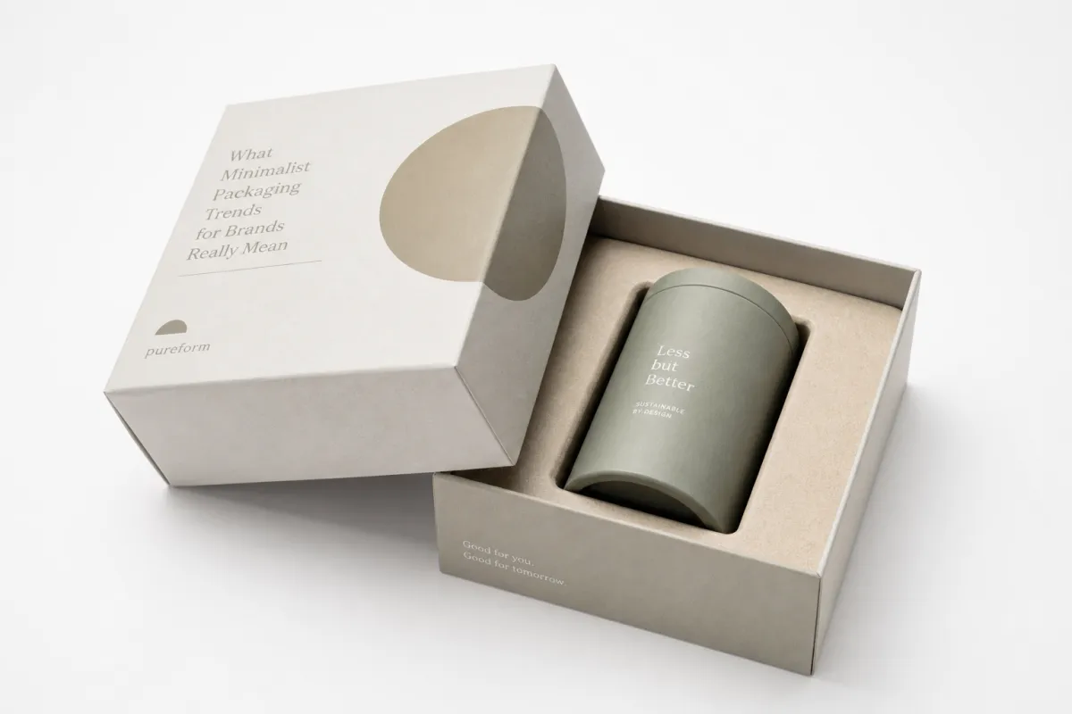
Minimalist Packaging Trends for Brands That Stand Out
Minimalist packaging trends for brands are not about making a box look empty. They are about making every visible decision earn its place. A plain carton can outperform a crowded one because the eye reads shape, contrast, type, and finish faster than decoration, especially at arm's length on a shelf or inside a thumbnail image. In a store aisle, shoppers often give a package only a few seconds before moving on. That short window rewards clarity, not noise.
That is why minimalist packaging trends for brands keep showing up across premium food, wellness, beauty, electronics, and direct-to-consumer product packaging. Done well, the style cuts visual clutter, sharpens package branding, and often improves production discipline. Done badly, it looks like a budget cut dressed up as restraint. The difference usually hides in the details: substrate choice, type hierarchy, and the one cue that makes the pack feel ownable.
For Custom Logo Things, this topic matters because custom printed boxes are not just containers. They are a commercial signal. The cleanest branded packaging can suggest confidence, restraint, and quality in a way that heavy graphics sometimes cannot. In my own reviews of packaging samples, I have watched buyers pick up the quiet box first more than once, then handle the louder version second. That reaction is not random. It is a clue about how people read confidence on the shelf.
"If the box has to explain too much, the design is working too hard."
One caveat: minimalism is not a magic trick. A sparse design can fail just as fast as an overstuffed one if the product story is muddy, the structure is flimsy, or the finish feels generic. The goal is not to remove personality. It is to remove waste.
What Minimalist Packaging Trends for Brands Really Mean
Minimalist packaging trends for brands start with a simple idea: reduce visual clutter so the core message gets through faster. That sounds obvious, yet many teams still confuse minimalism with underdesign. A blank white panel is not a strategy. A stripped-down box with no hierarchy, no tactile interest, and no clear category cue can feel cheap rather than premium.
In practice, minimalist packaging trends for brands use fewer colors, cleaner typography, and more whitespace to create structure. The layout usually relies on a strong product name, a restrained brand mark, and one supporting line that tells the buyer what the product does. When the design is disciplined, the box feels calm. The consumer does not have to decode a wall of claims before deciding whether the item belongs in their cart.
That is where a lot of packaging design discussions go sideways. Teams assume minimal means generic. It does not. The best versions usually include one signature element: a textured paperboard, an embossed logo, a cut corner, a vivid inner print, or an unusual structural shape. That single feature can carry identity while the rest of the pack stays quiet. Minimalist packaging trends for brands are not anti-brand; they are selective about where the brand shows up.
There is also a psychological reason these packs work. A cleaner surface can feel more confident because it leaves space for the product to breathe. On a shelf full of busy competitors, that restraint can read as quality control. On ecommerce pages, it lowers the chance that extra artwork turns muddy in photos. A minimal system also makes it easier to manage a line extension because the same grid can carry multiple SKUs without turning into a visual mess.
From a packaging buyer's point of view, the practical value is obvious. Fewer design variables usually mean fewer approval loops. Fewer embellishments often mean fewer opportunities for print mismatch. A tighter system can help brands keep product packaging consistent across retail packaging, shipping mailers, and promotional sets. That consistency matters because shoppers rarely experience a brand in one channel anymore. They see a product on a phone, then in a cart, then in a box on a doorstep.
Minimalist packaging trends for brands also fit the sustainability conversation, but only if the execution is real. Removing unnecessary inks, oversized inserts, and decorative layers can reduce material use. Still, sustainability is not automatic. A heavy rigid box with a quiet design is not automatically better than a lighter folding carton with smart dimensions. The packaging structure matters as much as the artwork.
For brands considering this shift, the right question is not, "Can we make it simpler?" It is, "What should remain visible after we remove everything else?" That answer should include the product promise, a clear hierarchy, and one distinctive cue that makes the pack recognizable from a few feet away. Minimalist packaging trends for brands work when they clarify, not erase.
How do minimalist packaging trends for brands work on shelf and online?
Minimalist packaging trends for brands succeed because the human eye is efficient. In a store aisle, shoppers do not study every box line by line. They scan for shape, contrast, type size, and whether the pack looks relevant to the need in front of them. On a screen, the process is even harsher. Thumbnail images shrink everything, so the strongest visual systems are the ones that remain legible when the box is only a few hundred pixels wide.
The first mechanism is hierarchy. Minimalist packaging trends for brands put the product name where it can be read quickly, often with generous spacing around it. The second is palette control. Two or three colors usually do more work than seven. A limited palette creates recognition faster, especially when one color becomes a repeated brand cue across an entire line. The third is material finish. A matte uncoated stock, a soft-touch lamination, or a slight sheen from aqueous coating can change perception more than a busy illustration ever could.
That matters online because clean surfaces photograph with less visual friction. Strong lighting, shadows, and reflections can expose flaws in highly decorated custom printed boxes. By contrast, minimalist systems hold together better across a range of images, which is why many ecommerce brands lean into them for launch pages, marketplace listings, and paid social creative. The pack becomes easier to standardize, and standardization saves time in the content pipeline.
Shape also plays a bigger role than many teams expect. When graphics are pared back, structure becomes memory. A tall narrow carton, a squat drawer box, a shoulder rigid box, or a mailer with a distinct opening mechanism can create recognition before the buyer even reads the front panel. That is one reason minimalist packaging trends for brands often pair with custom structures instead of stock boxes alone. The form carries some of the branding load that decoration would otherwise carry.
For product packaging in categories like supplements, skincare, or tech accessories, that form language can be powerful. A minimal front panel with one precise logo and a clear product descriptor often feels more trustworthy than cluttered copy blocks. It suggests the company knows what the product is, who it is for, and how to present it without shouting. That confidence reads well, even if the design itself is quiet.
There is a useful sustainability angle here too. Cleaner design systems often make it easier to simplify production steps, reduce print coverage, and avoid waste from overcomplicated revisions. The EPA's guidance on materials reduction and recycling is worth reviewing if your team wants to connect design changes to broader waste goals: EPA recycling and materials guidance. That said, fewer graphics do not automatically mean better environmental performance. A low-ink box made from the wrong substrate still creates problems downstream.
Minimalist packaging trends for brands work best when the visual idea, the structural idea, and the channel all agree. If the pack must perform on shelf, on camera, and in a shipping lane, the design should be built for all three from the start. That usually means deciding what role the box plays: silent stage, bold signal, or a hybrid of the two. If the team cannot answer that, the design will drift toward blandness. And honestly, bland packaging is often what people remember least.
Key Factors Behind Minimalist Packaging Trends for Brands
Not every brand benefits equally from minimalism, and that is where the strategy gets interesting. Minimalist packaging trends for brands tend to work best in categories where restraint signals competence: luxury, wellness, natural ingredients, skincare, home fragrance, and certain tech products. In those spaces, clean packaging can communicate control, precision, and trust. If the category is built around exuberance, celebration, or impulse, minimalism may need one brighter cue to avoid feeling cold.
Material choice is the next lever. Recycled paperboard, kraft substrates, and mono-material builds are all common starting points because they support a quieter look while keeping the pack grounded. Uncoated stocks can feel natural and honest. Lightly coated surfaces can look sharper if the typography is fine and the photography is minimal. In branded packaging, the substrate is often doing half the storytelling before the buyer notices the logo.
Tactile cues matter more when the artwork is reduced. A debossed mark, a raised varnish, a blind emboss, or a soft-touch coating can create a premium feel without adding visual clutter. Foil is not off the table, but many brands now use it more selectively. A small accent on a logo, seal, or edge detail can be enough. A lot of packaging design teams overuse shine because they worry the box will disappear. The better answer is usually to let one texture or finish do the heavy lifting.
Information architecture is another pressure point. Regulatory copy, ingredient panels, recycling marks, and use instructions all need space. Minimalist packaging trends for brands succeed when that information is mapped early instead of squeezed in at the end. If the compliance copy is an afterthought, the final layout can feel crowded even when the concept is clean. A smart grid, generous margins, and a strict type scale help preserve the look without hiding required information.
For brands selling through multiple channels, the same design also has to survive different viewing distances and different expectations. A premium retail shelf can support subtlety; a crowded marketplace thumbnail may not. That means the front panel has to be stronger than it looks on a full-size mockup. Many teams solve this by keeping the packaging minimal but increasing typographic contrast and product naming clarity. It is a small change with a big payoff, and it avoids the common trap of making the box pretty but unreadable.
There is also a standards side to all of this. If the box is intended for transit, testing against ISTA distribution standards can reveal whether a delicate-looking pack actually protects the product. A minimalist box that arrives dented is not elegant. It is just underbuilt. Likewise, if a brand claims responsibly sourced board, a credible certification such as FSC certification can support the claim far better than vague language on the side panel.
In the real world, minimalist packaging trends for brands often come down to balance. Too much restraint and the pack feels anonymous. Too much embellishment and the idea collapses. The sweet spot is usually a clean layout with one or two carefully chosen differentiators: a tactile stock, a structural twist, or a bold but disciplined color system. That is how minimalism becomes a brand asset instead of a design fad.
Minimalist packaging trends for brands: cost and pricing tradeoffs
Minimalist packaging trends for brands are often assumed to be cheaper, and sometimes they are. Fewer colors can lower certain print costs, but the full picture is messier. If a brand replaces a busy litho-printed carton with a custom rigid box, a specialty paper wrap, and a soft-touch finish, the unit price can rise quickly. Minimalism reduces some production variables, yet premium materials can offset those savings in a hurry.
Print setup is one major driver. A simple single-color or two-color design usually needs less press time and fewer plates than a full-coverage illustration. That can help lower cost, especially on larger runs. Dieline complexity can swing the opposite way. A minimal box with a custom window, unusual tuck, or magnetic closure may require more engineering, more sampling, and more time at prepress. Minimalist packaging trends for brands should be budgeted as a whole system, not just as artwork.
There are places where the savings are real. Reduced ink coverage lowers print consumption. Fewer embellishment passes reduce labor and setup. A cleaner design system can also streamline proofing because there are fewer moving parts for the team to approve. For brands with multiple SKUs, that can shorten revision cycles and reduce the chance of expensive last-minute changes. Even a small reduction in artwork churn can save several days on the calendar.
There are also places where costs rise. High-grade paperboard, textured wraps, specialty coatings, and lower minimum order quantities can push the per-unit number upward. A minimal pack that feels expensive usually does so for a reason: the tactile stock, the finish, or the precision of the structure is carrying more weight. If a brand wants the pack to feel premium without looking busy, the material budget often needs to move a little higher.
Here is a practical lens. On a 5,000-piece folding carton run, a clean design on standard SBS board might sit in a relatively efficient range, while the same artwork on a custom rigid structure with specialty finishing could move into a higher tier. The exact numbers depend on size, coating, and shipping format, but the pattern is consistent: design simplicity lowers some costs, and premium execution adds others. Brands should ask suppliers to quote multiple versions so they can see the tradeoff clearly instead of guessing from a single number.
| Packaging option | Typical cost impact | Best for | Watch-outs |
|---|---|---|---|
| Standard folding carton with minimal print | Usually the lowest unit cost when volumes are steady | Launches, retail packaging, subscription product packaging | Can feel plain if stock and typography are weak |
| Kraft or recycled board with one-color ink | Often efficient, especially for clean, natural branding | Natural, wellness, and eco-positioned lines | Print contrast can suffer if copy is too small |
| Soft-touch folding carton with embossing | Mid to higher cost because of finish and tooling | Premium beauty, lifestyle, and giftable sets | Fingerprints, scuff resistance, and lead time need attention |
| Custom rigid box with restrained graphics | Highest among common options, often starting from a premium base | High-end kits, corporate gifts, collector sets | Beautiful but easy to overspec for lower-margin items |
For brands comparing options, pricing should include the whole job: design hours, sample rounds, printing, finishing, inserts, freight, and warehousing. A box that looks cheaper at the quote stage can become expensive if it requires extra handling or if the structural spec creates damage in transit. I have seen minimal designs win because they removed unnecessary pieces, and I have seen them lose because the wrong finish or substrate pushed the budget beyond what the category could support. That is the part no one likes to hear, but it is usually true.
That is why minimalist packaging trends for brands are best viewed as a decision framework, not a shortcut. If the product sits in a sensitive margin category, a simpler structure may be the right economic move. If the brand sells at a premium and the packaging is part of the perceived value, spending more on paper quality or tactile finishing can be the correct call. The right answer depends on the channel, the price point, and the role of the pack in the sale.
Step-by-Step Process and Timeline for Minimalist Packaging
Minimalist packaging trends for brands are easier to execute when the process is disciplined from day one. The cleanest designs usually come from the clearest briefs. A strong brief defines the product, the sales channel, the target margin, the unboxing goal, and the one thing the package must communicate immediately. Without that, the design team ends up chasing taste instead of solving a packaging problem.
A typical workflow starts with strategy and concepting. That stage usually takes one to two weeks, depending on how quickly the team can agree on the message hierarchy. From there, material selection and rough prototyping may take another one to two weeks. If the brand wants to compare recycled board, coated board, and a textured premium substrate, the sampling cycle can stretch further. Small decisions at this stage can make a big difference later. A 24-pt rigid board feels very different from an 18-pt folding carton, and those differences affect both perception and shipping performance.
Once the concept is approved, prepress work begins. This is where minimalist packaging trends for brands can either accelerate or slow down. Clean layouts generally reduce the number of edits, but they are less forgiving of spacing errors, low-contrast copy, and off-brand type choices. A 1.5 mm shift on a minimal box can look like a design flaw because there is nowhere for the eye to hide. Teams that think simpler equals easier are often surprised by how precise the final artwork needs to be.
Production timelines depend on the packaging format. A straightforward custom printed box can sometimes move from proof approval to production in about 10 to 15 business days, while more complex structures, specialty coatings, or insert programs may take longer. If the line needs transit testing, add time for samples and validation. If the box includes a window, foil accent, or unusual closure, expect extra review. The fastest projects are the ones that make fewer decisions late in the process.
Here is a useful way to shorten the approval cycle:
- Set the hierarchy first so the logo, product name, and variant are locked before cosmetic details.
- Limit the palette early, ideally to a primary neutral and one accent color.
- Approve the substrate before final artwork files are prepared.
- Define copy limits for claims, ingredients, and legal text before layout begins.
- Test one or two finish options instead of comparing five at once.
That last point matters more than most brands realize. Minimalist packaging trends for brands often lose time because teams keep opening the door to new options. A clean design process should do the opposite. Every extra choice becomes a delay. Every delay costs money, especially if a launch window is tied to retail placement or a seasonal campaign. The project starts drifting, and suddenly the schedule is doing the steering.
Brands should also think about testing. Print legibility, ink rub resistance, corner crush strength, and carton fit are worth checking before the order is released. If the product is shipped long-distance, distribution testing matters. If the pack is intended for a premium retail display, color consistency across multiple units matters just as much. A minimal pack exposes variation quickly because there are fewer graphics to distract from it.
For teams building out a broader line, this is where resources like Custom Packaging Products can help translate the concept into a family of formats without losing consistency. The goal is not to create one beautiful box and stop there. The goal is to build a system that can stretch across sizes, variants, and channels while still feeling like one brand.
In practical terms, minimalist packaging trends for brands can shorten the route from concept to launch if the brand commits early. The fewer the variables, the faster the approvals. That only works if the first decisions are made carefully. A minimalist box with weak decisions is still a weak box. A minimalist box with clear objectives becomes a very efficient piece of package branding.
Common Mistakes Brands Make with Minimalist Packaging
The most common mistake is making the pack too bare. Some teams remove so much that the product identity disappears. The result is a box that feels generic, underpowered, or oddly fragile in the hands of the customer. Minimalist packaging trends for brands are not supposed to erase character. They are supposed to sharpen it.
Another problem is poor hierarchy. A logo may be placed beautifully, yet the actual product name is too small to read quickly. Variant information gets buried. Usage instructions are squeezed into a side panel with low contrast. In retail packaging, that is a costly mistake because shoppers have limited time and limited patience. The box has to answer the obvious question before the buyer asks it.
Sustainability theater is also common. A brand may describe the pack as eco-friendly while still using oversized inserts, mixed materials that are hard to separate, or decorative layers that add no functional value. That kind of language damages trust. If sustainability is part of the pitch, it should be tied to measurable choices such as reduced ink coverage, responsibly sourced board, or a right-sized structure. Otherwise, the claim reads like decoration.
There is a structural risk too. Some minimalist boxes look elegant but fail in transit. Corners crush, inserts shift, and the product arrives damaged. That is not just an operations problem; it is a brand problem. A customer rarely distinguishes between product failure and packaging failure. They just remember the disappointment. If the pack is going through shipping or fulfillment, the structure should be checked against realistic handling, not just photographed on a studio table.
Copycat design is another trap. A brand may follow current minimalist packaging trends for brands without considering the category, audience, or channel. That can leave it looking generic in the exact segment where distinctiveness matters most. The best minimal systems still include a recognizable cue: a specific type treatment, a recurring color block, a mark placement rule, or a structural signature. Without that, the packaging becomes a trend follower instead of a brand builder.
Sometimes the issue is less about the design and more about the team's decision process. When too many stakeholders have equal veto power, the final layout gets over-edited until the original concept loses force. Simplicity needs discipline. It is easier to keep adding than to decide what to remove. Brands that understand this usually get better results, because they treat minimalist packaging trends for brands as a strategic filter rather than an aesthetic preference.
One practical way to avoid these errors is to review a prototype in three settings: on a shelf mockup, in a shipping carton, and on a phone screen. That combination reveals whether the design is still readable, still durable, and still ownable. If it fails in any one of those views, the minimal approach needs adjustment before production begins. I wish there were a prettier answer, but there really isn't.
Expert Tips and Next Steps for Minimalist Packaging Trends for Brands
If a brand wants to use minimalist packaging trends for brands without wasting time or budget, the smartest move is to start small. Redesign one hero SKU first. Or apply the new system to one packaging tier, such as the outer carton before the insert tray or sleeve. That approach gives the team a real-world read on cost, durability, and shelf impact without forcing a full line overhaul on day one.
A decision matrix helps as well. Score the concept against four questions: shelf impact, sustainability goals, cost ceiling, and unboxing expectations. If a version scores well on three but fails badly on the fourth, the team should not ignore the gap. Minimalist design works best when its purpose is clear. A beautiful box that misses the business requirement is just expensive artwork.
Testing finish combinations can also save a lot of guesswork. Try two or three versions rather than ten. For example: uncoated board with emboss, soft-touch with a matte logo, or kraft stock with a single ink color and blind deboss. Those options create very different emotional tones. One may feel more natural. Another may feel more premium. The point is to find the version that feels distinctive without being noisy.
Ask suppliers direct questions. What substrates do they recommend for the product weight? What is the minimum order quantity for each print method? How do lead times change if you add embossing, foil, or a specialty coating? What happens to unit cost if you move from a standard mailer to a custom structure? These questions expose the real tradeoffs behind minimalist packaging trends for brands, and they keep the discussion grounded in production reality rather than mood boards.
For teams evaluating broader rollout options, the best resource is often a mix of internal audit and external proof. Review your current line, then look at competitors and at your own past launches. The Case Studies section can be a useful reference point for seeing how format choices translate into real packaging outcomes. A strong example from one category can reveal what your own packaging system is missing.
Here is a practical action plan that usually works:
- Audit the current pack and remove one visual element that adds little to sales or compliance.
- Upgrade one material choice, such as board quality, surface feel, or insert fit.
- Prototype one version with tighter hierarchy and fewer colors.
- Test it in retail, in shipping, and on mobile screens.
- Compare the unit cost, damage rate, and approval speed against the old version.
That last comparison is where the story becomes measurable. Minimalist packaging trends for brands are most convincing when the brand can point to outcomes: faster approvals, lower ink coverage, better shelf readability, stronger perceived value, or reduced damage in transit. If the new packaging does not move one of those needles, the design has probably become too aesthetic and not strategic enough.
Honestly, that is the real test. Minimalism should make the brand easier to understand, easier to trust, and easier to buy. It should make the product look more intentional, not less. When minimalist packaging trends for brands are executed with discipline, they can improve both perception and performance. When they are treated as a shortcut, they flatten the brand instead.
For Custom Logo Things, the opportunity is clear: use minimalist packaging trends for brands to build a cleaner, stronger packaging system that supports the product, the channel, and the price point. The smartest versions do not disappear on shelf. They stand out because they know exactly what not to say. That is the real work, and it is worth doing carefully.
How do minimalist packaging trends for brands help sales without looking plain?
They help by making the most important buying cues easier to read: the product name, the shape, and one memorable finish or material. Minimalist packaging trends for brands feel intentional when typography, spacing, and contrast are handled with precision. They Work Best when the pack still gives the shopper a clear category signal instead of relying on empty space alone.
Are minimalist packaging trends for brands actually more sustainable?
Often, yes, but not automatically. If the design reduces ink coverage, simplifies structure, and removes unnecessary secondary components, the package can use less material and create less waste. The more credible versions of minimalist packaging trends for brands pair visual restraint with measurable reductions, not just cleaner artwork.
What materials work best for minimalist packaging trends for brands?
Recycled paperboard, kraft board, and mono-material formats are common starting points because they support a restrained look and usually print well. Uncoated or lightly coated stocks often feel the most natural, while embossing, debossing, or soft-touch finishes can add premium character without adding clutter. The best choice depends on the product weight, channel, and target price point.
How long does it take to launch a minimalist packaging design?
If the structure stays the same and only the artwork changes, a refresh can move relatively fast. New structures, specialty coatings, or transit testing add time for samples and approval. For minimalist packaging trends for brands, the biggest delays usually come from slow copy decisions and too many late-stage revisions, not from the minimal design itself.
What should brands budget for minimalist packaging trends for brands?
Budget for both design and production. Simpler graphics can reduce some costs, but premium board, specialty finishes, and lower quantities can raise unit pricing. The smartest approach is to ask for multiple quotes across materials and finishes so you can compare the real tradeoffs behind minimalist packaging trends for brands instead of guessing from a single number.

