Buyer Fit Snapshot
| Best fit | Offset Printed Kraft Cartons projects where brand print, material claims, artwork control, MOQ, and repeat-order consistency need to be specified before quoting. |
|---|---|
| Quote inputs | Share finished size, material target, print colors, finish, packing count, annual reorder estimate, ship-to region, and any compliance wording. |
| Proofing check | Approve dieline scale, logo placement, barcode or warning zones, color tolerance, closure strength, and carton packing before bulk production. |
| Main risk | Vague material claims, crowded artwork, missing packing details, or unclear freight terms can make a low unit price expensive after revisions. |
Fast answer: Offset Printed Kraft Cartons: How They Work and Cost should be specified like a repeatable production item. The safest quote records material, print method, finish, artwork proof, packing count, and reorder notes in one written spec.
Production checks before approval
Compare the actual filled-product size with the drawing, then confirm tolerance on folds, seals, hang holes, label areas, and retail display edges. Reserve space for logos, QR codes, warning copy, and material claims before decorative graphics fill the panel.
Quote comparison points
Review material grade, print process, finish, sampling route, tooling charges, carton quantity, and freight assumptions side by side. A quote is only useful when the supplier can repeat the same color, closure quality, and packing count on the next order.
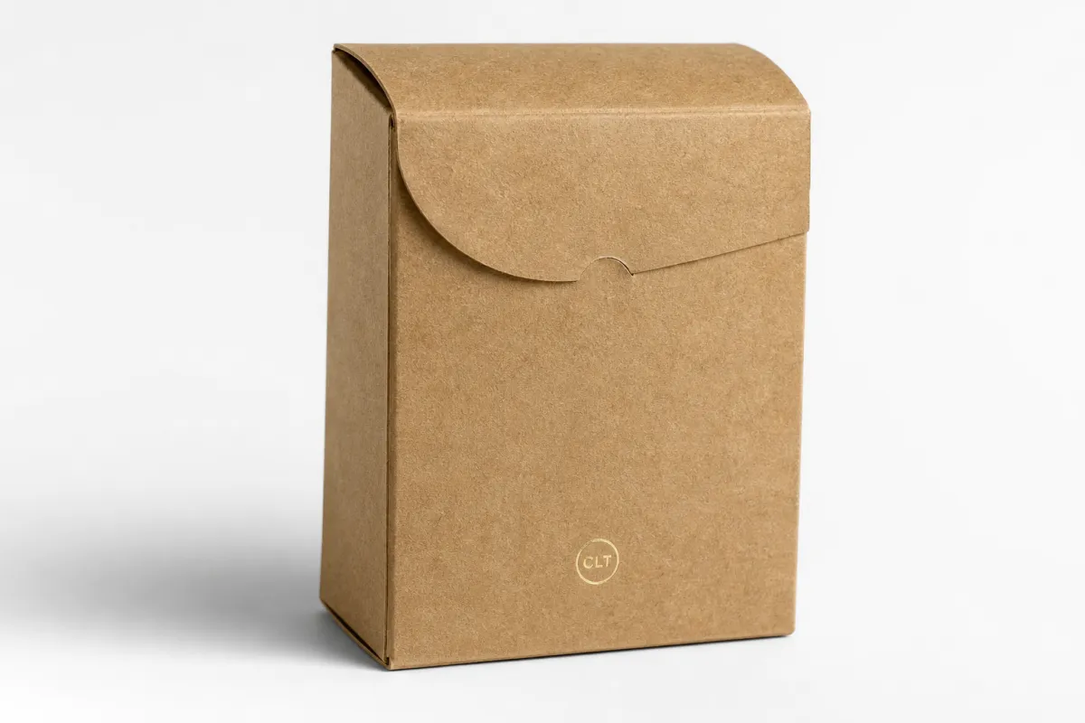
Offset Printed Kraft cartons can look plain at first glance, then reveal a surprising amount of technical work once you inspect the details. Print clarity, board choice, scoring, glue performance, and finishing all pull in different directions. A tea carton in a specialty store, a skincare box on a crowded shelf, or a subscription package arriving through the mail all depend on the same quiet equation: the surface needs to feel natural, the graphics need to read cleanly, and the carton needs to survive production without turning into a budget leak. If you are buying packaging for a brand that needs both shelf presence and manufacturing discipline, that balance matters more than a glossy mockup ever will.
That is the appeal of offset printed kraft cartons. They are usually built from kraft-faced folding carton board or natural kraft paperboard and printed on an offset press, which gives the printer tighter registration, sharper type, and more reliable color control than many direct-print approaches. Kraft carries a specific visual signal. It suggests restraint, material honesty, and a less polished sort of confidence. Offset printing does not erase that character. It sharpens it.
Buying decisions get simpler once the job is framed correctly. offset printed kraft cartons are a strong fit for certain products and a poor fit for others. Fine typography, detailed line art, or a front panel that has to do a lot of selling usually benefits from offset printing. A very short run with changing artwork or a carton that only needs basic protection may not justify the setup. The sections that follow walk through production, pricing, timing, and the mistakes that keep good cartons from printing the way they were imagined.
Offset Printed Kraft Cartons: A Strong First Impression
Walk through a specialty retail aisle and the pattern becomes obvious quickly: the package is speaking before anyone touches the product. offset printed kraft cartons help shape that first impression because they combine the warm, tactile look of kraft with the precision of a high-resolution printing process. That combination suits tea, supplements, candles, apparel, artisanal foods, and small gift items especially well. The box needs to feel trustworthy, yet it also has to earn attention in a shelf environment where every neighboring package is competing for a glance.
People sometimes treat kraft as a shorthand for rough or unfinished. That assumption leaves a lot of good packaging on the table. offset printed kraft cartons can look refined, even elegant, when the typography is chosen carefully, the design respects the board tone, and the ink strategy matches the surface. A two-color layout, a restrained logo lockup, or a full-color front panel with controlled coverage can all work. Kraft does not need to pretend to be coated white stock. It performs better when the design accepts its own texture and color.
That distinction matters for brand consistency. A package that looks intentional tends to support repeat orders, retail recognition, and stronger buyer confidence. offset printed kraft cartons are often chosen when the brand wants to signal natural materials without giving up the crispness needed for legal text, ingredient statements, barcodes, and a clear logo. A carton that looks considered usually makes the product inside look equally considered. The connection is subtle, but shoppers notice it faster than they notice the spec sheet.
Offset printing also offers a practical edge: control. Tight registration helps small type stay readable and keeps brand marks aligned across the run. That matters in categories where the carton front panel carries a lot of information or where the image area is small and every millimeter affects legibility. offset printed kraft cartons tend to perform well in those situations because the press can hold detail that lower-resolution methods may blur or shift.
The lowest quote rarely tells the whole story. With offset printed kraft cartons, early decisions about board, finish, and artwork often decide whether the final box feels premium, underwhelming, or simply expensive for the wrong reasons.
In the projects I have reviewed, the surprise is rarely the print itself. It is the board. Kraft is not one thing, and it is definitely not a neutral surface. A warm natural stock, a kraft-faced liner, and a recycled board with visible fiber content all behave differently under ink. If the printer does not explain that difference clearly, the brand can end up chasing a color match that was never realistic in the first place.
If you want a broader view of how packaging programs come together, our Manufacturing Capabilities page gives a useful overview of the production methods that support folding cartons, retail packaging, and finishing combinations. That perspective matters because the carton is not just a printed surface. It is a structural object that has to fold correctly, glue correctly, and travel correctly from the factory to the shelf.
How Offset Printed Kraft Cartons Are Produced
The production path for offset printed kraft cartons begins well before the press starts running. Artwork setup comes first. The dieline has to be confirmed, panel sizes checked, copy reviewed, and type tested at final scale. Once the files are ready, plates are made for the offset press. In lithography, the image transfers from plate to blanket and then onto the board, which is one reason the process is so good at handling fine detail, small type, and sharp linework.
That precision matters even more on kraft. The brown tone of the board affects everything printed on top of it. offset printed kraft cartons often need a white underprint if the design depends on bright red, saturated blue, or a clean photographic look. Without that base, colors usually print warmer, darker, and more muted. Sometimes that shift is exactly what the designer wants. A natural food brand may prefer it. A luxury cosmetic line probably will not. The printer and designer need to agree on that before anyone signs off on the files.
Press setup is only one stage in the chain. offset printed kraft cartons still need drying or curing time, and that timing shifts with ink coverage, coating selection, and the press line itself. After printing, the sheets move to converting. They are die-cut, scored, folded, glued, and packed. Each step can make or break the finished carton. A clean printed face means very little if the score is too shallow, the fold cracks, or the glue flap lands off by a few millimeters.
Finishing choices often separate a carton that feels thoughtful from one that feels overworked. Aqueous coating is common because it adds basic protection and a finished look without excessive complexity. Spot UV can highlight a logo or focal mark, though it may be too stark for some kraft designs if the rest of the carton is already busy. Soft-touch lamination brings a velvet-like hand feel, but it usually belongs on premium presentation packaging rather than a straightforward retail carton. Embossing can work well on offset printed kraft cartons because raised detail pairs nicely with the natural fiber appearance, yet the value has to justify the die cost and setup time.
Structure deserves equal attention. A carton that scores poorly may burst or crack at the folds. A design with overly tight tolerances can create repeat assembly problems on the packing line. Comparing offset printed kraft cartons across suppliers means asking about board thickness, score depth, glue flap width, and the exact carton style being quoted. A good proof is not the same thing as a carton that converts reliably at production speed.
Projects that involve a deeper production conversation often expose the real complexity behind the carton. Our Manufacturing Capabilities page is a useful reference point because it helps separate design ambition from manufacturing reality. That distinction matters a great deal with offset printed kraft cartons, where a modest change in board or coating can shift cost, turnaround, and appearance at the same time.
Key Factors That Affect Quality and Price
The main cost drivers behind offset printed kraft cartons are easy to name and easy to underestimate. Board grade is one of the biggest variables. Kraft-faced paperboard, recycled board, and higher-strength folding carton board all behave differently on press and in conversion. A board that looks fine in a sample book may act differently once ink, scoring pressure, and glue are applied. Print coverage is another major factor. A one-color carton is simpler to run than a full-bleed design with dense artwork, especially if the brand expects bright colors to sit cleanly on a brown base.
The number of colors matters too. A single spot color may be enough for a minimal brand. A four-color process job with white underprint and varnish demands more control and more setup. On offset printed kraft cartons, heavy coverage often means extra attention on press, slower pace during adjustment, and sometimes a higher waste allowance to keep density and registration in range. If the artwork relies on photography, the printer may need a board and coating combination that keeps the image from muddying in the shadows or flattening in the highlights.
Finishing changes the quote in a very real way. Aqueous coating is usually less expensive than soft-touch lamination or special UV work. Die complexity matters as well. A simple tuck-end carton is usually cheaper than a structure with windows, inserts, display features, or unusual locking tabs. With offset printed kraft cartons, even a small structural change can ripple through tooling, setup, and packing efficiency. That ripple often appears later, after the first round of pricing, which is why detailed specs matter from the start.
Quantity changes the math in a predictable way. Fixed costs for plates, setup, proofs, and conversion are spread across more units as volume rises, so larger runs generally improve unit pricing. Smaller runs can still make sense, but the per-carton price often climbs fast. That is why offset printed kraft cartons can look expensive at 2,500 units and far more reasonable at 10,000 units, even with almost identical artwork. The price jump is not random. It reflects how print production works.
Sustainability requirements can affect pricing too. If the project needs FSC-certified board, recycled content, or food-safe inks and coatings, the supplier may need specific sourcing or compliance documentation. Some projects also call for testing based on how the cartons will be shipped and handled. Industry methods such as ISTA packaging transport test methods and ASTM-based checks can help confirm that the carton survives distribution, especially when the product is fragile or the unboxing experience matters. Those tests are not mandatory for every job, but they become more valuable as the product’s value and vulnerability rise.
One caution from the production side: a color-managed proof is not the same thing as a production match on kraft. A screen rendering can look cleaner than the real box will, even if the files are technically correct. That is not a failure of software. It is simply the difference between light emitted by a display and ink absorbed by a fiber-based board. Buyers who understand that gap usually make better calls, and they get fewer nasty surprises.
| Option | Typical Look | Best Use | Illustrative Unit Cost | Notes |
|---|---|---|---|---|
| 1-color direct print on kraft | Minimal, earthy, restrained | Simple retail or shipping cartons | $0.12-$0.20 at 5,000 units | Lowest setup burden, but limited color control |
| 4-color process without white underprint | Warm, muted, natural | Organic brands, craft products | $0.16-$0.26 at 5,000 units | Kraft tone shifts the artwork and deepens the palette |
| 4-color plus white underprint and aqueous coating | Crisp, cleaner, more retail-ready | Premium shelf packaging | $0.22-$0.38 at 5,000 units | Extra coverage or an added press step can raise cost |
| Premium finish with spot UV or embossing | High contrast, tactile, display-focused | Gift sets, cosmetics, specialty items | $0.30-$0.55 at 5,000 units | More setup, more inspection, longer lead time |
Those figures are for planning, not quoting. They still show why offset printed kraft cartons should be priced from a complete spec sheet rather than a loose request. Board grade, print count, coating, quantity, and size all change the final number, sometimes by more than buyers expect. A carton that looks simple in a mockup may require a much more demanding production path than the mockup suggests.
Offset Printed Kraft Cartons Process and Timeline
A clean schedule for offset printed kraft cartons usually follows a familiar sequence. Finalize the dieline first, then confirm carton dimensions. Review copy, barcodes, legal statements, and product claims next. From there the job moves into prepress file checking, proof approval, plate creation, printing, finishing, converting, inspection, and shipment. Each stage has its own failure point. Most delays trace back to late artwork changes, vague specifications, or approvals that move at different speeds across departments.
The proofing stage deserves more scrutiny than it often gets. A digital proof can confirm layout, but it does not always show how the ink will behave on kraft. For offset printed kraft cartons, a physical sample or press proof is often the safest way to confirm color, contrast, and text readability. That becomes even more important when the carton has to match an existing product family or sit inside a tightly controlled retail system.
Lead time depends on more than the print run itself. Drying or curing, finishing complexity, and freight planning all affect delivery speed. A straightforward run of offset printed kraft cartons may move quickly if the artwork is settled and the press slot is open. Add foil, embossing, or a custom insert, and the schedule almost always stretches. A rush order can still happen, but the tradeoff is usually less flexibility on material choices, fewer finish options, or a premium for expedited handling.
The smartest teams think in milestones rather than wishful timelines. Clean files lower the risk of corrections. An approved dieline removes uncertainty. Final copy prevents late-stage rework. offset printed kraft cartons become easier to buy once the spec is locked before production begins, not halfway through the job. The cost of indecision tends to show up as waste, reproofs, and lost time.
Production planning also benefits from hard dates. Many projects need 2-4 business days for proofing, then another 10-15 business days for manufacturing after approval, though that range shifts with quantity and finishing complexity. Freight can add several more days depending on destination and mode. With offset printed kraft cartons, a disciplined timeline usually beats a rushed one because both the visible surfaces and the structural fit are on the line.
Another useful habit is assigning ownership for each approval step. Marketing can approve the color, operations can approve the carton fit, and compliance can approve barcode and copy details. That simple division keeps the project from stalling. A missing signature can delay offset printed kraft cartons just as easily as a missing tool file, and the wasted time rarely looks dramatic until the deadline is already gone.
Cost, Pricing, MOQ, and Quote Planning for Offset Printed Kraft Cartons
Good quote requests make offset printed kraft cartons much easier to price and compare. The best request includes dimensions, carton style, board preference, print count, finish requirements, quantity, shipping destination, and any special needs such as inserts, windows, or food-contact considerations. A picture and a rough size force the supplier to estimate. A spec sheet gives the supplier something real to build on.
MOQ affects more than whether a supplier accepts the order. It shapes the unit economics. A smaller run of offset printed kraft cartons carries a higher share of fixed setup work, while a larger run spreads that work across more units and usually lowers the per-piece number. Two quotes can appear wildly different and still both be honest. One may be pricing 3,000 units on premium board, and another may be pricing 10,000 units on lighter stock. The numbers only make sense once the spec is matched line by line.
Fair comparison starts with the basics. Ask whether each supplier is pricing the same board type, same print method, same coating, same carton style, same pack-out, and same freight assumptions. Hidden costs can sit outside the main quote: plates, tooling, sample runs, revisions, freight, storage, and any secondary packaging used to protect the cartons in transit. With offset printed kraft cartons, even the way the cartons are packed can affect damage risk and final landed cost.
Budgeting gets easier if you separate the features that truly sell the product from the features that merely look attractive in a presentation. A strong logo, clean copy, and one well-chosen finish may carry most of the brand value. A second coating or decorative effect may not earn its keep unless the carton sits in a fiercely competitive environment. That is the real test for offset printed kraft cartons: do the finishes strengthen recognition, or do they just inflate spend?
There is a simple financial question hiding inside most packaging decisions. If the carton is part of the customer’s first touchpoint, it deserves a stronger spec. If it exists mainly to protect the product inside a master shipper, a simpler build may be wiser. That distinction can save real money. offset printed kraft cartons are most cost-effective when they are treated as brand assets, not just containers with printing on them.
For sustainability claims, verify before approval. If the packaging will reference FSC-certified board, confirm the certification chain of custody and the exact wording used in the artwork. The official guidance at FSC is a useful reference for what the claim can and cannot say. Accuracy protects the brand as much as the carton protects the product.
If a supplier cannot explain the difference between quoted price and landed cost, pause. Freight, sampling, overage, and rework can quietly move the real number. I have seen a job win on unit price and lose on everything else. That is not a victory; it is a very tidy-looking mistake.
Common Mistakes to Avoid With Offset Printed Kraft Cartons
One of the most common errors is designing offset printed kraft cartons as if kraft were white board. It is not. Colors behave differently on brown or recycled surfaces, contrast is lower, and fine detail can disappear if the artwork is too delicate. A pale beige logo that looks elegant on a screen may vanish once it is printed. Stronger type weight, clearer contrast, and more deliberate use of negative space usually perform better.
Another mistake is loading the carton with every finish available. Good typography and disciplined layout often carry more visual weight than a pile of effects. A design does not need foil, embossing, spot UV, soft-touch lamination, and a specialty coating all at once. On offset printed kraft cartons, too many effects can create a package that is expensive without being more effective. One or two well-placed details usually outperform a crowded finish stack.
Skipping prepress checks is another expensive habit. Barcode placement, small legal text, panel alignment, and glue area clearance all need review. If the barcode sits too close to a fold or the logo lands in the glue flap, the carton can still pass a visual proof and fail on press. That is a frustrating way to discover that offset printed kraft cartons need the same discipline as any other precision print job.
Testing gets overlooked as well. A carton that looks perfect under studio lighting may still crush in transit, scuff during distribution, or warp on shelf. If the product is fragile or premium, ask about distribution testing and handling assumptions. Standards such as ASTM and ISTA help buyers evaluate real shipping conditions instead of relying on appearance alone. That matters because offset printed kraft cartons are supposed to protect and present, not just present.
Sustainability should not be judged by color alone. Kraft can imply environmental care, but the actual picture depends on material sourcing, coating choices, print waste, and what happens to the package after use. A carton with responsible board and efficient production may be a better choice than a heavily decorated design that only looks green. offset printed kraft cartons deserve full-system evaluation, not paper-color assumptions.
The communication gap between design and production can also cause trouble. Designers often think in visual terms; production teams think in board, score, and glue terms. The strongest offset printed kraft cartons come from those viewpoints being aligned early, before the order is released to press. That alignment saves time, and time is usually the hidden line item no one budgets for until it disappears.
There is also a very human mistake: assuming every supplier uses the same definition of “kraft.” Some mean a natural brown sheet. Others mean a kraft-faced board with a coated liner. Some quote a surface that looks rustic but prints quite cleanly; others quote a substrate that soaks up ink and dulls the result. That difference changes the whole job, so it deserves a direct question before anyone commits.
Expert Tips and Next Steps for Better Results
Start with the product, not the artwork. Weight, fragility, shelf life, retail display needs, and shipping method should shape the carton spec first. Once those factors are clear, Choosing the Right board and structure for offset printed kraft cartons becomes much easier. A sturdy tea carton does not need the same build as a luxury accessory box, and neither should be forced into the same structure simply because the brand wants one visual template.
Ask for board and finish samples. Real samples tell you far more than a PDF because kraft changes under actual light. A muted brown stock with satin aqueous coating feels different from a darker kraft-faced board with no coating at all. If the carton matters to retail presentation, touching the samples is worth the time. It also helps buyers decide whether offset printed kraft cartons should include a white underprint or embrace the natural tone of the paper.
Compare one quote at a time using the same spec sheet. That sounds obvious, yet it prevents a lot of confusion. If one supplier quotes 5,000 cartons on 18pt kraft-faced board with aqueous coating and another quotes 5,000 cartons on lighter stock with no coating, the prices are not truly comparable. For offset printed kraft cartons, fair comparison depends on matching board, finish, print count, and pack-out before anyone starts discussing cost.
Put a pre-production checklist in writing. Dieline approval, color expectations, carton fit, insert needs, labeling, shipping method, and inventory planning should all be checked before the run is released. That discipline is especially useful for offset printed kraft cartons because the package has to satisfy both brand and operational demands. A carton that looks beautiful but slows packing is not a win. It is a bottleneck with good styling.
Keep the design honest. Kraft has a natural character that usually looks better when the artwork respects it rather than fights it. A clean logo, one or two brand colors, and a confident layout often outperform an overworked design. The strongest offset printed kraft cartons are often the ones that feel deliberate rather than decorated. That restraint can be harder to achieve than it looks, which is part of why it stands out.
If you are planning a new package or revisiting an old one, gather the dimensions, list the required finishes, confirm the quantity, and request samples before you place the order. That sequence reduces surprises and usually improves pricing. For brands that want strong shelf appeal without losing the natural look of the substrate, offset printed kraft cartons remain one of the most practical choices available. The actionable takeaway is simple: lock the spec, approve a physical proof, and only then compare final pricing. That order protects both the budget and the box.
Frequently Asked Questions
What are offset printed kraft cartons best used for?
They are a strong fit for retail packaging that needs sharp graphics, stable color, and a natural kraft appearance, such as food, wellness, apparel, and specialty gift products. offset printed kraft cartons work especially well when the box is part of the brand story and needs to look polished on shelf or in unboxing photos.
Do offset printed kraft cartons need a white underprint?
Not always, but a white underprint is often used when the design needs bright, accurate color on brown kraft stock. Without a white base, offset printed kraft cartons usually show deeper, warmer, or more muted colors, which can be exactly the right look for a natural brand style.
How do I estimate the cost of offset printed kraft cartons?
Start with carton size, quantity, board type, number of print colors, and finishing requirements, since those are the biggest pricing drivers. Ask for quotes using the same spec sheet so you can compare offset printed kraft cartons fairly, and include freight, tooling, samples, and any compliance requirements in the full budget.
What is a realistic lead time for offset printed kraft cartons?
Lead time depends on proof approval, press scheduling, finishing steps, and shipping distance, so simple jobs move faster than complex ones. Allow extra time if you need multiple approval rounds, custom inserts, or color-critical matching. The safest plan is to build production around the full schedule, not just the print run for offset printed kraft cartons.
Can offset printed kraft cartons be made with recycled or FSC paper?
Yes, many projects can specify recycled content or FSC-certified board, depending on the performance requirements and supplier availability. The right choice depends on product weight, finish needs, and whether the carton also has to meet food-contact or retail-display expectations. Always confirm the exact board, coating, and certification claims before approval so offset printed kraft cartons support accurate sustainability messaging.


