Buyer Fit Snapshot
| Best fit | Offset Printed Kraft Boxes projects where brand print, material claims, artwork control, MOQ, and repeat-order consistency need to be specified before quoting. |
|---|---|
| Quote inputs | Share finished size, material target, print colors, finish, packing count, annual reorder estimate, ship-to region, and any compliance wording. |
| Proofing check | Approve dieline scale, logo placement, barcode or warning zones, color tolerance, closure strength, and carton packing before bulk production. |
| Main risk | Vague material claims, crowded artwork, missing packing details, or unclear freight terms can make a low unit price expensive after revisions. |
Fast answer: Offset Printed Kraft Boxes: Design, Cost, and Process should be specified like a repeatable production item. The safest quote records material, print method, finish, artwork proof, packing count, and reorder notes in one written spec.
Production checks before approval
Compare the actual filled-product size with the drawing, then confirm tolerance on folds, seals, hang holes, label areas, and retail display edges. Reserve space for logos, QR codes, warning copy, and material claims before decorative graphics fill the panel.
Quote comparison points
Review material grade, print process, finish, sampling route, tooling charges, carton quantity, and freight assumptions side by side. A quote is only useful when the supplier can repeat the same color, closure quality, and packing count on the next order.
Offset Printed Kraft boxes sit in a useful middle ground that a lot of brands underestimate. They keep the grounded, paper-first character people associate with kraft, while giving you the cleaner typography, tighter registration, and more controlled color that direct printing on natural kraft often struggles to hold. For a packaging buyer, that matters because the box can still feel honest and material-driven, yet present itself with enough polish for retail shelves, gift programs, and premium e-commerce unboxing.
Offset Printed Kraft boxes are turning up more often for a reason. A brand does not have to choose between rustic and refined when the design, board selection, and finishing plan are aligned from the start. The challenge is that the same things that make offset Printed Kraft Boxes appealing also make them sensitive to process decisions: substrate color, ink density, proofing, tooling, and order size all shape the final result. If you want to compare structures while you read, the Custom Packaging Products page and the Manufacturing Capabilities page are useful starting points.
This overview stays practical. The goal is to help you judge whether offset printed kraft boxes fit your product, budget, and launch timeline, and to point out the hidden cost and quality variables that tend to show up late if nobody is watching for them. I have sat through enough press checks to know that the mockup is usually the easy part. The real job is getting the box to look right on the actual board, under actual light, with actual deadlines breathing down everybody's neck.
Offset Printed Kraft Boxes: The Shelf Signal Most Brands Miss
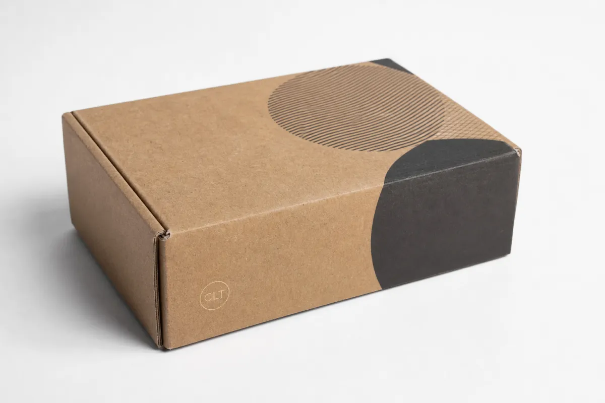
Many people still read kraft as a rough visual cue. Brown paper. Earthy. Honest. Maybe handmade, maybe recycled, maybe a little understated. That only tells part of the story. Offset printed kraft boxes can look sharp, modern, and very deliberate when the artwork is built around the substrate instead of fighting it. The natural kraft base gives the package a warmer, less clinical character, while offset printing adds a level of detail that helps logos, line art, and typography read clearly from arm's length.
That tension is what makes offset printed kraft boxes interesting. They do not shout luxury the way foil-heavy rigid cartons can. They communicate control. A well-built kraft carton tells the shopper that the brand pays attention to materials and also knows how to print with discipline. That combination can be more persuasive than a louder package, especially in categories where trust, ingredient transparency, or sustainability messaging carries real weight.
In practical terms, offset printed kraft boxes are kraft board or kraft-lined board printed with offset lithography, then die-cut, scored, folded, glued, and finished. The process follows the same broad sequence used for many folding cartons, but the substrate changes the visual outcome. On brown kraft, color looks warmer and more muted. On white-lined kraft, color behaves more like standard carton stock, with stronger contrast and cleaner image reproduction. The same artwork can feel handmade on one board and premium retail on another.
That difference matters at the buying stage. A brand launch, a gift set, a promotional kit, or a retail display does not need the same visual language as a shipping shipper or an entry-level mailer. Offset printed kraft boxes are a strong fit when the goal is to keep a paper-based structure while improving shelf impact. They can support a matte, understated identity or a colorful, illustration-heavy look with good control over detail. They also work well when the packaging must hold up across multiple SKUs, because the presswork stays consistent once the run is locked in.
"If the box only looks good in a mockup with a white background, it is not ready for production. Offset printed kraft boxes need to be designed for the real board, the real ink load, and the real viewing distance."
There is a trade-off. Offset printed kraft boxes reward planning, and they are less forgiving than a fast digital print job if the artwork ignores the brown tone, the line weights are too thin, or the brand color depends on a bright white base. The upside is that once those variables are handled, the result can feel more elegant than buyers expect. A little restraint often looks better on kraft than a crowded layout. One strong mark, one memorable claim, and one coherent color family can do more work than three unrelated effects.
From a packaging buyer's point of view, offset printed kraft boxes make the most sense when three conditions line up: the brand wants paper-based packaging, the design needs real print accuracy, and the run size is large enough that setup costs can be spread efficiently. That is why they show up in launches, seasonal campaigns, gift packaging, and retail systems where the box is not just protection, but part of the sales argument.
How Offset Printed Kraft Boxes Are Printed and Converted
Offset printed kraft boxes start with the press, but the finished package is really the result of a chain of decisions made before anyone runs a sheet. In offset lithography, the image is transferred from a plate to a rubber blanket and then onto the sheet. That indirect transfer is one reason offset does so well with crisp type, tight registration, and repeatable solids over a long run. For offset printed kraft boxes, that consistency is a real advantage, especially when a brand wants several SKU variants that still look related on shelf.
The substrate changes the story. Brown kraft is absorbent and visually warm, so inks sink in differently than they do on coated white board. White-lined kraft behaves more like a traditional folding carton stock, which means color can be managed more predictably. If the design relies on branded reds, blacks, or deep blues, the board choice needs to be settled early. Offset printed kraft boxes are not difficult because the process is exotic; they become difficult when the design team assumes the board will behave like glossy art paper.
- Artwork setup: dielines, bleed, safe zones, fold lines, glue tabs, and any window or insert locations need to be mapped before production begins.
- Color setup: CMYK builds, Pantone references, and black generation should be checked against the actual kraft tone, not a white monitor preview.
- Proofing: digital proofs are useful for layout, but a press proof or matched sample is the safer call for brand-critical color.
- Printing: once plates are made, the sheets run through the press, where ink density and registration are monitored continuously.
- Converting: printed sheets are die-cut, scored, folded, glued, and then packed flat or assembled depending on the box style.
That sequence sounds routine, but each step shapes the final result. Offset printed kraft boxes often look best when the file is built with the board in mind. Thin serif fonts can still work, but they need enough stroke weight to survive the substrate. Heavy solids can look elegant, yet too much ink coverage on brown kraft may create a muddy look if the palette is not tuned properly. White ink can help in some designs, but it adds complexity and cost, so it should be used with a purpose rather than as a default fix.
After printing, the box usually moves into converting. This is where die-cutting, creasing, folding, and gluing happen. If a window patch is needed, or if the carton needs inserts, trays, or partitions, those steps add both time and tooling considerations. Offset printed kraft boxes can also include coatings such as aqueous varnish, matte lamination, or spot UV. Each finish affects appearance and production flow. A subtle matte varnish keeps the kraft look calm and tactile. A gloss patch can create contrast, but too many finishing effects can undermine the natural aesthetic that drew the brand to kraft in the first place.
For buyers comparing print methods, the visual difference is usually easy to spot. Offset typically gives smoother solids and cleaner typography than many low-volume alternatives, especially on medium and larger runs. Digital printing is flexible, but offset printed kraft boxes usually have the edge once consistency, speed per sheet, and total run economics matter. Flexographic printing can work well for simpler structures, yet offset usually wins on fine detail and image fidelity.
Standards and testing matter here too. If the box is doing more than sitting on a shelf, ask whether the structure should be checked against common packaging and transport expectations such as ISTA test protocols for distribution handling or ASTM methods used to assess carton performance. The ISTA site is a useful reference if you need to think about transit stresses rather than just print quality. The print may be gorgeous. The carton still has to survive reality.
For responsible sourcing questions, FSC certification can matter as well. If your program requires certified fiber, ask about chain-of-custody documentation and whether the board supplier can support it. The FSC site is a reasonable place to start for understanding how certification is framed. Offset printed kraft boxes can be a good fit for sustainability goals, but only if the substrate, coatings, and supply chain choices support that claim.
Offset Printed Kraft Boxes Production Process and Timeline
A realistic schedule matters more than most teams admit. Offset printed kraft boxes can move faster than people expect once the files are approved, but the front end is where the clock usually slips. The typical path starts with a quote request, then dieline review, then artwork prep, then proof approval, then plate making, printing, finishing, converting, packing, and shipping. If every decision is ready, the whole job stays tidy. If the structure, art, or finish is still changing, the lead time expands quickly.
For many standard offset printed kraft boxes jobs, a simple production window might land around 12-15 business days after final proof approval, assuming tooling is already available and the order is moving through a familiar structure. Add custom inserts, specialty coatings, or imported materials, and the schedule can stretch toward three to five weeks or more. That is not a warning label; it is just how the sequence behaves in practice. A buyer who plans for it usually avoids disappointment. A buyer who assumes print happens overnight usually does not.
- Quote and spec review: confirm dimensions, quantity, board type, print colors, finish, and destination.
- Dieline and structural check: verify lock bottoms, tuck flaps, windows, and insert dimensions before artwork starts.
- Artwork and proofing: review logo placement, copy, barcodes, and barcode quiet zones if the box is retail-facing.
- Plate making and press setup: prepare the press for the chosen board and ink configuration.
- Printing and drying: monitor density, registration, and drying time, especially if heavy solids are involved.
- Finishing and converting: apply coatings, cut, crease, fold, glue, and inspect the carton before packing.
Where do delays usually happen? Late artwork changes. Unclear specs. A design file that looks fine on screen but fails once it hits the actual kraft board. Approval chains are another frequent bottleneck; someone always has to sign off, and that person is often out of office when the schedule is tight. Offset printed kraft boxes also slow down when the brand wants multiple versions in one order and each version needs separate color correction or separate finish calls.
There is a good planning rule here: if the packaging must land before a launch date, a seasonal reset, or a trade show, build extra time into the schedule and treat the proof as a decision point, not a placeholder. That sounds obvious, but it saves money. A rushed reprint is almost always more expensive than a careful first run of offset printed kraft boxes. Good process discipline at the start reduces handoffs later. Fewer handoffs usually means fewer mistakes.
Rush production is possible in some cases, but it comes with trade-offs. A simple tuck-end carton with limited print coverage can move faster than a complex structure with inserts, foil, embossing, or special coatings. If the job is domestic, if the artwork is final, and if the board is already approved, speed improves. If the order involves a new design, a new die, or a hard sustainability target, it gets more complicated. Offset printed kraft boxes are flexible, but not magical.
One practical way to protect your launch is to separate the timeline into two decisions: the structural approval and the visual approval. The structure should be locked before artwork starts. The color should be locked before presswork begins. That sounds like basic project management, yet it is often the difference between a smooth carton program and a scramble. Offset printed kraft boxes reward order. They do not reward improvisation under deadline pressure.
Offset Printed Kraft Boxes: What Changes Cost and Quality
Cost is where the conversation gets real. Offset printed kraft boxes are not priced like a generic stock carton, because they carry setup work, print coordination, and finishing choices that can swing the total by a wide margin. The biggest cost drivers are box size, board weight, number of colors, print coverage, finishing, inserts, and order quantity. If you change any one of those, the quote can move noticeably. If you change three, the quote can move a lot.
Here is the basic economics: setup costs are relatively fixed, so they hurt more on low quantities. Once the plates, press setup, and converting tools are in place, unit cost falls as volume rises. That is why offset printed kraft boxes tend to make more sense as the run gets larger. A 500-unit order can be perfectly doable, but the per-box price is often much higher than a 5,000-unit or 10,000-unit run with the same design.
| Option | Typical Use | Indicative Unit Range | What Drives the Price |
|---|---|---|---|
| Simple kraft carton, limited colors | Entry-level retail, samples, small gift sets | $0.18-$0.32 at 5,000 units | Lower ink coverage, simpler die, minimal finishing |
| Offset printed kraft boxes with full-color artwork | Brand launches, cosmetics, premium consumer goods | $0.28-$0.55 at 5,000 units | More press time, tighter color control, better board selection |
| Offset printed kraft boxes with coating or insert | Gift packaging, kits, display-ready retail cartons | $0.45-$0.95 at 5,000 units | Extra finishing, tooling, inserts, and inspection labor |
Those are planning ranges, not promises. A lighter board, simpler shape, and low coverage design can land near the low end. A box with a heavy ink load, special coating, and custom insert will move higher. Offset printed kraft boxes also vary by geography, freight, and supplier capacity. Shipping a carton flat is usually far cheaper than shipping it pre-assembled, but flat-packed cartons require the receiving team to manage storage and assembly. The cheapest quote is not always the cheapest outcome.
MOQ is another issue buyers should ask about early. Lower minimums can be possible, but they usually come with higher per-unit pricing because the setup work does not shrink. A supplier quoting offset printed kraft boxes should be able to tell you whether the price includes plates, tooling, proofing, and standard packing. If it does not, ask for itemization. That one habit prevents surprises later.
Quality and cost are linked, but not in a simple way. Heavier board can improve stiffness and make the carton feel more premium, yet it also increases material cost and may require different converting settings. A matte aqueous coating can keep the kraft character intact while protecting the print, but it adds finishing time. Spot UV can create contrast, but it is rarely the best choice if the design is supposed to feel organic. Offset printed kraft boxes look better when the upgrade supports the concept instead of trying to decorate it from every angle.
If you are comparing quotes, ask these questions:
- What board spec is included, and is it white-lined or natural kraft?
- Are plates, dies, and proofing included in the quote?
- How many colors are priced, and what happens if the artwork changes?
- Does the price include folding, gluing, inserts, or window patching?
- How are freight, duties, and final delivery handled?
Comparison logic matters here. Offset printed kraft boxes can look expensive at first glance, especially against digital or stock options. The unit economics often improve quickly once the run size grows and the same die or structure gets reused. That is why experienced packaging teams tend to think in lifecycle terms. One carton may serve a seasonal release, then return as a core SKU with only an artwork change. If the structure stays stable, offset printed kraft boxes can become a very efficient branding system.
Common Mistakes With Offset Printed Kraft Boxes
The biggest mistake is simple: designing for white paper and expecting kraft to behave the same way. Offset printed kraft boxes have a darker, warmer base, so contrast shifts immediately. Thin pastel text may disappear. Deep shadows can muddy. A logo that feels elegant on a white mockup can lose definition once it lands on natural kraft. Good brands test early, because the board itself is part of the color palette.
Skipping proofing is the second mistake, and it is expensive. A monitor preview is not enough for offset printed kraft boxes, especially if the job depends on brand color, fine typography, or tight border alignment. A printed proof or approved sample lets the team see how the ink sits on the board, how the brown tone alters the image, and whether the design still feels balanced after folding. On kraft, those differences matter more than people expect.
- Too much detail: tiny lines, small reverse type, and dense textures can break down on absorbent board.
- Over-finishing: too many varnishes, foils, or special effects can fight the natural look of kraft.
- Weak dielines: even a good design fails if the structure does not fit the product correctly.
- Vague specs: board, quantity, and finish assumptions lead to unreliable quotes and delayed approvals.
- Late changes: artwork edits after plate making can add cost and shift the schedule.
Another common error is treating the dieline as a formality. It is not. The dieline decides how the box folds, where glue lands, and how the printed artwork will disappear into the seams. If the dimensions are wrong by even a few millimeters, the result can be sloppy assembly or a product fit problem. For offset printed kraft boxes, that is especially frustrating because the print might be excellent while the structure itself is off.
Timing mistakes are just as common. People assume offset printing is slow because it involves plates, but they underestimate how long approvals take. A cleanly defined order can move at a steady pace. A moving target cannot. Offset printed kraft boxes are best planned with a fixed artwork deadline, a clear finishing decision, and a final delivery date that includes freight buffer. If the carton has to support a product launch, build in enough slack that one revision does not threaten the whole schedule.
There is also a misunderstanding around sustainability. Kraft does not automatically mean eco-friendly in every version. Offset printed kraft boxes can be a responsible choice, but the actual profile depends on board source, coating, windows, adhesives, and transport efficiency. A recyclable structure with FSC-certified fiber and low-impact coating can be a solid option. A heavily laminated, over-finished carton with unnecessary plastic details is a different story. The material story should match the physical reality, not the marketing copy.
Testing can help reduce these mistakes. For cartons that need to ship, look at test methods and transit expectations rather than assuming print quality is the only benchmark. A package that passes visual inspection but fails in distribution is still a bad package. That is where standards thinking pays off. Offset printed kraft boxes should be judged as a system: board, print, structure, and handling all working together.
Expert Tips for Better Offset Printed Kraft Boxes
The best results usually come from designing with the substrate, not against it. That sounds basic, but it is where a lot of offset printed kraft boxes improve immediately. Brown kraft is not a blank canvas in the usual sense; it is a colored surface. Use that tone. Let it do part of the design work. A restrained palette, a strong logo, and one memorable visual device often outperform a crowded box with too many decorative layers.
One useful rule: pick one or two hero details and make them excellent. For offset printed kraft boxes, that might mean a beautiful wordmark, a repeat pattern, or a single finish choice like a matte varnish that deepens contrast without masking the kraft character. Buyers often think more effects equal more premium. In practice, controlled design usually reads as more expensive than a package that tries to display every technique at once. I have seen more than one launch get saved by cutting a finish call that was doing too much and adding nothing useful.
- Specify brand colors clearly: if a Pantone match matters, say so, and include acceptable tolerance notes where possible.
- Review in real light: a proof viewed under daylight or neutral white light is more useful than one judged in a warm office corner.
- Ask for past board references: a supplier that regularly runs offset printed kraft boxes should be able to show you similar outcomes.
- Keep small text honest: if a legal note, ingredient panel, or barcode must be included, give it enough space and contrast.
- Plan for the final use case: shelf display, gifting, shipping, and promotional distribution all stress the carton differently.
Early supplier conversations matter too. Ask what board and finish combinations they know behave well on the specific box structure you want. Ask whether they prefer a white-lined kraft face for your color goals or a natural kraft look for visual warmth. If the carton needs to travel, ask how the structure performs under handling and whether test standards such as ISTA 3A or similar distribution protocols are relevant to your route. That kind of question signals that you are buying a packaging system, not just a print job.
If you are building a program rather than a one-off box, scaling strategy matters. Start with a manageable run of offset printed kraft boxes, confirm the print behavior, verify assembly quality, and then increase volume once the baseline is understood. That approach keeps risk low and helps the brand learn what the substrate does in real production. It also makes future artwork updates easier because the structure is already proven.
Here is the blunt version: offset printed kraft boxes look best when the brand is willing to edit. A package with fewer elements, cleaner hierarchy, and one clear material story often feels more intentional than a busier design that tries to justify the board. That does not mean the box should be boring. It means the strongest package usually has confidence. If the carton reads well in one second from a shelf, it is doing its job.
"The strongest carton is not the one that does the most. It is the one that makes every element earn its place."
Before moving to a quote, make sure you have the basics ready: dimensions, product weight, target quantity, print colors, finish preferences, and delivery date. Those details let a supplier tell you whether offset printed kraft boxes are the right fit, or whether a different structure would save time and money without hurting the brand story.
What to Do Next Before Ordering Offset Printed Kraft Boxes
The easiest way to get a clean quote is to think like a production manager for ten minutes. Build a one-page spec sheet before you request pricing. Include carton dimensions, product weight, board preference, print colors, finish choices, insert needs, and target quantity. If your artwork is still moving, say so. Offset printed kraft boxes can still be quoted, but the numbers are more meaningful once the structure is stable.
A good quote request should trigger more than one number. Ask for lead time, MOQ, tooling, proofing, and freight assumptions. Ask whether the price includes plate making and whether any finishing steps are extra. Ask what happens if you increase volume by 20 percent or if you need a second SKU in the same format. A supplier who handles offset printed kraft boxes regularly should be able to answer those questions without guessing.
- Gather your specs: dimensions, board, quantity, and finish are the starting point.
- Lock the structural intent: decide whether the carton is for retail, gifting, or product protection.
- Request proofing: especially if color accuracy or first-impression quality will affect launch decisions.
- Compare complete quotes: not just unit price, but also tooling, lead time, packing, and freight.
- Clarify the priority: premium appearance, lowest cost, fastest turnaround, or a stronger sustainability profile.
If you are still weighing options, use the company’s own packaging resources rather than trying to infer everything from a sample image. The Custom Packaging Products page can help you narrow structure choices, while Manufacturing Capabilities gives a better sense of what kinds of print and finishing combinations are actually supported. That is especially useful for offset printed kraft boxes, because the best design is the one the plant can run cleanly and repeatedly.
From a buyer's point of view, the final decision usually comes down to a simple triangle: brand impact, Cost, and Timeline. Offset printed kraft boxes are strongest when you want a package that looks refined without abandoning a paper-based material story, when the run size is large enough to benefit from offset economics, and when you have enough schedule control to proof the work properly. If one of those three is missing, the project may still work, but the balance changes.
So the short answer is this: offset printed kraft boxes are not the default answer for every carton, but they are often the right answer for brands that want a natural look with real print precision. If you plan them well, they can feel premium without looking overdesigned. If you rush them, or design them like coated white board, they lose some of their advantage. Get the substrate, structure, and schedule aligned, and offset printed kraft boxes can do a lot of quiet selling for a brand. The actionable takeaway is simple: lock the board choice, approve a real proof, and fix the structure before artwork starts. That one sequence saves more time, money, and rework than any last-minute design polish ever will.
What are offset printed kraft boxes used for?
They are used for retail packaging, subscription boxes, gift sets, cosmetics, secondary food packaging, and promotional kits where print quality matters. Offset printed kraft boxes work best when a brand wants the natural feel of kraft with sharper graphics than many direct-print or low-detail options provide. They are especially useful for medium to larger runs where setup costs can be spread across more units.
Are offset printed kraft boxes better than digital printing?
Offset is usually stronger for larger runs, finer detail, and more consistent color across long production jobs. Digital can be faster and more flexible for short runs or frequent artwork changes, but unit cost often stays higher at scale. If the package needs premium shelf impact and repeatable brand color, offset printed kraft boxes are often the stronger fit.
How long do offset printed kraft boxes usually take to produce?
The timeline depends on proofing, artwork readiness, finishing complexity, and whether tooling or plates need to be made first. Simple offset printed kraft boxes can move faster, while specialty finishes, inserts, and approval delays can add days or weeks. A safe plan is to build extra time into the schedule before a launch or seasonal deadline.
What affects offset printed kraft boxes pricing the most?
Quantity, box size, board weight, number of colors, finishing, and inserts are usually the biggest pricing variables. Setup work matters too, which is why low-MOQ offset printed kraft boxes often have a higher unit cost. Shipping, proofing, and tooling can also change the final quote, so ask for a fully itemized estimate.
Can offset printed kraft boxes be eco-friendly?
Yes, they can be more responsible when made with recyclable kraft board, efficient layouts, and low-impact inks or coatings. The most eco-friendly version usually avoids unnecessary lamination, heavy plastic windows, or excessive finishing. Ask whether the board is FSC-certified or sourced from responsible mills if sustainability is a priority, especially for offset printed kraft boxes that will be repeated across multiple product cycles.


