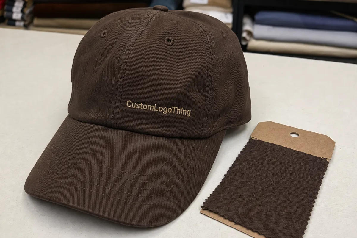
Chocolate brown can look rich, muted, red-leaning, or nearly black depending on the lighting and the finish of the fabric. That is why the chocolate embroidered baseball caps material sample guide matters before anyone signs off on a bulk order. A mockup can show placement and proportion, but it cannot tell you how the color behaves under warehouse LEDs, how the thread sits across a curved front panel, or whether the cap still feels polished once it is on a real head.
For a buyer, the sample is not just a miniature version of the final product. It is a proof point for the garment, the embroidery, and the brand presentation around it. If the cap is meant to sit beside a hoodie, shipping carton, hangtag, or retail bundle, a slight shade shift can make the whole set feel mismatched. That is where a physical sample earns its keep: it replaces assumptions with something measurable.
There is also a subtle commercial reason to be strict. Chocolate is one of those colors that can read premium in one context and flat in another. On matte cotton twill, the tone may feel warm and grounded. On a shinier blend, it can lose depth. If the cap is going into a launch kit or resale program, those differences become visible fast. The sample shows them before they become returns, rework, or awkward internal debate.
Chocolate embroidered baseball caps material samples under real light
The most common mistake is judging brown on a screen and assuming the result will translate cleanly to fabric. It rarely does. Under daylight, chocolate can feel earthy and saturated. Under warm office lighting, the same cap may pull red. Under cool LEDs, it can collapse toward near-black. That range matters because most buyers view samples in more than one setting, even if they do not realize they are doing it.
I would check any sample in three conditions: daylight near a window, standard indoor white light, and a warmer retail or home light source. Then I would move the cap farther away. If the logo still reads cleanly from arm’s length, the contrast is probably right. If the embroidery disappears into the crown, the thread and fabric are competing instead of working together. That is a much more useful test than a color chip or a digital proof.
The same holds true for packaging comparisons. A chocolate cap beside kraft paper, recycled board, or a natural-fiber insert can look cohesive. Put it next to glossy white print or a blue-heavy carton and the mood changes immediately. Small shifts in tone become obvious once the product is surrounded by real materials. That is one reason a sample should be reviewed as part of the full bundle, not as a stand-alone hat.
“A sample is not a formality. It is the first time the brand meets gravity, light, and texture all at once.”
One practical habit helps a lot: photograph the cap beside the other items that will ship with it, under the same light you expect for merchandising or ecommerce. If the cap is part of a presentation box, include the carton, insert, and any protective wrap in the shot. Photography flattens texture, but it also reveals whether the color palette hangs together. A brown that looks sophisticated in person can read dull in a set photo, and that is usually the first sign that the material balance needs another look.
It is also worth checking the sample after handling it for a minute or two. Some fabrics show oils or pressure marks more readily than others. On a dark brown cap, that can make the crown look uneven even when the construction is sound. A good sample should stay visually stable after being lifted, flexed, and worn. If it does not, the issue may be the surface finish rather than the color itself.
How the sample is built from fabric, thread, and structure
A cap sample is really a stack of decisions disguised as a single object. Fabric, thread, backing, crown shape, sweatband, visor, and closure all shape the final result. If one of those choices changes, the cap can feel noticeably different even when the logo art stays identical. That is why buyers should ask whether the sample reflects production exactly or only approximates it.
Fabric usually sets the first impression. Cotton twill is the safest baseline because it has a familiar matte surface and tends to hold chocolate dye or pigment with good depth. Brushed twill feels softer and a little more refined, though it can show lint sooner. Canvas gives more body and a rugged look. Performance blends can help in hot weather, but they often reflect more light, which can pull the brown away from the heritage feel many brands want.
Fabric weight matters too. A lighter cap body around 240-280 gsm may feel comfortable, but it can show embroidery distortion more easily. A heavier shell around 300-350 gsm usually gives the front panel more stability, especially for denser logos. There is no universal best choice. The right weight depends on whether the cap is meant for everyday wear, retail display, or promotional distribution where price sensitivity is higher.
Thread and embroidery are just as important. A simple logo with 6,000 to 8,000 stitches is relatively straightforward. Once the design moves toward 12,000 stitches or more, or introduces tight lettering and multiple thread colors, the sample becomes a test of tension, density, and cleanup. On a curved crown, digitizing has to account for seam placement, stitch direction, and pull compensation. A weak file will show up as puckering, uneven edges, or letters that lean more than they should.
Backing is often overlooked. Tear-away backing, cutaway backing, and fusible support each behave differently. For dense front embroidery, a more stable backing usually gives cleaner edges and less distortion after wear. If the sample uses a temporary backing and the bulk order will use something else, make sure that difference is stated plainly. A cap can look acceptable in prototype form and then behave differently once production starts.
Structure changes the visual result as much as the artwork. A 5-panel cap gives a broad front area for centered embroidery. A 6-panel cap feels more traditional, but the front seam can complicate placement. High-crown caps present the logo more aggressively. Lower crowns sit closer to the head and usually feel more casual. A sample makes those silhouette choices tangible. On paper they look minor. On the head, they are not.
For shipping, the sample should be packed in a way that protects the crown and brim without hiding the product in unnecessary material. A rigid corrugated mailer with a simple kraft sleeve is often enough for domestic samples. If sustainability requirements matter, specify them before the sample is built. FSC board, recycled inserts, or plastic-free wrap can be part of the brief, but they need to be defined early so the packaging and cap are evaluated as one system instead of patched together later.
Cost, pricing, and MOQ tradeoffs to compare
Pricing surprises people because a sample is only one item, but it still carries setup costs that disappear across a larger run. Digitizing, thread matching, pattern adjustments, and material sourcing all get loaded into that first unit. That is why sample pricing rarely tracks final production pricing in a neat line. The smaller the run, the more expensive each unit tends to be.
The useful distinction is simple: sample pricing buys certainty, while bulk pricing buys efficiency. If the cap is tied to a launch, retail drop, or seasonal campaign, paying more for one or two samples can save a larger loss later. If the shape is already approved and the main question is whether the chocolate tone reads correctly, a close-match sample may be enough to move forward.
| Sample path | Typical cost per sample | Typical lead time | Best use |
|---|---|---|---|
| Stock cap with brown thread only | $18-$28 | 5-8 business days | Fast color and contrast check |
| Near-match prototype | $28-$45 | 8-12 business days | Compare fabric handfeel and crown shape |
| Production-matching pre-production sample | $45-$65 | 10-15 business days | Final signoff before bulk order |
Those numbers are only the visible part of the bill. Digitizing can add $20-$60 depending on how dense or detailed the logo is. Custom labels, woven tags, inside taping, and specialty sweatbands may add another $10-$35 even on a sample. Metal buckles, leather straps, and premium closures also raise the cost a little at a time. Rush handling is where budgets often drift, because the fee is easy to approve once but hard to remember when the final total arrives.
Freight deserves more attention than it usually gets. A sample sent in a simple mailer can be inexpensive domestically, but international courier fees often exceed the cap itself. If the sample is packed in a rigid carton with inserts, the shipping class can change again. That is not a reason to cut corners; it is a reason to plan for transit from the start. A crushed brim or flattened crown can mislead a review team into blaming construction when the real issue was poor shipment protection.
MOQ ties directly into this. Low minimums are useful for testing, but they usually mean higher unit costs and fewer material options. Once a brand wants exact thread colors, custom labels, or a specific closure, the economics change quickly. A sensible sample budget often falls in the $25-$60 range per unit, plus shipping, with one revision round reserved if the first pass reveals something structural. That is usually enough to learn what matters without multiplying costs unnecessarily.
If a supplier promises unusually low sample pricing, ask what has been removed from the build. Sometimes it is a real production closure, sometimes the backing differs, and sometimes the sample is only a visual approximation. None of those are automatically bad. They just need to be named. A clear sample is worth more than a cheap one that cannot tell you anything useful.
Process and timeline for turning a sample into approval
The fastest approvals usually happen when the brief is complete before anyone cuts fabric. Start with one page: cap style, crown height, fabric target, logo dimensions, thread colors, closure type, color reference, and whether the sample must match the final bill of materials exactly. If the factory has to infer even one of those inputs, the schedule expands and the risk of revisions rises with it.
A typical sample cycle looks something like this:
- Brief review - 1 business day for specs, artwork, and feasibility questions.
- Digitizing - 1-3 business days for the embroidery file, longer if fine lettering or dense fills are involved.
- Material selection - 2-5 business days if the brown shade needs sourcing or matching.
- Sample build - 5-10 business days, depending on factory load and stitch complexity.
- Photo review and shipment - 1-3 business days to approve images and dispatch.
- Revision round - 3-7 business days if the first physical sample needs changes.
That puts a normal cycle in the 10-21 business day range. Specialty materials, unusual closures, or complex logos can stretch it further. Thread matching is a common source of delay. So is a fabric that looks correct in swatch form but arrives differently in full cap construction. For chocolate brown in particular, the light source used for swatch review should be as close as possible to the one used for final signoff. Otherwise the team ends up approving one shade and producing another.
Internal decision speed matters more than many teams expect. A sample can stall because marketing wants one version, ecommerce wants another, and operations wants a third closure. The practical fix is not more meetings. It is a clear approval window: 48 hours for comments, one owner for signoff, and one written revision list. That keeps the loop tight and prevents the cap from drifting while people debate details that should have been defined earlier.
It also helps to document what is locked and what can still vary in bulk production. If the sample uses a specific sweatband, closure, or label, note whether the final order must match that component or can substitute a like-for-like option. That kind of note sounds small, but it saves time when the production run is already in motion and everyone is trying to remember which version was actually approved.
Material factors that change fit, breathability, and stitch quality
Fit starts with structure, but material is what people actually feel. Cotton twill remains the most common choice because it balances body and comfort while holding a chocolate shade with good depth. Brushed twill feels softer in the hand and can make the cap read more premium. Canvas is tougher and more rugged. Performance blends can be useful in hot conditions, although they often reflect more light and can shift the visual character of the brown.
Breathability is easy to ignore until the sample is worn for more than a few minutes. Dense embroidery on a thin crown can create puckering and heat buildup. Eyelets, sweatband construction, and internal taping all matter here. A firm sweatband and clean seam finish usually hold shape better during wear tests. If the cap feels good only when it is sitting untouched on a table, that is not much of a test.
Crown height changes the overall read faster than many buyers expect. A higher crown gives the logo more space and often makes chocolate embroidery look more deliberate. A lower crown feels quieter and more casual. Panel count matters as well. A 5-panel front gives a smooth field for centered art, while a 6-panel cap can create a more classic baseball shape but complicate larger embroidered marks. If the logo is oversized, the panel layout should be part of the sample discussion from the beginning.
Stitch quality depends on more than stitch count. Stitch direction, underlay, density, and seam placement all shape the final effect. Horizontal fills on a curved panel can show more stress than diagonal paths. A logo centered over a seam needs stronger digitizing to avoid distortion. In practice, the sample is where those decisions become visible. Digital artwork can hide problems that the finished cap cannot.
Color matching and material choice also interact with packaging. A chocolate cap placed inside natural kraft or recycled board usually feels coherent. Put the same cap against high-gloss inserts or bright white film and the tone may feel different, even if the cap itself is unchanged. That is why teams reviewing a product set should look at the textile and the packaging together. The materials need to support the same story.
One caution: not every fabric that looks good in a sample will hold up the same way after repeated wear or storage. A soft surface can pill, a lightly woven crown can lose shape, and some finishes show pressure marks quickly. Sample review should include at least a short handling test, and if the caps are intended for retail, a few minutes of wear testing is worth more than another mockup image.
Common mistakes when reviewing cap samples
The first mistake is approving from one light source only. Brown is not neutral. It shifts. A cap that looks elegant in daylight can look muddy under warm bulbs or almost black under cool ones. If the sample is judged only on a desk under office light, a problem can slip through and show up everywhere else the product is seen.
The second mistake is trusting a photo too much. A picture can flatten texture, hide puckering, and exaggerate contrast depending on exposure. Use photos for comparison, not final approval. The physical sample is the only version that reveals handfeel, edge finish, and how the embroidery behaves on the curved front panel.
The third mistake is ignoring the inside of the cap. That is where workmanship tells on itself. Look for clean seam trimming, even sweatband stitching, and tidy embroidery backing. Loose threads inside the cap often predict sloppy finishing elsewhere. If the hidden details are careless, the visible ones deserve a second look.
The fourth mistake is skipping a wear test. Put the cap on. Move. Sit. Walk a bit. Check whether the front panel caves in, whether the sweatband feels abrasive, and whether the logo pulls when the crown flexes. Those are ordinary issues, but they affect how the product is perceived the moment it is worn in public.
The fifth mistake is failing to log revision notes before the sample leaves the room. A verbal comment is easy to forget and harder to recreate later. A written mark-up with photos and measurements keeps the revision loop disciplined. Measure placement from the center seam and brim edge, not from memory. A few millimeters can change the balance of the whole cap.
Another common gap is forgetting to define what “approved” actually means. Sometimes the team approves the color but not the closure. Sometimes the crown is accepted, but the thread backing still needs work. If that is not written down, the bulk order can drift while everyone assumes a different part was locked. A sample should function like evidence: if it is good, record exactly what made it good; if it is not, record why.
Before you request a quote
Before asking for pricing, build a one-page spec sheet. Keep it direct: shade target, logo width and height, number of embroidery colors, crown height, fabric preference, closure type, and whether the sample must match production trim exactly. If those points are vague, quotes will be hard to compare and the sample may come back in a form that answers the wrong question.
Then request two or three focused variants rather than a dozen loose ideas. One should test fabric feel, one should test logo contrast, and one should test the final trim package. That gives your team enough data to compare color depth, stitch sharpness, and comfort without creating decision fatigue. Too many options can be as unhelpful as too few, especially if different stakeholders begin arguing for different versions before any sample has been worn.
A simple approval matrix helps here. Decide in advance who checks color, who checks fit, who checks embroidery quality, and who checks any packaging that ships with the cap. Write it down before the sample arrives. If the sample is packed in kraft paper, a mailer, or a small retail kit, include that in the review. Presentation affects perception, and perception affects approval.
For brands with sustainability requirements, include those details early rather than treating them as a finishing touch. FSC board, recycled inserts, plastic-free wrap, and post-consumer content are all useful only if they are part of the original sample brief. Retrofits are where timelines slip and pricing gets messy. The same applies to embroidery thread shade or closure hardware; if it matters, it should be part of the first round.
The cleanest working approach is to treat the cap sample as part of a larger product system. Fabric, embroidery, closure, packaging, and photography all affect how the final product is perceived. If one of those elements feels off, the whole package loses certainty. That is the real purpose of the sample: to protect the intent before the purchase order locks everything in place.
With a clear brief, one or two smart revisions, and a disciplined review process, the final cap usually lands much closer to the original plan. That is what a careful chocolate embroidered baseball Caps Material Sample guide should do: reduce guesswork, expose weak points early, and keep the final order from drifting into something merely close.
Frequently Asked Questions
What should I check in a chocolate embroidered baseball caps material sample?
Check the color in daylight and indoor light so the chocolate tone does not shift unexpectedly. Inspect embroidery density, edge cleanup, and logo placement on the curved front panel. Try the cap on a real head to confirm fit, crown shape, and comfort. A flat lay can hide problems that become obvious the moment the cap is worn.
How many chocolate embroidered baseball cap samples should I request?
Two or three variants is usually enough to compare fabric, closure, and color depth without slowing the decision. Ask only for the combinations that actually affect your choice, such as structure or stitch finish. Too many samples can add cost and create approval confusion, especially if different stakeholders start favoring different versions for different reasons.
What affects the price of chocolate embroidered baseball caps samples?
Fabric grade, embroidery complexity, and custom labels are usually the biggest cost drivers. MOQ and setup fees can change the unit cost dramatically, especially for smaller orders. Rush shipping and extra revision rounds often increase the total sample spend. If the sample kit also needs branded packaging, the carton, insert, and mailer materials will add more cost.
How long does the chocolate embroidered baseball caps sample process take?
Simple samples move faster than fully custom builds with special fabrics or detailed embroidery. Digitizing, material sourcing, and revision cycles usually control the schedule more than sewing itself. A normal cycle often lands in the 10-21 business day range, though unusual materials or a second revision can stretch it longer.
Can I approve a cap sample without seeing the final bulk order?
You can approve the sample structure, but confirm which materials or trims are still allowed to vary. Get a written list of approved substitutions so the bulk order matches the sample expectations. Do not sign off until the factory includes the sample notes in the final purchase order, especially if color, thread, backing, or closure changes could affect the finished product.

