A logo can look perfect on a screen and still fail on a flexible bag if it crosses a seam, lands on a zipper track, or gets hidden by a fold. That is why cosmetics heavy duty garment Bags Logo Placement is a production decision, not just an artwork decision. The right position has to survive handling, shipping, storage, and repeated use.
For buyers, the useful questions are simple: where will the mark stay visible, what print method supports that location, how much does it change the quote, and what proof confirms the bag will still read correctly in real use? Those are the questions this guide answers.
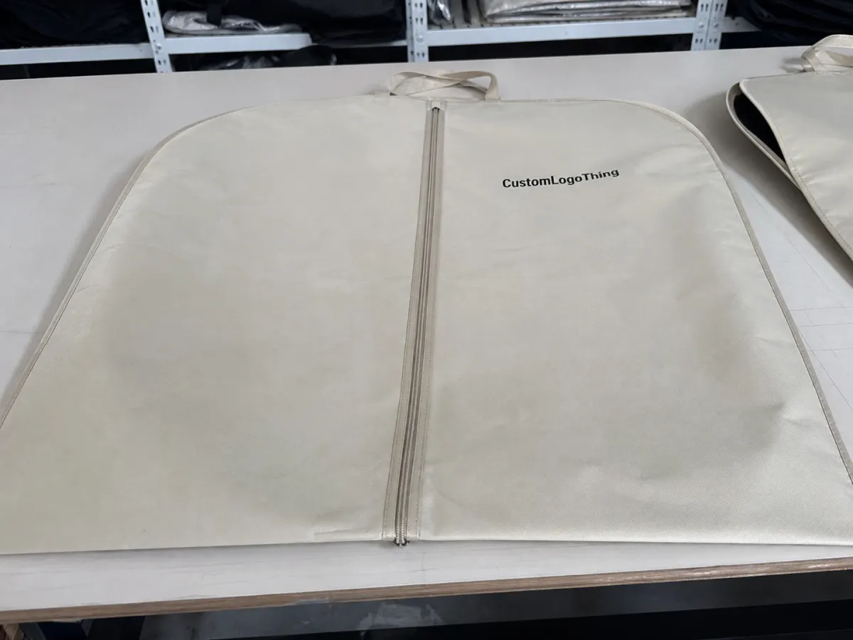
Cosmetics heavy duty garment bags logo placement: what the panel can really support
Start with the panel, not the outside dimensions. A heavy-duty garment bag may look spacious, but seam allowance, zipper tape, hanger openings, gusset depth, and reinforced edges quickly shrink the usable print zone. Thick films also resist folding in some areas and stretch in others, so the same logo can behave differently depending on where it sits.
Most buyers are surprised by how much a few millimeters matter. A logo that clears a mockup can still run into a weld line or get pinched by the closure. The safest answer is always the dieline, because the printable field is smaller than the outside face and more exact than a simple rectangle.
For cosmetics programs, the logo also has to match how the bag is used. These bags may be lifted from a rack, laid flat on a cart, reopened several times a day, and hung again. The best placement is usually the one that still reads after that handling, not the one that looks largest in presentation art.
Visibility and dominance are not the same thing. A full-panel graphic can look strong, but many wardrobe and cosmetics applications read better with a cleaner front mark and enough negative space to keep the bag from feeling crowded. If the bag is part of a retail set or backroom system, the logo should help the user identify it quickly.
How print location works on a heavy-duty plastic bag
Print location is tied to construction. A flat poly bag, a zipper garment bag, and a gusseted storage bag do not share the same safe areas. A good proof should map the artwork to the actual dieline, not just to an estimated panel size.
Decoration method changes what is possible. Flexographic printing is often the best fit for larger runs with bold, simple artwork. Screen printing can carry heavier ink coverage and stronger opacity, which helps on translucent or glossy material. Digital printing can work for shorter runs or detailed art, but it still has to respect edge clearance, opacity, and the bag's fold behavior.
A centered logo is not always the best answer. If the bag has a hanger hole, top zipper, or gusset that hides the middle area when folded, a slightly offset position may keep the mark visible in real use. For hanging display, the upper third of the front panel often performs well. For stacked storage, the logo may need to sit lower so it does not get covered.
One rule helps buyers cut through the noise: build the artwork around a safe zone and a viewing hierarchy. The logo should land where the eye goes first, and the rest of the bag should leave enough breathing room that handling does not make the layout feel cramped.
| Placement option | Best use | Typical risk | Cost impact |
|---|---|---|---|
| Front-center single mark | Retail display, wardrobe sets, clean brand recognition | Can clash with zippers or folds if the safe zone is not mapped | Usually lowest if one color and one location |
| Upper-corner logo | Hanging storage, utility bags, subtle branding | May feel small on a large panel if the mark is not bold | Often similar to front-center, depending on setup |
| Front and back branding | Multi-angle visibility, shared internal/external use | Extra proofing and registration checks are needed | Often adds $0.03-$0.12 per unit on many runs |
| Full-panel graphic | Premium presentation, event kits, strong shelf impact | More sensitive to ink coverage, distortion, and lead time | Usually highest due to coverage and screen size |
For sensitive contents, package-handling guidance from ISTA can help you think about how the bag will be moved and stored. Broader sourcing guidance from The Packaging Institute is also useful when the garment bag is part of a larger retail or fulfillment system.
Cost, pricing, and MOQ drivers that change the quote
Placement changes price because it changes production complexity. A logo in one clean panel is usually simpler than a design that wraps across two surfaces or needs multiple impressions to stay legible. On most custom runs, the main drivers are still bag size, film gauge, number of ink colors, print method, finish, closures, and carton pack-out.
A larger logo is not automatically more expensive than a smaller one. If the artwork stays in one location and uses one color, it can be easier to prepare than a compact design that must print on both sides or stop and start around a fold. The opposite is also true: a full-panel mark on thick film can push costs up if it needs heavier ink coverage, larger screens, or extra drying time.
For buyers comparing quotes, tiered pricing is the cleanest way to see the tradeoff. Ask for one-color front placement, a dual-location version, and a full-panel version on the same spec sheet. That lets you compare visibility against unit cost before artwork is approved.
MOQ follows the same logic. Custom film or custom print runs need enough quantity to spread prep cost across the order. Short runs can still work, but the per-unit price usually climbs because setup time does not shrink much. For mid-volume jobs, a one-color single-location design on a decent gauge bag can sometimes land around $0.18-$0.45 per unit, while dual-placement or higher-coverage versions often move into the $0.30-$0.80 range before freight, cartons, and inserts.
What to compare before you approve
- Single vs. double placement - extra visibility only pays off if the second side has a real viewing angle.
- One color vs. multiple colors - every added ink color can affect setup and registration.
- Small mark vs. full-panel art - larger coverage usually means more ink, more proofing, and more time.
- Standard finish vs. specialty finish - gloss, matte, or frosted film changes both appearance and cost.
- Packaging efficiency - carton pack-out and bag folding can matter as much as the print itself.
For sustainability or supply-chain documentation, paper inserts, cartons, and hangtags can sometimes be sourced to FSC expectations at fsc.org. That does not change the plastic body of the bag, but it can matter if the program includes secondary packaging or instruction cards.
Process and timeline from artwork to production steps
The cleanest production path starts with measurements, not mockups. Confirm the bag dimensions, mark the seams and zipper locations, identify the printable panel, and ask for a dieline that shows exactly where the logo can live. If a supplier sends only a generic artboard, push for a construction drawing.
Send vector artwork whenever possible. A crisp logo in AI, EPS, or a properly built PDF usually holds better than a low-resolution image, especially on a large bag where the print needs sharp edges. Then request a proof that shows size, clear space, ink color, and exact location on the actual bag outline.
Quality checks belong early, not after production. A press-ready proof should confirm that the logo sits inside the safe zone, the smallest text remains readable at print size, and the chosen color has enough contrast against the film. If the bag is translucent, ask how the contents will affect the image.
Sampling is worth considering if the order is valuable or the material is difficult. A physical sample can reveal opacity issues, distortion on curved areas, or how the logo reads under warehouse light versus daylight. That extra step adds time, but it often prevents a costly mistake later.
Typical lead time depends on quantity, ink matching, tooling, seasonality, and shipping method. A simple job may move in 12-15 business days after proof approval. More complex orders with custom colors, sampling, or multiple placements can stretch to 18-25 business days or longer if the season is busy. Build in room for at least one revision cycle.
Common logo-placement mistakes that hurt cosmetic bag performance
The most common mistake is putting artwork too close to a stress point. Seams, hems, zipper tracks, hanger holes, and edge seals are areas where the film bends, stretches, or gets compressed. If a logo sits there, it may look fine on a flat proof and still misbehave in production.
Another frequent issue is approving the design without checking how the bag folds. A large front panel on a screen may be the visible face in the artwork, but if the bag collapses differently in the carton or during storage, that same area may be hidden in real use.
Color contrast matters more than many teams expect. A pale logo on a glossy tinted bag, or a dark mark on a busy translucent background, can turn muddy quickly. Screens do not simulate reflectivity, depth, or light scatter through plastic film very well.
There is also a budgeting trap: printing the same logo on both sides without a use case. If the bag lives on a hanger and one side already faces the customer, a second side may add cost without improving brand recall. Double-sided branding can be smart, but only when it solves a real visibility problem.
Finally, tiny text is a poor match for thick plastic. A slogan that looks elegant on a carton often breaks apart on a heavy-duty bag. Large type, short taglines, and simplified marks hold better. If legal copy is needed, keep it in a separate panel or insert.
Three things to check on every proof
- Clear space - make sure the logo is not crowding seams, zippers, or fold lines.
- Contrast - check how the art reads against the actual film color, not just on white paper.
- Real viewing angle - confirm the mark is visible when the bag is hung, folded, and stacked.
Expert specs for stronger branding and longer wear
Good specs do not try to make every surface important. They pick one primary viewing face and one secondary support area, then let the construction breathe. That usually gives the bag a cleaner feel and makes the brand easier to read from across a rack or storage cart.
For cosmetics programs, bold type and simplified symbols usually outperform intricate artwork. A strong mark with clear negative space survives abrasion better and stays recognizable when the bag is carried, folded, or handled by different teams.
Match the print style to the finish of the film. Matte surfaces soften glare and can help a logo feel more premium, but they sometimes mute contrast if the artwork is too light. Gloss film gives stronger pop, although reflections can interfere with thin lines. Frosted film can look elegant, yet it demands deliberate color choices because the surface changes how the logo reads under bright light.
Material choice matters too. Many heavy-Duty Garment Bags use LDPE or an LDPE/LLDPE blend in the 2.5-4.0 mil range, with thicker gauges reserved for repeated handling or premium presentation. If the bag includes a zipper, antistatic treatment, or a matte finish, those details can influence ink adhesion and overall appearance.
Durability improves when the artwork stays away from abrasion points. If a logo sits where bags rub together in transit or where hands grip the top opening, the print may wear faster than the plastic around it. Sometimes the smarter move is to size the mark for repeated use and keep the strongest visual element out of the wear path.
A simple spec pattern works well on many orders:
- Primary logo - one front-facing mark in the cleanest uninterrupted panel.
- Secondary element - a small icon or wordmark only if it serves storage or display.
- Artwork style - bold strokes, limited color count, and generous clear space.
- Construction note - call out zipper, hanger, seam, or gusset locations on the proof.
- Approval rule - sign off only after the dieline shows the exact safe zone.
FAQ
Where should cosmetics heavy duty garment bags logo placement go for the best visibility?
Put the primary logo on the largest uninterrupted panel that faces the customer during hanging, folding, or storage. Keep it clear of zippers, seams, hanger cutouts, and gussets so the artwork stays readable in use. The front-facing side usually does the main branding job, while the reverse side should be used only if it has a specific purpose.
Does logo placement change the price on heavy-duty garment bags?
Yes. Larger print areas, multiple placements, and extra ink colors can raise setup and run costs. A logo that sits in a clean, single-location panel is often more efficient than a design that wraps across several features. Ask for pricing by placement option so you can compare value before approving artwork.
What print method is best for a logo on plastic garment bags?
The best method depends on quantity, color count, and how crisp the artwork needs to be. Flexographic and screen printing are often strong choices for bold, repeatable branding on larger runs. Digital methods can help with shorter runs or more detailed art, but placement still has to respect the bag's structure.
How far should the logo stay from seams or edges?
Keep artwork inside a safe zone that avoids seams, hems, zippers, and edge stress points. The exact clearance depends on the bag construction, so use the dieline rather than guessing from the outside dimensions. A proof should show the clearance clearly before production starts.
Can I place logos on both sides of heavy-duty garment bags?
Yes, but only if both placements support a clear use case such as display, organization, or brand recognition from multiple angles. If the second side adds little value, it may be better to keep one side clean and reduce cost. Double-sided branding also needs extra proofing to avoid registration or contrast issues.
For packaging buyers, the safest habit is simple: measure the printable panel, approve the dieline, compare placement options, and make sure the final proof matches the way the bag will actually live on the floor, in storage, or in transit.

