Restaurant FSC Paper Shopping Bags logo placement looks straightforward until the first proof comes back. A mark that feels balanced in a design file can land too close to a handle block, disappear into a gusset fold, or shrink once the bag is filled with boxes, cups, and cutlery. The bag is not a flat poster. It moves, bends, stacks, and gets seen from awkward angles.
That is why logo placement matters for more than aesthetics. It affects legibility, brand recall, packing speed, and the way the bag behaves in hand or in a delivery car. FSC paper adds a sustainability signal, but it also brings texture, absorbency, and fold memory that influence how ink sits on the surface. A good layout works with those constraints instead of pretending they do not exist.
Why placement affects how the bag works
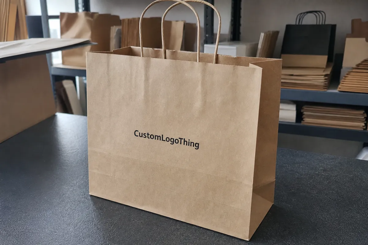
On a restaurant bag, placement is a structural decision. The front panel is usually the safest home for the main logo because it gives the largest uninterrupted surface. The side gusset has value too, but its visible area changes as the bag fills and creases. A logo that looks centered before packing can drift visually once the bag is loaded and carried.
Delivery makes this more obvious. A customer may see the bag from above in a car, from the side on a counter, or while the driver holds it by the handle. That means the design needs to survive multiple viewing positions. A logo placed too low can be hidden by a table edge or package overlap. A logo placed too high can collide with the handle reinforcement or top fold. Neither issue shows up well in a clean digital mockup, yet both show up quickly in real service.
For buyers, the useful question is not “Where does the logo look nicest?” It is “Where will it still be readable after packing, transport, and handoff?” In restaurants, that distinction matters more than in many retail settings because speed is part of the workflow. Staff are filling bags under pressure, often with limited time to inspect every line of print.
Placement usually includes several zones, not just one:
- The front panel, where the main brand mark usually belongs.
- The back panel, useful for secondary branding or a supporting message.
- The gusset, often better for a smaller mark or repeated icon.
- The lower area, which can hold recycling or handling notes if kept minimal.
- The safe space around folds, seams, handles, and reinforcement patches.
FSC paper changes the visual result in subtle ways. Kraft stock has more tooth than coated paper, so thin lines can soften and small text can lose crispness. Dense color can show unevenly if the ink load is too light or the paper absorbs too quickly. The best restaurant FSC paper shopping Bags Logo Placement accepts those limits from the start and builds a layout that reads clearly at arm’s length.
A logo that looks centered in the artwork file can still feel off-center on the finished bag if a fold line, seam, or handle block shifts the visual weight.
How the print file turns into a finished bag
The printer does not work from a blank rectangle. They work from a dieline. That file defines the panel widths, gusset depth, bottom fold, handle attachment, glue zones, and any structural areas where ink should be avoided. The real printable surface is often smaller than the outer bag dimensions suggest.
That is why a layout approved on screen can fail on press. A text block that sits comfortably in a mockup might land inside a fold once the dieline is applied. A logo that reaches close to the edge may be technically printable, but if the bag is filled heavily, the edge can warp or disappear behind a crease. Production teams usually catch these issues early, but only if the buyer supplies a clean vector file and a clear brief.
Print method matters too. Flexographic printing is common for longer runs and simple one-color or two-color artwork. It is efficient, but very fine lines can soften, especially on rough kraft paper. Offset printing gives sharper detail and better color control, which helps for tighter typography or more refined brand marks. Digital printing is useful for shorter runs and fast changes, though the unit cost often climbs as volume increases.
Each method changes how ambitious the layout can be. One front-panel logo is easy to manage and usually delivers the cleanest result. A two-panel layout improves visibility from multiple angles, but it asks more from the press operator and increases the chance of alignment drift. Wraparound graphics can look strong, yet they are the most sensitive to seam location, bag filling, and minor registration shifts.
There is also a difference between visual balance and production balance. A centered logo may be perfect from a design standpoint, but if it falls too close to the handle block, the final bag can look crowded. A high-set logo can stay visible on a counter, but it needs enough breathing room to avoid the top fold. A lower placement can work on a retail bag, but food service bags usually need the brand to remain readable even when the base is compressed by containers.
For that reason, the press proof should be judged at actual size, not just as a thumbnail. What matters is whether the operator can register it cleanly, the packer can identify it quickly, and the customer can read it without rotating the bag. That standard is harsher than a screen preview, but it is closer to reality.
Materials, sizes, and print methods that change the layout
Bag size shapes the design more than many buyers expect. A narrow 8-inch bag leaves little room for a wide horizontal logo. A 10-inch or 12-inch format gives the artwork more breathing space and reduces the risk of crowding. Height matters too, because a tall bag shifts the visual center upward, while a shorter lunch bag compresses the available print field.
Paper weight also affects readability and durability. Many restaurant paper shopping bags fall somewhere around 100gsm to 170gsm, depending on the handle type and intended load. Lighter stock is easier on cost, but it can wrinkle more easily after filling. Heavier kraft holds shape better and often looks more premium, though it may raise price and shipping weight. If the bag must carry boxed meals or heavier catering items, the extra rigidity usually pays off in use.
Finish changes the look of the logo. Uncoated kraft gives a natural, honest appearance and supports the FSC story well, but it can absorb ink and soften tiny details. A smoother surface improves sharpness, yet it may reduce the earthy look that many restaurant brands want. The right choice depends on what the brand is trying to communicate. A minimalist cafe and a high-volume takeaway kitchen rarely need the same surface treatment.
Logo complexity has a direct impact on production risk. A bold single-color icon generally prints more cleanly than a detailed crest, especially on textured paper. Thin outlines, reverse type, and tiny taglines are all possible, but they need enough size and contrast to survive real use. Gradients can be done in some workflows, yet they add room for inconsistency if the run is large or the timeline is tight.
There is a practical hierarchy that usually works well on food bags:
- Main logo: keep it large, legible, and on the most stable panel.
- Secondary text: use only if it adds useful information.
- Recycling or FSC language: place it separately so it does not crowd the brand mark.
- Website or QR code: include only if the bag actually supports pickup, catering, or repeat ordering behavior.
The wrong instinct is to treat the bag like a miniature poster. It is not. Every extra line of copy competes with the structural features of the bag, and every extra color creates another point of failure. Clean layouts are not just easier to approve; they are usually easier to print well.
| Layout option | Visual effect | Production behavior | Best fit |
|---|---|---|---|
| Single front-panel logo | Clear, simple, easy to read | Lowest proof risk and easiest alignment | Pickup, takeaway, standard restaurant orders |
| Front and back branding | Visible from more angles | More ink coverage and tighter placement control | Busy counters, delivery handoff, catering |
| Wraparound design | Strong presence if executed carefully | Harder to manage across gussets and folds | Premium programs with locked artwork |
| Gusset mark only | Subtle, secondary, restrained | Low coverage, but detail can be limited | Minimal branding or supporting identity use |
Proofing, approval, and production timelines
Most delays come from the same small set of problems. The file is not vector. The team has not chosen one-color versus multicolor print. The logo is still being resized while the proof is already underway. None of those issues feels large at the beginning, but each one can push the schedule.
A clean approval sequence usually follows this order: confirm the bag size, choose the handle style, request the dieline, position the artwork, review the proof, and sign off on the final file. If the project is more complex, ask for a sample before committing to mass production. That extra round is slower, but it is cheaper than discovering a placement issue after thousands of bags have already been printed.
There is a useful difference between proof time, sample time, and production time. A proof can return quickly when the artwork is ready and the layout is simple. A sample takes longer because the supplier may need to print, dry, fold, and ship the bag before anyone can review it. Production lead time then depends on quantity, print method, and how much setup the artwork requires.
For most restaurant buyers, the key is not to chase the fastest possible schedule. It is to reduce revision loops. A layout that is technically correct but hard to approve can add several days. A simpler design, backed by a clear dieline and a usable file, often moves faster than a more elaborate bag that creates questions at every review.
A practical approval path looks like this:
- Lock the bag format and handle style before moving the logo.
- Check the artwork at true scale against the dieline.
- Confirm color count and print method early.
- Use a sample if the bag will carry heavier food or if the design has thin type.
- Only release production after the proof is reviewed on a screen and, if possible, in print.
This process sounds ordinary. In practice, it prevents the most expensive mistake in branded packaging: approving a design that is elegant in isolation but awkward on the actual bag. That is where restaurant FSC Paper Shopping Bags logo placement either protects the schedule or quietly creates rework.
Cost, MOQ, and the trade-offs buyers actually feel
Price moves with quantity, but not in a neat straight line. Small runs usually carry a higher unit cost because setup gets spread across fewer bags. Once the order size rises, that setup cost gets diluted, so the per-bag price typically falls. A restaurant ordering 3,000 bags may pay far more per unit than one ordering 10,000, even if the artwork is identical.
Print complexity changes the quote as well. A one-color logo on one panel is usually the lowest-cost choice. Add a second color, and the press needs more adjustment. Add a second side, and registration control becomes tighter. Add wraparound coverage, and the bag starts behaving like a packaging project rather than a simple takeaway item. The material may still be standard FSC paper, but the production burden is not standard anymore.
MOQ should be treated as a planning constraint, not a surprise. A minimum order that looks attractive on paper can become a storage problem if the restaurant changes menus often or runs seasonal promotions. It is not enough to ask for the lowest threshold. Buyers should also ask how long the design will remain useful, how much space the bags will occupy, and whether the artwork will still fit the brand six months later.
There are hidden costs in artwork decisions too. Clean vector files reduce cleanup time. Strong margins reduce proof corrections. A focused layout avoids long debates over whether a QR code, slogan, and recycling note all belong on the same face of the bag. Those time savings are not dramatic in isolation, but they matter when a supplier is working through multiple revisions under schedule pressure.
Useful rule of thumb: ask for a quote that separates quantity, print method, color count, and placement complexity. A low headline price without those details is hard to compare and often harder to trust. If a supplier cannot explain why one layout costs more than another, the difference has probably been moved into setup, proofing, or lead time instead.
- Simple single-panel branding: lowest risk, easier approval, cleaner handoff.
- Multi-panel branding: better visibility, more alignment risk, more review time.
- Full-coverage design: strongest visual impact, but best for controlled runs with locked artwork.
- Higher MOQ: better unit economics, only useful if storage and menu stability are real.
Mistakes that make branded bags look cheap
The fastest way to make a branded paper bag look off is to place the logo too close to a fold, seam, or handle attachment. Even a good mark can look distorted if it sits in a deformation zone. The artwork may be fine. The structure is what breaks the read.
Another common error is over-detailing. Thin lines, small type, and delicate badges often lose sharpness on kraft paper. A mark that performs well on a website or storefront sign may not survive the speed and handling of restaurant service. The better test is not how intricate the logo looks in a file. It is how fast a customer can recognize it while holding a warm bag with one hand.
Orientation also matters. A front-panel layout may look balanced in a mockup, but if most customers see the bag while walking away from the counter, the mark can feel mispositioned. Delivery adds another layer because bags are seen from above, from the side, and while stacked next to other orders. A design that assumes one perfect viewing angle usually underperforms in real use.
Skipping proof review is another expensive mistake. A half-inch shift on screen can turn into a logo under the handle or a tagline dropped into the gusset. That kind of error looks small until the bag is printed, filled, and stacked. At that point, the fix is usually reprint, not adjustment.
There is also a broader mistake: trying to make one bag do every branding job at once. The clearest restaurant bags are not the most crowded ones. They are the ones with a clear hierarchy, minimal visual noise, and placement that respects how the bag actually moves through service.
A practical checklist before you place the order
Before ordering, confirm the bag size, handle style, paper weight, and print method. Then request the dieline and place the artwork against the true printable area, not a guessed template. That one step removes a surprising number of revisions.
Next, test the design the way a customer would see it. Hold the mockup at arm’s length. Turn it slightly. Check the logo from the side. See whether the main mark still reads in two seconds. If the bag has a secondary message, ask whether it earns its space or just fills it.
A short internal checklist helps keep the order moving:
- Use a vector logo or a print-ready high-resolution file.
- Keep clear space away from folds, seams, handles, and glue areas.
- Choose the primary branding panel before adding extra copy.
- Compare one-color and multi-color pricing before locking the layout.
- Decide whether a sample is needed based on print detail and load weight.
The simplest layout that still protects the brand is usually the best one. In food service, clarity beats decoration more often than teams expect. A clean front panel, a readable logo, and a bag that stacks and folds correctly can outperform a more ambitious concept that creates trouble at the press. That is the real test for restaurant FSC paper shopping Bags Logo Placement: not whether the artwork looks polished in isolation, but whether it holds up under restaurant use.
Where should restaurant FSC paper shopping bags logo placement go for the best visibility?
The front panel is usually the best first choice because it gives the widest uninterrupted surface and stays visible during pickup and delivery handoff. Keep the logo away from the top fold, handles, and gussets so the mark remains readable after packing. If the bag will be carried often, test the proof at arm’s length and while held in one hand.
How large should the logo be on FSC paper shopping bags for restaurants?
Size it for readability before decoration. A logo that looks fine on a monitor can disappear on textured kraft if it is too small or too detailed. Start with the real panel width, leave clear margins, and review a proof at actual scale so proportion and legibility can be judged properly.
Does logo placement change the cost of restaurant paper shopping bags?
Yes. More print positions, more color passes, and larger ink coverage can all raise unit cost. A single-panel design is usually cheaper and easier to approve than a wraparound or multi-panel layout. Higher quantities often lower the per-bag price, but only if the artwork is already locked before production begins.
How long does the process usually take for branded paper bags?
Proofing can move quickly if the file is ready and the placement is already decided. Samples and revisions add time, especially when the bag size, handle style, or print method still needs confirmation. Production lead time depends on quantity, print complexity, and whether the supplier requires final sign-off before press.
Can I add recycling or compliance text near the logo on restaurant paper bags?
Yes, but keep it secondary so it does not fight the brand mark for attention. Place compliance copy in a separate zone with enough white space to remain legible on FSC paper. Make sure the extra text does not push the logo into a fold, seam, or low-visibility area.

