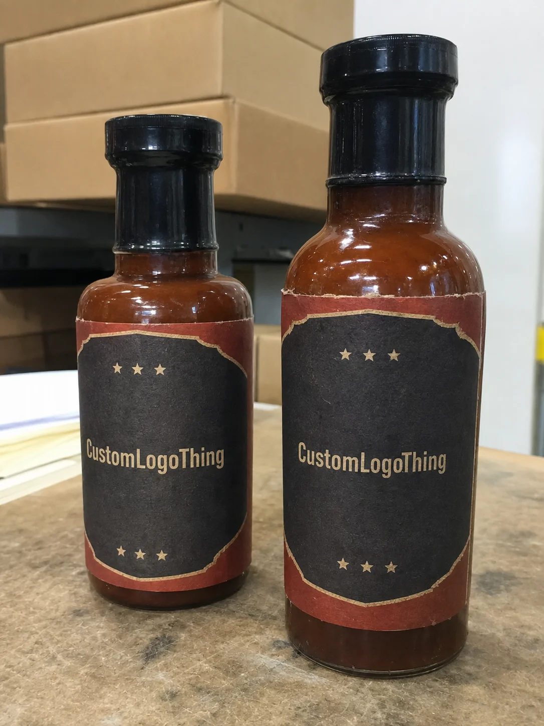
Custom BBQ Sauce Labels That Hold Up on the Shelf
Custom bbq sauce labels do more than identify a flavor. They have to sell a bottle, survive handling, and still look like they belong after the product has spent time in a cooler, a shipping carton, or a restaurant line where everything gets touched too often. That is a tougher assignment than most brands expect.
A good label starts with the bottle it lives on. Shape matters. Condensation matters. Adhesive choice matters. If the artwork only looks strong in a flat mockup, the real bottle will expose the gaps fast. The label either carries the brand or makes the package look like a rush job. There is not much middle ground.
For barbecue brands, sauce labels also sit at the intersection of branding and operations. They need to support shelf visibility, ingredient disclosure, barcode placement, and repeatable production across multiple SKUs. That is why packaging buyers should think of labels as part of the product system, not as a finishing touch.
What custom bbq sauce labels need to do on shelf
Sauce bottles do not live gentle lives. They get refrigerated, handled with greasy hands, wiped down, boxed, unboxed, and shoved into displays that are not always clean or dry. A label that looks fine on a sample sheet may still fail once it meets real storage and real people. That is the first thing buyers should plan for.
The job starts with visibility. A shopper should be able to read the brand and flavor from a few feet away. If the bottle needs to be picked up before anyone knows what it is, the design is not doing its job. Dense layouts, low contrast, and tiny type all cut into shelf performance.
The second job is durability. Custom bbq sauce labels need to stay attached and legible after condensation, light abrasion, and routine wiping. That does not mean every label needs industrial-grade overkill. It does mean the face stock, adhesive, and finish have to match the use case. The wrong combination is easy to spot. Corners lift. Ink scuffs. The bottle starts looking tired before the product is halfway gone.
The third job is hierarchy. The label should answer a shopper’s basic questions in order: what brand is this, what flavor is it, and why should I care. Everything else supports those answers. If the design tries to say too much, it ends up saying less.
A label that looks polished on a screen can still fail on a cold bottle with wet hands.
For brands building a family of sauces, consistency matters almost as much as the artwork. Keeping label sizes, type hierarchy, and finish choices aligned across flavors makes the line feel deliberate instead of improvised. That matters even more when the sauce sits beside Custom Printed Boxes, jars, or other branded packaging in the same retail environment.
How custom bbq sauce labels materials and finishes affect performance
Material selection is where a lot of label problems begin or end. Paper stock is usually the lowest-cost option and can look clean on dry shelf products, but it is a poor match for refrigerated bottles or high-handling environments. Condensation is the enemy. So is repeated wiping. For those conditions, waterproof film is usually the safer choice.
In practical terms, many barbecue brands do better with polypropylene film than with standard paper. Film tends to hold up against moisture, scuffs, and edge wear more consistently. That said, it is not magic. A film label on a poorly cleaned bottle or a badly matched adhesive can still fail. Surface prep and bottle shape still matter.
Adhesive choice is not a footnote. Glass, curved PET, flexible squeeze bottles, and bottles with light residue each behave differently during application. A label that bonds cleanly to one container can start lifting on another because the curve is too tight or the adhesive was selected for a different surface. If the bottle is changing, the spec should change with it.
Finish changes both look and readability. Gloss makes color pop, and it can give barbecue packaging a richer, more saturated feel. The tradeoff is glare. Under bright grocery lighting or outdoor market sun, glossy labels can become harder to read. Matte reduces reflection and often improves legibility. It also hides small scuffs better.
Soft-touch finishes sound premium, and sometimes they are, but they are not automatically the right answer. On sauce bottles that get wet or handled often, a soft-touch surface can add cost without improving real-world performance. The finish should earn its place.
Shape matters just as much as material. A front-only label keeps things simple and is easier to apply. A wrap label gives more room for copy, ingredient panels, and barcode placement, but the seam needs to be planned with care. Neck labels can help with promotions or gift sets, though they should not crowd the primary panel. The package should look controlled, not busy.
For buyers who care about sourcing, paper stock can be selected from certified forestry programs such as FSC. That does not make a weak label strong, but it does support sustainability claims when the paper route is the right route.
| Material | Typical use | Practical price range at 5,000 units | Notes |
|---|---|---|---|
| Paper label stock | Dry shelf, short display runs, indoor retail | $0.08-$0.18 per label | Lowest cost, but weak against condensation and heavy handling |
| Waterproof film | Refrigerated bottles, market tents, frequent handling | $0.12-$0.26 per label | Better moisture resistance and better edge durability |
| Specialty stock with premium finish | Gift sets, premium retail packaging, higher-end brand presentation | $0.18-$0.40 per label | Stronger shelf presence, but cost rises quickly with extra finishing steps |
It also helps to think about the bottle and the shipping path as one system. A label that survives a shelf test may still struggle in transit if the product moves through corrugated shippers, warehouse handling, or seasonal temperature swings. Using packaging test principles similar to the ISTA approach is smarter than assuming the first sample proves everything.
Production steps and turnaround: from proof to shipment
The cleanest production runs start before artwork is finalized. Measure the bottle first. Not approximately. Get the label panel width, height, shoulder curve, seam location, and any recessed areas that affect application. A label can look perfect in layout and still misbehave on the bottle if the dimensions are wrong.
Next comes the proof. This is where size, bleed, copy, color treatment, barcode placement, and compliance text get checked together. If ingredient statements, net weight, or any required legal copy are missing, stop and fix them before approving the file. Printing the wrong information faster does not improve anything.
For timing, a basic proof cycle often takes a couple of business days if the artwork and specs are complete. Production is commonly 5-10 business days after approval for standard runs. More complex orders, such as multiple flavors, special finishes, or custom shapes, can land in the 10-15 business day range or longer. That is not unusual. It is what happens when the order has more variables.
Most delays come from small changes after the proof stage. A wording edit, a new barcode, or a last-minute shift in label size can force another round of setup. Buyers sometimes treat proof approval like a soft checkpoint. It is not. Once that file is signed off, every change costs time.
If the labels support a launch, distributor drop, or event date, build in buffer. One or two extra days is not much. One extra week is better. The cost of a shipping delay or a rushed reprint is almost always higher than the cost of planning ahead.
The fastest order is the one that does not turn into a redesign after approval.
For buyers comparing Custom Labels & Tags with other options in Custom Packaging Products, the deciding factors are usually storage conditions, bottle geometry, and how many SKUs need to run at once.
Cost and pricing: what drives unit cost for sauce labels
Label pricing follows a few clear variables. Size, material, finish, quantity, number of SKUs, and whether a Custom Die Cut is required all affect the final unit cost. Bigger labels use more material. Specialty finishes add press steps. More flavors mean more setup. None of that is mysterious, even if quotes sometimes make it feel that way.
Small runs cost more per label because setup gets spread over fewer pieces. Larger quantities usually bring the unit price down, but inventory then becomes part of the equation. Buyers often focus only on label cost and ignore storage or reorder timing. That is a mistake. A cheap label that sits in boxes for a year is not actually cheap if the spec changes before it gets used.
Custom shapes deserve extra scrutiny. A die-cut shape can strengthen shelf identity, but it also adds tooling and setup considerations. If the shape is only decorative, the return may be weak. The same applies to premium effects. Foil, textured coatings, and laminated finishes can look sharp, but they should improve clarity or brand recognition, not just decorate the bottle for its own sake.
| Cost driver | What it changes | Buyer impact |
|---|---|---|
| Size | Material usage and press time | Larger labels cost more per unit |
| Material | Durability and appearance | Film costs more than paper, but usually performs better |
| Finish | Look, glare, and scuff resistance | Gloss, matte, and soft-touch all change price |
| Quantity | Setup spread | Larger runs lower unit cost |
| Number of SKUs | Artwork and proof work | More flavors usually mean more administrative cost |
| Custom shape | Die-cut setup | Unique shapes raise initial cost and can slow production |
Reorders are where a disciplined spec pays off. If the size, adhesive, material, and artwork stay the same, the next run is much easier to quote and much less likely to surprise anyone. If the brand keeps changing the label every time, that is not a reorder. That is a reset.
Step-by-step: how to order labels without redoing the artwork twice
- Measure the bottle first. Get the label panel width, height, shoulder curve, and any seam or indentation that affects application. Photos help more than people expect because they show the actual surface, not a perfect sketch.
- Collect the final copy early. Brand name, flavor name, ingredients, net weight, barcode, warnings, and any required legal text should be locked before design starts. Missing copy is one of the most common reasons a label gets rebuilt.
- Pick the environment. Shelf-only, refrigerated, shipped, or event-only. That decision changes the best stock and adhesive. A label for a cold bottle is not the same as one for a dry pantry shelf.
- Build the design around hierarchy. The bottle should tell the shopper what matters in three seconds. Brand first. Flavor second. Supporting details third. If the label needs a paragraph to explain itself, it is working too hard.
- Request a proof that matches real dimensions. A proof on a screen is not enough. The dimensions need to match the actual bottle so the team can see whether text, edges, and barcode placement still work.
- Test one label on the real container. This catches curve issues, edge lift, and unexpected reflections before the full run lands on your dock.
That order of operations saves money because it prevents the common fix-it-later cycle. The best label specs come from the bottle, the storage conditions, and the production schedule, not from a design file floating by itself in email. It is a packaging decision first and a graphic decision second.
If the sauce line sits alongside other products, keep the broader packaging system in view. A bottle label should feel connected to the rest of the product packaging, whether that includes cartons, inserts, or custom printed boxes. The individual pieces do not have to match perfectly. They do need to look like they belong to the same brand.
Common mistakes that ruin a good bottle design
Low contrast is the easiest way to lose shelf visibility. Dark sauce, dark background, small type, and a glossy finish are a bad mix. The label might look rich in a file preview, but under retail lighting the reading experience gets worse fast.
Overcrowded copy is another problem. Brands often try to make the front panel do too much. Story, ingredients, claims, awards, flavor notes, social icons, and a barcode all fight for space. The result is a busy label that looks more expensive than it is. Clean space is not wasted space. It creates hierarchy.
Finish mismatch causes more trouble than people expect. Gloss can be great for bright color, but it can also create glare and make fingerprints more visible. Matte is usually easier to read and easier to live with in cold or humid environments. The right answer depends on where the bottle will sit and how it will be handled.
Size errors are expensive because they often show up late. If the label runs too close to a shoulder, seam, or curve, it can wrinkle or lift after a short time. A small misfit can also make the bottle look crooked on the shelf, even when the application was technically acceptable. Retailers and buyers notice that kind of thing.
Another mistake is changing the spec on every reorder. New size, new finish, new adhesive, new vendor. That creates a moving target and burns time for no reason. Stability is not glamorous, but it keeps packaging consistent and makes procurement easier.
If the bottle stays the same, the label spec should stay boring.
Expert tips for a sharper label and a cleaner reorder
Start with one focal point. A sauce label does not need six. A strong brand mark, a clean flavor cue, and one useful proof point are usually enough. If the design feels crowded, remove something before adding another graphic flourish.
Use premium effects where they help the sale. A gloss highlight on a logo can work well on an otherwise matte label. A metallic accent can lift the brand without turning the bottle into a mirror. Selective finishing usually gives better value than blanketing the entire label in extra cost.
Keep a spec sheet. Not a casual note in someone’s inbox. A real record with the exact bottle measurements, approved artwork version, material, finish, adhesive details, and print notes. That is what turns a second order into a true reorder instead of a new project disguised as one.
From a purchasing angle, the smartest custom bbq sauce labels are the ones that match the bottle’s actual life. They hold up in cold storage, stay readable at shelf distance, and can be ordered again without rebuilding the file. That is what good packaging work looks like: predictable, clean, and hard to mess up.
For comparison shopping, keep the decision anchored to the real use case. A label spec that works for a shelf-stable sauce in a dry store is not automatically right for a refrigerated bottle sold at events. The quote should reflect the environment, the quantity, and the full packaging system around it. That is where Custom Labels & Tags and the broader mix of Custom Packaging Products are worth evaluating side by side instead of in isolation.
What material is best for custom bbq sauce labels on refrigerated bottles?
Use waterproof film with a permanent adhesive if the bottles will see condensation, cold storage, or repeated handling. A matte or satin finish usually improves readability on wet or reflective bottles.
How long do custom bbq sauce labels usually take to produce?
Proofing often takes a couple of business days if the artwork and measurements are ready. Standard production is commonly 5-10 business days after approval, and more complex orders can run longer.
What changes the price of custom bbq sauce labels the most?
Size, material, finish, quantity, and the number of SKUs drive most of the cost. Special adhesives, custom die cuts, and premium finishing steps usually raise both setup and unit pricing.
Do I need different labels for glass bottles and squeeze bottles?
Usually yes. Curved glass and flexible squeeze bottles often need different sizing and sometimes different adhesive behavior. Test the label on the actual container before approving the full run.
What should I send before requesting a quote for BBQ sauce labels?
Send bottle dimensions, label panel size, quantity per SKU, finish preference, and the final artwork if you have it. Include storage conditions and whether the bottles will be refrigerated, shipped, or sold at events.
If you want custom bbq sauce labels that look good on the shelf and still survive real handling, the starting point is simple: match the material to the bottle, the finish to the environment, and the spec to the reorder plan.