For a packaging buyer, custom bottle labels online are not just a printing order. They are a fast way to control shelf appearance, application behavior, and repeat purchasing without turning a simple label into a long procurement exercise. The same bottle can look premium or disposable depending on stock, finish, and fit, even when the liquid inside never changes.
That is why the details matter. A label has to survive condensation, friction, refrigeration, shipping, and the occasional rushed hand application. It also has to support branding, not fight the bottle shape or clutter the product packaging story. If the label is hard to read, hard to apply, or easy to damage, it starts costing money long before the first customer notices.
There is no magic here. Good labels are the result of a few boring but important decisions made well: correct dimensions, the right adhesive, a finish that matches the environment, and artwork that was built for print instead of for a screen. Skip one of those and the order becomes more expensive than it looked.
What custom bottle labels online actually cover
The phrase custom bottle labels online covers a lot more than choosing a size and uploading artwork. A decent ordering system should help you think through dimensions, stock, adhesive, finish, proofing, and delivery. In practice, those choices decide whether the label looks polished on the shelf or starts curling after a week in cold storage.
Most buyers are not just purchasing a sticker. They are choosing a functional surface that has to work with the bottle’s contour, the fill environment, and the customer’s handling pattern. If the bottle sits in a cooler, gets wiped down, or travels in a carton with other units, the label needs to be specified for those conditions. That is where online ordering is useful: it lets you compare options quickly, especially for small brands, event runs, and repeat jobs where speed matters more than a long quote cycle.
There is also a practical difference between decorative labels and labels that need to do a job. A decorative label may look fine on screen and fail in use. A functional label needs the right adhesive tack, enough face stock durability, and a finish that does not go cloudy under condensation. That is as true for beverage packaging as it is for personal care, specialty foods, and industrial bottles with oil or solvent exposure.
For brands building a broader packaging system, labels often sit alongside Custom Labels & Tags and other Custom Packaging Products. The label is one piece of the visual system, not the whole strategy. Good package branding makes that relationship obvious without overcomplicating the order.
A Label That Fits the bottle but fails in the environment is still a bad label. The best spec is the one that survives the real use case, not just the mockup.
Some of the most common options are ordinary on paper and very different in use. Paper stocks work fine for dry environments. Film labels handle moisture better. Clear labels create a cleaner look, but they need a white underprint if you expect color to stay legible on dark glass or colored liquid. Rolls are better for machine application. Sheets are fine for hand-apply jobs and short runs. Those are small choices until they are not.
How the online ordering workflow usually works
Most online label orders follow a predictable path: choose dimensions, upload artwork, review a digital proof, approve, and move into production. That sounds simple, but the quality of the outcome depends on what you prepare before the first click. If you know the bottle diameter, the usable flat or curved panel, the placement area, and the run quantity, the rest moves faster and with fewer revisions.
Packaging teams that order often already know the bottle spec. New buyers usually do not. If that is you, measure the label panel, not just the bottle height or circumference. A tapered neck, embossed shoulder, or strong curve can reduce the usable space by more than you expect. For a clear or textured bottle, a paper template wrapped on the actual container is worth more than a guess from a screen. Tape it, step back, and look at it from the distance your customer will actually see it. The bottle does not care what the mockup looked like on a laptop.
Online ordering saves time because it collapses the back-and-forth that often eats up small projects. Instead of waiting for a custom quote thread to resolve basic sizing, a buyer can compare stock options, finish types, and quantity breaks on the spot. That matters when a launch is tied to a trade show, a seasonal promotion, or a short retail window where packaging has to land on schedule.
Good vendors also catch artwork problems early. They should flag low-resolution images, missing bleed, tiny type, and a dieline that will not wrap cleanly around the bottle. That early warning is not a cosmetic service; it prevents a misfit design from reaching press. If you already know your preferred label style, review a template against the bottle before approving anything. A few minutes here can save a reprint later.
There is one more production detail that buyers overlook: application method. A label that will be hand-applied can tolerate slightly different tolerances than a label that must run through a labeler at speed. If the order is going on a machine, ask for roll direction, core size, roll OD, and unwind direction before approving the job. The label might be perfect and still unusable if it is wound wrong.
For a broader view of materials and packaging production, the Packaging Machinery and Materials people at packaging.org publish useful background on substrates and manufacturing logic. For shipping and transit stresses, ISTA is a better reference point when you want to understand why packaging that looks fine on a desk can fail in a carton.
Cost, pricing, and MOQ: what drives the quote
Pricing for custom bottle labels online usually comes down to six variables: size, material, finish, quantity, shape complexity, and whether the label is a standard rectangle or a custom die-cut. If any one of those changes, the quote changes. That is normal, not a sign that the vendor is hiding something.
Unit cost almost always drops as quantity rises. The reason is basic manufacturing math. Setup, proofing, and press preparation are fixed or semi-fixed costs, so a run of 500 labels carries more overhead per piece than a run of 5,000. Small orders are still worth doing, but buyers should expect the per-label price to reflect the reality of setup work. A startup testing a flavor line and a brand replenishing a core SKU are not buying the same economics.
Minimum order quantities can shape the decision more than the sticker price does. If you need labels for a short seasonal run, a higher MOQ may create inventory you cannot use later. That is where total value matters. The cheapest line item is not always the cheapest outcome if it leaves you with boxes of obsolete labels after the promotion ends. Some labels are inexpensive to print and expensive to own.
Here is a practical way to compare common order types:
| Order type | Typical use case | Indicative unit range | Turnaround pattern | Notes |
|---|---|---|---|---|
| Short digital run | Test launch, event bottles, small-batch product packaging | $0.20-$0.55 each | Often 5-10 business days after proof approval | Higher setup share, but low inventory risk |
| Mid-volume reorder | Core SKU replenishment | $0.08-$0.22 each | Often 8-15 business days after proof approval | Best balance of cost and flexibility |
| Premium finish run | Retail packaging with specialty film or metallic effects | $0.18-$0.40 each | Often 10-20 business days after proof approval | Finishes and inspection can add time |
Those ranges are not universal, and they should not be treated as quotes. They are a buyer benchmark. If a price is dramatically lower, ask what changed: material thickness, adhesive performance, proofing depth, or finishing quality. The best comparison is not the headline price alone. It is price plus durability plus proof quality plus the likelihood that the order arrives usable.
Design changes also affect pricing more than people expect. A simple rectangular label with a single color background is easier to run than a multi-layer layout with fine type, multiple spot colors, and a die line that follows a contour. If the quote includes a white underlay, variable data, or additional finish passes, that is not padding. It is labor and machine time.
For procurement teams, one more question matters: what does the price include after the job is approved? Some vendors build in one proof and one revision. Others charge for additional file changes. That difference can be small on paper and annoying in practice if the artwork is not final yet.
Materials, adhesive, and finish choices that change performance
Material choice does most of the heavy lifting. Paper stocks work well in dry environments and are often enough for indoor products, gift bottles, or short-life applications. Film labels, by contrast, are the more reliable choice when moisture resistance matters. If the bottle will be chilled, splashed, or stored in a humid environment, film is usually the safer bet. Specialty stocks can add perceived value, but they should be chosen because the bottle environment supports them, not because they look impressive in a mockup.
A good rule: choose the substrate for the worst normal condition, not the best-case condition. If the bottle will be refrigerated, assume condensation. If it will be packed tightly in a case, assume edge rub. If the label will be touched a lot, assume abrasion from fingerprints, stock movement, and retail handling. That sounds cautious because it is. Caution is cheaper than reprint.
Adhesive selection is easy to underestimate. A label that peels at the corner after refrigeration usually has the wrong adhesive for the job, not a bad graphic. Curved surfaces need enough initial tack to stay put, while cold or wet bottles may need an adhesive designed for lower-temperature application or wet-service conditions. If the bottle is heavily handled, the edge security matters as much as the face stock. Permanent acrylic, freezer-grade, and removable adhesives are not interchangeable, even if the artwork stays the same.
Finish affects both appearance and legibility. Matte can soften glare and support a more restrained premium feel. Gloss boosts color contrast and gives a brighter shelf read. Soft-touch can feel elevated, but it is not always the best match for moisture or heavy handling. A finish should fit the use case, not just the brand mood board. For example, a glossy label may read better in a cooler case, while a matte label can make fine type easier to see on an artisan-style bottle. Lamination generally holds up better to scuffing and wet handling than a simple varnish, but it costs more and can change the feel of the label in hand.
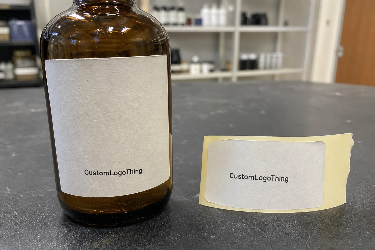
Transparent labels deserve special attention. They can look clean and modern, but they expose every mistake in artwork setup. Text needs enough contrast. White ink often has to sit under color areas. If the bottle itself is tinted, the finished look can shift more than a buyer expects. Test it before committing to a larger run.
There is also a sourcing angle. If paper content matters to your procurement policy, ask about FSC options and chain-of-custody claims at fsc.org. That does not replace performance testing, but it gives the procurement team a cleaner way to align the label spec with sustainability targets. Buyers who manage both branded packaging and compliance often treat that as a basic requirement, not a premium extra.
From a packaging design standpoint, the most successful labels are the ones that balance readability, moisture resistance, and application speed. A label that looks elegant but is hard to apply by hand can add labor cost that never shows up on the quote. Labor always shows up somewhere. Usually later.
Production steps and turnaround: from proof to ship date
Once artwork is approved, the job moves through file prep, print setup, press production, finishing, inspection, packing, and shipment. Each step is straightforward on paper. In real production, the delays usually happen earlier, not later. Missing dimensions, a revision to the dieline, or a proof that needs one more correction can add days before the press ever starts.
Turnaround is not the same as transit time. That distinction matters. A vendor might promise seven business days of production, but shipping can add another two to five days depending on location and service level. If labels are tied to a launch date, treat the delivery window as production time plus freight time plus a buffer. That buffer is not pessimism. It is normal planning margin for packaging work that has to show up on time.
For buyers managing repeat orders, the fastest jobs are the ones with stable specs. Same bottle, same artwork, same finish, same quantity. If the team is changing only one variable, the order is usually easier to quote and faster to schedule. The more the order resembles a repeat, the more online ordering pays off.
Complex finishes can lengthen the schedule. Specialty lamination, spot effects, metallic inks, or custom die lines require more setup and more inspection. That does not mean they are slow by default; it means they should be planned with a realistic lead time. When a vendor gives you a proof, read it carefully. The proof is not just a visual preview. It is the last place to catch a placement issue, a color shift, or a contour problem before it becomes a production mistake.
Quality control should include more than a quick scan. Confirm trim size, label count, color consistency, barcode scannability if the label carries retail data, and edge adhesion on a sample bottle. If the label is going onto a matte or textured substrate, look for image breakup in fine type. If the label is metallic or clear, check contrast under real store lighting, not just desk lighting. Print samples have a talent for looking better under the wrong lamp.
For teams that manage Custom Printed Boxes and labels together, the useful rule is simple: coordinate proof timing so your product packaging assets do not drift apart. A bottle label and a carton should look like they belong to the same system, even if they are produced in different runs. If the box is warmer in tone and the label is cooler, customers notice, even if they cannot explain why.
Common mistakes that cause peeling, curling, or wasted spend
The biggest error is the oldest one: wrong measurements. Buyers often measure the bottle, not the label field. Those are not the same thing. A shoulder curve, taper, or molded groove can eat into the real placement area. If the label wraps too far, it may wrinkle. If it stops too short, it can look unbalanced. Both outcomes weaken the shelf read.
Another common issue is ignoring the bottle environment. A label that looks fine on a dry sample can fail when exposed to condensation. Curling edges, cloudy film, or adhesive lift are usually environmental problems, not design problems. The product may be excellent. The label spec is what missed the use case. Cold chain packaging is where this shows up fastest, but it is not limited to beverages. Body care, sauces, and specialty oils all create their own version of the same problem.
Artwork can also sabotage the order. Safe area, bleed, and resolution are not optional production details. A design that is sharp on a monitor can still print poorly if the type is too small or the artwork is built at the wrong size. This is where online proofing should help. A proper vendor will point out issues before printing, not after the press run is done.
Type size deserves more attention than it gets. Decorative labels often hide unreadable small text behind busy graphics. That works until someone has to find a batch code, a flavor note, or a legally required panel on a crowded shelf. If the label carries regulatory copy, leave enough room for it from the start. Crowding it in later is how good designs become bad labels.
One test application is cheaper than one wasted case. That is especially true for seasonal or short-run labels, where leftover inventory has almost no second life.
Order quantity mistakes create a different kind of waste. Too few labels and you reprint under pressure. Too many and you sit on unusable stock after the design changes. This happens often with seasonal beverages, limited-edition launches, and event-specific branded packaging. A better rule is to align the quantity with the product life cycle, not with the lowest unit price on the screen.
If the bottle has a strange contour, textured glass, or a hard-to-stick finish, ask for a sample or test print before the full run. That is not overcautious. It is standard risk control. Labels are inexpensive compared with a launch delay, a rework cycle, or a pallet of product that no longer presents well in retail packaging.
Another quiet mistake is ignoring how the label will age. Some inks and finishes look great for a week and then start to dull, scratch, or discolor. If the product sits on shelf for months, ask what the surface will look like after normal handling and light exposure. Shelf life applies to packaging too. Nobody likes discovering the label aged faster than the product.
Expert tips and next steps before you place the order
Before you place the order, run a simple checklist. Measure the bottle’s usable label area. Confirm where the label will sit on the bottle. Decide whether the surface will be dry, chilled, handled often, or exposed to moisture. Lock the finish before you request proofing. Those four decisions eliminate a surprising number of preventable mistakes.
If the container is textured, unusually shaped, or stored cold, ask for a sample or test print. That extra step is worth the time because it shows how the adhesive behaves in the real world, not just on a flat proof screen. It also helps confirm whether the design still reads clearly once wrapped around the bottle. If the text disappears once the bottle curve kicks in, the design was never ready.
When comparing vendors, compare total value rather than the lowest quote. Ask what the price includes: proofing support, revision count, material choice, finish quality, and production consistency. A slightly higher quote can be the better deal if it cuts down on waste and reduces the odds of a rush reprint. That matters more than a small upfront savings on labels that have to be applied correctly, shipped on time, and survive actual use.
Ask about how the vendor handles tolerances. A real production partner should be able to tell you what kind of registration variation is normal, how they verify trim, and whether there is a sample approval step for special finishes. If the answer is vague, expect more surprises later. Surprise is not a quality system.
Finally, make sure the proof matches the bottle, the use case, and the timeline before you approve it. That is the point where custom bottle labels online stop being a search result and become a production decision. If those three pieces line up, the order is usually straightforward, predictable, and far easier to scale on the next repeat run.
In other words, buy the label spec that fits the bottle, the environment, and the launch schedule. That is how custom bottle labels online stay useful after the proof stage and earn their place in a larger package branding system. The best labels do their job quietly, which is exactly what you want from packaging.
How do I choose the right size for custom bottle labels online?
Measure the bottle's usable flat or curved panel, not just the overall circumference. Leave margin for seams, overlap, and areas that wrap too close to a shoulder or taper. A paper mockup or template on the actual bottle is the safest way to confirm fit before approval.
What label material works best for chilled bottles ordered online?
Choose a moisture-resistant film or other waterproof stock for condensation and cold storage. Use an adhesive designed for wet or refrigerated environments so edges do not lift early. Ask whether the finish will stay readable after repeated handling or cooler storage.
Why do custom bottle labels online prices vary so much?
Price changes with size, material, finish, shape complexity, and print quantity. Small runs usually cost more per label because setup and proofing are spread across fewer units. Compare total quote details, not just the headline price, before deciding.
How long does turnaround usually take after proof approval?
Production time starts after the proof is approved, not when the quote is accepted. Complex finishes, revisions, or custom die lines can add time before printing begins. Shipping time is separate, so build a buffer if the labels are tied to a launch date.
Can I reuse one design across different bottle shapes?
Yes, but the artwork often needs resizing or repositioning to fit each bottle correctly. Tapered or contoured bottles usually need special attention so the design does not distort. A proof or test wrap is the safest way to confirm the design before ordering multiple versions.