Personalized Address Labels with photo solve a packaging problem that is easy to underestimate. A plain mailer gets ignored. A label with a real image, clear address copy, and the right finish does more than identify a package. It helps the parcel look intentional before it is even opened.
The catch is simple: the photo cannot wreck the address block. If the image takes over the label, delivery suffers. If the address dominates everything, the photo becomes pointless decoration. The useful version sits in the middle. It gives the brand a visual cue and still lets the carrier read the label without hesitation.
What Personalized Address Labels With Photo Actually Are
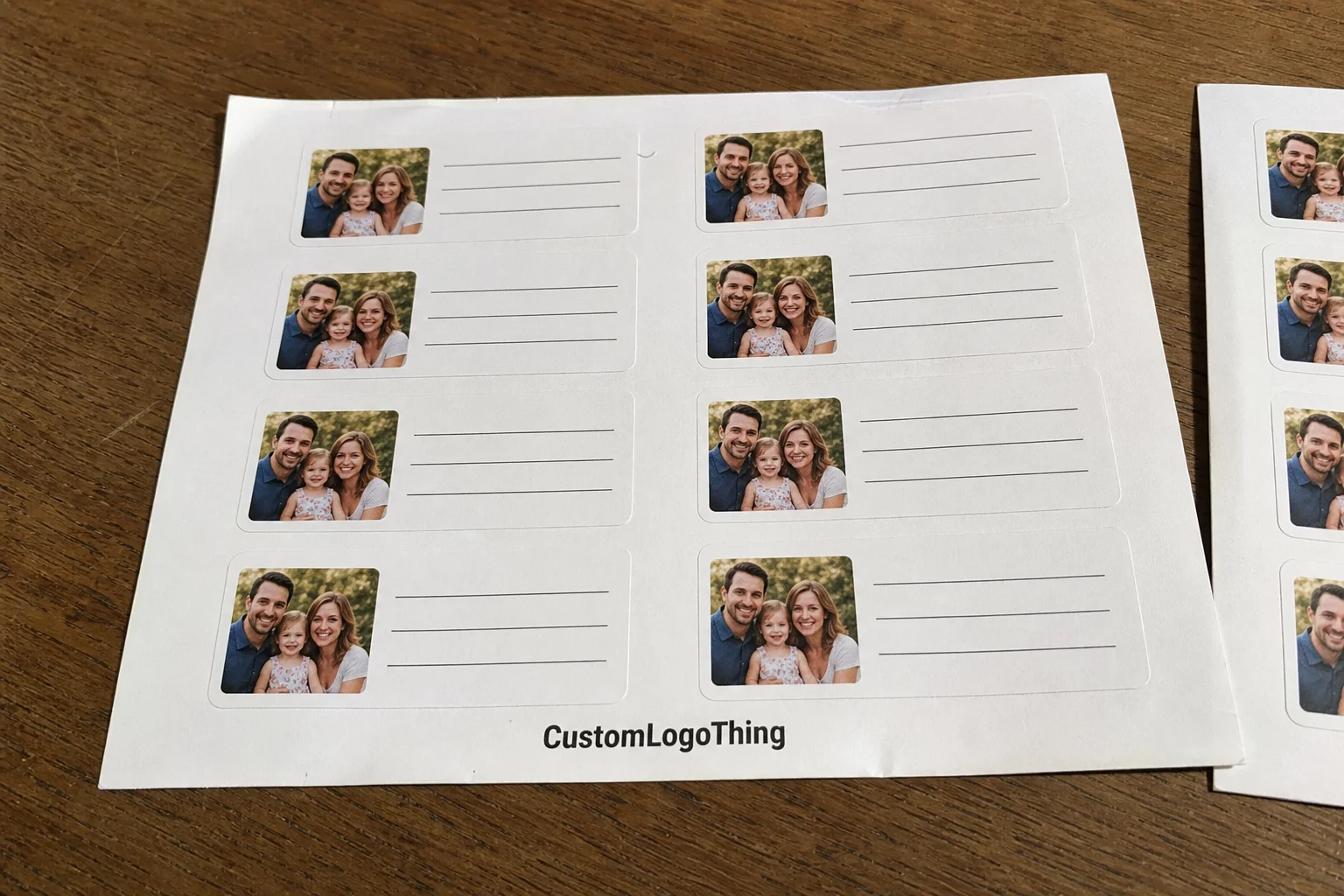
These labels combine mailing information with an image element. That image might be a product photo, a portrait, a team shot, a logo treatment, or a branded graphic. For apparel sellers, the format works well on shipping mailers, return address panels, thank-you envelopes, insert packs, and seasonal campaign boxes. The photo makes the package recognizable. The address keeps it useful. That is the whole job.
The strongest designs are built around recognition, not decoration. A buyer should notice the package quickly. A fulfillment team should be able to sort it without squinting. A carrier should not have to guess where the recipient line ends and the artwork begins. If the label needs explanation, the layout is already too busy.
That is why these labels show up so often in ecommerce and subscription packaging. They add a small visual signal that helps a package stand apart from a stack of identical cartons. They also give a brand some personality without forcing a full packaging redesign. For teams moving volume, that matters. It is cheaper to adjust the label system than to rebuild every outer carton.
Practical rule: if the label does not read clearly at arm's length, it is not ready. The image should support the address block, not compete with it.
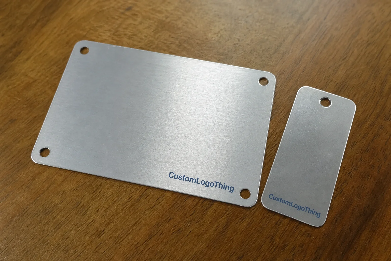
If a broader packaging system is already in place, it helps to keep the label style aligned with the rest of the line. A coordinated set of Custom Labels & Tags makes the photo version feel like part of a system instead of a one-off experiment.
How Personalized Address Labels With Photo Are Designed
The design process is not complicated, but a few details decide whether the label works. Start with the image, place the address block, set the final size, then review a proof before anything prints. That sounds basic because it is. The part people miss is how much can change when a photo is cropped to fit a small format.
A clean proof has to answer three questions at once. Is the image crop right? Is the address readable at final size? Does the layout still make sense after trim and bleed are applied? If the answer to any of those is no, the proof needs another pass. Small labels are unforgiving. They expose weak artwork fast.
Most programs use templates for a reason. If the same label has to serve multiple return addresses, fulfillment locations, or campaign versions, a structured layout saves time and reduces mistakes. Variable data can be dropped into a stable design without rebuilding the whole file. That is especially useful when several people touch the artwork before approval. Fewer moving parts means fewer errors.
File prep is where many orders slow down. Photos need enough resolution to survive the final print size after cropping. Faces, product edges, and logo details need breathing room so they do not get clipped. If the design is full bleed, the file needs tighter control. If it is framed with margins, the layout is easier to manage and often easier to read. Framed designs are not as flashy. They are usually more reliable, which is more useful.
Print method matters too. Digital printing is usually the best fit for short runs and variable artwork because setup is faster and revisions are easier to absorb. Flexographic printing makes more sense for larger repeat orders where the same layout will run in volume. Neither method is automatically better. The right choice depends on quantity, artwork complexity, and how often the label design will change.
For teams that want a neutral reference point on packaging structure and material decisions, the educational resources at packaging.org are useful before you approve a run.
Material, Adhesive, and Finish Choices That Matter
Paper and film behave differently once the package leaves the table. Paper is usually the lower-cost choice and works well on dry cartons, envelopes, and indoor fulfillment environments. Film, often BOPP or another synthetic stock, is better when the label may face moisture, friction, or colder handling conditions. If the package might pass through a damp sortation area or rub against other parcels, film usually earns its price.
Adhesive choice is not a minor detail. Permanent adhesive is the standard for shipping labels because it grips hard and stays put. Removable adhesive has a place on inserts, gift wrap, and short-lived promotions, but it is the wrong call if the label has to survive a long transit path. A corner that lifts is not a style choice. It is a defect.
Finish changes both appearance and readability. Matte reduces glare and helps small text hold up in mixed lighting. Gloss makes color photos look brighter, but it can create reflections that hurt legibility on certain packaging. Soft-touch gives a premium feel, although it is not always the best choice for a label that needs to stand up to hard handling. Nice to touch. Not always nice in transit.
Size and shape deserve the same level of attention. Rectangles are the easiest format for address density because they give enough room for the image, recipient line, and return details without forcing the typography into a cramped stack. Square and rounded shapes can work, but photo-heavy layouts usually need more width than those formats allow. A label that looks balanced on screen can feel crowded once it is printed at actual size.
Surface matching matters more than most buyers expect. A design that looks fine on a white envelope may fall apart on kraft mailers or dark boxes. The adhesive can also behave differently on smooth poly mailers, textured cartons, and coated paper. If the package surface is unusual, test it. Guessing is cheap until the first batch starts peeling.
For buyers who need a paper-based option with traceable sourcing, FSC is a useful reference point for responsibly managed fiber. That does not replace a good material choice, but it does help when sustainability requirements are part of the spec.
If the packaging system includes inserts, tags, and shipping labels, custom label and tag options can keep the whole kit visually consistent.
Production Steps and Timeline: From Proof to Ship Date
Most orders move through the same sequence: quote, artwork review, proof creation, proof approval, printing, cutting, packing, and shipment. The sequence is predictable. The delays usually are too. One missing file or one late correction can add more time than people expect.
- Collect the final address copy, image file, quantity, size, and finish.
- Check resolution, crop, and bleed before the proof is built.
- Review the digital proof for spelling, line breaks, and address placement.
- Approve the design only after the layout works at actual label size.
- Inspect a production sample if the run is large or the design is critical.
- Finish, pack, and ship after quality checks are complete.
Turnaround depends on more than press time. A short digital run with clean artwork can often ship in 4-7 business days after proof approval. Larger runs, specialty films, custom shapes, or multiple address versions usually stretch closer to 10-15 business days. Rush service can shorten that window, but it usually raises cost and leaves less room for revision. Late approval also pushes the job into the next production cycle, which is where a lot of “why is this not shipping yet?” emails come from.
The most common delays are boring and avoidable. Low-resolution photos. Missing final copy. Multiple revision rounds. Last-minute address changes. These are not production mysteries. They are workflow problems. Send complete files the first time and decide on full bleed versus inset layout before the proof request goes out. That is usually enough to keep the job moving.
For parcel performance and transit expectations, the testing methods published by the International Safe Transit Association are a useful reference when labels and outer packs need to survive rough handling.
Cost and Pricing: What Changes Unit Cost
Quantity is the biggest pricing lever. Small runs carry more setup cost per label because prepress, proofing, and finishing are spread across fewer pieces. A 250-piece order will almost always cost more per label than a 5,000-piece run, even if the artwork does not change. That is normal manufacturing math, not a trick.
Material and shape are the next variables. Standard paper labels usually cost less than synthetic film. A custom die-cut shape can add tooling or finishing cost, especially on smaller quantities. Specialty finishes such as soft-touch, heavy gloss, or premium coatings can move the price upward too. The more parts of the build that are nonstandard, the more the unit cost climbs.
Photo complexity also changes the quote. A clean portrait or product shot with controlled contrast is easier to print than a crowded collage with several image zones and tiny text. If the artwork needs color correction, background cleanup, or extra proof rounds to keep the address readable, that labor has to be covered somewhere. The image itself is rarely the expensive part. The file management around it is.
| Option | Best Use | Typical Unit Cost Impact | Notes |
|---|---|---|---|
| Matte paper label | Dry mailers, envelopes, light-duty shipping | Lowest | Good readability and fast production |
| Gloss paper label | Bright photo-heavy branding | Low to moderate | Stronger color pop, more glare risk |
| Film label | Moisture, friction, cold storage | Moderate to higher | Better durability on rough handling |
| Soft-touch or specialty finish | Premium gifting and campaign mailers | Higher | Useful for feel, not always for shipping wear |
Ask for the full cost breakdown. Proof fees, die-cut charges, freight, rush fees, and minimum order requirements can change the real landed cost more than the quoted unit price does. A buyer comparing a launch run to a replenishment run should look at the whole order, not just the sticker price on the label itself. That is where budget surprises usually hide.
Common Mistakes That Make Photo Labels Hard to Read
Low-resolution images are the fastest way to ruin a label. A photo that looks fine on a phone screen can turn soft once it is scaled and trimmed for print. Faces, logos, and product details need enough detail to survive the final size. If the image is going to be enlarged, ask for a proof on the intended stock before approving the run.
Trying to fit too much into a small format is the other big mistake. Address line, return line, decorative frame, and photo all fighting for the same space leaves the layout crowded and slow to read. On a shipping label, slow reading is a problem. The eye should know where to go first. Image, then address, then any decorative element. Not the other way around.
Contrast gets overlooked constantly. Pale text over a busy image or dark artwork behind a black address block can make the label difficult to use. Busy backgrounds cause the same issue. A solid panel or a lightly tinted area behind the address usually fixes it. That is why proofs should be reviewed at actual size, not just enlarged on a screen where everything looks easier than it will in the real world.
Bleed and safe area mistakes are expensive because they show up after trim. A face can be clipped. A logo can sit too close to the edge. A line of text can disappear into the cut. The file may look tidy in design software and still fail at print. The last mistake is practical: choosing a finish or adhesive that looks good in mockup but does not match the packaging surface. A glossy label can behave very differently on kraft, coated paper, and smooth plastic.
Expert Tips for Sharper Art and Better Brand Consistency
If you want Personalized Address Labels with photo to feel like part of the brand instead of a novelty, start with a high-resolution image that still has room around the subject. That extra space gives the designer enough margin to crop without cutting into the important part of the photo. It also keeps the label from feeling jammed once the address block is added.
Keep the address block in the same place across versions. Consistency matters more than most people think. Once packing staff learn the structure, they move faster and make fewer mistakes. That matters on busy apparel lines where different collections ship through the same fulfillment process. The label becomes a cue, not just a sticker.
Match the typography to the rest of the packaging system. If the mailers, insert cards, and hang tags use a soft sans serif, a sharp condensed address label can feel out of place. If the brand leans more editorial, a restrained serif or clean sans can work. The point is not to make every surface identical. It is to make them feel related.
Test the design against the actual packaging color. A label that looks strong on white stock can disappear on kraft mailers or dark boxes. The same problem shows up with image-heavy layouts that rely on subtle color differences. A printed sample on the real substrate is more useful than a polished screen mockup because physical contrast is what the customer and the carrier will actually see.
It also helps to think about the production environment, not just the design. If labels are being applied quickly on a packing line, a matte finish often reads better under warehouse lighting. If the packages travel through moisture, a film stock makes more sense. If the order volume changes every season, a template with variable fields is easier to maintain than a custom layout every time someone wants a new look. Pretty is not the goal. Usable is the goal.
For design checks and substrate decisions, the technical references at packaging.org can help you verify assumptions before the run is approved.
Next Steps Before You Place the Order
Before requesting a quote, gather the final address copy, the photo or logo file, preferred size, quantity, finish, and the surface the label will touch. That last part matters. A label for an envelope does not behave like one that sits on a smooth poly mailer or a textured box flap. If the packaging type is clear up front, the supplier can recommend the right stock instead of guessing.
A good proof should show the photo crop, exact dimensions, and full address block at actual scale. If the order is for apparel shipments, say so. It tells production that the label has to survive a real packing environment, not just look polished in a mockup. If you need the label to match a larger packaging family, keep it aligned with the rest of your Custom Labels & Tags so the full presentation stays consistent.
Compare turnaround, minimum order quantity, and freight together. A lower unit price can disappear fast if the minimum is too high or shipping is expensive. The cheapest quote on paper is not always the best option for a launch, especially if you need a small batch quickly and do not want inventory sitting around. A larger run can reduce the per-label cost enough to justify holding some stock for the next cycle. That is a better trade than paying premium pricing for a tiny emergency order.
Final check: approve the run only after the proof, material, adhesive, and timeline all match the way you ship. That is where branding and production stop fighting each other and start doing the same job.
Frequently Asked Questions
What photo resolution is best for address labels with a photo?
Use the highest practical resolution you have, then let the label size determine how much of the image remains visible. A sharp file with enough pixels at final print size will keep faces, logos, and product details clean. If the image has to be enlarged, ask for a proof on the intended stock before approving the run.
Can personalized address labels with photo work on poly mailers?
Yes, but the adhesive has to suit the surface. Smooth poly mailers usually need a strong permanent bond, and the finish should be checked for glare or scuffing. If the mailers are textured, cold, or handled in a humid space, confirm adhesion conditions before the order is placed.
Are photo address labels more expensive than plain labels?
Usually they are, because the artwork, proofing, and color management take more time. Quantity has the biggest impact on unit cost, followed by material, finish, and shape. A larger run usually lowers the per-label price enough to make the photo version more practical.
How long does production usually take for custom photo address labels?
Turnaround depends on proof approval, order size, stock choice, and current production load. A clean file with a fast approval cycle can move quickly, while specialty finishes or multiple revisions will stretch the schedule. Rush service may be available, but it usually adds cost.
What should I send to get an accurate proof for photo address labels?
Send the final address text, the photo or logo file, the label size, quantity, and the packaging surface. If you have brand colors, line-break preferences, or a specific finish in mind, include those too. The more complete the brief, the fewer surprises you will have at proof stage.
If your packaging line depends on consistency, order personalized address labels with photo only after the proof has been checked at actual size, the material matches the mailer surface, and the ship date fits the way your team actually packs orders.