Subscription Printed Poly Mailers logo placement is less about decoration than about whether a recurring shipment looks consistent every time it arrives. A logo can reinforce brand recognition, but only if it stays visible after packing, sealing, shipping labels, and handling. In a subscription program, that matters because the same layout repeats on every cycle, so a weak spec creates the same problem over and over.
For a buyer, the key question is simple: will the logo still read clearly once the mailer is packed and in transit? If the answer is yes, the bag supports brand memory, a cleaner unboxing moment, and fewer rework issues. If the answer is no, the artwork is doing less than the packaging cost justifies.
What Subscription Printed Poly Mailers Logo Placement Actually Means
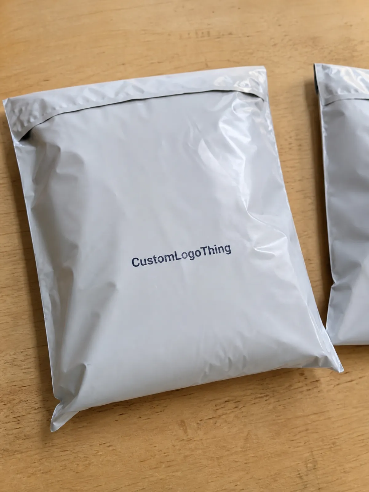
On a subscription mailer, logo placement affects how quickly the package is recognized and how polished it feels on arrival. A centered logo on a clean panel usually reads like an intentional system. A logo pushed into a seam, flap, or crowded corner often looks accidental, even if the art file is strong.
Buyers should think in print zones, not just bag dimensions. The front panel is usually the primary brand area. The back panel can carry a secondary logo, support copy, or a return cue. Seams, closure strips, gussets, and heat-seal zones reduce the usable field, so a design that crosses those areas can distort or disappear once the mailer is filled.
This is especially important for subscription programs because the same placement decision repeats every week or month. A one-off mistake is annoying. A recurring mistake becomes part of the customer experience. That is why the spec should define the logo position as part of the package system, not as a loose design preference.
Distance and motion also matter. A logo that looks fine on a screen may not read well from courier-handling distance or while the parcel is moving. Line weight, contrast, and clear space around the mark can matter as much as the exact position. A design can be technically printed and still fail as packaging.
If the logo disappears under a barcode, a fold, or a seal line, you are paying for decoration, not memory.
In practice, the best placement is the one that survives packing variation, label placement, and the way the bag changes shape when filled. That is the standard worth using before approving a production run.
Print Process and Lead Time for Repeat Mailer Runs
The production flow is usually straightforward: artwork handoff, proofing, approval, press setup, printing, curing or drying, finishing, and packing. Clean files move quickly. Files that need rework slow everything down, especially when the logo sits too close to a seam or the printable area was measured incorrectly.
Print method affects timing. A single-color logo usually moves faster than a multi-color layout or a design that needs precise registration. More colors mean more setup, more alignment checks, and more chances for shift. For a recurring program, a simple one-color mark on a stable panel is often the easiest and fastest to repeat.
Most delays come from the same few problems: artwork outside the printable area, missing color references, revisions after proof approval, or a need to move the logo because it intersects the seal. None of those issues are unusual, but they extend the schedule. For clean repeat runs, a common lead time is often 12-15 business days after approval, while more complex jobs can run longer depending on press load and freight.
Once the placement is approved, subscription programs gain a real advantage: the same spec can be reused. That reduces back-and-forth on future orders and makes replenishment easier to schedule. The more exact the documented placement, the easier it is to reorder without reopening the layout from scratch.
It also helps to coordinate the mailer with the rest of the packaging system. If you are ordering inserts, labels, or other branded components, matching the visual logic across those items can reduce extra approval steps. A broader view of the packaging line can also help with sourcing through Custom Packaging Products, especially when the outer mailer has to work with other printed pieces.
For teams comparing distribution performance, the International Safe Transit Association offers practical guidance at ISTA. Their standards are useful when the shipment path is rough and the print needs to stay intact through handling.
Cost, MOQ, and Unit Pricing for Printed Poly Mailers
Price depends on more than the bag itself. For printed mailers, the quote usually reflects size, film thickness, print coverage, color count, proofing, and whether the logo requires tighter alignment or special ink support. The more complex the placement and coverage, the more control the press team needs, and that adds cost.
MOQ matters because setup costs get spread across the run. Lower quantities usually have a higher unit price, while larger subscription volumes can reduce the per-bag cost. A 1,000-unit order is very different from a 10,000- or 25,000-unit program. Buyers should compare those volumes carefully because the economics change quickly.
Here is a practical way to compare common production options for subscription mailers:
| Option | Typical unit range | Best fit | Cost pressure |
|---|---|---|---|
| Single-color logo on one panel | $0.18-$0.28 at 5,000 units | Simple branding, fast reorders | Low |
| Two-color logo or larger coverage | $0.24-$0.38 at 5,000 units | Stronger shelf impact, more visual depth | Moderate |
| Full-panel print or tight registration layout | $0.30-$0.55 at 5,000 units | High brand emphasis, premium presentation | Higher |
| Dual-side branding | $0.32-$0.60 at 5,000 units | Support copy, reorder cues, expanded branding | Higher |
Those numbers are broad ranges, not commitments. Freight, rush charges, and remake risk can change the landed cost enough to alter the decision. The best way to compare suppliers is to separate product cost, print setup, proofing, freight, and any rush or remake charges instead of looking only at the headline unit price.
The placement choice also influences the quote. A centered single-color logo on a clean field is usually easier to print than a full-panel layout that needs tighter press control. If the logo has to stay away from seams, folds, or labels, the usable field gets smaller, and the proof may need an extra revision.
If your team is sourcing the bag as well as the print, review a dedicated Custom Poly Mailers page to match size, gauge, and finish before you finalize artwork. That is often where the better budget decision starts.
For sustainability context, the EPA provides recycling guidance at epa.gov/recycle. Even for poly mailers, buyers still need to understand local recycling realities before making claims on the package.
Best Logo Placement Zones on Flat and Gusseted Mailers
Flat and gusseted mailers behave differently. A flat bag offers a more predictable print field. A gusseted bag can hide part of the artwork when the sides expand. That means the printable area is not always the same as the nominal bag size, so the real print zone should be mapped before approval.
Centered placement often works best on flat mailers because it reads quickly and stays clear of the most common interference zones. Top-left placement can work when a brand wants a quieter look or needs space for a shipping label. Lower-front placement may fit better when the closure area is wide or when the upper panel is already busy with service markings.
Edges and fold lines need extra caution. A logo too close to a seal line can look crooked once the bag is filled. Type that crosses a gusset can warp when the mailer expands. Even if the press run is perfect, the finished package may expose problems that were not visible in the flat proof.
A good rule is to place the logo where the eye naturally lands, not where leftover space happens to be. In most subscription runs, that means one primary logo on the front panel and any secondary copy on the reverse panel. Multi-panel branding can work, but only if the main identity stays dominant.
Shipping labels matter too. If the label sits too close to the logo, the package starts to feel crowded and the brand loses clarity. Good spacing keeps the identity visible after carrier processing and gives the parcel a more controlled look.
Step-by-Step Spec Checklist for Approving Artwork
Start with measurement, not design. Confirm the exact printable width and height before moving the logo in the layout file. If the art team works from the nominal bag size instead of the true print field, the proof is already at risk.
Next, lock brand hierarchy. The logo should have a clear role, and any subscription message or support copy should support that role rather than compete with it. Too many mailers try to say everything at once, which usually creates noise instead of clarity.
Then check the design at actual viewing distance. A screen mockup is useful, but a physical sample tells the truth faster. Review the logo from arm's length, from a quick glance, and under normal indoor light. This is where the placement either holds up or shows that the mark is too small, too faint, or too close to the edge.
- Confirm the printable area in inches or millimeters.
- Reserve clear space around the logo and seam lines.
- Check color values and proof them against brand references.
- Allow label clearance for the shipping panel.
- Verify repeat-order naming so the same spec is used again.
Finish with an approval sheet that covers placement, color, bleed, barcode or label clearance, and the expected repeat pattern. The best teams also save the final art version, approved coordinates, and bag size in one place so the reorder does not start from zero six weeks later.
If the mailer is part of a broader packaging set, use the same approval standard across inserts, cartons, and outer shippers. Consistency makes the whole subscription kit feel intentional instead of assembled in pieces.
Common Placement Mistakes That Can Undercut Brand Trust
Oversizing the artwork is the most common mistake. A logo that crowds the panel can look bold in a proof, but on the finished mailer it often feels heavy and cluttered. Premium usually comes from control and spacing, not from making the mark as large as possible.
Ignoring the seal area or fold line is another frequent problem. A logo aligned to an empty flat mockup can look crooked once the mailer is filled and the film pulls into shape. That is a small technical miss with a visible brand penalty.
Color contrast is also easy to underestimate. Light logos on translucent film can disappear depending on what is inside the bag and how the parcel is photographed. Dark logos on dark film can vanish in low light or when the shipping label dominates the front panel. The print may be correct, but the visibility is weak.
Consistency matters as much as design. If reorder batch A is centered and reorder batch B shifts the logo by three-quarters of an inch, the brand starts to feel less controlled. Subscription customers notice packaging changes more quickly than one-off buyers do.
These are not just style issues. They are signal issues. And signal issues are expensive because they weaken perception without creating an obvious production failure.
Expert Design Tips for Subscription Packaging That Repeats Well
Keep one dominant logo position and let everything else support it. That is usually the cleanest approach for recurring mailer programs. A strong primary mark gives the package a visual anchor, and the rest of the bag can stay minimal so the parcel reads quickly.
Build the placement system by size family. Small, medium, and large bags should share the same visual logic even when the dimensions change. The logo might stay centered across all sizes, while the safe margins or secondary copy shift slightly. The goal is to make the family feel related rather than random.
Use contrast intentionally. A strong logo on a simple field usually outperforms a crowded design that tries to say too much. Subscription mailers are seen quickly, often while moving, so cleaner layouts tend to hold up better in photos, on doorsteps, and in social sharing.
It also helps to design for the photo moment. A bag that looks good in a hand shot or unboxing clip is doing more than transporting product. It is acting like a mobile billboard. If the brand wants the parcel to travel beyond the mailbox, the placement needs to work from camera angles as well as carrier handling.
Real packaging has weight, folds, bulges, and handling marks. The best placement survives that shift. Great placement anticipates it. That is the difference between a spec that looks fine on paper and one that repeats well in the real world.
Next Steps for Ordering a Stronger Mailer Spec
Start by gathering the bag size, target quantity, print colors, and brand files before requesting quotes. Vendors can price more accurately when the information is complete. If the team is still debating the exact logo position, it is usually too early for final pricing.
Ask for a proof that shows the logo at full scale, with seam and label clearance visible. The proof should answer the only question that matters: does the mailer still read clearly once it is packed and moving through the system? If the answer is unclear, revise before production starts.
Compare suppliers on total landed cost, not only the unit price. Freight and reprint risk can erase a small savings quickly. A lower price is not a good deal if the placement is unstable or the reorder process is difficult.
Use the first run as the spec-setting run. If the approval is solid, reuse that standard for future replenishment orders without reopening the artwork unless the brand itself changes. That is how subscription programs keep control while reducing friction.
That is the real value of subscription Printed Poly Mailers logo placement: not decoration, but a repeatable packaging decision that supports visibility, cost discipline, and brand memory.
How do I choose the right subscription printed poly mailers logo placement?
Pick the largest flat panel with the least interference from seals, folds, or shipping labels. Keep the logo visible from arm's length and make sure it still reads when the bag is filled.
What affects the price of subscription printed poly mailers logo placement?
Quantity, print colors, bag size, film thickness, and coverage area are the main cost drivers. Tighter placement requirements and special ink or proofing steps can increase setup and unit cost.
How long does production usually take after artwork approval?
Simple repeat runs are faster once the artwork and placement are locked. Lead time often extends when samples, revisions, or multi-color registration checks are needed.
Can I print the logo on both sides of a subscription poly mailer?
Yes, but both sides add cost and can require more careful layout control. Many buyers keep the main logo on one side and use the reverse for support copy or secondary branding.
What files should I send for logo placement approval?
Send vector artwork when possible, plus the exact mailer size and any brand color references. Include notes on preferred placement, minimum logo size, and areas that must stay clear for labels or folds.

