Pet Treat Woven Label Beanies Material Thickness Guide
A pet treat Woven Label Beanies Material thickness guide matters because one small spec change can shift the entire feel of a hat. On a proof, the logo can look perfect. In the cuff, it can feel wrong.
Buyers should judge woven labels by hand feel, drape, and stitch behavior instead of artwork alone. A label that is too thick leaves a ridge under the finger, while a label that is too thin sinks into the knit and loses the branding value the customer is paying for.
A beanie label should feel like part of the garment, not an accessory trying too hard.
Comfort first.
If you are comparing Custom Labels & Tags, why judge the card instead of the knit?
Why thickness changes the whole feel of a beanie
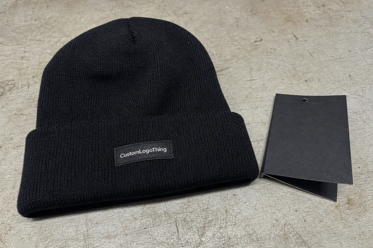
Beanies are soft and flexible, so even a little extra body stands out. A woven label sits on top of that softness, which means thickness affects comfort, drape, and the way the cuff folds under pressure.
Why let a label overpower a soft cuff? The effect shows up most clearly on cuffed styles, where the fold and seam structure already create tension and a dense label can make one section feel firmer than the rest.
Thin labels are the safest choice when comfort matters most. They sit low, bend easily, and suit understated branding. Medium builds usually offer the best commercial balance because they stay readable without overpowering the knit. Thicker constructions can work on heavier acrylic cuffs, but they are less forgiving on soft or slouchy styles.
Placement matters just as much as the material itself. A label centered on a cuff takes more pressure than one placed slightly off-center, and a fold line can magnify the profile of the label near the forehead line. Many thickness complaints are really placement problems.
Readability brings its own tradeoff. Fine text and narrow outlines need enough density to stay legible, but too much structure makes the logo feel overbuilt. The aim is not maximum body. The aim is a label that supports the beanie instead of fighting it.
For most programs, a medium-thin woven label with a simple edge finish is the best starting point. It is usually soft enough for wear and structured enough for production.
Fit, drape, and comfort on real knit fabrics
A beanie never stays flat. It stretches, folds, rebounds, and rubs against skin, so the label has to work in motion, not just in a sample card comparison. Once it is stitched into rib knit, brushed acrylic, merino blends, or fleece-backed fabric, the result can change quickly.
Comfort issues usually appear first at the edge. Hot-cut, folded, and stitched finishes all behave differently once they are sewn in, and there is no universal winner because the right tradeoff depends on the fabric and the placement.
That range only helps when it matches the knit. Dense acrylic can usually support a little more structure. Softer wool blends often cannot. Slouch beanies usually need a lighter touch than tight cuffed hats because the drape is part of the product design.
- Thin: softest hand, lowest profile, best for comfort-first branding.
- Medium: best balance of readability, structure, and wearability.
- Thick: most visible, but more likely to feel rigid on soft cuffs.
Wear testing is worth the time. A label that looks neat when new can curl, pucker, or stiffen after repeated use, and a sample that survives a few wear cycles tells you more than a polished render ever will.
Judge the sewn sample, not the loose label. A flat card does not show stitch tension, knit stretch, or fold pressure.
The spec points that actually control thickness
Thickness comes from several choices, not one number. Yarn type, weave density, backing, and edge finish all affect how the label feels once it is sewn into a beanie.
Weave density has the biggest impact on perceived thickness. A tighter weave gives better detail and more structure, but it also feels firmer; a looser weave is softer, but small artwork can blur.
Yarn diameter shapes the visual and tactile result too. Thicker yarn creates a bolder, more textured label. Finer yarn can sharpen detail and reduce bulk, but only if the factory can weave it cleanly enough for the logo to stay readable.
Backing changes flexibility quickly. No backing is usually the best choice for beanies when softness matters. Heat-fused or stitched support can improve stability during sewing, but it also adds body. Use the lightest backing that still keeps production reliable.
Edge finish is easy to underestimate. A hot-cut edge can stay neat but feel a little firm if the finish is heavy, while a folded edge can look cleaner even though it adds thickness at the fold line. A merrowed edge usually adds more bulk than most beanie labels need.
Packaging terms can cause confusion in the same spec conversation. FSC certified, recycled materials, and post-consumer waste are related but not identical. FSC is about responsible sourcing, not recycled content. A biodegradable packaging claim should also be checked carefully before it becomes part of the order notes.
For packaging references, FSC and ISTA are useful benchmarks if you need packaging that looks neat and also holds up in transit.
Cost, MOQ, and unit pricing
Thicker woven labels usually cost a little more, but thickness is rarely the main pricing driver. Size, color count, backing, and setup tend to move the quote more. Still, once the weave gets denser or the finish gets more complex, the cost rises.
For a typical 20 x 50 mm woven label run at 5,000 pieces, a practical buying range looks like this:
| Option | Approx. thickness | Feel on beanie | Typical unit cost | Best fit |
|---|---|---|---|---|
| Soft / low-profile | 0.18-0.24 mm | Very flexible, barely noticeable | $0.04-$0.07 | Minimal branding, comfort-first cuffs |
| Standard retail | 0.25-0.35 mm | Balanced, clean, easy to read | $0.05-$0.09 | Most beanie programs |
| Structured / premium | 0.40-0.55 mm | Noticeably firmer, more visible | $0.07-$0.12 | Bold branding, heavier knit fabrics |
Those ranges are directional, not guaranteed. Smaller orders often cost more per piece, dense color changes can add time, and special backing can push the quote higher even if the label size stays the same.
MOQ can shift as well. Some suppliers keep the same minimum across thickness options, while others raise the minimum for thicker or more complex labels because those runs take more setup time.
Approval flow, lead time, and sample checks
The approval process should catch thickness issues early, before the full run starts. A digital proof helps with layout, but a stitched sample tells you how the label will actually sit on the beanie.
Lead time usually changes when the spec gets more complex. Simple labels can move quickly. Labels with dense weaving, special finishes, or extra backing need more production time and more review. That extra time is usually worth it.


