Restaurant woven label beanies material sample guide sounds technical because it is. A woven label can look polished in a mockup and still fail in the hand: too stiff for a knit cuff, too shiny under dining room lights, too small to read once the beanie stretches. Samples exist to catch those problems before a production run locks them in.
For restaurant buyers, the label is rarely just decoration. It sits on uniform beanies, retail merch, or winter promo stock that staff will wear for long shifts. That means the sample has to prove comfort, clarity, durability, and brand fit at the same time. Not just on paper. Not just on a screen.
The useful version of a restaurant woven label Beanies Material Sample guide is blunt about what matters: the feel of the yarn, the structure of the weave, the edge finish, the way the label sits on the actual beanie, and whether the colors still work under real light. If any of those are off, the final product will look off too.
What a restaurant woven label beanies material sample guide should include
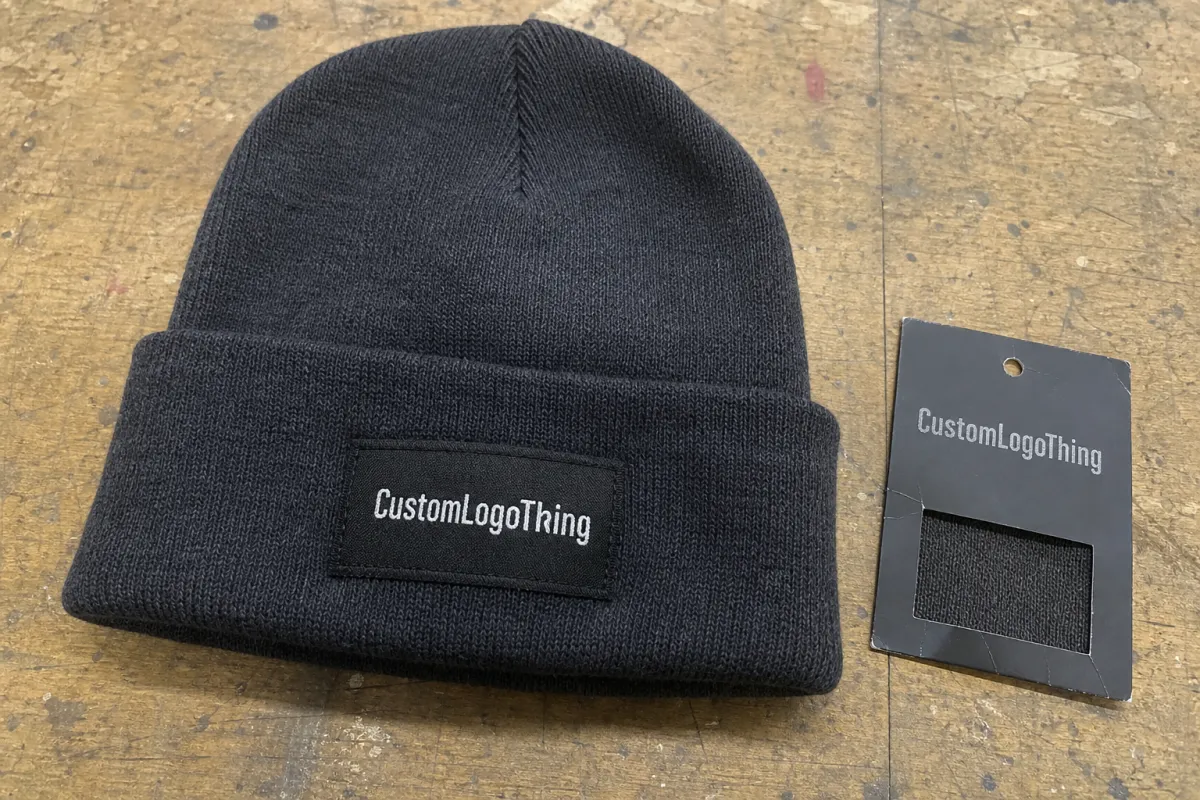
A proper sample is more than a mini label. It should show the real materials, the actual weave resolution, the finished border, and the attachment method that will be used in production. If the sample is only a loose swatch, you still do not know how it behaves once sewn into a cuff, folded over, or pressed against skin.
The first thing I look for is readability at actual size. Small restaurant logos often have a lot going on: text, icon, tagline, or a tiny accent line that looked fine in the branding file. Woven construction forces all of that into thread geometry. Fine details can survive, but only if the design is scaled for the loom instead of the presentation deck.
The second thing is hand-feel. A beanie label lives in a harsher environment than most buyers expect. It gets stretched, folded, washed, stuffed into lockers, and worn through prep and service. A good sample should make the comfort issue obvious. If the label feels scratchy in the sample, it will not magically improve after production.
- Yarn texture: soft enough for wear, but not so fuzzy that letters blur.
- Weave clarity: clean shapes, readable small type, and no muddy edges.
- Edge finish: folded, merrowed, or heat-sealed depending on placement.
- Attachment method: sew-in, fold-over, or backing style that matches the beanie construction.
- Color behavior: how the label reads on black, charcoal, cream, and heather knits.
A woven label gets judged twice: once in the hand, and once after a full shift.
That is why the sample should answer a simple question: does this look like the brand we want, and will people actually want to wear it? For staff uniforms, durability and comfort usually win. For retail merch, presentation and color accuracy matter more. The sample stage is where that tradeoff gets decided with evidence instead of guesswork.
How woven label samples translate artwork into stitch reality
Most problems start when artwork is treated like a print job. Woven labels are built from threads, not ink. That sounds obvious until a thin line disappears, a small word closes up, or a curved logo gets flattened because the loom cannot render the detail cleanly at that size.
A sample shows where the artwork needs to be simplified. Fine lines may need to be thickened. Tight counters may need to open up. Tiny type may need to be removed altogether. None of that is a failure. It is the normal difference between digital art and textile production. If the logo is supposed to sit on a beanie cuff, that mismatch gets even more noticeable because the label is being viewed on a curved, stretchable surface.
Density matters more than most buyers think. A tighter weave usually gives better definition and cleaner small text. It can also make the label feel smoother and more refined. A looser weave can be softer and slightly more relaxed, but it may soften edges enough that the logo stops reading well from a few feet away. For restaurant uniforms, that tradeoff is not abstract. Staff members and guests see the beanie in motion, not on a white background.
Color is another place where expectations need to be adjusted. Woven labels are limited by yarn selection and loom behavior, so exact Pantone matching is usually not the right expectation. Better to think in terms of color family, contrast, and legibility. A cream mark on black knit can look crisp. The same cream on oatmeal may wash out. A deep red might look rich in daylight but heavier under warm interior lighting.
What to check on the sample
- Does the logo stay legible at the beanie size the restaurant will actually use?
- Do the smallest letters hold their shape after weaving?
- Does the border stay clean when the label is folded or stitched?
- Does the color contrast still work in daylight and indoor light?
- Does the artwork still feel like the brand after it is reduced for textile production?
Buyers often try to preserve every detail from the original artwork. That usually creates a busy label that looks fine in design review and crowded in production. The cleaner move is to trim the artwork until the woven version feels intentional. Not stripped down. Just readable.
Choose yarns, weave density, and edge finishes that hold up
Material choice should match the job the beanie has to do. For restaurant use, polyester is the most common option because it is durable, color-stable, and less likely to look tired after repeated laundering. It handles abrasion well, which matters when hats get pulled on and off all day. If the label needs to survive regular wash cycles, polyester usually gives the safest baseline.
Cotton or cotton-blend labels can feel softer and more natural. That can be a good fit for retail merch or a more casual brand presentation. The downside is that they tend to read a little less crisp when the weave is dense or the design is dark and detailed. If the logo depends on clean edges, cotton needs to be chosen carefully.
There are also specialty yarns and recycled options. Recycled polyester can make sense if the brand has a sustainability standard it actually follows, not just one it wants printed on a hang tag. Specialty yarns can improve texture, but they can also introduce reflectivity, fuzz, or irregularity that changes the way the logo reads. Those effects are fine if they are deliberate. They are a problem if they show up by accident.
Weave density is the next decision. A high-density damask-style weave is often the most useful starting point for a woven label on a beanie because it balances detail and durability. It gives cleaner lettering, sharper borders, and better support for small logos. A lower-density weave may feel softer, but it can blur thin strokes or make the label look less finished once it is sewn down.
Material and finish choices buyers compare most often
- Polyester yarn: strong, color-stable, and usually best for staff uniforms.
- Cotton blend yarn: softer feel, relaxed look, often used for merch pieces.
- Recycled polyester: useful when the brand wants a lower-impact material story.
- Folded edge: tidy and comfortable when sewn into the cuff.
- Merrowed border: more structured and visually defined, but slightly more noticeable.
- Soft backing: helpful if the label may touch skin near the forehead.
Edge finish is not just cosmetic. A hard fold can feel fine on a table and irritating after four hours of wear. A scratchy backing can make a nice-looking beanie sit unused in a staff locker. For front-of-house wear, I would usually prioritize comfort first and crispness second. For retail merch, a cleaner border and a more structured feel may be worth the trade.
If the project also needs care labels or retail tagging, pairing the woven label order with Custom Labels & Tags can keep the artwork consistent across every piece and reduce the risk of mismatched finishes.
Process and timeline: from request to approved sample
A good sample process starts with artwork review, then moves to loom setup, first proof, inspection, revision, and final approval. The fastest jobs are the ones where the buyer sends a finished file, the correct dimensions, and a clear note about where the label will sit on the beanie. If those basics are vague, the sample process slows down fast.
Typical timing depends on the complexity of the label. A straightforward proof often takes about 5-7 business days after artwork approval. A revision can take another 3-5 business days, depending on what changes are needed. If the design needs custom yarn matching, multiple color options, or a border change, add more time. There is always some setup overhead because the loom has to be prepared for the exact weave structure and size.
The approval itself should happen on the actual beanie, not just on the sample card. Put the label on the knit body, stretch it a little, fold it, and check the label in the same light it will be seen in service or retail. A label that looks good flat can behave differently once the knit tension changes the surface around it.
- Review artwork: confirm label size, stitch direction, and any text that may need simplification.
- Weave the sample: produce the first proof using the selected yarn and edge finish.
- Inspect in hand: check feel, border quality, shape retention, and thread definition.
- Test on the beanie: place the label on the real knit body, not only on paper.
- Approve or revise: send exact notes so the production run matches the approved proof.
Packaging matters more than people expect. A sample shipped in a rigid mailer or protective kraft wrap arrives in better shape and is easier to review than one stuffed loosely into a soft envelope. If the buyer needs recycled packaging or FSC-certified materials, that needs to be requested early. Those choices affect both cost and lead time, especially if the sample is part of a broader packaging program.
For teams working against a launch date, it helps to assume one extra round may be needed. A proof that looks fine under office lighting can read differently under warm restaurant lighting, and a darker beanie colorway can expose contrast issues that were not obvious before. That extra round is usually cheaper than fixing a production mistake later.
Cost, pricing, MOQ, and unit cost tradeoffs
Pricing is shaped by a few basic variables: label size, weave complexity, yarn choice, finish type, and order quantity. Samples cost more per piece than production because setup time gets spread across only one or two proofs. That is normal. Paying a little more for a sample is cheaper than approving a run that misses the mark.
MOQ matters because setup costs do not disappear on small runs. A 1,000-piece order often carries a higher per-unit price than a 5,000-piece order, even if the label design is identical. The same loom setup, edge finishing, and inspection time are being shared across fewer pieces. That is why the unit cost drops as quantities rise.
For restaurant buyers, the real question is usually not the cheapest label. It is whether the label needs to feel premium enough for retail merch, or tough enough for staff uniforms, without blowing the budget. Sometimes a simpler label wins because it holds up better and keeps the total program easier to manage. Fancy is not useful if it breaks the budget or slows production.
| Option | Best for | Typical sample or unit cost | Notes |
|---|---|---|---|
| Basic woven proof | Artwork check and initial feel | $25-$60 one-off | Usually enough to confirm size, weave clarity, and edge style. |
| Matched-color proof | Brand color review | $40-$90 one-off | Useful when the label must sit cleanly against a dark or light cuff. |
| Production run, 5,000 pieces | Staff uniforms or core merch | $0.12-$0.22 per label | Often priced well for standard polyester yarn and a simple finish. |
| Production run, 10,000 pieces | Multi-location restaurant groups | $0.09-$0.16 per label | Setup cost spreads farther, so the unit rate usually improves. |
Those ranges are only useful if they include the full landed cost. Sewing, folding, extra packing, relabeling, and secondary tags can change the final budget. If the program includes multiple textile components, bundling them with Custom Labels & Tags can reduce version drift between the woven logo, care information, and retail presentation.
My usual rule is straightforward: if the label carries a lot of the brand identity, pay for the cleaner weave and better finish. If the label is secondary branding, prioritize durability and consistency. A simple label that survives wash after wash is better than a decorative one that starts to look worn after a few kitchen shifts.
Common mistakes when approving beanie label samples
The most common mistake is approving a sample under the wrong light. Office lighting, warehouse lighting, restaurant lighting, and outdoor daylight all change how a woven label reads. Dark yarn can disappear in dim rooms. Light yarn can look harsh against a darker cuff. If the beanie will be worn in service, the sample needs to be viewed there or as close to there as possible.
Scale gets people too. A logo that feels balanced on a screen can become crowded once it is reduced to fit a cuff patch or small fold-over label. Thin lines and tiny type are usually the first elements to fail. If the artwork is trying to say too much at once, the sample will expose that quickly.
Comfort is another easy miss. Buyers focus on logo accuracy and forget that the label touches skin, hair, or a knit cuff for hours at a time. A stiff border, scratchy backing, or rough fold can turn a polished-looking beanie into one that staff leave in a drawer. That is especially true for front-of-house teams who are already picky about what they wear.
Do not approve the label in isolation. The beanie body color, stitch pattern, and placement all change the final read.
Stretch behavior needs a check too. Knit fabric moves. If the label is sewn too tightly, it can pucker. If it is too loose, it can float or shift and look unfinished. The best sample review includes bending the beanie, stretching the cuff, and checking whether the label still lies flat after the knit changes shape.
Another trap is ignoring wash and wear expectations. If the beanie is going into a laundry cycle more than once or twice, the label should be checked for color loss, yarn fuzzing, and edge wear. Buyers do not need lab-grade testing for every order, but they do need a realistic standard. A restaurant beanie is not a collector piece. It has to survive work.
Next steps: compare, sign off, and place the production order
Once the sample arrives, compare it against the actual beanie fabric, the brand colors, and the intended use. If the hat is for staff, review it under the same light they will see during shifts. If it is for retail, check how it photographs. Screens can be ruthless, and buyers often judge merchandise from images before they ever feel the fabric.
Write down the final decision while the sample is in hand. Keep the approved size, border style, yarn choice, backing type, and placement notes together. A sample that is approved without a clear record can create confusion later, especially if someone else has to place the reorder or review a seasonal refresh.
It also helps to keep the approved sample as a benchmark for future runs. Fabric batches shift. Lighting changes. Small production differences add up. Having a physical proof makes it easier to catch drift before it reaches a full order.
The point of a restaurant woven label Beanies Material Sample guide is not to add process for the sake of process. It is to make the final label predictable enough that the brand looks consistent, the staff stays comfortable, and the order does not need fixing after delivery.
FAQ
What does a restaurant woven label beanies material sample usually show?
It should show the yarn feel, weave clarity, edge finish, color accuracy, and how the label behaves once attached to a beanie. The best sample also shows whether small text and fine logo details survive at actual garment size.
How long does a woven label sample process usually take?
A simple proof often takes about 5-7 business days after artwork approval. Revisions usually add 3-5 business days, and custom yarn matching or extra color options can add more time.
What material is best for restaurant beanies with woven labels?
Polyester is the most common choice because it is durable and holds color well. Cotton blends can feel softer, while recycled polyester can fit brands that want a lower-impact material option. The right choice depends on whether the beanie is for uniforms, retail, or a premium promo item.
Why does MOQ affect unit cost on woven label beanies?
Setup work is spread across fewer pieces on smaller runs, so the per-unit cost goes up. Larger runs usually lower the unit price because the same weaving and finishing setup is divided across more labels.
What should I change if the sample looks too stiff or scratchy?
Ask about a softer backing, a different edge finish, or a lighter weave density. If the beanie will be worn during long shifts, comfort should be adjusted before production starts.
Bottom line: a restaurant Woven Label Beanies Material sample guide works best when it tests the label in the same light, on the same fabric, and in the same wearing conditions the final beanie will face.


