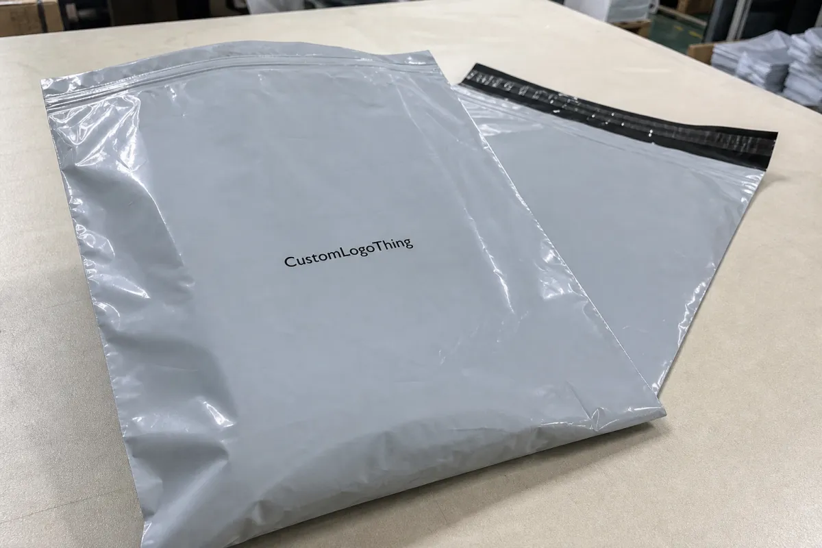
Poly Mailer Bags Logo Placement Guide for Brand Buyers
A logo can look perfectly centered on a PDF and still land badly on the finished mailer. That is the trap. This Poly Mailer Bags logo placement guide starts with the part buyers usually miss: the bag moves, stretches, seals, and gets labeled before anyone sees it on a doorstep.
What Logo Placement Actually Controls
Placement is not just a design choice. It decides what people notice first, whether the brand mark survives a shipping label, and how much the package feels like a branded mailer instead of a plain bag with a sticker slapped on later. A good placement plan has to work in motion, not only in a mockup.
Most buyers end up choosing between three zones: upper panel, center panel, or lower panel. Upper panel placement gives quick recognition and works well for unboxing photos. A centered logo can look cleaner and more premium on larger mailers, especially when the rest of the design stays minimal. Lower placement is less common, but it leaves more room for shipping labels, return details, or handling marks above the artwork. The right answer depends on the bag size, how the parcel will be packed, and how much of the front panel your operation will cover with labels.
Think of a poly mailer as a moving surface with constraints. Heat seals, side welds, gussets, and fill volume all change the usable space. A design that looks balanced on a flat artboard can shift once the mailer is stuffed, folded, and tossed into a tote or carton. That is why placement should be treated as a production decision. If the logo sits too close to a seam, it does not just look cramped. It looks like the mistake went to press on purpose.
“If the artwork touches the seal zone, the bag will advertise the mistake before it advertises the brand.”
That logic applies across Custom Poly Mailers and other Custom Packaging Products. The substrate changes. The job does not. The package still has to read fast, survive handling, and stay on brand after the warehouse gets involved.
How Artwork Reads on a Flat Bag vs a Filled Parcel
A flat bag shows every millimeter of the print area. A filled bag changes the geometry. The panel stretches, corners pull inward, and the shipping label starts competing with the brand mark for attention. That is why this kind of placement guide has to deal with two realities at once: what looks right in the proof and what reads clearly after fulfillment.
Front-panel branding usually performs best because it stays visible even if the bag is slightly overfilled or covered with a 4 x 6 shipping label. Centering can work for minimal layouts or lifestyle brands that want a quiet look. It still needs clearance from the top seal and from the side welds. Double-sided printing can help if the parcel will move through more touchpoints, but it adds risk. More sides mean more chances for registration drift, color mismatch, or a design that feels busy instead of confident.
The practical test is simple. Ask what the buyer sees in a product photo, what the warehouse team sees during packing, and what the customer sees on the doorstep. Good placement handles all three. Poor placement usually serves only one of them.
For transit durability, many teams borrow the mindset used in packaging testing by groups such as the ISTA community. Not because every order needs a lab report. Because vibration, stacking, drop handling, and abrasion are normal shipping realities. Artwork that survives those conditions usually has clean placement, enough margin, and a simple visual hierarchy. Fancy is fine. Fragile is expensive.
Logo Size, Safe Margins, and Print Limits
Start with the bag size, not the logo file. A mark that is too large leaves no breathing room. A mark that is too small disappears once the label goes on, the bag gets folded, or the parcel sits under another package in transit. The usable print window is always smaller than the full panel, and buyers get into trouble when they forget that basic fact.
On a standard bag, the safe zone often leaves out the top seal, side seams, and areas affected by gusset behavior. A 10 x 13 inch mailer may have only about 8.5 x 11 inches of truly safe space, depending on construction. That is not universal. Ask the supplier for the usable area on the exact bag you plan to order, not a generic template. Some vendors quote in inches, others in mil or microns. If you hear both in the same conversation, pause and confirm they are talking about the same film thickness before you compare anything else.
For reference, a 2.5 mil mailer is roughly 60 micron, but the number alone does not tell the whole story. Film quality, seal strength, and print surface all matter too. Two bags can share the same thickness and still behave differently under print pressure.
Color and contrast matter as much as size. A white logo on a black mailer can read sharply from a few feet away. A soft gray logo on silver film can disappear unless the light hits it just right. If the artwork includes a tagline, keep the hierarchy simple. The logo should do the heavy lifting. The rest should support it, not compete with it.
Here is a rule that saves time: if the logo contains fine detail, request a proof at true scale. PDFs can make delicate strokes look safer than they really are. Print does not reward optimism. It punishes it.
Ask for a label-safe zone too. A design that ignores the footprint of a shipping label usually looks fine right up until fulfillment starts covering the best part of the print. That is not a design flaw. It is a planning flaw.
Pricing, MOQ, and Quote Drivers
Placement choices affect cost more than many buyers expect. A larger print area takes more setup time and more ink. Two-sided printing adds registration control. A complex logo with thin lines or multiple colors can slow production and increase the chance of rework. A cheap-looking layout on screen can become the expensive version to produce.
MOQ usually tracks print method, bag size, and color count. A simple one-color logo on a standard stock size may start around 1,000 to 3,000 pieces. Custom sizes, special film colors, or multi-color artwork can push the minimum closer to 5,000 or more. That varies by supplier and press setup, but the pattern is consistent. More custom work usually means a higher bar to entry.
Quotes also hide details if you do not ask the right questions. Check whether the price includes screens or plates, proofing, freight, and any reprint protection for artwork errors. Those line items change the real cost fast. I have seen buyers compare two quotes that looked close on paper, only to find one had everything bundled and the other had every support step billed separately.
| Placement option | Best use | Typical cost impact at 5,000 pcs | Risk level |
|---|---|---|---|
| Upper front panel | Fast recognition, photo-friendly branding | Often base pricing for single-side print | Low if the safe zone is respected |
| Centered front panel | Minimal layouts and premium presentation | Usually near base price unless the art is large or multi-color | Medium, because label overlap is easier to trigger |
| Back panel print | Return info, secondary branding, discreet logos | Often similar to front-only pricing | Medium, since it can be ignored in the customer photo |
| Double-sided print | Stronger brand recall across handling points | Commonly adds about $0.03-$0.08 per bag, depending on setup and colors | Higher, because alignment matters more |
If you are comparing quotes, keep the spec list identical across vendors: bag dimensions, film thickness, print colors, placement location, and quantity. A supplier pricing a 2.5 mil white mailer with one spot color is not the same as one pricing a 3 mil tinted mailer with two-sided print and a custom label window. That sounds obvious. It still gets missed all the time.
Production Process and Turnaround
The production path usually starts with artwork review. The supplier checks resolution, file type, color count, and whether the logo sits far enough from the edges and seal areas. That first check matters because it prevents wasted proof cycles later. A poly mailer Bags Logo Placement guide only helps if it matches the actual production workflow, not the fantasy version where every file arrives perfect.
Next comes the proof stage. This is where you verify exact scale, panel orientation, and safe margins. I would also ask for the proof to show the bag filled and labeled, not just flat. That catches a lot: a logo sitting too low, text crossing a fold, or a QR code landing in a spot that nobody can scan cleanly. A flat proof does not always reveal how the package will behave once the seal is closed and the product is inside.
Turnaround depends on art readiness, sample requirements, and order size. Simple runs with final art can often move from proof approval to shipment in about 12 to 15 business days. More complex runs, or any order that needs a physical sample first, can take longer. Fast approval usually saves more time than asking for a rush after the design is already stuck in revision.
Production also includes plate prep, print registration, curing or inspection, packing, and outbound freight. If one of those steps changes late, expect the schedule to stretch. That is not supplier drama. It is how production behaves when the art is not fully locked.
For buyers who need a sustainability check, the EPA recycling guidance is a better reference than vague marketing claims. Poly mailers are not universally recycled curbside, and local rules vary. If your brand is making material claims, keep the language accurate. Trust falls apart quickly when the packaging copy sounds nicer than the package itself.
Placement Checklist for First-Time Buyers
The safest way to use a placement guide is to turn it into a checklist before the first proof leaves your inbox. The biggest mistakes happen when buyers approve art too quickly and assume the printer will center it. Centered relative to what? The flat panel, the filled bag, or the sealed edge? Those are not the same thing.
- Measure the usable panel. Mark the visible area before you upload artwork so the logo does not drift into the seal or seam zones.
- Pick one focal point. If the logo, tagline, web address, and icon all compete, the bag starts to feel crowded and the brand signal weakens.
- Mock up the filled bag. A flat rectangle hides proportion problems that a realistic bag shape will expose immediately.
- Reserve label space. Decide where the shipping label will sit so it does not cover the strongest part of the print.
- Check the outward-facing panel. Make sure the design faces the right direction when the bag is packed into a carton or tote.
- Approve at true scale. Zoomed-in PDFs can make tiny type look more durable than it really is.
If your order repeats every month, save the exact placement dimensions in a spec sheet. That avoids drift between reorders, especially if multiple people touch the file over time. Small changes compound fast. Move a logo down by a quarter inch, and suddenly the label overlaps the signature mark. Shift it again, and the design starts to feel accidental instead of intentional.
One more practical point: if you are using small Bags for Apparel, accessories, or subscription kits, do not try to fill every inch. A little negative space usually makes the brand look more expensive, not less. Buyers often expect more ink to mean more value. In packaging, restraint usually wins.
Common Mistakes That Make Mailers Look Off-Center
Printing too low is the fastest way to create a problem. Bottom-heavy artwork gets buried when the bag is full, and it can disappear even more once the parcel bends during packing or stacking. A guide like this should warn buyers that a design can be technically centered and still feel low, heavy, and awkward.
Ignoring the seal zone creates a different kind of failure. The top of the design feels cramped, and the print can look clipped once the mailer is closed. Side seams cause similar trouble. If a logo or letterform crosses a weld line, the result is rarely elegant. It usually looks like the artwork was squeezed after approval, because that is exactly what happened.
Busy layouts cause another common miss. On a small bag, too many elements turn the mailer into a slogan sheet. From a packaging buyer’s point of view, that is a weak trade-off. A clean logo, one supporting line, and maybe a discreet URL almost always read better than three lines of copy fighting for attention. Simplicity is not empty. It is easier to read at distance.
Skipping a real-size proof is the last big problem. Screen alignment on glossy film is not the same as alignment on paper. A tiny shift on a 2.5 mil or 60 micron mailer can change the whole look. The brand might still be there, but it will not feel finished. I would rather see one careful proof and one filled-bag test than three rushed revisions after production starts.
A centered logo on a flat file is not proof of a centered logo on a shipped parcel.
Expert Tips Before You Approve Art
Send vector artwork whenever possible, along with Pantone references if color match matters. Clean files reduce revision time and lower the odds of blurry edges, especially on small type or thin line work. If the artwork is raster only, ask whether the supplier wants 300 dpi at full size or higher. That small question can save a lot of back-and-forth.
Ask for a mockup that shows the bag filled, sealed, and labeled. That is the fastest way to catch a logo that sits too close to a fold or label zone. If the mailer will be handled by a 3PL, add their label placement requirements too. Operations should not have to fight the art.
If the order will repeat, document the final placement measurements in writing. I mean exact offsets from the top edge, side seam, and centerline. That is the difference between a reorder that matches the first run and a reorder that “looks close.” Close is usually not good enough for brand consistency.
Before you Request a Quote, gather the bag size, quantity, color count, file format, and preferred placement location. If you have a sample from another pack, include that too. The more specific the brief, the less the supplier has to guess. And for buyers comparing categories, it helps to keep the same logic across Custom Poly Mailers and broader Custom Packaging Products so the branding system stays coherent.
My honest view: the best designs are rarely the loudest ones. They are the ones that read instantly, survive handling, and make the pack look intentional from three feet away. That is the real test of a Poly Mailer Bags logo placement guide, and it is also the point where art stops being theoretical and starts doing actual work.
If you are still deciding, compare one proof, one sample, and one filled-bag test before you lock the order. That sequence usually catches the expensive mistakes early, which is exactly what a good placement process should do.
Frequently Asked Questions
How do I choose the best logo placement on poly mailer bags?
Place the logo where it stays visible after the bag is filled, sealed, and labeled. Keep it away from seams and the top seal so it does not look cramped or distorted.
What size should a logo be on a poly mailer bag?
Use the bag width as your starting point and leave clear margins on all sides. Test the design at true scale so small text and thin lines still read from a short distance.
Can I print on both sides of a poly mailer bag?
Yes, if the supplier supports it, but double-sided printing usually adds cost and registration complexity. Use both sides only when the second side adds real value, such as brand recall or handling instructions.
How long does custom poly mailer production usually take?
Time depends on proof approval, artwork readiness, order size, and whether the design needs revision. Fast approvals and simple artwork usually move the order through production faster than rush requests made late.
What should I send before asking for a quote on logo placement?
Send the bag size, quantity, print colors, artwork file, and your preferred placement location. Include any sample or mockup references so the supplier can price the order with fewer assumptions.

