A boutique orders clean, clear Slider Lock Clothing Bags. The bags arrive, the print is technically correct, and then the logo sits too close to the zipper track and looks crooked once a folded sweater is inside. Annoying? Yes. Fatal? No. Avoidable? Completely. This slider lock clothing Bags Logo Placement guide is about making the bag look intentional after it is filled, stacked, handled, photographed, stickered, and tossed into real fulfillment work.
What a Slider Lock Clothing Bags Logo Placement Guide Actually Solves
Slider lock clothing bags are resealable plastic apparel bags with a rigid sliding zipper closure. Brands use them for shirts, sweaters, uniforms, sample kits, subscription apparel, retail backstock, e-commerce returns, and reusable garment storage. They look simple. They are not.
Logo placement is not just graphic design on a flat rectangle. The final look is affected by side seams, bottom seals, zipper hardware, slider tabs, gussets, hang holes, vent holes, suffocation warnings, film thickness, product bulk, and how the garment settles inside the bag. A logo that looks perfect on a PDF can land across a hoodie fold like it lost a bar fight.
The real goal is practical: keep the brand visible, centered, scannable, and print-friendly without interfering with the closure or required labeling. That means your placement has to work on a packed bag, not only on a flat proof.
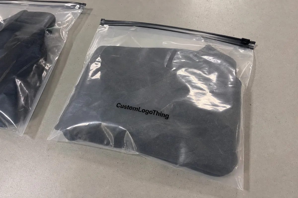
Flat artwork lies. Filled bags tell the truth. Always judge placement after the product is inside the bag, especially for hoodies, denim, uniforms, and thicker folded items.
From a packaging buyer's point of view, the cheapest print position is not always the smartest one. A low logo may save visual space near the zipper, but it can disappear under a warehouse label. A high logo may look clean on a mockup, then fight with the slider hardware. That is why a slider lock clothing bags logo placement guide matters before you approve plates, screens, or bulk production.
How Logo Placement Works on Slider Lock Apparel Bags
Most custom slider zipper apparel bags use one of six print zones: front panel center, back panel center, lower front panel, chest-style center below the zipper, lower corner placement, or repeat pattern coverage. Each option solves a different problem.
A centered front logo works for most apparel brands because it photographs well and reads quickly in a packing station. A lower corner logo feels more understated and can work nicely for premium basics, sample kits, or reusable storage bags. Back-panel printing is useful for care notes, recycling marks, barcode zones, reorder QR codes, or return instructions. Repeat patterns can look polished, but they increase print coverage and can make clear bags feel visually busy fast.
The risky zones are less glamorous but more expensive to ignore: slider track, slider tab travel path, heat seals, side seams, bottom seal, wicket holes, hang holes, and reinforced zipper areas. Keep fine text and thin linework away from those spots. Plastic moves during production. Registration can shift a few millimeters, sometimes more depending on bag size, film, and print method. If your logo depends on being exactly 0.12 inches from a seam, congratulations, you designed stress.
The slider closure also changes visual balance. A logo centered on the full flat bag can look too high once the top zipper strip dominates the design. That rigid slider tab has physical weight and visual weight. Leave breathing room below it.
Front-only printing is usually cleaner and cheaper. Two-sided printing makes sense if the back has a job: compliance text, a barcode area, recycling information, or a small QR code for reorders. Do not print the back just because empty space makes someone nervous.
Common print methods include screen Printing for Bold logos and moderate quantities, flexographic printing for larger runs, and digital labels or digitally printed alternatives for low-quantity testing. Clear, frosted, tinted, and opaque films all change contrast. A matte white logo on frosted LDPE can feel premium. A pale gray logo over a beige hoodie may vanish. Stunning, if invisibility was the brief.
Key Placement Factors: Bag Size, Garment Bulk, and Artwork Shape
Start with bag size. A 9 x 12 inch bag for a folded tee has a very different usable print area than a 14 x 18 inch bag for a hoodie. Bigger bag, bigger logo? Not automatically. Oversized logos on large plastic bags can look loud and cheap, especially if the product inside already creates wrinkles and glare.
Fill behavior matters more than most buyers expect. Folded garments create a raised center, rounded edges, trapped air pockets, and shifting contents. Place the logo where the surface stays reasonably flat after packing. For many shirts, that is the front-center zone below the zipper and above the lower fold. For bulky hoodies, it may be slightly lower or smaller than your first instinct.
Use safe zones. For small apparel bags, keep artwork at least 0.5 to 1 inch from seams, seals, and zipper hardware. For larger or thicker apparel bags, 1 to 1.5 inches is safer when the design allows it. These are not sacred numbers, but they prevent most ugly surprises.
Logo shape changes the answer. Horizontal wordmarks usually work best centered below the slider track. Tall stacked logos may need lower placement so they do not crowd the zipper. Round logos often sit well in a lower corner or centered over the garment fold. Long URLs and skinny taglines are the fragile little glass ornaments of Plastic Bag Printing. Treat them carefully.
| Bag Type | Typical Bag Size | Practical Logo Width | Suggested Safe Margin |
|---|---|---|---|
| Small tee or accessory bag | 9 x 12 in to 10 x 13 in | 3 to 5 in | 0.5 to 1 in from zipper and seams |
| Standard shirt or uniform bag | 11 x 14 in to 12 x 16 in | 4 to 7 in | 0.75 to 1.25 in from hardware and seals |
| Hoodie or sweater bag | 14 x 18 in to 16 x 20 in | 6 to 9 in | 1 to 1.5 in from stressed areas |
Opacity and contrast matter. White ink, black ink, metallic ink, and spot color behave differently on clear or frosted LDPE, PEVA, or similar flexible films. Thin lines and tiny type are usually the first details to look cheap. If your product colors vary across SKUs, design against the worst background, not the prettiest cream sweatshirt in the mockup.
Leave space for required markings too. Suffocation warnings, recycling symbols, material codes, and barcodes need their own zones. For recycling guidance and broader packaging claims, the EPA recycling resources are a useful starting point. Do not make legal copy compete with the logo unless chaos is part of the brand system.
Step-by-Step Process and Timeline for Approving Logo Placement
A good slider lock clothing bags logo placement guide should save time at proofing, not create a 19-email circus. Use a clean process.
- Confirm the bag specs. List exact width, height, material, film thickness, zipper style, slider color, hang hole, gusset, vent hole, and header area. A 2.5 mil frosted LDPE bag prints and handles differently from a thinner clear bag.
- Share the packed garment details. Give the supplier the folded dimensions and product type. Tees, hoodies, denim, uniforms, and mixed SKU programs do not fill the bag the same way.
- Send vector artwork. AI, EPS, or editable PDF files are best. PNG files can help as references, but they are not ideal for production unless the design is simple, high resolution, and approved for that use.
- Ask for a real dieline proof. The proof should show zipper track, slider location, seams, seals, hang holes, printable area, warning copy, and dimensions. A plain rectangle with your logo pasted in the middle is a guess wearing a suit.
- Review at actual size. Print the proof on paper, place it over a folded garment, and check balance after the product fills the bag.
- Lock the details before production. Approve ink color, logo width, distance from zipper, print side, back-panel information, and tolerance notes before screens or plates are made.
Typical timing depends on supplier workload and print method, but buyers can use these ranges for planning: artwork review often takes 1 to 2 business days, proof revisions add 1 to 3 business days, physical sampling can add 5 to 10 business days, and full production may run several weeks depending on quantity, material availability, and whether plates or tooling are required.
For shipping validation, especially if the bags are part of a larger e-commerce packout, standards from ISTA can help teams think about compression, handling, and transport testing. A slider bag does not live in a showroom. It gets packed, squeezed, scanned, shipped, returned, and sometimes abused by gravity. Plan accordingly.
Cost, Pricing, and MOQ Tradeoffs for Printed Slider Lock Bags
Cost is driven by bag size, material thickness, zipper style, slider color, print method, ink count, print coverage, quantity, and setup requirements. If two quotes are far apart, one supplier may be quoting a thinner film, smaller imprint, looser registration, or different closure. Same bag name. Not the same bag.
Custom printed slider lock clothing bags often start in the low thousands for efficient production. Some larger operations prefer higher MOQs for flexographic printing because setup time, plates, and material changeovers need enough volume to make sense. Smaller test runs may use labels, stock bags, or digital alternatives. Not as polished, but useful before you commit to 10,000 bags with a logo sitting in the wrong zip code.
A 1-color front logo on a standard clear bag is usually the lowest-cost branded option. Two-side printing, full-coverage patterns, metallic inks, custom slider colors, thicker films, and custom opacity raise the unit price. Setup costs for screens, plates, color matching, and sampling can make small orders feel expensive. That does not mean the factory is inventing fees for fun. Custom packaging has labor before the first bag exists.
| Option | Typical Use | Cost Impact | Buyer Advice |
|---|---|---|---|
| 1-color front logo | Most apparel brands and e-commerce orders | Lowest custom print cost | Choose strong contrast and correct placement first |
| 2-color or 2-side print | Retail presentation, QR code, care notes, return info | Moderate increase from extra setup and registration | Use the back panel for functional content |
| Full pattern or large coverage | Premium drops, influencer mailers, subscription packs | Higher ink use and tighter proofing needs | Test glare and readability before bulk approval |
| Stock bag plus label | Small tests, events, early brand validation | Lower setup, higher manual labor per unit | Good for pilots, not always ideal for scale |
Price ranges vary by size, country, freight, resin cost, and order volume, so treat any number without specs as decoration. As a rough planning range, a simple 1-color printed apparel slider bag at several thousand units may land around $0.18 to $0.45 per unit for common sizes, while thicker frosted bags, larger hoodie formats, two-sided printing, or premium sliders can push higher. Sampling and setup may add separate charges from roughly $50 to several hundred dollars depending on method.
If budget is tight, prioritize correct logo size and high contrast over extra ink colors. A crisp one-color logo beats a muddy four-color print every day. Pay more for frosted film, heavier gauge plastic, two-sided artwork, or custom slider colors only when the bag supports a retail experience, subscription drop, premium apparel line, or reusable storage purpose.
Common Logo Placement Mistakes That Make Clothing Bags Look Cheap
The first mistake is placing the logo too close to the slider track. The brand fights the zipper, and the zipper usually wins because it is three-dimensional and visually loud. Keep the logo below the hardware with enough air to look deliberate.
The second mistake is using a logo that is too large. Bigger is not branding. Sometimes it is just shouting through plastic. Leave enough breathing room so the bag still feels premium and the garment remains visible.
Third, buyers ignore the garment fold. A centered logo on an empty bag can land across a bulky fold, pocket, hood edge, collar, or trapped air bubble once packed. Do a filled-bag check. It takes minutes and can save thousands of units of regret.
Fourth, low-contrast ink causes trouble. Pale ink on clear plastic over mixed garment colors is risky. If the bag will hold black, beige, red, navy, and heather gray products, the logo has to survive all of them. Design for the hardest background.
Fifth, tiny text gets abused. Taglines, URLs, QR codes, and social handles need minimum size and clean space. Plastic is not a business card. Fine type near a wrinkle or seal can look fuzzy even if the printer did nothing wrong.
Sixth, operational labels get forgotten. Warehouses often need SKU stickers, barcode labels, return labels, size dots, or inspection marks. Reserve clean zones for them so they do not cover the logo. It sounds obvious after the fact, which is the most annoying category of obvious.
Seventh, teams approve only a digital mockup. Mockups are useful. They do not show glare, wrinkles, film haze, packed garment thickness, slider shadow, or how the bag looks in a shipping bin under fluorescent lighting.
Expert Tips for Cleaner Proofs, Better Print, and Fewer Revisions
Ask the supplier to show measurements from the zipper track, side seams, and bottom seal. Vague placement notes like “centered” leave too much room for interpretation. Centered to what: full bag height, printable area, garment fold, or visual center after the slider is included? Those are not the same.
Keep primary logos away from moving and stressed areas. The slider path, zipper strip, top header, side seams, and bottom seal get handled repeatedly. Fine details there may scuff, warp, or look crowded. A normal production shift of a few millimeters should not ruin the design, so build tolerance into the layout.
Use a filled-bag test before final approval. Print the logo at actual size on paper, tape it lightly to a real packed bag, photograph it straight-on and at a 45-degree angle, then check readability in normal room light. If it fails that test, the bulk order will not magically improve.
Choose artwork based on print reality. Bold marks, clean line weights, simplified icons, and limited colors usually print better on flexible plastic than delicate gradients, tiny distressed textures, or hairline details. If your brand mark has a complicated version and a simplified version, send both. Let the supplier recommend what will hold.
Create a hierarchy: front panel for the logo, back panel for care notes or QR code, lower corner for recycling information. This keeps the front clean and prevents the bag from looking like a crowded takeout menu.
Match ink finish to material. Matte white on frosted film feels soft and premium. Gloss black on clear film feels sharper and more retail. Metallics can work, but they need testing because reflection can reduce readability. If you are paying for metallic ink and customers have to tilt the bag like a secret decoder ring, rethink it.
Request production tolerance notes in writing. A small shift within tolerance is not a defect. That is normal manufacturing. The smart move is designing logo placement that still looks good within that tolerance.
Next Steps Before You Send Artwork to a Bag Supplier
Create a simple spec sheet before asking for a quote. Include bag width, bag height, material type, film thickness, slider color, zipper style, quantity, print colors, print sides, packed garment type, and any hang hole or vent hole requirements. Five extra minutes here can prevent five days of clarification.
Mark preferred logo placement in inches, not just with a screenshot. Include the distance from the top zipper track, desired logo width, and whether the logo should be visually centered over the packed garment or mechanically centered on the flat bag. Those are different instructions.
Prepare two artwork versions if possible: one full-size brand mark and one simplified print-friendly mark. Vector files such as AI, EPS, or editable PDF are the safest. Convert fonts to outlines or include font files so the logo does not shift when the supplier opens it.
Ask for three things before approval: a dieline proof, print tolerance, and production timeline. If a supplier cannot provide those basics, enjoy your surprise bag order.
- Check logo position: clear of zipper, slider tab, seams, bottom seal, and hang holes.
- Check filled appearance: centered after packing, not just on the flat proof.
- Check readability: strong contrast over every garment color in the range.
- Check operations: space left for SKU labels, barcode stickers, return notes, and warnings.
- Check production details: ink color, print side, logo width, tolerance, and proof approval date.
Use This Slider Lock Clothing bags logo placement guide as the pre-quote checklist so artwork, pricing, proofing, and production stay aligned before money is on the table. That is the whole point: fewer surprises, cleaner bags, and a logo that still looks like someone meant it after the product goes inside.
FAQ
Where should a logo go on slider lock clothing bags?
For most apparel bags, place the logo on the front panel below the slider track, centered over the flattest part of the folded garment. Keep it at least 0.5 to 1 inch away from the zipper, seams, and bottom seal on smaller bags. Use more space for larger bags, bulky garments, gussets, or thicker films. If the bag needs barcode labels, warning text, or SKU stickers, reserve those areas before finalizing the logo position.
How big should the logo be on custom slider zipper apparel bags?
Small clothing bags often work well with a 3 to 5 inch wide logo. Medium bags usually need 4 to 7 inches. Oversized hoodie or sweater bags may use 6 to 9 inches depending on the brand style, logo shape, and film finish. Test the logo at actual size on a filled bag before approving the proof.
Does logo placement affect the cost of slider lock clothing bags?
Yes. Placement can affect cost if it requires two-sided printing, larger print coverage, extra ink colors, tighter registration, or special setup. A simple one-color front logo is usually the most cost-efficient custom print option. Moving artwork away from seams and zipper hardware can also reduce proofing problems and production headaches.
What artwork file is best for printed slider lock clothing bags?
Vector files such as AI, EPS, or editable PDF are best because they scale cleanly and give the printer usable linework. High-resolution PNG or JPG files may work for reference, but they are not ideal for production setup. Convert fonts to outlines or include font files so the logo does not shift when the supplier opens the artwork.
How long does the logo approval process take for slider lock apparel bags?
Basic artwork review can take 1 to 2 business days if the specs and files are complete. Proof revisions often add 1 to 3 business days, while physical sampling can add 5 to 10 business days or more. Full production timing depends on quantity, print method, material availability, and whether custom plates, screens, or tooling are needed.

