Premium Cuffed Beanies logo placement looks like a small decision on paper, but it affects how the hat reads in real use. The cuff changes the available space, the knit changes how sharp the edges stay, and the fold can shift the mark once the beanie is worn. A proof can make the layout look simple; production often exposes the parts that need measurement.
Buyers usually see the problem in one of two ways: a logo that looked centered in the mockup lands too high on the finished hat, or fine detail disappears into the knit. Both issues are common, and both are easier to prevent than correct. That is why placement should be treated as a production spec, not a loose visual preference.
For sourcing teams, the useful questions are practical: where should the logo sit, which decoration method suits the knit, how much will it cost, what MOQ applies, how long will approval take, and what inspection points matter before shipment. Those are the details that decide whether the order is clean or needs rework.
What Premium Cuffed Beanies Logo Placement Really Changes
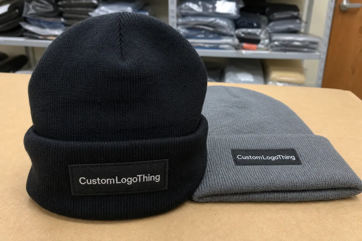
The cuff is usually the best branding zone because it is flatter and more stable than the knit above it. A logo on the cuff typically reads better from a distance, holds its shape more reliably, and stays visible when the wearer moves. On premium pieces, that matters as much as appearance because buyers expect the finish to look intentional.
Placement also changes the feel of the hat. A centered front-cuff mark looks classic and retail-ready. A slight offset can feel more fashion-forward if the measurement is deliberate. Side placement is quieter and works best for smaller marks or secondary branding. The same logo can look strong, subtle, or awkward depending on where it sits.
There is also a technical side. A mark too close to the fold may bend. A mark too near a seam may read off-center even when it was stitched correctly. On a stretchy knit, that distortion becomes more visible once the hat is worn. What looks acceptable flat can shift noticeably on the head.
For most buyers, the choices narrow to a few practical formats:
- Front-center cuff embroidery for the clearest everyday brand read.
- Slightly off-center placement for a more editorial look when measured carefully.
- Side placement for restrained branding or horizontal marks.
- Patch decoration for sharper edges and better contrast on textured yarn.
A beanie logo works best when it looks inevitable. If the viewer notices the placement before the brand, the layout is doing too much work.
That is especially true on Premium Cuffed Beanies because the decoration is part of the product identity, not an afterthought. The more considered the placement, the less the buyer has to explain it later.
How the Decoration Sits on a Cuffed Beanie
A cuffed beanie gives you a few distinct zones: the folded cuff, the body above it, the side panels, and the seam area. Each behaves differently. The cuff is usually the safest location because it is flatter and less distorted. The body above the cuff can work for taller motifs, but it follows the curve of the head more closely. Side panels are useful for small marks, labels, or secondary branding.
The decoration method matters as much as the location. Embroidery is common because it is durable and familiar, but dense fills can pucker if the artwork is too large for the knit. Woven labels hold small detail better and lie flatter. Patches create stronger contrast and a cleaner edge, whether woven, embroidered, PVC, or faux leather. Applique adds dimension, but it also requires more careful sewing and alignment.
Flat artwork rarely shows the full result. A beanie stretches over the head, and the logo moves with the fabric. That is why a good proof should show both a flat view and a worn view. The flat view confirms the technical position. The worn view shows what the customer will actually see.
Material and construction also affect the outcome. A thick rib knit with a tall cuff can support a larger logo. A lighter gauge knit usually needs a narrower width and simpler detail. Acrylic, wool blends, and recycled yarns behave differently under stitching, so the same logo may need a different size or method from one style to another.
That is why placement should be written as a measured spec. Clear measurements reduce revisions, and they make it easier for the buyer and supplier to align before sampling starts.
Cost, Pricing, and MOQ for Logo Placement
Pricing usually starts with the decoration method and then moves into setup, stitch count, color count, and whether the logo appears in one location or multiple. A simple front-cuff embroidery is usually the most efficient option because the digitizing is straightforward and the production flow is predictable. Add a second location, a layered patch, or more complex art, and the quote rises because the order needs more labor and more checks.
For bulk orders, a basic embroidered front logo often lands around $0.90 to $1.80 per piece at higher quantities. That range changes with order size, stitch density, thread count, and the underlying hat cost. Smaller runs are usually more expensive per unit because setup is spread across fewer pieces. Patches can cost more depending on material, backing, and finishing.
MOQ, or minimum order quantity, is mostly about setup efficiency. Depending on the style and decoration method, the minimum may be 100, 200, 300, or more. Lower quantities are sometimes possible, but the unit price usually rises because the same setup work is divided across fewer hats.
Ask about the costs behind the headline price:
- Artwork conversion if the logo is not ready for embroidery or patch production.
- Digitizing if the design needs stitch instructions.
- Sample or strike-off fees if physical approval is needed.
- Rush charges if the schedule leaves little room for revision.
- Private labeling for custom tags, hang tags, or retail packaging.
| Decoration option | Typical use | Approx. unit cost impact | Best fit |
|---|---|---|---|
| Flat embroidery | Front cuff logo | Lowest to moderate | Clean brand read, classic retail feel |
| Woven patch | Front or side placement | Moderate | Small text, fine details, smoother edges |
| Leather or faux leather patch | Front cuff centerpiece | Moderate to higher | Premium look, simple mark, strong contrast |
| Applique or layered patch | Fashion-led custom programs | Higher | Dimensional branding and tactile finish |
Packaging can add line items many buyers do not expect. FSC-certified paper is a straightforward choice if the brand wants a verifiable paper standard, and cartons should be sized for the folded beanie format so the decoration is not crushed in transit. On retail programs, that matters because a flattened cuff or damaged patch can trigger rework.
It helps if decoration, labeling, and packing move through one approval flow. When those steps are split across too many handoffs, the order takes longer and the chance of inconsistency rises. One proof, one measured placement guide, and one pack-out standard usually produce a cleaner result than several partial approvals.
Production Process and Timeline for Approval
Strong production starts with specific inputs: artwork, hat style, quantity, placement, thread or patch specs, and any private labeling details. Vague direction slows everything down. "A little higher" or "closer to the front" can mean different things to different operators, and that ambiguity often shows up in the finished run.
The best proof includes actual measurements: distance from the cuff edge, the centerline, and the nearest seam. If the proof only floats a logo on a generic beanie silhouette, the buyer has to guess. A measured guide makes approvals faster because merchandising, operations, and design are reacting to the same layout.
After approval, the sequence is usually predictable: digitizing or setup, sample or strike-off if required, bulk decoration, finishing, packing, and shipment. For simple embroidery, the decoration stage can move quickly once the proof is signed off. Delays usually happen earlier, when artwork is cleaned up or placement is revised.
Typical lead times vary by method and quantity, but a straightforward order with approved artwork often takes 12 to 15 business days after proof approval. Multi-location decoration, patch construction, custom packaging, or detailed revisions can extend that window. Rush orders are possible, but they leave less room for correction.
Quality control should cover stitch consistency, thread tension, patch alignment, logo centering, and color matching before packing. If the order includes labels or printed components, those should be checked too. A small shift in any of these details can change how premium the final product feels.
Key Factors That Control Visibility and Wear
Logo size is one of the easiest variables to get wrong. On many cuffed beanies, a front logo around 2.0 to 3.25 inches wide is readable without overpowering the cuff, though the right size depends on the artwork and the knit. Thin type usually needs more width. Dense icons may need less. If the logo is too small, texture swallows it. If it is too large, the fold starts to feel crowded.
Contrast matters just as much. Dark thread on a dark beanie can look refined, but it may disappear at a distance. Higher contrast improves readability, though it can also make the branding feel louder than intended. Finish changes the read too. Matte thread gives a softer look. Slightly shinier polyester thread feels sharper and more energetic. Neither is better in every case.
Seams need respect. If the logo sits too close to a seam line, the knit can warp the shape as the beanie stretches. Head shape matters as well. A snug fit pulls harder across the front than a relaxed one, so a centered logo can appear curved once worn. That is why a proof should be judged in both flat and worn states.
Audience changes the ideal placement. Retail merchandise usually benefits from stronger front-facing visibility because the hat itself is part of the brand story. Corporate gifts often work better with a smaller, more restrained mark. Uniform use sits in the middle and usually needs a clear read without oversized branding. Placement should follow the use case, not a habit carried over from another product.
A simple way to think about it:
- Retail: prioritize shelf visibility and photo clarity.
- Staff wear: keep the mark readable but balanced.
- Executive gifting: reduce size and use stronger material finishes.
- Event merchandise: favor instant recognition from a few steps away.
Most buyers see beanies in quick photos, folded stacks, or on moving people outdoors. That means the first second matters more than the tenth. Placement should work immediately.
Common Mistakes That Make Beanie Logos Look Off
The first mistake is centering the logo to the fold instead of the true front panel. That seems close on paper, but the fold can shift slightly once the hat is worn, and the logo reads crooked. Human eyes catch that imbalance fast.
The second mistake is approving a proof that does not match the actual hat style. Cuff height, knit density, and yarn color all affect the final read. A logo that looks balanced on a white mockup can disappear on charcoal. A wide mark that feels elegant on a tall cuff can look cramped on a shorter one.
The third mistake is preserving too much detail. Thin lines, tiny text, and fine gradients can collapse on knit surfaces. Embroidery fills in. Woven labels hold detail better, but only up to a point. Patches improve contrast, though tiny copy can still become unreadable from normal viewing distance. On a beanie, simplicity usually wins.
The fourth mistake is treating off-center placement as if it were accidental. Off-center can be excellent when the measurements are consistent. It looks sloppy when the seam, fold, and logo angle vary across the order. The difference between editorial and messy is often less than a quarter inch.
Packing can create a final problem after production. If the beanies are folded too tightly, compressed for too long, or packed with a heavy insert pressing on the decoration, the cuff can lose shape and the logo can arrive distorted. Packaging is part of how placement survives shipment.
Expert Tips and Next Steps for a Cleaner Order
Ask for a real-size placement guide, not just a loose visual. The guide should show the distance from the cuff edge, the centerline, and the nearest seam. If multiple styles are involved, request separate guides because a placement that works on a tall cuff may not work on a shorter one.
Review both a flat proof and a worn mockup before approving the run. The flat proof confirms technical location. The worn mockup shows how the logo reads on a person. Those are different questions, and they catch different mistakes.
Choose the decoration method for the finish you want, not only the lowest quote. Embroidery gives texture and a familiar premium look. Woven patches are better for fine detail and a flatter presentation. Leather or faux leather patches create stronger contrast. Applique adds dimension but increases complexity. The right choice depends on artwork, knit, and quantity.
For most bulk programs, the cleanest sequence is simple: confirm artwork, placement, quantity, method, and lead time in the same approval round, then sign off on a sample or proof before production. That reduces surprises and keeps the order consistent across the full run.
The value is predictability. The hat still feels easy to wear, the branding still reads clearly, and the placement looks deliberate from a distance and calm up close. In a category where texture, stretch, and fold lines all compete with the logo, that discipline matters.
What is the best logo position on cuffed beanies for a clean look?
Centered on the front cuff is the most common choice because it offers strong visibility and usually reads well in photos and on wearers. If a brand wants a softer or more fashion-led result, a carefully measured off-center placement can work, but it should still be tied to the true front panel rather than the fold alone.
How big should a logo be on premium cuffed beanies?
The most practical size depends on cuff height, knit scale, and logo complexity, but many front placements fall around 2.0 to 3.25 inches wide. Smaller text and thin strokes should be simplified first because knit texture can swallow fine detail faster than a flat garment panel would.
Does cuff height change logo placement on cuffed beanies?
Yes. A taller cuff gives the logo more vertical room and often supports a larger or slightly higher placement. A shorter cuff has less space and usually needs a tighter layout. The same artwork can look balanced on one style and crowded on another if the cuff height changes by even a small amount.
What affects pricing for logo placement on beanies?
Pricing is usually shaped by decoration method, stitch count, color count, setup work, and whether the logo appears in one place or several. MOQ matters too, because smaller runs carry more setup cost per piece. Patches, digitizing, and special packaging can all push the unit price upward.
How long does production usually take after approval?
A straightforward order with approved artwork often takes about 12 to 15 business days after proof approval. More complex decoration, extra placement revisions, custom labels, or special packing can extend that timeline. Rush orders are possible, but they leave less room for correction and can increase the chance of compromise.

