Premium Cuffed Beanies Logo Placement Guide: Why the Cuff Changes Everything
The logo usually is not printed on the beanie body. It sits on a folded cuff that moves, stretches, and changes shape on a real head. That is why a Premium Cuffed Beanies logo placement guide is useful before anyone approves artwork.
Cuffed beanies look simple from ten feet away. One knit hat. One folded edge. One logo. Easy, apparently.
Not really. The branding surface is small, curved, stretchy, and affected by how the wearer folds, pulls, or adjusts the cuff. A logo that looks balanced on a flat mockup can sit too low once the hat is worn. A patch that technically fits can still look crowded. A beautiful brand mark can turn into a fuzzy blob if the method does not match the knit.
Premium beanies give you several practical logo zones: centered front cuff, left or right offset cuff, wraparound woven label, side seam tag, back cuff mark, and crown embroidery on certain shapes. Each one says something different. Center front is classic and visible. Offset placement feels more retail. Side labels are quieter. Back cuff marks are secondary. Crown embroidery can work, but only if the beanie has enough structure and the logo is simple enough to survive the surface.
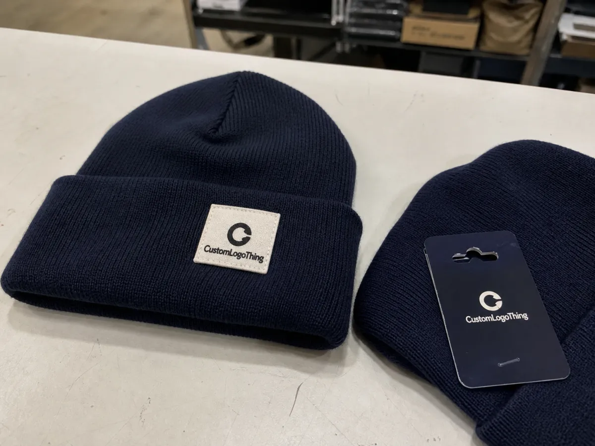
Premium does not mean louder branding. This is where many merch buyers lose the plot. A nicer beanie often looks more expensive with a smaller woven label, clean leatherette patch, or tight embroidery than with a giant front patch yelling from someone’s forehead.
The goal is not to decorate every available inch. The goal is to make the beanie look intentional, wearable, and aligned with the brand. A half-inch too low can make a good hat look like bargain-bin merch. Dramatic? Maybe. Still true.
How Logo Placement Works on Cuffed Beanies
The cuff creates a double-layer area. That extra layer gives decoration more structure than the stretchy crown of the hat. It can support embroidery, sewn patches, woven labels, leatherette labels, rubber patches, or printed fabric labels without collapsing into the knit as easily as a single-layer area.
Embroidery is durable, familiar, and usually efficient for simple marks. It works best for icons, short wordmarks, clean block lettering, and logos without tiny internal details. Fine lines under about 0.04 inches can fill in, especially on ribbed acrylic or chunky knits. If your logo relies on hairline strokes, delicate script, or a tiny tagline, embroidery may not be your friend.
Patches add texture and a more retail-ready finish. Woven patches handle small type better than direct embroidery. Leatherette patches look polished and work well for outdoor, hospitality, lifestyle, and corporate gift programs, but the artwork needs clean lines. Tiny distress marks, gradients, and photo-like shading rarely translate well. Rubber patches can look sharp and modern, though they often require higher minimums, custom molds, and careful edge placement.
Production teams measure placement more literally than buyers expect. Center front usually aligns to the wearer’s nose line. Side placement is measured from the center front, from a seam, or from a defined side point. Vertical placement is usually measured from the lower cuff edge, not from a vague “make it look good” zone. A common front cuff patch might sit 0.25 to 0.5 inches above the bottom edge, depending on cuff height and patch size.
Supplier translation: “Put the logo where it looks good” means “please guess, then accept blame later.” Charming. Also useless.
Cuff height controls the safe branding area. A 3-inch cuff gives more room than a shallow 2-inch fold, but oversized marks can still look clumsy. A 2.25-inch-tall patch on a 3-inch cuff leaves almost no breathing room. It may fit on paper. That does not mean it looks premium.
Flat mockups help, but they are not enough. A logo that appears centered on a flat product shot may shift visually when the beanie wraps around a head. Review the placement on a worn sample, shaped product image, or at least a mockup that shows the cuff in its actual folded form. The product people approve on screen should resemble the product people will wear. Radical concept.
Key Factors That Decide the Best Logo Position
Start with the logo shape. Horizontal logos usually work better as woven labels, leatherette patches, rectangular embroidered patches, or low-profile applique. Tall icons can work well as centered embroidery, especially if the mark stays under about 1.75 inches tall and has clean internal spacing. Detailed seals, tiny taglines, and thin script often need to be simplified or moved to a woven patch.
Use case matters. Retail merch needs to look like something a person would buy with their own money. Employee uniforms need consistency and visibility from 6 to 10 feet away. Outdoor events need stronger contrast because photos, weather, shadows, and movement reduce clarity. Luxury kits usually benefit from restraint: smaller mark, better material, cleaner finish.
The knit texture can make or break the logo. Ribbed knits stretch in columns, so straight horizontal lines may wobble slightly. Waffle knits have more surface variation. Chunky acrylic can swallow detail. Cotton blends tend to feel smoother, though they may not carry the same winter weight. Wool blends look elevated, but texture and shrink behavior can vary. Not every beanie is a clean canvas. Some are more like a tiny knitted obstacle course.
Material also affects perceived value. Basic acrylic is common, affordable, and easy to source in stock colors. Recycled acrylic can be a good option when the supplier can document the content and the hand feel passes review. Wool and wool blends can feel warmer and more refined, but they may cost more, require tighter care instructions, and behave differently across dye lots. Cotton blends can work for milder climates or indoor retail, though they often feel less insulated.
Color contrast deserves plain talk. If the logo and beanie are both charcoal, congratulations, you made a secret logo. That may be fine for subtle executive gifts, but it will disappear in event photos and retail thumbnails. For most buyer scenarios, aim for clear contrast within approved brand colors: cream on navy, black on heather gray, tan leatherette on forest green, white woven label on black.
Wearer behavior also counts. People roll cuffs higher. They flatten them. They wear beanies slouched. They tug them down over cold ears. Placement should survive normal human use, not just a catalog photo with a perfectly symmetrical mannequin head.
Brand guidelines add another layer. Check clear space, minimum logo size, approved colors, and alternate marks. A supplier can quote more accurately with vector artwork, usually AI, EPS, SVG, or production-ready PDF. A screenshot pulled from a slide deck is not artwork. It is a cry for help.
Quantity matters too. A 48-piece stock beanie embroidery order has different options than a 1,000-piece custom-knit program with private labels and branded packaging. Small runs should avoid expensive tooling unless the look truly justifies it. Large programs should test placement more carefully because small errors multiply fast.
Cost, Pricing, and MOQ by Placement Method
Logo placement affects price because it changes the decoration method, setup, stitch count, patch type, application labor, and sometimes reject rate. A centered front embroidery on a stock cuffed beanie is usually efficient. A custom rubber patch sewn on the left cuff with a side woven label and individual belly band packaging is a different animal.
For simple logos, embroidery is often cost-effective. A small one-location embroidery order on stock beanies may start around 24 to 72 pieces, depending on the supplier, blank availability, and season. Stitch count drives cost, so a 5,000-stitch icon behaves very differently from a dense 14,000-stitch crest. More thread, more machine time, more chances for the knit to pull. None of that is free.
Woven, leatherette, and rubber patches usually add setup and application cost. Woven labels are strong for small type and clean detail. Leatherette patches are often laser-etched, debossed, or printed, with heat-press or sewn application depending on the patch and blank. Rubber patches can look crisp and dimensional, but custom molds may push minimums higher, often 100 to 300 pieces or more.
| Placement Method | Best For | Typical MOQ Range | Cost Behavior |
|---|---|---|---|
| Center front embroidery | Simple logos, uniforms, events | 24-72 pieces on stock styles | Setup plus stitch count; usually efficient for one location |
| Offset woven patch | Retail merch, fine details, small type | 100-250 pieces depending on patch supplier | Patch setup, patch unit cost, sewing labor |
| Leatherette cuff patch | Premium gifts, outdoor brands, lifestyle merch | 72-250 pieces depending on blank and patch | Material, engraving or debossing, application labor |
| Side seam woven tag | Subtle branding, retail labels, private label programs | 100-500 pieces for custom labels | Label production and sewing; low visual impact but polished |
| Rubber patch | Bold icons, outdoor goods, modern merch | 100-300+ pieces | Mold or setup cost; higher upfront cost but strong durability |
Unit cost depends on the beanie blank quality, cuff construction, number of logo locations, thread colors, patch material, backing type, packaging, and shipping method. A stock acrylic beanie with one embroidery location may land in a very different range from a wool blend beanie with a Custom Woven Label, FSC-certified hangtag, and individual recycled polybag.
If the budget is tight, reduce logo locations before reducing beanie quality. A cheap beanie with a fancy patch still feels cheap. Nobody is fooled. One clean front cuff patch on a better blank usually beats four branding hits on a scratchy hat.
Ask suppliers to separate product cost, decoration cost, setup fees, sample fee, MOQ, lead time, packaging, freight, and overage or underrun policy. Blended pricing can hide the real cost driver. If the number jumps, you want to know whether the issue is the patch mold, second location, rush freight, carton labeling, or the special packaging someone added after the quote was already “final.” Always fun.
For packaging claims, review guidance from the EPA Sustainable Materials Management hierarchy. For paper tags, sleeves, or retail cartons tied to forest-based materials, FSC certification is a useful standard to understand. Do not rely on vague recycled or eco language without documentation.
Process and Timeline From Artwork to Finished Beanies
A clean beanie order follows a predictable path: artwork review, placement recommendation, quote, digital proof, pre-production sample if needed, approval, bulk decoration, quality control, packing, and shipping. Skip steps and you may save two days now, then lose two weeks fixing avoidable problems. Excellent strategy, if the goal is stress.
Stock beanies with simple embroidery are usually the fastest. Many suppliers can move after proof approval within several business days to two weeks, depending on queue, quantity, and season. Peak winter demand can slow everything down. Custom patches, custom colors, private labels, dyed yarn, imported goods, or specialty trims add lead time. A custom-knit program can require several weeks because yarn sourcing, knitting, labeling, finishing, inspection, packing, and freight all stack together.
Artwork readiness speeds the process. Provide vector files, Pantone colors, final logo size, and placement notes. If brand colors have thread equivalents, include them. If not, approve the closest available thread or patch color before sampling. Pantone 186 C does not automatically become the same red in thread, woven yarn, leatherette, rubber, and printed packaging. Materials interpret color differently.
Proofing is not a ceremonial checkbox. Check logo scale, placement measurement, thread or patch colors, spelling, orientation, and whether the mark sits above the lower cuff edge cleanly. Look for balance. A centered patch that is technically centered but visually too low will still look wrong.
Quality-control checks should include more than “logo exists.” Inspect stitch density, loose threads, patch alignment, puckering, label angle, cuff height consistency, color match, and whether the beanie can be worn without the decoration twisting off-center. For larger orders, ask how many pieces are inspected and what tolerance applies to placement variation. A 1/8-inch shift may be acceptable on knit goods. A crooked patch that looks drunk is not.
Request a physical sample for retail launches, paid merch, influencer kits, premium client gifts, or any order where brand perception matters more than saving a few days. Sample fees vary widely, and some suppliers credit them back on bulk orders. Either way, one sample is cheaper than explaining 500 ugly beanies to your boss.
Approval responsibility is real. Once a proof is approved, changing placement can cause delays, rework fees, or unusable goods. Harsh, but true. A supplier may catch obvious issues, but they are not your brand manager, legal team, and merchandising director rolled into one.
Build buffer into the deadline. Holidays, weather, customs, freight congestion, blank shortages, and internal approval spirals all happen. If the beanies need to be in hand for an event, work backward from the delivery date and leave several business days for inspection, sorting, and any last-minute distribution needs.
Step-by-Step Placement Brief for Your Supplier
A good brief saves money because it removes guessing. Use the checklist below before requesting a final quote or proof.
- Choose the beanie style. Specify cuff height, material, color, size range, and whether the cuff is fixed or adjustable. A 3-inch fixed cuff behaves differently from a loose roll cuff.
- Choose the decoration method. Use embroidery for simple marks, woven labels for fine detail, patches for premium texture, and side tags for subtle branding.
- Specify logo size. Use inches or millimeters. “Medium” is not a production spec. It is a sandwich size.
- State exact placement. Say centered front cuff, left offset, right offset, side seam, back cuff, or crown. Add distance from the lower cuff edge or center line when possible.
- Provide production artwork. Send vector art, approved colors, clear space rules, minimum size requirements, and alternate marks if available.
- Request the right proof. Ask for a front view and close-up placement view. For premium runs, ask for a photo sample before bulk production.
- Check a shaped view. Approve only after judging scale on an actual head-shaped view, not just a flat rectangle mockup.
Here is a strong example: “Use the navy ribbed cuffed beanie with a 3-inch cuff. Apply the cream woven patch centered on the front cuff, patch size 2.25 inches wide by 0.75 inches tall, bottom edge of patch 0.4 inches above lower cuff edge. Use attached vector logo and match Pantone 7499 C as closely as woven thread allows.” That is a supplier brief. Short. Specific. Useful.
A weak example: “Put our logo on the front and make it look premium.” That is not a brief. That is a wish.
If the order has multiple colors, specify whether the same patch, thread, or label applies to every beanie color. A cream patch may look great on navy and terrible on oatmeal. If the program includes several beanie colors, request a proof for each colorway or approve a decoration system that works across the full range.
Common Logo Placement Mistakes That Make Beanies Look Cheap
The first mistake is making the logo too large. Oversized cuff logos can pucker, distort, or dominate the product in a very trade-show-freebie way. Most premium cuff logos need breathing room above and below the mark. If the patch almost touches both cuff edges, it is probably too tall.
Another mistake is ignoring cuff fold height. If the wearer folds the cuff differently, a poorly placed mark can sit too low, too high, or partly disappear. Fixed cuffs are easier to control. Adjustable cuffs require more caution because people do not wear them like factory drawings.
Detailed artwork in embroidery creates predictable trouble. Small type, gradients, thin outlines, and seals often stitch poorly on knit fabric. A woven label or patch can preserve detail better. The result may cost more, but at least people can read it.
Heavy ribbing deserves testing. Place a straight rectangular label across deep ribs and the edges may look slightly uneven once stretched. That does not always mean the work is defective. It means the surface moves. Knitwear does that. Annoying, but not shocking.
Low contrast causes buyer regret. Subtle branding can be elegant, but unreadable branding is just expensive camouflage. If the beanies will be photographed, worn by staff, sold online, or handed out at events, confirm visibility under normal lighting.
Too many branding locations can also cheapen the product. Front patch, side tag, back embroidery, custom label, hangtag, printed bag. At some point it becomes a ransom note. Choose one primary mark and one secondary detail only if it improves the finished piece.
Watch the lower cuff edge. Logos placed too close to the bottom can look like they are sliding off the hat. They can also get distorted when the cuff rolls, especially on softer knits. A little space below the mark gives the decoration room to breathe and keeps it from looking like an afterthought.
Do not approve a flat digital proof without asking how placement translates to a worn beanie. Flat proofs are useful, but they do not tell the whole story. The buyer approves the product people will wear, not the rectangle on the screen.
Next Steps Before You Approve a Beanie Order
Start by narrowing the placement choice to one primary branding location. For most premium cuffed beanies, that means centered front cuff, offset cuff patch, or subtle side label. Crown embroidery, back cuff marks, and multiple logo hits can work, but they need a reason beyond “we had space.”
Prepare a clean supplier brief with beanie style, cuff height, color, quantity, logo file, decoration method preference, target in-hand date, packaging needs, and shipping destination. If retail packaging is part of the order, define it early: hangtag, belly band, kraft sleeve, individual bag, barcode label, or carton labeling. Packaging can affect cost, packing time, freight volume, and receiving requirements.
Ask for a quote that separates product cost, decoration cost, setup charges, sample fees, packaging, and freight. Confirm whether the supplier expects exact quantities or allows overages and underruns. For custom goods, a small percentage variance is common. Better to know that before the finance team asks why 1,027 units arrived instead of 1,000.
Review proofs against a simple checklist: logo size, placement, spelling, color, edge distance, thread or patch material, and how it looks on a worn beanie shape. If products ship in cartons, ask whether carton labeling and packing counts are included. For larger distribution programs, test packing and transit expectations against standards from groups such as ISTA.
If the order is for retail, VIP gifts, or a high-visibility launch, approve a physical sample before bulk production. The sample fee is cheaper than a bad first impression, and it gives one last chance to catch scale, placement, material, or color issues before the full run starts.
Finalize the specs before production approval: beanie style, cuff height, logo size, decoration method, placement measurement, colors, packaging, and delivery date. A guide only helps if the decisions are locked before the supplier starts making product. Otherwise it is just another nice document sitting in someone’s inbox while the wrong patch gets sewn on 800 hats.
FAQ
What is the best logo placement for premium cuffed beanies?
The safest choice is usually centered on the front cuff because it is visible, balanced, and easy to standardize across sizes and wearers. For a quieter retail look, use an offset patch or side woven label. Avoid crown placement unless the beanie shape and logo both support it.
How large should a logo be on a cuffed beanie?
Most cuff logos look best when they stay comfortably within the cuff height and leave breathing room above and below the mark. Small icons can work well around 1 to 2 inches wide, while horizontal patches may run wider if the cuff is tall enough. Confirm final size with a proof or sample because knit stretch changes the visual scale.
Is embroidery or a patch better for premium beanie logo placement?
Embroidery is best for simple logos, short text, and durable uniform-style branding. Patches are better for premium retail looks, detailed logos, and strong contrast on textured knits. Woven labels are usually the cleanest choice for tiny type or intricate artwork.
Does logo placement affect the cost of custom cuffed beanies?
Yes. Placement can change decoration method, setup cost, labor, stitch count, patch application, and minimum order quantity. A single front cuff logo is usually more efficient than multiple logo locations. Custom patches or labels often cost more upfront but can create a more polished finished product.
How early should I finalize placement before production?
Finalize placement before approving the digital proof or pre-production sample. Changes after approval can delay the order and may create rework costs. For launches, events, or retail orders, build in extra time for sampling and internal approvals.


