Buyer Fit Snapshot
| Best fit | Printed Bottle Packaging Labels projects where brand print, material claims, artwork control, MOQ, and repeat-order consistency need to be specified before quoting. |
|---|---|
| Quote inputs | Share finished size, material target, print colors, finish, packing count, annual reorder estimate, ship-to region, and any compliance wording. |
| Proofing check | Approve dieline scale, logo placement, barcode or warning zones, color tolerance, closure strength, and carton packing before bulk production. |
| Main risk | Vague material claims, crowded artwork, missing packing details, or unclear freight terms can make a low unit price expensive after revisions. |
Fast answer: Printed Bottle Packaging Labels: Design, Cost, and Fit should be specified like a repeatable production item. The safest quote records material, print method, finish, artwork proof, packing count, and reorder notes in one written spec.
Production checks before approval
Compare the actual filled-product size with the drawing, then confirm tolerance on folds, seals, hang holes, label areas, and retail display edges. Reserve space for logos, QR codes, warning copy, and material claims before decorative graphics fill the panel.
Quote comparison points
Review material grade, print process, finish, sampling route, tooling charges, carton quantity, and freight assumptions side by side. A quote is only useful when the supplier can repeat the same color, closure quality, and packing count on the next order.
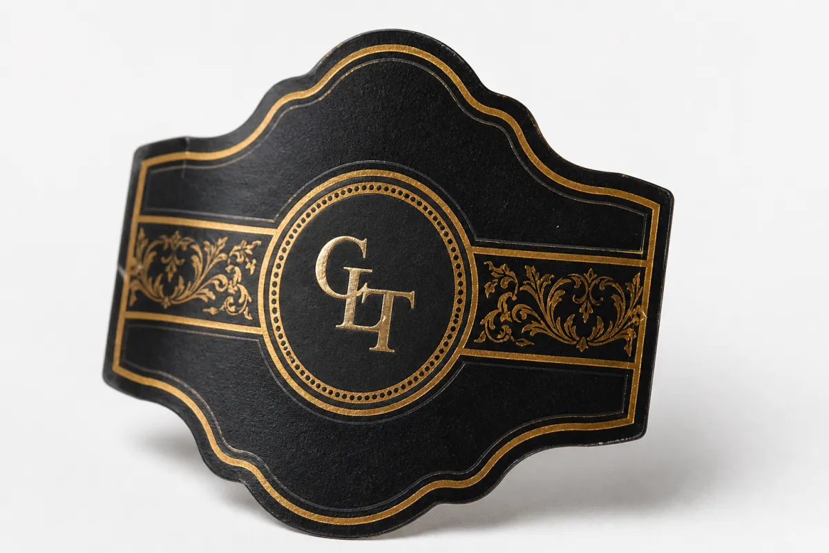
Printed Bottle Packaging Labels: Design, Cost, and Fit
Printed bottle packaging labels do far more than carry a logo. They decide whether a bottle feels credible, survives condensation, and still reads cleanly after shipping, shelf handling, and a few dozen fingerprints. I have watched strong brands stumble here more than once: the artwork looks polished on a monitor, then the real label wrinkles on a curved bottle or clouds up as soon as the product gets chilled. That is not branding. That is a complaint waiting to happen.
If you are building branded packaging for beverages, cosmetics, sauces, supplements, or cleaners, printed bottle packaging labels are often the quickest way to change how a product is perceived without changing the bottle mold, the closure, or the whole production line. A strong label can make a plain container feel premium. A weak one can make an expensive bottle look like it was chosen in a hurry. Brands that also use Custom Printed Boxes need the same visual discipline here, not a label that argues with the rest of the package.
That is why this topic matters. Printed bottle packaging labels are not one material, one adhesive, or one finish. Paper, film, clear, metallic, textured, removable, freezer-grade, and tamper-evident options all solve different problems. The right choice depends on where the bottle sits, how it is filled, how it is applied, and how much abuse it has to survive before a customer opens it.
Here is the practical side: printed bottle packaging labels affect shelf appeal, compliance, pricing cues, and day-to-day handling more than most buyers expect. If you want the bottle to function as packaging, not just decoration, you have to think about fit, cost, print method, and the environment the bottle will actually live in. That is the work this article covers, minus the fluff.
What Printed Bottle Packaging Labels Actually Do
At the simplest level, printed bottle packaging labels are the branded face of the bottle. They tell the customer what the product is, what size it is, why it should be trusted, and sometimes why it costs what it costs. In retail packaging, that face has to do a lot in a very small space. It usually needs the brand name, variant, ingredients, warnings, barcodes, legal copy, and enough visual polish to earn a second glance.
That is why printed bottle packaging labels are never just decoration. They are a sales tool, a compliance tool, and a production tool. The label has to fit the bottle shape, survive the environment, and support package branding without making the design feel crowded. If the layout is beautiful but the information hierarchy is messy, the bottle still fails. Pretty does not scan well at the register. Pretty does not fix a crooked seam either.
One of the biggest advantages of printed bottle packaging labels is speed. If a brand wants to refresh a SKU, test a seasonal version, or shift positioning, a new label is usually faster and cheaper than a full packaging redesign. That matters for small brands and established ones alike. You can move from plain stock to polished branded packaging without retooling the entire container system. For a lot of startups, that is the difference between getting on shelf and sitting in planning for another quarter.
Printed bottle packaging labels also help create consistency across a line. A beverage brand might use one label family across glass bottles, PET bottles, and sample-size containers. A skincare line might carry the same visual language from labels to inserts to Custom Packaging Products. That is where packaging design starts to look intentional instead of pieced together by three unrelated vendors who never spoke to each other.
There is also a practical side that buyers often ignore until the first complaint arrives: the label has to survive handling. Bottles get cold. They sweat. They rub against trays, cases, and other bottles. They get stacked, shipped, picked up, and put back down. Printed bottle packaging labels that look fine in a mockup can still wrinkle, lift at the edge, or turn hazy when exposed to moisture. A label that fails physically makes the entire bottle feel cheaper than it is.
A bottle can look premium in the render and still fail on shelf if the label wrinkles, peels, or clouds up under condensation. That is the part most people discover after production, which is a frustrating time to discover it.
There is another thing most buyers miss: printed bottle packaging labels can influence price perception before a customer reads a single ingredient line. Paper stock with a soft matte finish sends a different signal than a glossy film with metallic accents. Clear labels create a floating look on transparent bottles. Textured stocks feel more artisanal. None of that happens by accident. It all shapes how the bottle sits in the category.
For bottles that sit inside a broader shelf system, labels should also align with custom printed boxes, cartons, and secondary packs. If the label says clean premium botanical and the outer box looks like discount warehouse inventory, the message collapses. Good packaging works as a system, not as disconnected parts.
Printed bottle packaging labels do not need to be complicated. They do need to fit the job. That usually means choosing the right material, the right adhesive, and the right finish for the bottle shape and the environment instead of chasing the lowest line item and hoping physics is feeling generous.
How Printed Bottle Packaging Labels Are Made: Process and Timeline
Most printed bottle packaging labels follow a standard production path, even if the details change by supplier. It starts with intake: the printer reviews bottle size, label dimensions, material preference, application method, quantity, and artwork. Then the dieline gets confirmed, because artwork that ignores the actual label panel is just expensive decoration.
After that comes proofing. Sometimes that is a PDF proof, sometimes a digital sample, and sometimes a physical proof or press proof if the project has tight color requirements or tricky bottle behavior. For printed bottle packaging labels, a physical sample matters more than people want to admit. Curves, moisture, and adhesive behavior do not show up accurately in a flat file. A mockup on an actual bottle tells you things a screen never will.
Production time depends on the print method and how much setup the job needs. Digital printing is often faster for short runs and reorders because setup is lighter and changes are easier to manage. Flexographic printing usually makes more sense for larger volumes because the unit cost can be lower once the press is set. Neither method is better in the abstract. The right one depends on the run size, shape complexity, color expectations, and finish requirements.
For a simple reorder of printed bottle packaging labels with no artwork changes, a buyer might see production in roughly 5 to 10 business days after proof approval. Custom shapes, metallic effects, multiple inks, or special coatings can stretch that to 10 to 15 business days, sometimes longer if tooling or material sourcing is involved. If the client approval cycle drags, that is usually where the schedule gets blown up. The press is not usually the problem. Humans with inboxes are.
Typical finishing steps may include lamination, varnish, slitting, rewinding, die-cutting, and packaging for shipment. In roll-fed applications, unwind direction and core size matter. For hand-applied printed bottle packaging labels, the printer may convert them into sheets or rolls depending on the application plan. If the label is going onto a machine, the supplier should know the applicator type before the order is locked.
If the bottle will face shipping abuse, it is smart to think about transit testing too. The International Safe Transit Association publishes packaging test profiles that help brands understand how a product behaves in distribution. If your labels are part of a system that includes secondary packaging, those tests can reveal problems before product is sitting in a warehouse with scuffed, lifted labels.
Another detail that matters more than most people expect is cure or bond time. Some pressure-sensitive adhesives reach a strong enough tack quickly but still improve over 24 to 72 hours as the adhesive wets out fully. That means a label may look acceptable immediately after application and still change slightly after sitting on the bottle. If the product will be chilled soon after labeling, that timing needs to be part of the plan.
When you ask for a timeline, ask for more than how long will it take. Ask when files are checked, when proof approval is required, when production starts, and whether rush service changes the available materials. Those details separate a realistic lead time from a sales quote that sounds fine until the calendar shows up.
In practice, printed bottle packaging labels move fastest when the buyer supplies a clean dieline, final copy, print-ready artwork, a target application method, and a bottle sample or exact container spec. The less guesswork the printer has to do, the less likely the job is to bounce back for corrections. That sounds obvious, but obvious is rare in print buying.
Material, Adhesive, and Finish: The Key Factors
Most problems with printed bottle packaging labels come from three choices: substrate, adhesive, and finish. If those three do not match the bottle and the environment, the label will fight you. Sometimes literally. I have seen good artwork ruined by a paper stock that softened in condensation and a finish that made fingerprints stand out like neon signs.
Start with the substrate. Paper labels usually make sense for dry applications where cost has to stay low and moisture is not a threat. They work well on shelf-stable products, some cosmetics, and certain gift-style bottles. Film labels, such as BOPP, are a better fit for wet environments, chilled products, and bottles that will be handled often. They resist moisture better and usually hold their shape better on a curved surface.
Specialty stocks sit in the middle or above it, depending on the job. Textured papers, metallic films, clear labels, and soft-touch constructions are used when the bottle needs a more premium feel or a specific visual effect. For premium retail packaging, the label finish often does just as much selling as the artwork. A matte texture can suggest natural or artisanal positioning. Gloss can feel more energetic and modern. Clear can make the container itself part of the design. None of those choices is free, and none should be random.
Adhesive choice matters just as much. Standard permanent adhesive is the default for many printed bottle packaging labels, but it is not a universal solution. Removable adhesive makes sense if the label needs to come off without residue, though that usually comes with tradeoffs in long-term hold. Freezer-grade adhesive is different again, because cold storage changes how materials and glue behave. Wet-bottle adhesive is often necessary when the container may be damp during application, especially on refrigerated beverages or products that come out of chill before labeling.
Bottle surface also affects performance. Glass, HDPE, PET, coated metal, and textured containers all behave differently. A smooth glass bottle usually gives the adhesive a cleaner surface than a low-surface-energy plastic bottle. Curved shapes can create lift at the edges if the label panel is too aggressive or the artwork wraps too far around the shoulder. Squeezable bottles add another wrinkle because the label has to tolerate flex without cracking or creasing.
Finish influences more than appearance. It can affect scuff resistance, barcode readability, and how obvious fingerprints or condensation marks become. A heavy gloss may look expensive, but it can also show scratches faster. A very matte finish can look refined, but some matte films can lose contrast in poor lighting. Clear labels look elegant on transparent bottles, yet they can disappear if the shelf backdrop is busy. That is a branding choice, not a coincidence.
Here is a quick comparison that buyers usually find useful:
| Option | Typical Use | Approx. Cost Per Label at 5,000 Units | Strengths | Tradeoffs |
|---|---|---|---|---|
| Paper | Dry shelf-stable products | $0.06-$0.12 | Lowest cost, easy print feel, good for simple retail packaging | Weak in moisture, can scuff or wrinkle |
| BOPP film | Chilled, wet, or handled bottles | $0.10-$0.22 | Moisture resistance, better durability, strong shelf performance | Usually costs more than paper |
| Clear film | Transparent bottles and premium branding | $0.14-$0.30 | Clean floating look, modern package branding | Needs strong contrast and careful layout |
| Textured specialty stock | Premium or artisan products | $0.18-$0.40 | Distinct feel, upscale presentation | Higher cost, not always ideal for wet storage |
The best label spec usually is not the fanciest one. It is the one that survives the actual use case. If the bottle sweats, gets chilled, or lives in a cooler, durability should outrank saving a few cents per unit. That is not being fancy. That is basic cost control.
If you are trying to decide between label types, ask for material samples and test them on a filled bottle. Not on a flat sheet. On the real bottle. Hold it for a day or two, then check for curl, lift, clouding, and scuffing. That small test catches more failures than a dozen mood boards.
And if the label is part of a larger branded packaging system, the finish should match the rest of the kit. A textured label on a high-gloss carton can work, but only if the contrast is deliberate. If the brand also uses custom printed boxes, the label and carton should look like siblings, not roommates who argue in public.
Printed Bottle Packaging Labels: Cost, MOQ, and Quote Basics
Printed bottle packaging labels cost what they cost because several variables stack together. Size is one of the biggest. Bigger labels use more material and more press coverage. Shape complexity matters too. A plain rectangle is easier and cheaper than a custom contour cut, especially if the contour needs tighter registration or special tooling. Material, adhesive, finish, and quantity all move the price as well.
At a practical level, small runs cost more per unit because setup has to be spread across fewer labels. As quantity rises, unit cost usually drops. That part is predictable. The tradeoff is inventory. Ordering 25,000 labels might get you a lower unit price, but it also ties up cash and creates storage risk if the artwork changes before the stock is used.
Minimum order quantity, or MOQ, is one of those phrases that sounds simple until you start quoting. Some suppliers quote by label count, some by roll, and some by the print method or die size. That means the minimum might not be the actual floor. It might be the point where a job becomes economically sensible for the supplier. Buyers should ask exactly how MOQ is being defined before comparing quotes. Otherwise you end up comparing three different math problems and pretending they are the same thing.
When reviewing pricing, ask for at least three quantity levels: a small run, a mid run, and a target annual volume. That gives you a better sense of the breakpoint. Sometimes the jump from 5,000 to 10,000 labels barely changes the unit cost. Sometimes it does, especially if the print method or setup is sensitive to volume. Without those breakpoints, it is easy to overbuy or underbuy.
Here is a simple quote framework that helps buyers stay sane:
| Quote Item | Why It Matters | What To Confirm |
|---|---|---|
| Material | Drives durability, feel, and cost | Paper, film, clear, textured, recyclable intent |
| Finish | Changes brand look and scuff resistance | Matte, gloss, soft-touch, foil, varnish |
| Adhesive | Controls bond strength and removability | Permanent, removable, freezer-grade, wet-bottle |
| Quantity | Affects unit price and inventory risk | Exact count plus breakout pricing at higher volumes |
| Setup costs | Can change the real project total fast | Die fees, proof charges, artwork changes, rush fees |
Hidden costs are where budget plans go sideways. Die fees, setup charges, special proofing, split shipments, and rush production can move the total more than a small artwork tweak ever will. If a quote seems unusually low, check whether something important was left out. The cheapest printed bottle packaging labels are not cheap if they peel, smear, or force a reprint after launch.
If you want to compare label pricing with other branded packaging components, it helps to look at the whole project. Some brands use the label as the main visual element while keeping the container simple. Others split the spend across label, carton, and insert. That is where a broader look at Custom Labels & Tags can help, especially if the bottle is part of a multi-SKU product packaging system.
One more point on pricing: the lowest quote is not always the lowest risk. A slightly higher quote that includes proper testing, better adhesive selection, and cleaner finishing can save money the first time the product ships. Reprints, delayed launches, and damaged shelf presentation are the expensive line items nobody puts on the original spreadsheet.
Step-by-Step Guide to Ordering Printed Bottle Packaging Labels
Ordering printed bottle packaging labels gets much easier when you stop treating it like a generic print job and start treating it like a fit problem. The bottle, the environment, the brand, and the application method all have to line up. Do that part well and the rest is mostly execution.
-
Measure the bottle properly. Get the diameter, height, label panel size, shoulder curve, and fill level. A visual guess is not a measurement. For curved bottles, the usable panel can be smaller than it looks, especially where the contour starts to taper.
-
Decide the use environment first. Dry shelf, refrigerated, frozen, oily, wet, outdoor, or high-touch use all point to different printed bottle packaging labels. A bottle that sweats needs a different spec from one that sits in a climate-controlled showroom.
-
Build the artwork around the dieline. Do not force a random logo layout into a label size and hope it fits later. The artwork should be designed for the actual shape, seam location, barcode zone, and readable area.
-
Choose the application method early. Hand-applied labels and machine-applied labels behave differently. If the label goes on an applicator, the supplier needs roll direction, core size, and unwind orientation. If it is applied by hand, the label should still be easy to place without bubbles or skew.
-
Request a quote with exact specs. Include quantity, material, finish, adhesive, target delivery date, and whether the bottle will be chilled or handled often. Vague quotes are how buyers end up with the wrong label construction and a longer schedule.
-
Review the proof like a production person, not a design tourist. Check barcode placement, legal copy, ingredient text, color consistency, seam placement, and orientation on the bottle. A pretty proof is nice. A readable, applicable one is better.
-
Test on a real bottle before full production. Fill the bottle, chill it if needed, handle it, and let it sit. That simple test reveals lift, condensation issues, and alignment problems that a flat proof hides.
For buyers building a full launch kit, it also helps to think beyond the label. The bottle may be the hero, but the broader package should support the story. That could mean outer cartons, shipper packs, or custom printed boxes that echo the same typography and color system. Brand consistency is what makes a line look intentional instead of assembled from leftovers.
If you need a broader packaging setup, you can also review Custom Packaging Products to match labels with the rest of the system. It is usually cheaper to align everything up front than to fix disconnected components after the first production run.
When buyers follow this order, printed bottle packaging labels stop being a gamble. The label spec becomes a clear decision based on the bottle, the use case, and the commercial target. That is a much better place to be than we thought the glossy one would work.
Common Mistakes That Cause Reprints and Waste
The expensive label mistakes are usually boring. No dramatic villain. Just bad measuring, loose approvals, and a little too much confidence. The biggest one is measuring the bottle by eye instead of measuring the actual label panel. Curves fool people. A bottle that looks generous from five feet away can have a much tighter usable space once the shoulder and seam allowances are accounted for.
Another mistake is choosing paper for a chilled product because the quote looks better. Printed bottle packaging labels for refrigerated items need moisture tolerance. If the bottle sweats, paper can soften, wrinkle, or stain. The label may survive the first few hours and fail after the product has been in and out of cold storage. That is not a design issue. That is a spec issue.
Proof approval without bottle testing creates its own brand of waste. On a flat proof, everything can look aligned. On the actual bottle, the seam may land in a bad spot, the barcode may wrap too close to the edge, or the artwork may distort around the curve. If the bottle is transparent, a clear label can also lose visibility once it is placed on a busy shelf. Printed bottle packaging labels need to be evaluated in context, not just as artwork.
Overordering before the design is final is another classic. Brands sometimes lock in a large quantity to save on unit cost, then change ingredients, legal text, or positioning a month later. Now there is old inventory sitting around looking expensive and useless. Printed bottle packaging labels should not be treated like a museum exhibit.
Application method mistakes are common too. A label that works fine by hand may not feed cleanly on an applicator. Roll direction, spacing, liner type, and core size all matter for machine use. If the production line is fast, the wrong construction can cause jams, misfeeds, or crooked placement. That costs time in a very unromantic way.
Finish mismatches are subtler but still costly. Ultra-gloss art on a bottle that should feel calm and premium can make the brand look louder than intended. Clear labels on a cluttered shelf can vanish into the background. Heavy metallic effects can help one SKU and hurt another. Packaging design is not just make it pop. That phrase has ruined enough good labels already.
If the bottle will sweat, get handled a lot, or sit in a cooler, test the label under those conditions. Not on a pristine sample. Real-world abuse is the only honest review.
If you want to reduce waste, ask for sample materials, test them on filled bottles, and compare two or three constructions side by side. That beats arguing in circles over theory. It also cuts down on reprints, which is good for cost and even better for your patience.
Expert Tips and Next Steps for Printed Bottle Packaging Labels
My best advice is simple: choose printed bottle packaging labels for the worst-case condition, not the ideal one. If the bottle might be chilled, choose a moisture-tolerant build. If it might be handled often, choose a finish with better scuff resistance. If the label has to go through a fast production line, make sure the roll format and unwind direction are confirmed before production starts. Buyers who plan for the happy path usually pay for it later.
Another practical move is to create a one-page spec sheet before requesting quotes. Keep it tight: bottle dimensions, bottle material, label size, finish preference, adhesive requirement, quantity, application method, and target delivery date. That one page prevents the same five questions from bouncing between inboxes for a week. It also makes comparison easier when multiple suppliers answer back with very different numbers.
Do not compare labels only on price. Compare them on use case. A lower-cost paper stock may work fine for one SKU and fail on another. A slightly more expensive film label might save the project if the product sits in refrigeration. A premium finish may be worth it if the bottle is on a crowded shelf and needs stronger package branding. The right answer depends on the bottle, not on a spreadsheet habit.
It also helps to think about how printed bottle packaging labels fit into the wider product packaging system. If the bottle is part of a launch that includes secondary cartons, inserts, or custom printed boxes, the label should be built to support the same visual language. That is where good branded packaging starts to feel deliberate. It is the difference between we printed a label and we built a product line.
For sustainability questions, look at the material family and sourcing claims carefully. Paper stocks can sometimes be tied to FSC-certified fiber chains, and that can matter if your brand wants to document responsible sourcing. For environmental claims beyond that, be careful and specific. A label is not automatically recyclable just because someone in sales says it is. If you want a deeper look at sourcing expectations, the FSC is a good reference point for responsible fiber certification.
Before you place the order, use this short checklist:
- Confirm the bottle dimensions and label panel.
- Match the material to the environment.
- Pick adhesive based on wet, cold, or dry conditions.
- Review the artwork on the actual dieline.
- Test one filled bottle before full production.
- Verify quantity, finish, and timeline in writing.
That checklist is not fancy, but it saves money. Most label problems are preventable if the buyer asks the right questions early. Once printed bottle packaging labels are in production, the room for correction gets very small very fast.
If you are building a new label program or tightening up an existing one, start with the bottle, the environment, and the shelf. Then move into material, adhesive, and finish. That order matters. Printed bottle packaging labels are the part of the package that has to look good, survive reality, and ship on time. Get that right, and the rest of the brand looks smarter by default.
FAQ
What materials are best for printed bottle packaging labels on refrigerated products?
Film-based stocks like BOPP are usually the safer choice for refrigerated products because they handle condensation better than paper. Pair that with a moisture-tolerant adhesive so the corners do not lift after chilling. Test the label on a filled bottle, not a dry sample, because condensation changes everything.
How long do printed bottle packaging labels usually take to produce?
Simple reorders can move quickly once artwork is approved, while custom shapes and premium finishes take longer. In practice, most delays happen during proofing and file fixes rather than press time. If you need a rush job, ask whether it changes material choices, cost, or the available finish options.
What affects printed bottle packaging labels cost the most?
Material, finish, quantity, and setup complexity usually move pricing more than small artwork changes. Special adhesives, custom dies, and premium effects like foil or soft-touch coating raise the unit cost. Request pricing at multiple quantities so you can see where the best breakpoint actually is.
Can printed bottle packaging labels be applied by hand and machine?
Yes, but the label construction has to match the application method. Small runs are often hand-applied, while larger runs usually need roll format and consistent unwind direction. Always confirm compatibility with your applicator before ordering a large batch.
How do I stop printed bottle packaging labels from peeling or bubbling?
Match the adhesive to the bottle surface and the storage environment. Use the right material and finish for chilled, wet, or high-touch products. Run a real-world test on filled bottles and wait for the label to sit through handling, cooling, and shipping before you approve the full run.
What is the single most reliable next step before ordering?
Get one sample on the actual bottle and test it under the worst condition the product will face. If the bottle is gonna sweat, chill it. If it rides on a fast line, run it through a real application test. That one move catches more mistakes than any proof PDF ever will.


