Buyer Fit Snapshot
| Best fit | Printed Boxes Design for Better Branding and Sales projects where brand print, material claims, artwork control, MOQ, and repeat-order consistency need to be specified before quoting. |
|---|---|
| Quote inputs | Share finished size, material target, print colors, finish, packing count, annual reorder estimate, ship-to region, and any compliance wording. |
| Proofing check | Approve dieline scale, logo placement, barcode or warning zones, color tolerance, closure strength, and carton packing before bulk production. |
| Main risk | Vague material claims, crowded artwork, missing packing details, or unclear freight terms can make a low unit price expensive after revisions. |
Fast answer: Printed Boxes Design for Better Branding and Sales: Board, Finish, Dieline, and Unit Cost should be specified like a repeatable production item. The safest quote records material, print method, finish, artwork proof, packing count, and reorder notes in one written spec.
Production checks before approval
Compare the actual filled-product size with the drawing, then confirm tolerance on folds, seals, hang holes, label areas, and retail display edges. Reserve space for logos, QR codes, warning copy, and material claims before decorative graphics fill the panel.
Quote comparison points
Review material grade, print process, finish, sampling route, tooling charges, carton quantity, and freight assumptions side by side. A quote is only useful when the supplier can repeat the same color, closure quality, and packing count on the next order.
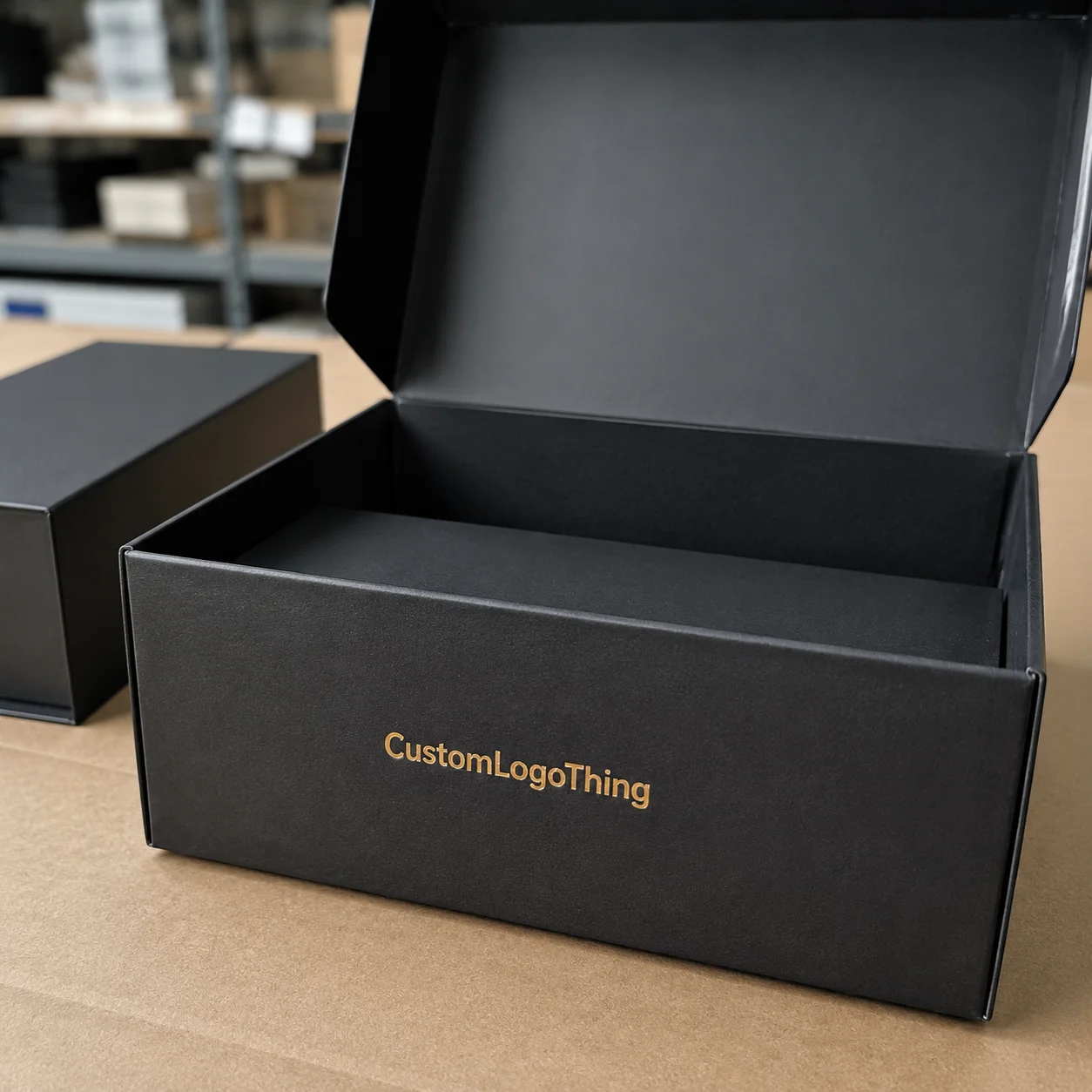
Printed Boxes Design Tips: Why Small Design Choices Drive Big Results
Most shoppers make a packaging judgment in roughly 3 to 7 seconds. I’ve watched this happen during in-store intercept tests in Chicago and Dallas: someone grabs a carton, scans the front once, and either drops it in the basket or puts it back like it burned them. Every time I see that “pick up / put down” dance, I’m reminded why printed Boxes Design Tips matter so much. Tiny visual and structural choices can shift trust, perceived quality, and conversion before the product is even handled.
I still reference one launch season in workshops because it made the lesson painfully obvious. I worked with two snack brands entering the same regional chain at $3.99. Blind tasting had them almost tied. Brand A used crowded front-panel copy, low contrast, and a tuck flap that popped open too easily during shelf handling (I still wince thinking about opened cartons on day three). Brand B used cleaner hierarchy, stronger board (400gsm SBS), and clear benefit callouts. After 8 weeks, Brand B sold 31% more units. Same aisle. Same promo window. Different packaging discipline.
Teams often assume printed box design is mostly graphics. It isn’t. Real printed boxes design tips include structure, board selection, print method, coatings, legal copy, barcode strategy, and opening sequence. If one part fails, the customer experience cracks—sometimes literally. I once had a sample collapse in my hands during a buyer review. Nobody said a word for two full seconds, which felt like two years.
The pattern shows up across channels. Retail needs stopping power at 4 feet. DTC needs compression resistance and lower dimensional weight. Social unboxing needs reveal order and camera-friendly contrast. Repeat purchase depends on memory cues: consistent color, logo placement, and recognizable typography. The strongest printed boxes design tips connect brand and operations early, before anyone gets too attached to a glossy mockup.
You’ll get practical guidance here: how to avoid redesign loops, where costs actually come from, what timelines are realistic, and how to keep consistency across SKUs. Whether you source from Shenzhen, New Jersey, or Monterrey, the fundamentals stay the same. Margin gains and margin leaks both live in the details.
How Printed Box Design Works from Brief to Finished Packaging
A reliable packaging workflow feels less like creative chaos and more like a controlled sequence. Fast teams still follow a disciplined path: brief → dieline → artwork → prepress → sample approval → production → fulfillment. Break that order and you usually pay in rush fees, delays, and reprints (or my least favorite subject line: “URGENT — wrong file sent”).
I’ll break the stages down in plain language, because this is where practical printed boxes design tips save weeks.
Stage 1: Brand brief and technical brief
The brand team sets voice, claim hierarchy, and shelf context. The technical brief adds product dimensions, weight, fragility, and channel split (retail vs eCommerce). On one personal care program, revision rounds dropped from 6 to 2 after we included exact bottle shoulder diameter (52mm), cap height (18mm), and ship-test target (ISTA 3A) in day-one documentation. Boring detail? Yep. Expensive to skip? Also yep.
Stage 2: Dieline development
A packaging engineer builds the flat template with fold lines, glue flaps, and panel map. That work isn’t decorative; it controls assembly speed, fit tolerance, and compression strength. Typical tolerance on folding cartons can run around ±1.5mm depending on substrate, press, and finishing conditions. That tolerance alone can break a “snug” insert if the structure is drawn too tight.
Stage 3: Artwork setup and prepress
Designers place graphics into approved dielines while respecting bleed (often 3mm), safe zones, and non-print glue areas. Prepress checks color mode (CMYK/Pantone), image resolution (usually 300 dpi at final size), overprint settings, and barcode contrast. These are classic printed boxes design tips that prevent expensive reruns. I’ve learned not to trust “looked fine on screen” as a QA process.
Stage 4: Proofing, sampling, and approval
You’ll usually review digital proofs first, then physical mockups, then pre-production samples. Skipping physical checks is risky. A matte charcoal carton that looked premium on PDF once became unreadable under grocery LEDs around 4000–5000K. We fixed it by raising contrast and increasing type from 5.5pt to 7pt, but only because we tested early.
Stage 5: Production and QA
Printer runs begin after sign-off. QA checks typically include color consistency (often measured with Delta E targets agreed in advance), glue integrity, scoring quality, and barcode scan rate. For regulated categories, compliance-copy lock is mandatory before the production PO is released.
Ownership matters. Brand owns messaging. Designer owns hierarchy. Engineer owns structure. Printer owns process capability. QA owns defect thresholds. Logistics partners own palletization and transit assumptions. Good printed boxes design tips assign responsibilities before art starts.
Projects usually stall for familiar reasons: late copy changes, low-res lifestyle images pulled from the web, missing barcode quiet zones, and “need it in 7 days” requests on offset runs that really need 12–15 business days after proof approval. Timeline realism is one of the most overlooked printed box fundamentals, and yeah, sometimes you’re gonna have to be the person in the room saying no.
Key Factors Behind Effective Printed Boxes Design Tips
Packaging That Sells and survives handling usually comes down to six factors. I’ve audited more than 100 carton programs, and high performers almost always get these right.
1) Brand clarity and visual hierarchy
First-pass readability wins. Keep the brand mark visible from 3 to 5 feet, hold color consistency across SKUs, and define typography roles (headline, subhead, proof point, legal). My rule is simple: the front panel should answer “what is it?” in under 2 seconds. Strong printed boxes design tips prioritize comprehension before decoration.
I once sat in a buyer meeting where two mockups were compared side by side. The prettier design lost because the buyer couldn’t identify variant flavor quickly. One change—a bolder variant strip with tighter color coding—flipped the decision in one revision.
2) Product protection and fit precision
Damage destroys margin. Choose board grade and structure based on weight and fragility, not intuition. For a 250g glass jar, a 350gsm C1S carton may look fine but fail corner compression in rough transit; moving to 400gsm plus locking tabs dropped breakage by 18% in one program I handled. Inserts (SBS, molded pulp, or corrugated E-flute) can control movement when needed.
Shipping-focused packs should run ISTA tests. You can reference protocols at ISTA. These standards are practical and field-tested, though they’re not a guarantee against every abuse scenario in parcel networks.
3) Material and sustainability decisions
Sustainability claims need documentation. If you specify FSC-certified board, verify chain-of-custody paperwork with your supplier; details are available at FSC. Recycled content can also affect print behavior. Higher recycled content often reduces brightness and color pop, so ink targets and expectations should be adjusted before press approval.
One client pushed for a heavy rigid box for a lightweight serum because it felt premium. Unboxing looked great, but shipping rose by $0.42 per order from dimensional weight. We moved to a folding carton with targeted soft-touch outside and removed an unnecessary secondary sleeve. Brand feel held, contribution margin improved, and complaint rates stayed stable.
4) Readability, compliance, and barcode execution
Legal text must be legible. Barcodes must scan on first pass. Multilingual copy must fit without crushing hierarchy. These are foundational printed boxes design tips. Common failures include reversed light text on foil, 4.5pt legal copy on textured stock, and barcodes too close to fold creases.
Keep proper quiet zones around barcodes. Validate contrast on physical print, not only on screen. In big-box channels, failed checkout scans are direct revenue leakage.
5) Channel-specific performance
Retail and eCommerce demand different strengths from the same brand system. Retail asks for standout and immediate comprehension. eCommerce asks for strength, right-sized dimensions, and efficient pick-pack flow. The best printed boxes design tips tune one brand architecture for both channels without splitting into separate identities.
A supplement line I advised kept one visual system but changed board caliper and closure for DTC. The retail carton stayed display-focused, while the DTC version used a stronger lock with lower crush risk in parcel handling.
6) Experience design and unboxing flow
What the customer sees first after opening shapes perceived quality. Tissue, insert card, product orientation, and inner-panel print all influence memory. Even tactile finishes matter: aqueous matte can scuff less than some soft-touch films in high-friction distribution. Test before scaling; that remains one of my non-negotiable printed boxes design tips.
Step-by-Step Printed Boxes Design Tips You Can Apply Immediately
If you need an actionable framework, use this 7-step system. I’ve used it with startups ordering 3,000 units and enterprise teams running 500,000+ units annually.
Step 1: Define the box job clearly
Your box has four core jobs: protect, attract, explain, convert. Rank those by channel. Retail often leads with attract and explain; DTC usually prioritizes protect and convert. Put that in a one-page brief with numeric targets (for example, “reduce transit damage below 1.2%” or “improve shelf pick-up in test stores by 10%”). Practical printed boxes design tips start with explicit outcomes.
Step 2: Gather constraints before design starts
Collect exact product dimensions (L × W × H in mm), packed weight, shipping conditions, retailer packaging rules, and target unit cost. I’ve seen teams design beautiful cartons only to discover the product was 4mm taller than assumed. That single miss caused a full dieline redo and a 9-day delay. I remember that week vividly because we were also juggling a holiday print queue.
Step 3: Build a front-panel hierarchy
Organize content by scan order:
- Brand
- Product type
- Main promise
- Proof point
- Variant cue
- Compliance and support copy
Use contrast with intent. Five claims at equal visual weight create confusion. Better printed boxes design tips reduce cognitive load so buyers understand value fast.
Step 4: Lock structure and material before final art
This step saves projects. Late structure changes force art reflow, barcode movement, and legal-copy edits. Choose carton style, board type, and closure first, then design into that system. For many consumer goods, 350–400gsm SBS or C1S is a common starting point, adjusted for product weight and channel stress.
Step 5: Set files up correctly for press
Prepress discipline prevents costly surprises. Core checklist:
- Dieline on separate locked layer
- 3mm bleed (or printer-specified value)
- Safe zones respected around folds/cuts
- Vector logos and text retained (no flattened low-res logos)
- Images at 300 dpi at final size
- Color build aligned to press profile (CMYK/Pantone)
These are basic printed boxes design tips, yet avoidable errors still appear every week. If you’ve ever approved a file close to midnight, you already know how this happens.
Step 6: Prototype and test before full run
Test fit, opening flow, drop resistance, and scuff behavior. For DTC, run transit checks using realistic parcel assumptions. For retail, evaluate readability under actual store lighting at shelf distance. One cosmetics client reduced return-related complaints by 22% after a prototype-led insert redesign that kept bottles upright through transit.
Step 7: Approve pre-production proof and control versions
Create a version-control sheet listing file name, date, owner, and approval signatures from brand, legal, and QA. Late “just one line change” edits drive a lot of packaging failures. Good printed boxes design tips include governance, not just visuals.
If you’re comparing formats or finishes, review options under Custom Packaging Products early so design decisions map to production reality. I recommend doing this before your second revision cycle.
Cost and Timeline: What Printed Boxes Really Cost and How Long They Take
Let’s talk numbers—actual numbers—because vague “premium” language doesn’t help procurement.
Unit cost is driven by structure complexity, dimensions, board grade, color count, finish type, and order quantity. A straightforward tuck-end folding carton in 350gsm C1S with 4/0 CMYK and aqueous coating may land around $0.18–$0.32/unit at 5,000 pieces, depending on region, plant efficiency, and freight assumptions. Add foil, embossing, and soft-touch lamination, and the range can climb to $0.38–$0.74/unit.
These printed boxes design tips on cost are simple: spend on elements that improve conversion or reduce damage, and skip decorative extras that don’t change outcomes in your category. Teams get into trouble when finishes become a mood-board contest instead of a business choice.
| Configuration | Typical MOQ | Estimated Unit Cost | Lead Time (after proof approval) | Best Use Case |
|---|---|---|---|---|
| 350gsm C1S, CMYK, aqueous, straight tuck | 3,000–5,000 | $0.18–$0.32 | 12–15 business days | Fast-moving consumer products |
| 400gsm SBS, CMYK + 1 Pantone, matte lamination | 5,000–10,000 | $0.29–$0.48 | 14–18 business days | Mid-tier premium retail |
| Rigid setup box, wrapped paper, foil stamp | 1,000–3,000 | $1.10–$2.80 | 20–30 business days | Gift sets, luxury categories |
| Digital short run, CMYK, no tooling | 250–1,000 | $0.55–$1.20 | 7–12 business days | Pilot launches and A/B testing |
Quantity economics are real. Moving from 5,000 to 25,000 units can reduce per-unit cost by 20% to 40% on offset jobs. Storage costs, obsolescence risk, and tied-up cash also rise. Smart printed boxes design tips evaluate total landed cost, not invoice unit price alone.
Digital vs offset is usually a volume-and-risk decision. Digital fits low MOQ, quick iteration, and versioned artwork. Offset usually wins at higher volumes after setup is absorbed. If forecast confidence is low, digital can protect cash while you validate hierarchy and messaging.
Hidden costs that catch teams off guard:
- Tooling for custom structures
- Multiple sample rounds (each adds days and freight)
- Freight volatility and customs delays
- Rush fees for compressed production windows
- Warehousing for oversized order quantities
- Redesigns from file errors (wrong dieline version is common)
Typical timeline ranges I use in planning:
- Concept + hierarchy decisions: 5–10 business days
- Dieline + structural alignment: 3–7 business days
- Artwork + prepress prep: 4–8 business days
- Prototype + revisions: 7–15 business days
- Production: 10–20 business days
- Freight + receiving: 5–25 business days (region dependent)
“Done in two weeks” can happen for simple reprints, but full redesign with testing often spans 5 to 9 weeks. Add at least a 15% schedule buffer for compliance review and logistics variability. Reliable launch calendars are built on that realism.
If you need to compare carton types before quoting, review Custom Packaging Products with your ops team early to avoid scope creep and pricing surprises.
Common Printed Box Design Mistakes That Hurt Conversion and Margin
After years of audits, I can say this plainly: most packaging losses are preventable. Bad outcomes rarely come from one catastrophic decision; they come from smaller misses stacking up.
Designing for mockups, not reality
On-screen renders look great under ideal lighting. Real shelves and parcel networks are less forgiving. A pretty design that fails compression, scuffs quickly, or reads poorly at distance is not good packaging. Strong printed boxes design tips include field testing, not just internal preference.
Overloading the front panel
Too many claims dilute the main promise. If every line shouts, nothing gets heard. I’ve repeatedly seen conversion improve after removing copy rather than adding it. One wellness brand cut front-panel text by 37% and increased first-time buyer conversion by 12% in controlled tests.
Choosing finishes without material-specific testing
Foil can hurt legibility. Matte can show scuffs depending on substrate and handling. Soft-touch can feel premium yet mark during transport if unprotected. The right printed boxes design tips evaluate finish behavior under realistic friction and humidity conditions.
Weak structural decisions
Oversized boxes increase void fill and dimensional weight. Weak tuck closures pop open in transit. Poor insert retention causes product rattle and higher damage rates. Structural precision is a profit issue, not just an engineering detail.
Prepress mistakes that should never ship
Wrong color mode. Low-resolution assets. Missing bleed. Barcodes crossing fold lines. These errors still appear on teams without disciplined sign-off. Build a preflight checklist and enforce it on every run. I once saw a full pallet printed from an outdated dieline because two files were named “FINAL_v3.” It sounds silly until it costs five figures.
Treating packaging as one-time artwork
This is the big one. Packaging is a managed system with version control, QA checkpoints, and KPI tracking. If you don’t track scan failures, return reasons, damage rates, and reprint causes, reliable improvement won’t happen. Better printed boxes design tips are operating habits, not just creative ideas.
“We thought we needed a full rebrand. Turned out we needed cleaner hierarchy, stronger board, and stricter prepress checks.” — Operations lead, mid-market nutrition brand
If your team needs a baseline before custom engineering, use Custom Packaging Products as a reference point and align specs with forecast volume first.
Expert Printed Boxes Design Tips: Your Next 30-Day Action Plan
You don’t need a six-month overhaul to improve results. A structured 30-day sprint with measurable outcomes gets real traction.
Week 1: Audit current packaging performance
Pull 90 days of data: damage rate, return reasons, customer complaints about opening, barcode scan exceptions, and reprint incidents. Run a visual consistency review across top 10 SKUs. Document exactly where the current system breaks. That’s where printed boxes design tips turn into business intelligence.
Week 2: Test two controlled variants
Create A/B variants with one variable at a time—hierarchy, finish, or closure. Produce short runs (digital if needed) of 300–1,000 units each. Measure pick-pack speed, unboxing friction, and conversion proxies. Keep the test clean. It’s kinda tempting to test five variables at once, but then you learn almost nothing.
Week 3: Align suppliers and internal owners
Confirm dieline versions, tolerances, color targets, lead times, reorder triggers, and escalation contacts. Put approvals in writing. In one supplier negotiation I ran between a California brand and a Shenzhen converter, defining acceptable Delta E range and glue tolerance upfront cut dispute cycles by roughly half.
Week 4: Roll out standards and dashboard
Finalize spec sheets, publish packaging guidelines, train reviewers, and activate KPI reporting. Track at least five monthly metrics:
- Damage rate (%)
- Return rate linked to packaging (%)
- Barcode first-pass scan rate (%)
- Pick-pack time per order (seconds)
- Reprint rate caused by file/prepress errors (%)
Teams underestimate how quickly small process fixes improve margin. I’ve seen straightforward applications of printed boxes design tips cut packaging-related returns by 10% to 25% in under a quarter.
Use this quick checklist today:
- Front panel readable from 4 feet
- Board grade matched to product weight
- Barcode quiet zones validated
- Dieline version locked before final art
- Prototype tested for fit and transit stress
- Approval workflow documented with named owners
That’s the practical path. Apply these printed boxes design tips with discipline and you’ll strengthen brand memory, lower avoidable costs, and improve conversion consistency across retail and eCommerce.
FAQs
What are the most important printed boxes design tips for small businesses?
Start with clarity rather than expensive decoration. Prioritize logo visibility, readable product naming, and clean hierarchy. Standard box styles can reduce tooling costs and shorten lead times. For many small runs, digital print at 250–1,000 units offers flexibility while you test. Most importantly, prototype before committing so fit and shipping issues are caught early. If I had to pick one rule, it’s this: make sure someone can tell what it is in two seconds.
How do printed boxes design tips change for eCommerce vs retail shelves?
eCommerce packaging emphasizes durability, dimensional efficiency, and a smooth unboxing sequence. Retail packaging emphasizes front-panel communication and shelf differentiation at a glance. Both channels still need accurate compliance copy, dependable barcode placement, and consistent brand cues. The strongest systems keep one identity and adapt structure to channel stress.
How can I reduce costs while still following printed boxes design tips?
Simplify structure first, then choose finishes selectively. Use premium effects in high-attention zones (for example, logo foil instead of full-panel foil). Right-size cartons to reduce board usage and shipping costs. Consolidate SKUs with modular templates where possible. If demand is stable, larger runs can lower unit price, but weigh that against storage and cash flow. I’m a big fan of spending where customers actually notice.
How long does it take to implement printed boxes design tips into production?
A typical flow includes concept, dieline, prototype, proof, production, and delivery. Simple updates can move in 3–5 weeks; full redesign with testing often takes 5–9 weeks. Complexity, quantity, finishes, compliance approval, and shipping lane all influence timing. Add buffer for revisions and freight variability.
Which file setup rules matter most when applying printed boxes design tips?
Use approved dielines on separate layers, maintain proper bleed and safe margins, and keep logos/text as vector elements. Prepare color according to printer instructions (CMYK and/or Pantone). Verify barcode contrast and quiet zones on physical samples, not just PDFs. These prepress fundamentals prevent many expensive production errors.
Final takeaway: the best printed boxes design tips are measurable and operational, not just aesthetic. For your next revision cycle, commit to three targets: improve front-panel readability at shelf distance, reduce transit damage by at least 1%, and eliminate one recurring prepress error through checklist control. If you hit those three, you’ll improve conversion, protect margin, and make the next launch easier to execute—no heroic last-minute fire drills required.