Buyer Fit Snapshot
| Best fit | carton dividers with logo for packaging buyers comparing material specs, print proof, MOQ, unit cost, freight, and repeat-order risk where brand print, material, artwork control, and repeat-order consistency matter. |
|---|---|
| Quote inputs | Share finished size, material target, print colors, finish, packing count, annual reorder estimate, and delivery region. |
| Proofing check | Approve dieline scale, logo placement, barcode or warning zones, color tolerance, and any recyclable or compostable wording before bulk production. |
| Main risk | Vague material claims, crowded artwork, or missing packing details can create delays even when the unit price looks attractive. |
Fast answer: Carton Dividers with Logo: Cell Size, Board Strength, and Packing QC should be specified like a repeatable production item. The safest quote includes material, print method, finish, artwork proof, carton packing, and reorder notes in one written spec.
What to confirm before approving the packaging proof
Check the product dimensions against the actual filled item, not only the sales mockup. Ask for tolerance on folds, seals, hang holes, label areas, and retail display edges. If the package carries a logo, QR code, warning copy, or legal claim, reserve that space before decorative graphics fill the panel.
How to compare quotes without losing quality
Compare board or film grade, print process, finish, sampling route, tooling charges, carton quantity, and freight assumptions side by side. A lower quote is only useful if the supplier can repeat the same color, closure quality, and packing count on the next order.
Buyer Fit Snapshot
Use this page when fragile or multi-unit products need branded dividers that improve protection and presentation.
| Decision point | What to specify before quoting |
|---|---|
| Material and structure | Board or film grade, thickness, size, closure, insert fit, and durability target. |
| Brand finish | Print coverage, color, coating, barcode or copy zones, and unboxing presentation. |
| Production control | MOQ, sample approval, packing workflow, carton marks, QC checks, and reorder plan. |
Printed Carton Dividers With Logo: Practical Branding That Pulls Its Weight
Printed carton dividers with logo do a lot more than fill empty space inside a shipper. They keep bottles from bumping into one another, stop jars from rubbing at the shoulders, and give the inside of the carton a finished feel instead of a temporary one. That matters more than people sometimes admit. I have watched packing teams notice a good divider before a customer ever sees it, because the right insert makes the whole line feel calmer, cleaner, and a little less prone to mishaps.
From a buyer’s point of view, printed carton dividers with logo live in a tricky middle ground. They have to protect the product, hold their shape through packing and transport, and still carry branding without turning into a fussy little art project. The job is not to make the divider decorative for its own sake. The job is to separate products, keep packing efficient, and let the brand show up in the parts of the package that usually get ignored.
That balance is why these inserts are worth specifying carefully. A divider that fits well, prints cleanly, and survives vibration can cut damage, reduce rework, and make warehouse handling less of a headache. A divider that misses any one of those pieces starts turning into a cost instead of a helper.
What printed carton dividers with logo do that plain inserts do not
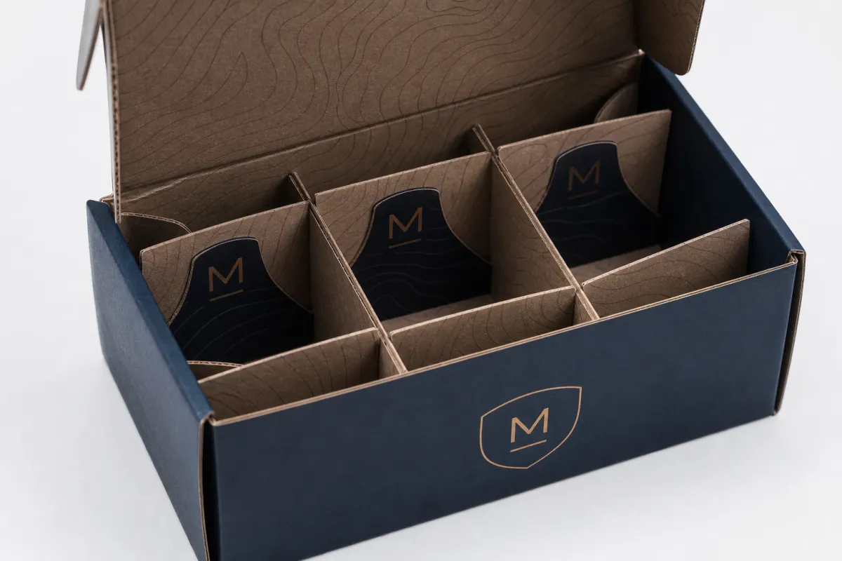
Picture a carton of glass bottles moving through a distribution chain with a few rough handoffs along the way. If those bottles shift even a little, edges start to rub, labels scuff, and caps can dent against the neighboring unit. A plain divider already helps with that. Printed carton dividers with logo go one step further because they make the insert part of the packaging system instead of something that looks tacked on after the fact. The logo gives the structure a brand role, and the structure gives the logo a purpose.
Carton dividers are board inserts that create cells, channels, or layered sections inside a case, tray, or mailer. The idea sounds simple because, honestly, it is simple. The real version has to fit carton dimensions, product tolerances, and packing speed, all at once. Adding a logo means the insert also has to behave like a print surface, which is where a lot of rushed specs start to wobble.
The logo does practical work. Packing teams spot the right insert faster when similar-looking SKUs use clearly branded divider formats. Fulfillment staff are less likely to mix parts. Customers get a cleaner interior presentation that matches the rest of the pack. When the carton opens, the inside looks considered instead of improvised. Not fancy. Considered.
Printed carton dividers with logo are especially useful in packs where product contact causes trouble: glass bottles, jars, cosmetics, candle sets, beverage packs, hardware kits, and subscription boxes shipping multiple pieces in one outer carton. They also work well where the carton gets opened and reclosed more than once, since the branded insert is easier to identify and reuse. In a lot of setups, the divider doubles as a visual cue for product count and orientation, which saves a few seconds during packing and a few mistakes over a long run.
The strongest divider designs keep three jobs in balance:
- Protection - prevent product-on-product contact and reduce scuffing.
- Presentation - make the inside of the carton feel intentional rather than patched together.
- Packing speed - keep assembly simple enough that operators can use it without slowing the line.
That balance is where the real work sits. Push branding too hard and the divider can become expensive or weak. Push protection too hard and the board may be heavier than the product needs. The best printed carton dividers with logo usually land in a practical middle zone: enough structure to protect, enough print to reinforce the brand, and enough simplicity to keep assembly painless.
“If the divider protects the product but slows the pack line, it is not a win. If it looks great but tears in assembly, it is not a win either.”
That is why plain inserts often stop short. They separate items, yes, but they do not help the pack feel complete. Printed carton dividers with logo do. They tell the buyer, the warehouse team, and the brand manager that the inside of the box got the same attention as the outside.
How printed carton dividers with logo are made
The process starts with dimensions, and that stage carries more weight than many people expect. The supplier needs product size, carton internal dimensions, product weight, any caps or closures that stick out, and the way the pack will be handled. From there, the divider layout is drawn up. A good layout does not just split space evenly; it leaves enough tolerance for the carton to close without force and enough room for the product to stay put during transit. That is the foundation for printed carton dividers with logo that actually work.
Once the layout is set, the board is selected and the logo is placed. The file is converted into a cut-ready format. Most jobs use one of three construction approaches:
- Die-cutting - best for repeatable cell shapes, clean edges, and higher-volume orders.
- Slot-and-tab construction - useful for faster assembly and inserts that need to interlock.
- Score lines - help the board fold cleanly and reduce cracking at bend points.
Printing method matters as well. Flexographic printing is common on larger runs because setup cost spreads more efficiently across volume, and the ink laydown is usually good for one- or two-color branding. Digital printing tends to make more sense for shorter runs or jobs with more variation in logo placement. For many printed carton dividers with logo projects, the smartest answer is not elaborate decoration. It is a clean one-color logo printed crisply on the right panel so the divider stays readable and cost-controlled.
The structure and the artwork affect each other more than people expect. Dense coverage can change stiffness. Coated surfaces can change how ink sits on the board. Tight folds can crack if the stock is too light or the score is too aggressive. A logo should never be treated as a separate layer from the engineering. If the divider folds through four or six repeated panels, the print layout needs to respect those folds from the start, not after the fact.
Before full production, reliable suppliers run prototypes, fit checks, and often a drop test or compression check depending on the product. That is where weak assumptions tend to show up. A divider that looked perfect on paper can buckle if the product weighs 900 g instead of 650 g, or if the carton is just loose enough to let the contents move. Fixing that on a sample costs a whole lot less than discovering it after 8,000 cartons are already in motion.
For buyers who want a standard to reference, packaging testing often ties back to methods used in ISTA protocols, while material sourcing and environmental claims can be aligned with guidance from groups like FSC. Not every divider needs a full certification stack, and I would not pretend otherwise, but it helps to know which standards matter before signing off on a spec.
Material, fit, and print choices that change performance
Board choice is where the performance difference becomes visible. A light single-wall board can work for small cosmetic items or lightweight accessories. Heavier corrugated board or thicker paperboard makes more sense for glass, candles, or anything with meaningful drop risk. Printed carton dividers with logo need enough crush resistance to survive stacking and enough crease quality to fold without splitting. That does not mean using the thickest board available. Overbuilding creates waste and raises cost fast.
Kraft-faced board and white-faced board behave differently. Kraft usually gives a natural, utilitarian look and hides scuffs better during transit. White-faced board gives a cleaner print surface and tends to make logos read more clearly, especially when the brand uses dark ink or a simple spot color. If the divider is mostly seen by warehouse staff, kraft may be enough. If the customer sees the insert during unboxing, white-faced stock often looks sharper. Printed carton dividers with logo can work on either, but the print style should suit the substrate instead of fighting it.
Fit tolerance is a practical issue, not an abstract one. Too loose, and the products rattle, tilt, or knock together. Too tight, and operators have to force the divider into the carton, which slows packing and risks bending edges or crushing fragile goods. I usually think in terms of a narrow working window: enough clearance to assemble comfortably, but not so much that the insert can move under vibration. For many applications, a few millimeters matter more than any fancy print effect.
Environmental stress changes the equation too. Cold storage can make some board stocks feel stiffer, while humidity can soften them. Long transit routes, especially those with temperature swings, can weaken inserts that were barely adequate to begin with. Heavier unit loads stacked on a pallet can compress divider walls if the board spec is too light. That is why printed carton dividers with logo should be specified against the route, not just the product. A divider that works in a local delivery box may fail in a longer freight chain.
Print choices deserve the same discipline. Logo size should be large enough to read at arm’s length, but not so dominant that it crowds folds or slot joints. Contrast matters more than clever artwork. A dark logo on kraft board is easy to read. A pale, thin, low-contrast mark usually disappears. If the divider stays mostly inside the shipper, a subtle mark is fine. If it doubles as an unboxing element, the print needs to hold up visually when the customer opens the carton.
One blunt truth stands out: premium print on weak board is wasted money. Heavy board for a light product that never leaves secondary packaging is wasted money too. Printed carton dividers with logo work best when the spec matches product weight, handling risk, and presentation goals. Here is a simple way to compare the common options:
| Option | Best For | Typical Strength | Print Appearance | Cost Position |
|---|---|---|---|---|
| Light kraft board | Small cosmetics, accessories, low-risk packs | Low to medium | Natural, muted, utilitarian | Lowest |
| White-faced board | Retail unboxing, cleaner branding, brighter logos | Medium | Sharper and higher contrast | Moderate |
| Heavier corrugated | Glass, candles, heavier kits, longer transit routes | Medium to high | Good, but more utilitarian | Higher |
| Custom die-cut insert | Complex product shapes, premium packs, tight fit requirements | Depends on board grade | Clean if artwork respects folds and slots | Highest setup cost |
If the product is fragile and the shipping route is rough, test the divider under load, not only in hand. If the logo matters for presentation, check how it reads after folding. Printed carton dividers with logo only earn their place when they solve both problems at once.
Printed carton dividers with logo: cost, pricing, and order minimums
Pricing comes down to a handful of predictable variables, and none of them are mysterious. Board grade, divider complexity, number of cells, print method, logo colors, finishing, and whether custom tooling is needed all move the number. The more folds, slots, and cuts a divider needs, the more labor and setup it takes. Printed carton dividers with logo are rarely expensive because of the logo alone. They become expensive when the structure gets complicated or the order is too small to spread setup cost across enough units.
Short runs make setup more visible. Die creation, file prep, proofing, and machine changeover can take a larger share of the total cost than the board itself. Larger runs shift the weight toward material and conversion labor. That is why the same divider can look costly at 500 units and reasonable at 10,000. The machine does not care about budget pressure; it cares about how much work gets divided across how many pieces.
Here is the kind of pricing logic buyers should expect, even though exact numbers vary by region, material market, and print spec:
- Simple one-color divider - usually the most economical option for branded separation.
- Custom dimensions with multiple cells - more board, more setup, more conversion time.
- Full-coverage print or multiple logo colors - higher ink and prep costs, especially on short runs.
- Special coatings or premium finishing - useful sometimes, but they add cost quickly.
Minimum order quantity is where many buyers get caught off guard. A smaller run may carry a noticeably higher per-piece price because the setup cost is divided across fewer units. A larger run lowers unit price, but it also ties up cash in inventory that may sit on a shelf. The right answer depends on demand stability. If the pack changes often, a lower minimum may be worth the extra cost. If the carton format stays steady, larger quantities usually make sense.
A practical buying move is to request quotes at two or three quantity breaks. For example, ask for 1,000, 5,000, and 10,000 units. That shows where the unit price drops enough to justify ordering ahead. It also reveals whether the supplier has a setup threshold that changes the economics. Printed carton dividers with logo often look expensive at one quantity and reasonable at another because setup costs are not linear.
Buyers should also ask what is included in the quote. Does it cover cutting, print, folding, packing, and freight? Is tooling separate? Are samples charged or credited back on production? A quote that looks low can become less attractive after add-ons. A quote that looks higher may actually be cleaner if it includes the full conversion path. That sort of detail saves arguments later.
One useful rule holds up well: if a supplier cannot explain why a divider costs what it costs, they probably do not understand the job well enough yet. Good printed carton dividers with logo pricing should be broken down by board, print, tooling, and conversion so you know what is driving the number.
Process and timeline for printed carton dividers with logo
Good timing starts with clean intake. Before quoting accurately, the supplier needs product dimensions, carton dimensions, unit weight, fragility level, stacking expectations, print artwork, and any packing line limits. If the divider has to fit into an existing shipper, the internal carton measurements matter more than the outer carton label size. If operators are hand-packing, line speed and assembly simplicity matter more than a perfect-looking die line. Printed carton dividers with logo cannot be specified well from a vague brief, and vague briefs are where mistakes hide.
The proofing stage usually has two parts. A flat proof checks logo placement, cut lines, and overall layout. A physical sample checks fold behavior, fit, and whether the divider actually protects the product. Both matter. The flat proof tells you whether the artwork is visually correct. The sample tells you whether the real object survives the real carton. Skip the sample, and you are counting on luck instead of testing.
After approval, tooling is prepared or adjusted, boards are printed and cut, then the inserts are converted, counted, packed, and shipped. The exact sequence varies by supplier, but the logic stays the same. Printed carton dividers with logo move from design to material to conversion to shipment, and each step can introduce delay if anything is unclear or needs revision.
Timing depends on how custom the job is. Simple repeat orders can move quickly once artwork and dimensions are locked. Custom sizes, new tooling, and proof revisions can add days or weeks. If the divider is tied to a product launch, do not assume the inserts will catch up automatically after the cartons are printed. They are a separate production stream, and that is where schedules get messy in a hurry.
Shipping and receiving deserve their own buffer. Freight can add another layer of timing risk, especially if the cartons are going to a warehouse with a receiving queue. Build in time for inbound checks, a quick line trial, and sign-off before the entire order goes live. A sample that passes in the supplier’s shop still needs to prove itself in your facility. That is especially true for printed carton dividers with logo that must fit quickly in a busy packing environment.
If you want a practical planning range, many custom divider projects move through a window that looks like this: a few days for quoting and sample alignment, time for proofing and revisions, then production plus transit. The exact number depends on complexity, but the safer way to think about it is not “How fast can we make it?” It is “How many decision points can delay it?” That is the real timeline.
Common mistakes that turn a simple divider into a headache
The first mistake is copying carton dimensions blindly. A pack that looks neat on a spec sheet can fail once product tolerances, closure style, and packing speed are added to the real world. If the product has a cap, a pump, a shoulder, or a handle, those features change the fit. If the carton is lined, taped, or reinforced, usable space shifts again. Printed carton dividers with logo need to be designed for the actual object, not for the clean drawing version of it.
Artwork problems are another common source of failure. Logos placed too close to folds disappear once the board is creased. Thin type fades on rough kraft stock. Colors that look fine on screen can print muddy on uncoated board. When the divider uses a rougher surface, the mark should stay bold and simple. This is not a place for tiny legal text or decorative detail that depends on perfect ink density. Printed carton dividers with logo should communicate quickly, even when the board is not perfect.
Strength errors show up just as often. Under-spec board for heavy items leads to crush issues, especially if cartons are stacked in transit or storage. Weak slots tear during assembly. Divider walls can sag after a few handling cycles if the load is too concentrated. If you are shipping glass, do not cut corners on compression resistance. If you are shipping lightweight goods, do not pay for structure you do not need. There is no prize for wasting board.
Operations mistakes can be just as damaging as structural mistakes. A divider that takes too long to assemble will get cursed at on the packing floor, and then it will quietly be used wrong. A design that needs too much training will lose consistency. Printed carton dividers with logo should be easy to identify, easy to orient, and easy to insert without extra instructions. If a warehouse team needs a ten-minute tutorial for a basic insert, the spec is probably trying too hard.
The reality is plain enough: if the divider saves a penny but causes rework, damage claims, or line friction, it is not saving money. It is moving the cost somewhere less visible. That hidden cost usually ends up worse than the original price difference because it shows up as broken product, frustrated staff, and avoidable delays.
Expert tips and next steps before you order printed carton dividers with logo
Start with a spec sheet, not a price question. Product dimensions, weight, fragility, shipping method, carton size, and target order volume should be ready before you ask for numbers. The clearer the input, the cleaner the quote. Printed carton dividers with logo are easier to price accurately when the supplier knows the actual use case instead of a rough guess.
Ask for a sample pack or dummy build. One physical divider usually answers more questions than a stack of emails. You can see how the board folds, whether the logo reads clearly, whether the product rattles, and whether the insert is a pain to assemble. A sample also gives your team something real to react to instead of debating a PDF as if it were final proof.
Keep the logo simple unless the divider is meant to be a hero surface. High-contrast branding, one or two colors, and clean placement usually print better and cost less. If the divider lives mostly inside the carton, the goal is recognition, not a billboard. Printed carton dividers with logo work best when the branding is strong enough to reinforce the pack and restrained enough to avoid layout problems.
Check packing speed with the operations team before final approval. A design can look elegant and still be a poor choice if it slows fulfillment by even a few seconds per unit. On a small order, that is annoying. On a larger run, that is real labor. I would rather see a slightly plainer divider that keeps the line moving than a flashy one that creates bottlenecks. That may sound a little unglamorous, but it is usually the right call.
For a practical next step, compare two material specs, request a printed sample, confirm the timeline, and lock the final artwork only after the fit test passes. That sequence cuts down on surprises. It also keeps the project grounded in how the divider will actually be used, which is the whole point of printed carton dividers with logo.
If you want one more layer of discipline, ask your supplier how the insert aligns with testing methods like compression or drop performance. You do not need a textbook, but you do need enough data to know whether the divider is protecting the product or merely occupying space. That is the difference between packaging that looks competent and packaging that actually is.
From a buying standpoint, the safest approach is often the least dramatic one: Choose the Right board, keep the logo clean, test the fit, and do not overspec for style points. Printed carton dividers with logo are at their best when they quietly reduce damage and make the pack feel finished. That is the job, and it already does quite a lot.
FAQ
How long do printed carton dividers with logo usually take to produce?
Simple repeat orders can move quickly once artwork and dimensions are approved. Custom sizing, new tooling, and sample revisions add the most time, so build in extra margin. Freight and final receiving checks should be planned separately from production time. In practice, the timeline is often shaped more by proof approval than by the actual cutting run.
What affects the price of printed carton dividers with logo most?
Board grade, divider complexity, print method, and order quantity are the biggest cost drivers. Short runs carry more setup cost per piece, while larger runs lower the unit price. Special coatings, multiple logo colors, and custom tooling can push pricing up fast. If you want a clean comparison, ask for quotes at several volume breaks.
Are printed carton dividers with logo recyclable?
Usually yes if they are made from paper-based board and do not use plastic lamination. Water-based inks and minimal coatings are easier to recycle than heavy finishes. Local recycling rules still matter, so confirm the material spec with the supplier. If sustainability matters to your brand, ask for the board description in writing.
What logo style works best on printed carton dividers with logo?
Bold, high-contrast logos with clean edges usually print best on board materials. One-color or two-color branding is often more readable and cost-effective than complex artwork. Keep important details away from folds, slots, and cut lines. If the logo must be tiny, it probably needs to get bigger or move.
Do I need custom sizing for printed carton dividers with logo?
If the product shifts, rattles, or has fragile surfaces, custom sizing is usually worth it. Standard sizes can work for simple packs, but only when the carton and product geometry already align. A physical sample is the fastest way to confirm whether a size is actually usable. For fragile goods, “close enough” is usually how damage starts.


