Buyer Fit Snapshot
| Best fit | Printed Cereal Boxes with Logo projects where brand print, material claims, artwork control, MOQ, and repeat-order consistency need to be specified before quoting. |
|---|---|
| Quote inputs | Share finished size, material target, print colors, finish, packing count, annual reorder estimate, ship-to region, and any compliance wording. |
| Proofing check | Approve dieline scale, logo placement, barcode or warning zones, color tolerance, closure strength, and carton packing before bulk production. |
| Main risk | Vague material claims, crowded artwork, missing packing details, or unclear freight terms can make a low unit price expensive after revisions. |
Fast answer: Printed Cereal Boxes with Logo: Board, Finish, Dieline, and Unit Cost should be specified like a repeatable production item. The safest quote records material, print method, finish, artwork proof, packing count, and reorder notes in one written spec.
Production checks before approval
Compare the actual filled-product size with the drawing, then confirm tolerance on folds, seals, hang holes, label areas, and retail display edges. Reserve space for logos, QR codes, warning copy, and material claims before decorative graphics fill the panel.
Quote comparison points
Review material grade, print process, finish, sampling route, tooling charges, carton quantity, and freight assumptions side by side. A quote is only useful when the supplier can repeat the same color, closure quality, and packing count on the next order.
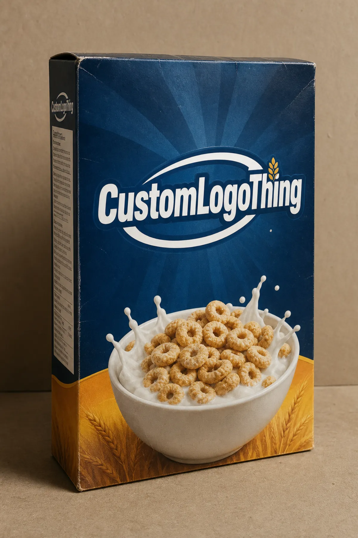
Printed Cereal Boxes With Logo: Cost, Process, Tips
Printed cereal boxes with logo have one job on shelf: be seen fast, read fast, and feel credible fast. No shopper is standing in the cereal aisle for a long design critique. If the logo is too small, the colors are muddy, or the box feels flimsy in hand, the brand starts losing before the cart even moves. If you are sorting through carton styles or planning a launch, the Custom Packaging Products page is a practical place to compare options without pretending packaging is a one-variable decision.
Why printed cereal boxes with logo matter on shelf
Shoppers do not linger over cereal. They scan, recognize, and move on. A carton has a few seconds to identify the flavor, reinforce the brand, and make the product look like it belongs in the category instead of wandering in from another aisle. That is a lot of pressure for a folded piece of paperboard.
Printed cereal boxes with logo show up in private label breakfast lines, seasonal promotions, limited test runs, subscription packs, and full retail launches. For an established brand, the carton has to stay consistent with the rest of the lineup. For a new brand, the box may be the first physical touchpoint a customer sees. Either way, the logo does real work. It anchors memory. A shopper may not read every line on the carton, but they will remember a mark that is placed well and printed cleanly.
Buyers also have to think beyond the artwork. The front panel needs room for branding and flavor copy. Side panels usually carry ingredients, nutrition facts, and brand messaging. The back may hold claims, QR codes, or retailer-friendly information. The barcode still has to scan. Legal copy still has to fit. Folds still cut through the layout if you ignore the dieline. Packaging does not care about your mood board.
That is why cereal packaging is not just design. It is a production object with structural limits. Dielines, glue flaps, crease tolerance, board caliper, coating choice, and warehouse handling all shape the final result. A carton can look polished and still fail if it cannot fill, seal, ship, and stack without drama. Good packaging respects the process instead of fighting it.
A cereal box can look sharp in a mockup and still fail in production if the logo crosses a fold, the barcode sits too close to a seam, or the board is too light for the fill weight.
The hardest part is usually the balance. Brand visibility, shelf impact, and manufacturability all want a say. Printed cereal boxes with logo work best when those decisions happen together, not as separate rounds of compromise after the artwork is already locked.
How the printing process and production steps work
The process usually starts with the dieline. That flat template shows cuts, folds, glue areas, safe zones, and where trouble is likely to show up later. The design team builds to that shape, then prepress checks the file for bleed, image resolution, color mode, barcode size, and copy placement. Skip that step and the job gets expensive in a hurry. It is amazing how often “minor file issues” turn into schedule damage.
Once the artwork is approved, the supplier handles plate or file preparation, press setup, and calibration. For folding cartons, offset lithography is often the best choice for high-color artwork because it gives strong detail and reliable reproduction at scale. Digital printing is usually the better fit for short runs, launch tests, and jobs that need a lower minimum order quantity. Flexographic printing can work for certain carton programs, especially when graphics are simpler or the production setup favors it, but it is usually not the first choice for rich imagery and tight logo control.
After printing, the sheets dry, then move through die-cutting, creasing, waste removal, folding, and gluing. The supplier counts and bundles the finished flat cartons, then packs them for shipment, often on pallets or wrapped stacks. If the cartons are heading straight to a filling line, shipping format should be discussed early. Nobody wants to discover that the cartons arrived in a format that makes the line crew curse your name.
| Print method | Best fit | Typical strengths | Tradeoffs |
|---|---|---|---|
| Offset lithography | Medium to high-volume cereal cartons | Strong color fidelity, sharp logo detail, efficient at scale | Setup takes longer, less attractive for very small runs |
| Digital printing | Short runs, test markets, limited editions | No plates, faster artwork changes, easier versioning | Unit cost is usually higher at volume, some finishes are limited |
| Flexographic printing | Programs with simpler graphics or specific production needs | Fast press speeds, useful in some cost-sensitive applications | Fine image detail and dense solids may be less forgiving than offset |
Finishing is the part that makes a box feel finished. Aqueous coating is common because it adds scuff resistance and leaves the surface clean. Matte varnish can make a premium brand feel quieter and more controlled. Spot gloss or spot UV can pull attention toward the logo or flavor callout, although those effects should earn their place. Too much shine just makes the box look busy. Embossing, foil, and inside printing are also available, but they add cost and complexity, so they should support the product rather than act like decoration for its own sake.
Some suppliers reference transport testing standards from organizations such as ISTA when a packaging program needs distribution validation. Buyers with sustainability requirements may also ask for paperboard with chain-of-custody documentation from FSC. Those details do not change the design on their own, but they matter when the carton has to satisfy retail, warehouse, and procurement expectations at the same time.
Food labeling still deserves a legal review. Packaging suppliers can print the copy you approve, but they are not the authority on whether your nutrition facts, allergen statement, or claims language are compliant. That responsibility sits with the brand owner and their regulatory team. Good vendors will flag obvious issues. The final call should still come from someone who knows the rules.
When the production sequence is managed well, the box feels simple to the shopper even though the work behind it is not simple at all. That is usually the sign of a good carton program: the result looks easy because the planning was not lazy.
Cost and pricing factors for printed cereal boxes with logo
The cost of printed cereal boxes with logo comes down to a few plain variables, and most of them are obvious before the quote arrives. Box size, board thickness, print coverage, order quantity, finishing, and carton structure all move the number. Larger boxes use more board. Heavy ink coverage takes more press time. Special finishes add labor, setup, and another reason for the production schedule to get cranky.
For rough planning, small runs usually carry a higher cost per box because setup gets spread across fewer units. A short digital run can make sense for a test launch or a local promotion. A larger offset run usually brings the unit price down once volume climbs. For many cereal cartons, buyers may see ranges like $0.18-$0.45 per unit at moderate quantities, with lower pricing possible at higher volumes and higher pricing when special coatings, heavy coverage, or tiny runs are involved. That is a planning range, not a promise. Carton size, region, and specification all move the target.
Setup charges matter too. Even when the box itself is inexpensive, tooling, plates, dielines, and proofing can make the first order feel surprisingly expensive. That is normal. The real question is how those costs are distributed across the order. A quote with a low unit price can still cost more if the supplier quietly adds sampling, tooling, freight, or artwork corrections later in the process. Cheap is a nice word. Surprises are not.
| Cost driver | How it affects price | Buyer note |
|---|---|---|
| Quantity | Higher volume usually lowers the per-unit cost | Plan for storage and demand so you do not overbuy |
| Box dimensions | Larger cartons use more board and more press coverage | Even a small size change can alter pricing noticeably |
| Board grade | Premium SBS or heavier caliper board costs more than lighter stock | Choose stiffness based on fill weight and shelf presentation |
| Print coverage | Heavy solids, full-bleed artwork, and multiple colors take more press time | Dark backgrounds often show scuffs more easily |
| Finish | Matte, gloss, spot UV, embossing, and foil each add cost | Use finishes where they support the brand story, not everywhere |
| Lead time | Rush orders may add expediting charges or limit production choices | Build room for proofing and transit before launch week |
Unit price should not be the only comparison point. Ask for a real apples-to-apples quote that separates board, print, finishing, samples, freight, and any setup charges. Otherwise, the cheapest line item can hide the biggest headache. A supplier with a clearer quote may look more expensive at first, then save time, money, and arguments once production starts.
There is also a quality side to pricing. Lower-cost cartons can bring weak fold memory, poor ink density, scuffing, or color drift on repeat runs. Reprints and delays cost more than a small price difference at the quote stage. For a food carton, that risk matters because the package has to survive a warehouse, a shelf, and a consumer kitchen. Mockups do not ship product.
Step-by-step sourcing checklist for printed cereal boxes with logo
Start with the product. Before requesting quotes, define the cereal type, fill weight, carton dimensions, sales channel, and case-pack expectations. A premium granola carton does not need the same structural treatment as a value cereal for club retail. A shelf-ready program also has different needs from a carton that will live inside a shipper. The box is not just a label with folds.
Next, build the artwork package properly. Include the logo in vector form, the correct brand colors, the barcode, nutrition facts panel, ingredient statement, allergen copy, and any claims language that needs to be there. If the supplier has to reconstruct your files from fragments and screenshots, the timeline stretches and the risk climbs. Good source files protect the launch date. That is not glamorous, but it works.
- Confirm box dimensions, fill weight, and retail channel.
- Choose the board grade and finish level before requesting quotes.
- Send a complete dieline with bleed and safe zones marked.
- Provide print-ready artwork with regulatory copy in place.
- Request a sample, proof, or drawdown before release.
- Lock shipping dates, pallet counts, and receiving requirements.
When comparing suppliers, ask the questions that expose real capability. What exact carton stock is being quoted? What is the minimum order quantity? Is the lead time measured from proof approval or order placement? Are samples included, and if so, are they digital proofs or press proofs? Does freight live inside the quote or outside it? Those answers tell you whether the supplier understands folding cartons or just knows how to send a low number in an email.
For brands that care about sustainability claims, ask whether the board can be sourced with FSC documentation or recycled content options. If the cartons will move through rough distribution, ask about transit testing, compression, or drop performance. A box can look fine on a monitor and still fail in storage if the board is too weak. That is why physical verification matters as much as the approval PDF.
If your team is sorting through a few printed cereal boxes with logo styles, it helps to lay the options out side by side. The broader Custom Packaging Products catalog is also useful when you are deciding whether a cereal carton, a display carton, or another folding carton format fits the product better.
Common mistakes that raise unit cost and delay turnaround
The easiest way to make a carton job harder is to send artwork that does not match the dieline. A logo too close to a fold, a barcode too near the edge, or a nutrition panel that does not fit the panel size can all trigger revisions after the job is already moving. Those fixes are possible. They just cost time and patience, which is not exactly a luxury during launch week.
Underestimating volume is another expensive mistake. If the first run is too small, the unit cost climbs and the brand may need to reorder sooner than planned. That hurts most when the packaging is tied to a retailer deadline or a seasonal promotion. A better move is to forecast conservatively, then ask where the price breaks sit so the order size makes sense instead of feeling random.
Finish choices cause problems when they are made for appearance alone. A matte or soft-touch surface may look attractive in a mockup, but if the carton will sit in humid storage, get handled constantly, or pack tightly in cases, the board and coating need to survive that reality. A pretty box that scuffs easily is still a problem box.
Approvals can slow everything down too. If one person is still debating the copy, someone else is revising the logo, and operations has not confirmed the fill schedule, the order just sits there. The print room cannot guess which version is final. Packaging projects punish indecision. That part is not subtle.
These four checks help keep the job out of trouble:
- Print clarity - Does the logo read cleanly at shelf distance?
- Structural strength - Will the board hold shape in transit and storage?
- Quote transparency - Are samples, freight, and setup costs shown clearly?
- Timeline realism - Is there time for proofing, revisions, and shipping?
One good habit is to treat the carton as both a brand asset and a manufacturing spec. If either side is vague, the job gets messy. Clear specifications reduce surprises, and fewer surprises usually mean cleaner pricing and a better schedule.
Expert tips for better brand impact and print quality
The front panel should carry most of the weight. Keep the logo hierarchy obvious, the flavor message easy to spot, and the contrast strong enough to read from across the aisle. A cereal shelf is already loud. The carton does not need to join the noise circus. Too many effects can blur the message, especially when the product is competing against established brands with strong shelf presence.
Side panels still matter, but they should not be stuffed to the edges. Use them for useful brand information, ingredient highlights, sourcing notes, or a QR code that leads to recipes, promotions, or a product story. That space is also handy when regulatory copy needs to live somewhere without squeezing the front panel into a wall of text. Clean information design beats clutter every time.
Color consistency deserves real attention when the logo appears across multiple flavors or sub-brands. Ask for ink drawdowns, press proofs, or a physical sample if exact color matching matters. A logo that drifts from one run to the next can make the line feel less disciplined, even if each box looks fine alone. If your brand guide uses specific Pantone colors, tell the supplier which ones are locked and which ones can tolerate small process shifts.
Board stiffness changes the feel of the packaging more than people expect. A carton with stronger caliper stands up better on shelf and stacks more cleanly in shippers. It also feels more substantial in the hand. That does not mean every project needs the heaviest board available. It means the box should match the fill weight, shelf life, and distribution pattern. A lightweight promo carton and a grocery carton built to carry inventory through a long chain are not the same thing.
Printed cereal boxes with logo look their best when the design and the production method are matched from the start, not patched together after the artwork is done.
If the budget is tight, start with the elements that matter most to the shopper: the logo, the flavor promise, and the shelf read. Add finishes only where they improve the package. A spot gloss on the logo can earn its keep. A foil treatment on every surface usually cannot. Small, well-chosen effects tend to age better than a box that tries to use every decorative option at once.
For private label cereal or fast-turn product lines, simpler often performs better. Fewer special effects mean fewer delays, fewer failure points, and more predictable print results. Predictability is boring in the best possible way when a packaging line has to run on time and keep moving.
Another practical detail: ask for a press-approved sample if the carton will use a very specific brand color, metallic ink, or dense black background. Screens lie. Paperboard tells the truth. The difference between a nice render and a production carton is often where the trouble begins.
What to do next: compare specs, quotes, and samples
The fastest way to make a packaging decision is to build a comparison sheet and keep every supplier on the same page. List the carton dimensions, quantity, board preference, finish choice, target ship date, and any special requirements such as FSC paperboard, inside printing, or retail-ready packing. Once that sheet exists, the quotes stop wandering off in different directions.
Then ask for at least two detailed quotes, not just one number. A serious comparison should show the unit cost, setup charges, sample cost, freight, and any tooling expense. That gives you the real landed cost. It also lets you compare process quality, not just price. Low numbers are nice until they hide the actual total.
When samples arrive, inspect them the way you would inspect a real production carton. Is the logo centered correctly? Does the barcode scan? Are the folds crisp? Is the board strong enough? Does the finish match the visual goal? Those checks are basic, which is exactly why people skip them and then regret it. A good sample usually tells you more than a long sales call and a cheerful promise.
It also helps to decide where you need flexibility. Some brands need the lowest MOQ because the flavor is still being tested. Others need a faster turnaround because a retailer already set the launch date. Another team may care most about a premium finish that supports a higher shelf price. There is no universal answer. The right carton is the one that fits the budget, the timing, and the product strategy together.
If the packaging is going into a grocery channel, include the retailer’s carton expectations in your spec sheet. If it is going into e-commerce, think about secondary packaging and compression risk. If it is going into club or mass retail, pallet pattern and case count matter more than they do in a boutique chain. The end use changes the quote more than people expect.
For brands sourcing through a packaging partner, the practical path is straightforward: define the carton, compare the quotes, inspect the proof, and only then release production. That order protects the budget and avoids a lot of preventable mess. It also makes final approval easier to live with.
Printed cereal boxes with logo work best when Design, Cost, and Timing are aligned before the press ever starts. Keep the specs tight, the artwork clear, and the sample review disciplined, and the carton will do its job without creating extra work for production or operations. That is the point. The box should sell cereal, not create paperwork.
How much do printed cereal boxes with logo usually cost?
Pricing depends on box size, board grade, print coverage, finish, and total order quantity. Higher volumes usually lower the unit cost, while small runs carry more setup expense per box. Ask for a line-item quote so you can compare board, printing, finishing, and freight separately.
What is the typical turnaround for printed cereal boxes with logo?
Turnaround depends on artwork readiness, proof approval speed, and the print method being used. Simple jobs can move faster when the dieline and files are already prepared correctly. Build extra time for revisions, sampling, and shipping so the boxes arrive before filling and launch.
What file format should I send for printed cereal boxes with logo?
A vector-based PDF or AI file is usually best for clean logo edges and accurate text output. Include the correct dieline, bleed, safe zones, and all required regulatory copy in the artwork package. Convert linked images to high resolution and make sure barcodes are tested for readability.
Can I order low MOQ printed cereal boxes with logo?
Yes, but low minimums often cost more per unit because setup expenses are spread across fewer boxes. Digital printing or short-run programs may be better for testing new flavors or limited releases. Confirm the MOQ before design approval so the packaging plan matches your budget and forecast.
What should I compare when sourcing printed cereal boxes with logo?
Compare board stock, print quality, finishing options, lead time, and proofing process. Check whether the supplier includes setup, samples, and freight in the quote or charges them separately. Look for consistency, communication, and carton performance, not just the lowest price.


